Design Advice

Colour Capping

One family, three values: the palest on the walls, the middle on the cornice, the deepest on the ceiling. Colour capping crowns the room with a colour that climbs - here is the art and the craft, with six complete gradients to get you started.

Discover the gradients

Start here

What is colour capping?

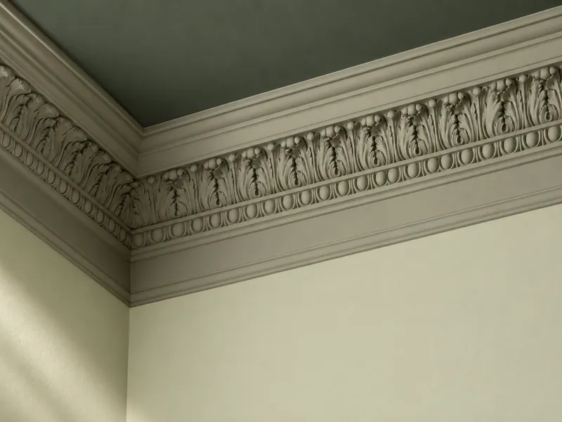
Colour capping takes one colour family and sends it up the room in three values: the palest on the walls, a middle value on the cornice (and, if you like, the skirting), the deepest on the ceiling. Nothing cuts, nothing contrasts: the same colour deepens as the eye rises, like a sky gathering at dusk.

It is the elegant answer to the question everyone asks of a ceiling: white, or colour? Neither - deeper. The gesture comes from old houses, where cornice and ceiling took a denser shade to absorb the soot of candles; it returns today for what it does to a volume. It asks for a coherent colour family, whose three values share the same base pigment - which is exactly how our colours have been composed in London since 1884.


Three values of one family, and the ceiling becomes the crowning note of the room

Why it works

Three effects of a colour that climbs

Colour capping is not a compromise between the white ceiling and the painted one: it is a third way, playing on how the eye reads height. Three mechanisms explain its power.

01

The ceiling draws nearer, without pressing down

A deep value overhead brings the ceiling down in the reading of the room - the effect everyone fears. But because it continues the wall colour instead of breaking it, it does not press: it envelops. Rooms that are too tall, stairwells and Haussmann-height sitting rooms gain an intimacy no white ceiling will ever give them.

02

The cornice becomes a drawing again

Painted white, a cornice is a boundary; painted in the middle value, it becomes a transition - a line of shadow that underlines the architecture instead of carving it up. Mouldings, roses and coves regain their relief, revealed by raking light rather than by contrast.

03

The colour gains depth

One value on every surface envelops; three values of the same family tell a story. The eye reads the passage from light to dark as light itself - the room seems lit from below, and the wall colour, tempered by its deep ceiling, looks richer than it really is in the tin.

Your turn

Compose your gradient

Pick a family, then send the colour up, value by value: walls alone, the cornice, then the ceiling. At every step, watch what the height becomes.

The family

The level of the gradient

Hurlingham → Serpentine → Pleasure Gardens Green
The full cap: the ceiling takes the deepest value, and the colour climbs in a single movement from floor to the sky of the room. Height turns intimate, the architecture draws itself, and the wall shade seems lit from below.

In real life the material matters as much as the value - matt on the ceiling, always, to forgive what raking light reveals. See the matter of capping

Our gradients

Six gradients, signed Mylands

Each palette climbs three values of one family - walls, cornice, ceiling - and adds their official companions: a related white for the woodwork, an accent for the one chosen contrast. Every swatch links to its colour, ready to sample.

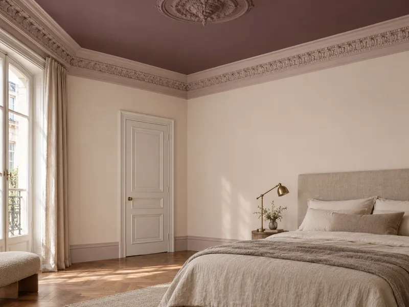
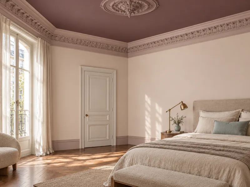
Bedroom in a pink gradient: plaster walls, dusty-rose cornice, plum ceiling

01 · Bedrooms & light-filled sitting rooms

The Dawn

A pink plaster climbing to a dusty rose and then a tannic plum: the early-morning gradient, soft on the walls, deep on the ceiling.

Finishes All three values in Marble Matt Emulsion, woodwork in The Boltons Eggshell. Keep Bridge Blue for a bedhead or an armchair.

Palette saved →
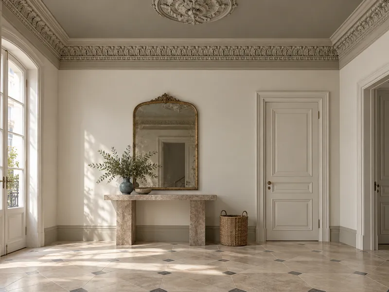
Living room in a stone gradient: chalk walls, greige cornice, warm grey ceiling

02 · Living rooms & hallways

The Cliff

Three stone greiges, from chalk to wet pebble: the most discreet of gradients, lending living rooms the gravity of an old house.

Finishes All three values in Marble Matt Emulsion, woodwork in Frieze Eggshell. Stockholm wakes the scheme in small touches - a vase, a chair.

Palette saved →
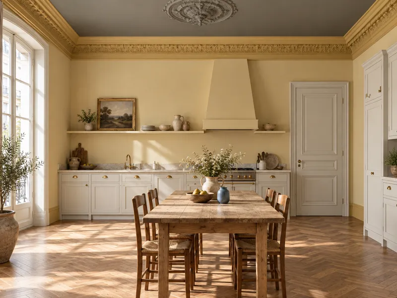
Kitchen in a golden gradient: wheat walls, honey cornice, olive ceiling

03 · Kitchens & darker rooms

The Harvest

From wheat to honey to olive: the gradient that manufactures sunshine in rooms that lack it, and settles it with an earthy ceiling.

Finishes Walls and cornice in Marble Matt Emulsion, Portcullis ceiling in Dead Matt; cabinet fronts and woodwork in Sleet Eggshell. Boathouse cools it in counterpoint.

Palette saved →
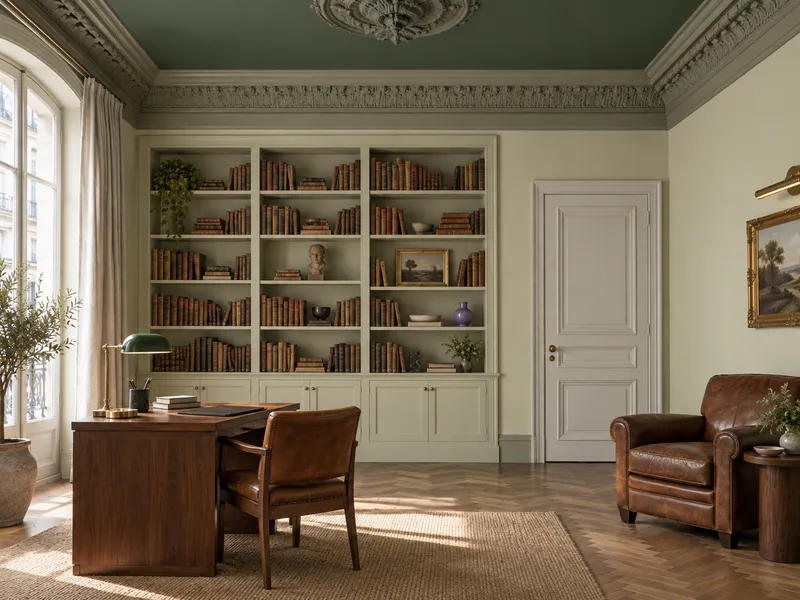
Library in a green gradient: soft green walls, sage cornice, deep green ceiling

04 · Studies, libraries & dining rooms

The Canopy

A soft green climbing to sage and then to a near-black archive green: the gradient of libraries and studies - the colour of leaves, lit from below.

Finishes All three values in Marble Matt Emulsion, Pleasure Gardens Green ceiling in Dead Matt; woodwork in Elgin Eggshell. Ultra Violet on one object only.

Palette saved →
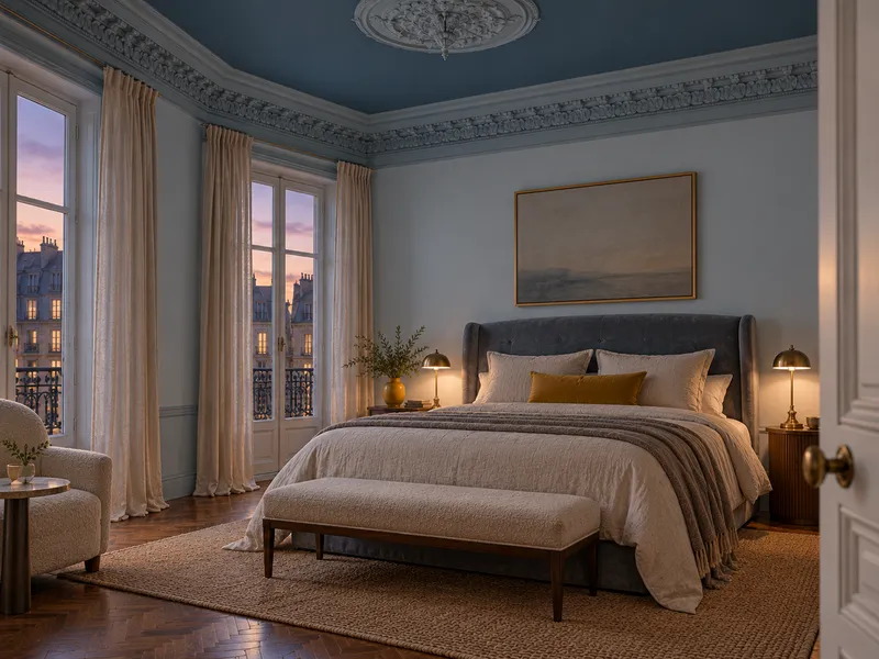
Bedroom in a blue gradient: dawn-blue walls, powder-blue cornice, Prussian-blue ceiling

05 · Bedrooms & evening studies

The Dusk

A summer evening sky, from dawn blue to Prussian: the most literal of gradients, cut for bedrooms and evening rooms.

Finishes All three values in Marble Matt Emulsion, Proper Blue ceiling in Dead Matt; woodwork in Greenwich Time Eggshell. Circle Line arrives on a lampshade, a throw.

Palette saved →
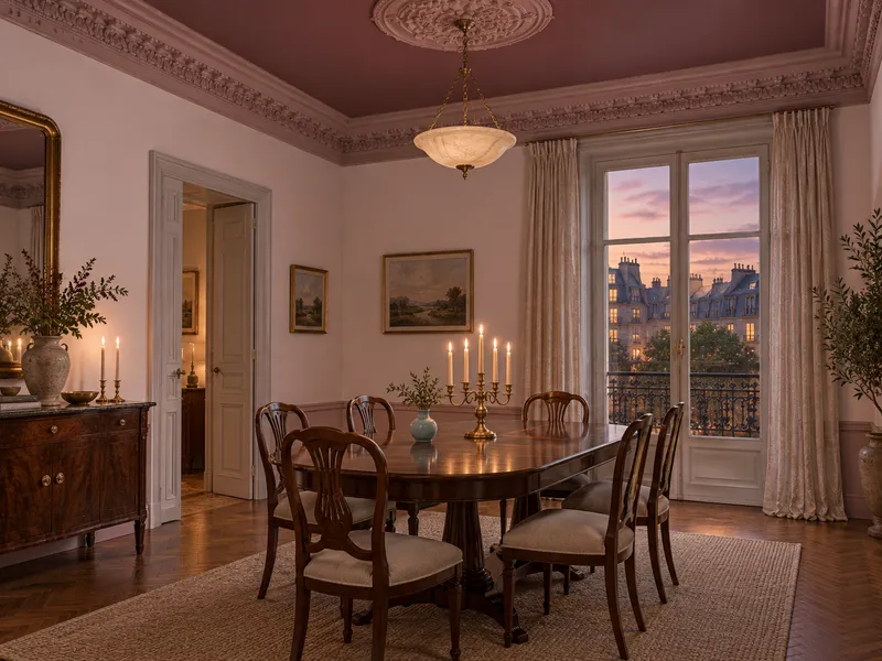
Dining room in a claret gradient: sugared-pink walls, faded-rose cornice, claret ceiling

06 · Dining rooms & evening sitting rooms

The Vintage

A sugared pink climbing to a faded rose and then a tannic claret: the gradient of dining rooms that entertain, sumptuous by candlelight.

Finishes All three values in Marble Matt Emulsion, Huguenot ceiling in Dead Matt; woodwork in The Boltons Satin to catch the flame. Notting Hill as a breath of air on a chair.

Palette saved →

Going further

The inverted gradient

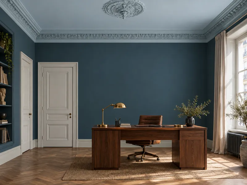
Turn the scale over: the deepest value on the walls, the palest on the ceiling. The descending gradient keeps the kinship of the three values - and so the envelope - but sends the light upwards. It is the version for low-ceilinged and dark rooms, where you want both the depth of a strong colour and the air of a ceiling that breathes.

The rule stays the same: three values of one family, never a stark white at the top. The ceiling takes the related white or the palest value of the palette, the cornice makes the transition, and the room reads taller than it is - without losing an ounce of character.

Pleasure Gardens Green · No.214 on the walls and cornice, Hurlingham · No.181 on the ceiling: the archive green keeps all its depth, and the light bounces off a soft green ceiling.

Proper Blue · No.67 on the walls, Morning Blue · No.32 on the ceiling: the Prussian blue of a low-ceilinged study opens onto a dawn sky.

The same family, the scale turned over: depth on the walls, light on the ceiling
Detail of a cornice painted in a middle value between a pale wall and a deep ceiling
Three values, the same matt material: only the depth changes

The matter

Three values, one rule of material

Colour capping is about value, not sheen: the three shades are worn in the same matt finish, wall to ceiling, so that only the depth changes. A satin ceiling would betray every flaw under raking light; a matt ceiling drinks the light and lets the value speak. The woodwork, for its part, takes a notch of sheen to shrug off knocks.

Cornice & skirting
Marble Matt Emulsion
Woodwork & doors
Eggshell or Satin
Radiators & metal
Multi-Surface Eggshell

This is what makes capping simple at Mylands: every value exists in every one of our finishes, and our colour families are composed from the same pigments - a deeper value is never another grey added, but the same colour, denser.

Find your finish

The rules of the art

Getting your cap right

Stay in the family

Three values, one pigment: a beige, a taupe and a brown taken from three different families will never make a gradient, only three colours. Our official pairings name each shade's family neighbours - start there.

Space the values

Too close, the three values blur and the ceiling simply looks grubby; too far apart, the top becomes a boundary again. Aim for a frank step between walls and ceiling, with the cornice halfway - it is the cornice that makes the transition.

Matt on the ceiling, always

The raking light of a window or a pendant reveals every patch and bump on a ceiling. A deep value in a matt finish absorbs them; the same in satin underlines them. Dead Matt or Marble Matt Emulsion, never glossier.

Measure out a cornice

No cornice? Draw one: a band of 15 to 25 cm below the ceiling, levelled and taped, in the middle value. It gives the gradient its landing - and a room without a moulding an architecture it never had.

Your colour capping questions

Is colour capping meant for low ceilings?

In its classic sense - deep at the top - it suits tall rooms first, which it makes intimate, and middling rooms, which it envelops. Below 2.40 m, prefer the inverted gradient: the deep value on the walls, the pale one on the ceiling. The kinship of the values keeps the enveloping effect, and the light returned by the ceiling makes the room read taller.

How is it different from colour drenching?

Drenching wears one value on every surface; capping wears three, of the same family, climbing. The first erases boundaries, the second turns them into transitions. If your room has a fine cornice or a tall ceiling, capping draws it; if it is small and awkward, drenching melts it.

Do I need a cornice?

No - but you need a landing. Without a moulding, a painted band of 15 to 25 cm below the ceiling, in the middle value, plays exactly the same part: it carries the transition and stops the deep ceiling from falling bluntly onto pale walls. Taped off with masking tape, it is crisp in an hour.

Which finishes should I choose?

The same matt finish for all three values - Marble Matt Emulsion on walls and cornice, Marble Matt Emulsion or Dead Matt on the ceiling - so that only the depth changes. Eggshell or Satin on woodwork and doors, Multi-Surface Eggshell on radiators. Every value exists in every one of our finishes.

How do I test before committing?

Order the 100 ml sample pots of the three values and paint them one below the other, on a vertical strip 20 cm wide running from floor to ceiling. You will see the staircase of values under your own light, morning and evening. Our online visualiser also lets you try the wall shade on a photograph of your own room.

A colour does not need contrast to tell a room. It only needs to climb.
Sign up to our newsletter

Sign up to our newsletter

Thanks for signing up to our newsletter!