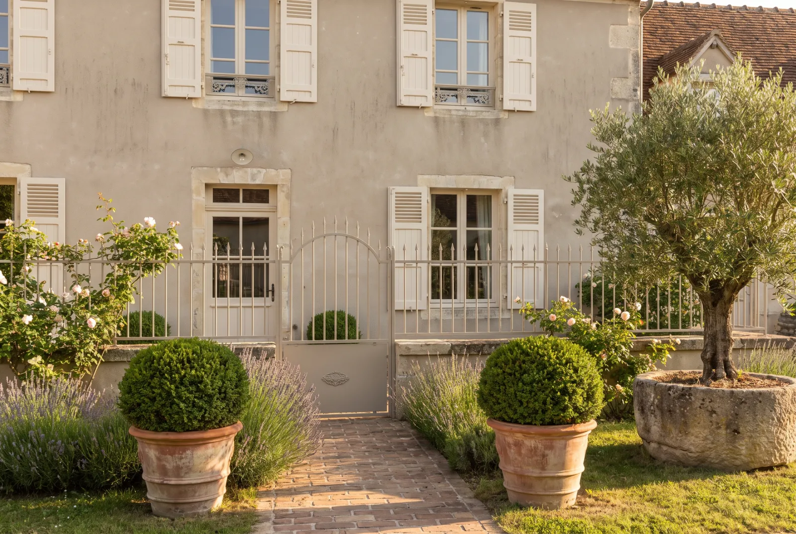
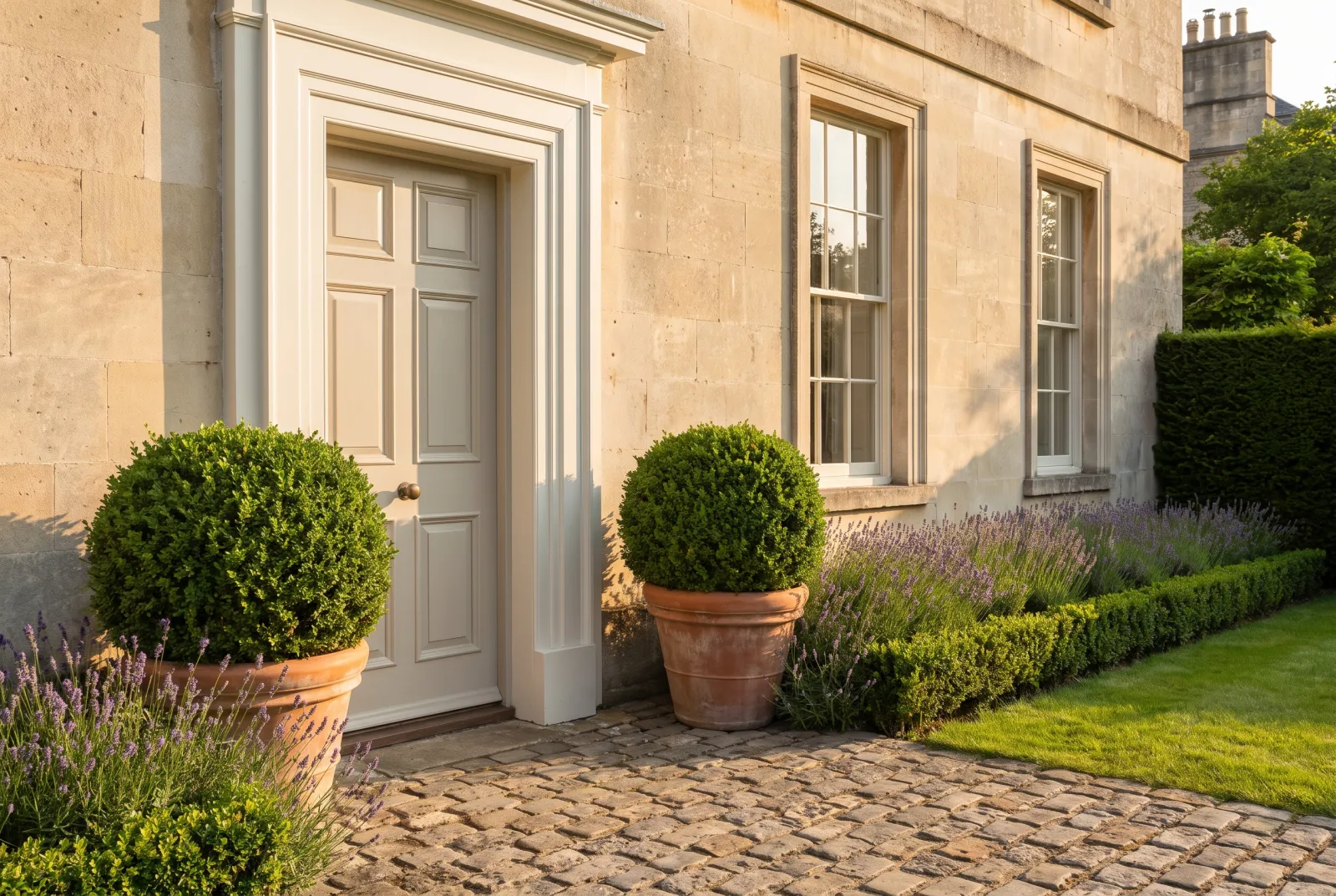
Inspirational ideas
Decorating ideas & inspiration in neutrals
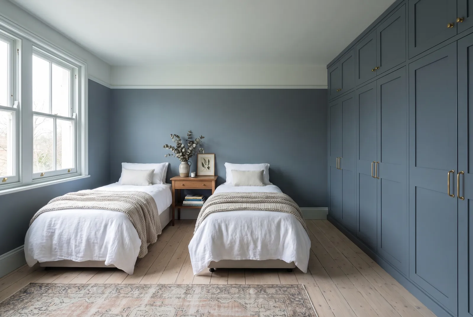
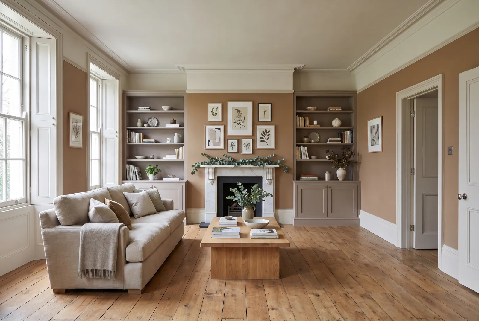
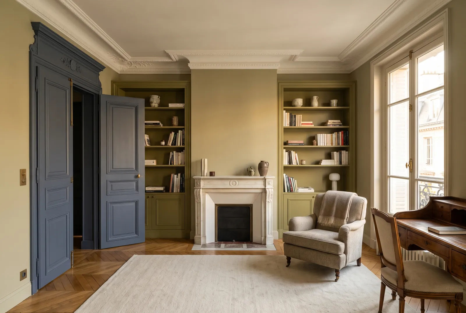
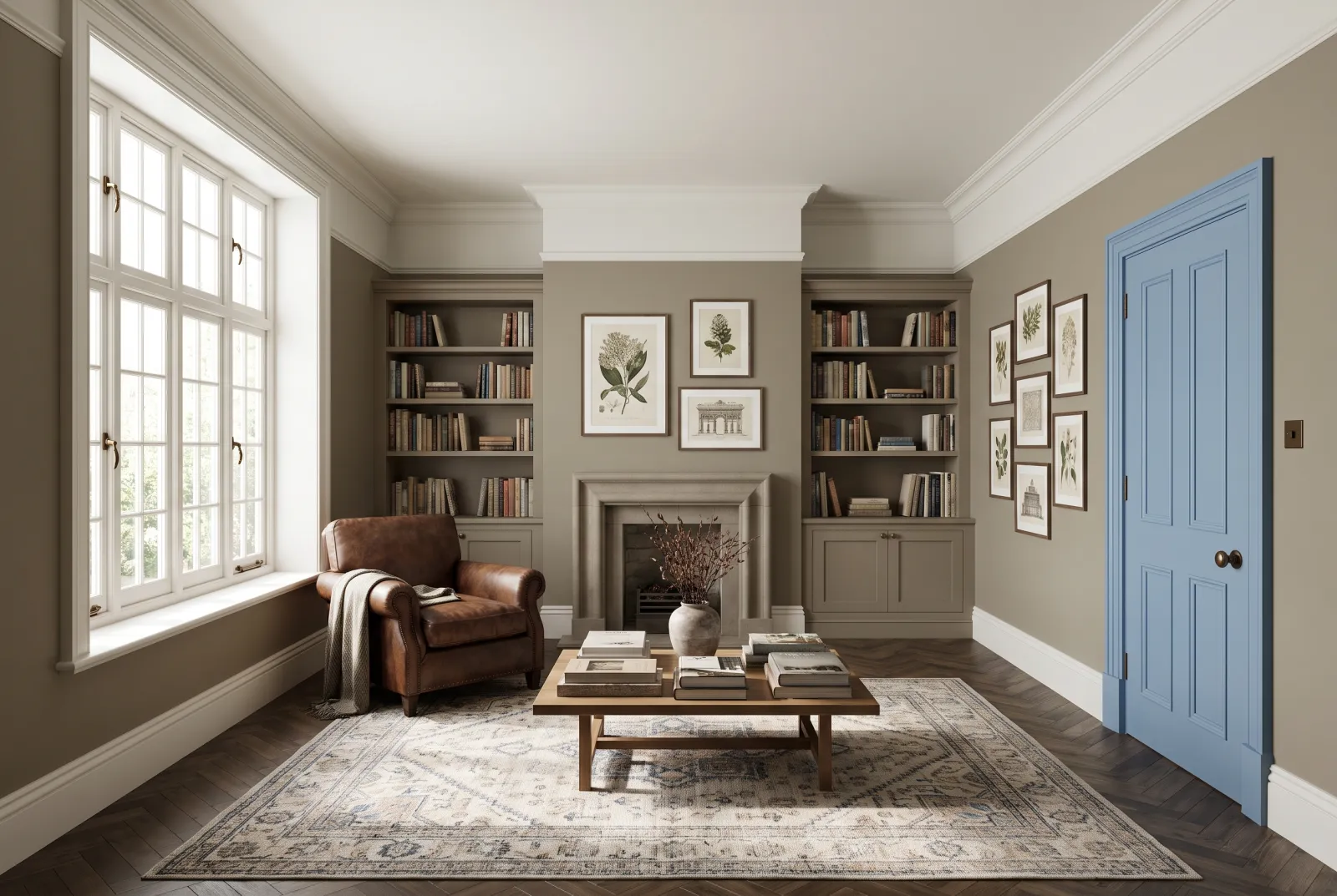
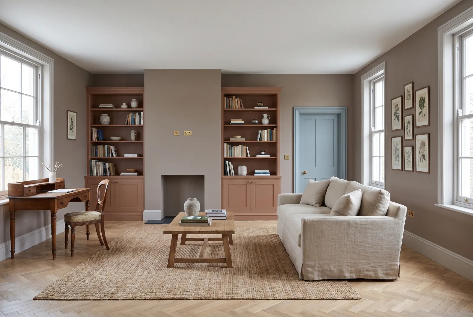
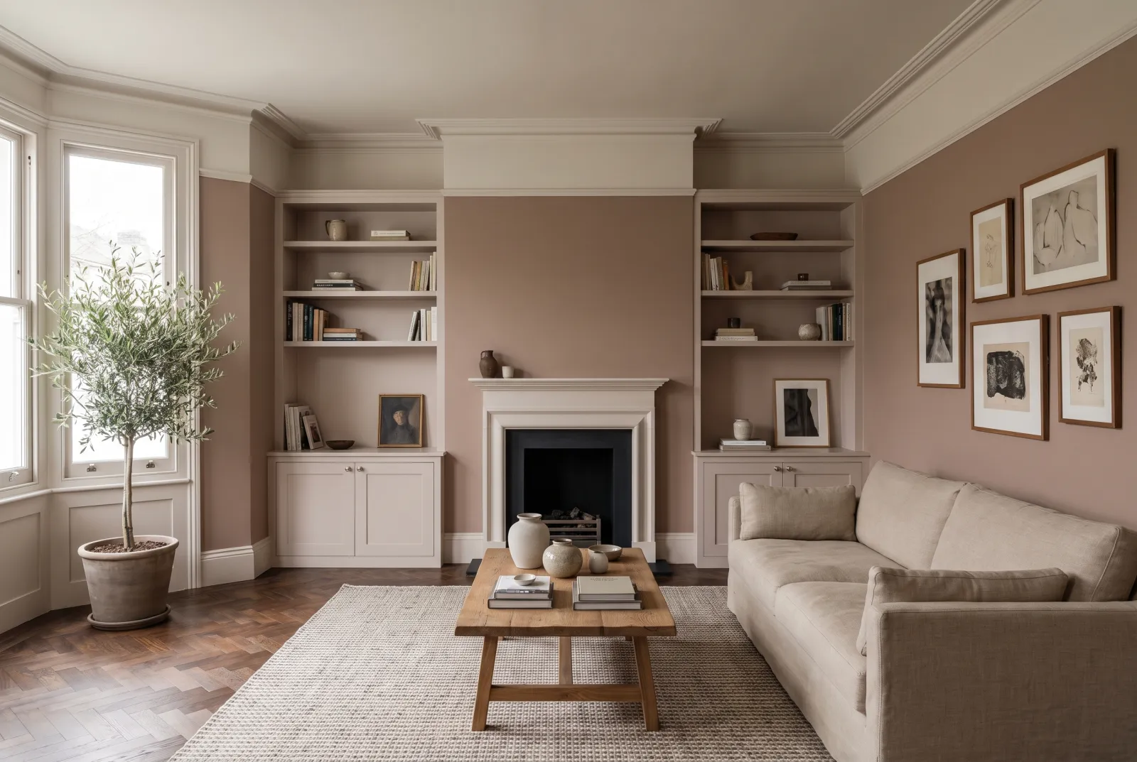
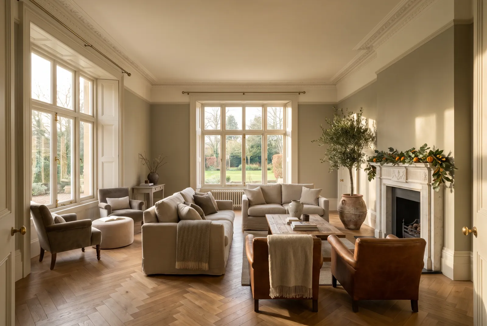
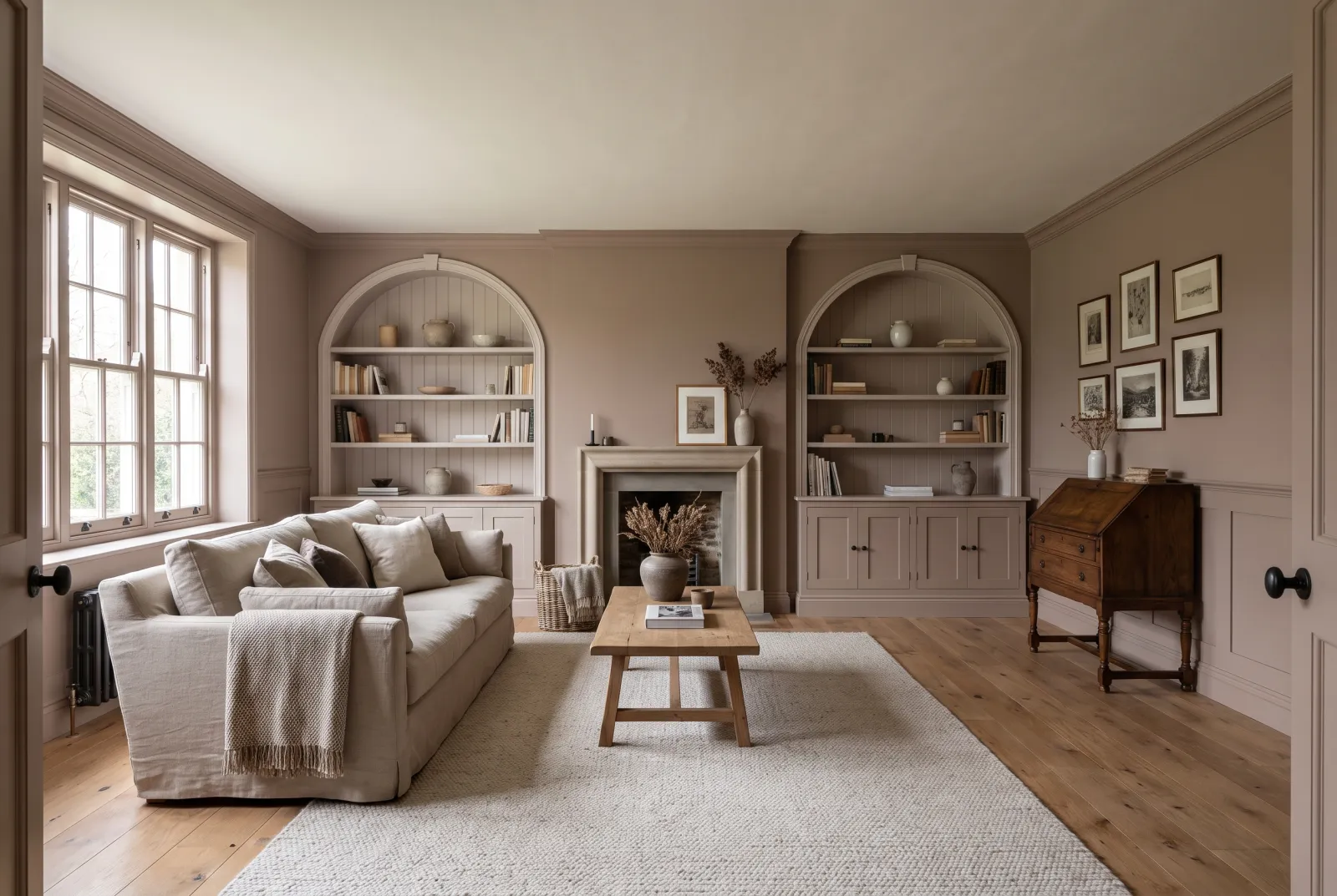
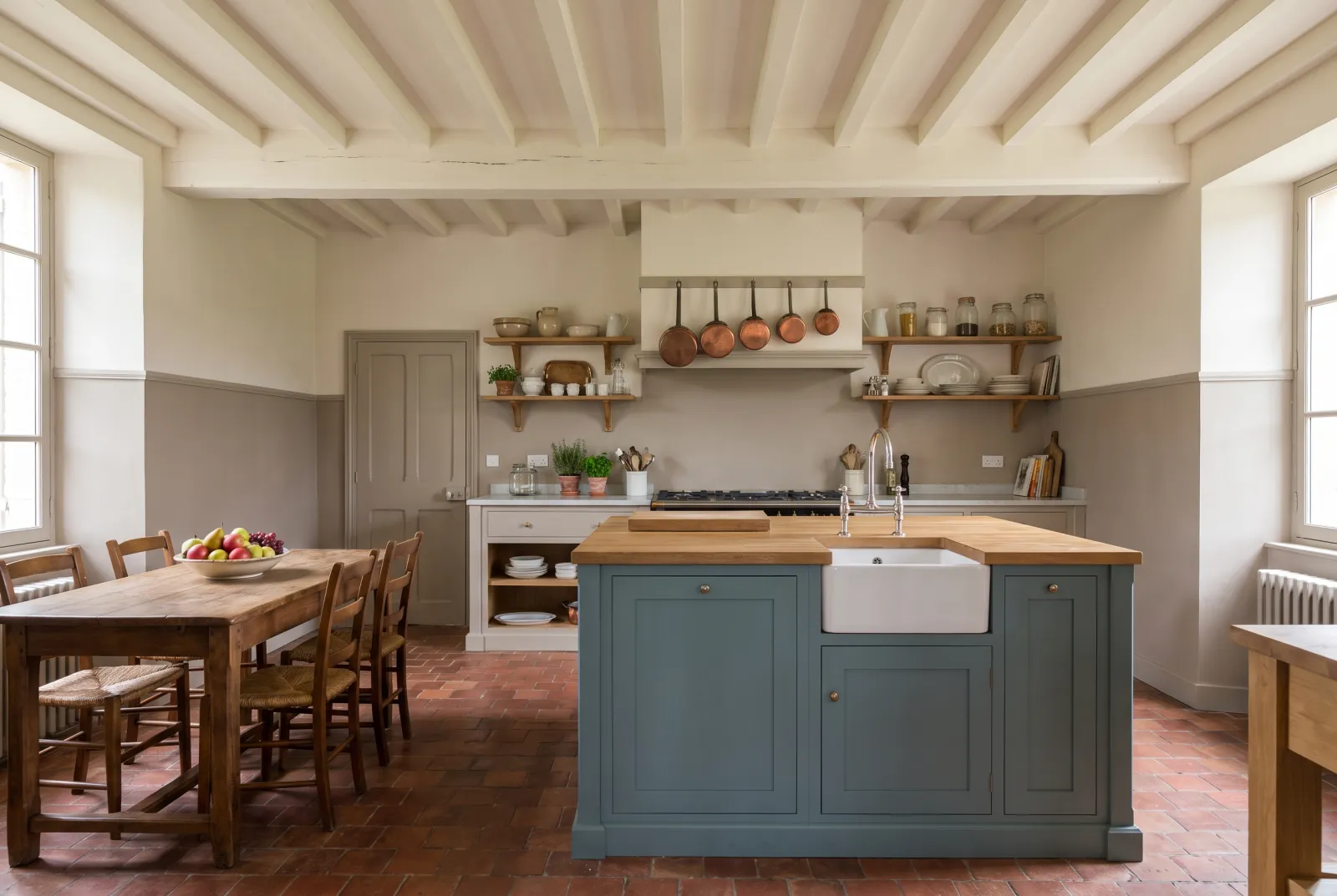
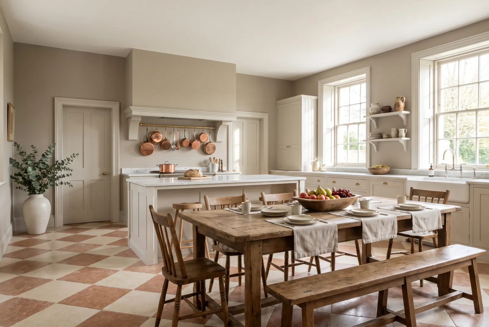
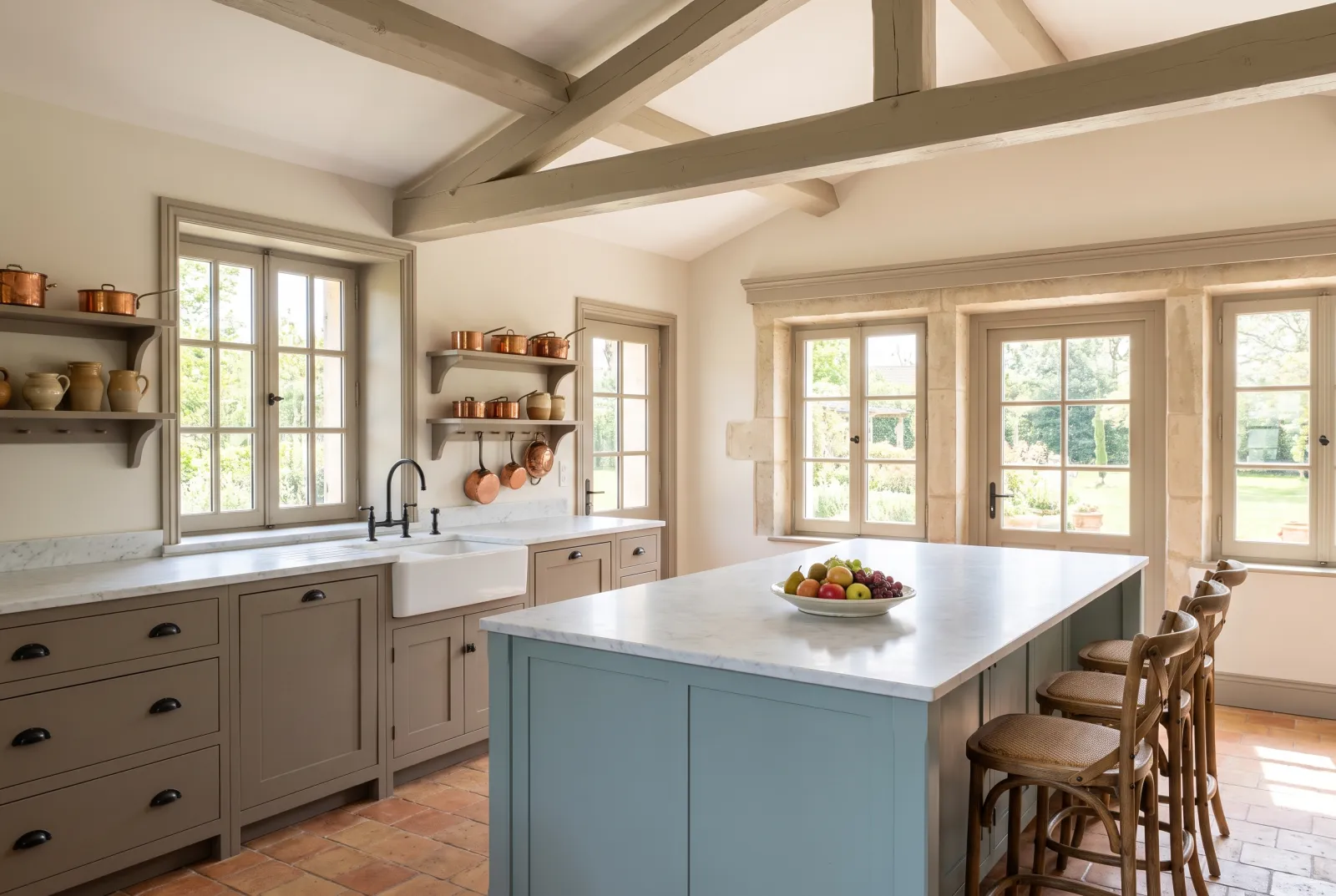
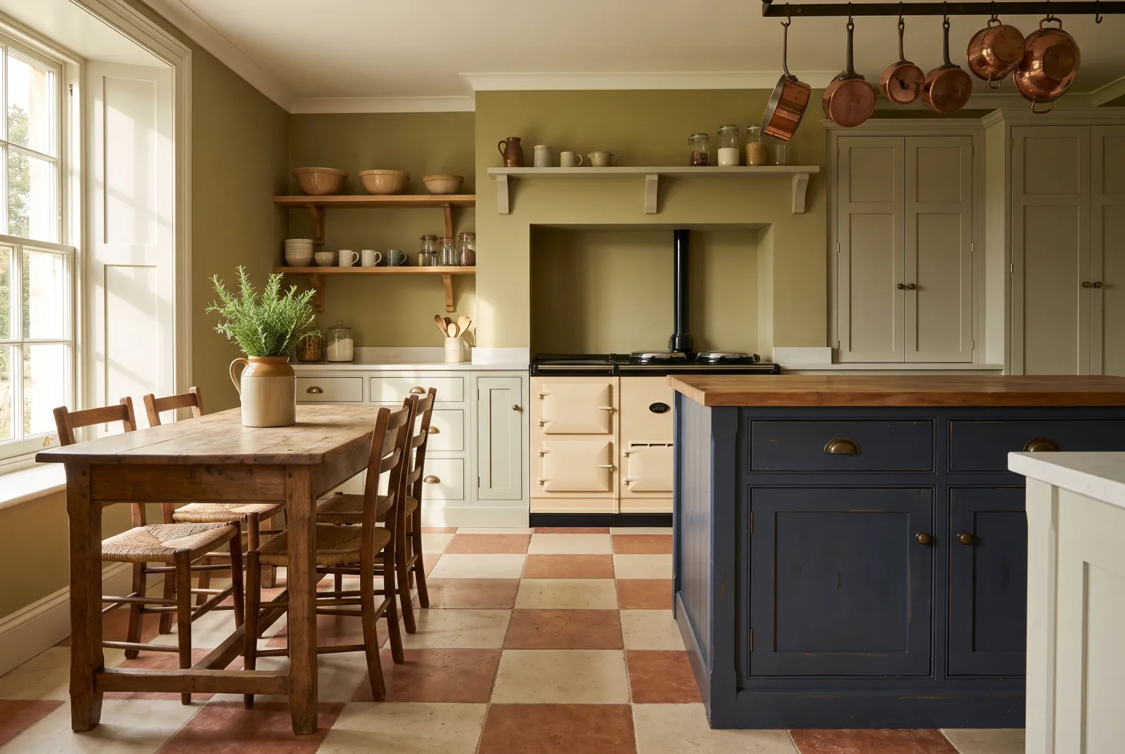
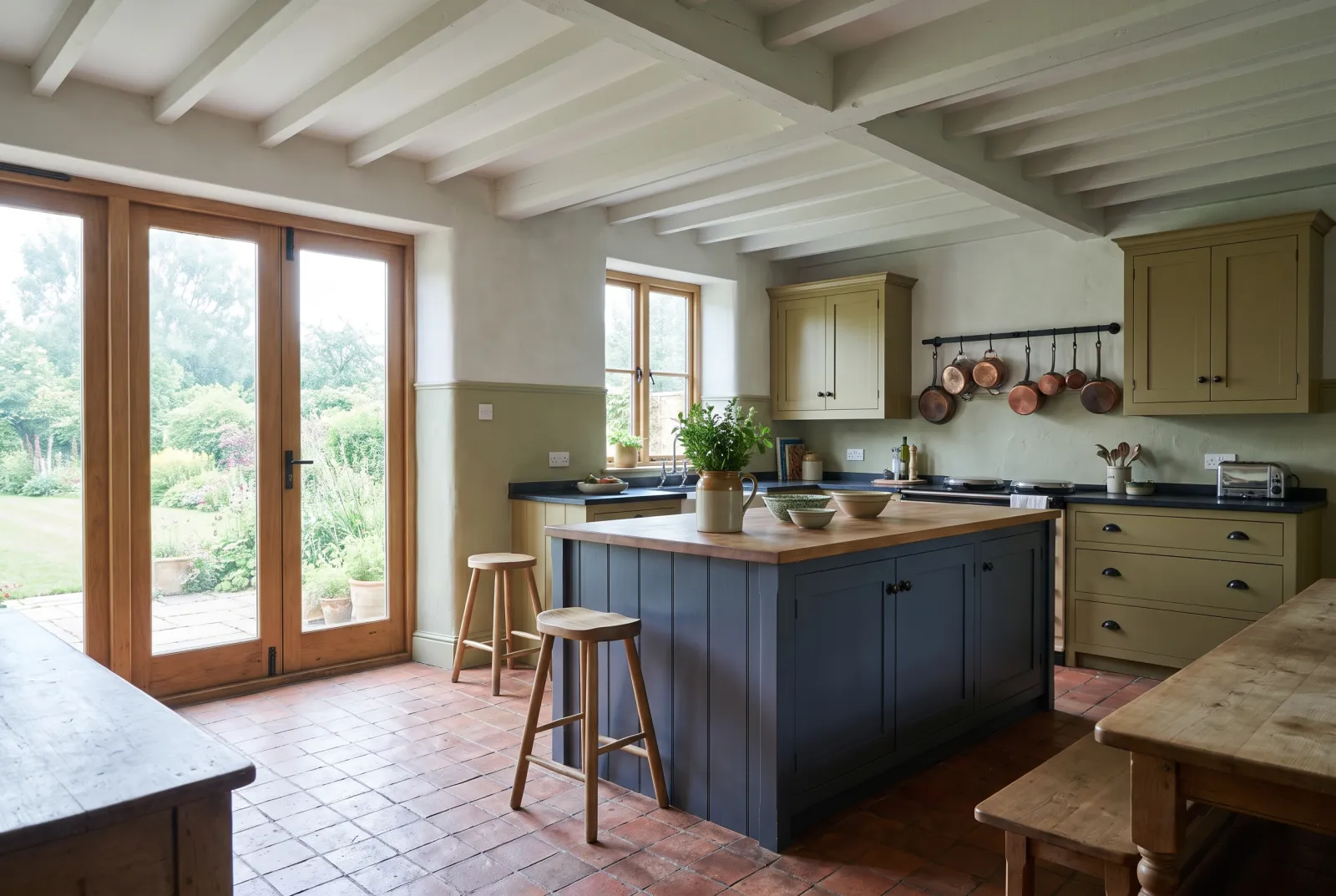
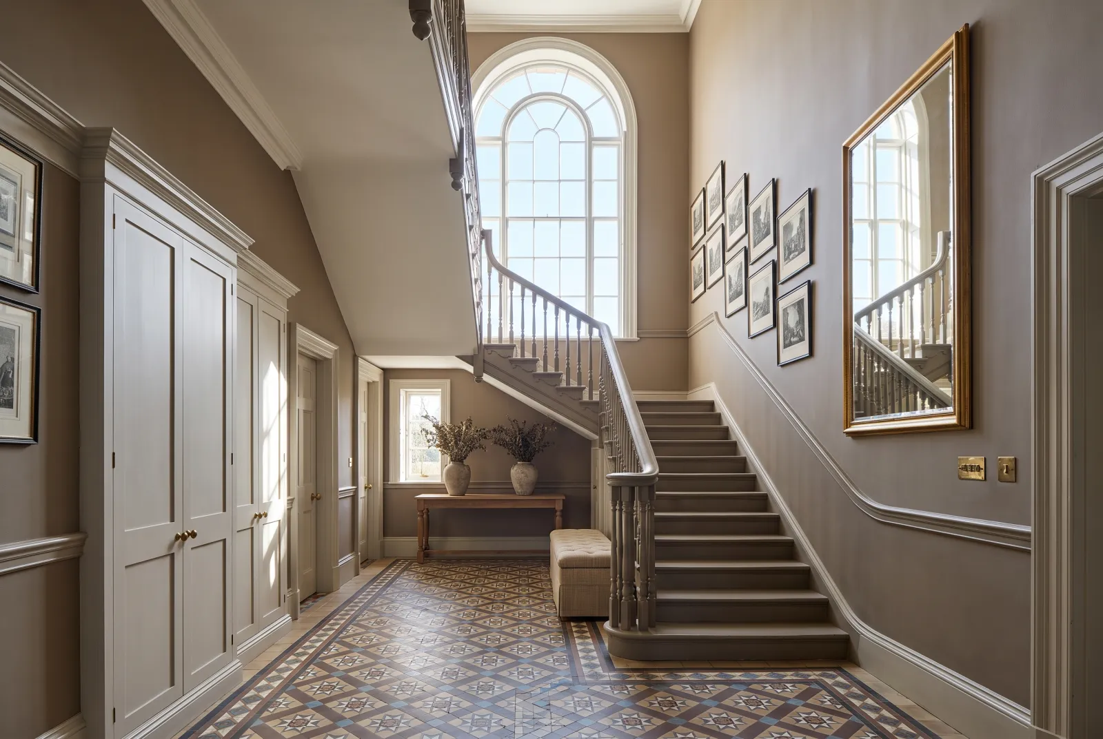
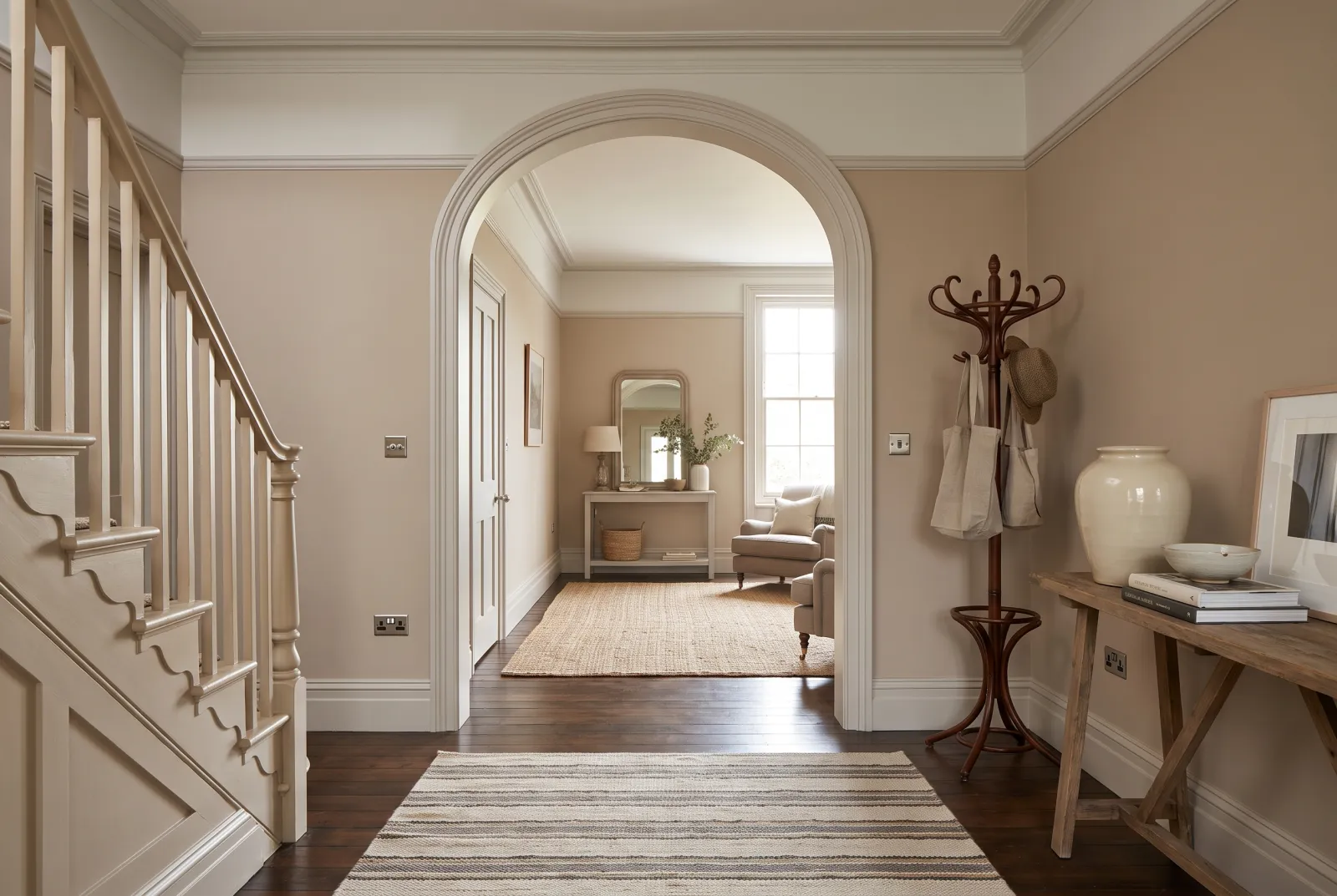
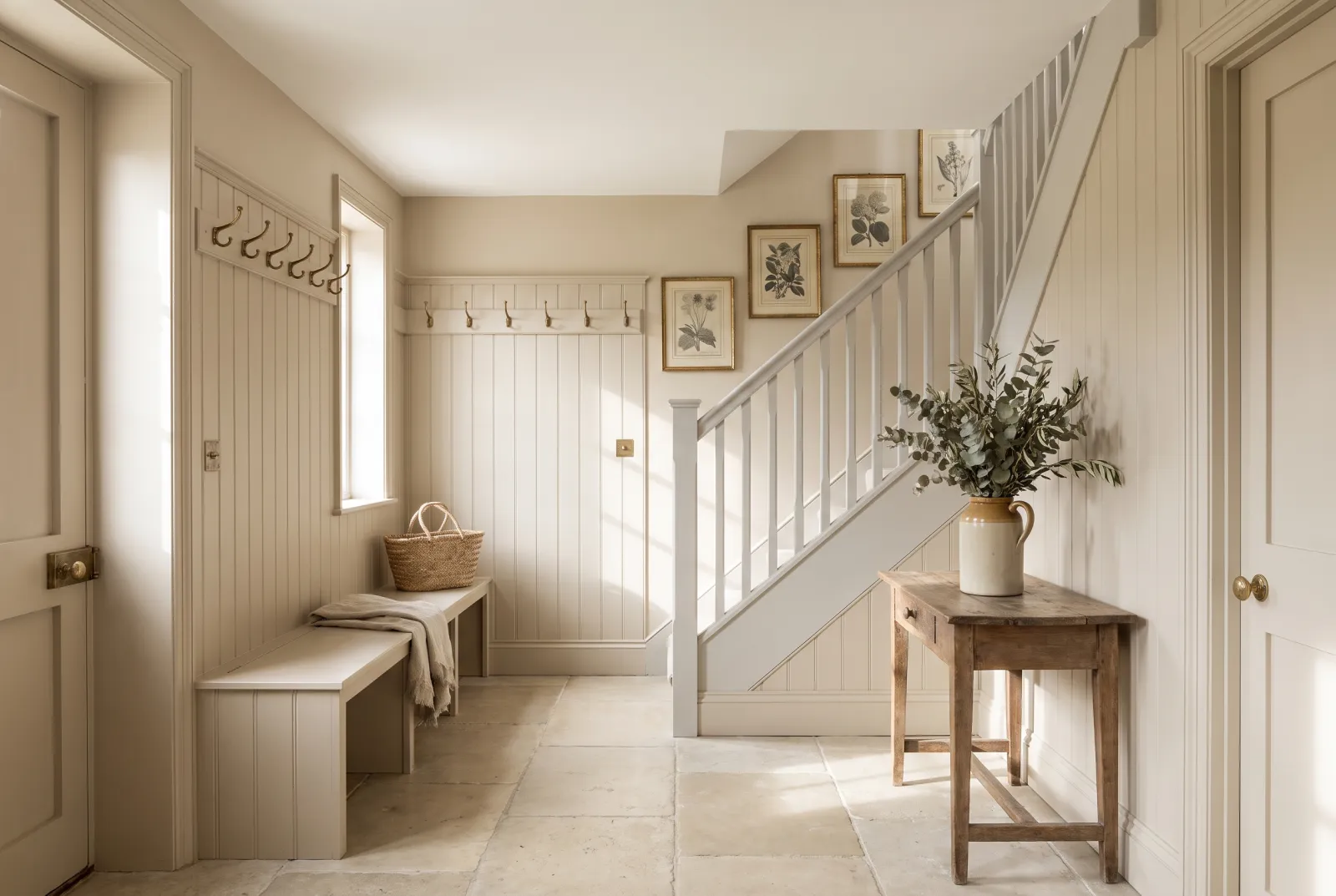
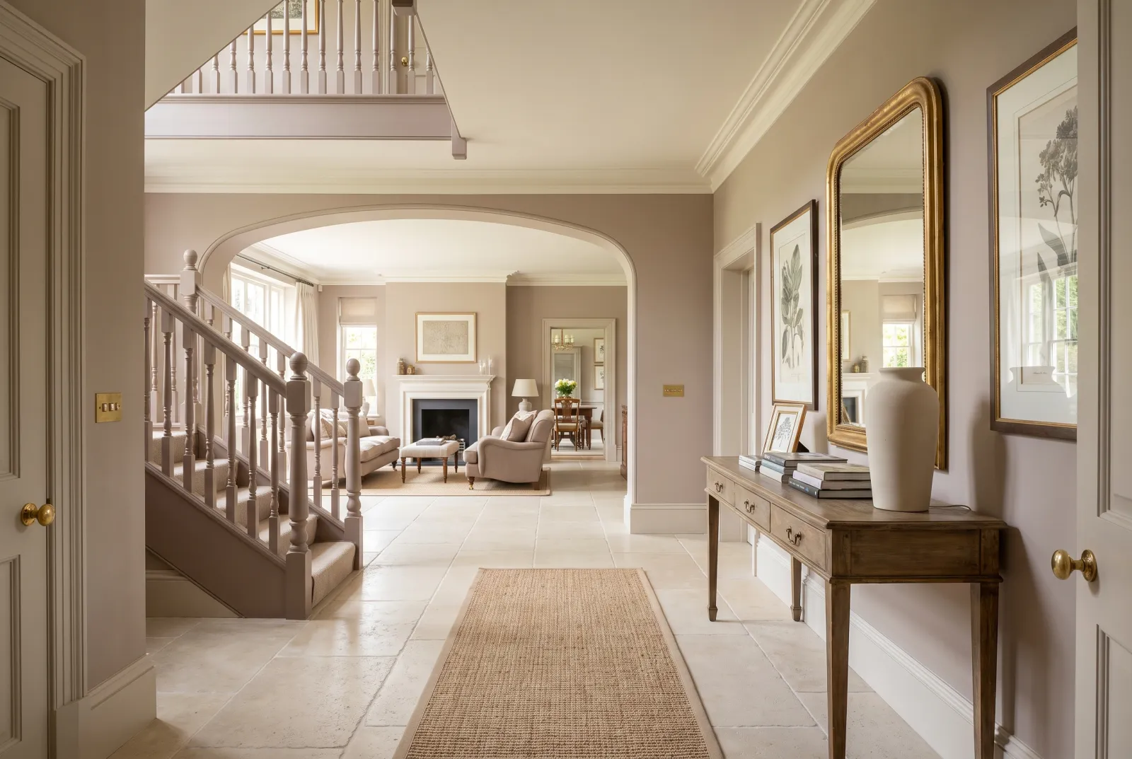
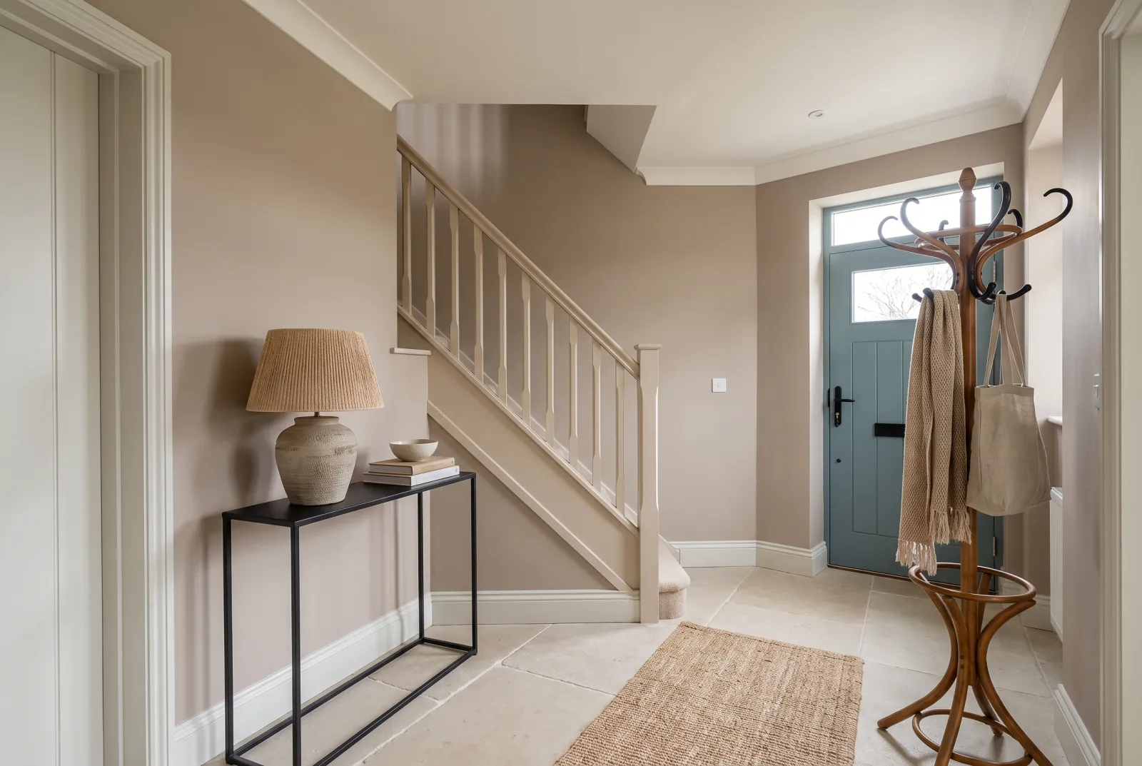
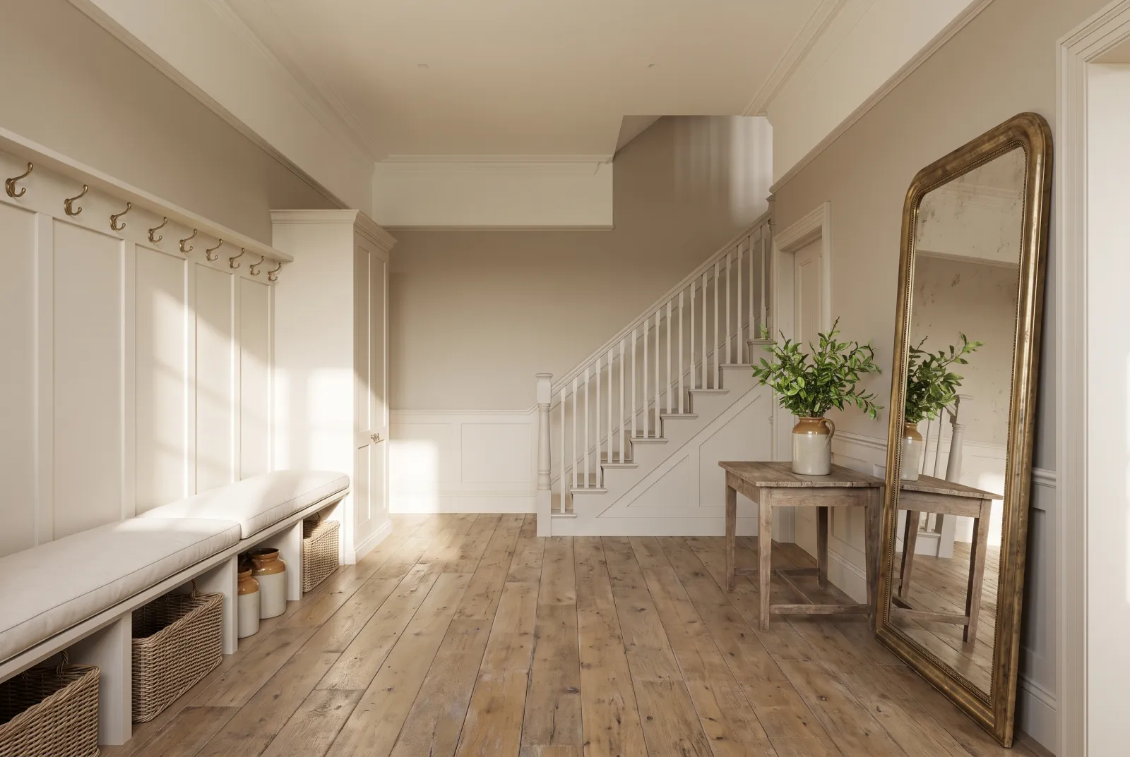
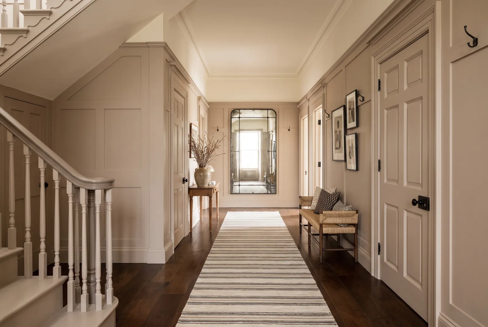
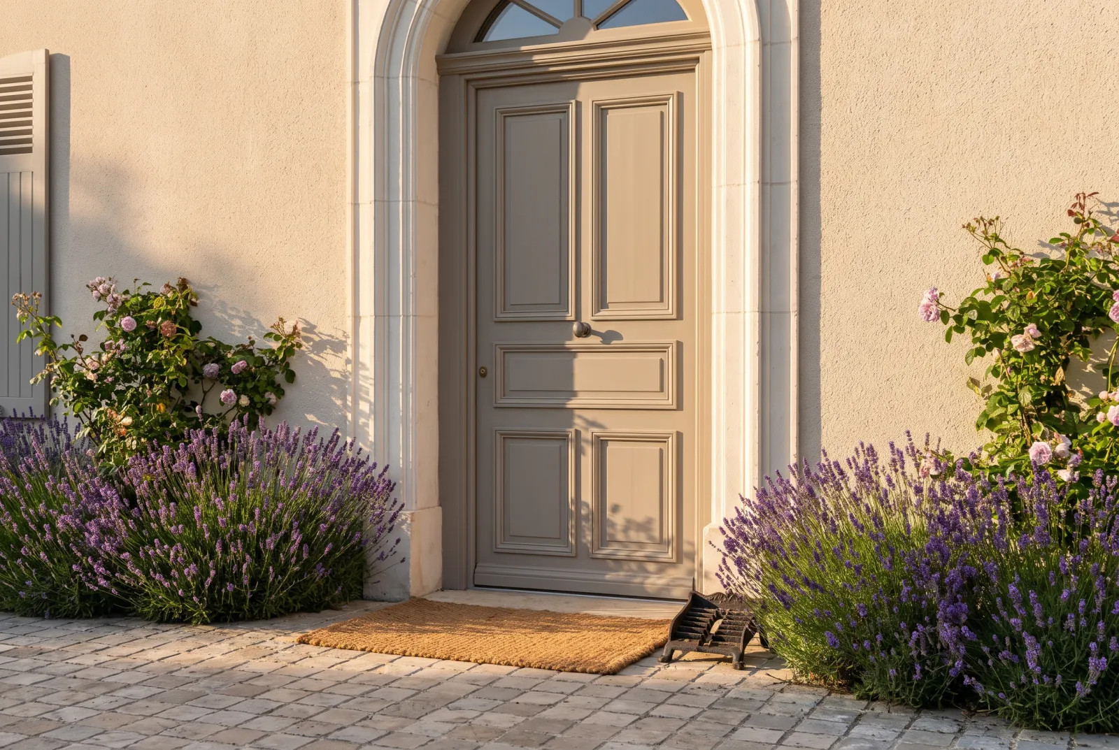
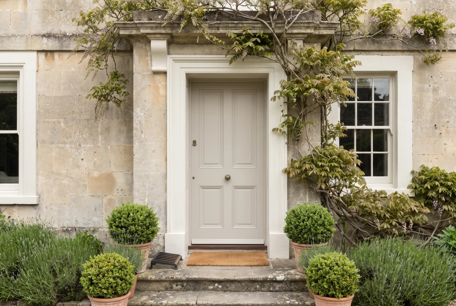
Stone, string, greige, taupe: Mylands neutrals are drawn from natural pigments that give them a depth ordinary beiges never reach.
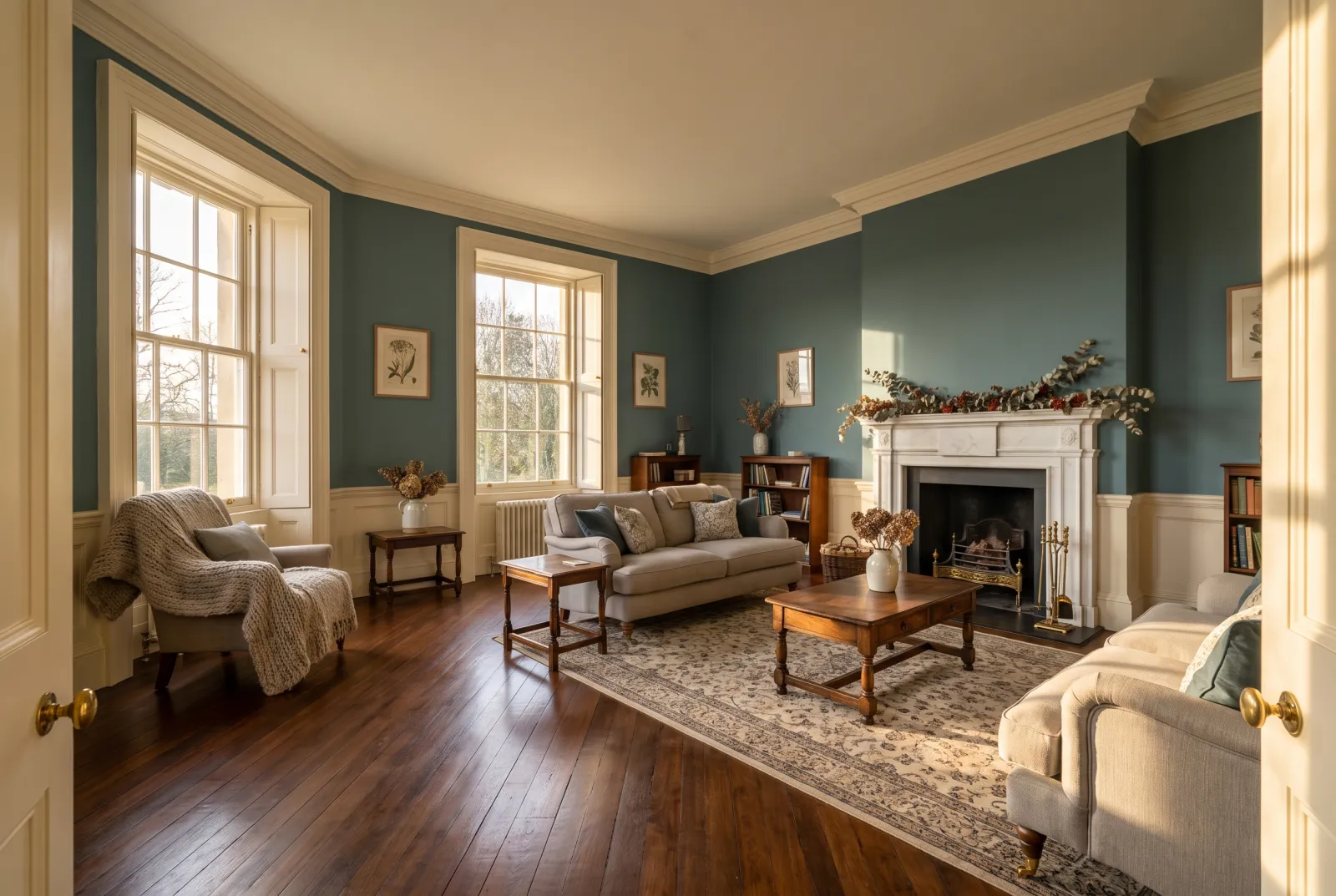
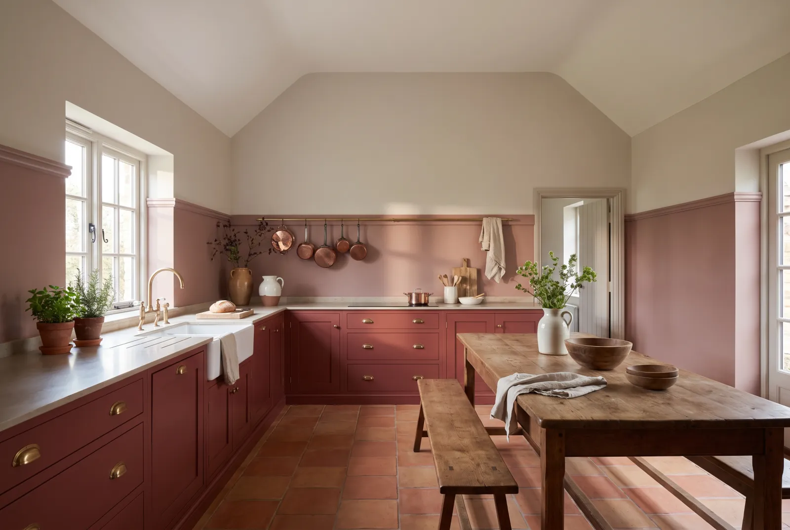
Our neutral schemes build calm, layered rooms where the shades slide into one another without ever competing.
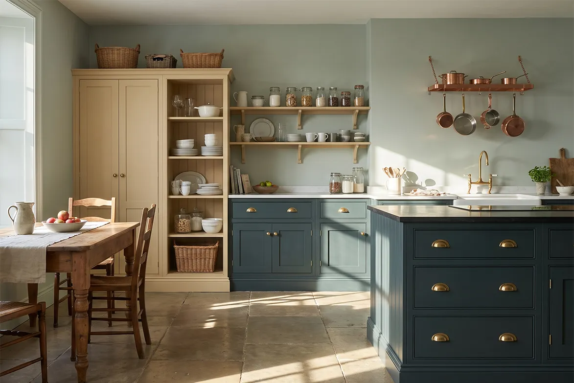
“The best neutrals go unnoticed: they are felt.”
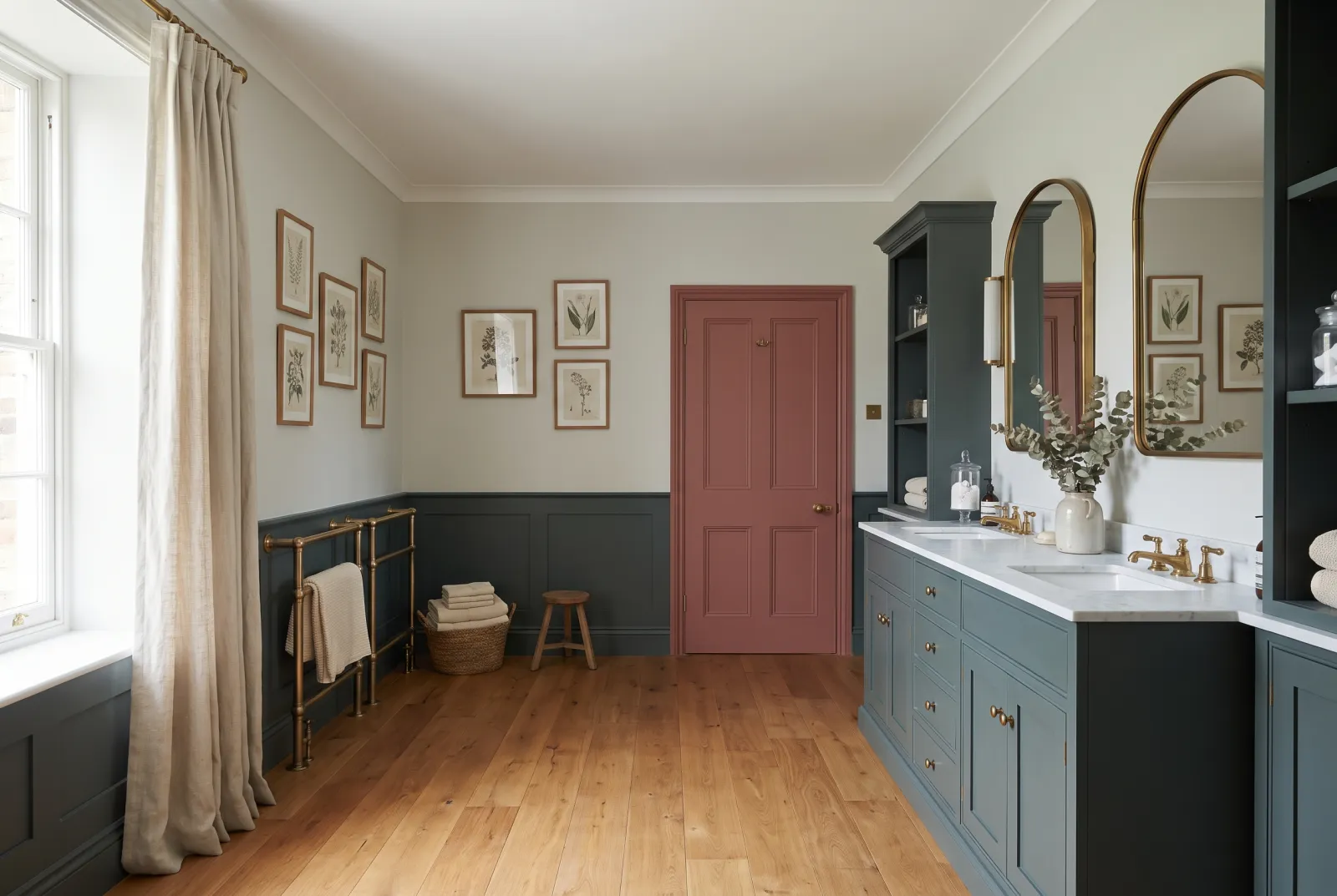
The Mylands neutrals: from pale stones to muted depths
Here, “neutral” does not mean “pale”. The family gathers both the pale stones that ground half our schemes and a set of muted, almost unnameable shades whose depth comes from a mix of green, brown and grey. It is the latter that give English interiors their slightly indefinable character.
Among the pale stones: Limestone No.55 is the single most-used shade across our whole range on ceilings and cornices, alongside Chalk Farm No.53, Cadogan Stone No.59, Cornice No.65 and Fitzrovia No.26. A tone down, Hoxton Grey No.72, Temple Bar No.70, Alderman No.60, Colosseum No.66 and Grosvenor Square No.109 make perfectly quiet ground walls, and Lamb's Ear BH.06 adds an almost downy softness.
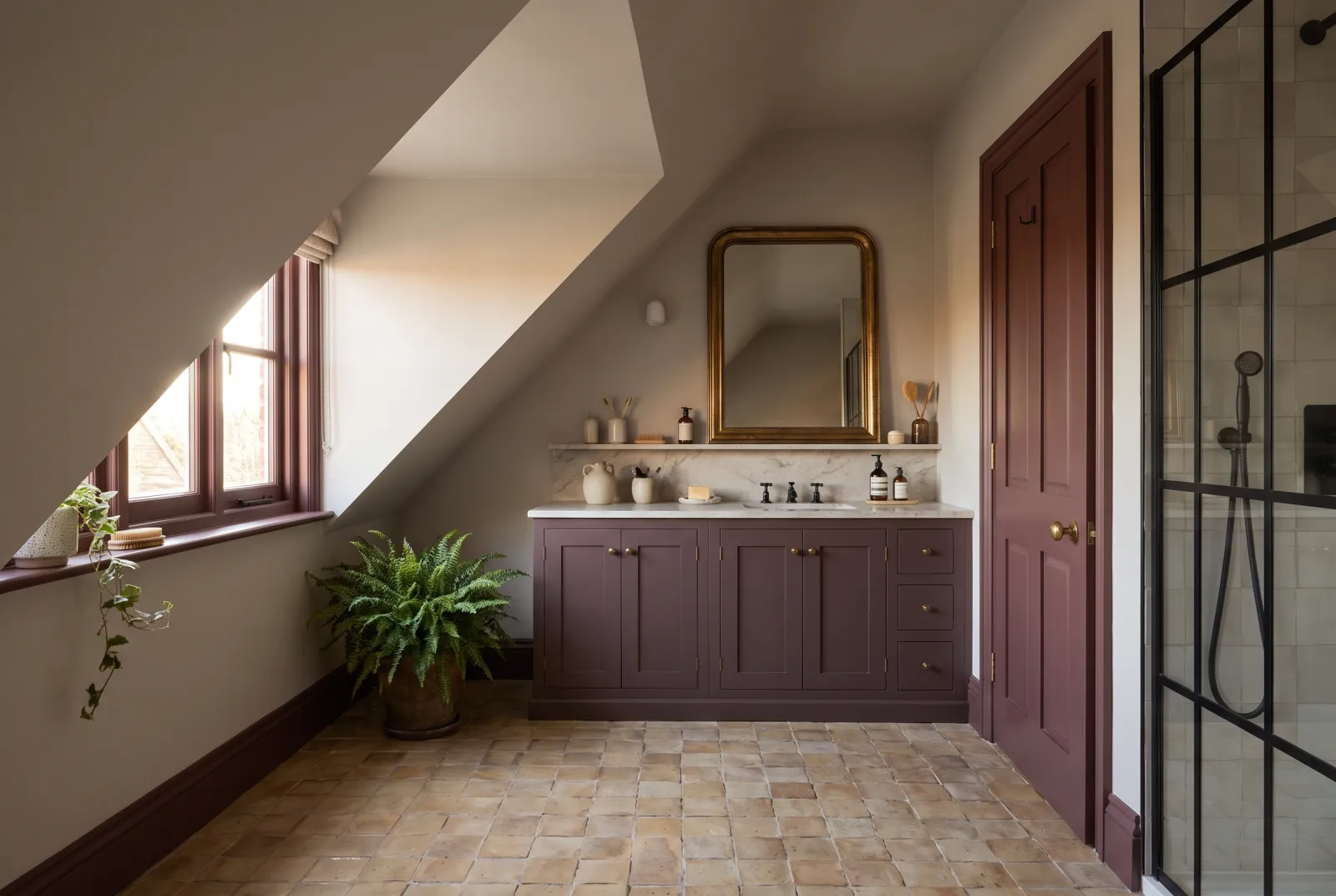
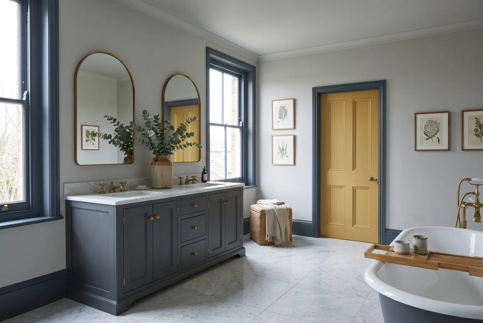
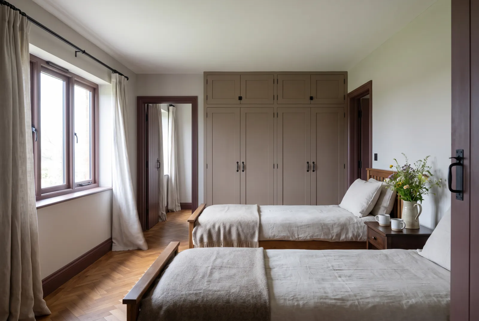
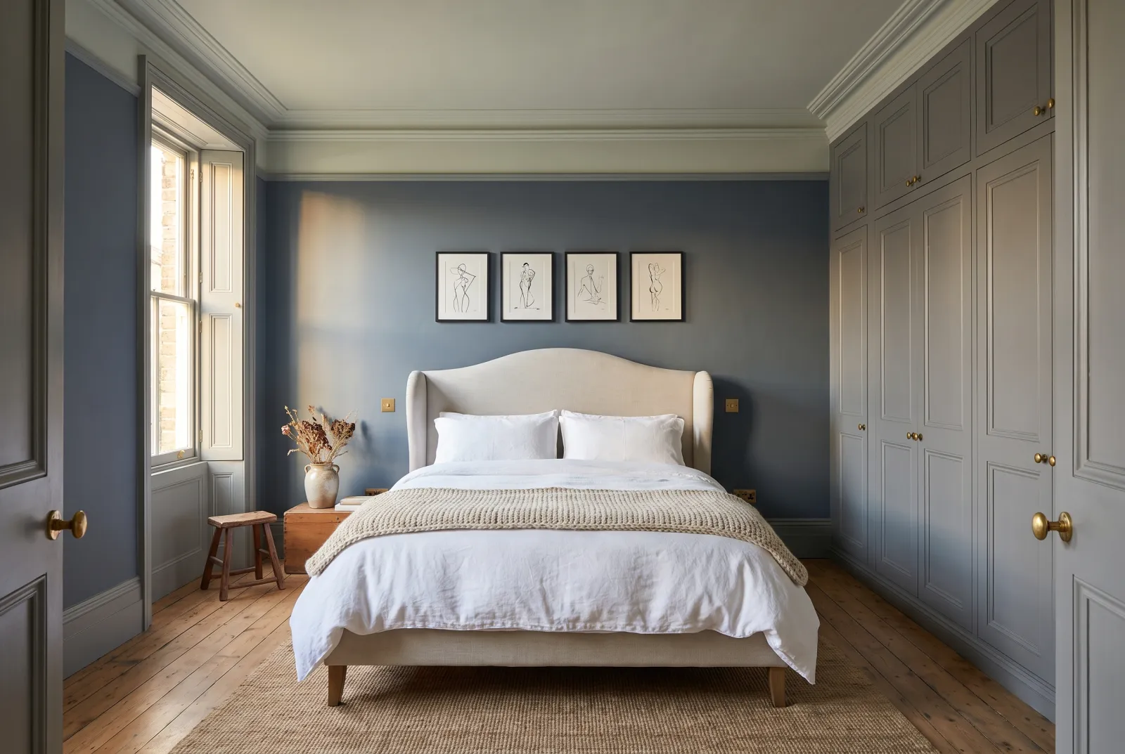
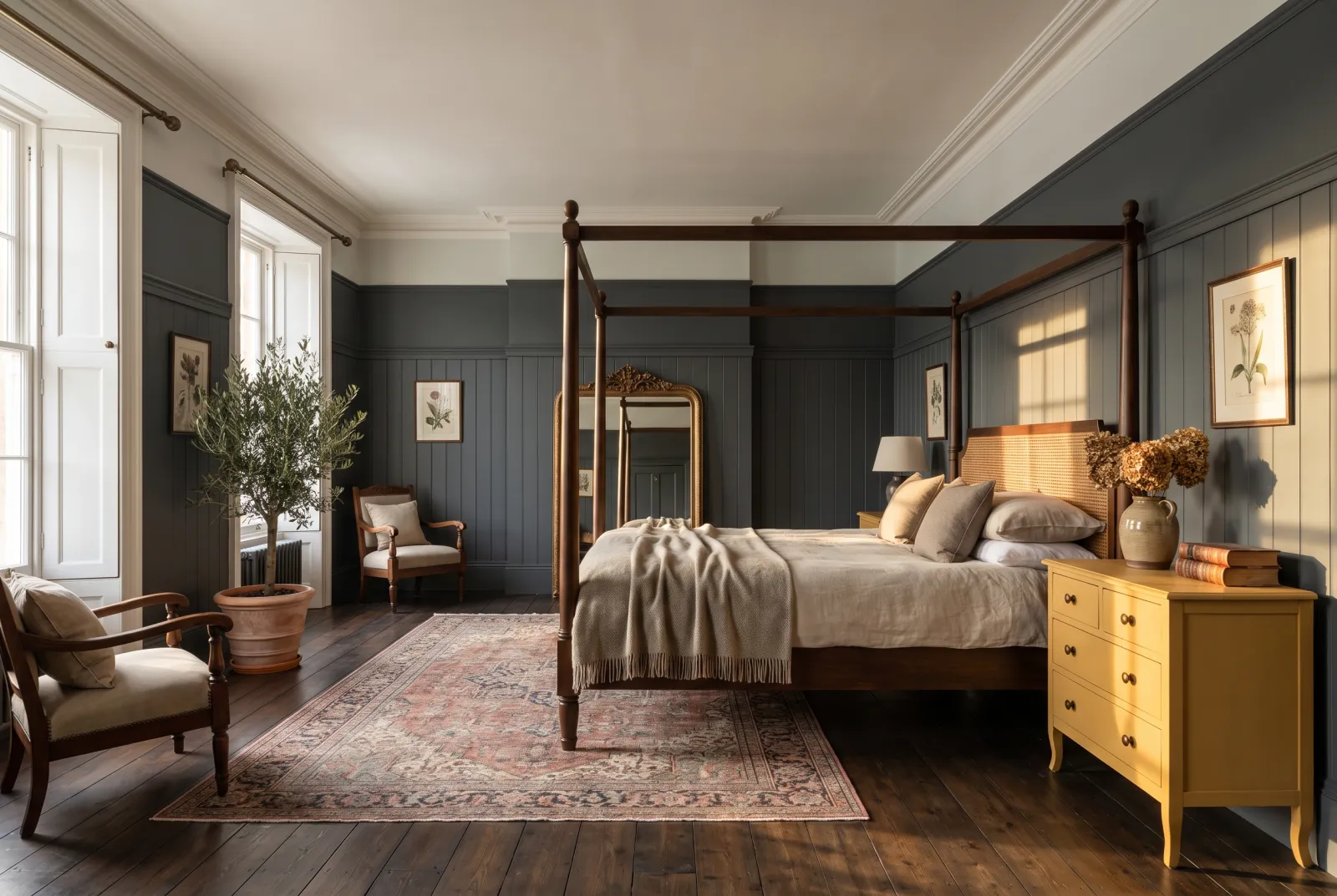
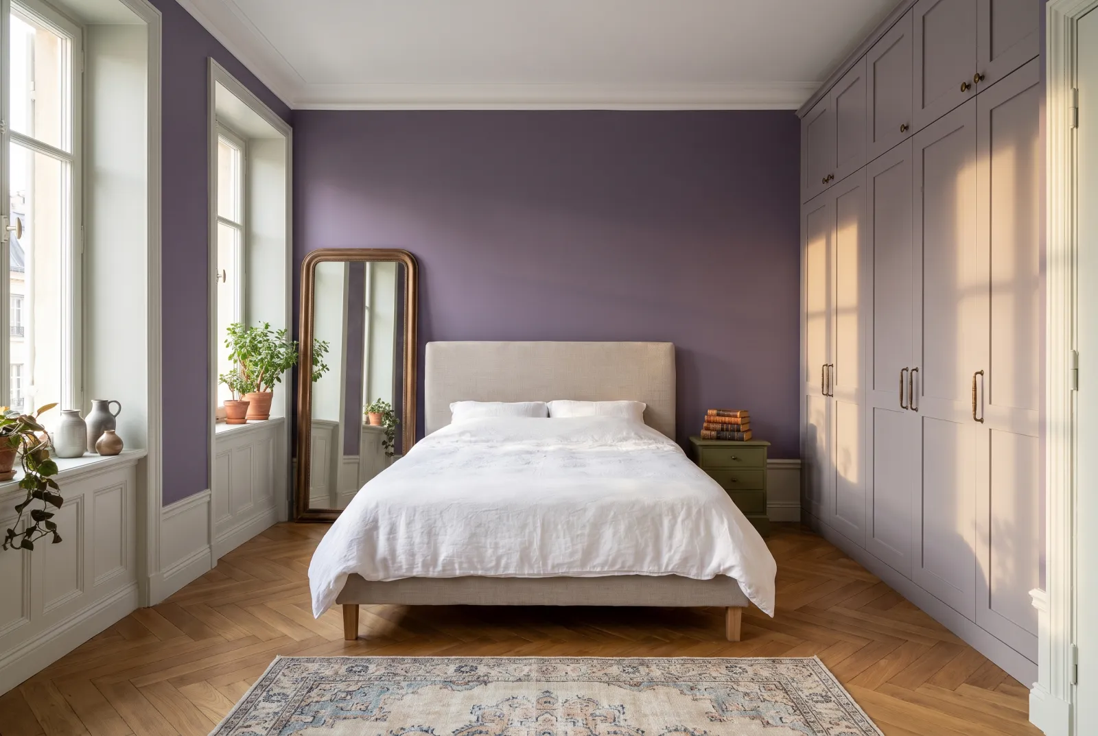
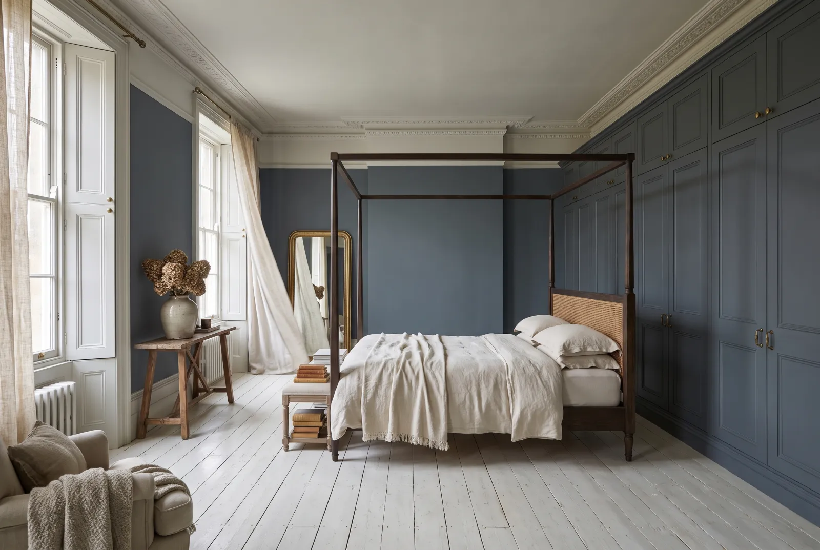
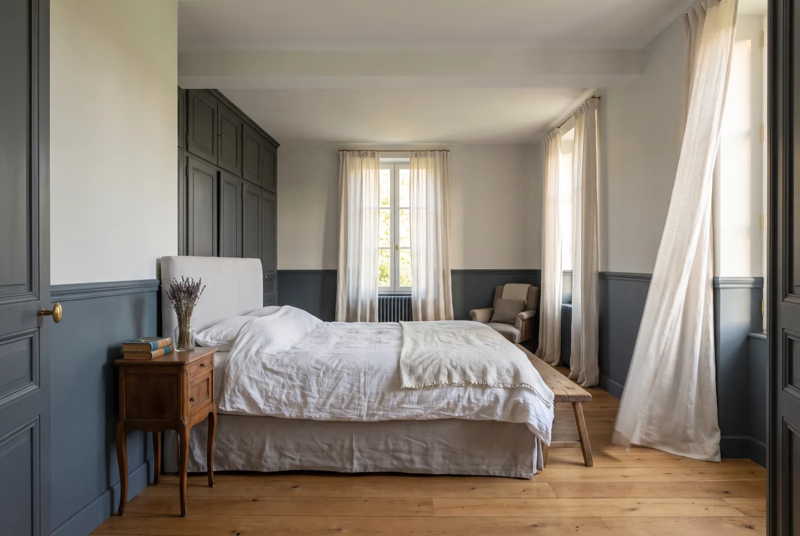
Among the deep neutrals — the shades leading the schemes below — look at Market Green No.38, Dark Green FTT-013, Mayfair Dark No.218, Bond Street No.219, Rothschild Street No.296, Murmuration JB.11, Thunder BH.12 and Maritime No.236. Plum Tree No.283 and Fluorite Violet FTT-020 push towards plum, London Brick BH.07 towards terracotta.
See also our grey paint ideas, whites and off-whites and green paint ideas, or browse all our neutral paints.
Our schemes
36 schemes