1950s paint colours

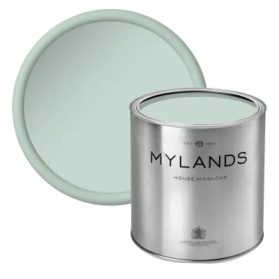
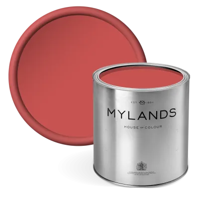
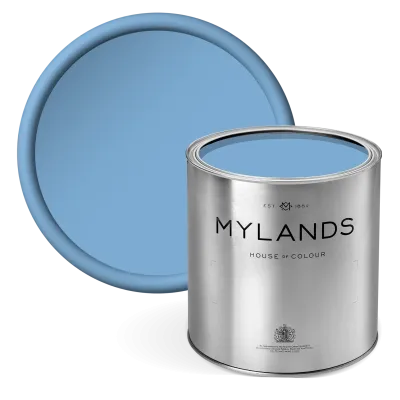
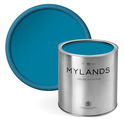
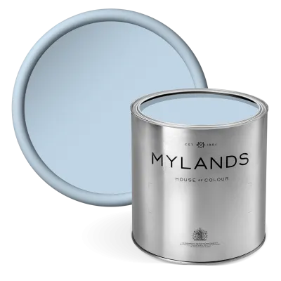
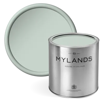
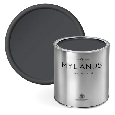
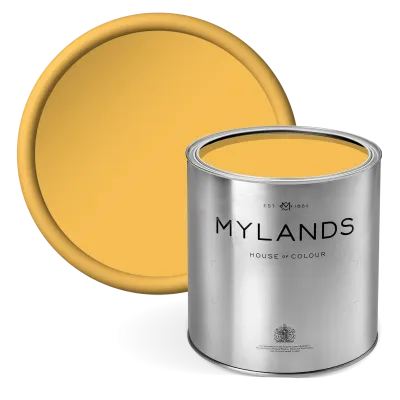
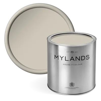
After the lean war years colour came roaring back, carried by the 1951 Festival of Britain. The standardised British colour cards of the day, the source of Alderman, sat alongside shades born in our Lambeth factory such as Lambeth Walk. In Formica kitchens and teak living rooms, people embraced pastels, powder blue, mint, candy pink and lemon, sharpened with turquoise, bright red and a graphic charcoal.

In a kitchen, use our Multi-Surface Satin Paint on the cupboards and a pastel in Marble Matt Emulsion on the walls; in a living room, a stronger chimney breast is all it takes to set the decade's tone.

A little history · 1950 – 1959

The 1950s

After austerity, colour came back: the Festival of Britain, Formica kitchens, teak furniture and a palette of pastels sharpened with bright red and charcoal.

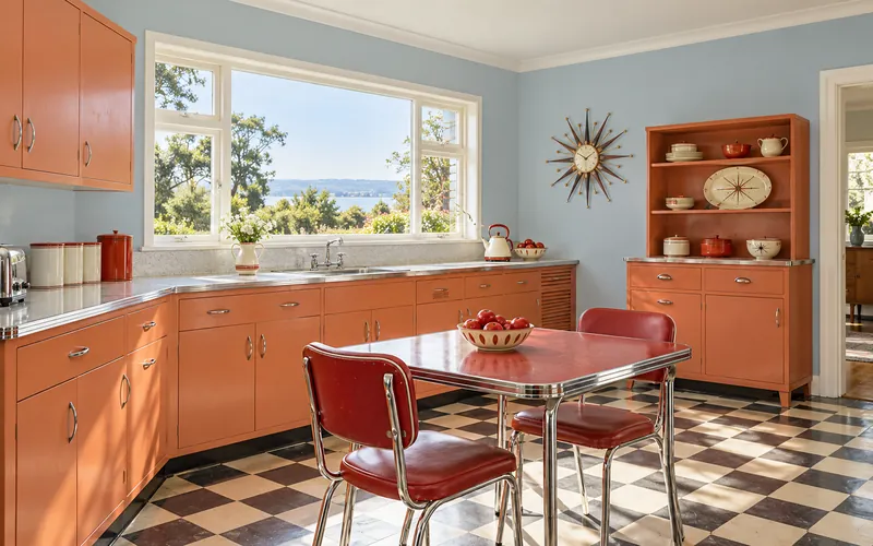
1950s kitchen with powder-blue walls and coral cabinets
Lambeth Walk and Coral Orange: the 1955 kitchen.

The society

The Festival of Britain and the return of colour

In 1951, on the South Bank of the Thames, the Festival of Britain showed the country what post-war life would look like: the Skylon, the Dome of Discovery, atomic patterns and frank colours. Rationing ended in 1954; the 1953 coronation was watched on television.

New towns, prefabs, housing estates: building was fast and people wanted new. The 'contemporary style', tapered legs, free forms, cheerful colours, replaced the heavy furniture inherited from parents.
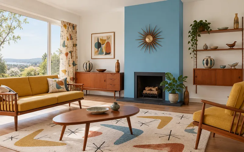
1950s living room with an enamel-blue chimney breast and teak sideboard
Enamel Blue on the chimney breast, Pure White around it: the 'contemporary' living room of 1957.

The interior

Formica, teak and tapered legs

The kitchen became a room to live in: painted cupboards, Formica worktops, a chrome-and-vinyl table, a starburst clock. In the living room, the teak sideboard, the splay-legged sofa and the boomerang-patterned rug replaced the heavy pre-war suites.

Light came in through wide picture windows; walls came down and the dining corner opened onto the kitchen through a serving hatch. Light, pale Scandinavian design set the tone for British makers such as Ercol and G-Plan.

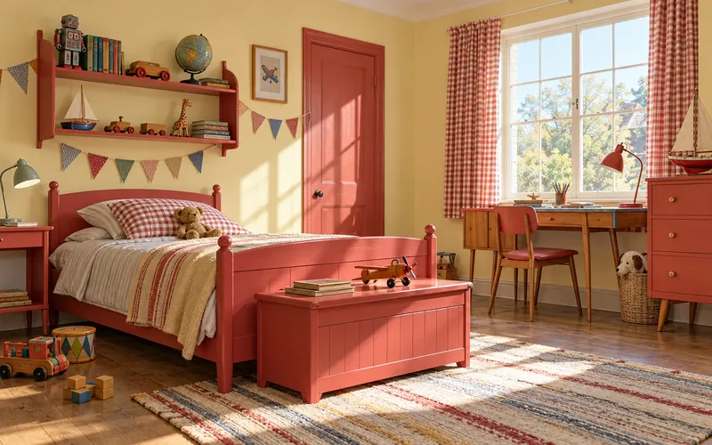
1950s child's bedroom with primrose walls and a red-painted bed
Floral Street and Bright Red: a 1956 child's bedroom.

The colours

Pastels, bright red and charcoal

Candy pink, powder blue, mint, lemon: the pastels of the 1950s were those of American cars and refrigerators. They were sharpened with bright red, turquoise or charcoal, often on a single wall or chimney breast.

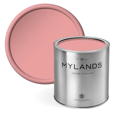
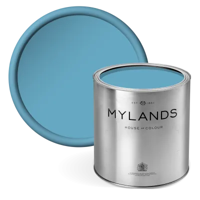
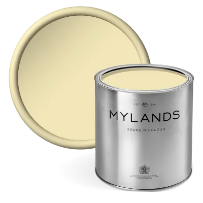
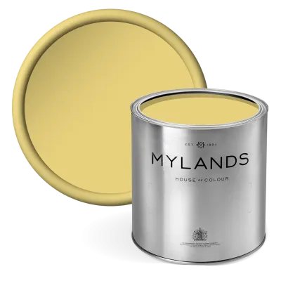
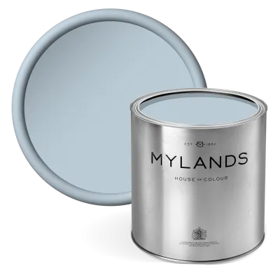
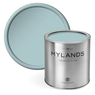
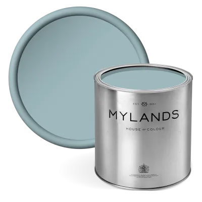
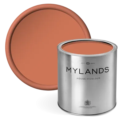
In 1955 British Standard 2660 standardised building colours; our Alderman descends from it. Lambeth Walk, a light blue born in our Lambeth factory, was all the rage. Enamel Blue, Coral Orange, Verdure Yellow and Bright Red complete the range.

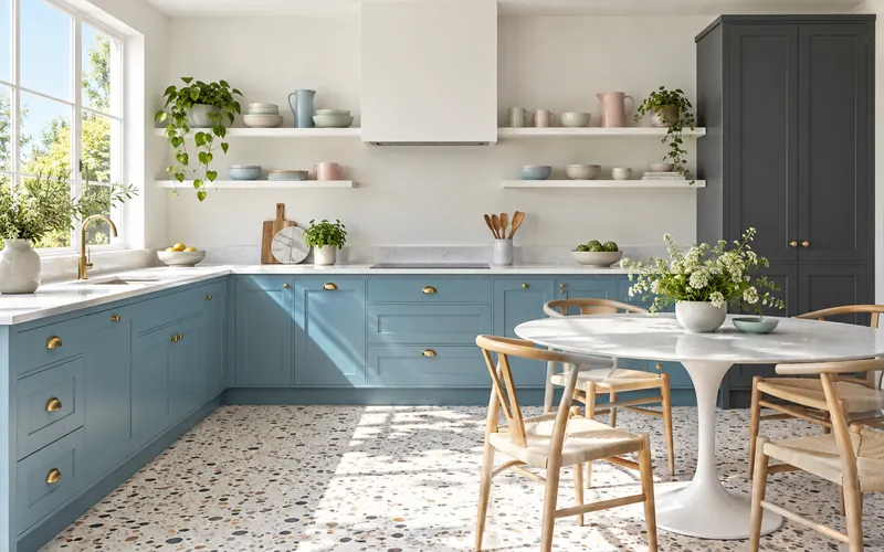
A fifties-spirit kitchen today, enamel-blue cabinets and white walls
Enamel Blue, Pure White and a Blackout accent: the fifties in 2026.

The legacy

And today?

By 1960 the pastels gave way to pop colours and teak to moulded plastic. But the 1950s love of light, open space and cheerful colour never went away: it is, at heart, the taste of the contemporary kitchen.

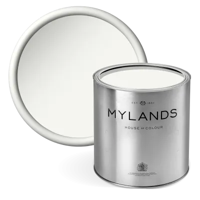
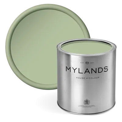
For the fifties spirit: cupboards in Multi-Surface Satin Paint, Coral Orange or Enamel Blue, a wall in Lambeth Walk or Floral Street, pure white everywhere else. One accent of Bright Red or Blackout, and the room reads as period without feeling dated.

20 colours found

Showing 1 to 20 of 20 results

Show
per page
Sign up to our newsletter

Sign up to our newsletter

Thanks for signing up to our newsletter!