


Design Advice
Discover Our Neutral Groups
The secret of a neutral house that is never bland comes down to one word: undertone. We have sorted our whites and neutrals into six families that agree with one another from ceiling to door - all that is left is to choose yours.
See the six groupsStart here
A neutral is never neutral
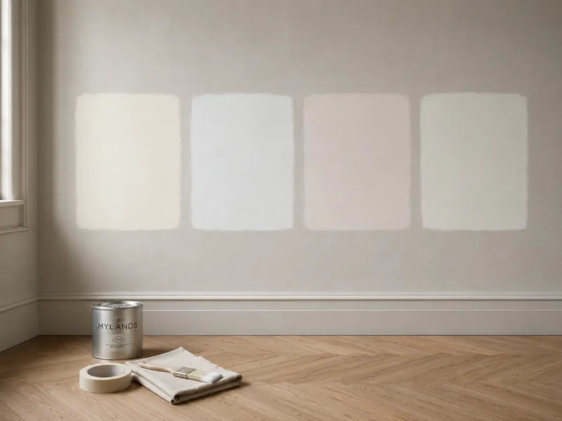
Put two « whites » side by side and one will look yellow, the other blue. Neither has changed: each has simply revealed its undertone - the hint of pigment that tips it warm or cool, pink or green. Alone, a neutral hides its undertone; in company, it shows it. Which is why a « white that goes with everything » sometimes turns dirty grey next to the very wall it was meant to flatter.
Hence our groups. Every Mylands white and neutral belongs to an undertone family, and every family runs as a ladder - from the brightest white to the lowest note. Choose a family, take your white from the top of the ladder, your walls from the middle, your door from the bottom: everything will agree, because everything shares the same pigment. What decorators call « a house that flows » is nothing more than that.
Your turn
One room, six groups
Choose a group: the room repaints itself in its ladder - the group's white on the ceiling and chimneypiece, a pale on the walls, a mid on the cushion, the low note on the door. Then change the wall shade without leaving the family.
The group
The wall shade
An evocation, not a screen-accurate rendering: a neutral is judged from a sample pot, at home, beside your floors and fabrics.
The families
Six groups, six undertones
Here are our six neutral families, each laid out as a ladder from white to low note. Every chip links to its colour page; every ladder is enough, on its own, to dress a whole house.
01
The pure whites
Undertone: almost none - a breath of green-grey
Light itself, barely tinted
These are our cleanest whites, built on pure white pigment, China clay and crushed marble: Pure White, « our purest white », and its close relations that stray from it by no more than a breath - Charterhouse with its hint of concentrated blue, Cotton Street with its archive freshness, Acanthus Leaf with its warmth of carved marble. Their undertone, where there is one, leans to a very faintly green grey, which keeps them crisp without being clinical. Further down the ladder, Elgin - « a true chameleon » - and Sloane Square lead on to Chester Square, their note of faded olive.
02
The creams
Undertone: yellow, softened with umber
The white of an old house in the sun
The warmest group - the whites that look as though they have always been there. Maugham White, created for a restoration, leads it: serene, traditional, never turning to butter. Around it, Sleet with its hint of grey, Limehouse and Lots Road gaining in ochre, then pales with the softness of limestone - St Martins, St James, Lemon Salts with its hint of lemon. The ladder descends to Grey Ochre and Chambers Gate, their yellowed greys, and ends on Messel, the dark, enveloping olive.
03
The stones
Undertone: earth, between ochre and grey
The greiges that carry a whole house
The all-rounders - the family decorators choose with their eyes shut for an enfilade, a staircase, an entire house. Its whites are stone whites: Frieze and Limestone, « natural and bright », Holland Park with its hint of yellow, White Hart with its grey glow. Its pales are the most asked-for greiges on the colour card - Cadogan Stone, Honest John named after our founder, Hoxton Grey « with deep, warm umber undertones ». Then come Grays Inn, Ionic, Egyptian Grey, and at the very bottom Westmoreland, the grey-brown that stands in for black in a gentle house.
04
The plaster pinks
Undertone: red and magenta, powdered
The neutrals that flatter faces
You do not see them as pink - you simply find them softer than the others. The Boltons, « subtly magenta-toned », opens the ladder with Holbein Chamber, bohemian Fitzrovia and Kensington Rose with its hint of red ochre. Then come the pales of fresh plaster - Marble Arch, Threadneedle, Pediment, Rose Theatre - then Stone Castle, Grouse and Soho Pink, which own their warmth; Rose Taupe closes, a vintage grey-brown from the British Colour Council. This is the group for bedrooms and bathrooms: the light they reflect is kind to skin.
05
The cool greys
Undertone: blue, sometimes a hint of violet
Morning air, in paint
The group of freshness and crispness. Greenwich Time - named after the clock face of the Royal Observatory - and Walpole, « reminiscent of a clear sky », are whites that breathe; Saint Johns adds a shadow of teal. The pales follow, mineral and contemporary: Mews Blue, Islington, Mid Wedgwood inspired by the potteries, Grail, Jinny Blom's rain-grey. Stirrup, Long Acre and Drury Lane deepen, down to Oratory and Bond Street, the slate greys that make a magnificent door.
06
The green greys
Undertone: green, from sage to lime leaf
The neutrals of the garden
The quietest of our coloured groups - neutrals you take for greys until a true grey passes by. St Clement and Syon Park open the ladder, whites in leaf shade. Mint Street, Chiswick, Beauvais and Lamb's Ear, Beata Heuman's velvet, make pales with the freshness of sage. Then Greenstone, « intensely calming », Museum, Serpentine and Myrtle Green, before Brompton Road, the deep grey-green that anchors it all. This is the group that brings the garden in without painting a single leaf.
The decorator's eye
The undertone revealer
Pick any neutral: we set it beside Pure White, our purest white, then exaggerate its pigment so the undertone leaps out. An exercise, not a rendering - but after it you will never look at a white the same way again.
The group
The shade
The exaggeration multiplies the shade's saturation without changing its lightness: it is a magnifying glass, not a colour on the card.
The method
Composing a house within one group
Four rules decorators follow so that a neutral house looks inevitable - and never dull.
01
One house, one family
Choose a group and stay in it from room to room: the undertones agree by themselves, and the eye reads a continuity without knowing why. If a room calls for colour, take it from the family's official pairings - the accent is there for exactly that.
02
The white is always related
The white for woodwork and ceiling comes from the top of the same ladder as the walls - never a raw factory white, which looks blue beside a cream and dirty beside a cool grey. It is the rule that makes the most difference for the least effort.
03
Two rungs apart
Ceiling, walls, woodwork, door: climb and descend the ladder two rungs at a time. One rung goes unseen; three cut. Two give that discreet relief that makes a neutral room look drawn.
04
The aspect chooses the group
Facing north, the warm families - creams, stones, plaster pinks - repair the coldness of the light; facing south, the cool ones - pure whites, cool greys, green greys - temper it. In doubt, the stones go everywhere. And always: a sample painted large, looked at morning and evening.
Your questions about neutrals
How do I recognise a neutral's undertone?
By comparison, never alone. Set the sample beside a sheet of white paper or, better, a pure white such as Pure White: the neutral at once confesses whether it leans yellow, pink, blue or green. Our undertone revealer, higher on this page, does the same on screen. And remember that the same neutral changes with the light: facing north it cools, facing south it warms.
Can two groups be mixed in one house?
Yes, provided it is done deliberately: one family for the daytime rooms, another for the bedrooms, say - and a shared white to join them. What does not work is the accidental mix: a cream white on the woodwork of a cool-grey wall, and the room looks dirty. If in doubt, the stones make peace between almost every group.
Which white should I use on my ceilings?
The white at the top of your group's ladder - not a generic ceiling white. With Hoxton Grey walls, a Frieze or Limestone ceiling; with Threadneedle walls, The Boltons; with Mid Wedgwood walls, Greenwich Time. The ceiling will look higher and brighter, because the eye finds no break in undertone.
Which family for a north-facing room?
A warm one: the creams if you love the golden light of an old house, the stones for a more contemporary result, the plaster pinks for a bedroom. North light blues everything; a warm undertone makes up for it. The pure whites and cool greys often read grey there - keep them for the south.
Isn't a neutral interior bound to be a little bland?
It is when everything shares the same value - one beige from floor to ceiling. It stops being so the moment you use the ladder: a white at the top, a pale on the walls, a mid on a piece of furniture or an alcove, the low note on the door. Add texture - matt on the walls, eggshell on the woodwork - and textiles, and you have a room with everything a coloured room has, except the colour.
The right neutral is not the one that goes with everything: it is the one that goes with its own.


