Spring sitting room in clear, changing light, a light voile in front of a French window opening onto a cherry tree in blossom

Design Advice

Shades of Spring Days

A spring day is a lesson in fickleness: lavender at dawn, grey under the shower, dazzling at noon, pink by evening - it changes colour and light seven times before night. We found them again in our colour card, so that April's freshness stays in the house once the blossom has fallen.

Follow the day's light

Start here

Spring is first of all a light

What we call « spring colours » is not a family of shades - it is a light that changes. In spring the sun climbs back fast, but the sky is never sure of itself: a shower, a cloud, a break - and the same room goes in an hour from grey to white and from white to gold. The leaves are new, almost transparent, and the light that passes through them is a green summer no longer knows. The colours we love in April are colours that like to change: fresh in the rain, tender in the sun, never the same two hours running.

That is exactly what to ask of them once they are home. A successful spring shade is light without being cold, fresh without being sharp, and above all richly pigmented: it is the umber, the grey, the hint of yellow that stop a soft green turning to mint cordial and a pale pink to sweets. Our colours are composed in London with generously weighed pigments - which is why they bear every whim of an April sky, and why they still keep their freshness when summer settles in.


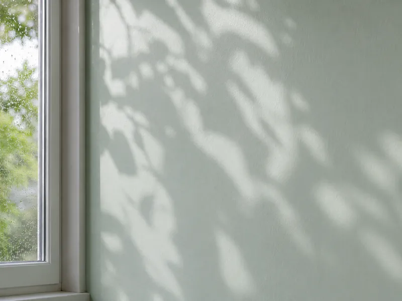
Wall painted a pale verdigris, splashed with the shadows of new leaves on a spring morning after the shower
Spring light does not settle: it passes. The shades that succeed are the ones that like to change with it

Your turn

A spring day, hour by hour

Slide the hour: the shower passes beyond the French window, the cherry tree blossoms, the sun climbs and sinks again - and the wall takes the shade of the hour. Seven moments, seven shades - this is the page's palette.

The hour 12.30 pm · Noon

12.30 pm — Noon
The hour's shade Syon Park · No.13
Overhead sun after the rain, washed bright light: the shade is exactly « itself ». This is the hour to judge a spring white. Its room · The hall, the conservatory - and every ceiling

An evocation, not a screen-accurate rendering: the true colour is judged from a sample pot, on your wall, at the hour you live in the room. The seven shades are detailed just below.

The palette

Seven hours, seven shades

Every hour of a spring day has its colour, and every colour its favourite room. Here are the seven, in the sun's order - each with two companions drawn from the Mylands pairings. The chips link to the colour pages.

6.30 am Early LavenderNo.260

Dawn

The lavender of the first hours

Spring rises early, and it rises mauve: the April sky, before the sun, has the colour of a lavender field under dew. Early Lavender carries that moment in its name - « a traditional lavender colour, always popular with designers », « a delicate, light pastel tone » that, paired with a white, « can add colour and fun ». On bedroom walls it makes waking a soft and faintly unreal thing - the hour the blackbirds are already singing.

Its room

The bedroom, the child's bedroom

9 am Copper GreenNo.36

Morning

The verdigris of a shower

A spring morning is never sure of itself: at nine the shower arrives, and the garden turns verdigris - the green of weathered copper roofs, of park benches, of streaming window panes. Copper Green is its exact translation: « inspired by the green patina of weathered copper roofs », « a soft, mint green, beautifully fresh and clean, with a modern, contemporary feel », that « adds a sense of fun and joy to a space ». The shade of a bathroom or a kitchen that likes rain on the tiles.

Its room

The bathroom, the kitchen

12.30 pm Syon ParkNo.13

Noon

The greenhouse white of full sun

The shower has passed, the sky is washed, and at noon spring is white - but a white grown under glass, with something green inside it. Syon Park, named after « the great conservatory by architect Charles Fowler », is that white: « clean and appealing », whose « green and blue undertones create an extremely fresh, cool shade », « brighter and fresher than St Clement ». It is the white of every piece of woodwork in this palette, and of ceilings that should look like a glass roof.

Its room

The hall, the conservatory - and every ceiling

3.30 pm New LimeNo.149

Afternoon

The soft green of new leaves

By mid-afternoon the sun shines through the new leaves - and April leaves are not green, they are yellow-green, almost translucent. New Lime is that colour: « a fresh yellow-green, a more yellow version of Primrose Hill », « a warm light-green whose yellow tones shine through », held by « a subtle brown, umber undertone » that gives it depth. In a sitting room or a study it lets the garden in - April's garden, not August's.

Its room

The sitting room, the study, the conservatory

6.30 pm Palmerston PinkNo.243

Golden evening

The pink of cherry blossom at sunset

A spring evening is long and golden, and it has the colour of cherry trees: a barely-pink pink that takes the setting sun and keeps it. Palmerston Pink - « a classic pink listed in the 1930 Dictionary of Colour » - is that pink: « hints of orange and bright yellow mixing with magenta » to make « a pretty, light pink », « fun and playful, whilst remaining a delicate pastel ». The shade of a bedroom where one lingers, of a dining room where one dines with the windows open.

Its room

The bedroom, the dining room

8.30 pm Lavender GardenNo.30

Dusk

The lilac that lingers after the sun has gone

The sun has gone, but an April sky is slow to go out: it turns lilac, grey and soft, for a long half-hour - the colour of the lavender fields south London was once famous for. Lavender Garden is that lilac: « a timeless soft lilac with grey undertones », « with a stony pastel quality », « tranquil and calming ». A guest room or a dressing room painted in Lavender Garden keeps the softness of dusk at every hour.

Its room

The dressing room, the guest room

10.30 pm Brompton RoadNo.205

Night

The green of the garden at night

A spring night is neither black nor blue: it is green, mild, full of leaves you hear without seeing. Brompton Road - « retrieved from our records, originally supplied to a house in this street » between Fulham and Chelsea - is that deep green « bringing a natural, leafy tone to a space », « perfect as a dark accent » and made for « light, earthy neutral tones ». It is the shade of the evening sitting room, of the library, of the bedroom that looks onto the garden: dark by day, leafy by night.

Its room

The evening sitting room, the library

Ready to paint

Three spring days, three palettes

One hour does not make a room: it takes a white that breathes, a tonal companion that binds, an accent that wakes. Here are three complete palettes - a morning, an afternoon, an evening - to order as samples or save to your favourites.

01 · Morning

Dewy morning

A shower verdigris, a greenhouse white, a porcelain blue, and the hint of pink of a fallen blossom.

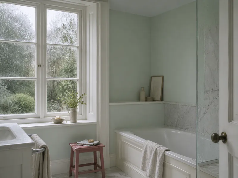
The palette of a bathroom or a kitchen that likes rain on the tiles. Copper Green dresses the walls; Syon Park, a greenhouse white with green undertones, takes the woodwork - a related white, not a raw white, which is the whole difference. On the ceiling, Beaufort Gardens, « a soft, pale blue inspired by Wedgwood pottery » and Copper Green's official pairing: the room gains height and the green seems to open onto the sky. Covent Garden Floral, a pink « in the alluring space between red and pink, rosy and natural », wakes it all on a door or a stool - the blossom fallen on the floor tiles.

Bathroom with pale verdigris walls, porcelain-blue ceiling, white woodwork and a floral pink stool, shower light
Copper Green No.36 on the walls, Beaufort Gardens No.212 on the ceiling, Covent Garden Floral No.270 as the accent

02 · Afternoon

New-leaf afternoon

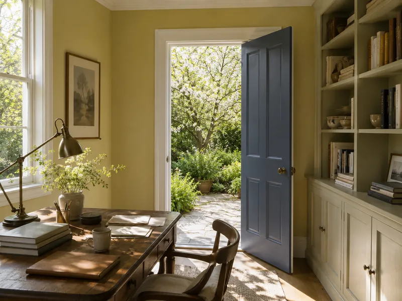
The yellow-green of new leaves, a serene white, the olive of an old wallpaper, and an ink-blue door.

The palette of a sitting room or a study that looks onto the garden - or wishes it did. New Lime covers the walls; Maugham White, the shade's official related white, « serene and traditional », takes the woodwork. Chester Square, « a faded olive-green colour-matched to a wallpaper fragment of c.1840 » and New Lime's official pairing, deepens an alcove or the bookcase: the same leaf, a month later. Observatory, Greenwich's ink blue and the shade's official accent, dresses the door - the low note that stops a yellow-green turning sharp.

03 · Evening

Cherry-blossom evening

A cherry-blossom pink, a petal white, an earthy old rose, and a flash of pale blue like the sky between the branches.

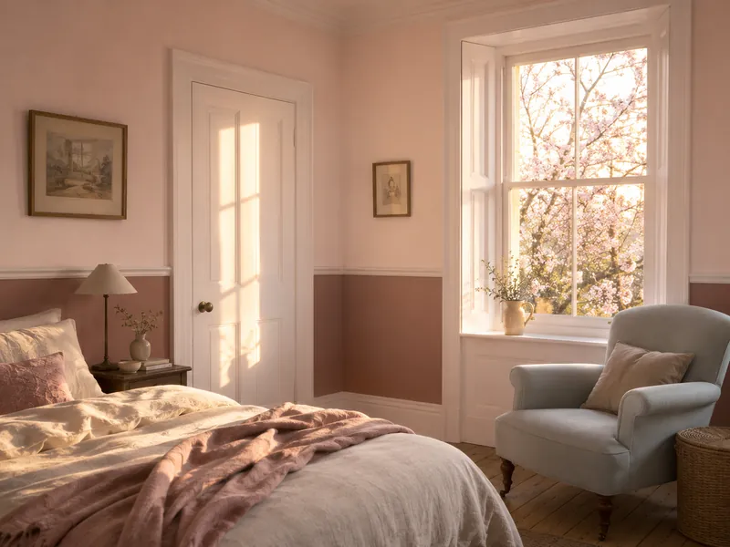
The palette of evenings spent dining with the windows open. Palmerston Pink wraps the bedroom or the dining room and does, at sunset, what the cherry trees do to the garden. Osterley - the shade's official related white, « a very pale white with a hint of pink » - takes woodwork and ceiling. Bloomsbury, « a soft and elegant muted pink with an earthy, terracotta tone », dresses the next room or a dado: the same blossom, an octave lower. And Bridge Blue, Palmerston Pink's official accent, the pale blue of the Albert Bridge, claims an armchair or the inside of a niche.

Bedroom with pale pink walls, petal-white woodwork, late-day light and a pale blue armchair in front of a cherry tree in blossom
Palmerston Pink No.243 on the walls, Osterley No.25 on the woodwork, Bridge Blue No.222 as the accent

The method

Keeping spring all year round

A spring shade should be as beautiful on a December evening as on an April morning. Four rules decorators follow to keep it that way.

01

Never raw white

Factory white, bluish and optical, makes a spring shade garish by contrast and makes it look sharp. Give it a related white - Syon Park, Maugham White, Osterley - and it will keep its freshness through the short days.

02

Matt on the walls, eggshell on the woodwork

Spring light is beautiful because it changes. A matt emulsion welcomes it without freezing it and lets the shade go from grey to gold with the sky; an eggshell on the woodwork lets it move around just enough. Gloss, on the other hand, fixes a single reflection - keep it for a door.

03

Beware of north

A pale, cool shade - Copper Green, Early Lavender - turns grey in a north-facing room in winter. Choose the palette's warm hours there instead: New Lime, Palmerston Pink. The yellow and the pink they contain make up for the sun that is missing.

04

Let the materials in

Fresh linen, washed cotton, pale wood, wicker, a white ceramic, cut flowers: these are the materials that make spring believable once the light has gone. A spring shade on bare walls is a promise; with the right materials, it is a season.

The neutrals that bind spring: Syon Park · No.13 St Clement · No.11 Elgin · No.20 Chiswick · No.100

Your questions about spring colours

Won't spring colours look washed out in winter?

The palest ones will, if left to themselves: a verdigris or a lavender in a north-facing room can grey over under a January sky. Three answers: choose the palette's warm hours (New Lime, Palmerston Pink) for rooms that see little sun, always pair the shade with a related white rather than a raw one, and give every room a low note - Observatory, Brompton Road, Plum Tree - that holds the palette when the light weakens.

Which spring colour for a bedroom?

The two ends of the day: dawn and the golden evening. Early Lavender for those who like to wake in a cool, slightly unreal light; Palmerston Pink for a more enveloping bedroom that keeps the softness of the cherry trees in the evening. In both cases, the ceiling in the shade's related white - and, if the bedroom faces north, Palmerston Pink rather than Early Lavender.

How do I avoid the « pastel » or « nursery » effect?

Through depth of pigment and through company. Our spring shades are powdery, never sugary: Lavender Garden has grey undertones, New Lime a hint of umber, Copper Green a grey base - that is what keeps them away from sweets. And always give them a low note: an Observatory door, a Plum Tree armchair, a Chester Square bookcase. A pastel alone is a pastel; a pastel with a bass line is a palette.

Can I mix several spring colours in one house?

It is the season that lends itself best to it - on one condition: keep a thread. Take a single white for the whole house (Syon Park, or Maugham White), and let each room choose its hour: Copper Green in the bathroom, New Lime in the study, Palmerston Pink in the bedroom. The shared white makes the house; the shades make the rooms. Only avoid two cool shades side by side with no neutral between them.

Can I paint shutters and exterior doors in these shades?

Yes - a verdigris or a deep green on shutters, a pale pink on a garden door, is spring all year round. Simply choose a finish made for outdoors (see our exterior selection) and expect the colour to look lighter outside than in the pot: daylight always lightens. For shutters, then, take the version one tone deeper than the shade you love indoors - Brompton Road rather than Copper Green.

Spring does not fit in one colour: it fits in a light that changes. Choose your hour.
Sign up to our newsletter

Sign up to our newsletter

Thanks for signing up to our newsletter!