Sunlit summer sitting room, a linen voile lifted by the breeze in front of an open French window

Design Advice

Shades of Summer Days

A summer's day is a lesson in colour: from the milky blue of dawn to the ink blue of night, it passes through seven shades. We found them again in our colour card - so that summer stays in the house once it has left the garden.

Follow the day's light

Start here

Summer is first of all a light

What we call « summer colours » is not a family of shades - it is an effect of light. In summer the sun climbs higher, stays longer and bleaches everything it touches: façades pale, shutters fade, the sea turns to milk. The colours we love in July are colours that have accepted the light - that have lightened in it without going out.

That is exactly what to ask of them once they are home. A successful summer shade is light without being cold, powdery without being bland, and above all richly pigmented: it is the depth of the pigment that stops a pale blue turning hospital-blue and a soft yellow turning nursery-yellow. Our colours are composed in London with generously weighed pigments - which is why they carry summer without caricaturing it, and why they still hold it when November comes.

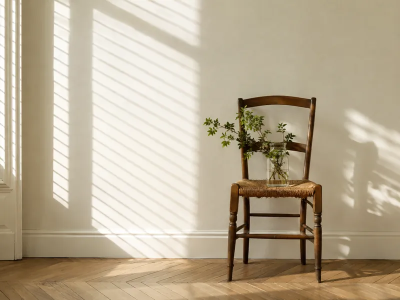
Wall painted the palest lemon yellow, striped by the shadow of a louvred shutter on a summer morning
Summer light does not colour: it lightens. The shades that succeed are the ones that can bear it

Your turn

A summer's day, hour by hour

Slide the hour: the sky beyond the French window changes, the light comes in differently, and the wall takes the shade of the hour. Seven moments, seven shades - this is the page's palette.

The hour 1 pm · Noon

1 pm — Noon
The hour's shade Belgravia · No.6
Overhead light, the most neutral of the day: the shade is exactly « itself ». This is the hour to judge a white. Its room · The hall, the corridors - and every ceiling

An evocation, not a screen-accurate rendering: the true colour is judged from a sample pot, on your wall, at the hour you live in the room. The seven shades are detailed just below.

The palette

Seven hours, seven shades

Every hour of the day has its colour, and every colour its favourite room. Here are the seven, in the sun's order - each with two companions drawn from the Mylands pairings. The chips link to the colour pages.

6 am Morning BlueNo.32

Dawn

The milky blue of the first hours

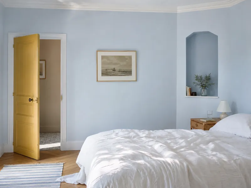
Before the sun clears the hedge, the world is blue - a light blue, almost white, with a hint of pink at the horizon. Morning Blue carries that moment in its name: an archive shade that « comes alive in morning light », calm without being cold thanks to its hints of magenta and umber. On bedroom walls it makes waking a gentle thing.
Its room

The bedroom, the morning bathroom

9 am Lemon SaltsNo.43

Morning

The pale lemon of breakfast

Morning light is yellow without being warm: it has the colour of a cut lemon. Lemon Salts is its exact translation - a white « with the subtlest hint of lemon », with a touch of green that stops it turning creamy. It is the shade that makes a kitchen cheerful at seven and, by noon, fades almost to white.

Its room

The kitchen, the breakfast room

1 pm BelgraviaNo.6

Noon

The warm white of full sun

At noon, summer is white: façades dazzle, shadows shorten. But that white is never pure - it is warmed by the sun. Belgravia is that white: « a crisp white that holds a warmth reflective of the summer sun-rays », softened by a drop of umber. It is the white of every piece of woodwork in this palette, and of ceilings that need to look taller.

Its room

The hall, the corridors - and every ceiling

4 pm French GreenNo.187

Afternoon

The green shade beneath the trees

At the hottest point of the afternoon one looks for shade - and summer shade is green: the lime tree's, the arbour's, the leaf's with the sun shining through it. French Green, a historic green from the turn of the nineteenth century, has that « eternally youthful » freshness with a hint of yellow that remembers the sun. In a sitting room it cools without chilling.

Its room

The sitting room, the study, the conservatory

7 pm Peach Flesh PinkNo.268

Golden hour

The apricot of the setting sun

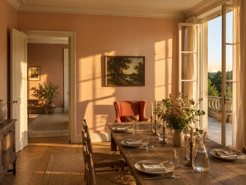
The loveliest hour of summer, the hour of drinks on the terrace: the sun sinks, the light turns apricot and everything is wrapped in gold. Peach Flesh Pink has that warmth - a peach « both punchy and delicate », blended from yellow oxide and bright red - and, like golden hour, it flatters every face it lights. The shade of a dining room where people linger.

Its room

The dining room, the covered terrace

9 pm FlorisNo.27

Dusk

The pink that lingers after the sun has gone

The sun has gone, but a summer sky is slow to go out: it turns pink, then mauve, for a long half-hour. Floris - named after the legendary London perfumery - is that pink: « pretty and sophisticated », never sweet, deepened by a hint of umber. A bedroom painted in Floris keeps the softness of dusk at every hour.

Its room

The bedroom, the dressing room, the guest room

11 pm ObservatoryNo.34

Night

The ink blue of summer nights

A summer night is never black: it is blue, deep and mild, pricked with stars. Observatory - Greenwich keeps watch over its name - is that ink blue, velvety, which draws in wonderfully under lamplight. It is the shade of the sitting room where you entertain, of the dining room of August dinners: dark by day, sumptuous by night.

Its room

The evening sitting room, the dining room

Ready to paint

Three summer days, three palettes

One hour does not make a room: it takes a white that breathes, a tonal neighbour that binds, an accent that wakes it up. Here are three complete palettes - a morning, an afternoon, an evening - to order as samples or save to your favourites.

01 · Morning

Seaside morning

A dawn blue, a cloud white, and the mustard flash of an oilskin hung on the door.

The palette of holiday houses that do not want to look like one. Morning Blue dresses the walls; Walpole, « stunningly clear, reminiscent of a clear sky », takes woodwork and ceiling - a related white, not a raw white, which is the whole difference. Lambeth Walk, the vintage blue of our old factory, deepens an alcove or the inside of a cupboard. And Haymarket, Morning Blue's official accent, wakes the whole thing up on a door or a bench.

02 · Afternoon

July garden

The green of shade, a fresh white, and a midnight-blue door like an arbour opening onto the evening.

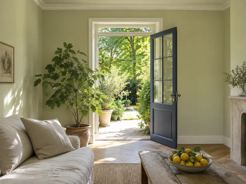
The palette of a sitting room that looks onto the garden - or wishes it did. French Green covers the walls; Cotton Street, a clean cool white from our archives and French Green's official related white, takes the woodwork. On the ceiling, Hurlingham, its paler Georgian cousin: the room gains height and the green seems to rise to the sky. Blueprint, the architect's ink blue and the shade's official accent, dresses the door - the low note that stops a soft green turning twee.

Sitting room with soft green walls, pale green ceiling, white woodwork and a midnight-blue door open onto a garden
French Green No.187 on the walls, Hurlingham No.181 on the ceiling, Blueprint No.50 on the door

03 · Evening

Evening on the terrace

Golden-hour apricot, a warm stone white, a mushroom pink and a flash of coral.

The palette of dinners that run late. Peach Flesh Pink wraps the dining room and does by candlelight what golden hour does to faces. Honest John - our founder's stone white - takes woodwork and ceiling. Egerton Place, the earthy mushroom pink of our summer palette, dresses the next room or a dado: the same warmth, an octave lower. And Coral Orange, « full of optimism », earns itself an armchair or the inside of an alcove.

Dining room with apricot walls, warm white woodwork, late-day light and a coral armchair
Peach Flesh Pink No.268 on the walls, Honest John No.58 on the woodwork, Coral Orange No.277 as the accent

The method

Keeping summer all year round

A summer shade must be as lovely on a Tuesday in November as on a Sunday in July. Four rules decorators follow to make sure it stays that way.

01

Never a raw white

Factory white, bluish and optical, chills a summer shade and makes it look dirty by contrast. Give it a related white instead - Belgravia, Walpole, Cotton Street - and it will keep its light through the short days.

02

Matt on the walls, eggshell on the woodwork

Summer light is beautiful because it is diffuse. A matt emulsion gives it back without reflections; an eggshell on the woodwork lets it move around just enough. Gloss brings back the glare of noon - keep it for a door.

03

Beware of north

A pale, cool shade - Morning Blue, French Green - turns grey in a north-facing room in winter. Choose the palette's warm hours there instead: Lemon Salts, Peach Flesh Pink, Floris. The sun they contain makes up for the sun that is missing.

04

Let the materials in

Washed linen, rattan, pale wood, terracotta, a white ceramic: these are the materials that make you believe in summer once the light has gone. A summer shade on bare walls is a promise; with the right materials, it is a season.

The neutrals that bind summer together: Belgravia · No.6 Hoxton Grey · No.72 Greenstone · No.190 Honest John · No.58

Your questions about summer colours

Won't summer colours look cold in winter?

The coolest ones will, if left to themselves: a pale blue in a north-facing room can grey over under a January sky. Three remedies: pick the palette's warm hours (Lemon Salts, Peach Flesh Pink, Floris) for rooms that see little sun, always pair the shade with a warm related white rather than a raw one, and take care of the evening lighting - bulbs between 2700 and 3000 K give any summer shade back its July light.

Which summer colour for a bedroom?

The two ends of the day: dawn and dusk. Morning Blue for those who like to wake in cool, clear light; Floris for a more enveloping bedroom that keeps its rosy softness in the evening. In both cases, the ceiling in the shade's related white - and, if the bedroom faces north, Floris rather than Morning Blue.

How do I avoid the « pastel » or « nursery » effect?

Through depth of pigment and through company. Our summer shades are powdery, never garish: Morning Blue contains magenta and umber, Floris umber, Lemon Salts a hint of green - that is what keeps them away from sweets. And always give them a low note: a Blueprint door, a Huguenot armchair, a Haymarket bench. A pastel alone is a pastel; a pastel with a bass line is a palette.

Which shades for a holiday house or a home by the sea?

The light there is stronger and whiter than in town, so shades can be a tone deeper than you would dare elsewhere - the light will « eat » them. Bedford Square or Lambeth Walk hold full sun better than Morning Blue; Haymarket turns solar there without shouting. And keep a single shade for the whole house, varying only the whites: a holiday house is meant to be simple.

Can shutters and front doors be painted in these shades?

Yes - and that is where summer shades are most at home. Simply choose a finish intended for exterior use (see our exterior selection) and expect the colour to look lighter outside than in the pot: full daylight always lightens. For shutters, then, take the version one tone deeper than the shade you love indoors.

Summer does not fit in a colour: it fits in a day. Choose your hour.
Sign up to our newsletter

Sign up to our newsletter

Thanks for signing up to our newsletter!