The journal
Colour Psychology at Home: What Each Shade Does to a Mood
Colour doesn't just decorate a room, it shapes how we feel in it. Here's a room-by-room guide to using colour psychology to your advantage.
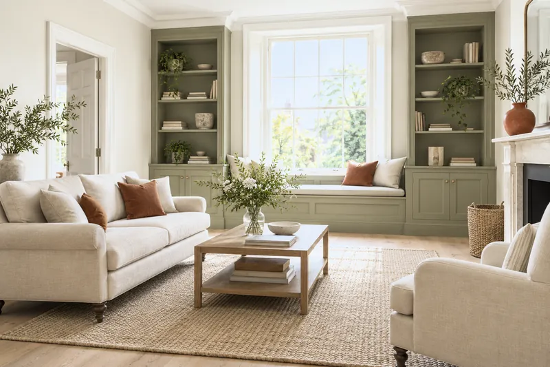
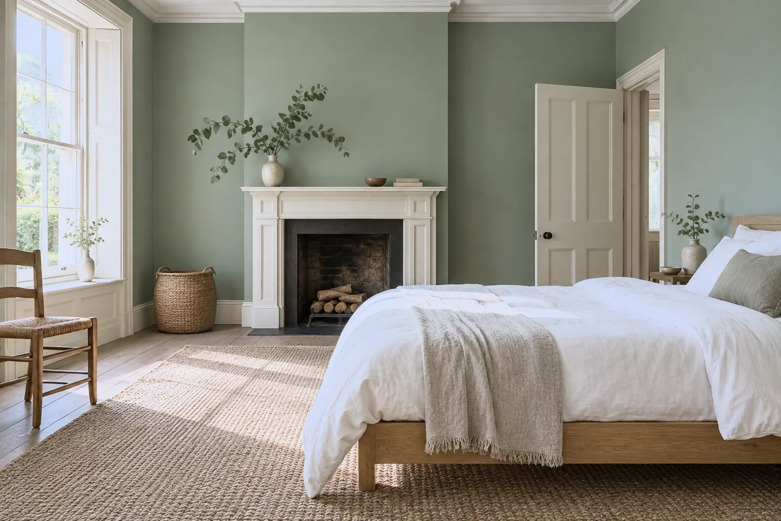
We often choose paint on looks alone, but colour works on us more deeply than that, quietly shaping how calm, energised or comfortable we feel in a space. Understanding a few basic associations helps you choose with intention, matching the colour to the life of the room. Blue is the great calmer, linked to focus, serenity and rest; it's a natural fit for bedrooms, bathrooms and studies, where a shade like Morning Blue™ No.32 soothes. Green sits at the heart of the spectrum and is the most restful colour of all, connected to nature, balance and renewal, ideal almost anywhere, from a Serpentine™ No.192 living room to a Greenstone™ No.190 nursery. Yellow is optimism and warmth, a wonderful lift for a dark hallway or a north-facing kitchen; Golden Square™ No.131 brings instant sunshine. Red is stimulating and sociable, raising energy and appetite, which makes it a classic for dining rooms but a bold choice for bedrooms. Pink, softer and nurturing, brings gentle comfort, while purple lends a sense of quiet luxury. Neutrals, warm stones and off-whites, feel grounding and flexible, letting other elements shine. The important thing is to match mood to purpose: energising colours for social, active spaces; calming ones for rooms of rest. And always weigh in light and finish, which change how any colour reads. Used thoughtfully, colour becomes more than decoration, it's a quiet tool for wellbeing, shaping how every room makes you feel from the moment you walk in.