


The journal
The 60-30-10 Rule, the Mylands Way
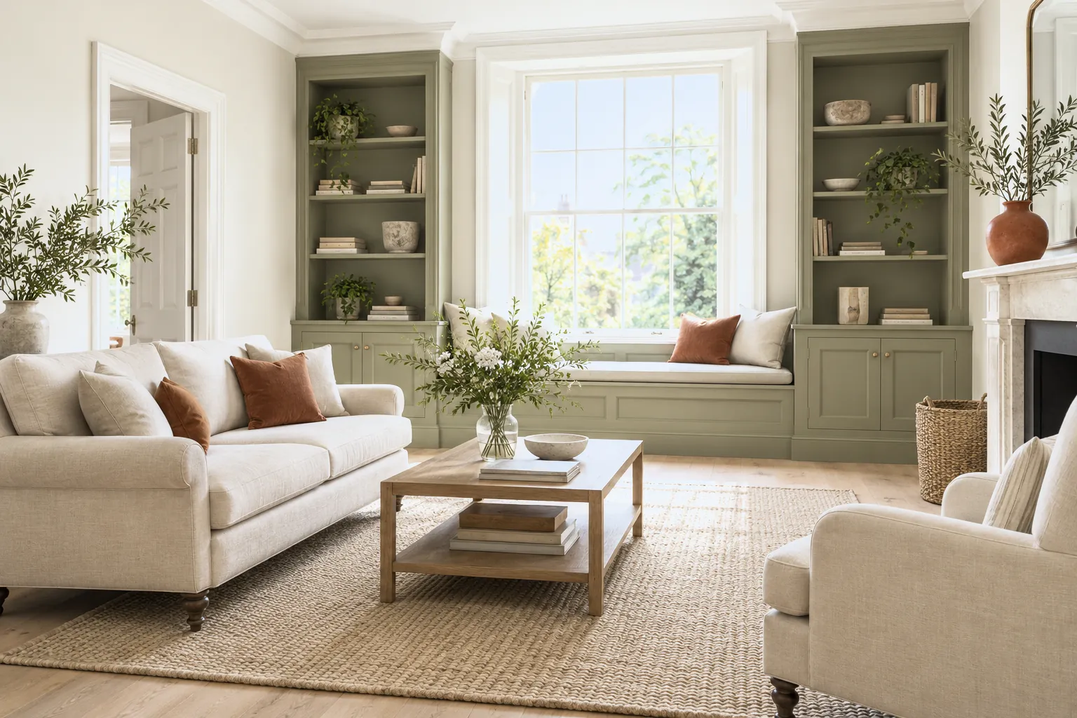
One simple ratio is the secret behind balanced, professional-looking rooms. Here's how the 60-30-10 rule works, and how to use it with colour.
If a room ever feels a little off and you can't say why, the balance of colour is often the reason. Interior designers lean on a simple, time-tested ratio to get it right: the 60-30-10 rule. It splits a scheme into three parts. Sixty percent is your dominant colour, usually the walls and largest surfaces, the backdrop that sets the mood. A warm neutral like Temple Bar™ No.70 or a soft Holland Park™ No.5 makes a versatile 60%. Thirty percent is your secondary colour, roughly half as much, carried through upholstery, curtains, a rug or larger furniture; it supports the main shade and adds contrast, perhaps a deeper Hoxton Grey™ No.72 or a green like Greenstone™ No.190. Ten percent is your accent, the smallest but most energising portion, used in cushions, art, lamps or a painted detail. This is where you can be bold, a hit of FTT-006™ Shocking Pink, a gold flourish, or a rich Huguenot™ No.49. The ratio works because it gives the eye a clear hierarchy: something to rest on, something to add interest, and something to spark delight. It's a guide rather than a law, feel free to bend it, but if a scheme isn't quite landing, checking these proportions usually reveals the fix. A common mistake is skipping the accent altogether, which leaves a room feeling flat, or over-using it, which makes it busy. Get the balance right and even a simple palette looks intentional and complete.





