


The journal
Colours of Summer 2025
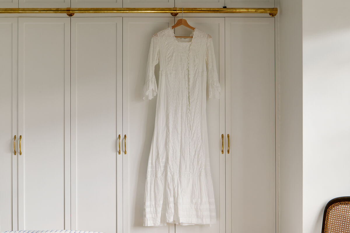
Mylands unveils Colours of Summer 2025, a carefully curated collection of ten bright, cheerful shades that captures the essence of summer. Discover ten luminous colours inspired by the beauty, optimism and elegance of the sun-drenched months.
Summer light is the least forgiving light a paint colour ever meets. It arrives high and hard at midday, bleaches the yellow out of a warm neutral, then comes sideways at eight in the evening and gives every bit of it back. A palette made for the season has to survive both. These ten shades are luminous rather than simply bright: they hold their character at noon and still have something to say once the sun has gone round the house.
A summer palette is not a set of colours for June to September alone. It is a way of choosing shades that behave in strong, changeable light: clear yellows, soft warm pinks, blues with air in them, greens that stay fresh rather than going grey, and a white that reflects without glaring. Get that group right and the rooms keep their lift through the winter too.
Two yellows, one bold and one quiet
Golden Square No.131
A cheerful shot of ochre yellow, evocative of the boutiques and bistros in the streets around Soho's Golden Square. Use it where a room should be unmistakably glad to see you: a hallway, a small study, kitchen cabinetry under a pale wall. It comes alive against a cool tone, so keep a clear blue nearby.
Floral Street No.147
A desaturated yellow that freshens an interior without ever raising its voice, inspired by Nottingham Ochre, the pigment London colourmen used long before modern paint colours arrived. Reach for it when a room faces north and wants warmth rather than sunshine. It is generous over whole walls and makes a fine ground behind painted joinery.
Blush, peach and coral
Floris No.27
A pretty, sophisticated blush pink built over an absorbing umber, which lends it depth and stops it overpowering a room. The softness of blush avoids an oversaturated look while leaving an interior fresh and vibrant. It makes an appealingly romantic bedroom, and wants linen, pale timber and a warm white beside it.
Peach Flesh Pink No.268
Warmer and fruitier than a blush, this is the peach a low sun turns a plastered wall at the end of a long day. It flatters faces, reason enough to try it in a bedroom or a bathroom, and it takes brass, unfinished oak and plenty of white cotton. Keep the woodwork close to it in tone.
Coral Orange No.277
The brightest thing in the collection, and the one to use with most restraint: a coral with real orange in it. On a run of kitchen cabinets, a cupboard interior or the frames of a garden room, it does more work than a whole wall would. Against a soft yellow it reads sun-warmed rather than loud.
Blues with air in them
Morning Blue No.32
A calming light blue that resembles morning light, cheerful and tranquil at once, with a hint of magenta and umber giving it depth. Powder blues make a space feel open and airy, exactly what a summer room wants, and paired with white they comfort rather than chill. Good in a bedroom, a bathroom, a north-lit landing.
Long Acre No.102
A blue dedicated to one of the earliest recorded sales of blue paint, to a Mrs. Adams of Long Acre in 1777. It works with the greens below rather than against them, so a room using both feels fresh and modern instead of busy. Give it plain natural textures and let it carry the joinery.
Greens that stay fresh in strong light
Mint Street No.95
A traditional shade renamed after the evocative London street, and the crispest green here. Mint keeps its freshness in bright light where a warmer green slides towards yellow, which earns it a kitchen, a garden room or a bathroom. Keep what surrounds it plain: bare wood, rush matting, white china.
Greenstone No.190
A truly modern grey-green, natural and unusual, with turquoise undertones and an intensely calming effect. It reflects natural light beautifully, so a room in it feels brighter and more spacious, which is why a quiet colour belongs in a bright collection. Use it where the household needs to slow down.
The white that holds it together
Belgravia No.6
A crisp white carrying a warmth like summer sun on your face as you step outdoors. Warm off-whites are the useful kind, light enough to brighten a space yet never so stark that they fight the colours next to them. Run it over ceilings and woodwork throughout and the other nine read as one collection.
Ten colours is more than any one house needs at once. Choose the white and two or three others, then let rooms that open into one another share at least one, so the eye is carried through. Paint samples large, on the wall that will actually hold the colour, and look again at breakfast and at nine in the evening. Summer light moves further between those hours than any other season's, and a shade that is right at both will be right in January.





