The journal
Painting with Red: Expert Advice for a Flawless Finish
Discover how to overcome the challenges and achieve a beautiful red interior, with expert advice on choosing red paint, priming and application techniques.
A red can look entirely settled on a colour card and then arrive on the wall thin, patchy and faintly streaked, the old colour ghosting through in the low light of the evening. It is the complaint made most often about red, and almost never the colour's fault.
Red rewards preparation more than almost any other colour. Choose the shade for the light you actually have, seal the wall properly and let each coat do its work, and you get the deep, even red that made you want it.
Why red asks more of the paint
Depth of colour comes from how much pigment a paint carries, so a thinly pigmented red spread too far will always read weaker on the wall than it did in the tin. Mylands Marble Matt Emulsion holds more pigment than any other paint on the market, which is why it covers fully in two coats and why its reds keep their richness instead of sinking into whatever is underneath.
A matt surface reflects very little light, and that lack of reflection amplifies the depth and richness of the colour. Marble Matt is made with super-fine ground marble powder, crushed Carrara marble left over from the Italian stone industry, which enhances light reflection within the pigment itself, so a red shifts subtly through the day.
Choosing the red for the room and its light
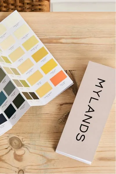
Colours look quite different in different light, and the only reliable test is the wall itself. Order colour cards or tester pots, live with the patches for a few days and look at them morning, afternoon and after dark, taking in the room's aspect and its lamps as well as its windows. Mylands arrived at Dulwich Red for Dulwich Picture Gallery this way, testing the colour at different hours until it drew out the Dulwich light across the Gallery's Enfilade.
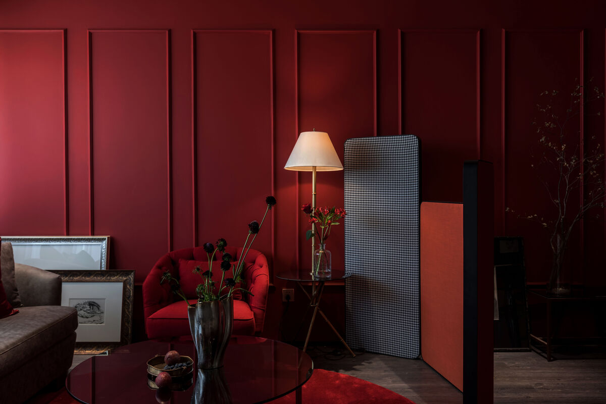
"Red is a bold choice, but it's not as intimidating if you know how to pick the right shade," says Dominic Myland, CEO of Mylands. "Deeper reds like Huguenot™ No.49 are ideal for an earthier tone, while brighter hues like Red Post Hill™ No.68 are lively, fun and vibrant, an exciting way to make a statement." A dark room is no argument against red: dark reds work well where daylight is short, and embracing the darkness beats fighting it with white.
Priming and the first coat under a red
A primer seals and sets the surface before any new colour goes on, so the finish has something even to sit on. Mylands Plant-Based Wall Primer suits freshly plastered walls and ceilings, and is made with a high bio-based content, plant-based resin and natural fillers. Priming matters more under a red than under a mid-tone neutral, because differences in porosity across a filled and sanded wall show up as differences in depth.
On breathable walls, Marble Matt can be used diluted as a mist coat instead: if the plaster is dry and in good condition, start with one thin coat diluted with up to 45% water, then finish with at least two coats diluted at no more than 10%. Over old gloss, or on joinery, sanding is not optional, since a high-sheen surface shows every imperfection beneath it.
Two coats, and the patience in between
Marble Matt goes on by brush, roller or spray, spreads smoothly and dries evenly, and its high pigment load gives full coverage in two coats. It recoats after two hours, quick enough to finish a room in a day but not an invitation to rush: a second coat over paint still soft underneath is exactly how patchiness happens. Work in even passes, keep a wet edge and lay off in one direction.
Marble Matt also retouches remarkably well, blending without flashing or patchiness so later touch-ups stay invisible, which is one reason museums and galleries trust it on heavily frequented walls.
Which finish suits a red, and where
Finish changes a red as much as shade does, because it changes how much light comes back off it. Marble Matt sits at 3% sheen, the flattest in the range, and that near-absence of reflection is what makes a deep red feel velvety; it is breathable, which matters in older houses with lime plaster, and scrubbable enough for a family sitting room. Plant-Based Multi-Surface Matt is a dead matt at 5%.
For woodwork in the same red — skirtings, a chimneypiece, a panelled door — eggshell is the sensible choice, at 23% sheen against 80% for gloss: lustre enough to take handling, and good at hiding fingerprints and brushstrokes. Gloss intensifies the colour with its reflective surface, glorious on cabinetry or a windowless dining room wall and unforgiving of anything left unsanded. Satin sits between them and suits doors and furniture.
Order the tester pots before anything else. A red that holds up on a wet Tuesday afternoon, a bright Saturday morning and the hour after the lamps go on is a red you will still be pleased with in five years.