


The journal
The October Edit: Shades of the Season
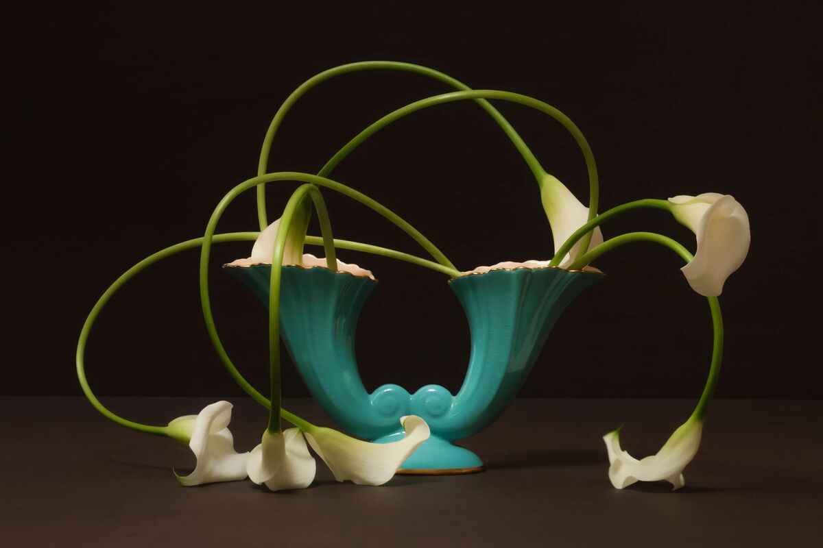
Explore our October Edit, a curated collection of 12 paint colours to inspire your interiors this season, drawn from nature, heritage and the warmth of autumn. Discover rich tones, timeless neutrals and classic combinations, perfect for heritage homes, countryside kitchens or cosy autumn corners.
Explore our October Edit, a curated collection of 12 paint colours to inspire your interiors this season, drawn from nature, heritage and the warmth of autumn. Discover rich tones, timeless neutrals and classic combinations, perfect for heritage homes, countryside kitchens or cosy autumn corners.
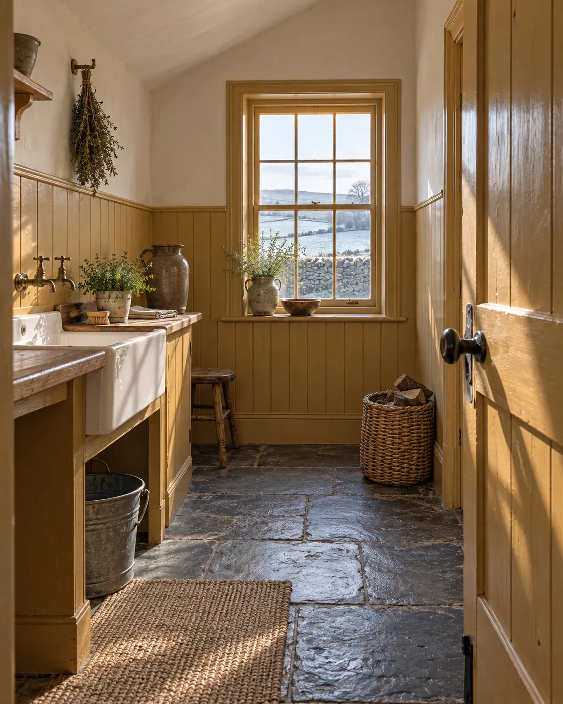
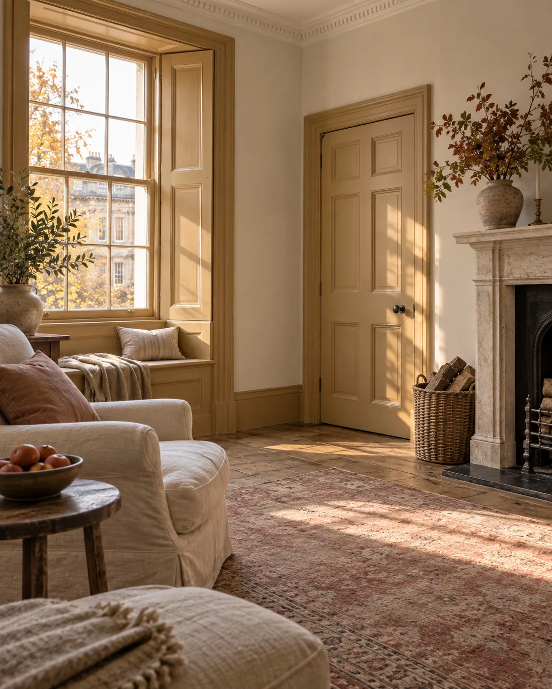
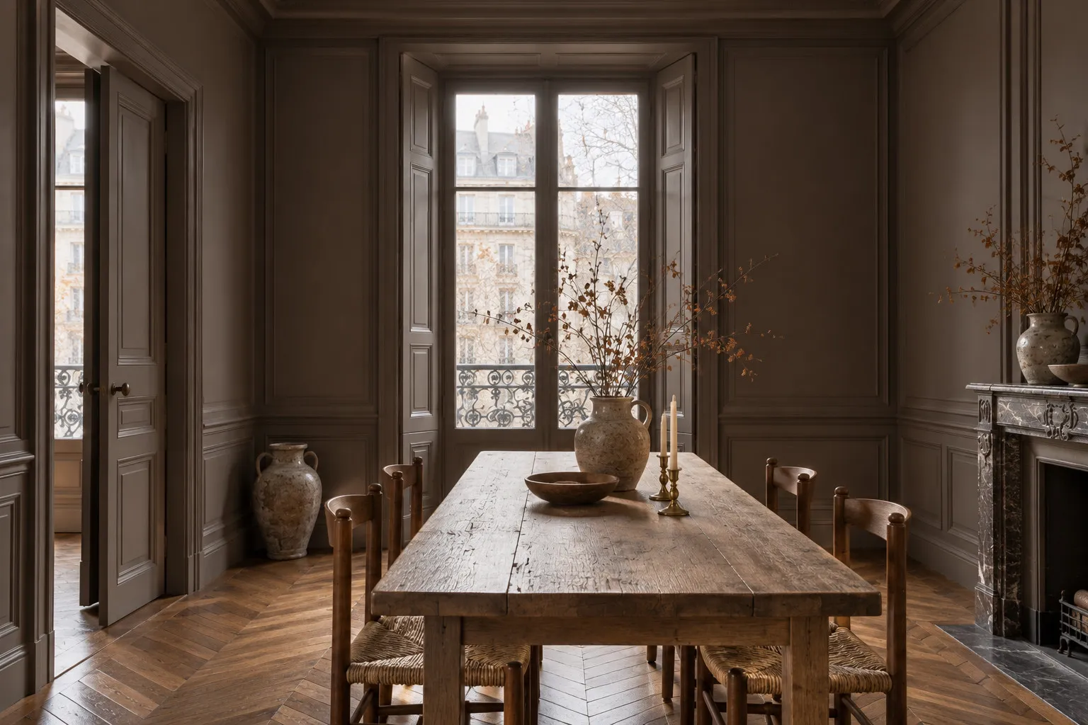
John's Pantry BH.24:
this handsome ochre yellow was developed for John's office at 188 Hammersmith Road, a sunny, striking tone that works wonderfully on woodwork and panelling, particularly tongue and groove, and is fantastic for windows and doors.
Honest John™ No.58:
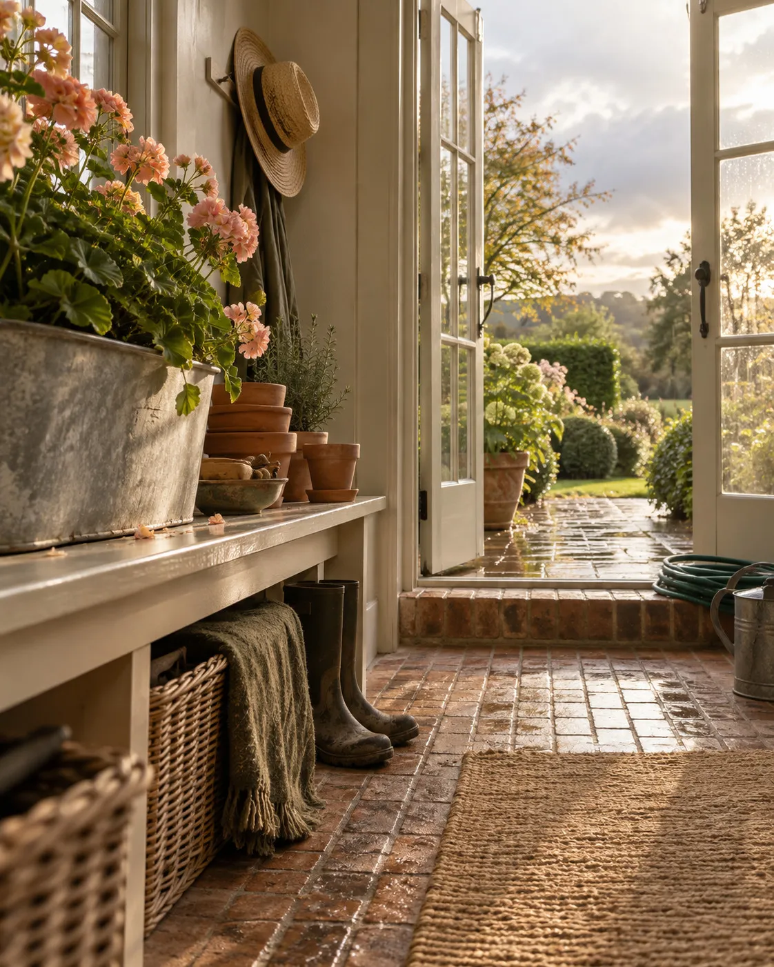
a traditional off-white named after John Myland, 'Honest John', who founded the company in 1884; with warm, stone undertones, this classic off-white is a popular choice for bringing a familiar feel to a space.
Cadogan Stone™ No.59:
a subtle, elegant stone shade inspired by a historic colour found in Cadogan Square; warm yet crisp, its balanced neutrality makes it a versatile backdrop, neither too warm nor too cool, perfect for pairing with a wide spectrum of tones and styles.
Huguenot™ No.49:
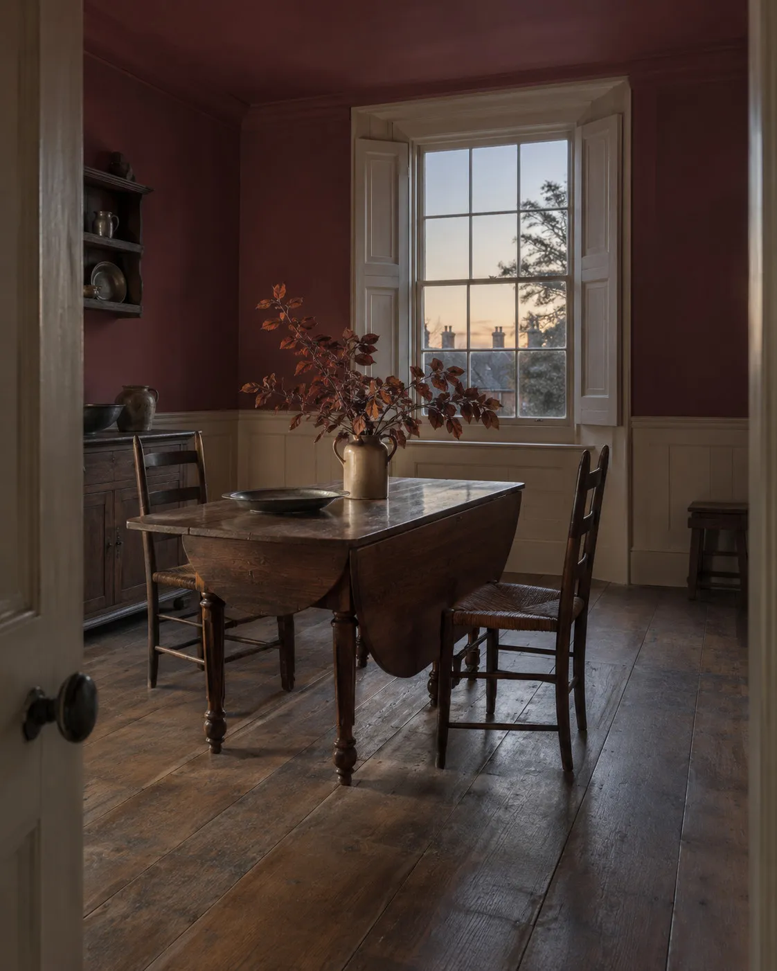
a sumptuous crimson red from our archives, inspired by the rich silk weavings of the Huguenots; with hints of magenta and orange, this deep shade carries both depth and intrigue, offering a traditional yet elegant presence, perfect for a warm, welcoming atmosphere.
FTT-001™ Rich Gold:
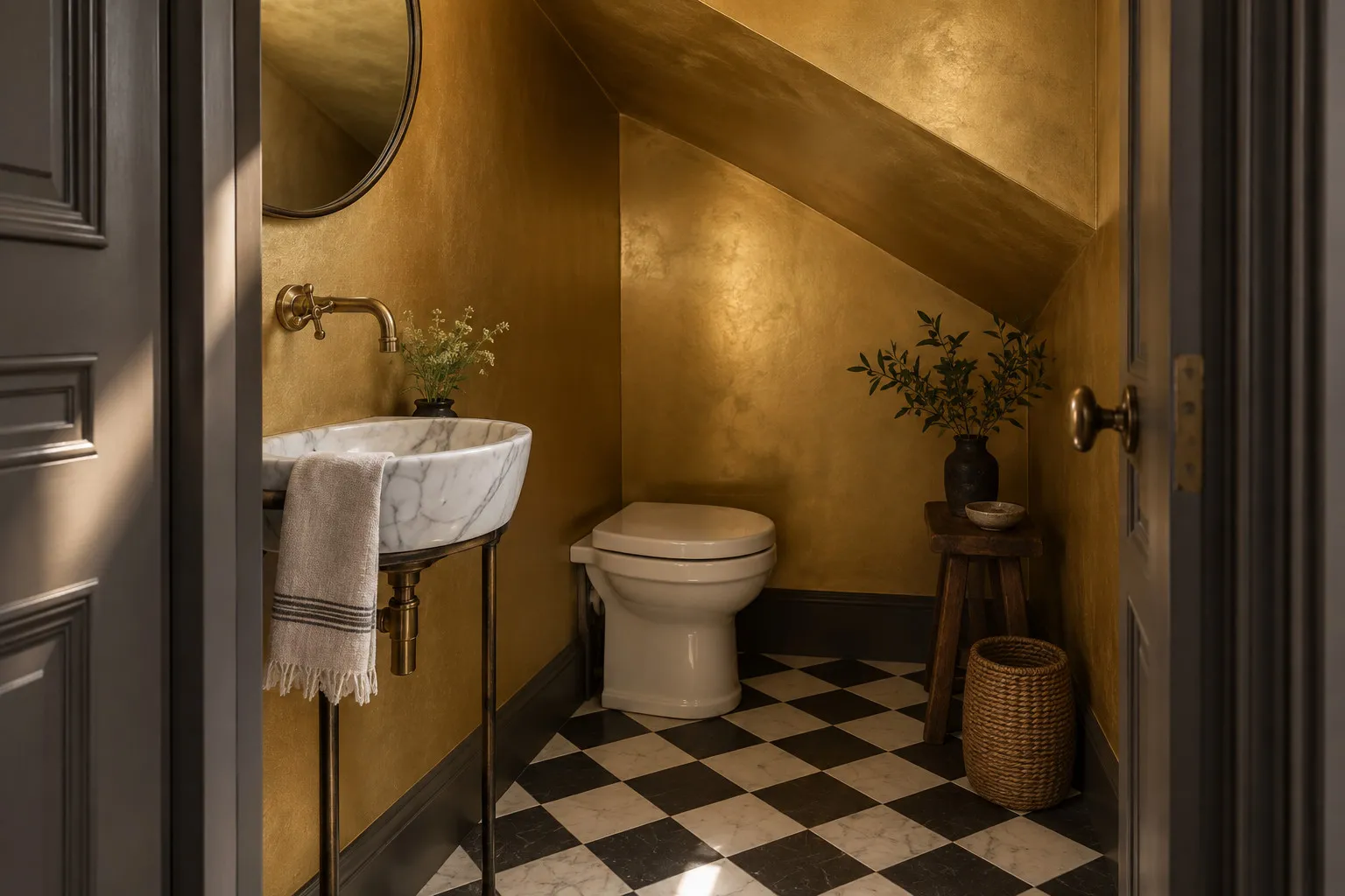
the first paint in our Film, Television & Theatre collection, a luminous, glamorous gold with warmth and sophistication; designed as a striking accent, it pairs beautifully with a wide range of colours, bringing a touch of cinematic luxury into the home.
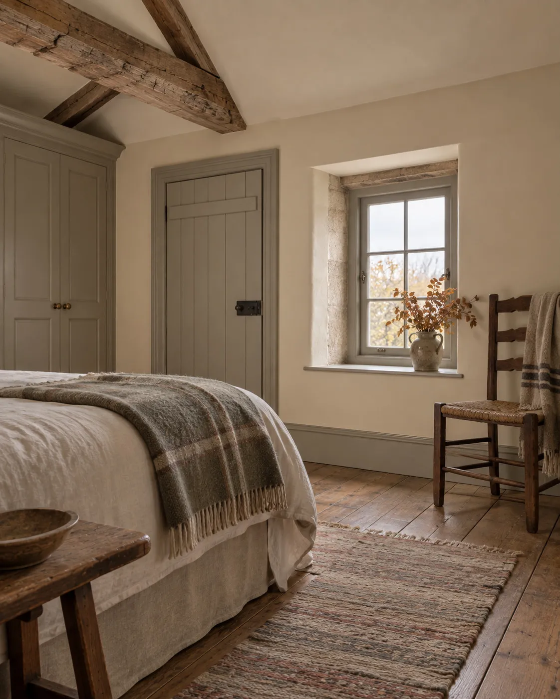
London Brick BH.07:
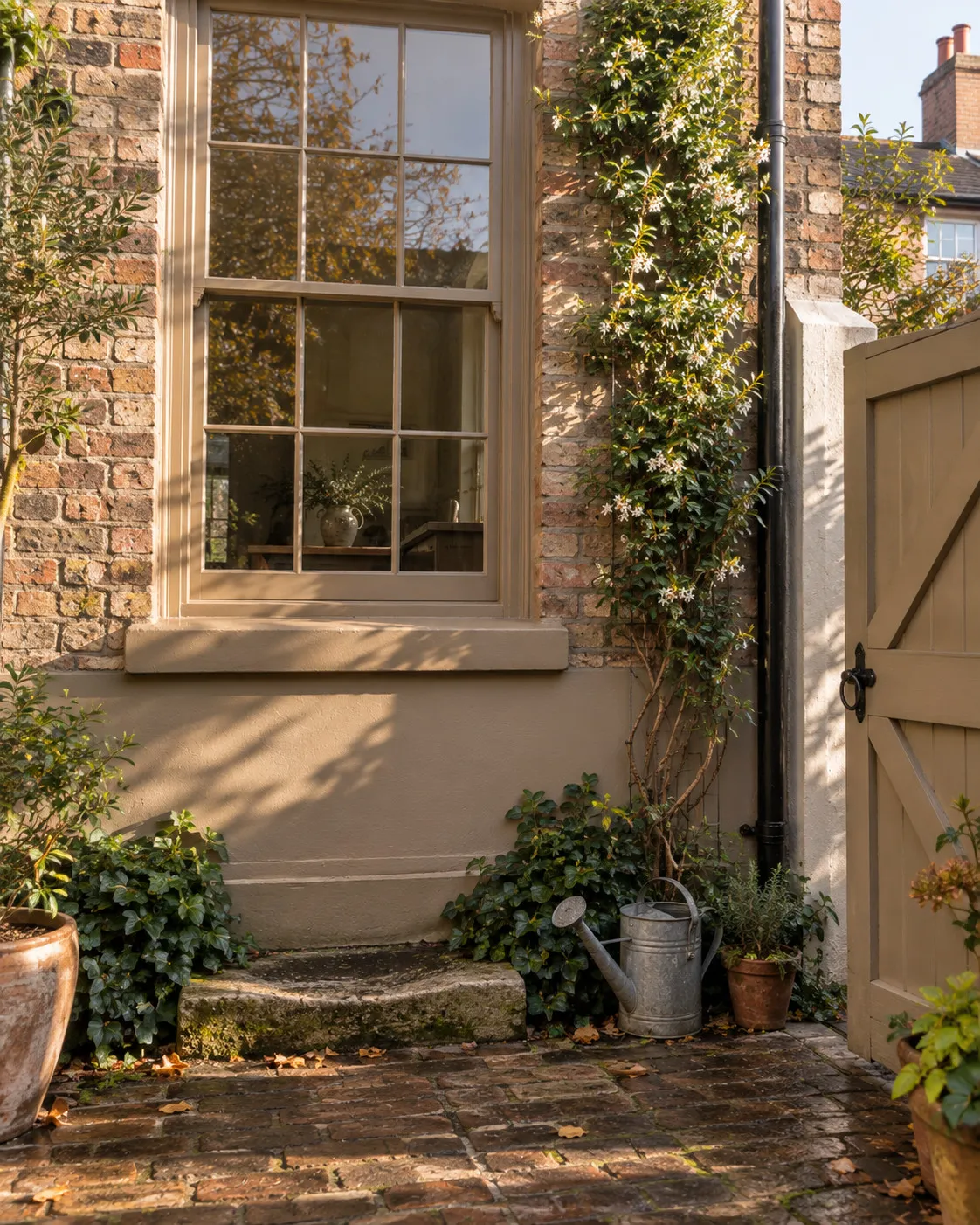
inspired by reclaimed London stock bricks, this refined shade offers an elegant alternative for exterior surfaces; developed to complement the iconic brickwork seen across the city, its warm craft-paper brown feels timeless, practical and enduringly stylish, ideal for external walls where it provides a sophisticated backdrop for climbers like jasmine or ivy.
Paving Stone™ No.61:
a warm, soothing neutral, a natural stony beige enriched with subtle yellow and umber undertones; comfortable and inviting yet fresh and uplifting, it offers timeless elegance for classic and contemporary interiors alike.
Portcullis™ No.170:
a traditional, warm dark grey, this sophisticated shade carries warm, dusty umber undertones with hints of yellow and green; its natural, earthy quality creates a welcoming, classic atmosphere while staying fresh, elegant and understated.
London Brown™ No.287:
one of our archive colours, a warm, complex dark brown enriched with raw umber and burnt sienna; its deep red undertones give it a rich warmth for an inviting, earthy atmosphere, dark yet approachable, offering a comforting sophistication that works beautifully in refined interiors.
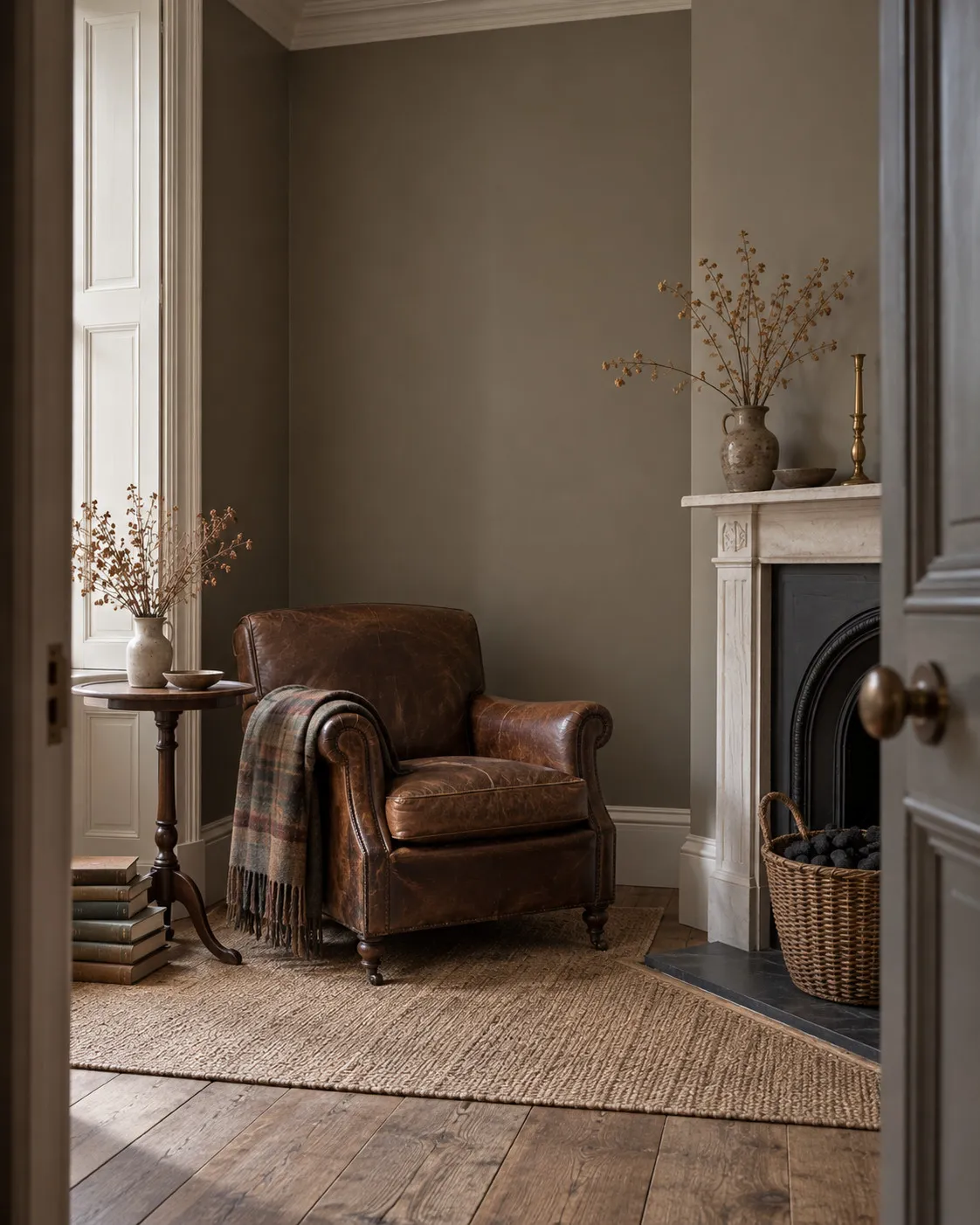
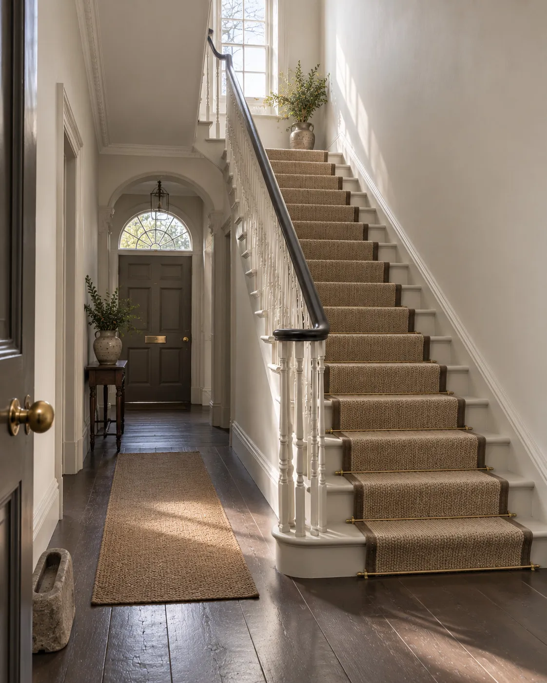
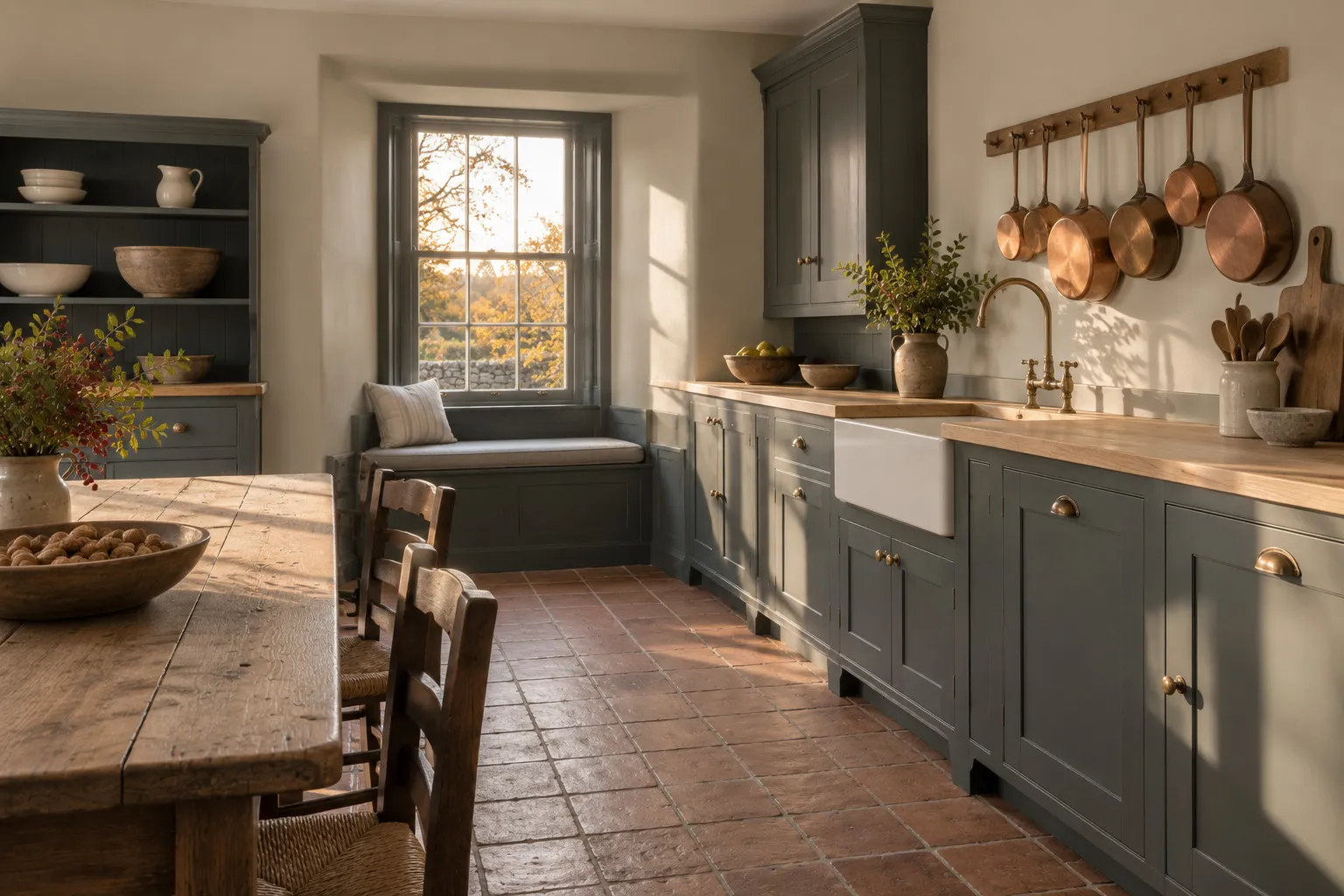
Alderman™ No.60:
a warm neutral inspired by an original 1950s British Standard shade; light yet earthy, it brings balance and subtle warmth to any room, while its delicate green undertone introduces a calming, natural elegance.
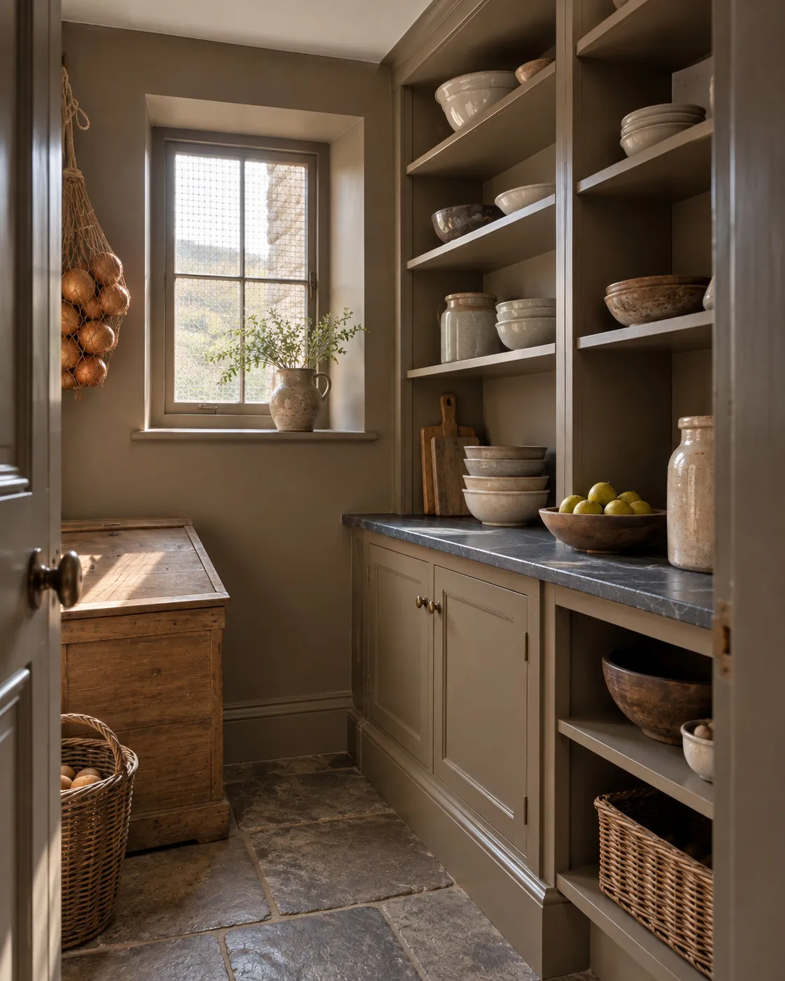
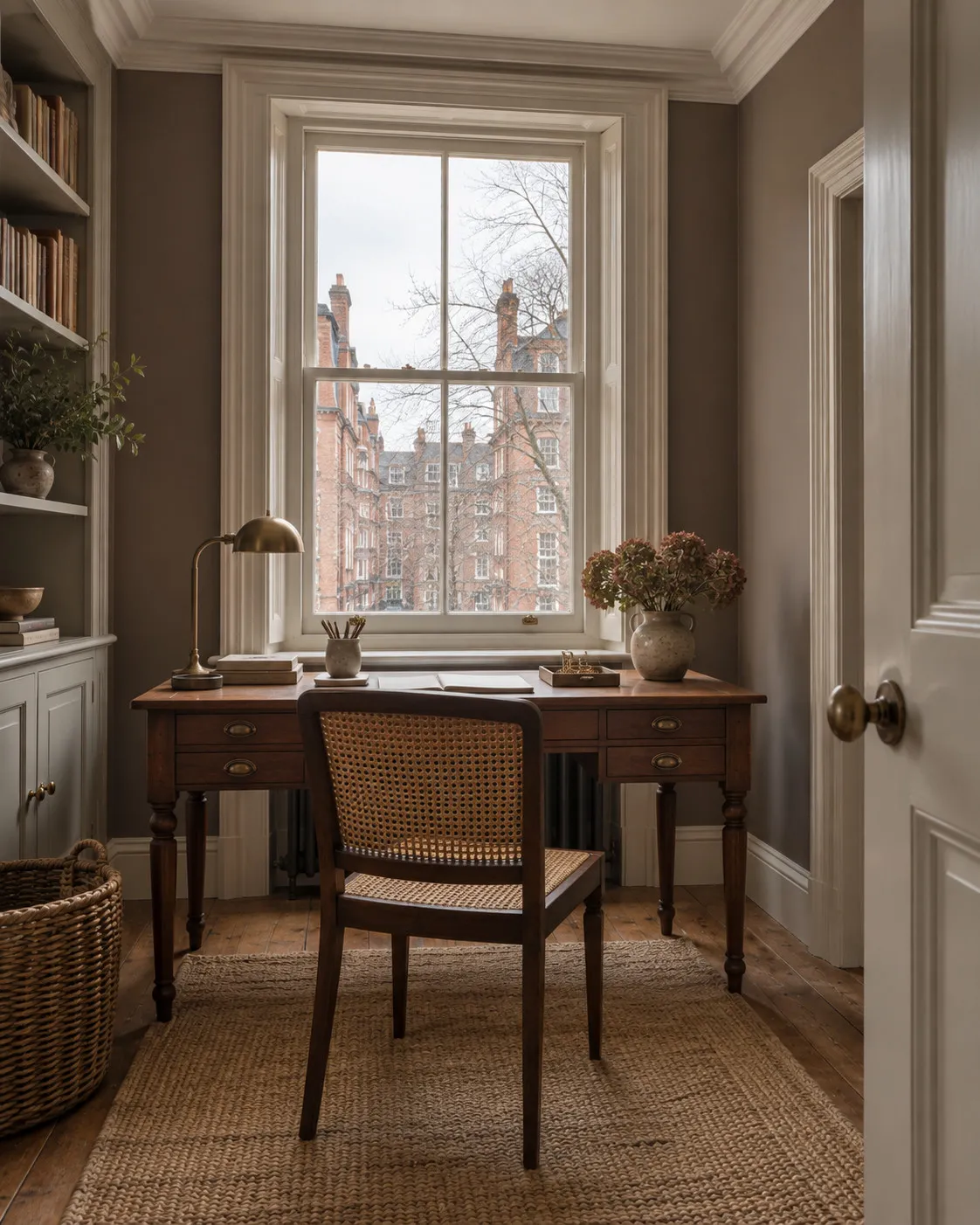
Westmoreland™ No.160:
a historic shade revived from the 1930 Dictionary of Colour; this rich, earthy brown carries subtle hints of yellow, creating a stony, natural tone that adds quiet depth and muted elegance, perfect for a grounded, timeless character.
Millbank™ No.254:
a soft, dark neutral with heritage roots, enriched with earthy brown hues and subtle undertones of magenta that lend warmth and depth; versatile and refined, it has a gentle brightening quality while serving as an elegant contrast to white shades, a timeless choice for classic and contemporary spaces alike.





