


The journal
Warm vs Cool Colours: How to Tell, and Why It Matters
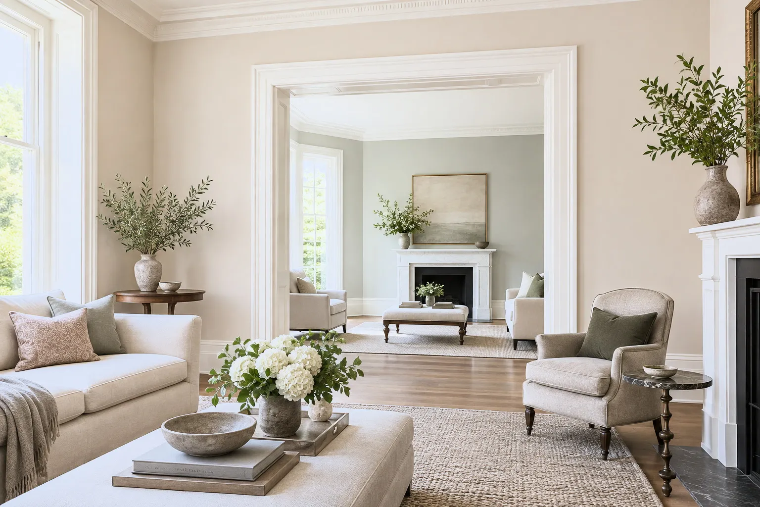
Understanding whether a colour is warm or cool is the single most useful skill in decorating. Here's how to read it, and use it to transform how a room feels.
If you learn one thing about colour, make it this: every shade is either warm or cool, and knowing which transforms how confidently you decorate. Warm colours, reds, oranges, yellows and the browns, terracottas and warm neutrals built from them, feel cosy, welcoming and enveloping. They visually advance, making large or cold rooms feel more intimate. A shade like Haymarket™ No.47 or London Brown™ No.287 wraps a space in warmth. Cool colours, blues, greens and violets, along with crisp greys and whites, feel calm, fresh and spacious. They recede, so they open up small rooms and bring serenity to busy ones. Bond Street™ No.219 or a soft Maugham White™ No.2 are good examples. The clever part is that temperature isn't only about the obvious colour; it lives in the undertone too. A grey can be warm (with brown or umber, like Hoxton Grey™ No.72) or cool (with blue), and the difference completely changes a room. Use temperature to solve problems: warm up a north-facing or shady room with warm-undertoned shades, and cool down a hot, south-facing room with cooler ones. You can also balance a scheme by pairing a dominant temperature with a small dose of its opposite, a warm room lifted by a cool accent, or vice versa, which keeps it from feeling one-note. Next time you're choosing paint, ask first: do I want this room to feel warm and cosy, or cool and calm? The answer points you straight to the right half of the colour card.





