


The journal
Which Paint Colours Go Well With Terracotta
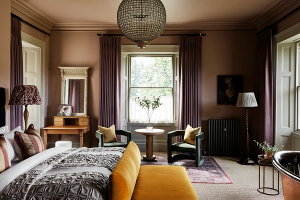
With its natural, earthy tones, terracotta is a warm and comforting colour to bring into your interior design. It's a versatile shade that works with a range of styles, and shouldn't be saved only for a Mediterranean aesthetic.
Warm, earthy terracotta evokes summer evenings in Tuscany. Translated from the Italian, terracotta means 'baked earth', and the colour recalls sun-baked landscapes as well as Mediterranean décor with terracotta floors, roof tiles and garden pots. With its natural, earthy tones, it's a warm, comforting colour to bring into your interior design, a versatile shade that works with a range of styles and shouldn't be saved only for a Mediterranean look.
Popular in Scandinavian countries, these rich neutral tones can be worked into a minimalist style, and they also suit boho chic, rustic décor or mid-century looks. The question is, which colours should you pair with terracotta? Here we recommend complementary colours that work together seamlessly in your living spaces.
About terracotta
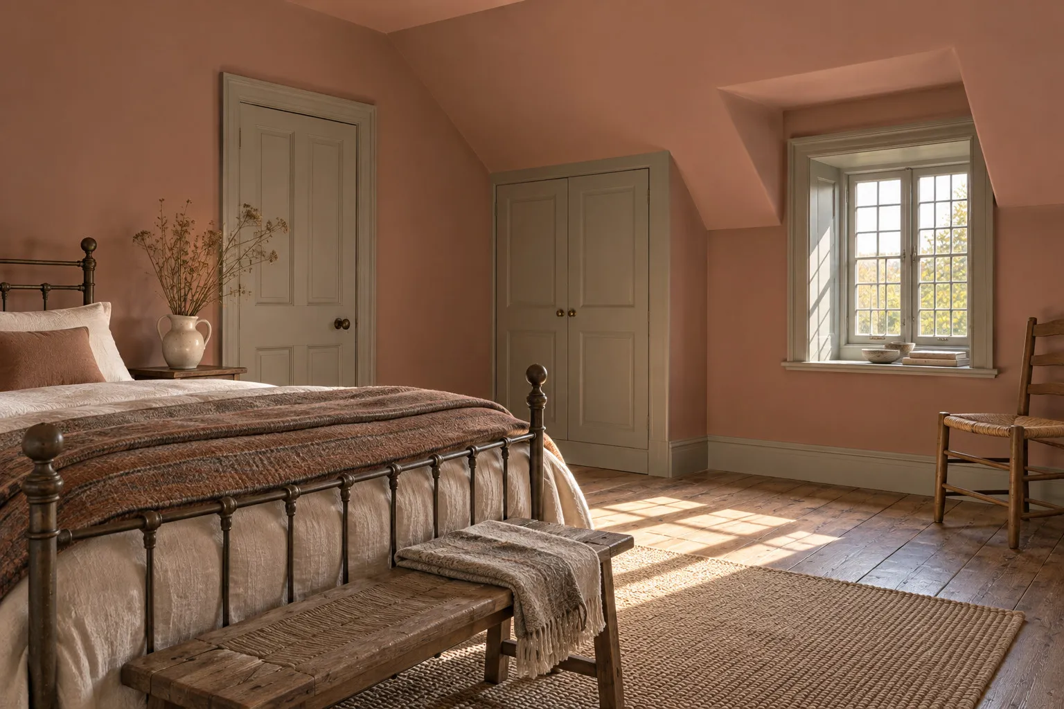
There isn't a single shade of terracotta; it spans burnt orange, deep red and pinky brown, all warm tones drawn from nature that bring a feeling of comfort and calm, welcome traits for any living space. Terracotta isn't just for interiors, either; it's an essential accent in any landscape or garden, and simply adding terracotta pots brings pops of contrasting colour to the green, a combination you can also bring indoors with terracotta pots and trailing green plants.
5 best terracotta colour schemes
Which colours match terracotta tiles? Which accents pair well with terracotta walls? Whether you have warm terracotta floor tiles, a soft terracotta wall or a few terracotta textiles, several schemes work well alongside this sumptuous earthy tone.
Neutral palettes
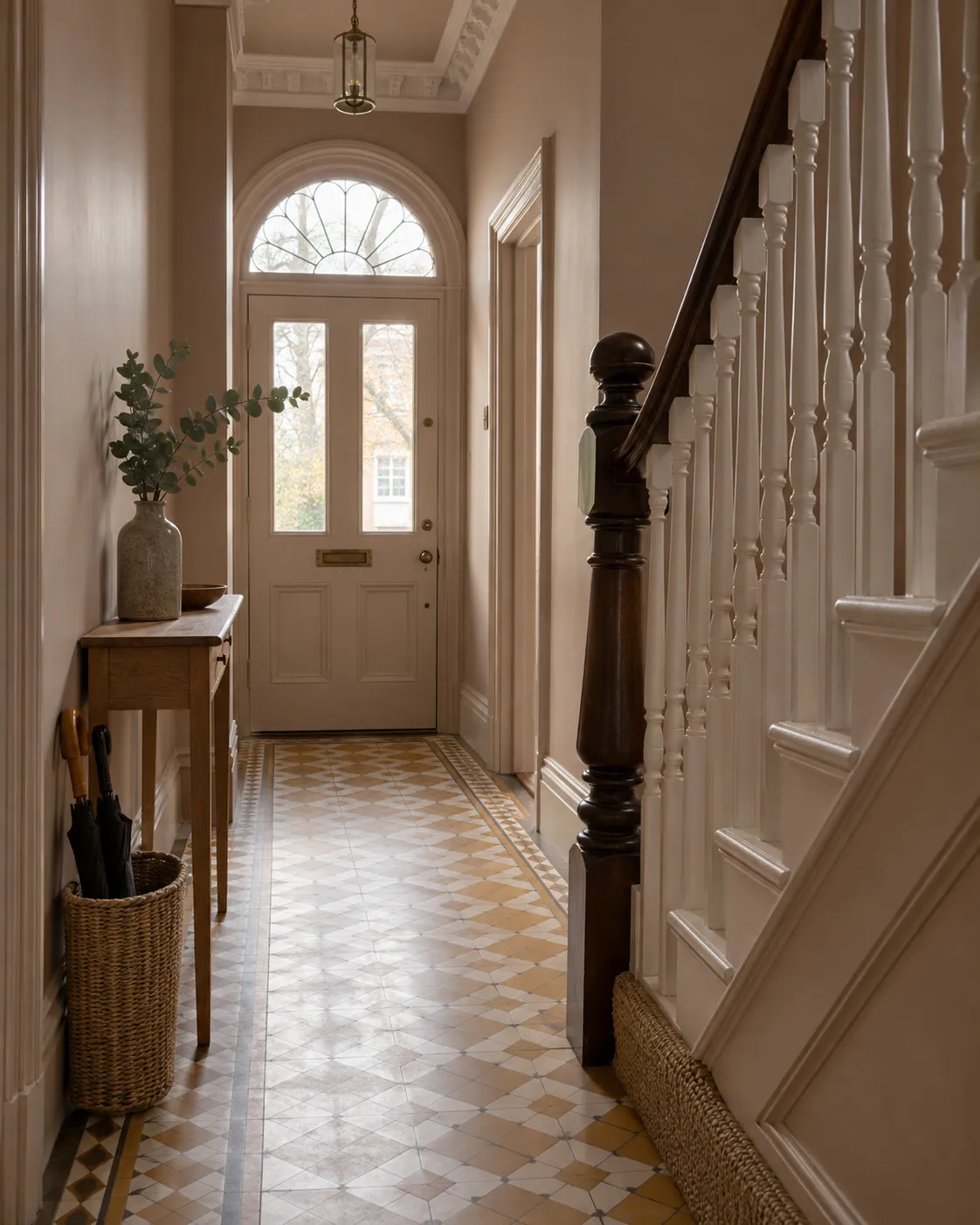
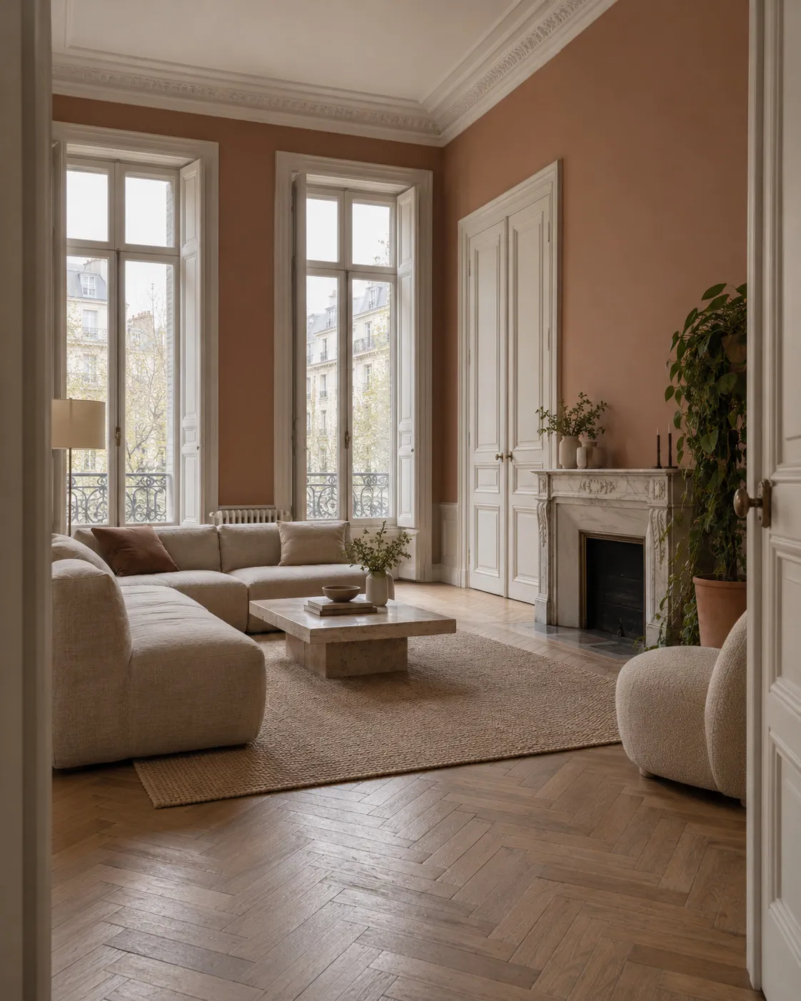
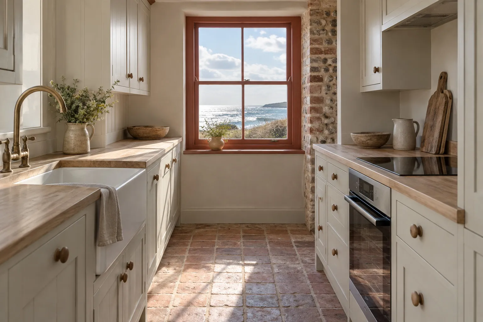
Neutrals are always popular; shades like stone, cream, taupe and light grey balance terracotta's warmth without overwhelming a space, providing a calming backdrop that lets the terracotta stand out. A classic, serene white scheme is lifted by terracotta elements, and in a stark white bedroom, terracotta cushions, throws or curtains soften the look for something cosier and more inviting. This neutral kitchen scheme is made more interesting by a terracotta window frame, drawing the eye to the window, a simple yet effective way to add a splash of rich, warm colour.
Jewel tones
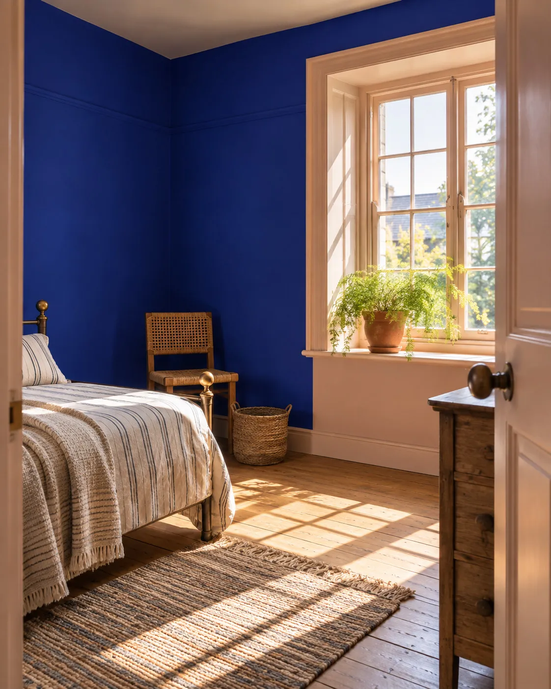
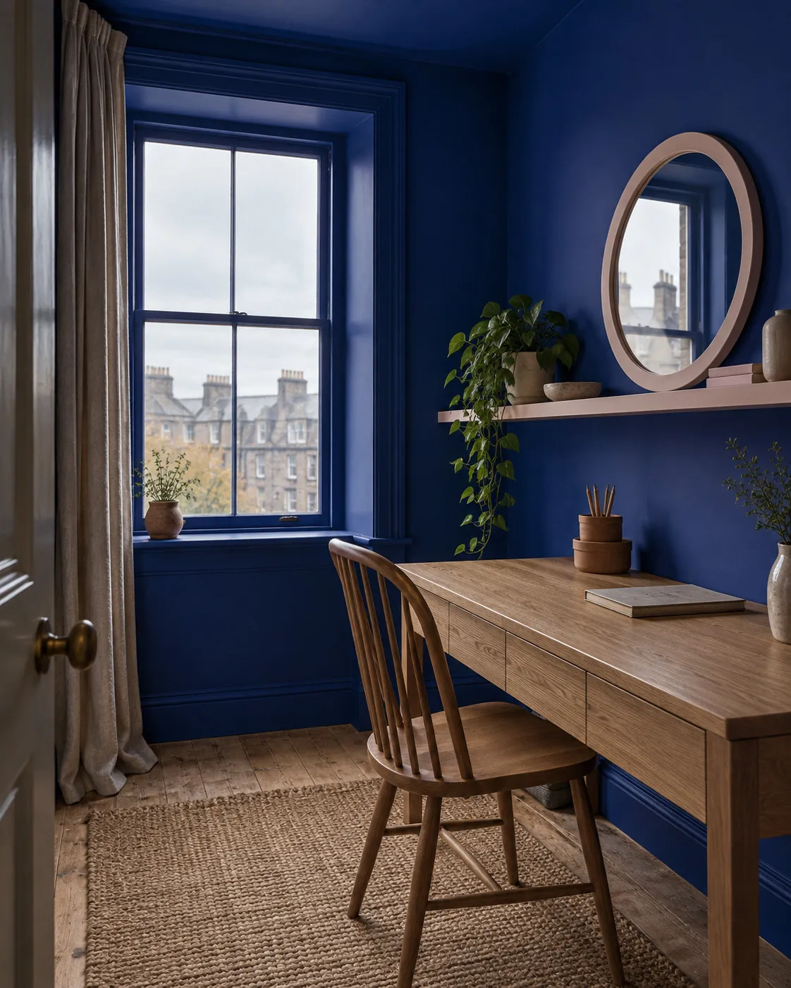
Rich jewel tones like sapphire blue, teal, emerald green and deep ruby red create a striking contrast with terracotta; their depth complements its warmth, adding sophistication and drama, a striking scheme for a bold room that's welcoming, inviting and stylish. Vibrant blues pair particularly well, a winning combo as opposites on the colour wheel, think sun-baked earth against a bright blue sky, a stunning complementary combination, while richer, deeper blues like teal or royal blue make a dramatic impact.
Nature-inspired greens
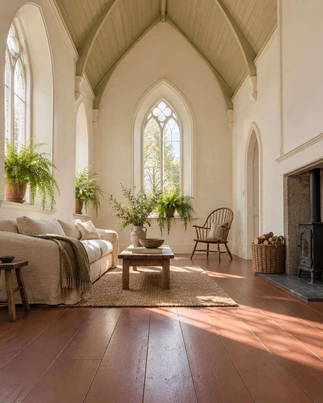
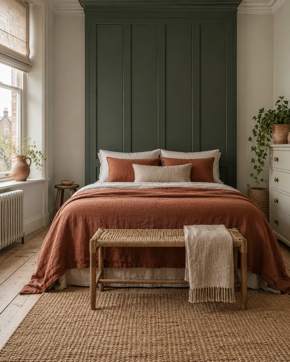
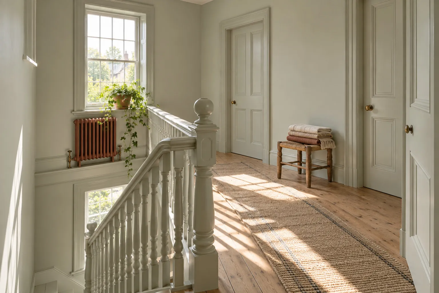
Earthy tones like olive, forest and sage green resonate beautifully with terracotta, the natural pairing enhancing the organic feel of a space; reminiscent of nature, earthy green and terracotta create a serene, tranquil environment, an ideal scheme for living rooms and bedrooms.
Soft pastels
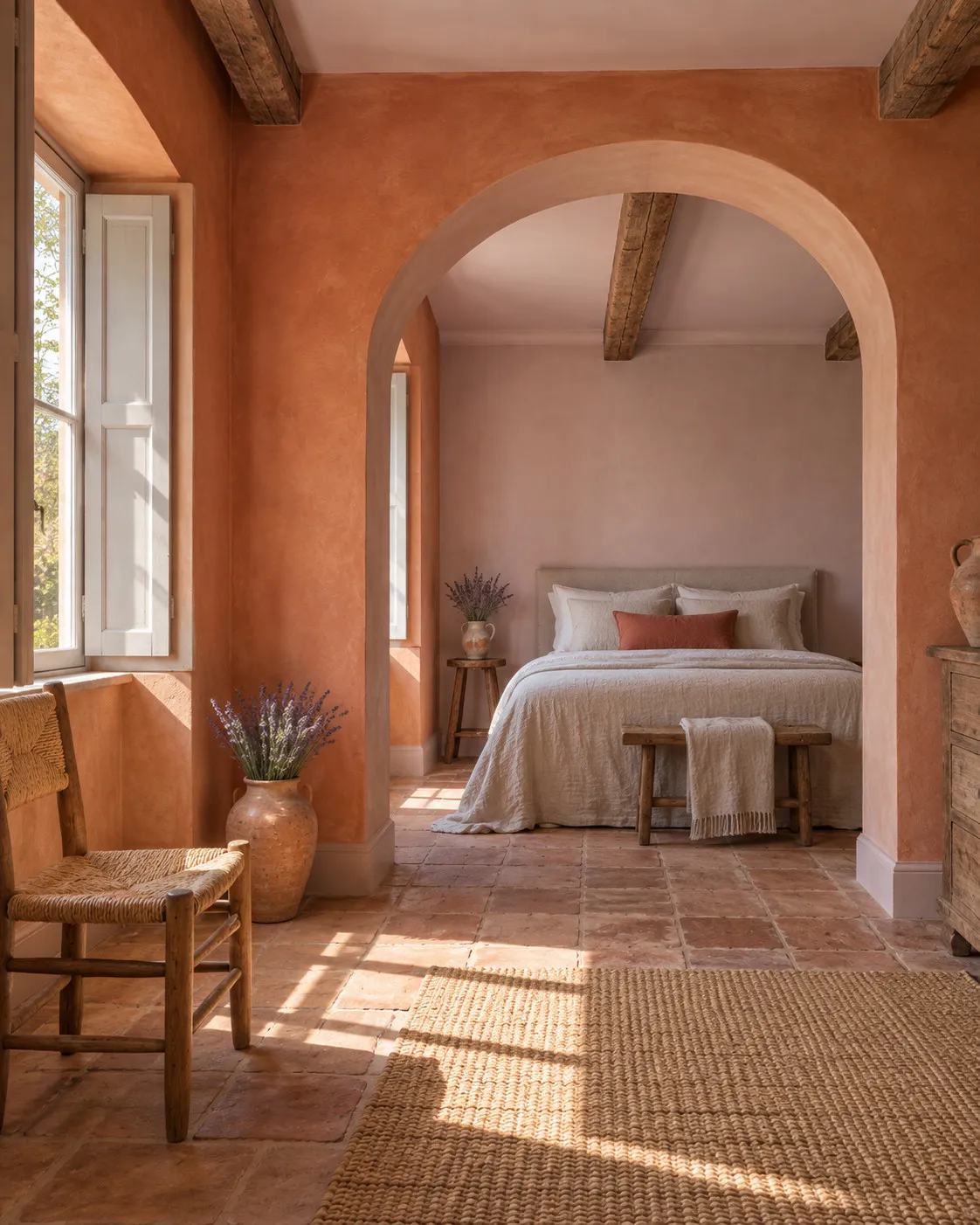
For a more subdued, delicate aesthetic, pastels like blush pink, baby blue or soft lavender complement terracotta beautifully, adding freshness to its warm tones and keeping smaller spaces from feeling too dark and enveloping. Pink and terracotta sit next to each other on the colour wheel, so they're comfortable together; terracotta can have coral undertones or lean pinky-brown, and this combination feels fresh and interesting yet gentle and reassuring, a great choice for any living space.
Contrasting deeper shades
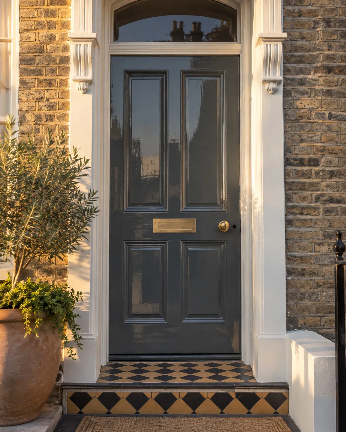
At the other extreme, deep, dark contrasting shades also sit easily with terracotta; deep charcoal grey, navy blue or even black create a stunning juxtaposition for a sleek, contemporary look. Navy kitchen cabinets are hugely popular right now, pairing nicely not only with glossy marble or pale wooden flooring but also with terracotta floor tiles, and adding gold or silver hardware brings light-reflecting glamour and sheen. Thanks to its warmer undertones, terracotta works with deeper browns too, so build a scheme with a couple of shades like terracotta and sienna that won't compete or merge into each other.
Introducing Mylands terracotta paints
Terracotta is versatile and inviting, pairing beautifully with light and dark shades for different moods and styles, so whether you prefer the calm of neutrals, the boldness of jewel tones or the softness of pastels, there's a perfect palette built around warm terracotta.
New this season, Mylands Crayfish Party is one of the beautiful colours in our Beata Heuman collection, a soft terracotta with pink undertones that enrich the colour, while Mylands Blomster JB.01 is a rich mineral terracotta red designed by Jinny Blom, born of her strong memory of living in Denmark, a strong, warming, natural tone.
All our paints contain natural earth pigments, making them sumptuously deep and colour-rich as well as eco-friendly, and they come in a range of finishes including our signature Marble Matt Emulsion and Plant-Based Multi-Surface Eggshell. If you're tempted to explore a terracotta scheme, order a sample pot or our colour wheel to find your ideal pairing.





