Inspirational ideas
Ideas & inspiration: the Archive collection
A hundred and forty years of making leaves traces: the Archive collection gathers shades recovered from our ledgers — colours of old commissions, vanished theatres and restored houses.
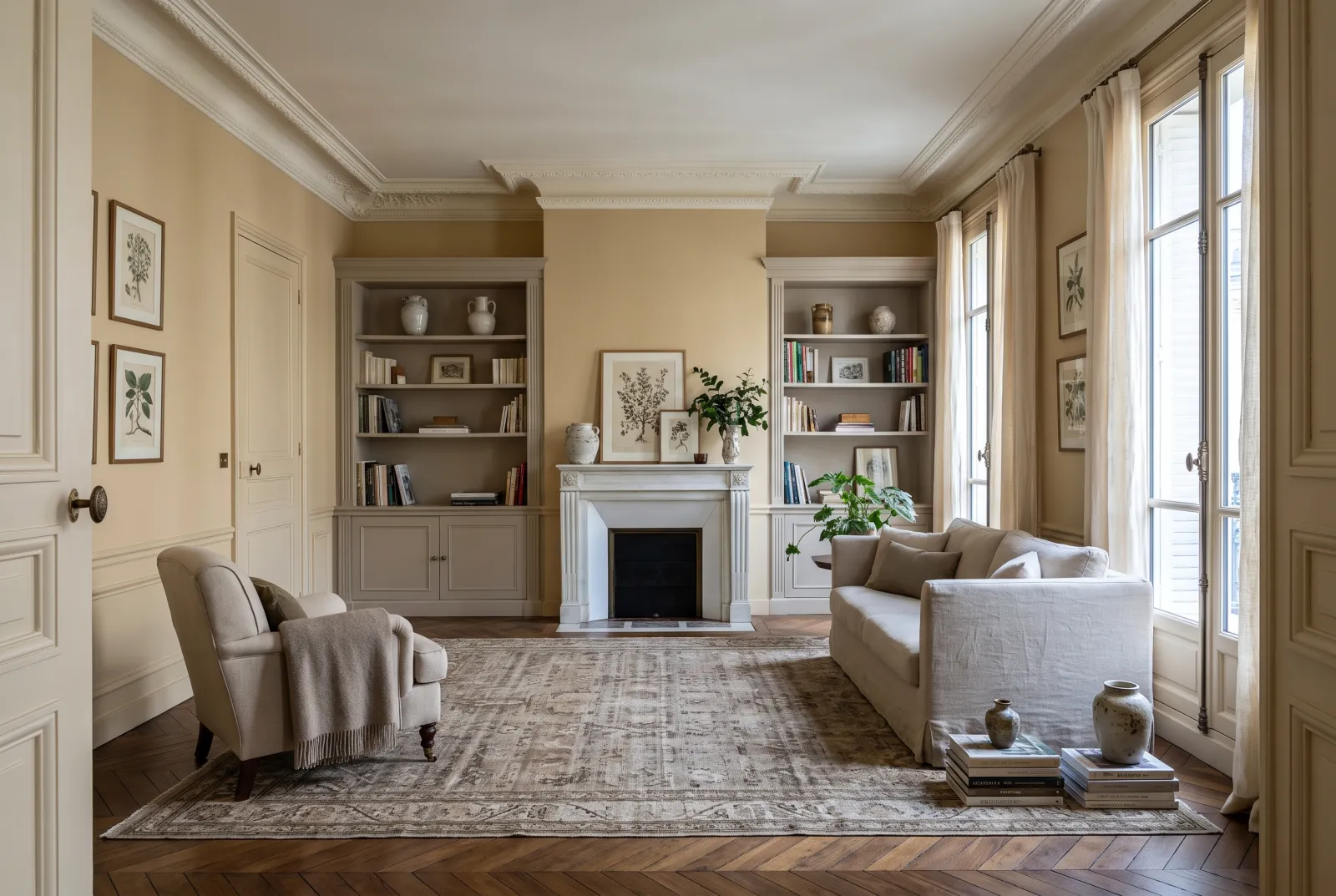
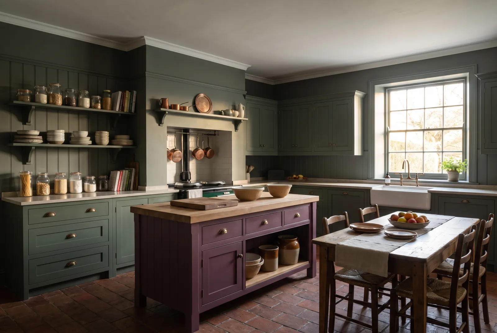
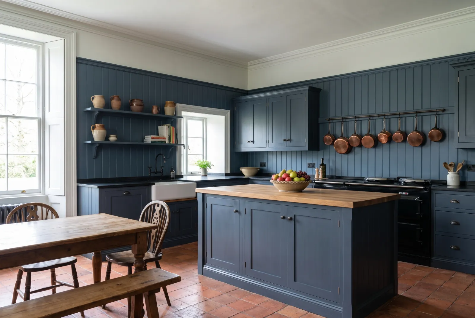
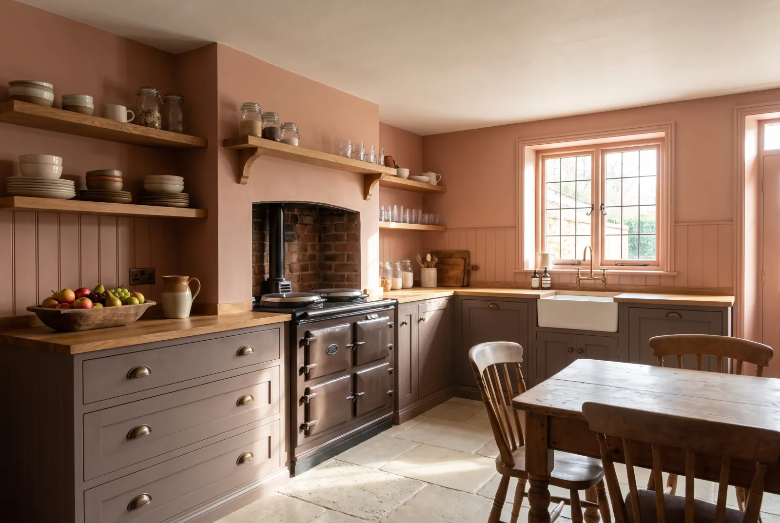
Here are our schemes composed from these archive colours, brought up to date without losing an ounce of their depth.
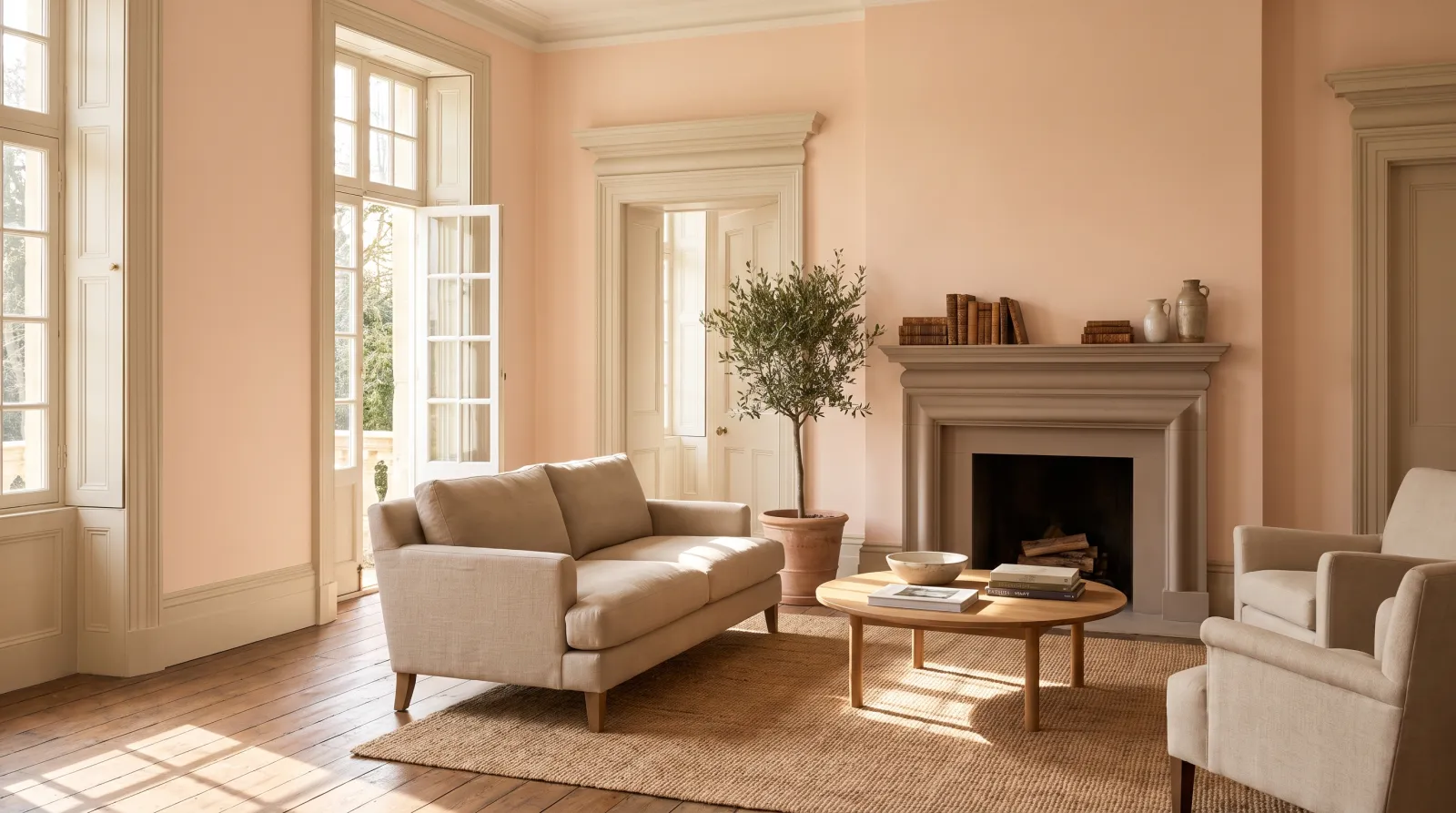
“Some colours have already lived several lives: these are ready to start yours.”
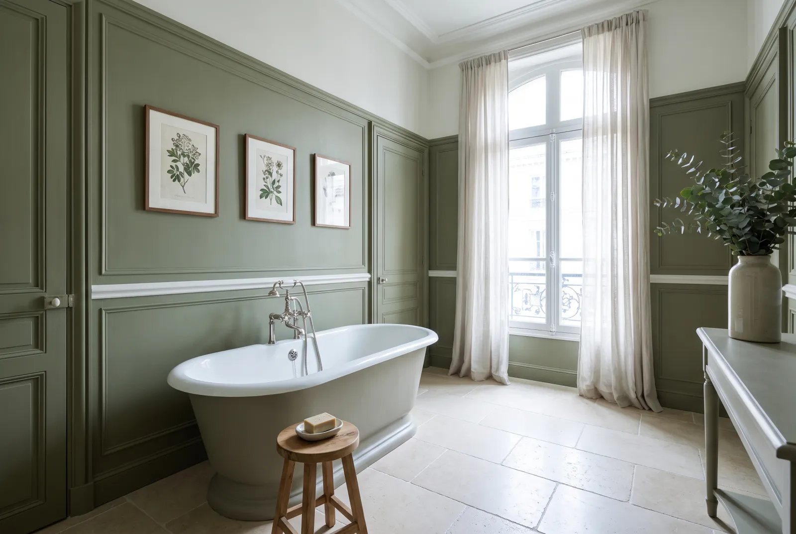
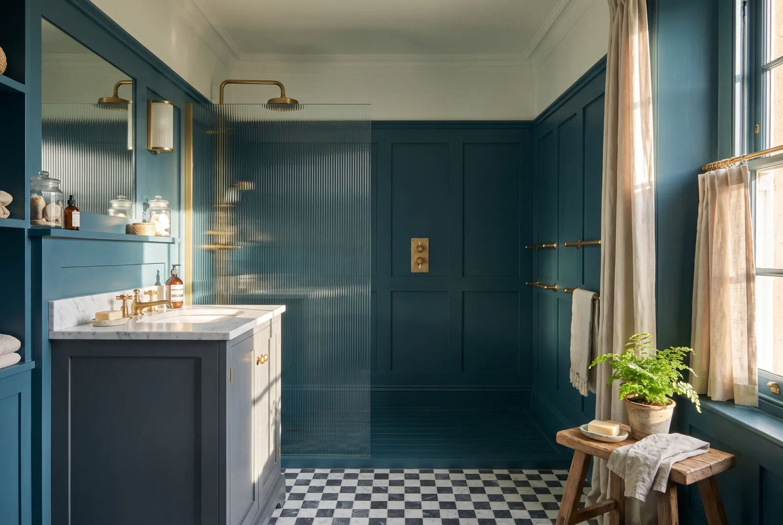
The colours of the Archive collection
The Archive collection gathers shades recovered from our ledgers: colours formulated for old commissions, for theatres and restored houses, and put back into production exactly as they were. They carry a saturation and a depth nobody really composes any more — which is precisely what makes them interesting in a contemporary interior.
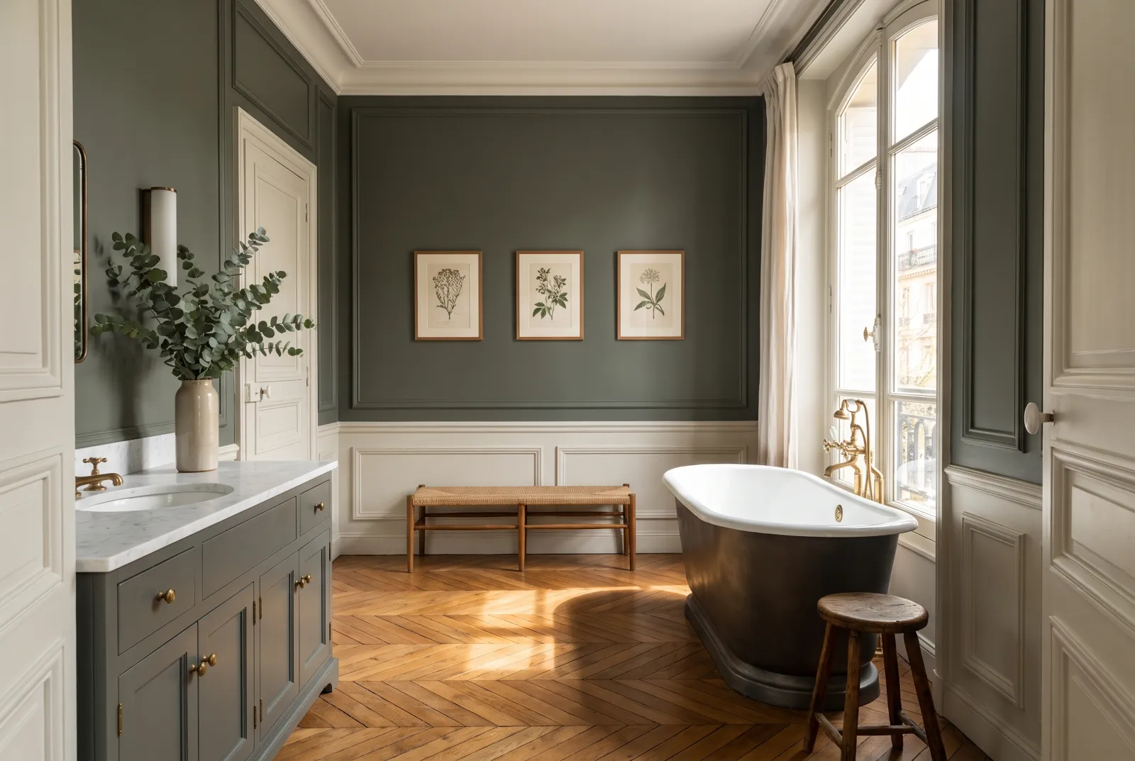
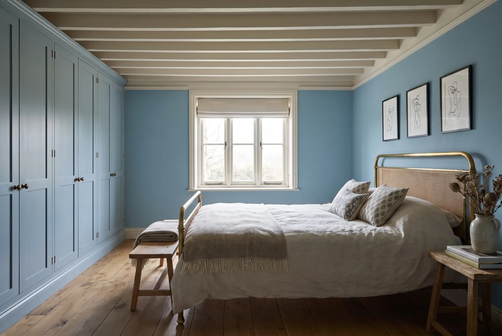
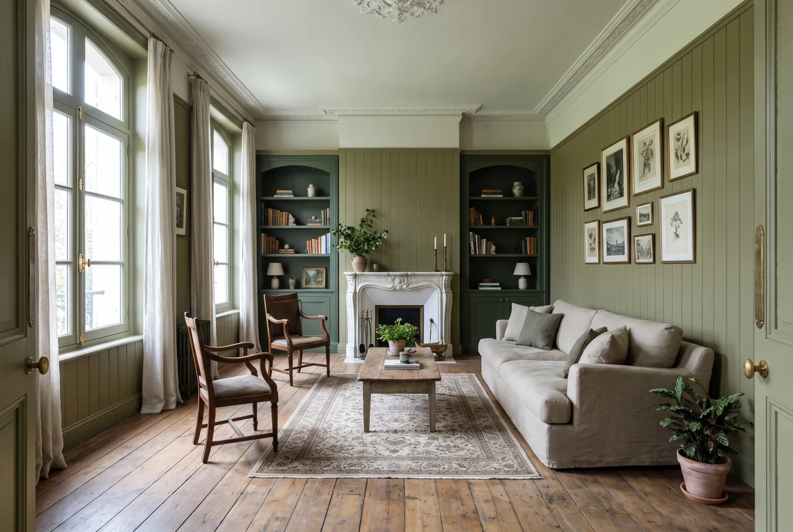
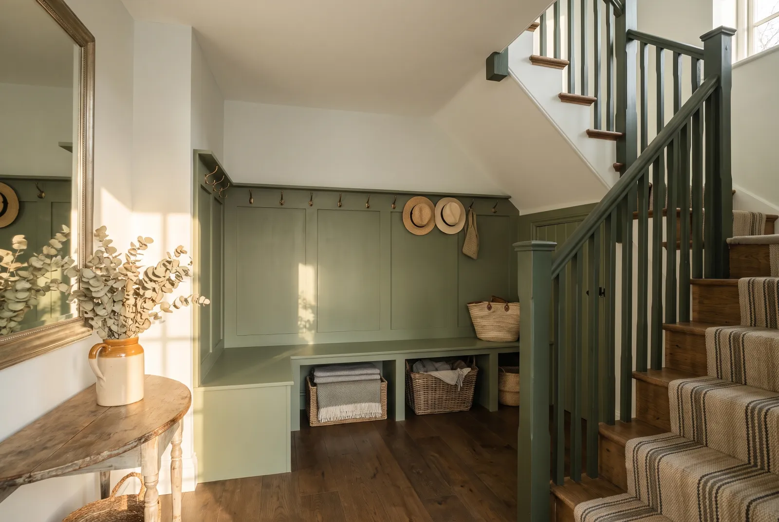
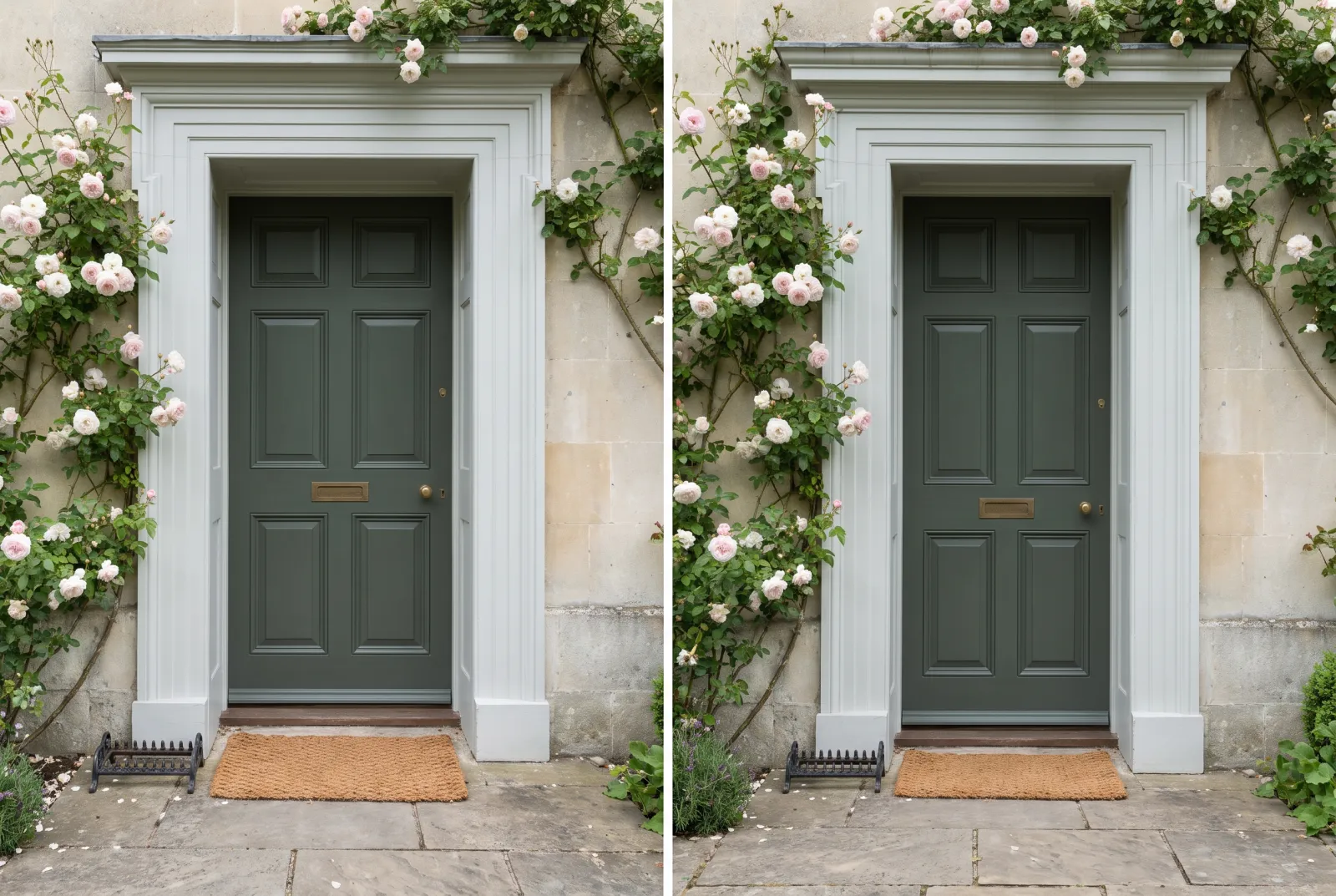
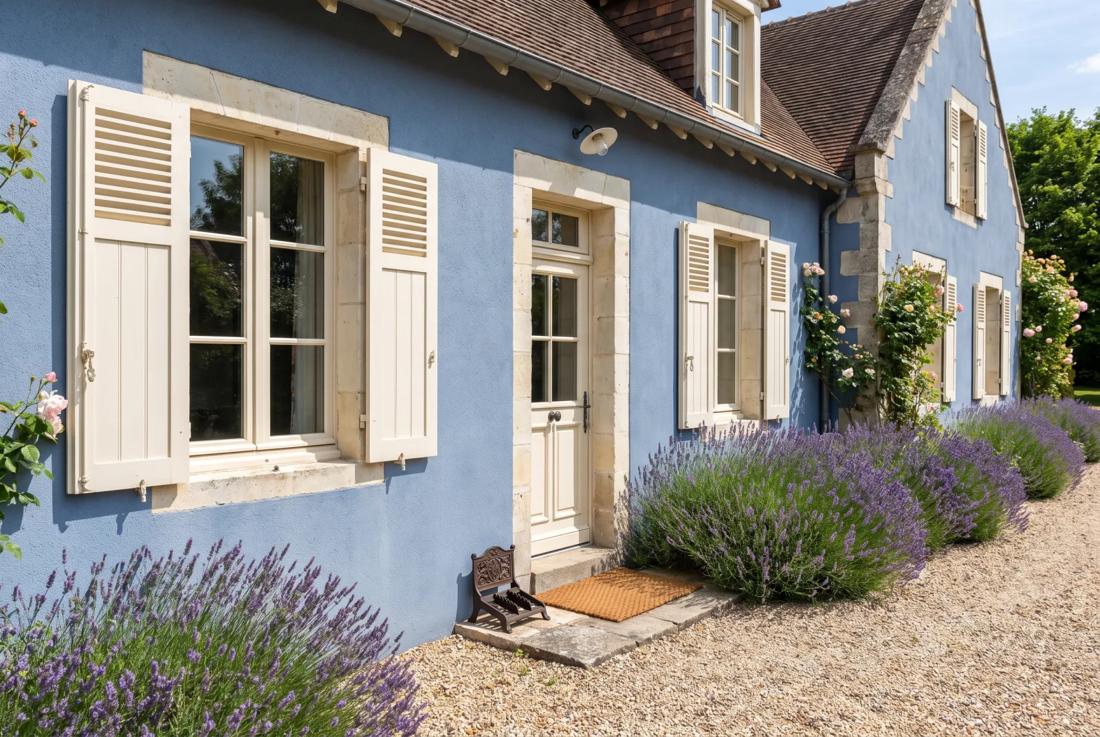
The archive blues and greens are the most used in our schemes: Proper Blue No.67, the deep blue of our kitchen cabinetry and bathrooms; Enamel Blue No.78, more enamelled; Sorrel Green No.207, the classic sage green; and Pleasure Gardens Green No.214, brighter.
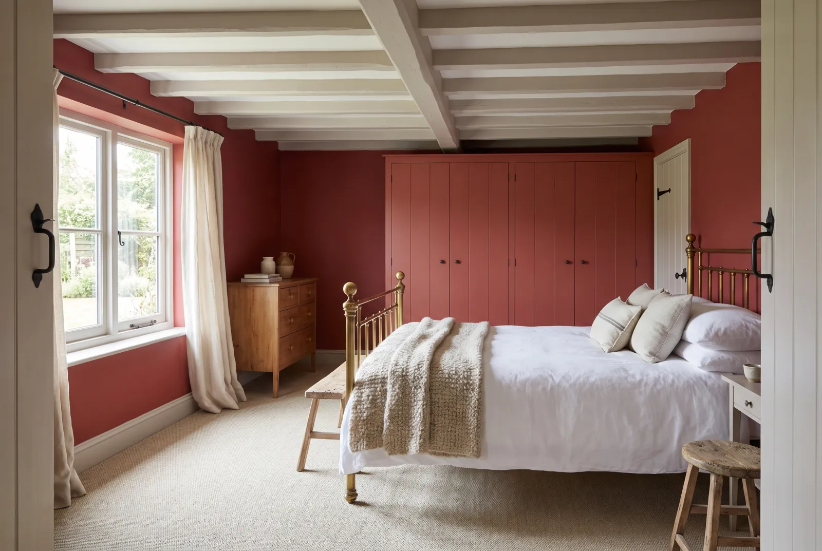
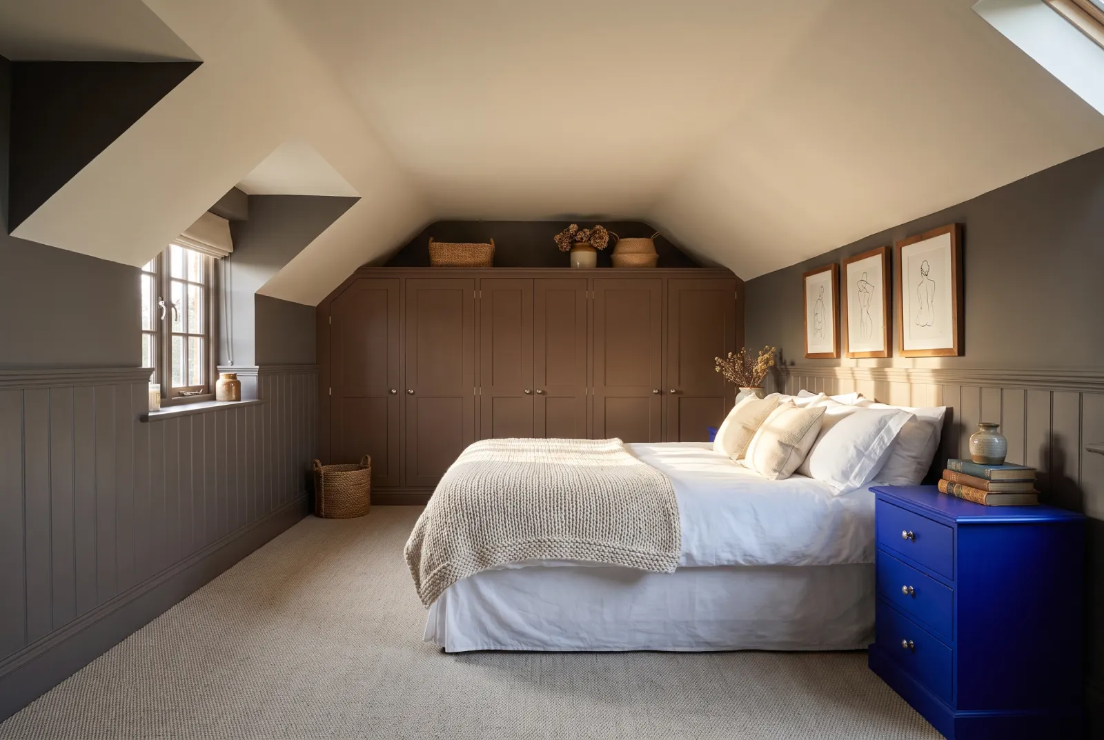
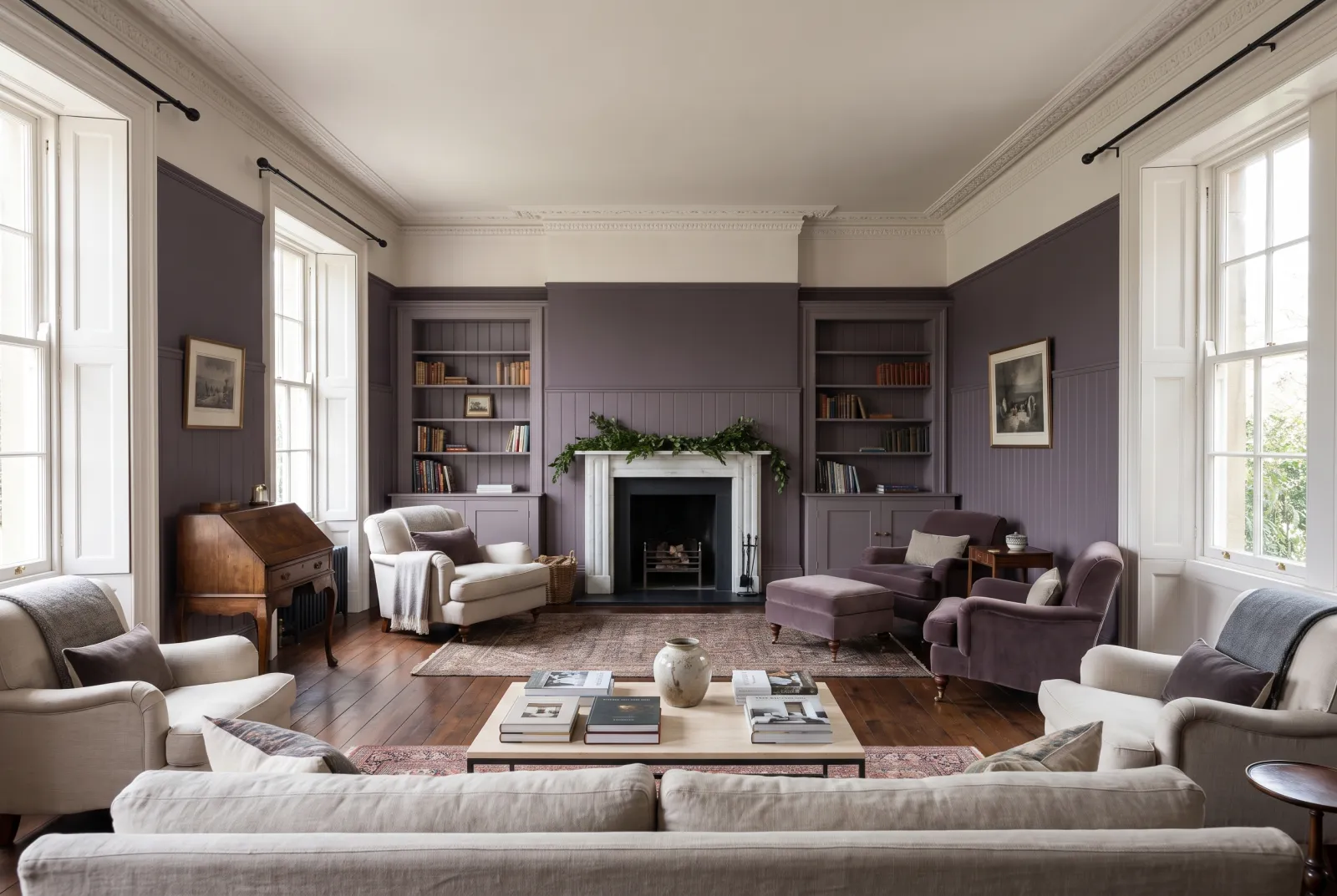
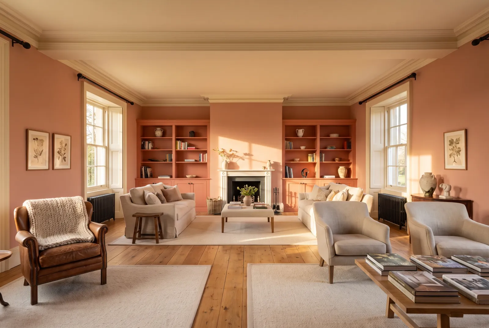
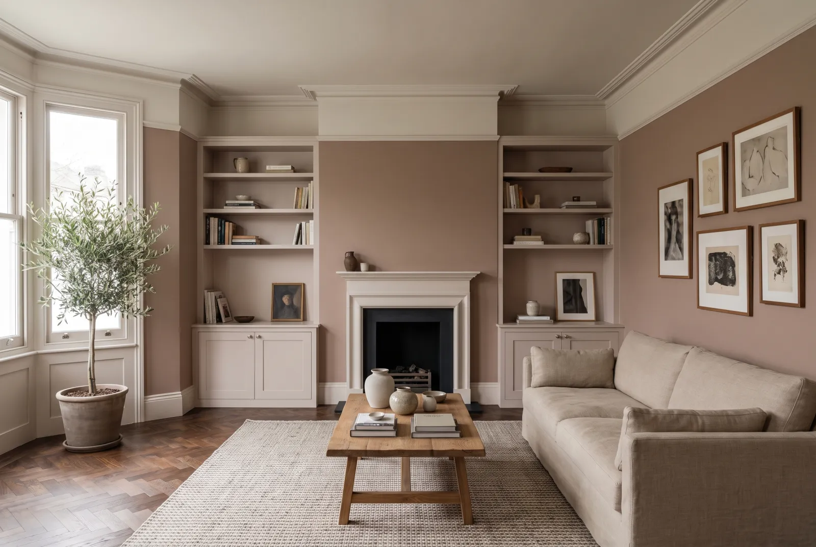
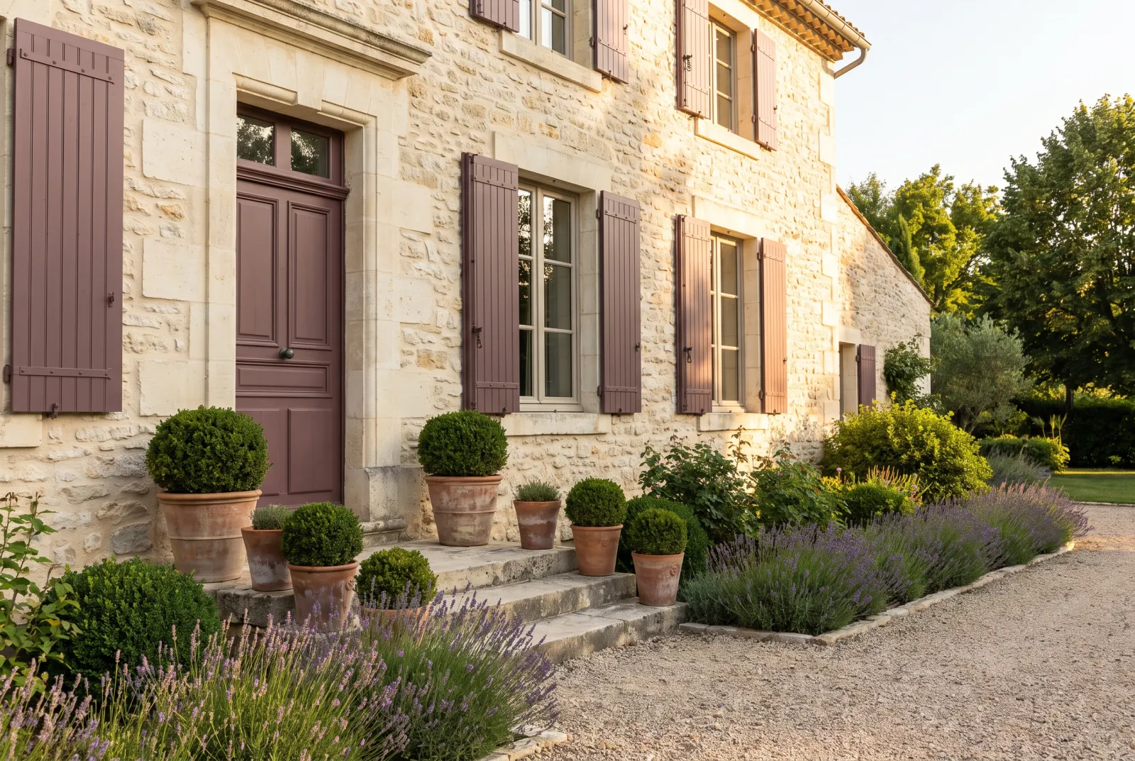
On the warm and muted side, Red Post Hill No.68 and Coral Orange No.277 give period reds and corals, Peach Flesh Pink No.268 a very soft peach, Rose Taupe No.292 and Egerton Place No.297 deep taupes, and Empire Violet No.80 an uncommon greyed violet. Beehive Place No.140 and Gentleman's Pink No.221 round the set out in ochre and faded pink.
See also our blue paint ideas, green paint ideas and Colours of London collection ideas, or browse the whole Archive collection.
Our schemes
18 schemes