Inspirational ideas
Decorating ideas & inspiration in pink
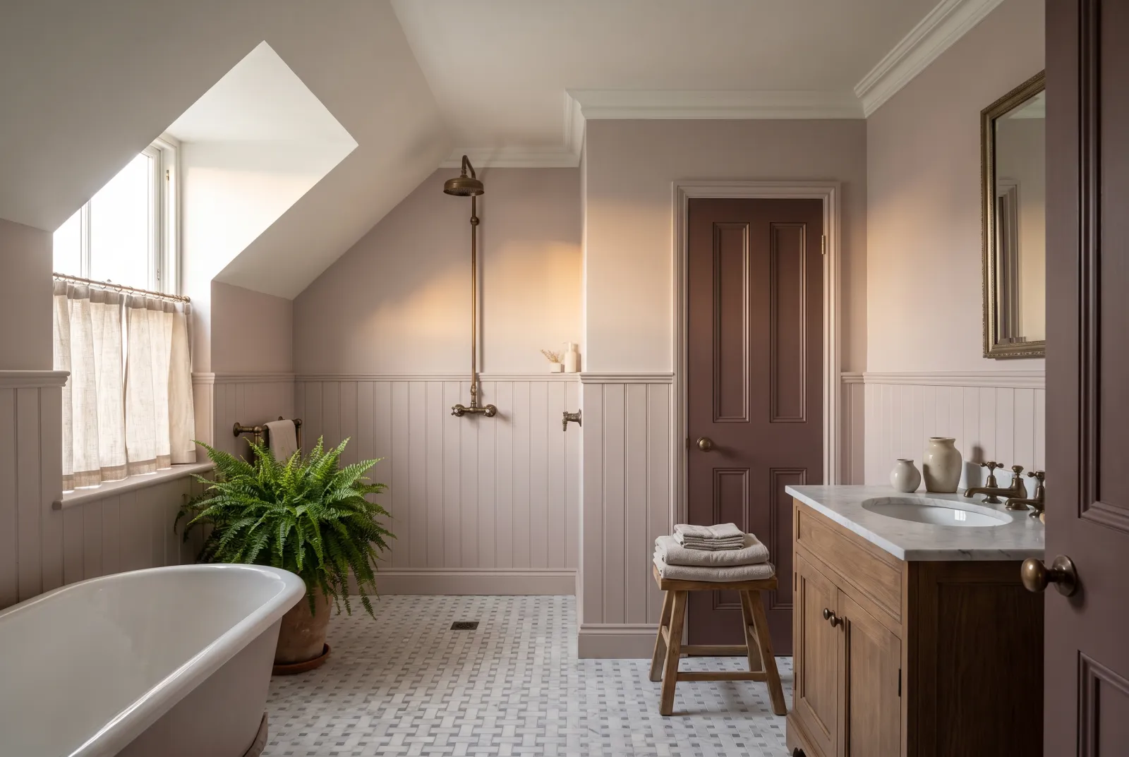
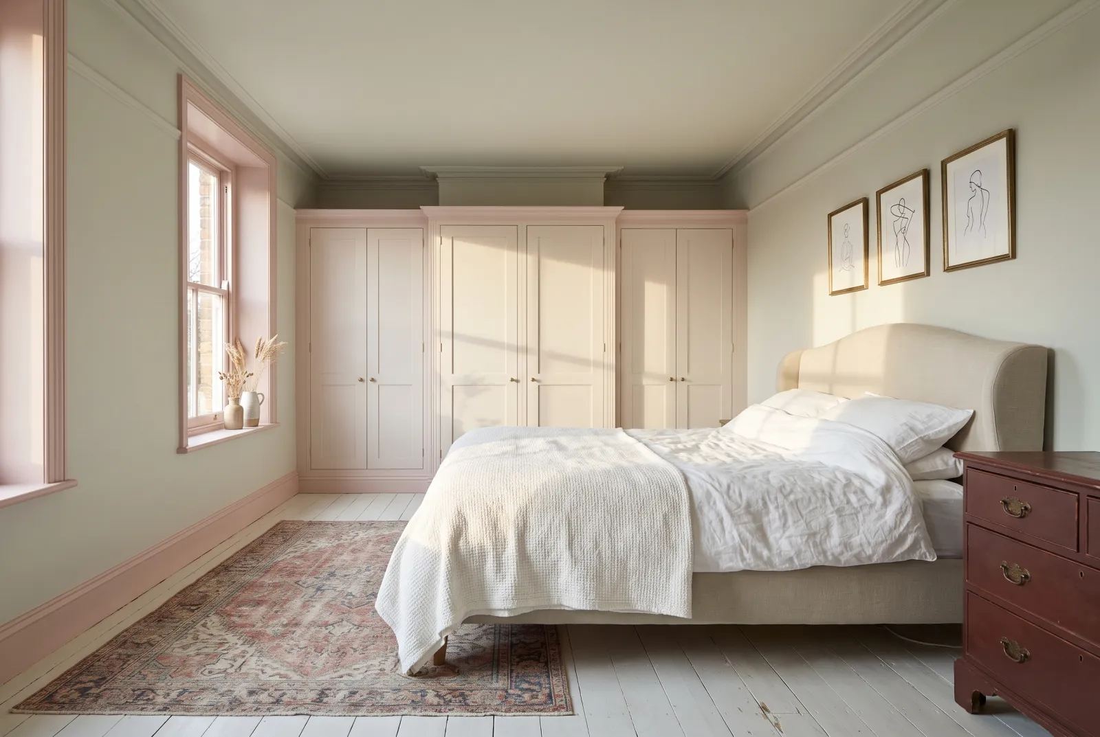
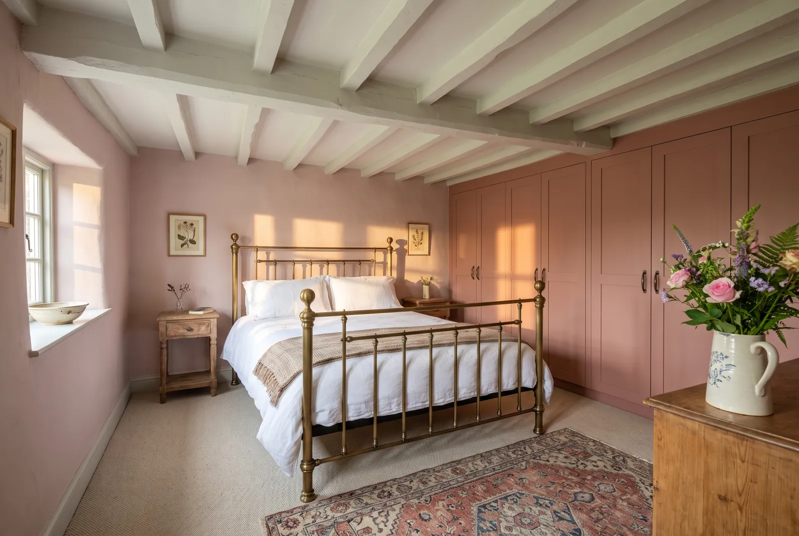
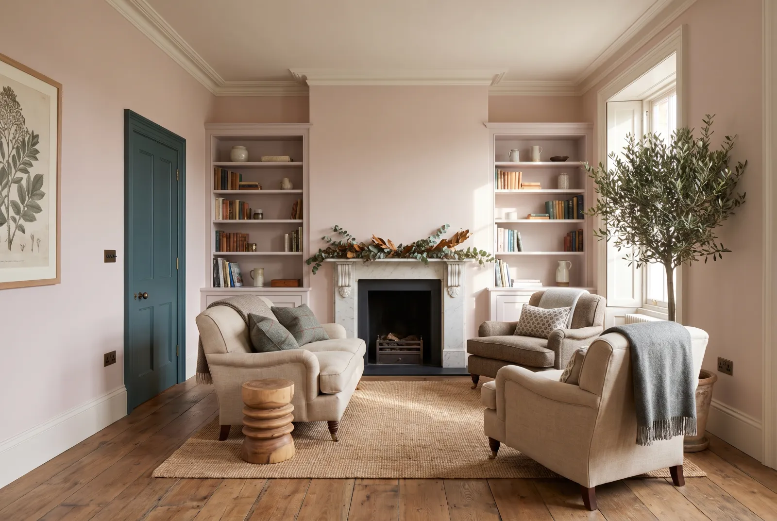
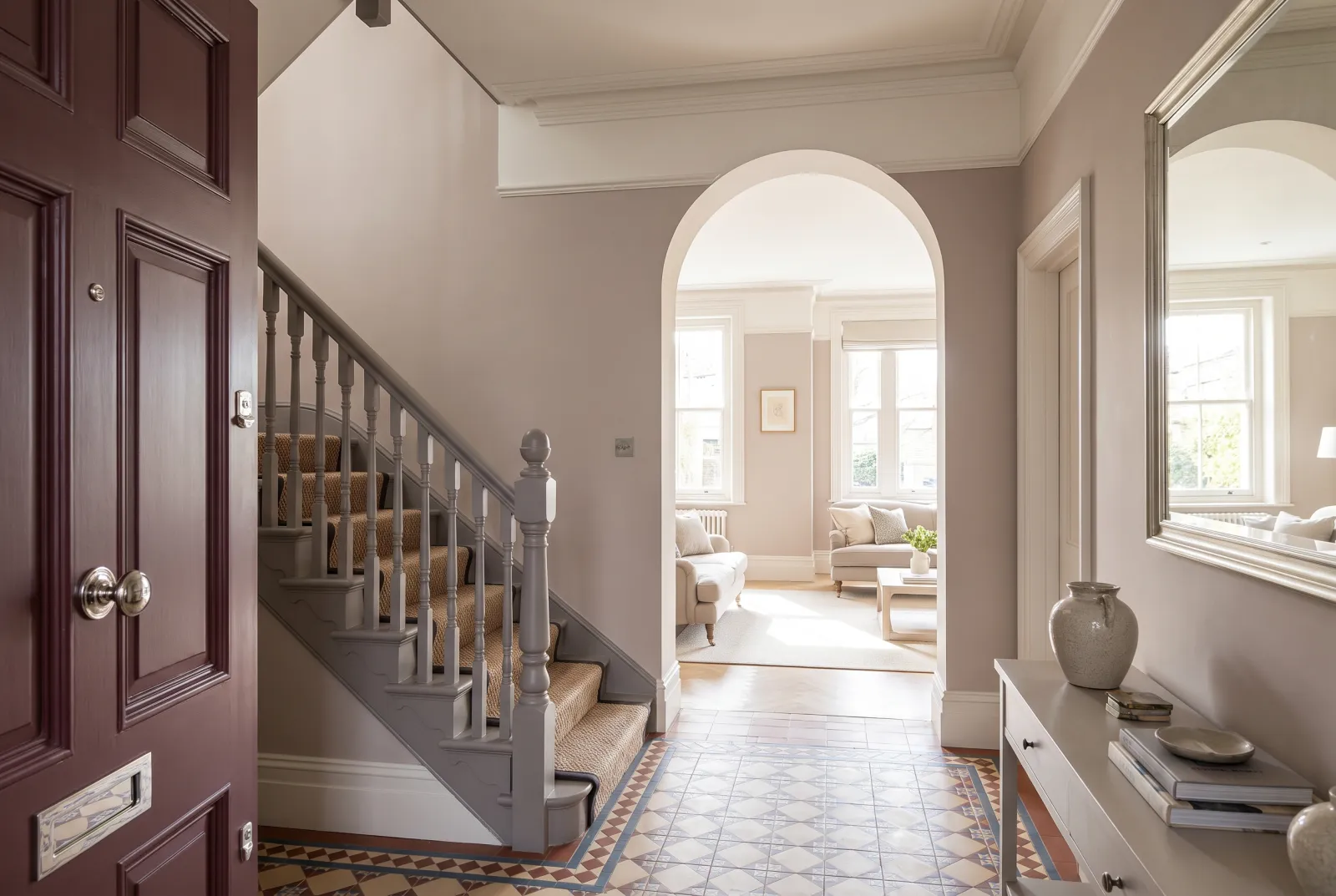
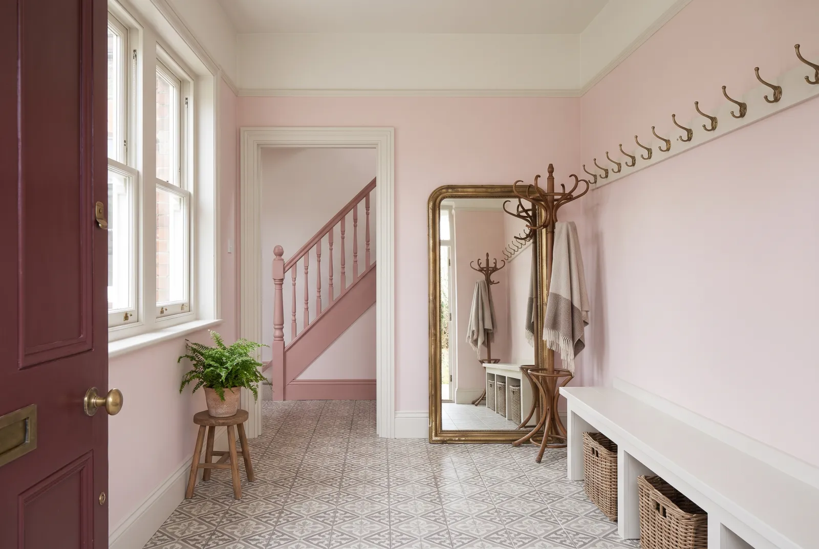
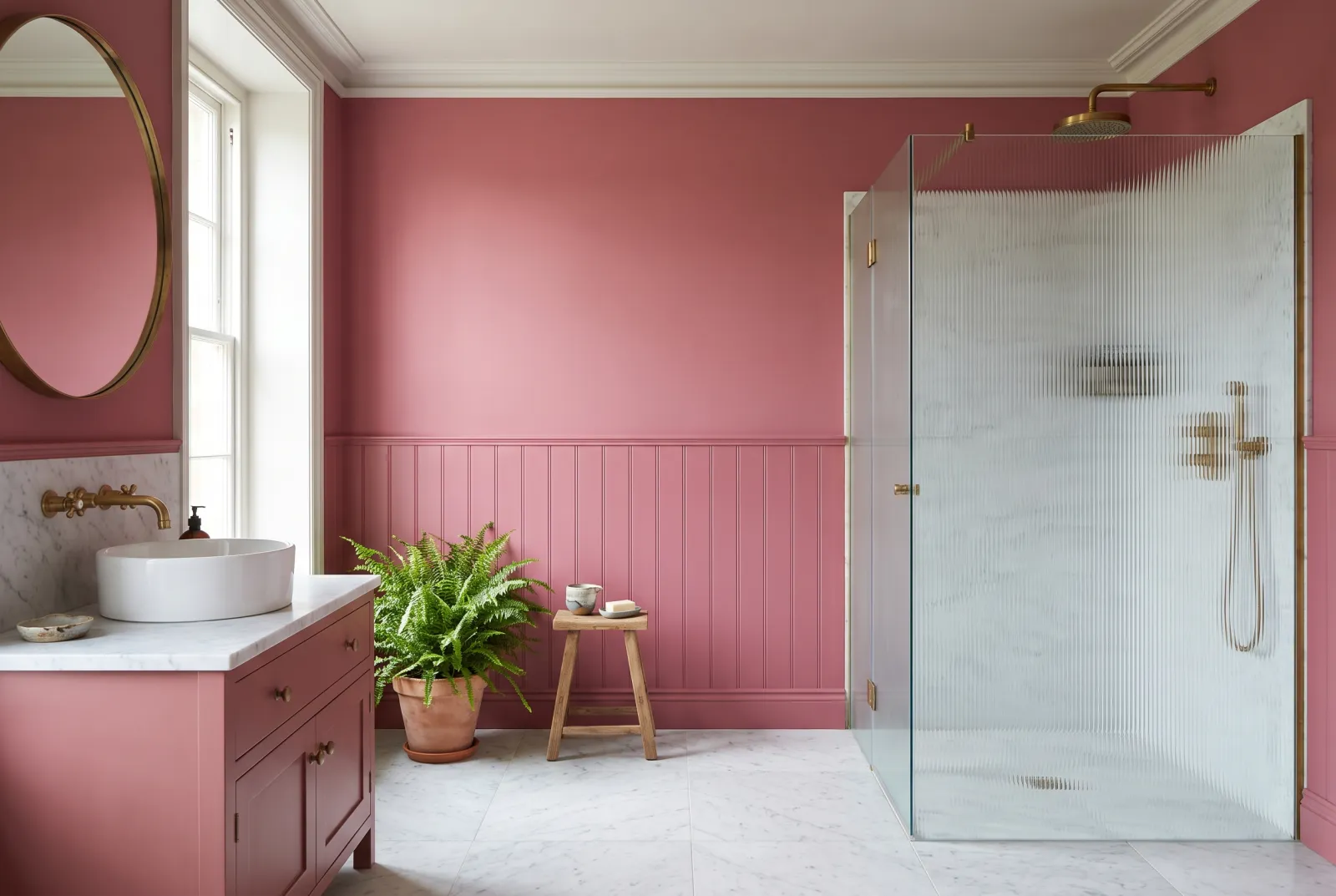
Far from sugary pinks, ours are powdery, earthy, almost neutral: shades of old plaster that flatter every light — and everyone standing in it.
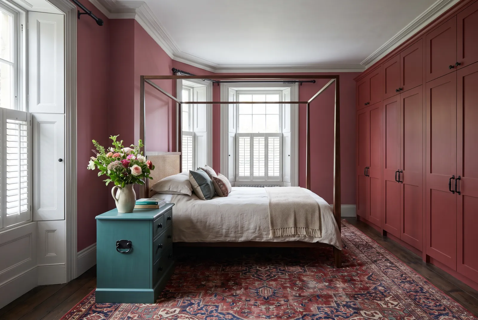
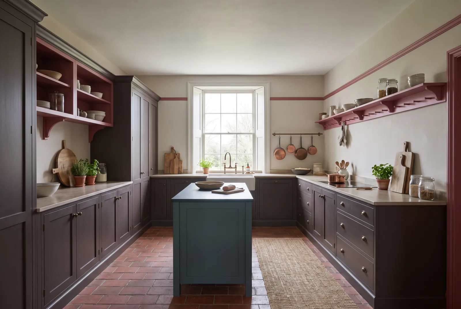
Our pink schemes pair it with the deep greens, warm browns and broken whites that make it grown-up.
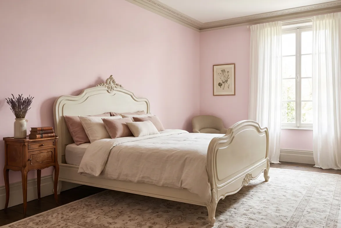
“The right pink is the one you mistake at first for a neutral.”
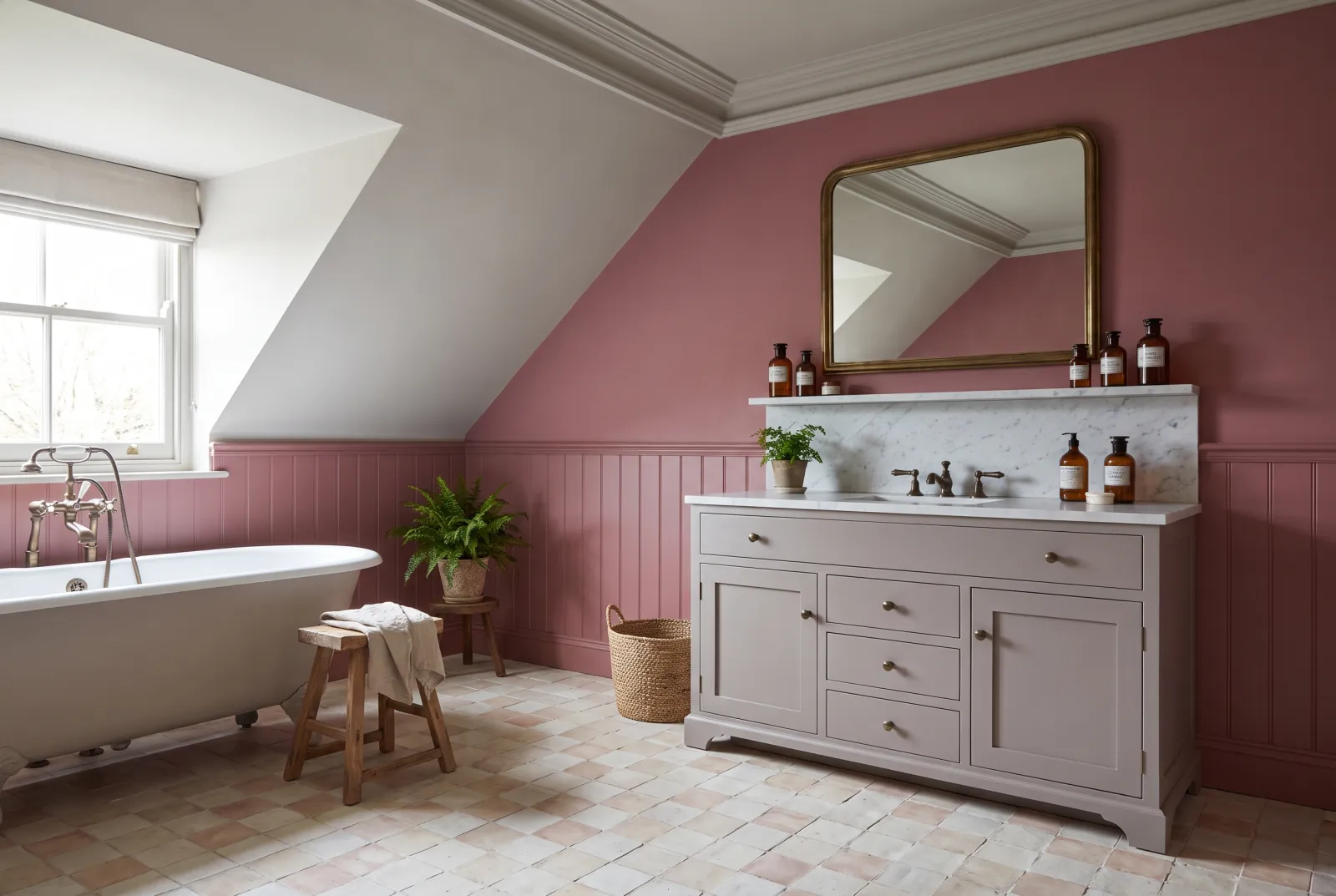
Choosing a pink: from powdery to magenta
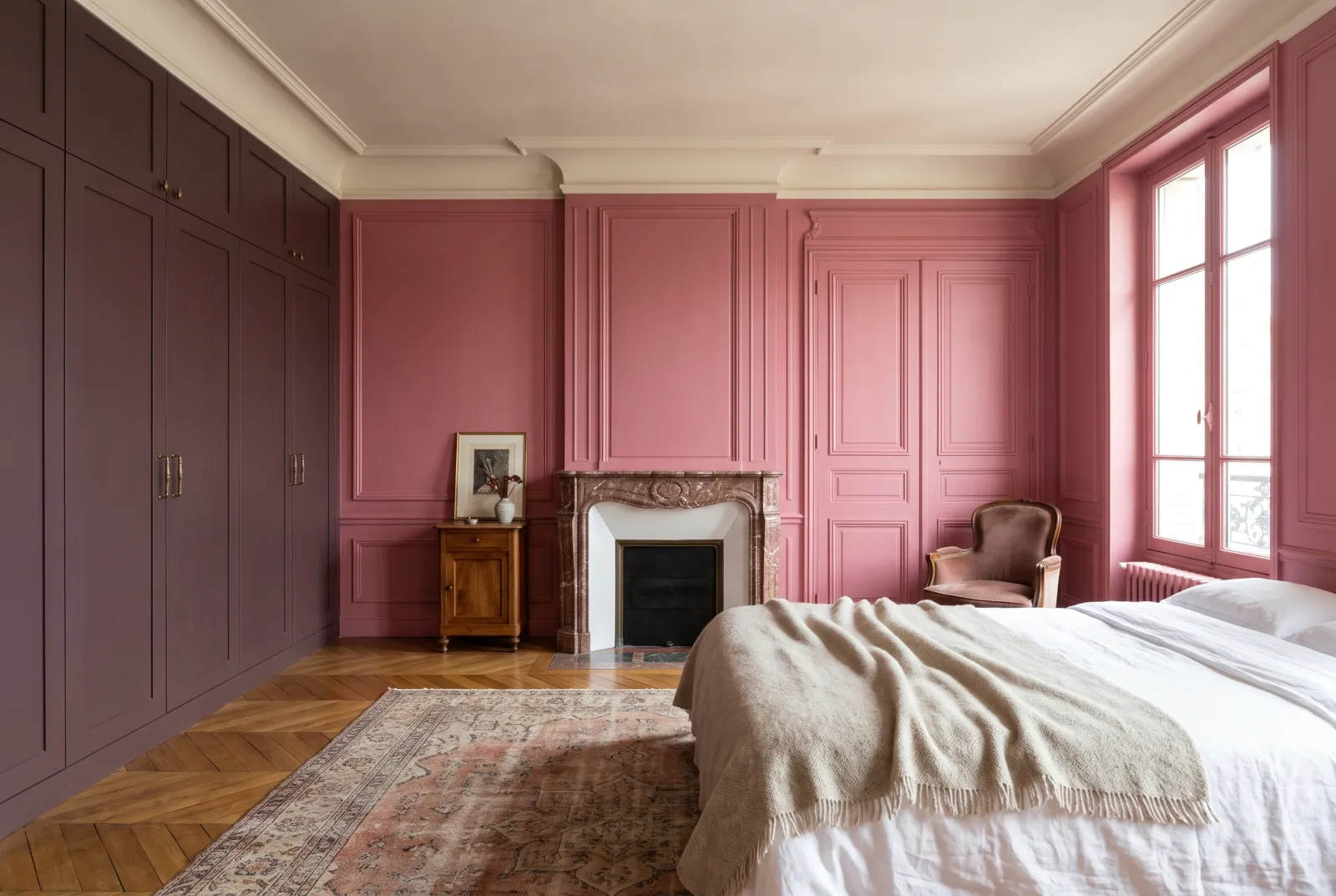
Pink is probably the most misunderstood colour on the card. Very pale pinks don’t read as “pink” on a wall: they read as warm light — the kind that flatters complexions and makes a room welcoming at any hour. Saturated pinks do exactly the opposite: they declare themselves, and you have to want them.
Among the soft pinks, Floris No.27 is our quietest, almost a pink-cast off-white: ideal in a bedroom or a north-facing room, where it compensates for the cold light. Pale Lilac No.246 slips towards grey lilac, very right on woodwork and in bathrooms.
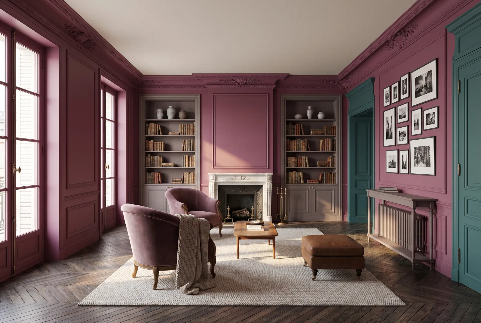
For a pink that commits, Shocking Pink FTT-006 and Magenta FTT-007 come from our film and theatre collection: intense, well held, spectacular on a door, panelling, a bedhead or the inside of a wardrobe. Ground them against a warm grey such as Saint Johns No.64 or a pale stone like Limestone No.55.
See also our red paint ideas, bedroom ideas and bathroom ideas, or browse all our pink paints.
Our schemes
12 schemes