


The journal
Dining Room Colour Ideas for Memorable Gatherings
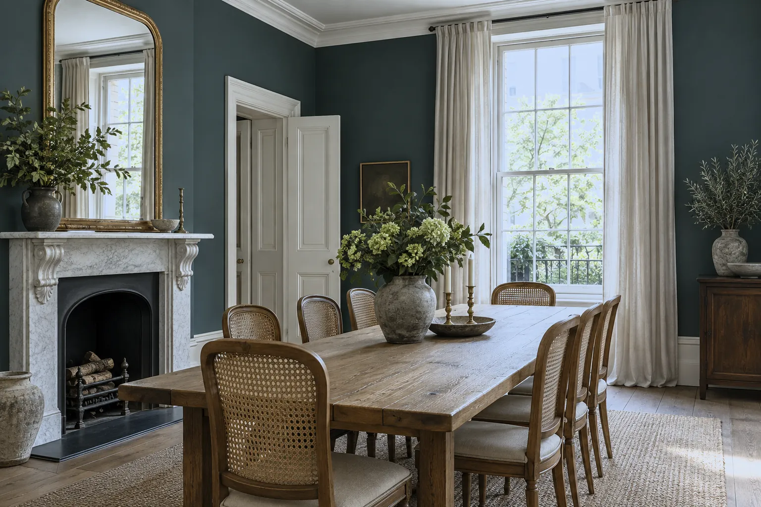
The dining room is made for coming together. The right colour turns a simple meal into an occasion. Here's how to choose shades that welcome, warm and impress.
Of all the rooms in the home, the dining room is perhaps the one that most rewards a bold hand with colour. Because it's often used in the evening and for gathering rather than everyday living, it can carry a deeper, more atmospheric palette than you'd choose elsewhere. Rich reds are the traditional choice for good reason: warm and enveloping, a shade like Huguenot™ No.49 or Arts Club™ No.281 draws people closer and glows beautifully by candlelight. Deep greens bring a sophisticated, heritage feel, Brompton Road™ No.205 or Pleasure Gardens Green™ No.214 pair wonderfully with dark wood and brass. For real drama, a deep blue such as Bond Street™ No.219, taken across walls and ceiling, wraps the room in an intimate, members'-club mood. If your dining space is open to a kitchen or living area, you might prefer a warm neutral that flows, a stone like Cadogan Stone™ No.59 or a soft ochre such as Onslow™ No.48 keeps things cohesive while still feeling considered. Whatever base you choose, dining rooms love a touch of metallic; gold accents, a gilded mirror or FTT-001™ Rich Gold on a ceiling rose add grandeur and catch the light as evening falls. Layer in candles, warm bulbs on a dimmer, and tactile textiles to complete the scene. Because you'll mostly enjoy the room after dark, always test your colour under your actual evening lighting, a shade that reads flat by day can come alive by candlelight.





