


The journal
How to Choose White Paint
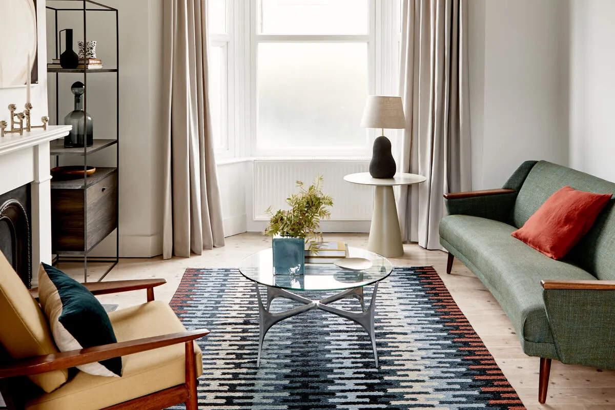
White has many personalities. It can be tranquil, dramatic, fresh, modern, bright, minimalist or maximalist, traditional, shabby chic and more. There are countless shades and nuances, each read differently depending on the setting.
White has many personalities. It can be tranquil, dramatic, fresh, modern, bright, minimalist or maximalist, traditional, shabby chic and more. There are countless shades and nuances, each read differently depending on the setting.
White paint has a special power to transform a space: a fresh coat is the easiest way to reinvigorate a room, while a crisp white makes the perfect backdrop for a pared-back, elegant look. With so many whites and possibilities, picking the right one can be hard, but it's worth taking time to choose the shade that delivers the effect you want. The single most important factor when choosing white for any setting or surface is the amount of natural light.
For a modern all-white scheme, it's important to find shades that work together, whether complementing or balancing one another. You might use different tones of white, starting with a bright, clean white on the ceiling to lift the height and a stronger shade to pick out architectural features. Varying the finish of the same paint can add dimension too, for instance eggshell on walls and gloss on woodwork.
North-facing rooms
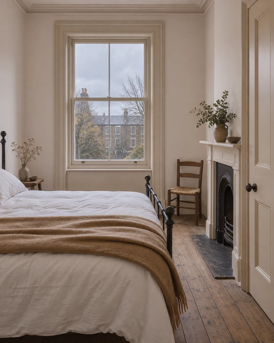
Lighting should be your key consideration for north-facing rooms. Because they get less natural light, choose a warm white that compensates for or balances the cool light. Artificial light can also change how the colour reads.
Dominic Myland, CEO of Mylands, advises avoiding cooler whites with green or blue undertones in north-facing or poorly lit rooms, as they can feel colder or even dull and colourless. Instead, pick warm tones such as an off-white with yellow undertones like Sloane Square™ No.92, St Martins No.37 or Lots Road No.24. On their own they can look slightly yellow, but paired with accent colours they become a warmer white with an organic, natural feel.
For a fresh yet warm off-white, the versatile pinky-white Holbein Chamber No.7 is a great choice, its warm undertones lending a subtle, friendly blush. Another lovely warm white is Honest John™ No.58.
South-facing rooms
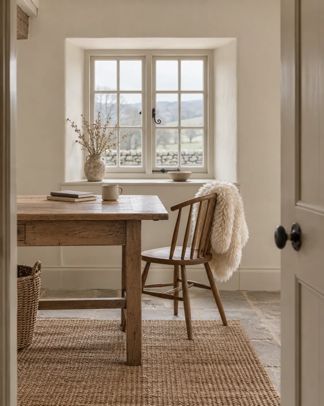
In a south-facing room or one that gets plenty of daylight, you can be a little bolder with your white. Because the natural light is warm, generally avoid a warm white, which won't counterbalance the yellowish cast of daylight and may even look brownish. Instead choose cooler colours with grey and blue undertones, which look gorgeous and give you more freedom with décor. For a subtle off-white scheme, Maugham White No.2 is a fresh cool white with a blue-grey undertone for a beautifully clean look, while Greenwich Time No.8 has a hint of pale blue for a bright, airy, calming feel.
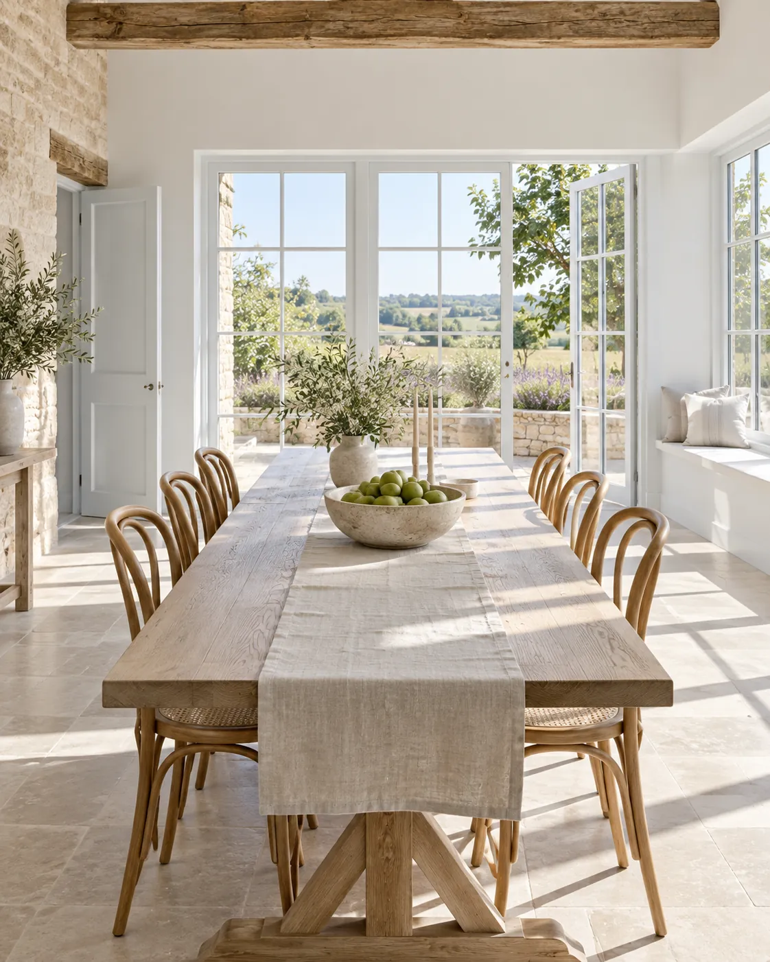
An all-rounder white
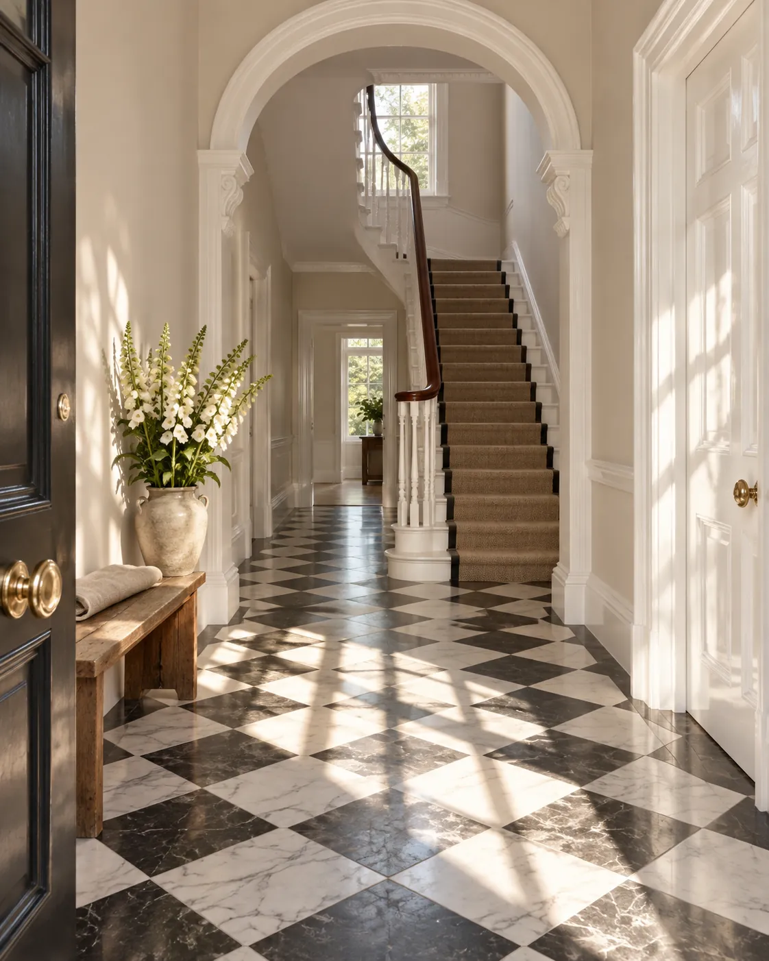
For an elegant neutral, consider Elgin™ No.20, which comes from the Mylands archive and takes its inspiration from the Elgin Marbles. With grey, blue and green undertones, this naturally pigmented paint is a true chameleon, its tones reading pink or green depending on the light and the rest of your scheme.
Maugham White No.2 is versatile enough for any room, from living and dining rooms to bedrooms, bathrooms and kitchens. For a subtle look, choose a light, yellowed off-white such as Holland Park No.5. This soft, warm-toned white is highly adaptable, bringing a clean, sunny warmth to any surface, and it's equally perfect for a sophisticated white kitchen or a timeless bathroom.
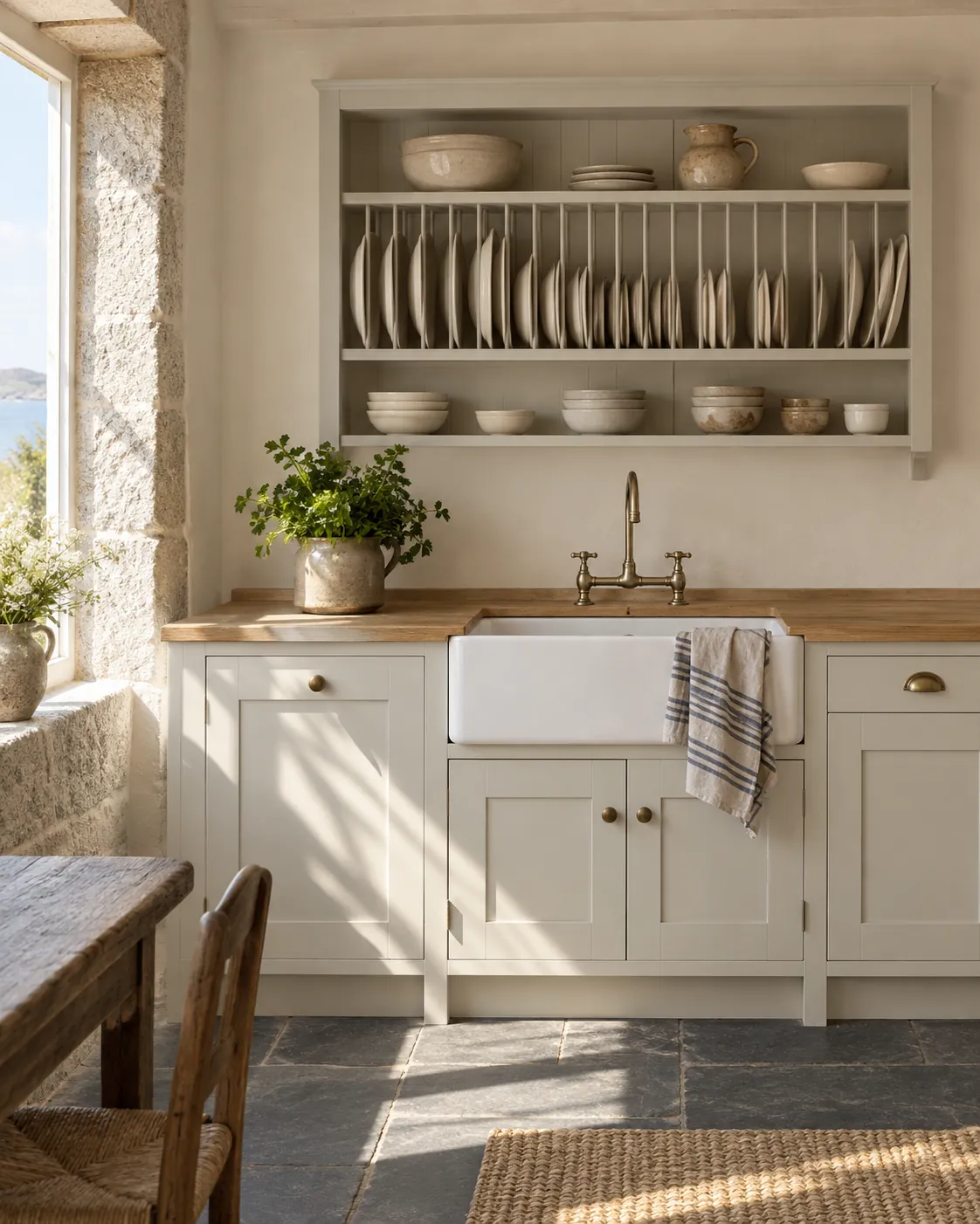
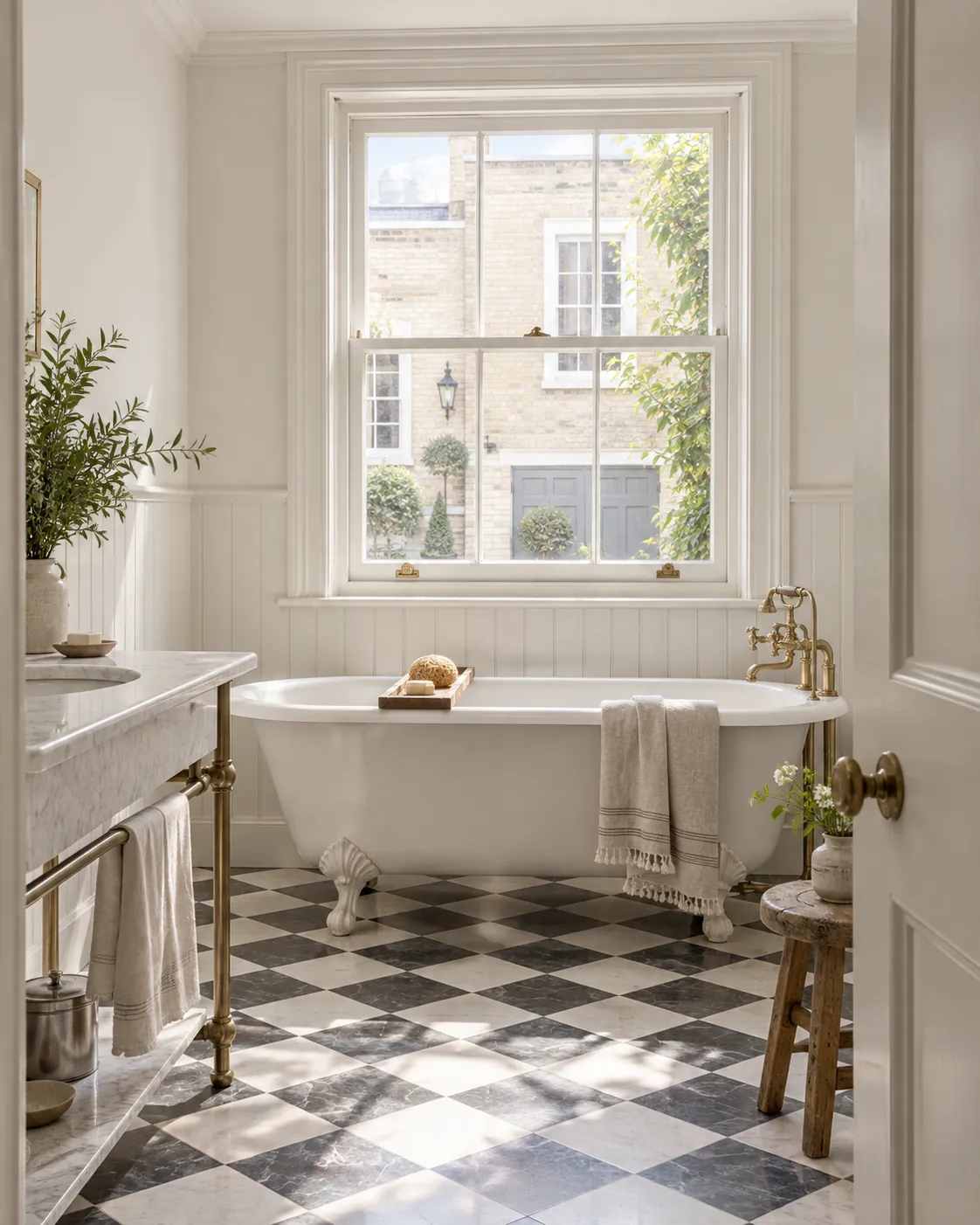
A Mylands special brilliant white
For a luminous, brilliant white, Pure White No.1 is our purest. Blended from pure white pigment, China clay and crushed marble, this fresh, bright white pairs well with many shades in our collection. For high-traffic areas, our Marble Matt Emulsion version of Pure White No.1 is a premium emulsion suitable for kitchens and bathrooms, with Class 1 European scrub-test resistance. Its crushed Carrara marble gives it a magical quality that comes alive as daylight shifts around the room and the light reflects off the natural marble mineral content.
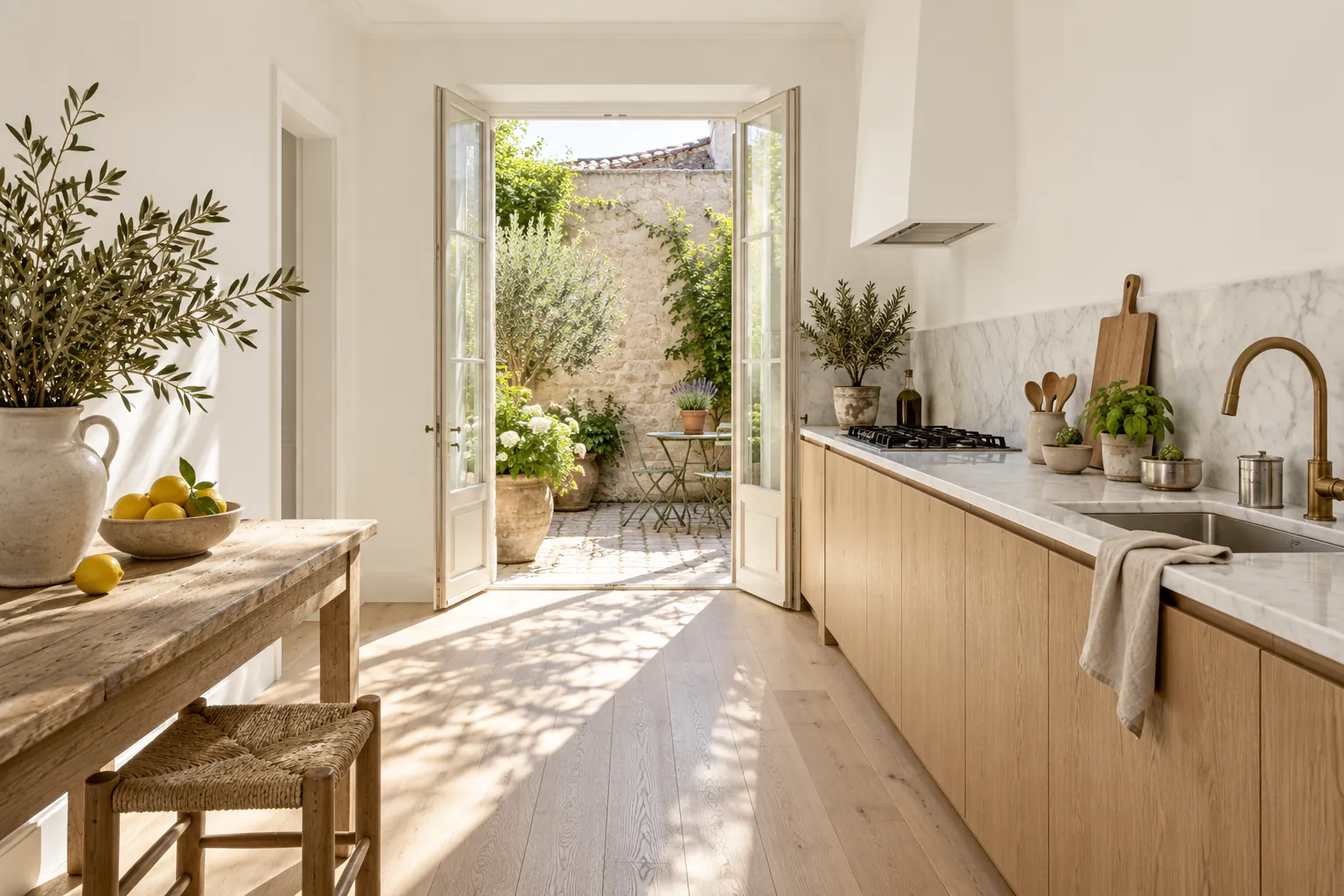
Create a dramatic space to show off artwork
There's a reason matt white walls are the backdrop of choice in art galleries: flat white creates a blank canvas by absorbing light and letting the paintings take centre stage. You can achieve the same at home by choosing a neutral white and complementing it with soft touches such as woodwork, fabrics or plants.
Mylands has made paints for film, television and theatre for over 80 years, which has helped us develop an unrivalled density of pigment, ideal for showcasing art in galleries. We've supplied Frieze Art Fair for years with our PURE WHITE™ NO.1 emulsion, chosen for its very high concentration of titanium dioxide white pigment, creating a true white that really lets artwork shine. It's not just for galleries; use our pure white at home to spotlight your favourite painting.
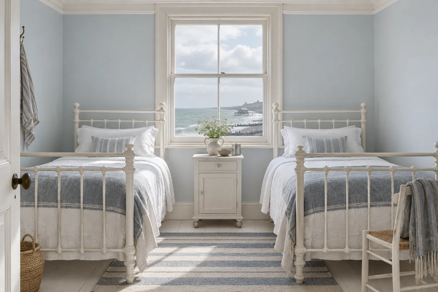
How to sample-test different whites
Because light has such an effect on how white reads, always get tester pots and try them on the actual surface you plan to paint. It's best to paint a large 1m² sample, ideally on lining paper, so you can move the swatch around the room and check the colour at different times of day. Testing on a white background is better than cardboard or darker surfaces, where the base colour can distort the top coat and mislead you about the final finish.
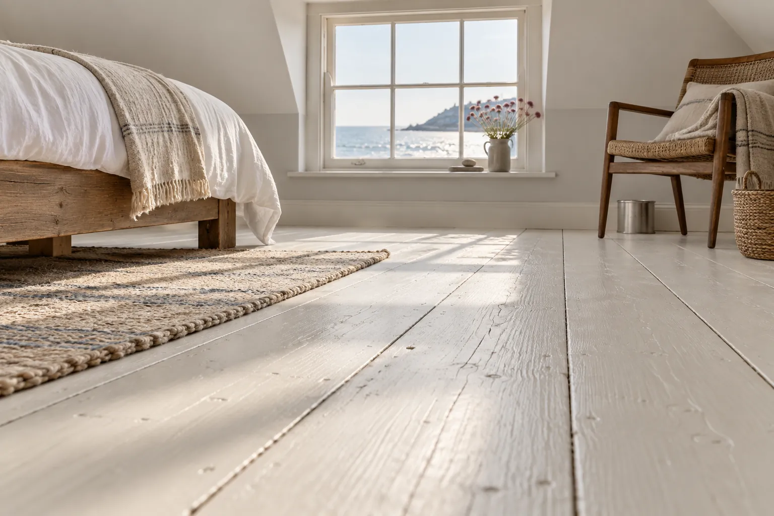
Whether you want a white to be the star or the blank canvas for your scheme, have fun experimenting. Decide between warm and cool whites, narrow it to a few options, then test until you find the right combination. The right choice will simply feel right.





