The journal
How to Decorate with Contrasting Colours
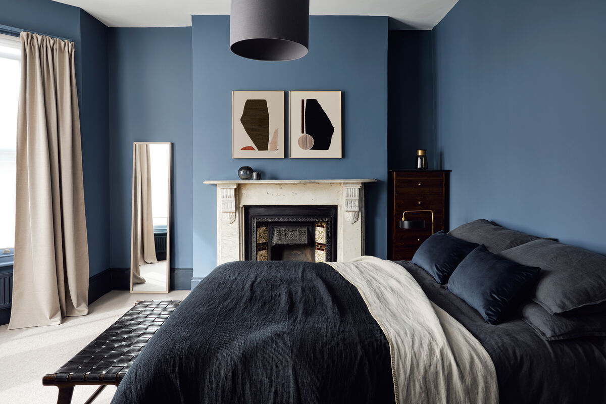
People are growing bolder with colour and using it in fresh ways at home. Rather than defaulting to off-white woodwork, many are choosing something with more character to add interest without overwhelming a room.
Homeowners are growing in confidence with colour and finding new ways to bring it into their interiors. Instead of the usual off-white woodwork, Mylands is seeing customers reach for something more characterful that adds interest without swamping a room. An easy-to-live-with mid-tone wall can be lifted with high-contrast detailing, giving a space real personality.
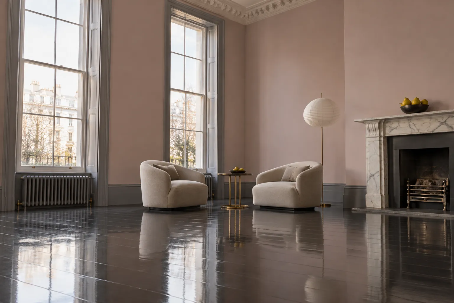
When it comes to high glamour, little beats a glossy dark floor, shown here in the iconic Mylands Downing Street® No.10. Grounded by a deeper, more dramatic tone underfoot, a room's fine proportions and natural light are thrown into relief. For an extra layer of interest, the skirting has been picked out in the cool, stone-like Oratory No.237.
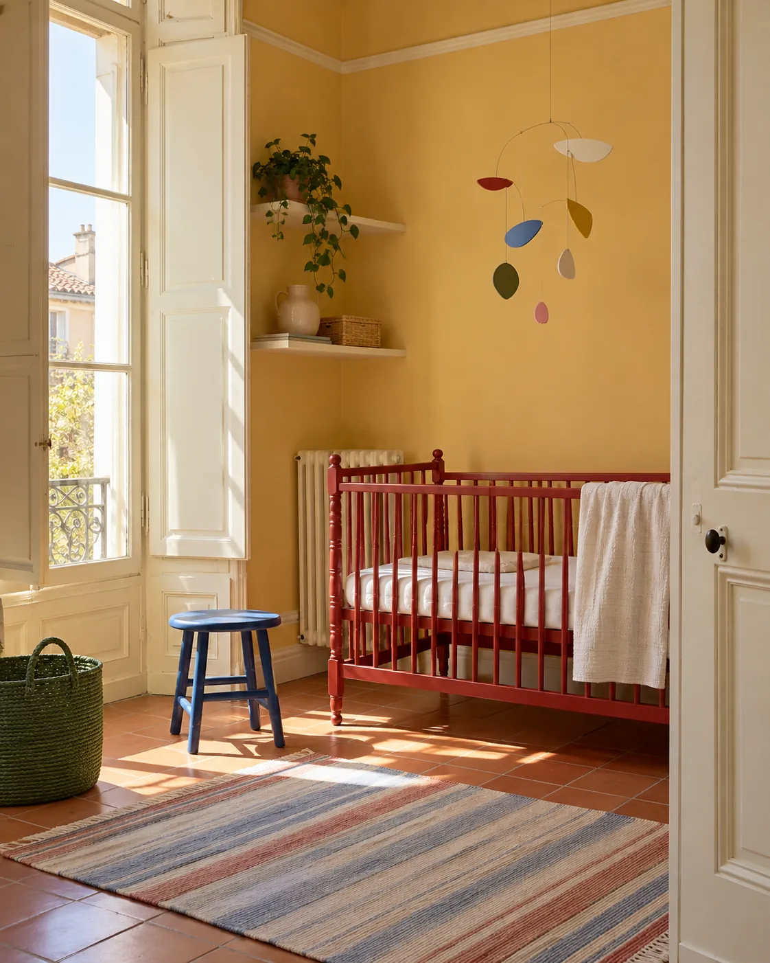
The layered approach works just as well in brighter tones; this charming nursery uses a playful palette, setting the cheerful ochre yellow of Golden Square© No.131 against the light freshness of Lemon Salts® No.43, with pops of brightly coloured furniture and accessories.
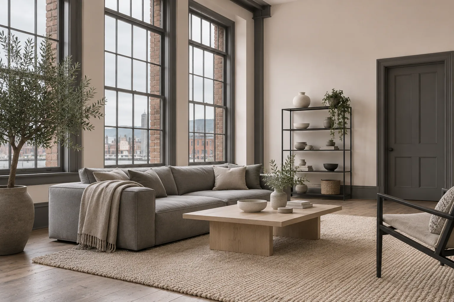
For a fresh, modern feel, perennially popular off-whites such as the delicate Kensington Rose® No.22 keep a space light and airy, while a high-contrast colour on the woodwork gives it an edge. This inverted treatment creates a sense of elegant contemporary chic.