


The journal
In Conversation with Beata Heuman
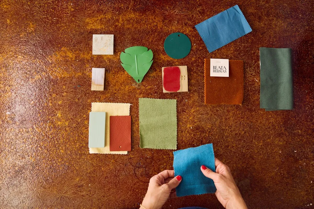
To celebrate the launch of Beata Heuman's collection, The Dependables, we talk with Beata about the story behind her colour inspiration, how it developed, and how to use these colours at home.
The Dependables collection was created in collaboration with leading interior designer Beata Heuman. Inspired by Beata's creative vision and her ability to craft interiors that balance boldness and charm, the collection features 24 dependable shades, from versatile neutrals to uplifting greens, buttery yellows and a striking pop of red, offering colours for every mood and style.
Tell us about your personal relationship with colour. What are your earliest memories of creating colour?
Colour, and the combination of colours, is a powerful way to communicate a mood and create an atmosphere, whether uplifting and inspiring or gentle and calming. Whenever I make these choices, I feel a thrill of excitement watching how small additions make a huge difference, such as just a touch of red. I like how everyone stands equal; whether your budget is vast or meagre, it's not about spending money but about thinking and careful consideration to help you make good decisions.
I remember the colour of garments being described in stories and how vivid they became in my mind's eye, which compelled me to draw it all out on paper, a frustrating business since I never quite managed to express what I saw in my head.
How did the Mylands collaboration come about? Why did you want to create a paint collection?
Mylands supplied all the paints for the restoration of 188 Hammersmith Road, our brand home, which felt like a perfect fit since they've been making paint in our shared home city since 1884. We began picking paints from Mylands' brilliant existing collection but also made a lot of bespoke colours for the space, and that was really the starting point for this collaboration. It's been my dream to do my own paint collection; I'm very specific about colour and think about it a lot, so it's been thoroughly enjoyable to express that and now share it with a bigger audience.
Why did you feel Mylands was the right partner?
Mylands has a lot of integrity as a brand, and being a fourth-generation family-owned business rather speaks for itself. Quality and passion for paint is the driver, which is how it's meant to be. Everything happens at their South London site, from the first experiments developing new products in the lab under Anna's watchful eye until rich, thick paint fills the steel tubs before they're neatly stacked in long rows, ready to be dispatched to homes all over London in the trusted Mylands van.

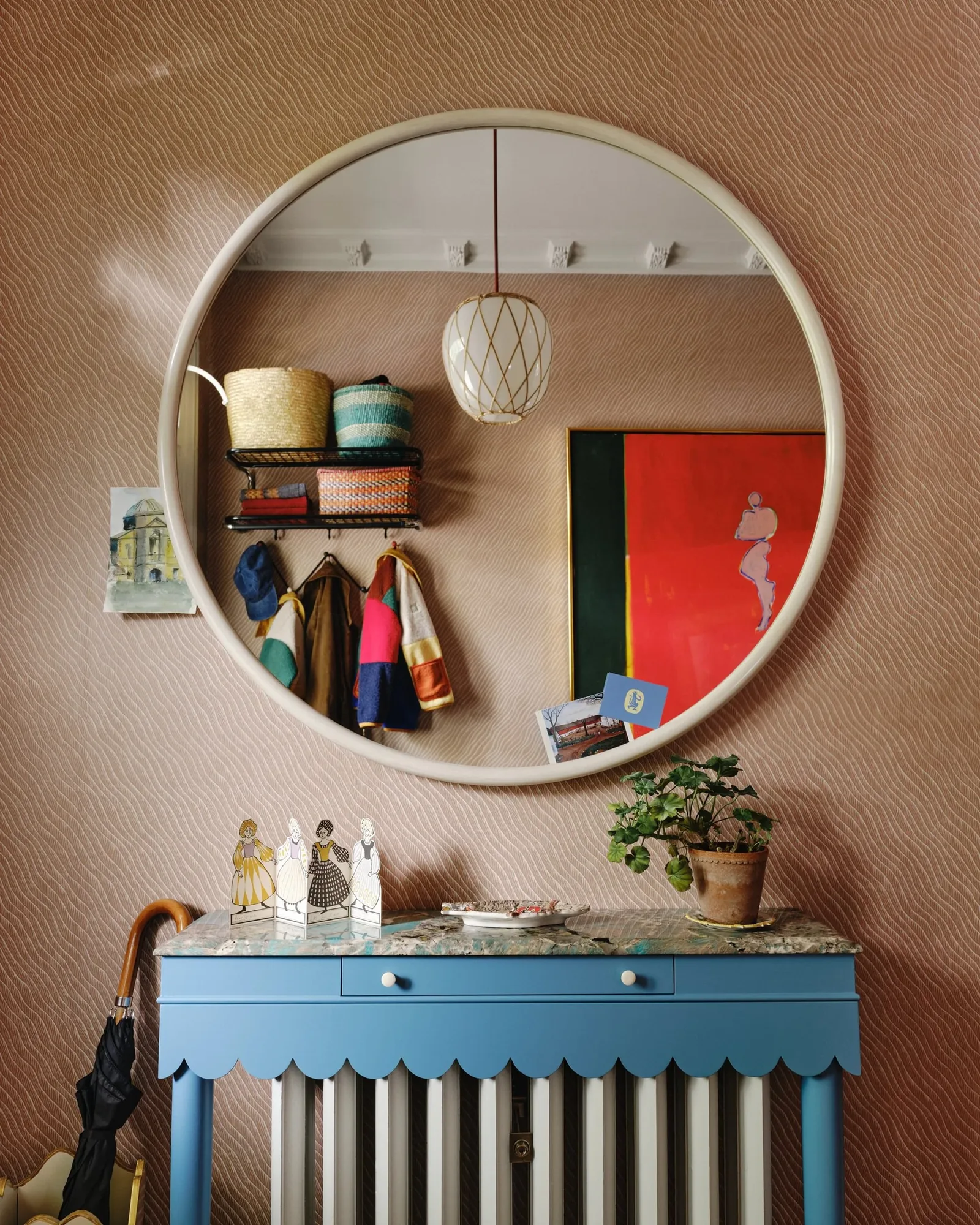
Talk us through the inspiration behind the collection
I started thinking about colours I love and looked back at photos I've taken of beautiful old houses over the years, Swedish ones in particular. In simpler houses before the turn of the last century, you often see a rich, zesty palette born of a relatively limited selection of pigments used to make linseed oil paints, which, I realised as part of this process, forms the basis of what I'm drawn to and tend to use. I gathered lots of references, some less esoteric, such as the moody dark countertop in a dingy Brighton pub decorated with car-key-carved phalluses.
How did you create the specific edit of colours?
The challenge was whittling it down to 24, the Dependables. The idea was a capsule collection that ticked a lot of boxes, a broad yet concise range that could serve your whole house. They each have their own character but also work as a whole. It's easy to feel overwhelmed by colour choice, so it's good to have a selection of go-tos you know work, and if you want to mix it up you can do that with wallpaper or fabrics.
Once I had the initial selection, I tested it in my own house, found some gaps and tweaked it further. My Dependables are a mix of go-tos like a good white and other light neutrals, things I struggle to find like a dark yet soft 'black' (which isn't actually black at all) and particular greens, and tones I'm excited about such as Boiled Dill and Crayfish Party.
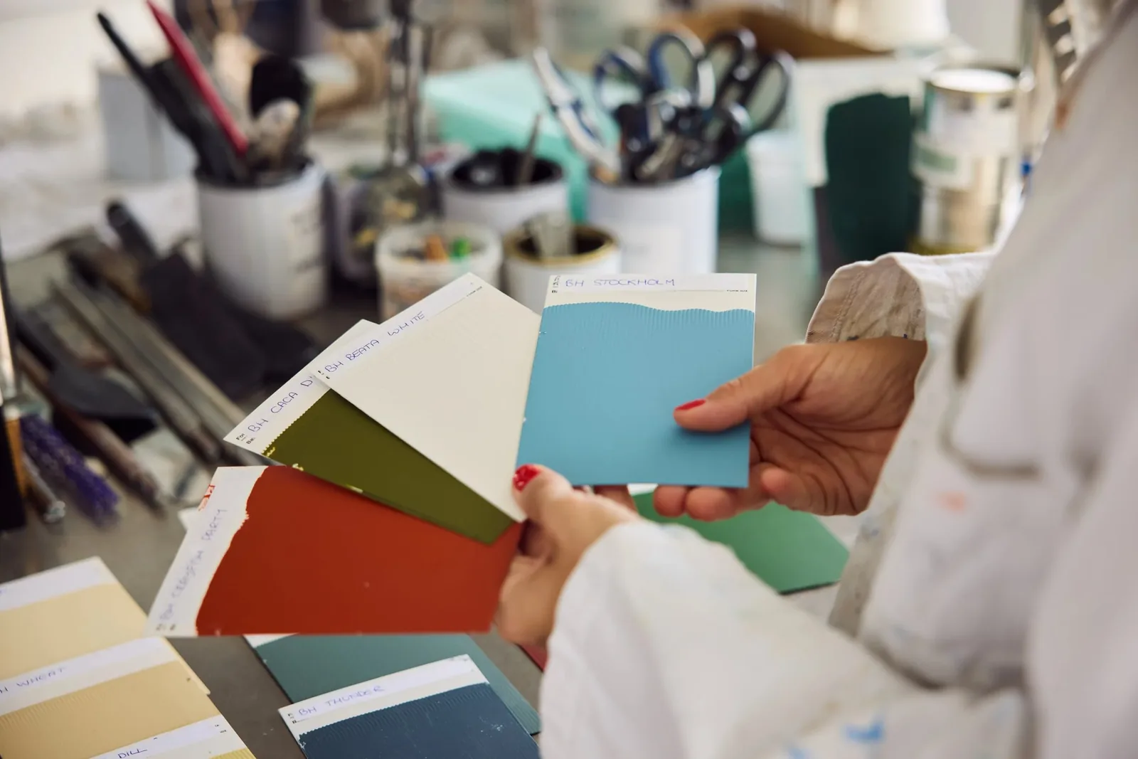
What did you enjoy about creating the colours with Mylands, and how did you develop the right shades with Anna, Head of Mylands' Colour Lab?
The team are all so enthusiastic about paint and colour, and really caring about the end product is all you can ever ask for. A few shades were perfect first time, but others took a while to get right, such as Mormor Zaza and Glass. It's been a thoroughly enjoyable experience, and Anna has been crucial to the process, remaining laser-focused, positive and extremely patient. When we found ourselves seven tries into sampling Cigar and even I was close to giving up, she kept pushing, and that commitment to getting it right really shines through in the collection, which I couldn't be happier with.
Three words that encapsulate the collection
Considered, vivid and dependable.
Do you have a personal favourite shade or shades?
Each one is a favourite, but the standout in terms of what I use most is Beata White. Crayfish Party is fantastic for accents and Wheatsheaf is wonderful for joinery.
Where have you used colours from the collection?
I've used the entire collection in my house in London and in lots of places at 188 Hammersmith Road.
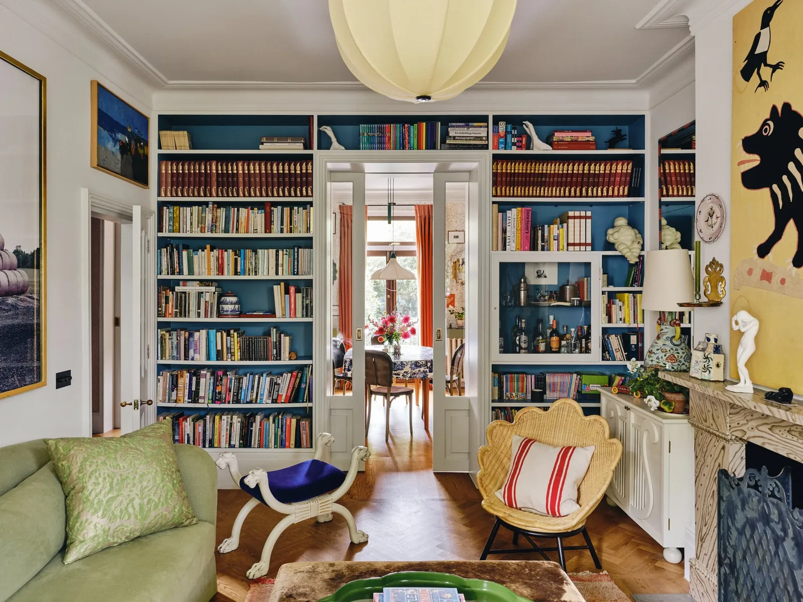
About the collection
How would you describe it to someone unfamiliar with your work?
It reflects a palette refined over decades of designing interiors, trusted colours you can rely on: versatile light neutrals to cover most walls, mid-tones for shadowy depth in places, darker shades for edge and contrast, a generous sprinkling of uplifting yet calming greens and blues, buttery, irresistible yellows, and a sizzling pop of red for the cherry on top.
How do you help clients choose colours?
The best thing is to plan for the whole house in one go, and depending on your approach have something that connects most rooms, such as woodwork and ceilings all in the same tone. I tend to work mostly with light neutrals as an overall palette and introduce colour in smaller doses, on individual pieces of furniture or in fabrics. It can be fabulous to do walls in something punchier, but in my opinion that works best sitting among quieter rooms, and if you cover it with pictures.
"The idea was to create a capsule collection that ticked a lot of boxes and gave a broad yet concise range which could serve your whole house. They all have their own character but they also work as a whole." - Beata Heuman.
How does paint colour influence the mood of a room or home?
Paint is the backdrop; it enhances and contributes to the mood but shouldn't be the main event, and in fact, by the time you've added furniture and art, you don't see it nearly as much as you think you will. So don't overthink it, and err on the side of caution with lots of colour. An overall neutral backdrop is probably more likely to stand the test of time; strong wall colours have a shorter shelf life and quickly get boring, especially in quantity. Once you've found your trusted go-tos, you can save a lot of time by relying on a curated palette you know works, then have fun adding character with fabrics and special furniture.
Some easy-to-use combinations from your collection (and with Mylands' other colours)?
Lamb's Ear walls with Artichoke woodwork; Wheatsheaf with accents of Crayfish Party; Beata White with accents of Stockholm; Old Man's Beard with a Glass ceiling.





