


The journal
Sage green paint: which shade for which light
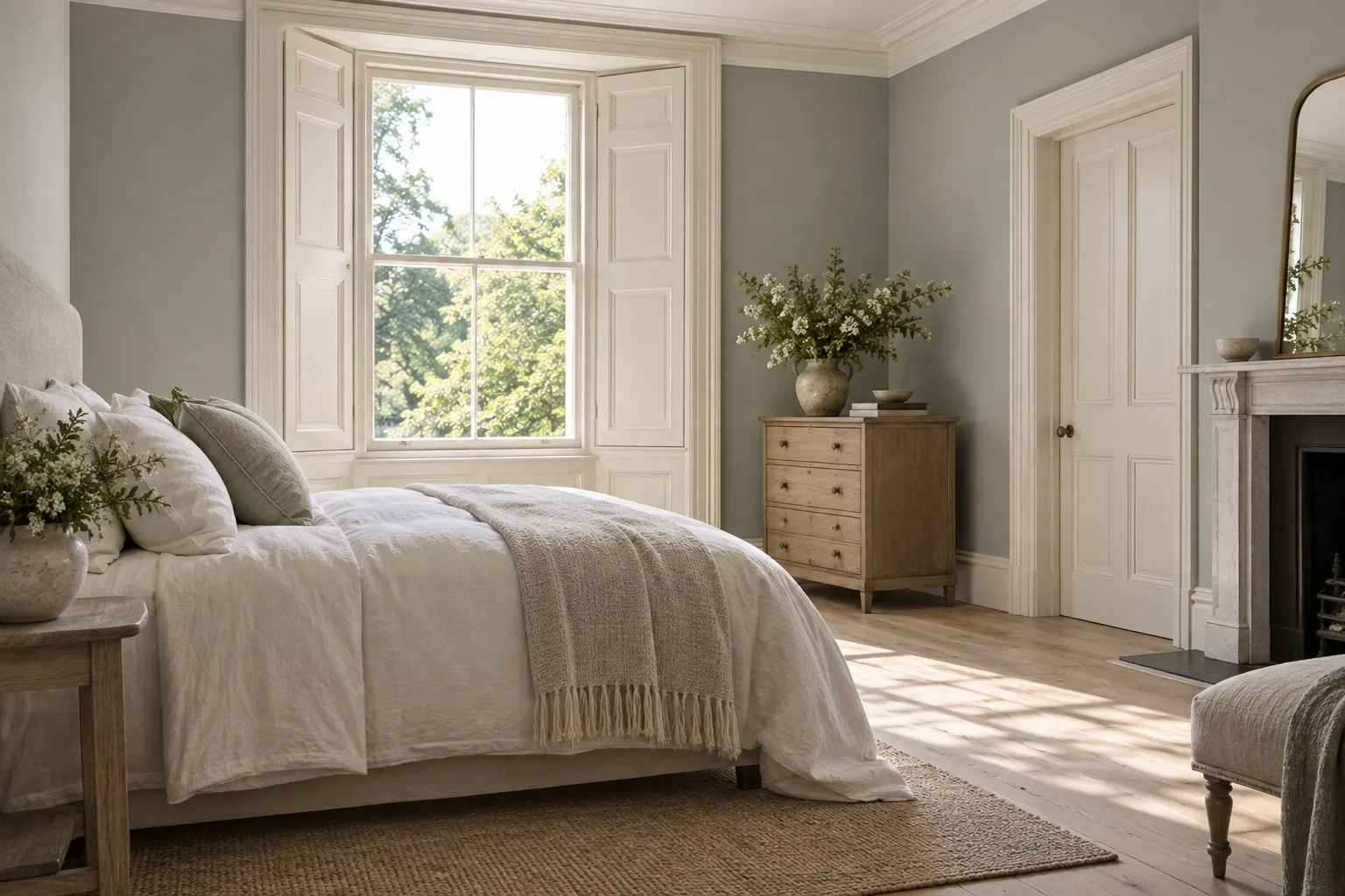
The right sage green paint depends on the light in the room: a pale, greyed sage such as Chiswick No.100 or Lamb's Ear BH.06 in a dark room, a smoky sage such as Museum No.151 in a bedroom, a deep sage such as Myrtle Green No.168 in a dining room, always in matt on the walls.
Sage green has become, within a few seasons, the colour people ask for first when they want a shade that is both present and restful. Sage green paint is neither a garden green nor a grey in disguise: it is a green softened with grey and a touch of yellow, the colour of a sage leaf seen against the light, which shifts with the hour without ever raising its voice. Its reputation as an easy colour is deserved, on one condition: choosing the shade that suits the light in the room, because between a sage that is almost white and an apothecary sage there is a whole landscape. Here is how we walk through it at Mylands, from palest to deepest.
What makes a true sage green
A sage stands up thanks to its earth pigments. Our greens are made from natural earth and mineral pigments, richly loaded, and that is what gives them the depth that moves from morning to evening: grey-green at dawn, more golden at midday, almost bluish as the light fades. A sage made up with a few machine tints stays flat and quickly drifts towards hospital green; a sage loaded with earths keeps its complexity whatever the surface, which is exactly what you want from sage green paint in a room you live in.
The question of grey is the important one. The more grey a sage contains, the more it recedes and behaves like a neutral; the more yellow, the warmer it becomes and the closer it moves to olive. The eight shades presented here are spaced along those two axes, from the palest and coolest to the warmest and densest, which is why there is always one that answers your room, your aspect and your furniture.
Which sage green paint for which light
The pale sages, for rooms short of light
Chiswick No.100 is the most discreet of the family: a very soft grey-green, recreated from our archives, that reads as a tinted white in a north-facing room and as a tender green under evening sun. Lamb's Ear BH.06, drawn up by Beata Heuman after the velvety leaves of the plant of that name, is a notch greener and warmer; it calms a hallway or a bedroom without ever darkening it. Both shades tolerate grey light precisely because they already contain some.
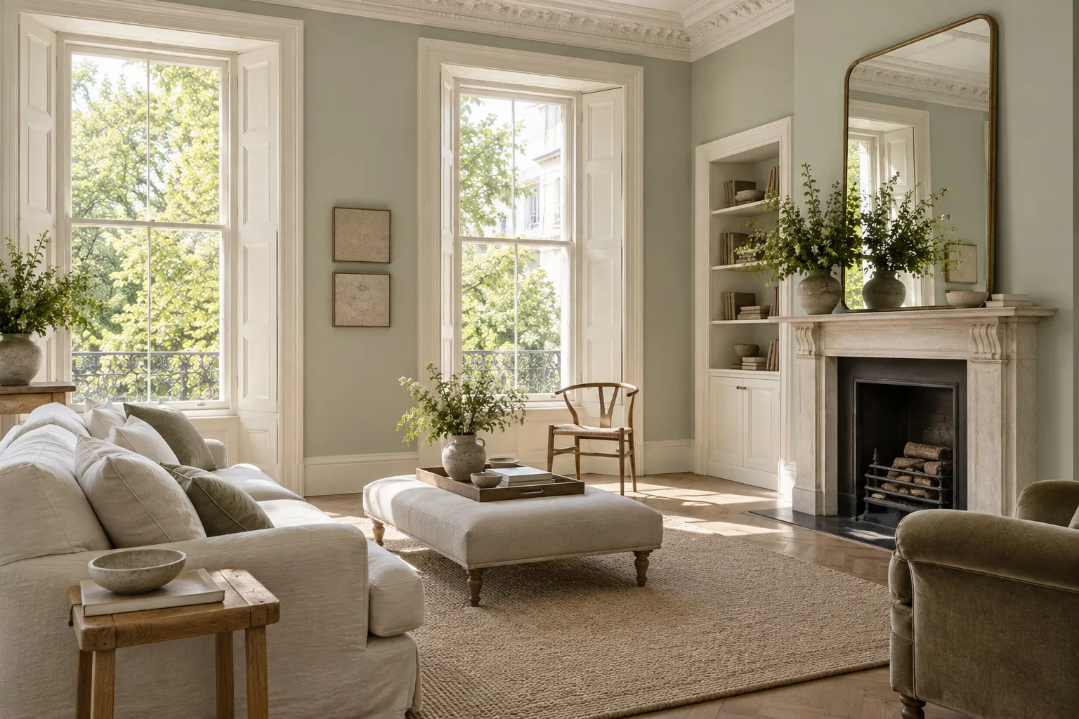
The mid sages, the balance
Museum No.151 is our sage par excellence, the one that recalls the walls of London's Victorian museums: smoky, faintly bluish, present enough to dress an entire bedroom and calm enough to sleep well in. Greenstone No.190 leans instead towards yellow and stone, with a natural verdigris tone that sits well with oak and undyed linen; it is superb in a country kitchen. Between the two, aspect decides: facing north, Museum No.151 keeps its freshness without turning cold; facing south, Greenstone No.190 takes on an almost southern warmth.
The deep sages, for envelopment
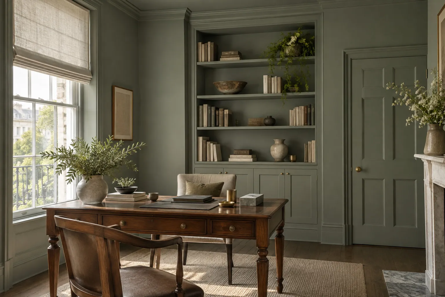
Myrtle Green No.168, a traditional green brought back from our colour books, is the sage to choose for a dining room or a study: denser, leafier, it holds its own against dark furniture and gilt frames. Artichoke BH.13, from the same collection as Lamb's Ear, is a dusty, amber-tinged green that makes an ideal tonal companion for it: Lamb's Ear walls, Artichoke doors, and the room takes shape without a hard contrast. Serpentine No.192, named after the former tributary of the Thames that became the lake in Hyde Park, is a khaki grey-green, sober and restrained, while Shoreditch No.15, the greyest of them all, is an archive green so muted that it passes for a warm grey in a dark room and for a tender green in sunshine.
A successful sage green is the one you stop noticing after a week, and miss the moment you leave the room.
The rooms where sage is at home
The bedroom first. A mid sage on all four walls, carried onto the ceiling in the same shade or in a warm white, creates an envelope that slows the pulse the moment you walk through the door. Then the kitchen: long before it was fashionable, sage green was the colour of pantries and sculleries, and it flatters wood, brass and white earthenware. The sitting room takes any sage provided the furniture is warm, tan leather, walnut, natural wool. And the hallway, where a pale sage green paint reflects the light from neighbouring rooms and ties a run of doors together.
Sage is also one of the few colours that can be applied to every surface at once. Walls, ceiling, doors, skirting and radiators in the same shade, in Multi-Surface Dead Matt, dissolve the corners of a small room and turn a study or a guest bedroom into a felted cabin. Serpentine No.192 or Myrtle Green No.168 lend themselves particularly well to this kind of drenching, because their grey stops them becoming overwhelming once multiplied across six surfaces.
What to pair with a sage green
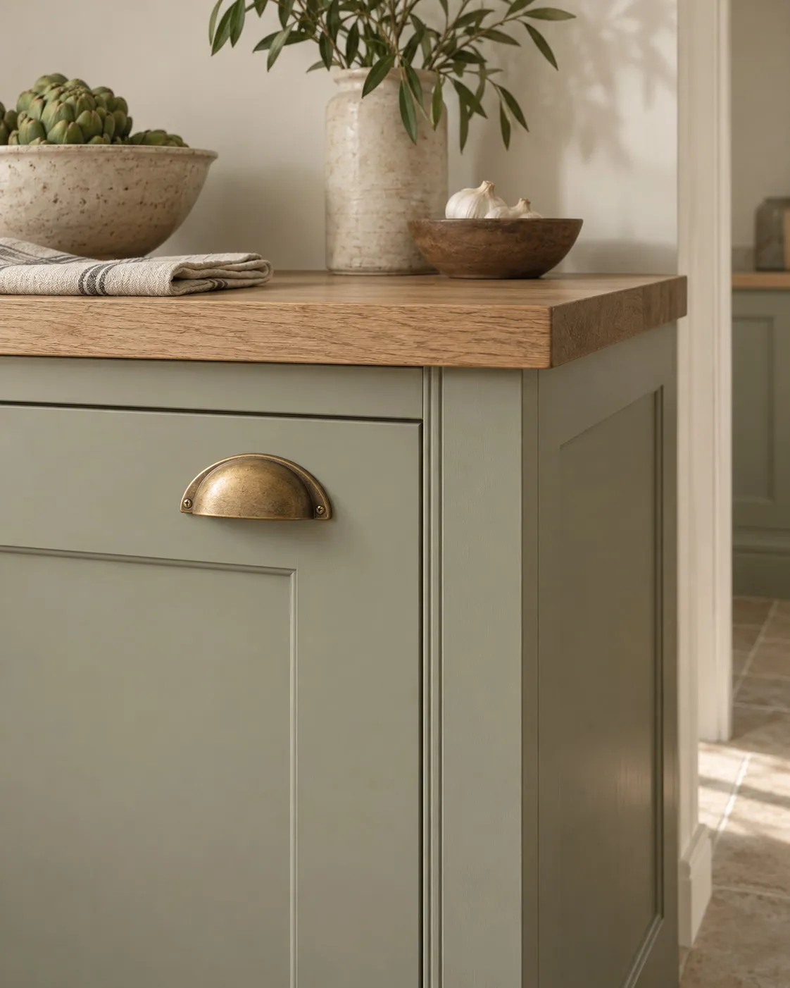
Sage loves warm whites and struggles with pure white, which makes it look dull. Holland Park No.5, a lightly yellowed white created for a period property, is our choice for ceilings and woodwork around all the pale and mid sages. Clay and powder pinks are its natural complements: an earthy pink on the facing wall, on an armchair or on a door warms the room without breaking its calm. Brass, pale oak, terracotta and undyed linen complete the palette; chrome and lacquered black harden it.
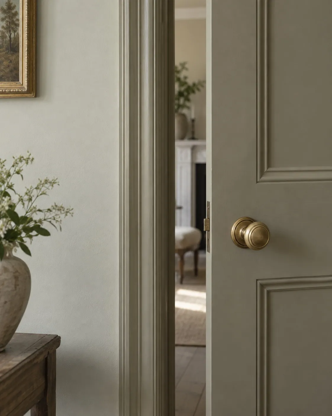
For woodwork, three options hold up. Tone on tone, doors and skirting in the same sage, gives an enveloping room; a deeper sage on the wood, Artichoke beneath Lamb's Ear or Myrtle Green beneath Museum, draws the architecture; warm white on the wood lightens the whole and suits flats with high ceilings. Our selection of green paints shows these neighbours side by side, from the palest sage to forest greens.
Which finish for sage green paint
On the walls, Marble Matt Emulsion. A sage is a colour of nuances, and only a deep matt lets you see its variations from one stretch of wall to the next; the crushed Carrara marble it contains gives the colour a mineral touch that suits a leaf green very well. It carries class 1 wet-scrub resistance under EN 13300, which clears sage for a kitchen or a children's corridor, and its breathable film suits old walls and lime plaster. Reckon on around 15 m² per litre per coat, two coats, and a room touch-dry in one to two hours.
On doors, skirting and furniture, Multi-Surface Eggshell, at around 15 % sheen, gives sage that soft glow which catches the light without reflecting the room. On a new, porous surface or one darker than the chosen shade, a primer in the tone shown on each colour's page guarantees full opacity in two coats. All our decorative paints are water-based, low in VOC and compliant with EN 71-3, so a child's bedroom or a small bed can be painted in sage without a second thought, and the brushes simply wash out in water.
Where to start
Choose two neighbouring sages rather than one, Chiswick No.100 and Lamb's Ear BH.06 in a dark room, Museum No.151 and Greenstone No.190 in a well-lit bedroom, and order their 100 ml sample pots, which cover around 1.5 m² each. Paint two squares on different walls and look at them in the morning, then in the evening. The physical colour card, sent free of charge, will show you all eight shades side by side, and the price per square metre page will tell you what your room represents in two coats.
Frequently asked questions
Which sage green should I choose for a dark room?
Choose a pale sage that already contains some grey, such as Chiswick No.100 or Lamb's Ear BH.06: they reflect the light without turning cold. Avoid very yellow sages, which go dull without sun. Test two samples on the wall furthest from the window and look at them at dusk, the moment a sage shows its true character.
Is sage green a colour that will date?
Sage is a historic colour long before it was a trend: it has been found in the pantries, kitchens and boudoirs of old houses for two centuries. It is the very acid or very pastel versions that date quickly. A greyed sage made with earth pigments, such as Museum No.151 or Shoreditch No.15, moves through fashions without effort.
What ceiling colour goes with sage green walls?
A warm white such as Holland Park No.5 is the safest choice: it carries on the softness of the sage without a break. In a bedroom or a small room, painting the ceiling in the same sage as the walls erases the corners and strengthens the cocooning effect. Avoid pure white, which makes sage look dull by contrast.
Can you paint a kitchen in sage green?
Yes, and it is one of the rooms where sage is most at ease. On the walls, Marble Matt Emulsion is washable and carries class 1 under EN 13300, so it copes with splashes. On cabinet fronts, Multi-Surface Eggshell or Multi-Surface Satin stand up to grease and sponging. Greenstone No.190 and Myrtle Green No.168 are our favourites there.





