


The journal
Slate blue paint: the right shade for every room
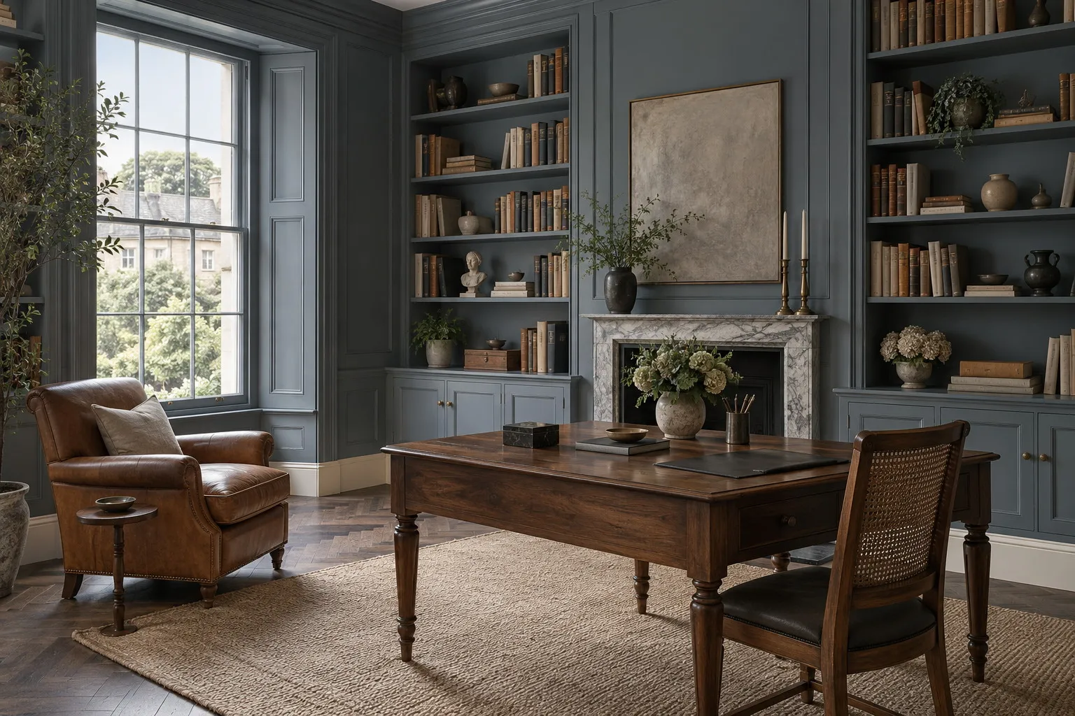
Slate blue paint, a blue darkened with grey and sometimes a hint of green, comes in eight Mylands shades: from Thunder BH.12 and Bond Street No.219 for a study or a front door to Long Acre No.102 and Uncle Maths BH.05 for a light bedroom, in deep matt on walls and gloss on doors.
Look at a slate roof after rain and you will understand the colour: a blue that does not quite dare to be one, darkened with grey, sometimes with a hint of green, shifting from navy to cloud grey with the sky. If searches for slate blue paint keep growing, it is because this shade offers what pure blues rarely deliver: depth without coldness, character without exuberance. It is a winter and library blue, a front-door and dining-room blue, and one of the few blues you can put in a room without southern light and never regret. Here are our eight slates, and above all where and how to use them.
What grey does to blue
A slate blue is a blue that has been made liveable. The black and natural umber it contains absorb the sharpest part of the blue, the part that makes a room feel cold, and let it slide towards grey as the light drops. That movement is its charm: the same wall looks blue at noon, blue-grey at five and almost charcoal at dusk. Our slates are made from natural earth and mineral pigments, richly loaded, and that loading is exactly what allows them to move this way instead of standing still.
There are nonetheless big differences within the family. Some shades lean towards green, others towards violet or indigo; some are light enough to cover an entire bedroom, others dark enough to suit only a door. The right way to choose is not to start from the colour card but from the room: its light first, its purpose second, and only then the shade.
Slate blue paint: north or south, the light decides
Facing north, daylight is bluish and scarce; a slate that is too cold turns leaden there. Choose the shades that carry some warmth or some green. Thunder BH.12, the colour of storm clouds according to Beata Heuman, is our first choice: a deep, felted blue-grey that keeps a surprising softness under an overcast sky and makes an admirable study or library. Riverine JB.07, drawn up by the landscape designer Jinny Blom, is greener, like a river under trees, and suits rooms where you want calm without melancholy.
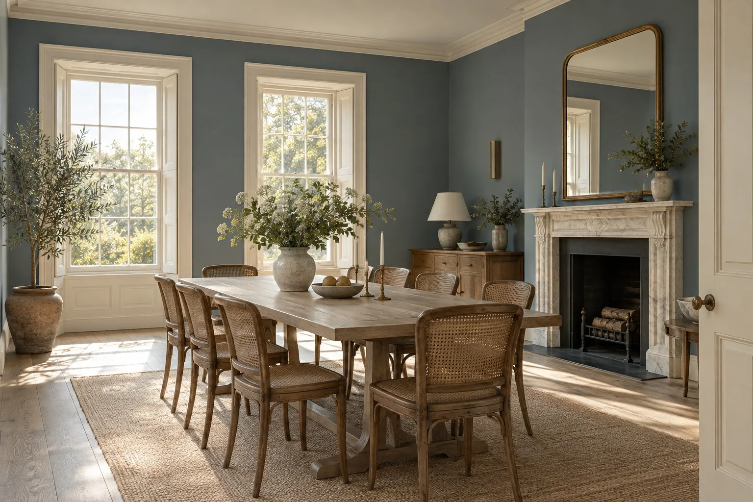
Facing south or west, warm light warms everything it touches, and you can allow yourself franker slates. Maritime No.236, inspired by the boating lake in Regent's Park, is a clean, seagoing slate blue that stays luminous until evening in a sunny dining room. Mayfair Dark No.218, a muted indigo matched to a wallpaper fragment, takes on violet reflections at sunset; it is a bedroom colour, enveloping and a little secretive. To understand what your window will do to a shade, nothing replaces a sample looked at several times through the day before you order.
The darkest slates
Bond Street No.219, a smart blue once supplied to a property in the street of that name, is the slate for panelled halls and front doors: darker than Thunder, almost grey in shadow, it makes the rooms beyond feel brighter by contrast. Oratory No.237, a homage to the stone of Brompton Oratory, is a grey that only admits its blue in sunshine; it is the most discreet of the series, ideal for anyone who wants slate blue without it being obvious at first glance that it is a blue at all.
The lighter slates
A slate need not be dark. Long Acre No.102, dedicated to one of the earliest sales of blue paint in our records, is a mid blue-grey, soft and matt, that dresses a sitting room or a study without ever weighing on it. Uncle Maths BH.05, an airy, composed grey-blue, is the morning slate: it lightens a bedroom or a bathroom while keeping the mineral tonality of the family. These two shades are also the best way in for anyone still hesitating in front of a deep blue.
A well-chosen slate is not seen as a blue; it is felt as a room in which people speak more quietly.
The rooms that love slate
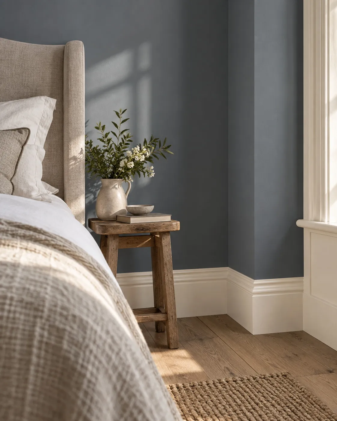
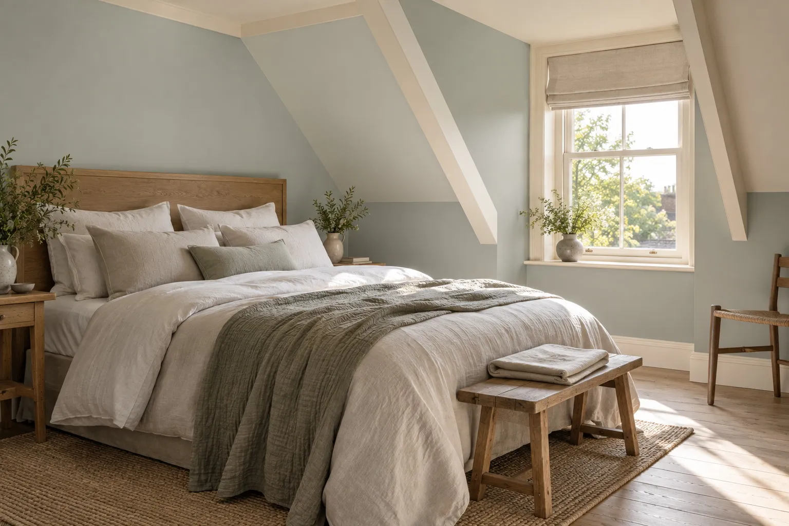
The study and the library first. Slate blue paint on the walls, and better still on the shelves, absorbs restlessness and sets off bindings, wood and paper; it is also a flattering backdrop for video calls. Then the dining room: it is an evening room, and by candlelight slate takes on a depth that pale colours never reach. In a bedroom, a mid slate on all four walls, ceiling included, brings the light down like a curtain.
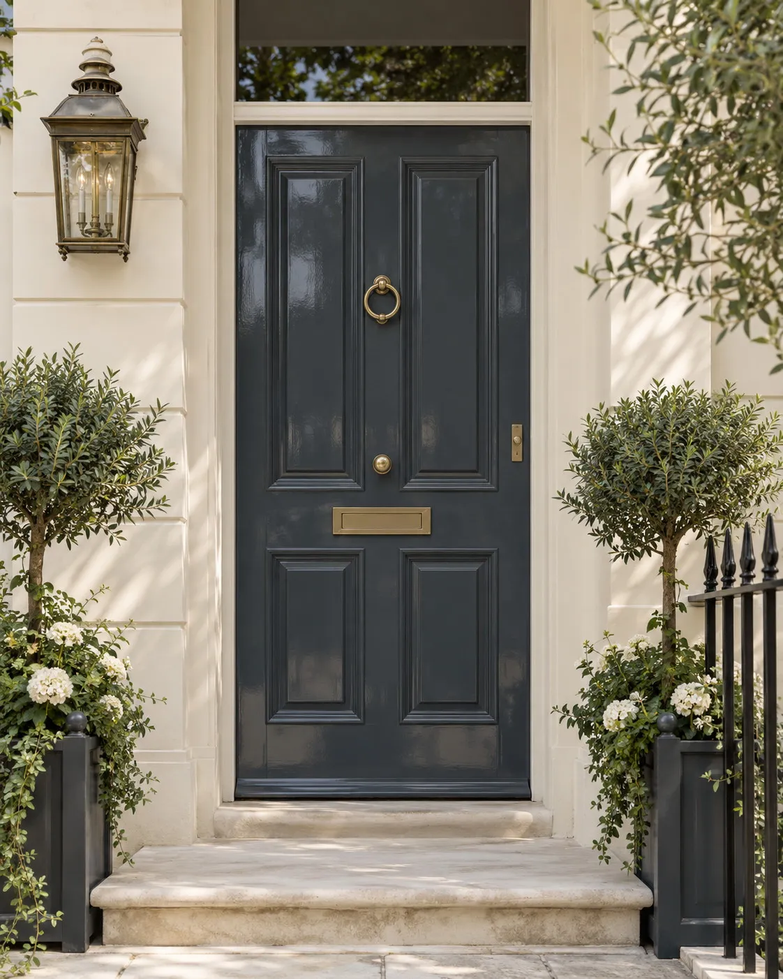
And then the front door. Few colours say "this is a well-kept house" as clearly as a door in Bond Street No.219 or Thunder BH.12, with a brass knocker and pale stone on the threshold. Here the finish matters as much as the shade: Multi-Surface Gloss, our most durable finish, gives slate that deep mirror which makes London's finest doors and stands up to rain, keys and years. Our selection of blue paints gathers these shades and their neighbours, from pale blue to indigo.
What to pair with a slate blue
The rule is simple: slate is cold by nature, so everything around it should be warm. Warm whites first, on ceilings and woodwork: Lots Road No.24, a warm neutral lifted with a touch of yellow ochre, is our favourite companion for Thunder and Maritime, because it brightens without pulling out the coldness of the blue the way a pure white would. Ochres and mustards come next, on an armchair, a curtain or a cushion; an ochre yellow against a slate is one of the oldest and safest pairings in decoration.
Tan leather, walnut, smoked oak, unlacquered brass and terracotta do the rest. Chrome, black glass and cold grey are best avoided, they push slate towards the office block. For woodwork, two approaches hold up: slate on the walls and a warm white on doors and skirting for a room that is drawn, or the same slate everywhere, in Multi-Surface Eggshell on the wood, for a room that envelops.
Which finish for slate blue paint
On walls, Marble Matt Emulsion is the finish that serves these blues best. A deep matt absorbs light rather than returning it, and that absorption is what gives slate its stony density; the crushed Carrara marble it contains adds a mineral touch that is exactly right for a colour with this name. Carrying class 1 wet-scrub resistance under EN 13300, it can be washed, which matters on a dark colour where marks show, and its breathable film suits old walls. Reckon on around 15 m² per litre per coat, two coats.
One practical note: a dark colour over a pale wall calls for a tinted primer to reach full opacity in two coats. Each shade's page tells you which primer belongs beneath it; allow roughly 0.5 L of primer per litre of paint. All our decorative paints are water-based, low in VOC and low in odour, and you can usually be back in the room the same evening once it has been aired. The brushes, for their part, wash out in water.
Where to start
Do not choose a slate on a screen. Order two or three 100 ml sample pots, say Thunder BH.12 and Riverine JB.07 for a north-facing room, Maritime No.236 and Mayfair Dark No.218 for a south-facing one, and paint squares of at least fifty centimetres on two different walls. Look at them in the morning, at midday and in the evening, which is when these blues reveal their movement. The physical colour card, sent free of charge, lines up all eight shades, and the price per square metre page will tell you what your study or dining room represents in two coats.
Frequently asked questions
Does slate blue work in a north-facing room?
Yes, provided you choose a slate that carries some warmth or a hint of green, such as Thunder BH.12 or Riverine JB.07. Very cold or violet-leaning slates turn leaden without sun. Pair them with a warm white on the woodwork and warm materials, leather, wood, brass, and always test a sample on the least-lit wall.
Which colours go with a slate blue wall?
Warm whites such as Lots Road No.24 on the ceiling and woodwork, rather than a pure white that sharpens the blue's coldness. For accents, ochres, mustards, tan leather, walnut and brass warm the whole. Avoid chrome, black glass and cold greys, which give slate the look of an office block.
Do I need a primer to paint a wall slate blue?
Over a pale wall, yes: a dark colour needs a primer tinted to its tone to reach full opacity in two coats, without show-through or lighter patches. Each shade's page tells you which primer belongs beneath it, and you should allow roughly 0.5 L of primer per litre of finish paint.
Which finish for a slate blue front door?
Multi-Surface Gloss, our most durable finish, gives a front door in Bond Street No.219 or Thunder BH.12 that deep mirror which makes London's finest doors and stands up to the weather. For a softer look, Multi-Surface Satin remains very hard-wearing. In both cases, degrease, sand and prime before two coats of finish.





