


The journal
Understanding Undertones: Why the Same White Looks Different in Every Room
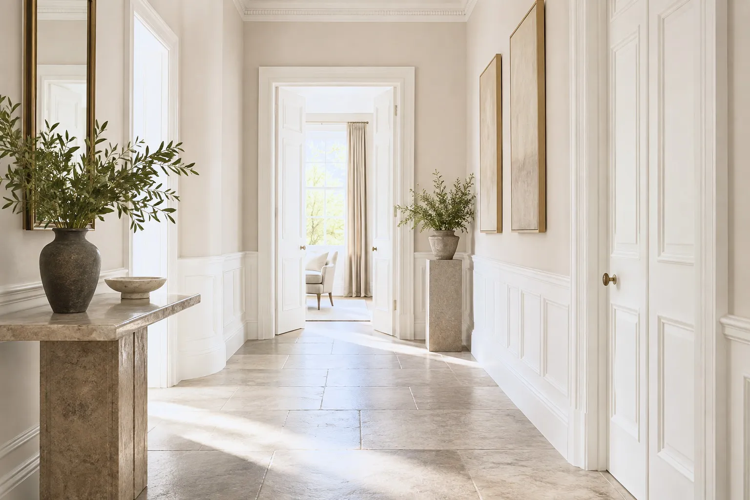
Ever painted a white you loved on a chart, only for it to look grey, yellow or blue on the wall? Undertones are the reason, and once you understand them, colour choice gets easier.
It's one of decorating's great puzzles: you fall for a white on the colour card, paint the room, and it comes out looking faintly grey, or yellow, or oddly blue. The culprit is almost always the undertone. Every neutral is mixed from other pigments, and those hidden components, a whisper of yellow, green, pink or violet, quietly steer how the colour reads. Under different light they come forward or recede, which is why a single shade can feel warm in one room and cool in another. Warm whites carry yellow, red or brown undertones and glow in cooler, north-facing spaces; Sloane Square™ No.92 and Holland Park™ No.5 are good examples. Cool whites lean grey, green or blue and keep sunny, south-facing rooms crisp; Maugham White™ No.2 has a fresh blue-grey undertone that reads beautifully clean. The trick is to work with your light rather than against it. Warm light exaggerates warm undertones (a yellow white can look brownish), while cool northern light draws out any grey or blue and can make a room feel flat. Always test a large sample, ideally a metre square on lining paper you can move around the room, and look at it morning, midday and evening, plus under your artificial lighting. Comparing two or three whites side by side helps enormously, as an undertone only really reveals itself next to another. Once you can spot undertones, you'll choose confidently, and never be surprised by a wall again.





