Colour guides · Exterior

Which colour for your shutters? 10 Mylands shades

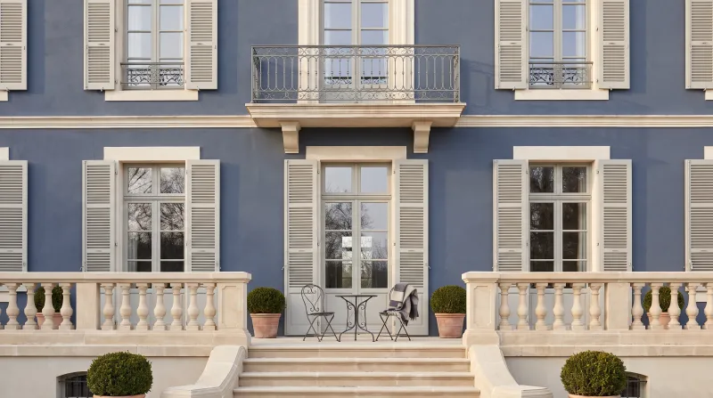
Shutters are the colour of the house as seen from the street: a façade is often thirty square metres of render or stone and five square metres of shutters, and it is the shutters people remember. They are also the one exterior colour that France has settled region by region — cart blue in Provence, red and green in the Basque Country, grey around Paris — and often town by town, in the local planning code.

Here are ten Mylands colours for timber or metal shutters, from soft white to burgundy, with the façade that suits each, the exterior finish to choose and what to check at the town hall before opening the tin.

Updated September 2026 · by the Mylands France colour team

The short answer

The safest shutter colours are the greys — pearl grey Sloane Square No.92 on a pale render, grey-green Long Acre No.102 on stone, anthracite Oratory No.237 on a contemporary house. For colour, cart blue Boathouse No.33 facing south, navy Observatory No.34 by the sea, bottle green Pleasure Gardens Green No.214 anywhere, Basque red Red Post Hill No.68 on a white façade. In Multi-Surface Eggshell, over Multi-Surface Primer, after checking the planning palette.

At a glance

Our selection

10 colours

Sleet — Outside
01

The white that does not dazzle

Sleet™ No.91

  • White
  • White
  • North light
  • LRV ≈ 77%

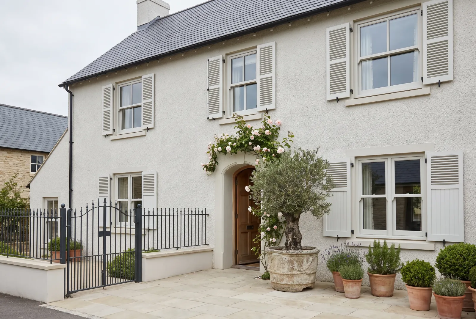
An off-white barely touched with grey, which keeps the freshness of white shutters without their blinding glare in the midday sun. On a white façade it stands out just enough to draw the windows; on pale stone or brick it is gentler than a pure white. It is the white of Normandy houses and seaside villas.

Our tip — Window frames in Pure White No.1, shutters in Sleet: the contrast is there, but nobody will be able to say why the façade is so calm.

View the colour → Already in your basket (limit 1 per order)
Sloane Square — Outside
02

Pearl grey

Sloane Square™ No.92

  • Grey
  • Pale tone
  • North light
  • LRV ≈ 68%

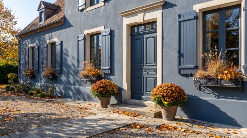
The light neutral grey that has replaced white on thousands of French façades, for good reason: it shows less dirt, ages better, and goes with every render from white to sand. On a greyed façade it blends in; on a cream render or warm stone it brings freshness.

Our tip — The most widespread pairing in the country, Sloane Square shutters and an Oratory door, remains the safest.

View the colour → Already in your basket (limit 1 per order)
Long Acre — Outside
03

The grey-green of the manor house

Long Acre™ No.102

  • Grey
  • Mid tone
  • North light
  • LRV ≈ 33%

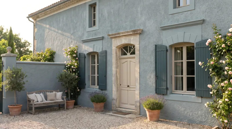
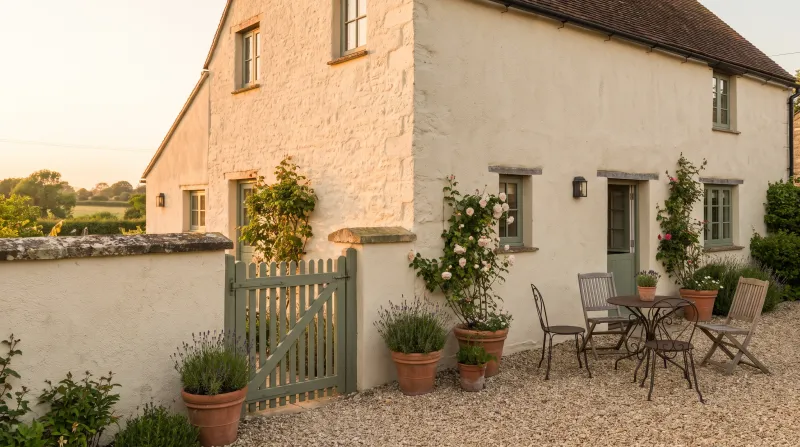
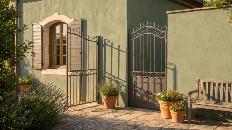
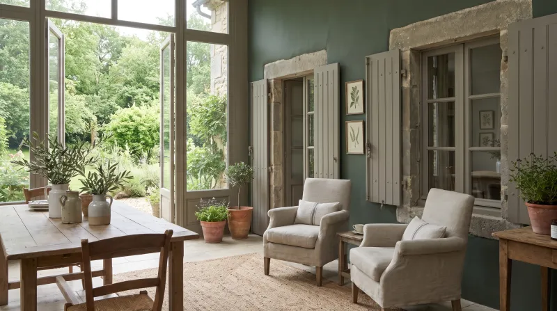
A mid grey shot with green and blue, changing with the sky: grey under cloud, green in sun. It is the grey-green of farmhouse, bastide and manor shutters, as happy against limestone as against granite and slate. It is the answer to "I want colour without it showing".

Our tip — On a grey or pale stone façade, with a Downing Street door: the house looks as if it has stood there two centuries.

View the colour → Already in your basket (limit 1 per order)
Boathouse — Outside
04

Cart blue

Boathouse™ No.33

  • Blue
  • Mid tone
  • South light
  • LRV ≈ 31%

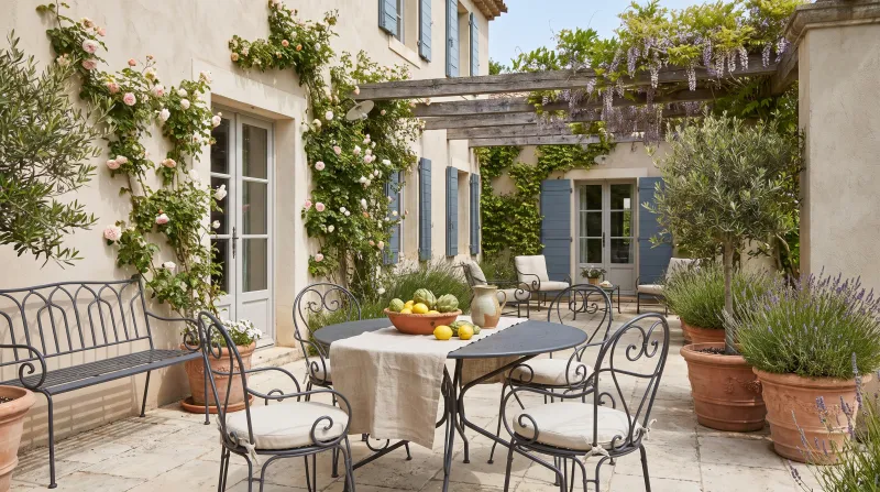
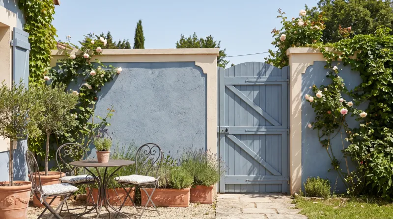
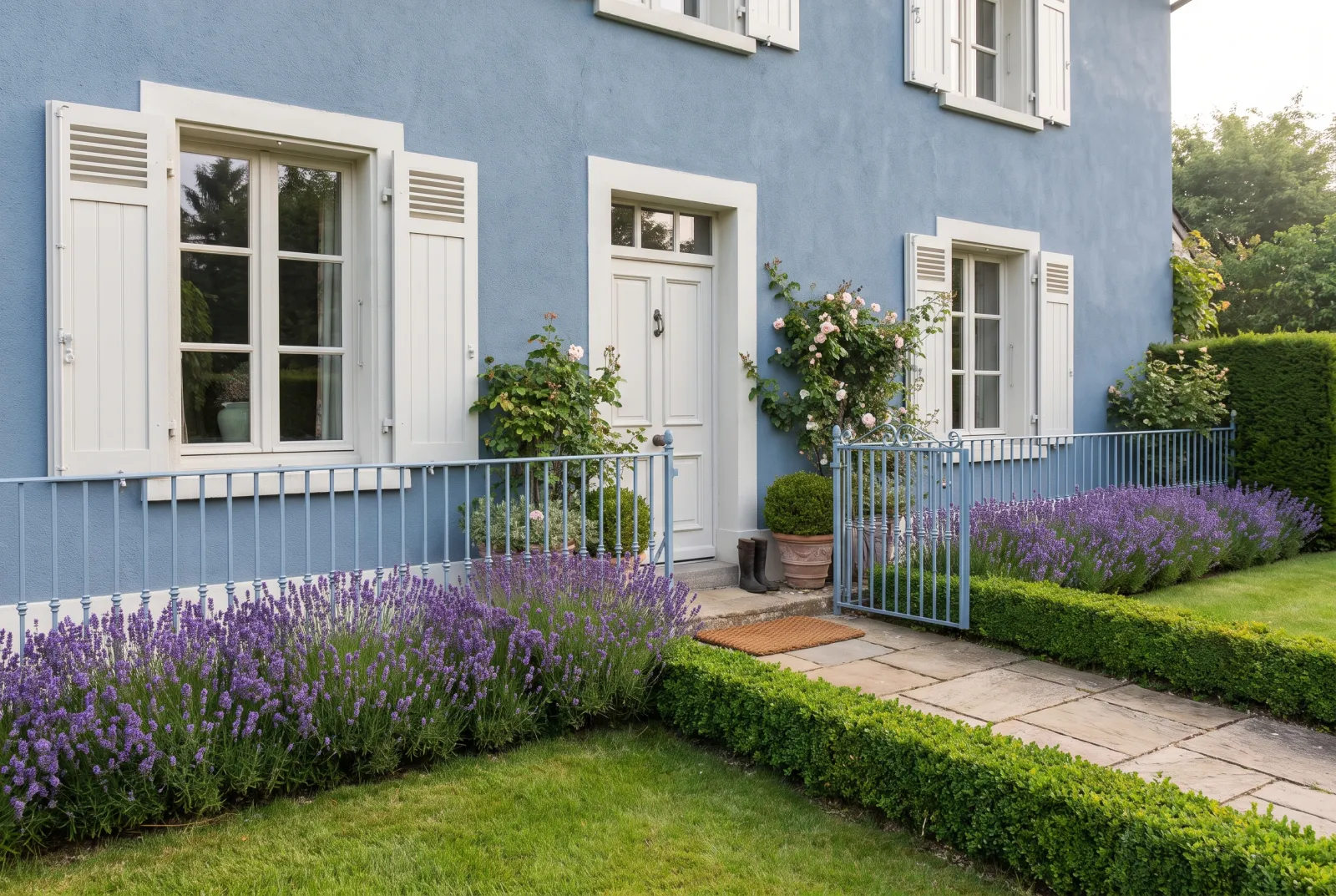
A mid blue, greyed and sunny, neither pastel nor navy: the blue of Provençal carts and shutters, which comes fully alive in strong light. It wants sun and a pale render — pale ochre, cream, white — and is at its best with frames in the same blue rather than white.

Our tip — Shutters, door and gate in Boathouse on a Lots Road render: the Provençal farmhouse without the cliché.

View the colour → Already in your basket (limit 1 per order)
Observatory — Outside
05

Seaside navy

Observatory™ No.34

  • Blue
  • Dark tone
  • South light
  • LRV ≈ 11%

An ink-grey night blue, softer than a flag navy and deeper than a Breton blue. On a white façade it makes the holiday house; on grey stone it makes the notary's house. It wears very well over time, which few blues manage.

Our tip — White façade, Observatory shutters, Red Post Hill door: the trio of the Atlantic ports.

View the colour → Already in your basket (limit 1 per order)
Serpentine — Outside
06

Verdigris

Serpentine™ No.192

  • Grey
  • Mid tone
  • West light
  • LRV ≈ 31%

A greyed khaki green, the colour of olive foliage or bronze patina. Warmer than Long Acre and quieter than a frank green, it melts into a garden and brings out stone. It is the shutter green of the South-West and of country houses that do not want to shout.

Our tip — With a sand render or warm stone, and a door one tone darker in Cragside JB.10.

View the colour → Already in your basket (limit 1 per order)
Pleasure Gardens Green — Outside
07

Bottle green

Pleasure Gardens Green™ No.214

  • Green
  • Dark tone
  • East light
  • LRV ≈ 8%

A very dark green, near black in shade and frankly green in sun: the green of farm shutters, shopfronts and park railings. It suits every façade but is finest on red brick and pale stone, where it reads like a clipped hedge.

Our tip — Bottle green takes a gloss finish better than any other green: lacquered, it looks as if it had always been there.

View the colour → Already in your basket (limit 1 per order)
Red Post Hill — Outside
08

Basque red

Red Post Hill™ No.68

  • Red
  • Dark tone
  • West light
  • LRV ≈ 11%

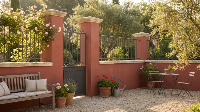
A frank but tempered red, more brick than vermilion, which is exactly the red of Basque timber frames and shutters — and which, on a white façade, works the same magic anywhere else. It wants a pale, neutral render so as not to fight it; superb with raw timber and grey stone.

Our tip — Hardware and hinges in black rather than brass: the red stays rustic and smart.

View the colour → Already in your basket (limit 1 per order)
Huguenot — Outside
09

Burgundy

Huguenot™ No.49

  • Red
  • Dark tone
  • West light
  • LRV ≈ 7%

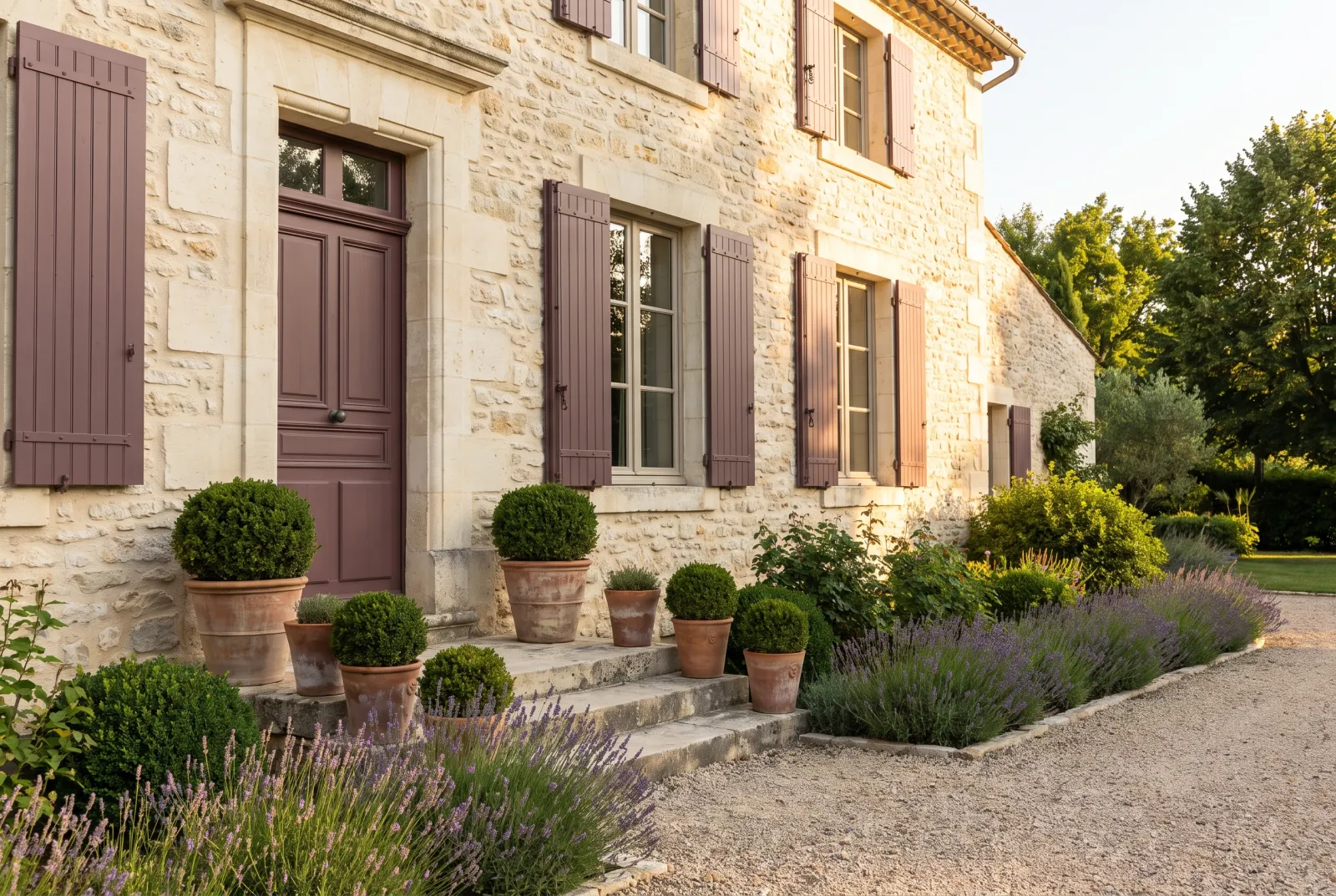
Our Colour of the Year 2027 is also a great shutter colour: a deep crimson, brown in shade, which gives a sober façade — grey stone, white render, yellow brick — the depth of old leather. Less expected than bottle green, warmer than navy.

Our tip — Avoid it on red brick, where it disappears; keep it for pale façades and grey stone.

View the colour → Already in your basket (limit 1 per order)
Oratory — Outside
10

Contemporary anthracite

Oratory™ No.237

  • Grey
  • Dark tone
  • North light
  • LRV ≈ 14%

A barely blued anthracite, softer than zinc grey and less hard than black. It is the colour of shutters and joinery on recent houses, and it also rejuvenates a 1970s house on a white or light grey render. It likes aluminium, zinc and greyed timber.

Our tip — Shutters, gate and garage door in Oratory, front door one tone darker in Sinner No.238: the coherent contemporary façade.

View the colour → Already in your basket (limit 1 per order)

These colours in real rooms

Our schemes in which one of this guide's shades plays the lead — or a supporting role.

All schemes · Exterior →
Pleasure Gardens Green™ No.214 Saint Johns™ No.64
Red Post Hill™ No.68 The Boltons™ No.28
Sleet™ No.91 Syon Park™ No.13 Beata White BH.01
Boathouse™ No.33 Greenwich Time™ No.8 Wedgwood FTT-016
Observatory™ No.34 Greenwich Time™ No.8 Mayfair Dark™ No.218
Oratory™ No.237 Saint Johns™ No.64 Haymarket™ No.47

Choosing a shutter colour

Start with the façade

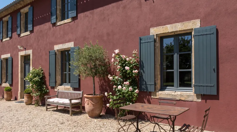
A white render takes anything, and it is where the frank colours — Basque red, cart blue, bottle green — look best. Pale stone or cream render likes grey-greens, greens and burgundies. Grey stone or granite calls for blues, greys and red. Red brick wants dark green, black or night blue, never red. A grey contemporary façade takes anthracite or, to surprise it, a burgundy.

Think of the region

Shutter colours are a local vocabulary: cart blue and olive green in Provence, red and green in the Basque Country, blue and white in Brittany, pearl grey and grey-green around Paris, in Normandy and the Loire. You can depart from it, but you do it better knowing it.

Check with the town hall before buying

Changing the colour of your shutters alters the exterior appearance of the house: in most French communes this requires a déclaration préalable de travaux, and the local plan (PLU) often imposes a palette of permitted shades. Near a listed monument or in a protected heritage site, the Architecte des Bâtiments de France also gives an opinion. One call to the planning office saves painting twice.

Match shutters, door and gate

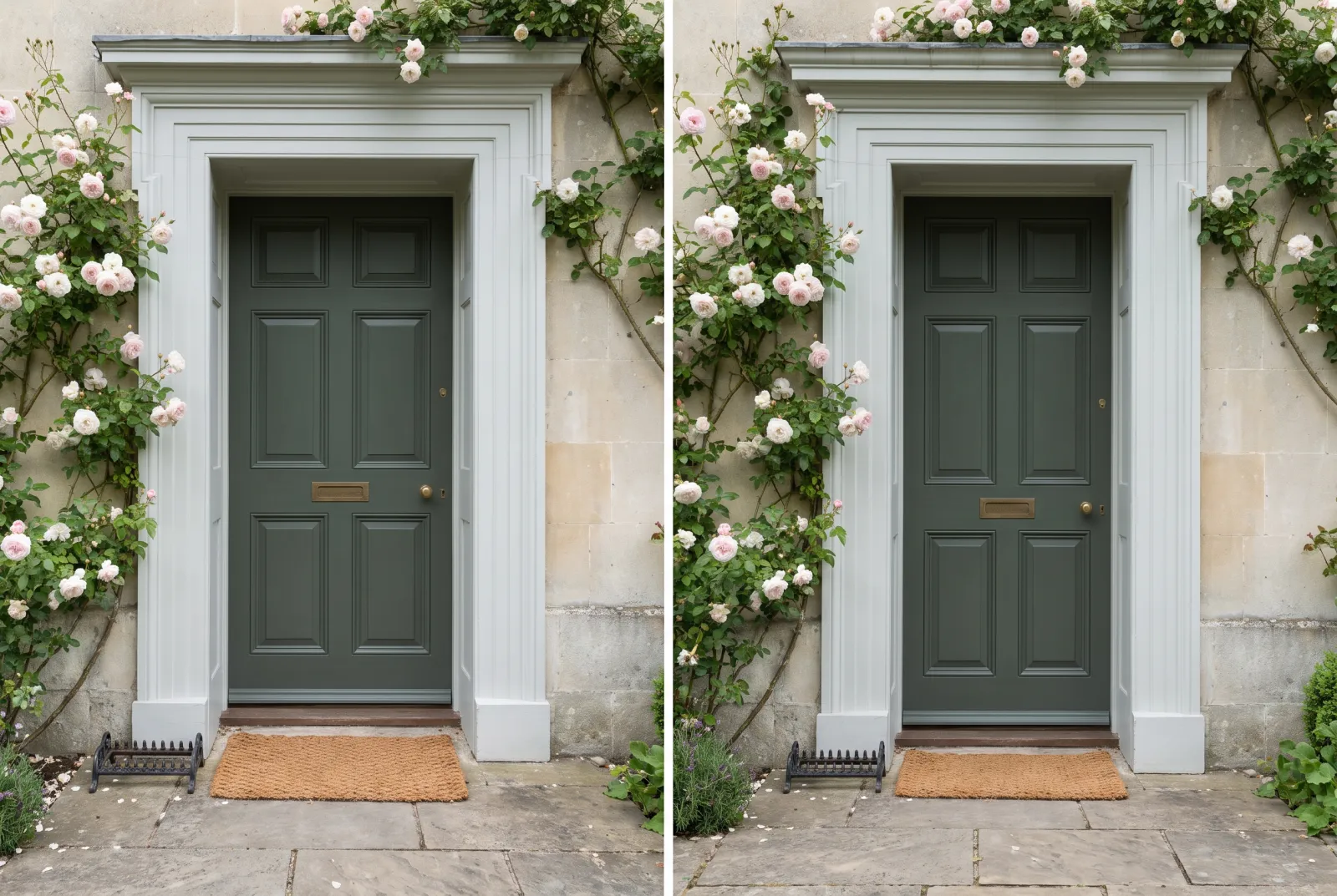
Three options: all in one colour (most coherent), the door one tone darker than the shutters (most elegant), or neutral shutters and a coloured door (most cheerful). Our front-door colours complete this guide.

Finish and quantity

Multi-Surface Eggshell by default: a light satin (≈ 15% sheen) that resists moisture, washes and does not underline the defects of old timber. Multi-Surface Satin for more lustre and greater resistance to rubbing and washing. Multi-Surface Gloss for the lacquered look of town shutters, the most weather-resistant, but demanding flawless preparation. All three go on wood and metal, after sanding, dusting and Multi-Surface Primer; in dry weather between 8 and 25 °C, out of full sun, in two thin coats, on both faces and the edges. Take the shutters off and paint them flat if you can: runs disappear and so do the hinges — the method is in How to paint exteriors with our Multi-Surface paints.

Quantities: a pair of 1.20 m × 0.50 m shutters is about 2.4 m² over both faces; five windows come to 12 m², so about 2 L of finish for two coats at 12 m² per litre, plus 1 L of primer. And before ordering the litres, test the shade on one shutter: outdoors, the light changes everything.


Frequently asked questions

What is the most requested shutter colour today?
Greys, from pearl to anthracite, dominate the requests we receive, and grey-green and blue-grey are rising. White remains the reference by the sea; bottle green and Basque red remain the colours of character.
Do I need permission to change the colour of my shutters?
In most French communes, yes: a déclaration préalable at the town hall, because shutter colour is part of the exterior appearance. The PLU may restrict the palette, and the Architecte des Bâtiments de France gives an opinion in protected areas.
Which finish for timber shutters?
Multi-Surface Eggshell, over Multi-Surface Primer, in two thin coats. Satin if you want more lustre and resistance, Gloss for a lacquered look.
Can I paint PVC or aluminium shutters?
Our Multi-Surface finishes are designed for wood and metal, including aluminium after degreasing and priming. For PVC, write to us before buying: the substrate and its condition decide.
Should the door match the shutters?
Not necessarily, but it is the most coherent solution. The elegant alternative is a door one tone darker in the same family — Sloane Square shutters, Oratory door; Boathouse shutters, Observatory door.

Guides to read next

All colour guides →

Want to see these colours at home?

Order a sample to judge the shade in your own light, or browse every paint for the room.

Sign up to our newsletter

Sign up to our newsletter

Thanks for signing up to our newsletter!