Colour guides · Living room · Neutral

10 neutrals for a living room

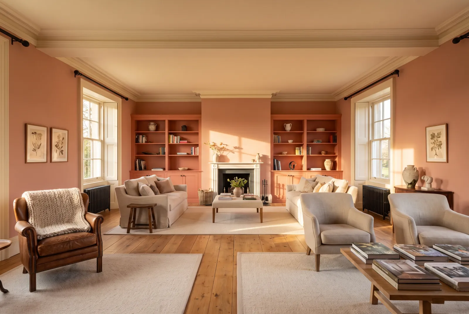
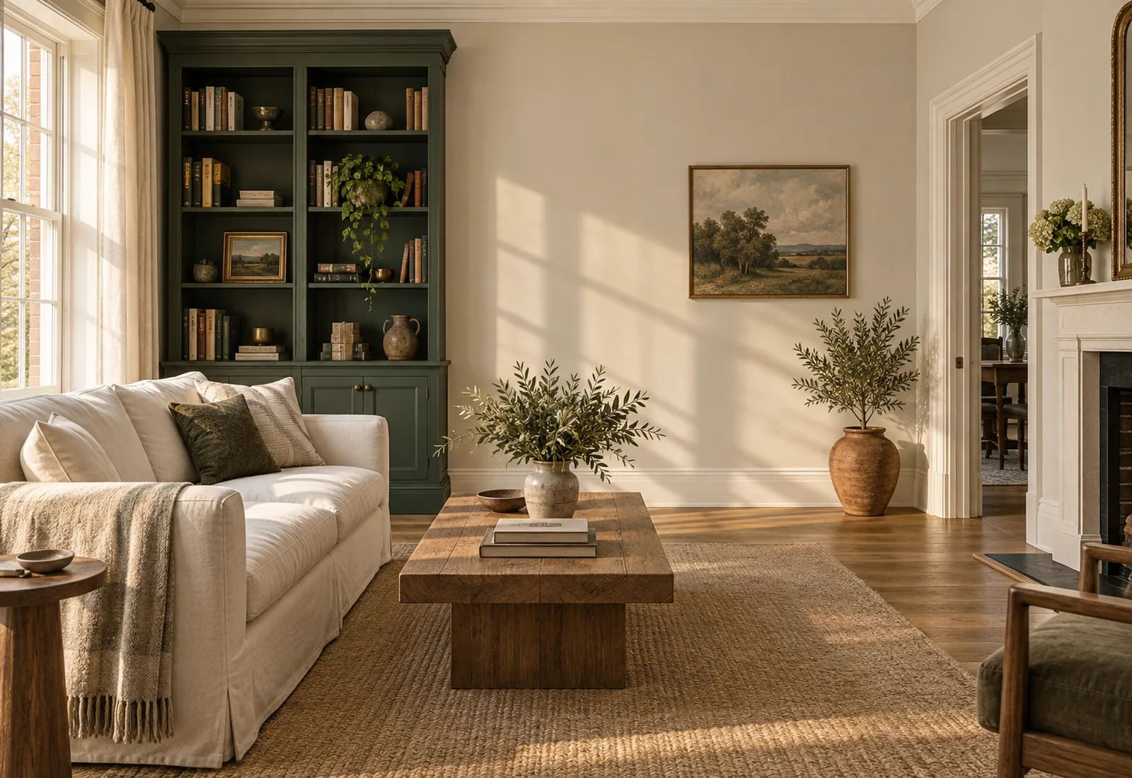
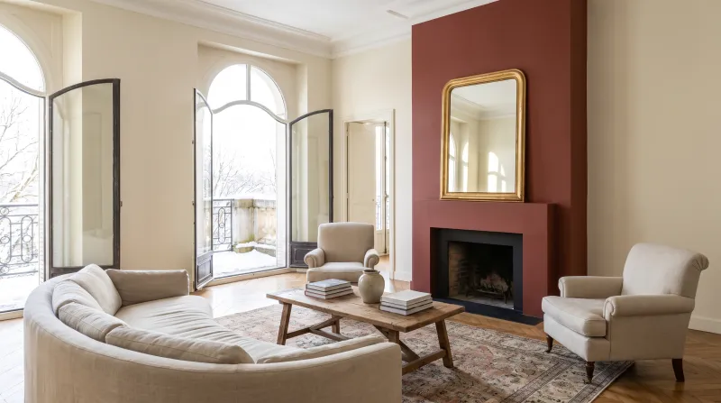
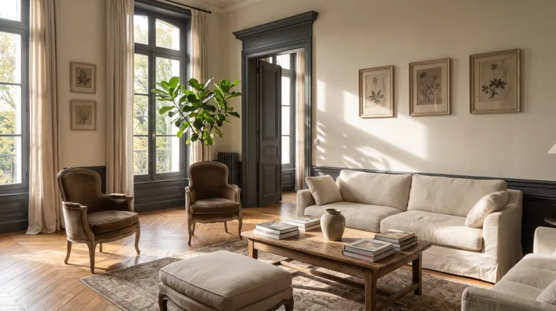
A neutral is not an absence of colour: it is a colour that has learnt discretion. Good living-room neutrals have an undertone — stone, plaster, sand, linen — that makes them warm without making them beige, and that leaves all the room to textiles, books and pictures.

Here are ten Mylands neutrals, from lightest to deepest, for a living room you'll live in for years.

Updated September 2026 · by the Mylands France colour team

10 neutrals for a living room

The short answer

For a living room, the safest neutrals are the pale stones — Cadogan Stone No.59, Chalk Farm No.53, Limestone No.55 — which warm without yellowing. For more depth, Temple Bar No.70 or Egyptian Grey No.154; for an evening living room, Westmoreland No.160.

At a glance

Our selection

10 colours

St James — Livingroom
01

The lightest

St James™ No.40

  • Neutral
  • Pale tone
  • South light
  • LRV ≈ 74%

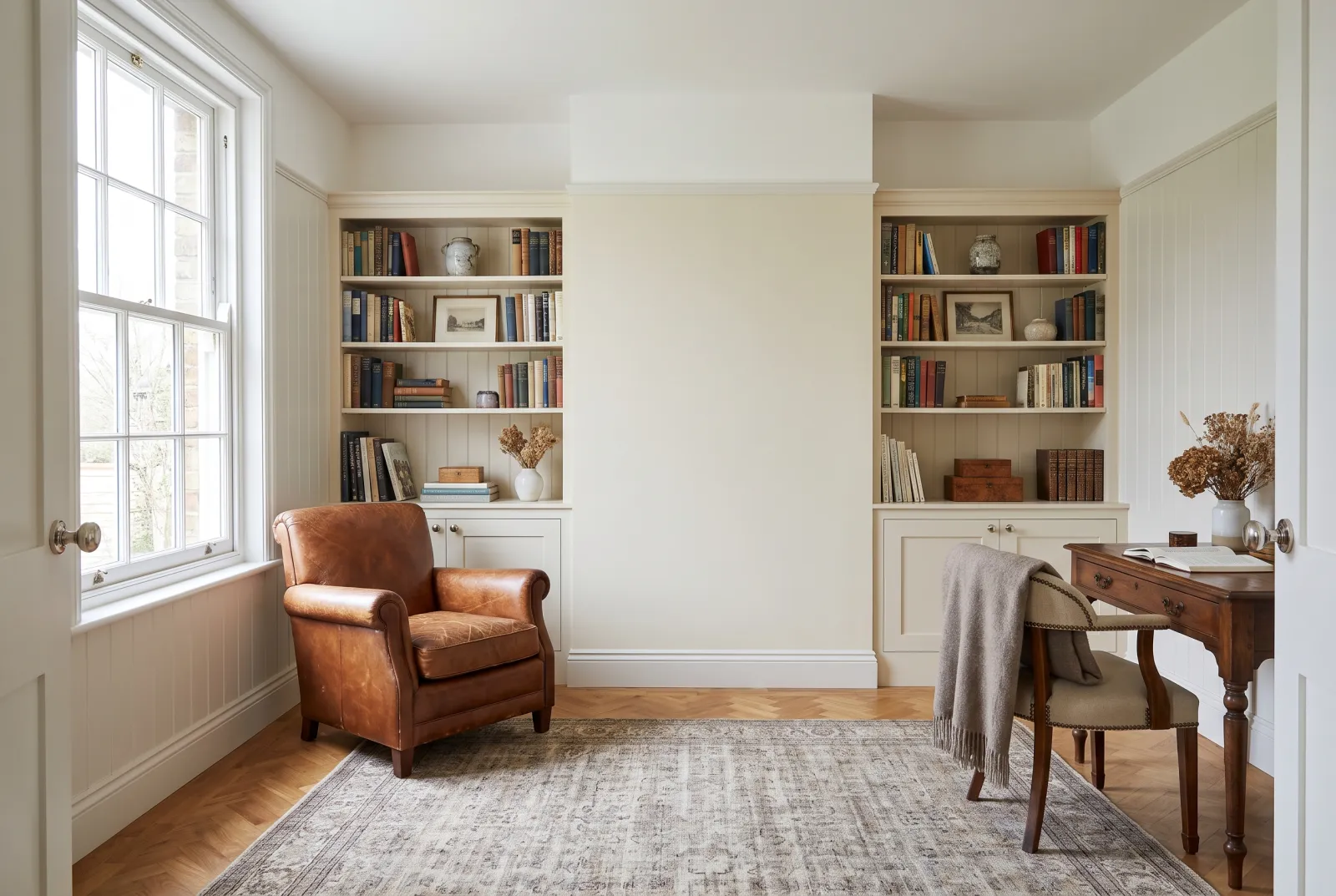
Barely more than a white: a very pale neutral with a yellow-stone undertone, reflecting almost as much light as an off-white. It is the neutral to choose for a living room you want bright above all, but without a white's coldness — it gives walls the softness of old lime plaster.

Our tip — Woodwork in Pure White for a crisp contrast, or in Charterhouse for a gentle one.
View the colour → Already in your basket (limit 1 per order)
Chalk Farm — Livingroom
02

The chalk neutral

Chalk Farm™ No.53

  • Neutral
  • Pale tone
  • South light
  • West light
  • LRV ≈ 73%

A pale, powdery beige, the colour of soft chalk, with a faintly pink undertone that keeps it on the warm side. It has the quality of the great neutrals: you don't notice it, you notice that the room is pleasant. With linen, pale timber and an ecru sofa, it is the calm living room par excellence.

Our tip — The ideal partner for Egyptian Grey on a bookcase or chimney breast.

View the colour → Already in your basket (limit 1 per order)
Cadogan Stone — living room
03

The dressed stone

Cadogan Stone™ No.59

  • Neutral
  • Pale tone
  • West light
  • LRV ≈ 67%

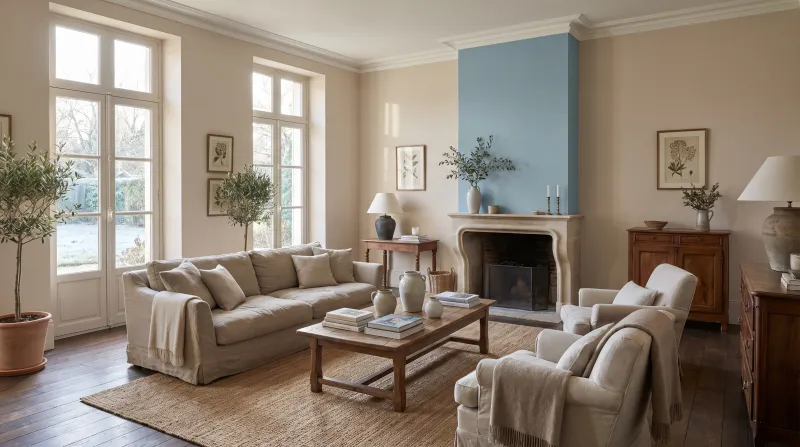
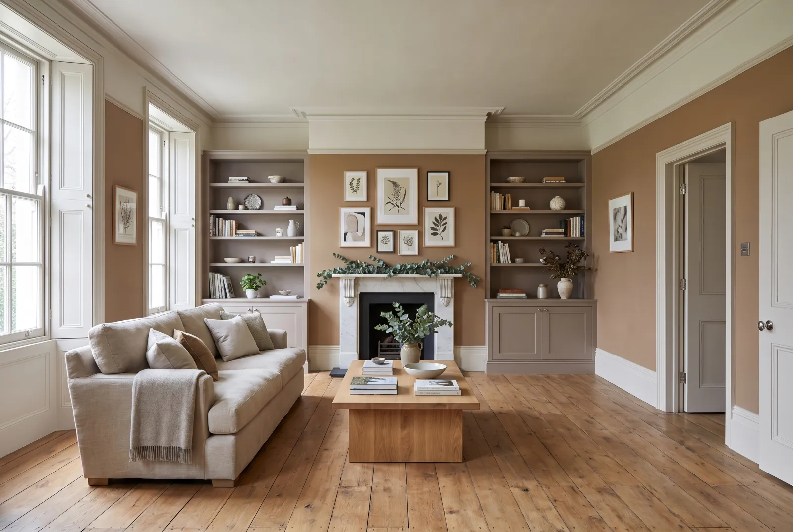
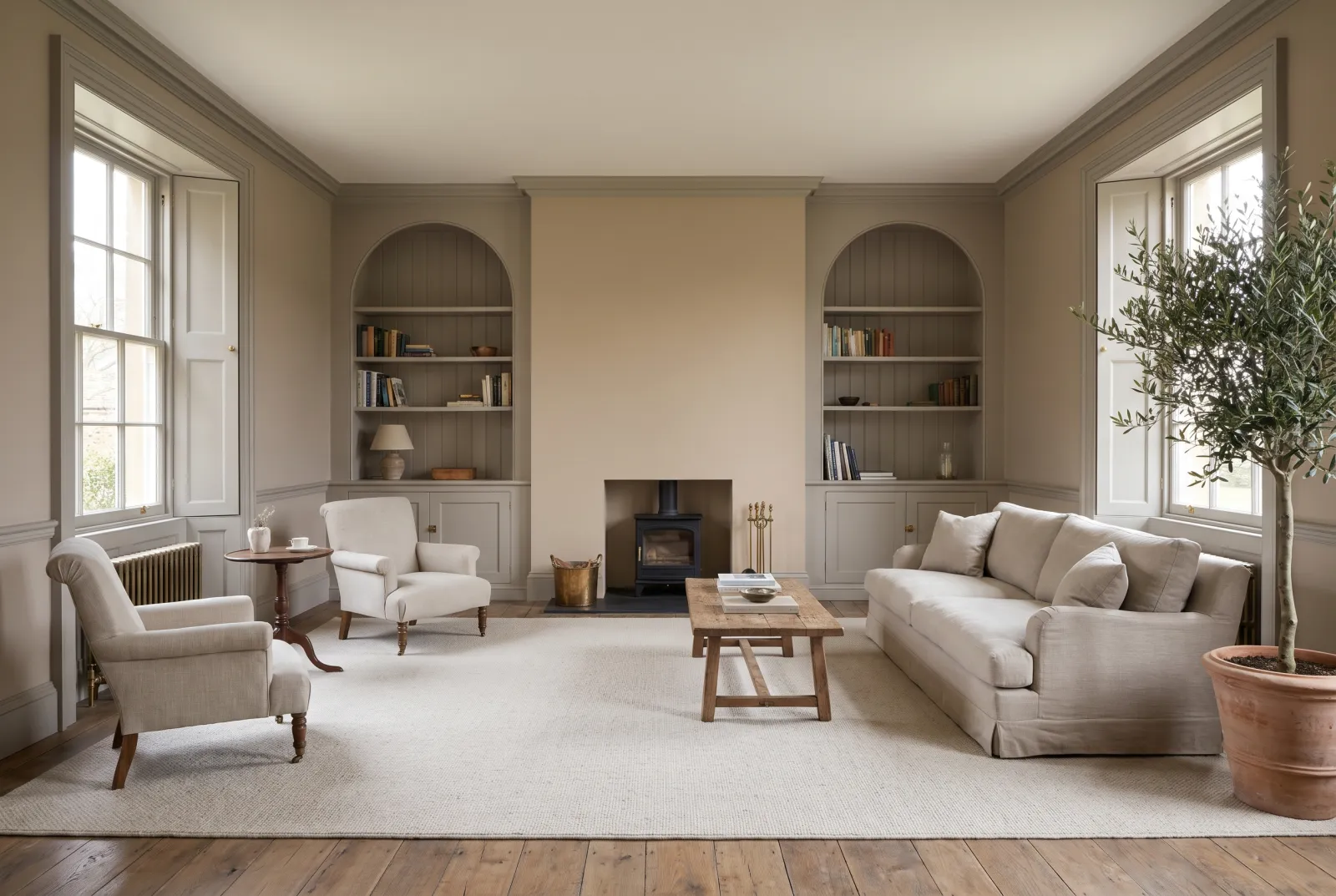
Our most asked-for living-room neutral: a soft, luminous stone beige with a yellow-brown undertone, like Bath limestone. It works in every orientation, warms a north-facing room and stays crisp facing south, and it accepts almost any colour beside it — from deep green to pink.

Our tip — Chimney wall in Westmoreland, the others in Cadogan Stone: two stones, one light, one dark.

View the colour → Already in your basket (limit 1 per order)
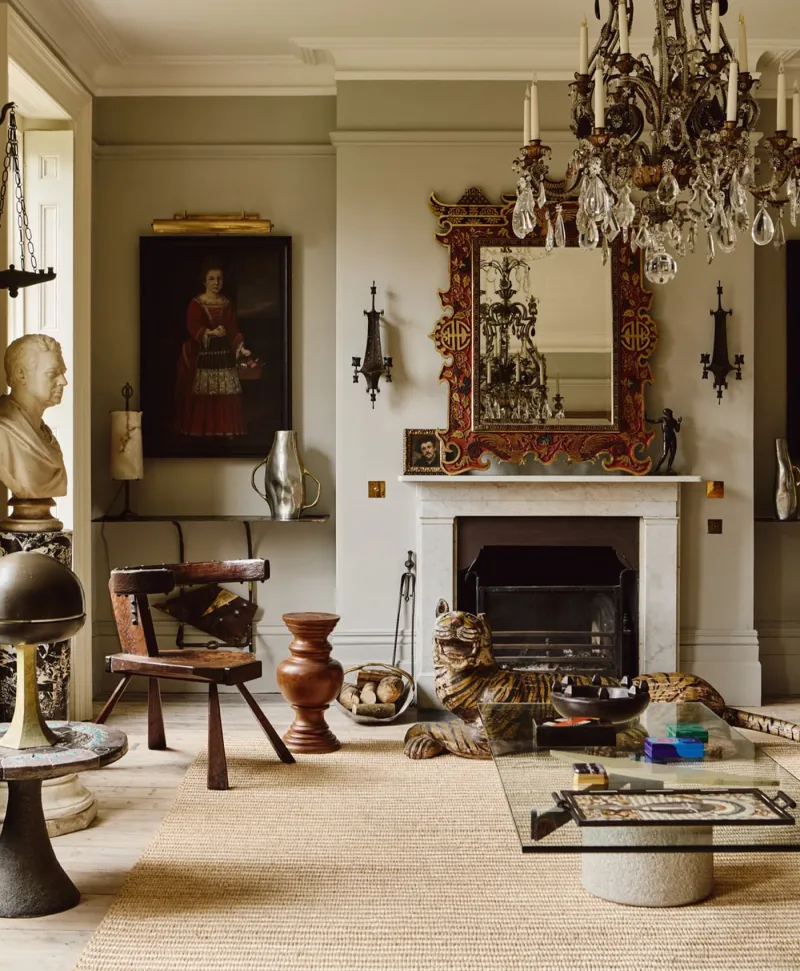
Warm grey living room with classical decor, including a chandelier, fireplace, and various sculptures.
04

The limestone

Limestone™ No.55

  • Neutral
  • Pale tone
  • South light
  • LRV ≈ 67%

A pale grey-beige between stone and linen, almost without undertone — the most 'neutral' neutral on the list. That is why it is so widely used: on a ceiling above a deep colour, on woodwork, or across the four walls of a living room that wants its furniture to do the talking. It never argues with anything.

Our tip — The reference ceiling and woodwork beneath Brompton Road, Huguenot or Observatory.

View the colour → Already in your basket (limit 1 per order)
Silver Bit — Livingroom
05

The pink-tinged neutral

Silver Bit™ No.77

  • Neutral
  • Pale tone
  • West light
  • LRV ≈ 65%

A pale beige with a pink undertone, warmer than Limestone, softer than Cadogan Stone. The pink is almost invisible on the wall — it shows only in the room looking more welcoming than expected, and in faces looking well in it. An evening living-room neutral, superb under lamps.

Our tip — With Soho Pink on a door or an alcove: the pink reveals itself without imposing.

View the colour → Already in your basket (limit 1 per order)
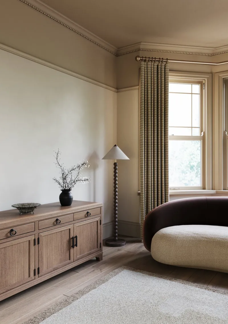
Temple Bar — Livingroom
06

The sand

Temple Bar™ No.70

  • Neutral
  • Pale tone
  • West light
  • LRV ≈ 60%

A light-to-mid beige, warm and settled, the colour of dry sand. It has more presence than the pale neutrals on this list: the walls become a material, not just a ground. It is the neutral of a country living room or a holiday house — with rattan, weathered timber and off-whites, it makes a permanent summer.

Our tip — Woodwork in Whitehall, a stone white barely lighter: the holiday house all year round.

View the colour → Already in your basket (limit 1 per order)
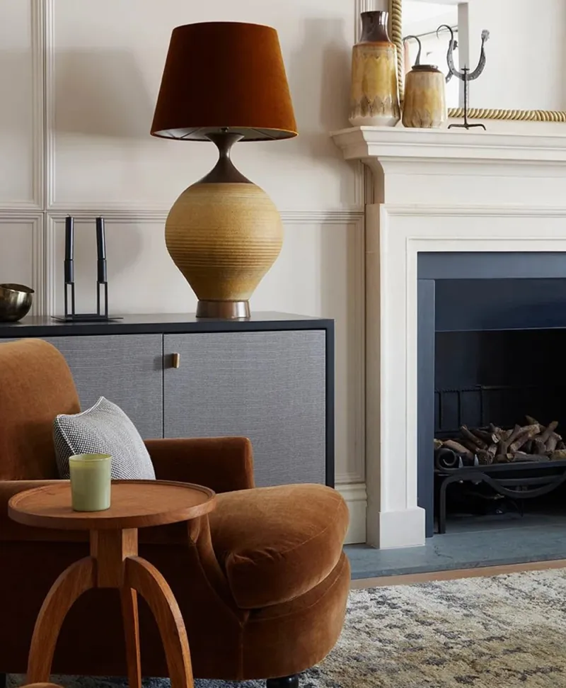
Cosy neutral living room with brown armchair, lamp, and fireplace.
07

The greige

Hoxton Grey™ No.72

  • Neutral
  • Pale tone
  • West light
  • LRV ≈ 58%

The reference grey-beige: a neutral with enough grey to stay sober and enough beige and pink to stay warm. It is the living-room neutral that ages best with fashion — it suited yesterday's Scandinavian style, it suits today's English one. An excellent ground for pictures and coloured fabrics.

Our tip — Colour-drenched, walls and woodwork in Hoxton Grey, the room gains depth without losing light.

View the colour → Already in your basket (limit 1 per order)
Chester Square — Livingroom
08

The olive neutral

Chester Square™ No.199

  • Neutral
  • Mid tone
  • South light
  • LRV ≈ 44%

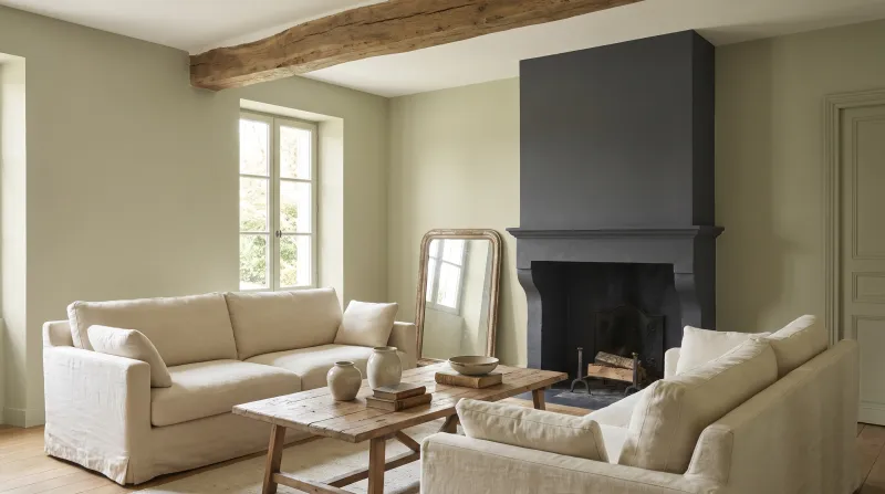
A mid neutral leaning towards olive and khaki — the only one on this list to carry green. That undertone gives it a garden quality beiges lack, and it makes a remarkable ground for dark timber, tan leather and gilt frames. An English living-room neutral, enveloping without heaviness.

Our tip — Ceiling in Limestone, woodwork in Chester Square too: the library-living room.

View the colour → Already in your basket (limit 1 per order)
Cadogan Stone — living room
09

The grey-taupe

Egyptian Grey™ No.154

  • Neutral
  • Mid tone
  • South light
  • LRV ≈ 37%

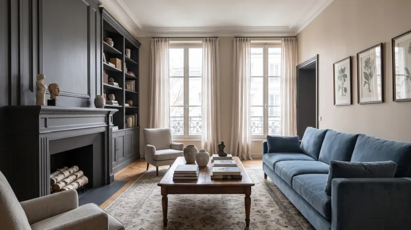
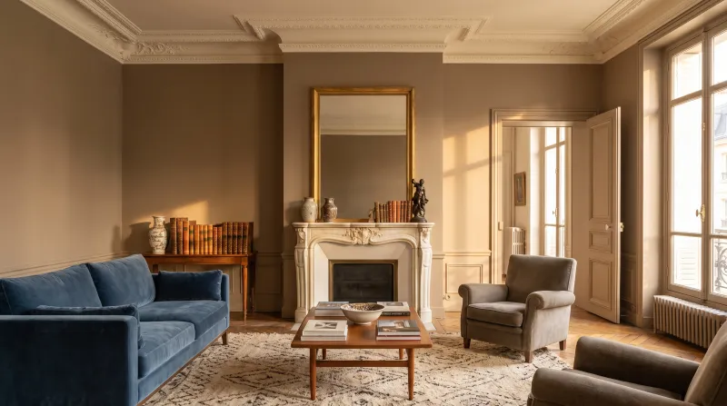
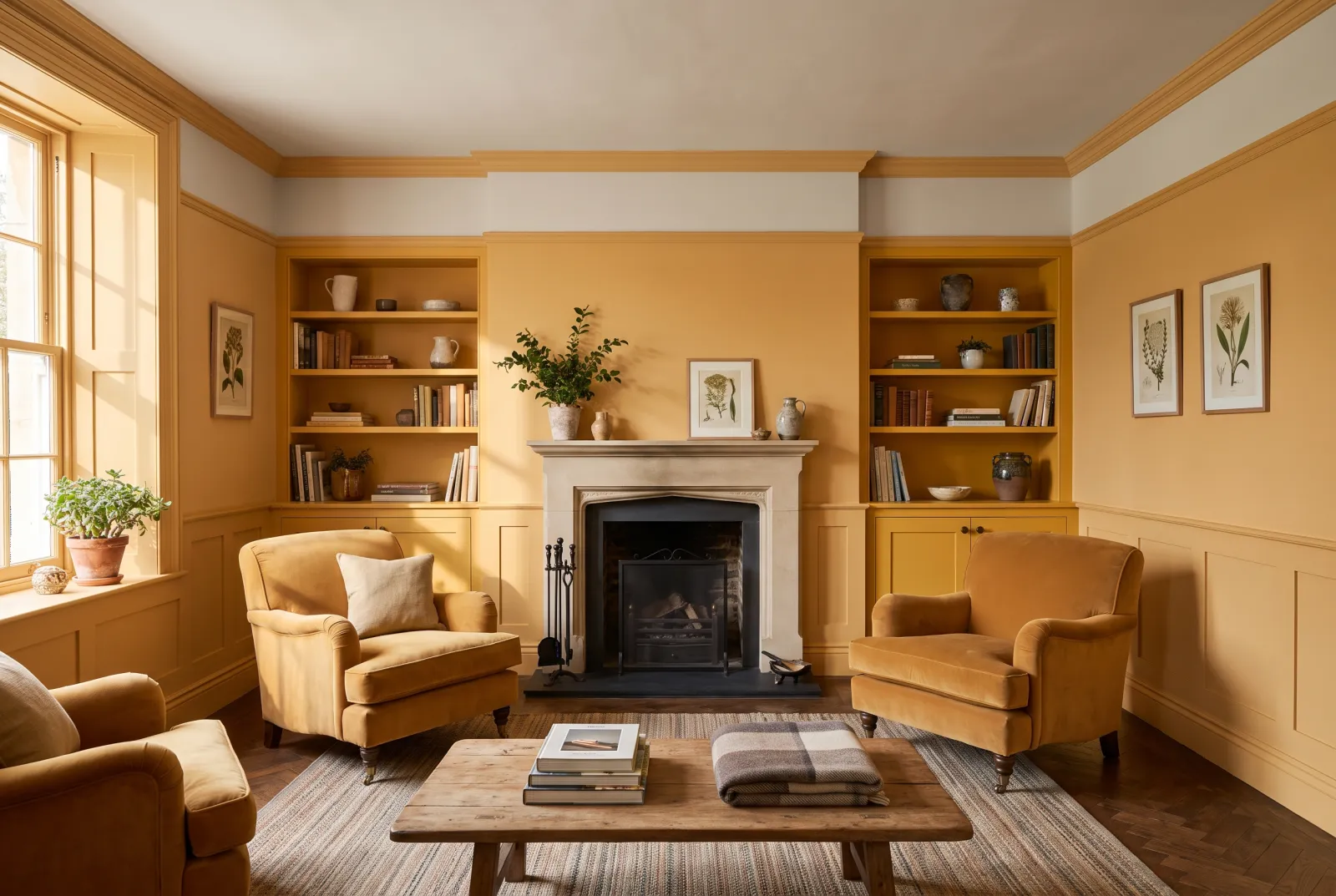
A mid neutral between grey and taupe, with a brown undertone that keeps it warm in every light. It is the neutral of evening living rooms: under lamps it turns cashmere-coloured; by day it stays sober. It likes warm whites, brass, velvet and dark timber.

Our tip — Woodwork in Chalk Farm, one step lighter, for a contrast that is all softness.

View the colour → Already in your basket (limit 1 per order)
Westmoreland — Livingroom
10

The deepest

Westmoreland™ No.160

  • Neutral
  • Mid tone
  • West light
  • LRV ≈ 22%

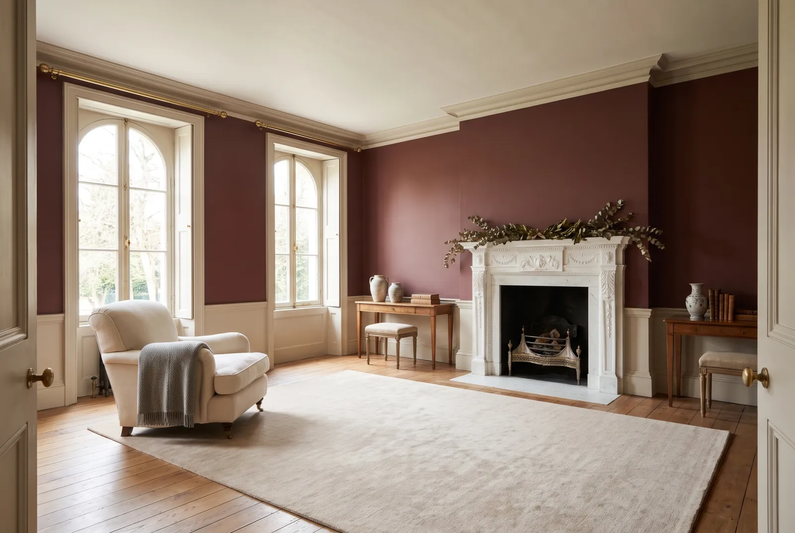
A deep taupe, brown-grey, the colour of wet stone. It is the neutral that makes a living room enveloping without resorting to a colour — the answer for those who want the depth of a dark green or blue without committing to a hue. Superb colour-drenched with ochre and rust textiles.

Our tip — Ceiling in Cadogan Stone to keep some air; or all in Westmoreland for the complete cocoon.

View the colour → Already in your basket (limit 1 per order)

These colours in real rooms

Our schemes in which one of this guide's shades plays the lead — or a supporting role.

All schemes · Living room →
London Brick BH.07 Limestone™ No.55 Birdcage Walk™ No.117
Clerkenwell™ No.21 Frieze™ No.84 Hoxton Grey™ No.72
Whitehall™ No.9 Cadogan Stone™ No.59
Golden Square™ No.131 Limestone™ No.55 Circle Line™ No.45
Huguenot™ No.49 Limestone™ No.55
Coral Orange™ No.277 Limestone™ No.55 Vermillion FTT-010

Choosing a living-room neutral

Find the undertone before the value. Two neutrals of the same lightness make opposite rooms depending on whether they lean pink (Silver Bit No.77, Chalk Farm No.53), yellow (Cadogan Stone No.59, Temple Bar No.70), green (Chester Square No.199) or grey (Limestone No.55, Hoxton Grey No.72). The undertone should follow what is already in the room: a golden oak floor calls for a yellow or green neutral, a grey floor for a pink-tinged one, a dark parquet for almost anything.

Think about the light. Facing north, pink and yellow neutrals keep their warmth; grey neutrals can look dull. Facing south, grey neutrals stay fresh; yellow neutrals can turn show-home beige. Our page Discover our neutral groups sorts them by undertone, and How light changes colour takes each orientation in turn.

Give it a contrast. An all-neutral living room needs one deep point: a bookcase in Westmoreland No.160, a door in Brompton Road No.205, a chimney breast in Huguenot No.49. Without it the neutral looks bland; with it, it looks chosen. See also our colours for a north-facing living room, our neutral schemes and all our neutrals.

Frequently asked questions

Which is the most versatile neutral for a living room?
Cadogan Stone No.59: a luminous stone beige that works in every orientation and accepts almost any colour beside it. For an even more discreet neutral, Limestone No.55.
Which neutral for a north-facing living room?
A neutral with a pink or yellow undertone: Chalk Farm No.53, Silver Bit No.77, Cadogan Stone No.59 or Hoxton Grey No.72. Frankly grey neutrals look dull in cold light.
How do I stop a neutral living room looking bland?
Add one deep point — a bookcase, a door, a chimney breast — in a dark colour: Westmoreland No.160, Brompton Road No.205 or Huguenot No.49. The neutral then looks chosen, not settled for.
Which finish for living-room walls?
Marble Matt Emulsion: a velvet matt with crushed Carrara marble, washable, that gives neutrals their most beautiful depth. Woodwork in Multi-Surface Eggshell.

Guides to read next

All colour guides →

Want to see these colours at home?

Order a sample to judge the shade in your own light, or browse every paint for the room.

Sign up to our newsletter

Sign up to our newsletter

Thanks for signing up to our newsletter!