Colour guides · Kitchen · Green

10 greens for a kitchen

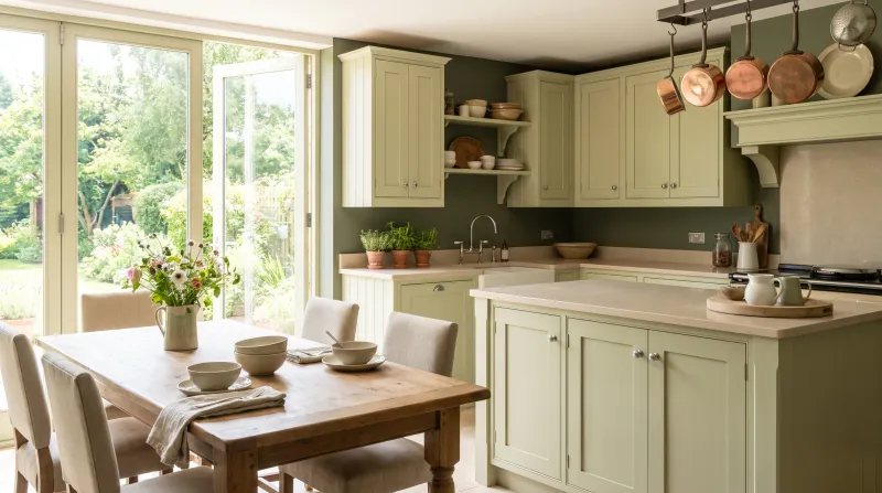
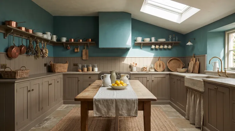
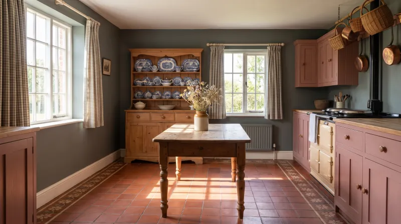
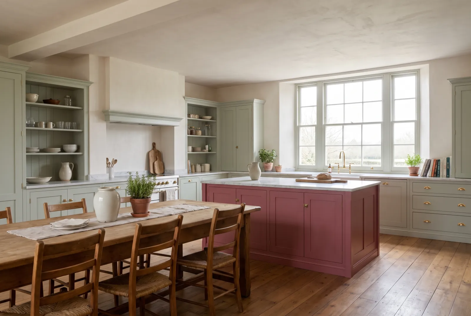
Green has become the kitchen colour: it suits timber, brass, marble and white tiles, and it looks as good at breakfast as at dinner. The trick is choosing the right one — a green for cabinet fronts is not a green for walls.

Here are ten Mylands shades, from palest to deepest, each with the job it does best.

Updated September 2026 · by the Mylands France colour team

10 greens for a kitchen

The short answer

On kitchen cabinets, mid and deep greens hold up best: Sorrel Green No.207, Brompton Road No.205 and Damp Leaf BH.14. On walls, stay with pale and grey-greens — Copper Green No.36, Glass BH.09, Myrtle Green No.168 — which keep the room bright.

At a glance

Our selection

10 colours

Glass — Kitchen
01

The brightest

Glass BH.09

  • Green
  • Pale tone
  • East light
  • LRV ≈ 66%

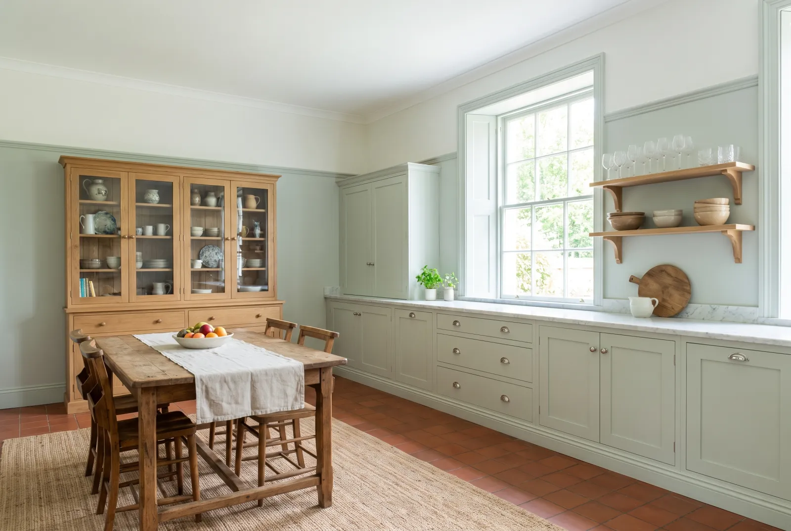
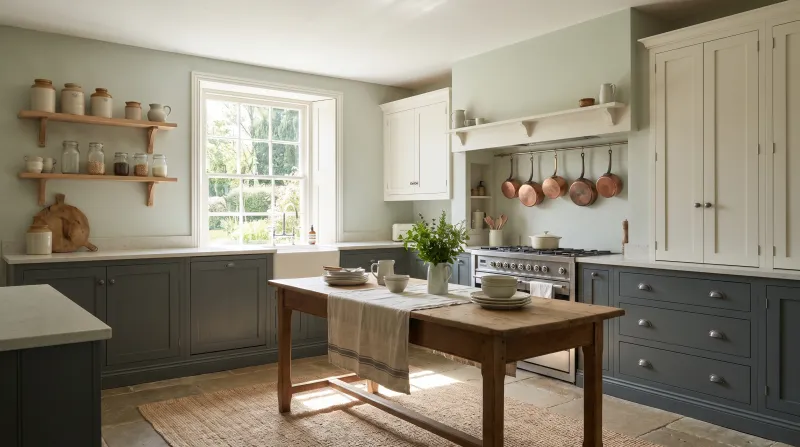
A barely-tinted water green, between mint and blue, drawn by Beata Heuman from the colour of glass. On kitchen walls it does what a white would — enlarge, lighten — while adding a freshness white lacks. It is especially handsome on a ceiling, where it lends a feeling of height.

Our tip — Walls and ceiling in Marble Matt Emulsion; with white or pale oak units it is all the colour the room needs.
View the colour → Already in your basket (limit 1 per order)
Copper Green — Kitchen
02

The verdigris of copper roofs

Copper Green™ No.36

  • Green
  • Pale tone
  • South light
  • LRV ≈ 63%

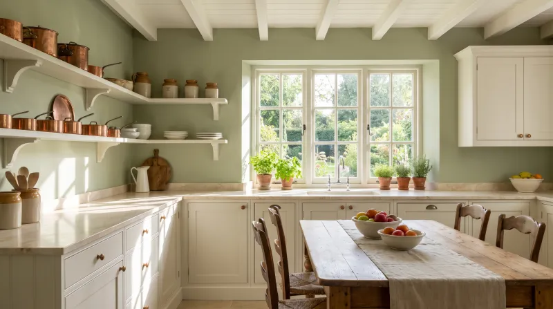
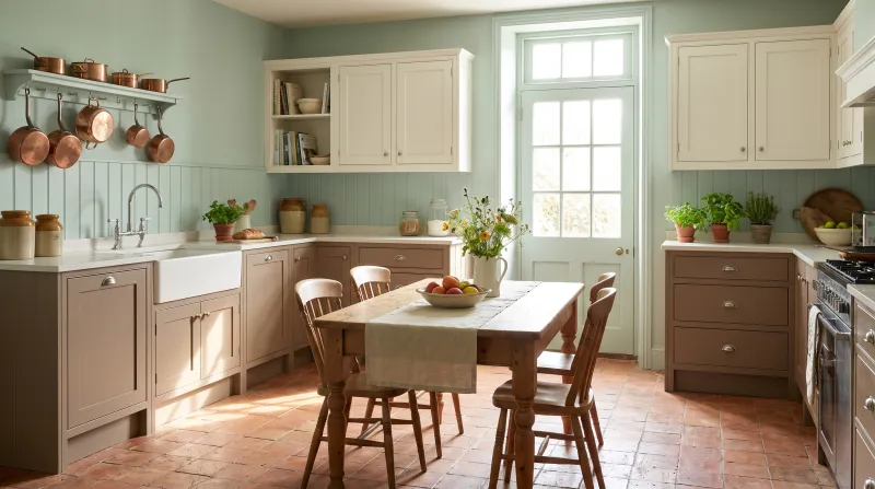
Inspired by the patina on copper roofs, a pale green lifted with a touch of blue. It is the easiest wall green in the range: light enough for a kitchen short of daylight, coloured enough never to read as grey. Against a white marble worktop the effect is immediate.

Our tip — Superb across every wall of a kitchen, facing north or south: its hint of blue stays fresh without ever turning cold.

View the colour → Already in your basket (limit 1 per order)
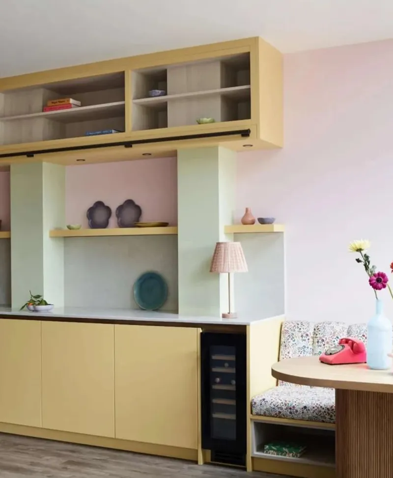
Retro kitchen with wooden cabinets in pastel shades including pale yellow, mint green, pastel pink, shelves, and a small table.
03

The almond green

French Green™ No.187

  • Green
  • Pale tone
  • East light
  • LRV ≈ 57%

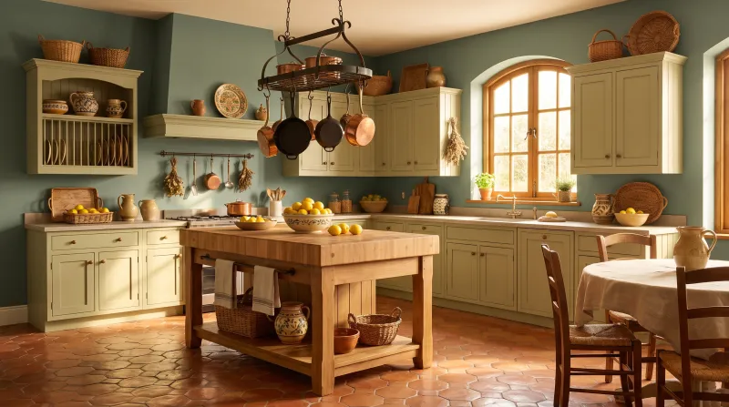
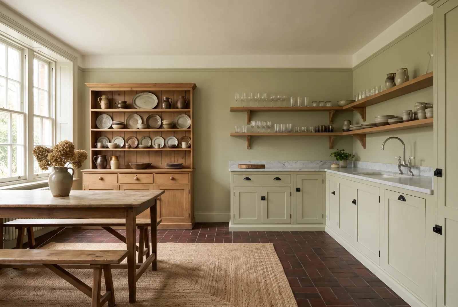
A fresh green with yellow undertones, inherited from early nineteenth-century palettes. That warmth makes it very easy to live with: it warms a north-facing kitchen and brings blond timber to life. On cabinet fronts it gives a country kitchen without the cliché; on walls it plays off crackled white tiles.

Our tip — Cabinets in Multi-Surface Eggshell, walls in Cavendish Cream: a warm, gentle kitchen.

View the colour → Already in your basket (limit 1 per order)
Sprig — Kitchen
04

The first leaf

Sprig JB.06

  • Green
  • Mid tone
  • East light
  • LRV ≈ 50%

Jinny Blom drew it from the first hazel leaf of spring, backlit by the sun. A tender green, yellower than Copper Green, that works as an alternative to white for brightening dark corners — the far end of a kitchen, a larder, the inside of a dresser.

Our tip — Paint the inside of open shelving or a dresser in Sprig: white crockery has never looked better.

View the colour → Already in your basket (limit 1 per order)
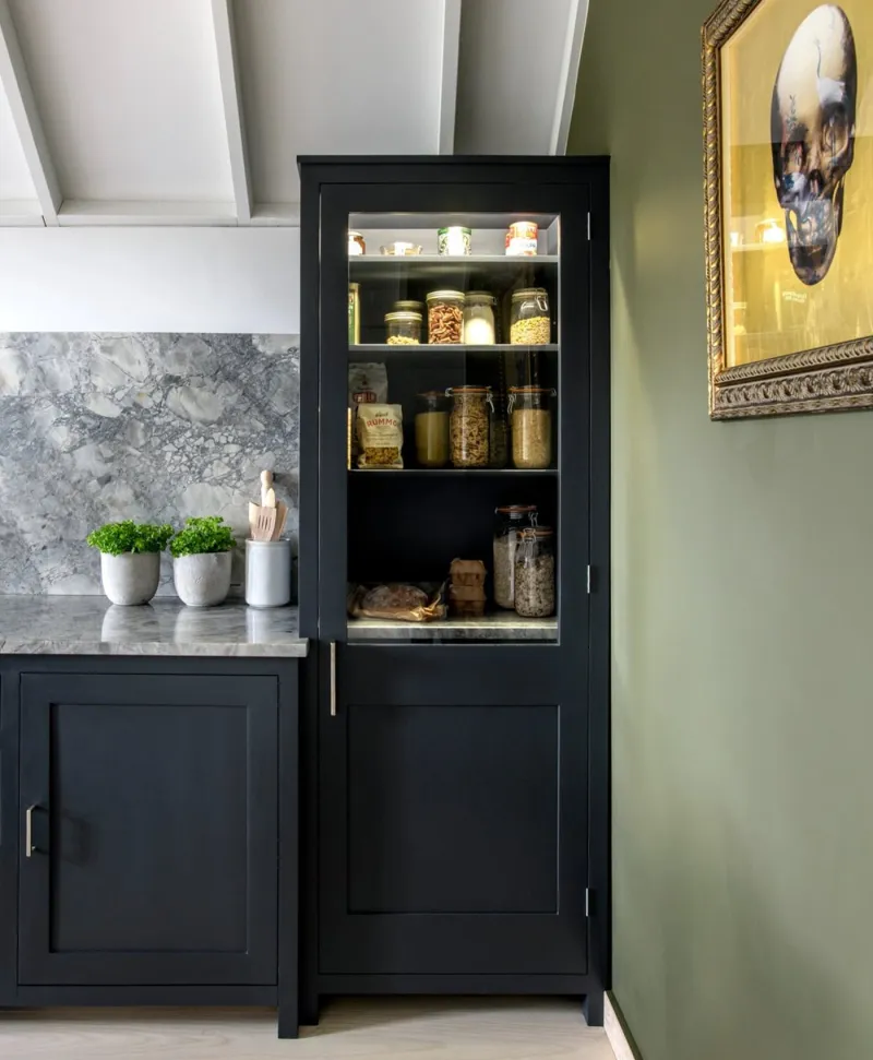
Black pantry cabinet with glass door in a kitchen setting, with a green wall and light grey ceiling
05

The classic grey-green

Myrtle Green™ No.168

  • Grey
  • Mid tone
  • North light
  • LRV ≈ 28%

Reintroduced from the archive colour cards, Myrtle Green is a green tempered with grey, settled and calming. It is the green for kitchens that don't want to look 'painted green': on walls it behaves like a coloured neutral; on cabinets it ages with a soft patina brighter greens never acquire.

Our tip — Walls and cabinets in the same shade (colour drenching) with a timber worktop: the most enveloping kitchen on this list.

View the colour → Already in your basket (limit 1 per order)
Sorrel Green — Kitchen
06

The cabinet green

Sorrel Green™ No.207

  • Green
  • Dark tone
  • East light
  • LRV ≈ 15%

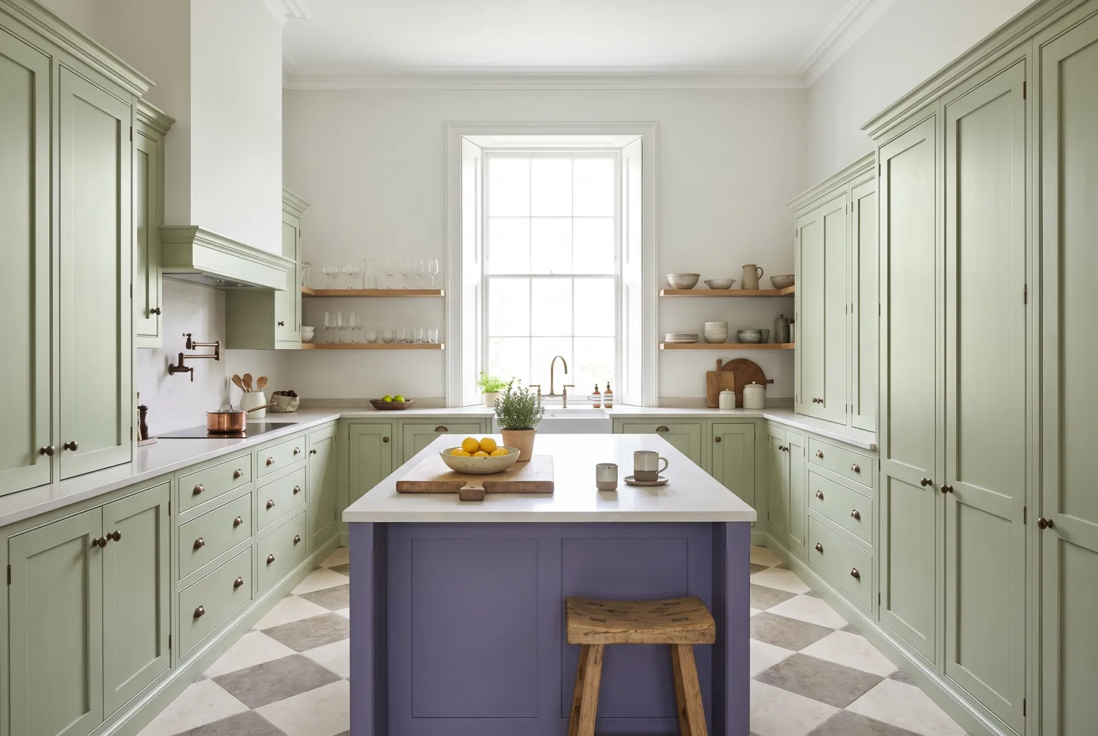
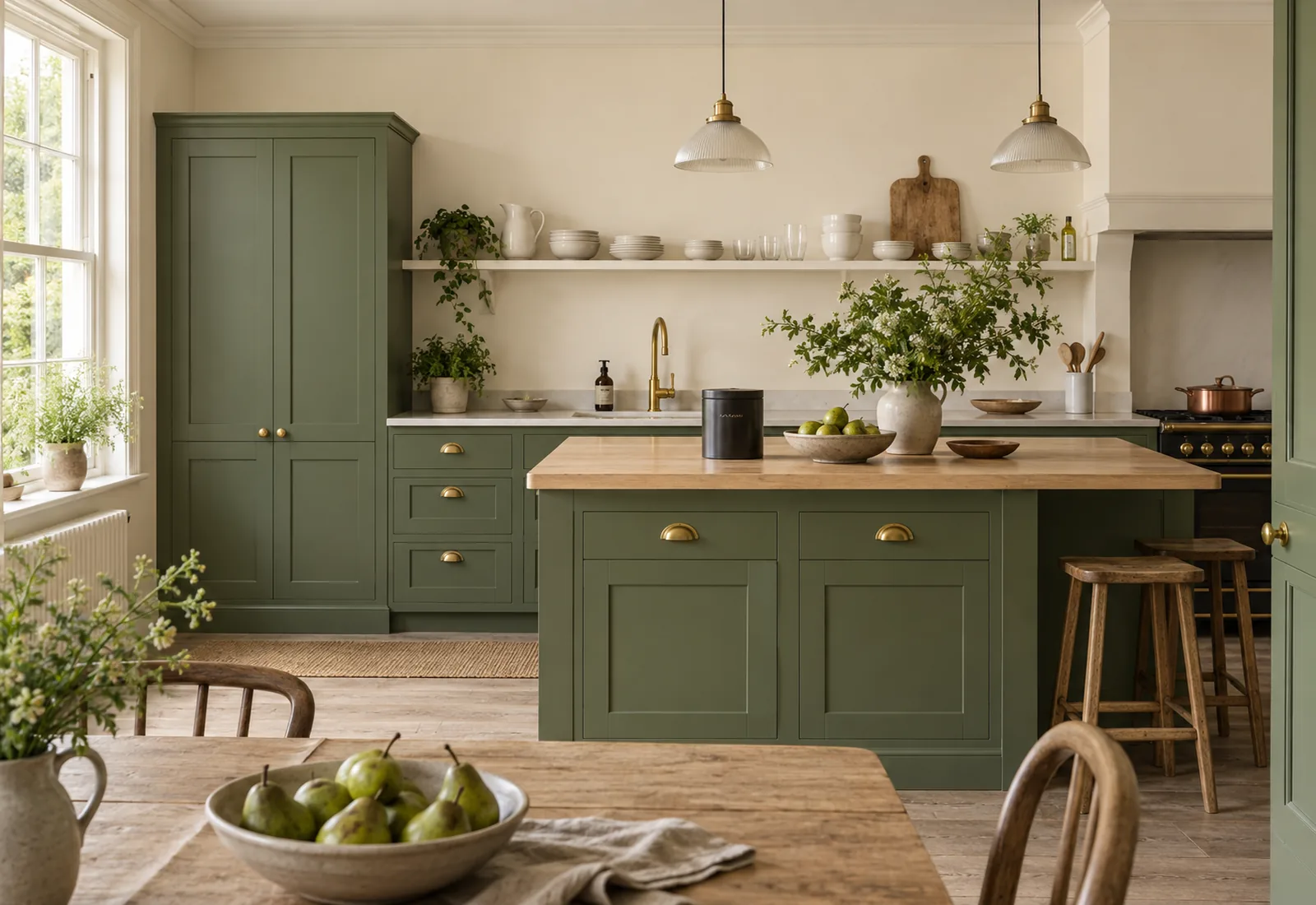
A vibrant botanical green, made of bright yellow, umber and a touch of white — perennial grass, as Mylands puts it. It is our most asked-for cabinet green: deep enough to stand up to marble and brass, alive enough never to darken the room. With pale stone walls, it is the contemporary English kitchen.

Our tip — Cabinets in Multi-Surface Eggshell over our green primer & undercoat; walls in Limestone or Frieze.

View the colour → Already in your basket (limit 1 per order)
Damp Leaf — 1990s kitchen
07

The light forest green

Damp Leaf BH.14

  • Green
  • Dark tone
  • East light
  • LRV ≈ 15%

Soft and enveloping like a misty garden on a summer morning, with a little blue that makes it more vibrant. Beata Heuman recommends it precisely for storage furniture, and a kitchen is the best case: on an island or a run of base units it makes a deep plinth beneath pale walls.

Our tip — Base units in Damp Leaf, wall units in Glass or Chalk: the kitchen stays light above and grounded below.

View the colour → Already in your basket (limit 1 per order)
French Green — Kitchen
08

The deep green of London houses

Brompton Road™ No.205

  • Grey
  • Dark tone
  • North light
  • LRV ≈ 13%

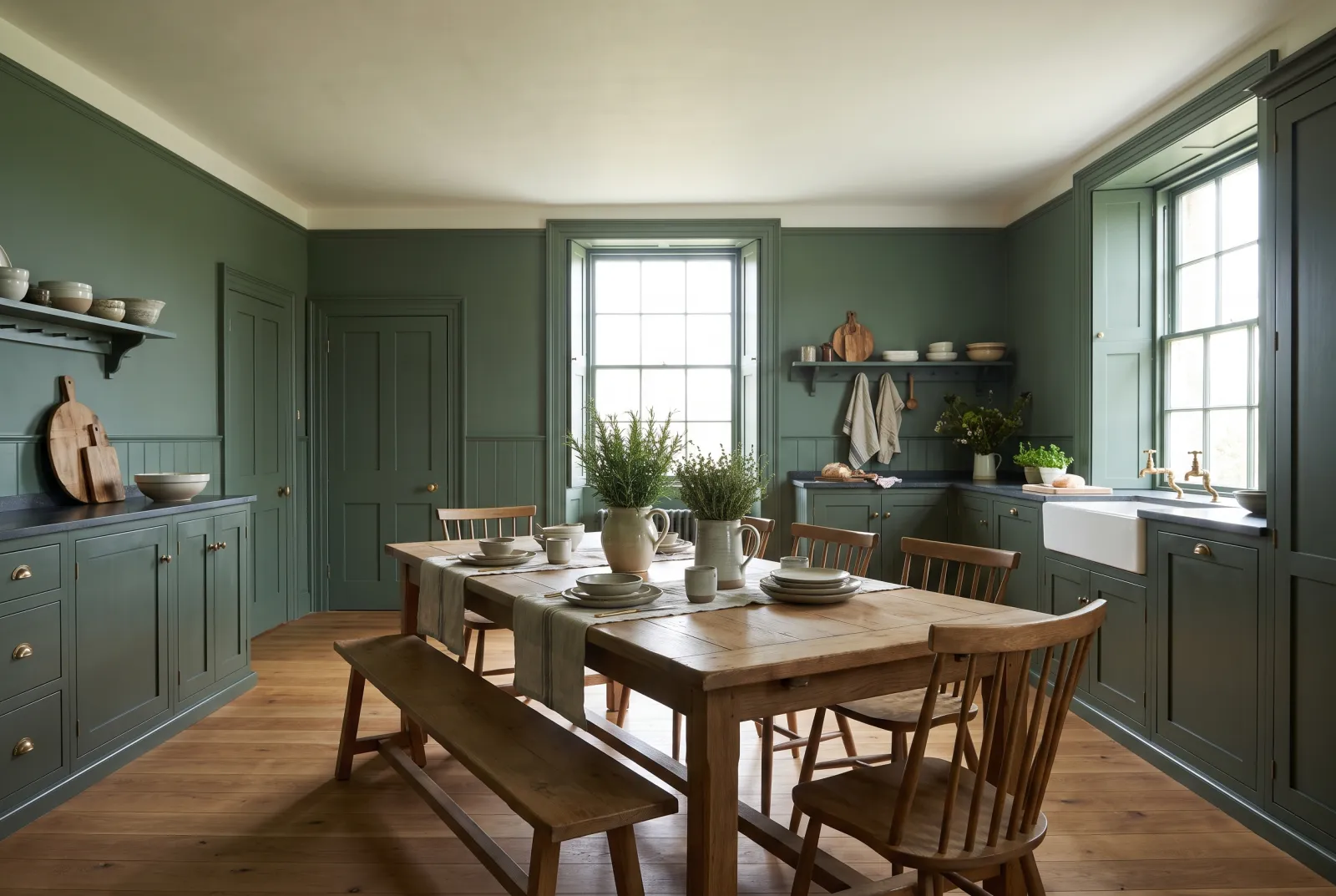
First supplied to a house on Brompton Road, between Fulham and Chelsea, it is a deep green tempered with grey, with warm undertones. It has everything a kitchen-cabinet green needs: it turns neither blue in north light nor yellow under spotlights. On framed doors it makes a serious, serene kitchen.

Our tip — With brushed-brass handles and a white veined-marble worktop: the safest contrast on the list.

View the colour → Already in your basket (limit 1 per order)
Deep Green — Kitchen
09

The modern turquoise green

Deep Green FTT-012

  • Green
  • Dark tone
  • South light
  • LRV ≈ 17%

From the FTT film-and-theatre palette, Deep Green is a luminous green with turquoise accents — brighter and more saturated than anything else on this list. It is not for the whole kitchen: it is a focal point. An island, a larder door, the splashback wall of a white kitchen — there, it does all the decorating.

Our tip — One element in Deep Green, everything else in Pure White: energy without fatigue.

View the colour → Already in your basket (limit 1 per order)
Pleasure Gardens Green — 1980s kitchen
10

The dark foliage green

Pleasure Gardens Green™ No.214

  • Green
  • Dark tone
  • East light
  • LRV ≈ 8%

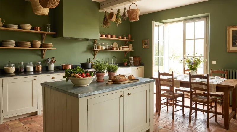
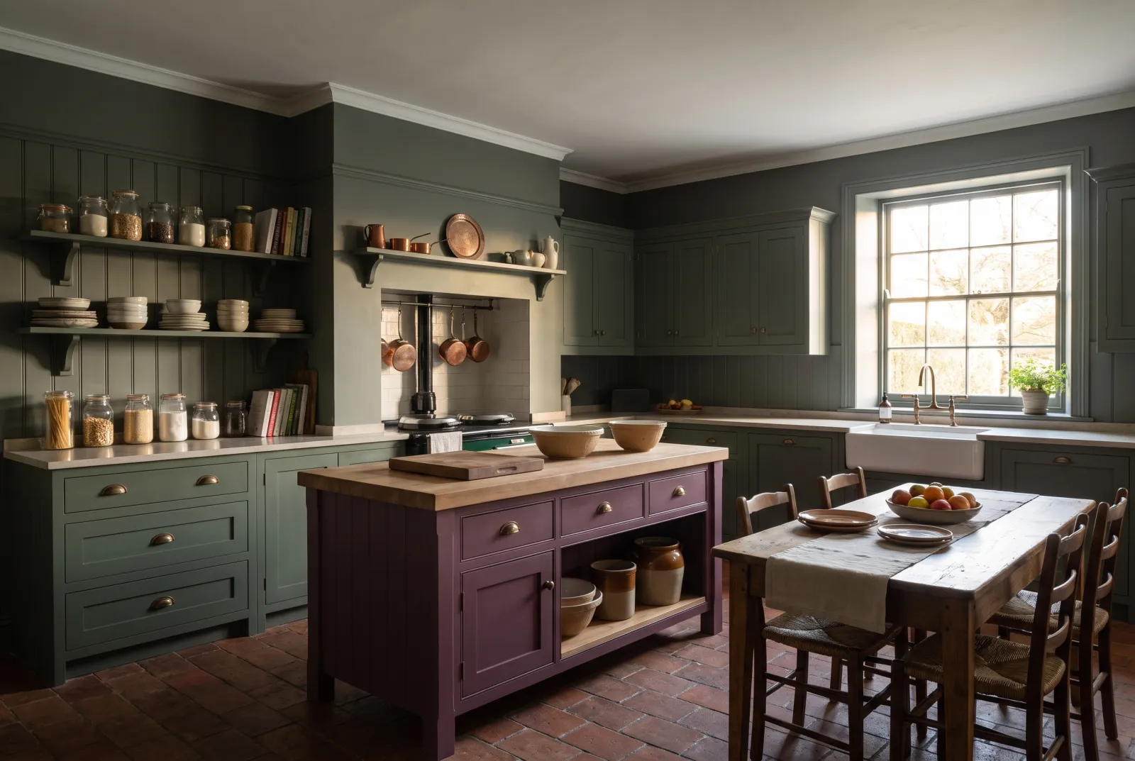
Named after the Vauxhall pleasure gardens, a stone's throw from Mylands' original shop: a dark green carrying red and a drop of violet, which makes it warmer and more complex than Forest. It is the shade for evening kitchen-diners — under a lamp it turns almost to velvet. On cabinets it accepts every hardware, from brass to black.

Our tip — Colour-drench it in Multi-Surface Dead Matt, walls and cabinets alike, over a terracotta floor: the warmest kitchen there is.

View the colour → Already in your basket (limit 1 per order)

These colours in real rooms

Our schemes in which one of this guide's shades plays the lead — or a supporting role.

All schemes · Kitchen →
Pleasure Gardens Green™ No.214 Saint Johns™ No.64 Forest BH.16 Magenta FTT-007
Damp Leaf BH.14 St Clement™ No.11 Pleasure Gardens Green™ No.214
Sprig JB.06 St Clement™ No.11 Chiswick™ No.100 Ultra Violet FTT-019
Glass BH.09 Syon Park™ No.13 Copper Green™ No.36
French Green™ No.187 Cotton Street™ No.3
Copper Green™ No.36 Holbein Chamber™ No.7 Shocking Pink FTT-006

How to choose a kitchen green

Decide on the surface first. A green for cabinet fronts needs body: pale greens look washed out once surrounded by worktop, appliances and crockery. Keep Glass BH.09, Copper Green No.36 and Sprig JB.06 for walls and ceiling; give the cabinets to Sorrel Green No.207, Brompton Road No.205, Damp Leaf BH.14 or Pleasure Gardens Green No.214.

Then look at the light. A north-facing kitchen cools blue-leaning greens: prefer yellow-undertoned greens there — French Green No.187, Sorrel Green No.207 — or a stable grey-green such as Myrtle Green No.168. Facing south, anything goes; that is where Deep Green FTT-012 and Pleasure Gardens Green No.214 give their best. Our guide How light changes colour takes each orientation in turn.

Finally, choose the whites. A kitchen green is judged by what surrounds it. Stone whites — Limestone No.55, Frieze No.84 — soften deep greens; clean whites — Pure White No.1, Cotton Street No.3 — make them graphic; creams — Cavendish Cream No.120 — warm them. To go further, browse our kitchen ideas, our green schemes or all our green paints.

Frequently asked questions

Which green for kitchen cabinets?
A mid or deep green that keeps its body once surrounded by worktop and appliances: Sorrel Green No.207 for a lively botanical green, Brompton Road No.205 for a serene grey-green, Damp Leaf BH.14 for a light forest green. Apply them in Multi-Surface Eggshell over our green primer & undercoat.
Which green for kitchen walls?
A pale green or a grey-green that keeps the room bright: Copper Green No.36 is the most versatile, Glass BH.09 the lightest, Myrtle Green No.168 the most classic. In washable Marble Matt Emulsion they stand up to kitchen life.
Does green work in a north-facing kitchen?
Yes, provided you choose a green with a yellow or grey undertone rather than a blue one: French Green No.187, Sorrel Green No.207 or Myrtle Green No.168 stay warm in cold light, where a blue-leaning green can look icy.
Which finish for painting kitchen cabinets green?
Multi-Surface Eggshell (15% sheen): moisture-resistant, washable, with a soft sheen that flatters the mouldings of framed doors. For a matt, enveloping look, Multi-Surface Dead Matt (5%).

Guides to read next

All colour guides →

Want to see these colours at home?

Order a sample to judge the shade in your own light, or browse every paint for the room.

Sign up to our newsletter

Sign up to our newsletter

Thanks for signing up to our newsletter!