Three rules for a ceiling
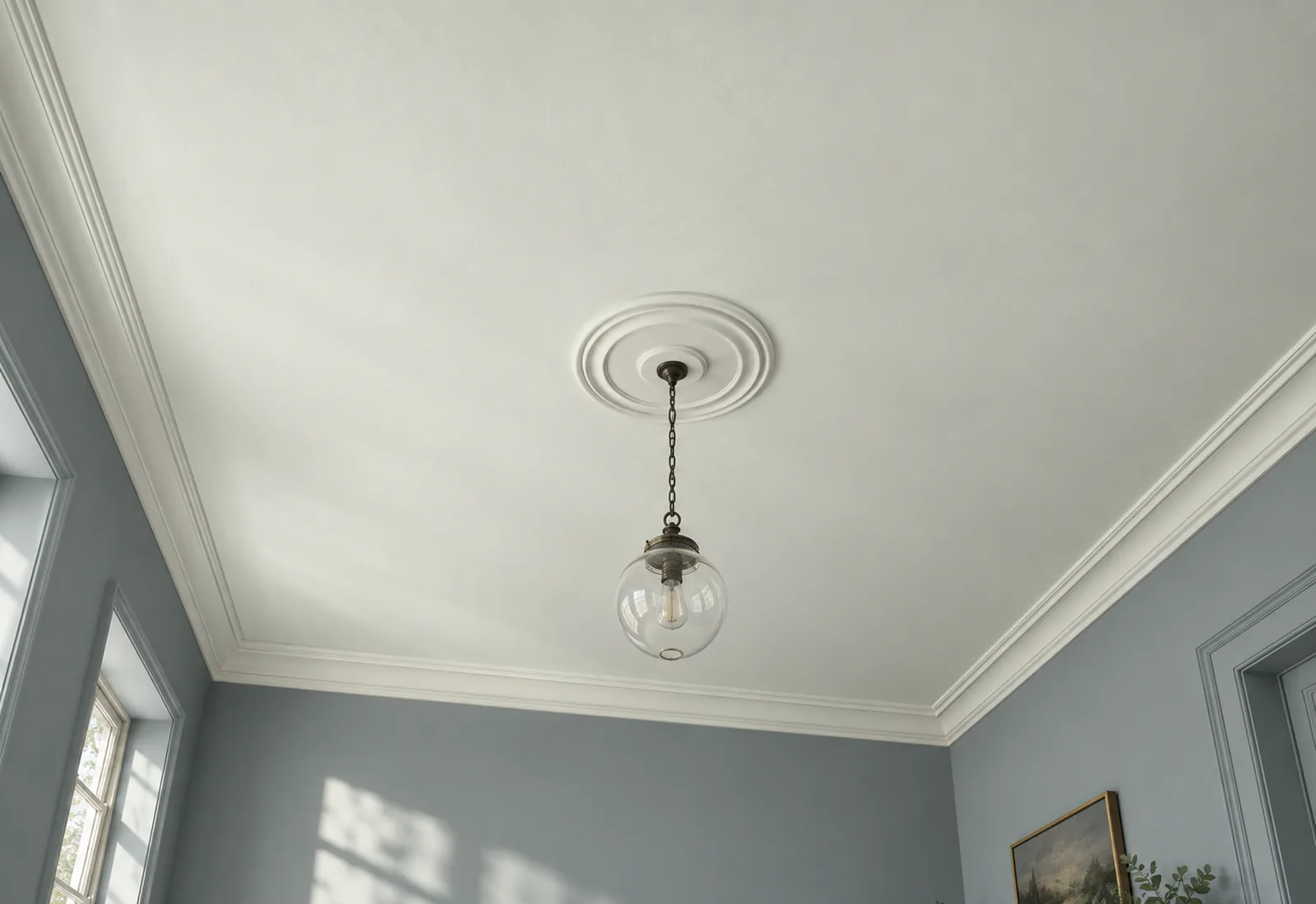
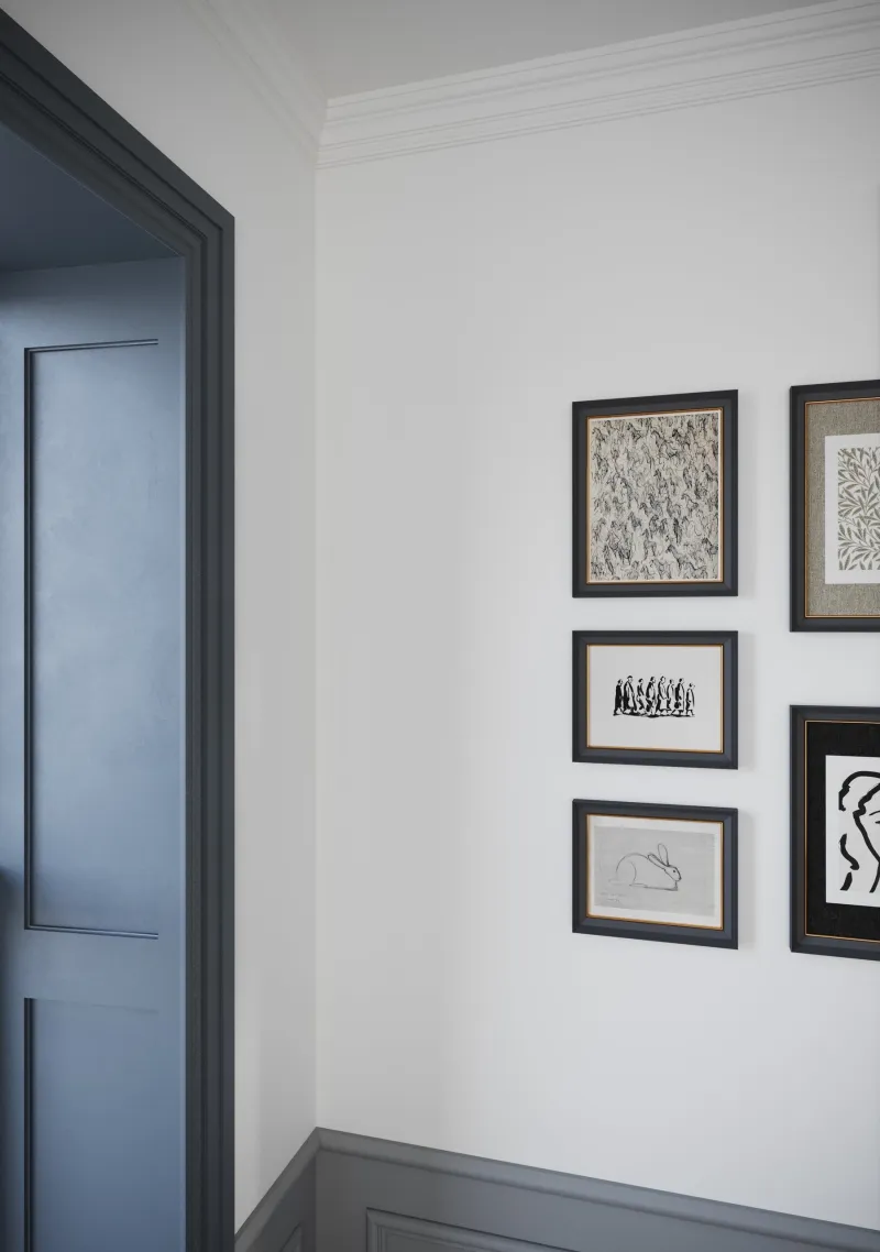
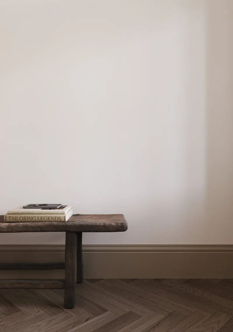
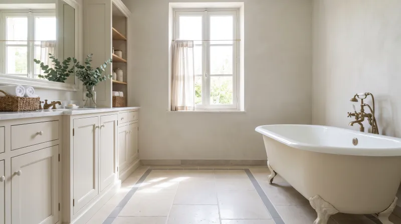
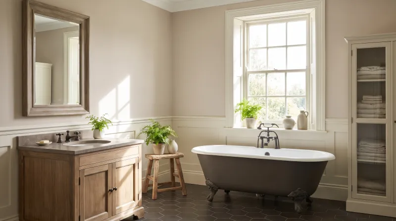
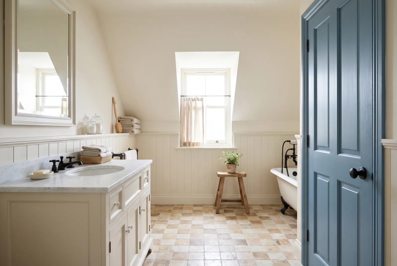
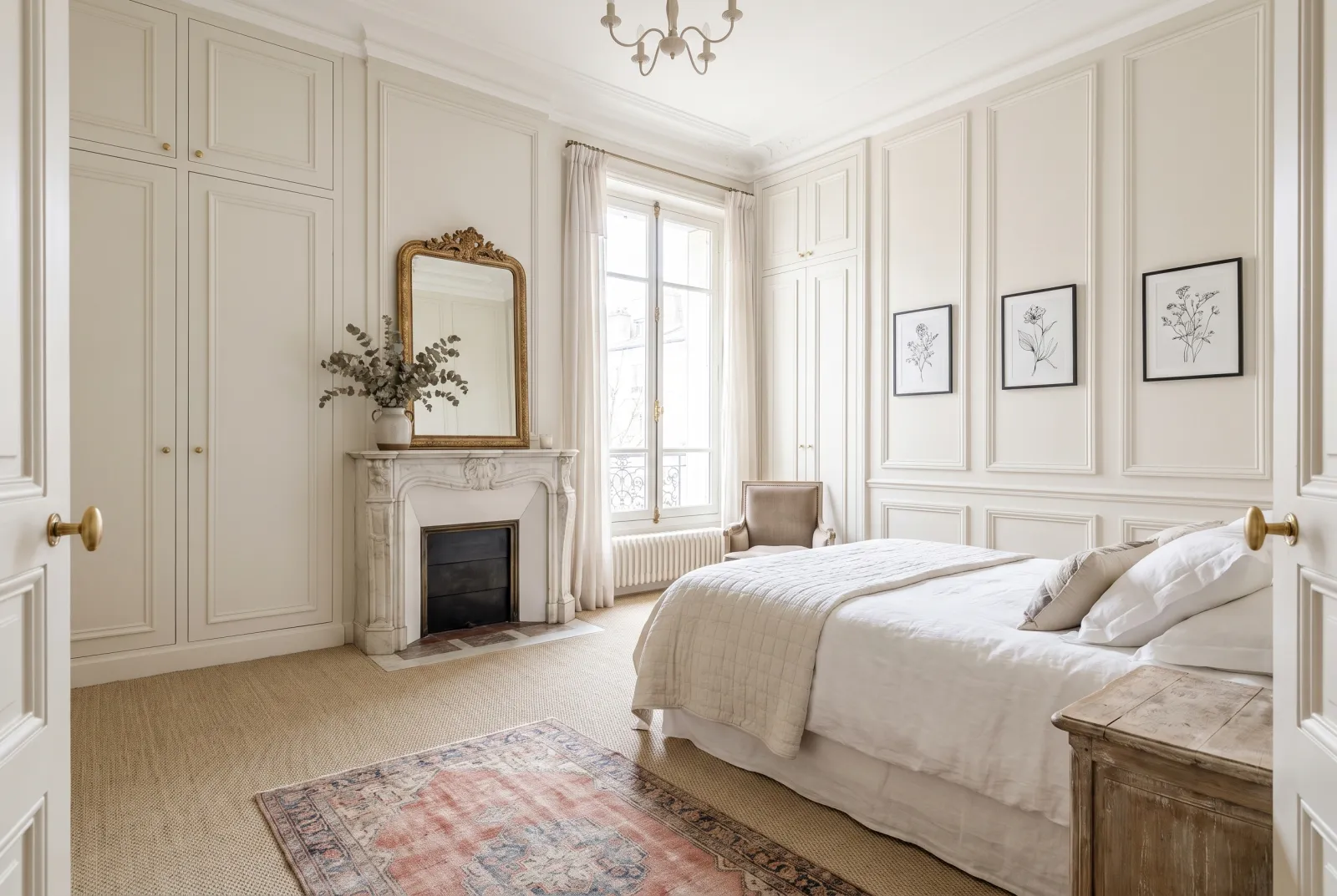
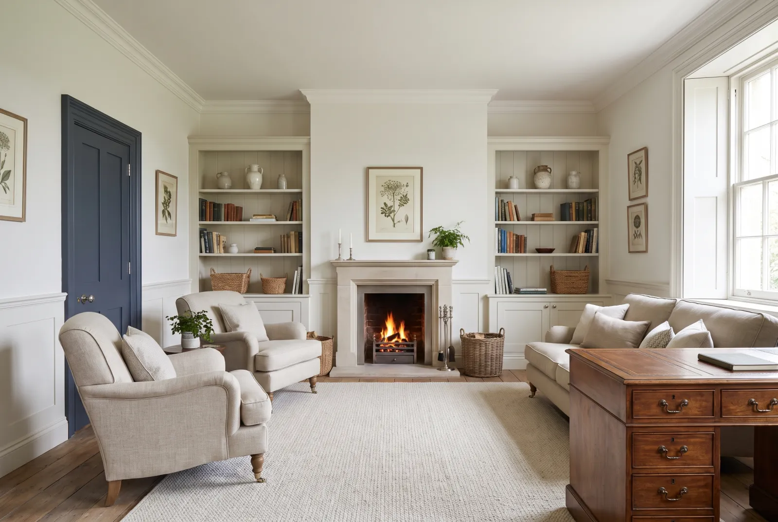
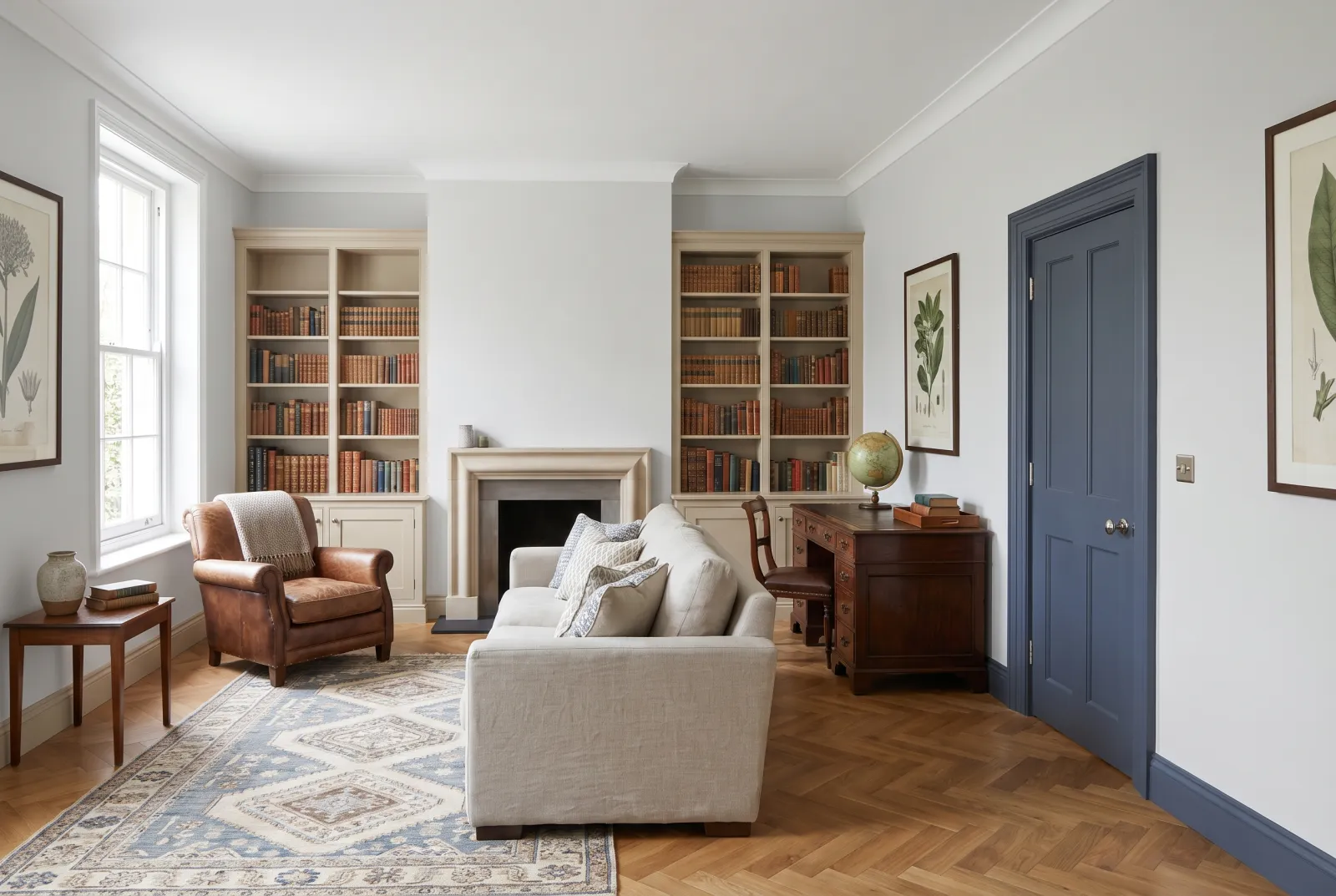
1. The ceiling follows the undertone of the walls. A pure white above warm walls looks blue; a warm white above cool walls looks yellow. Cool walls — blues, water greens, cool greys, pure whites — → Pure White No.1, Charterhouse No.4, Cotton Street No.3. Warm walls — pinks, stone neutrals, creams — → Maugham White No.2, Holland Park No.5. North-facing room → Sleet No.91.
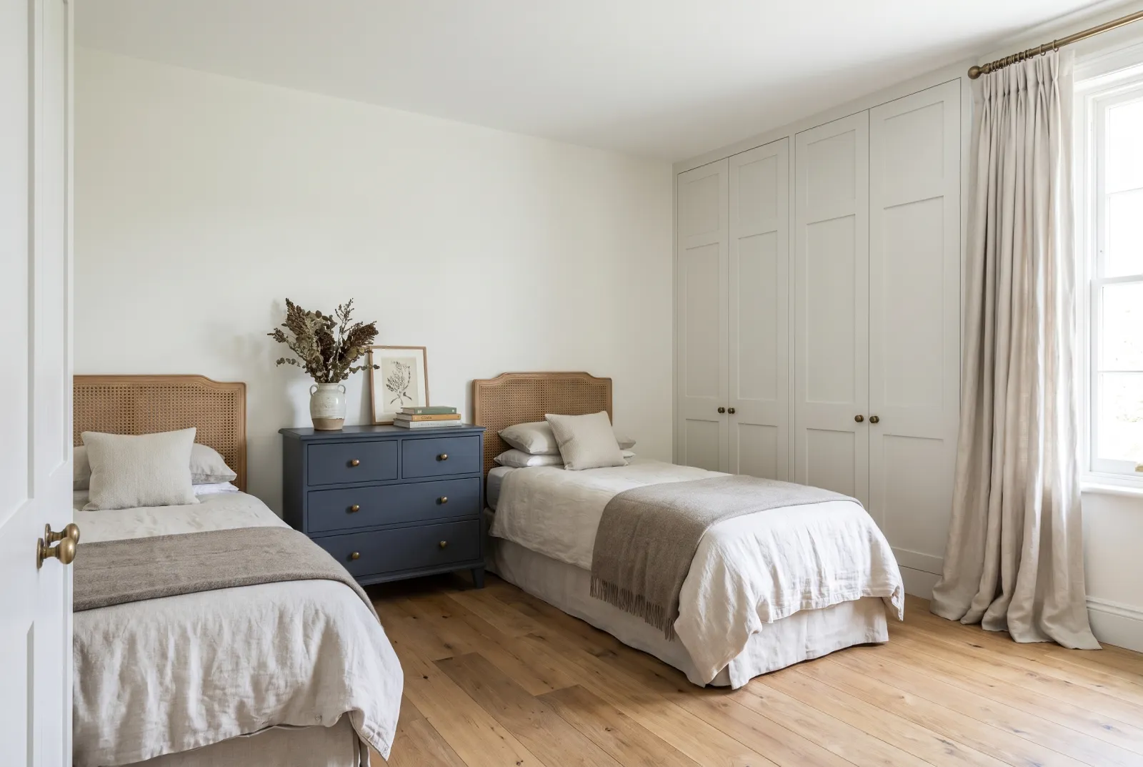
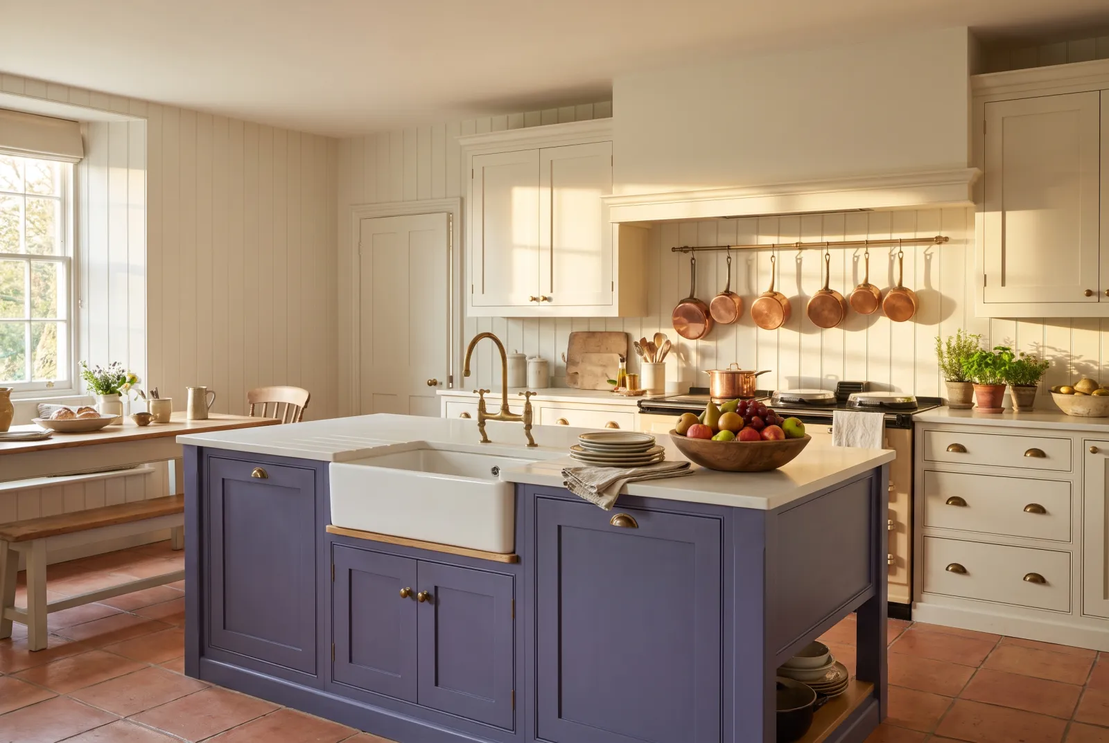
2. The ceiling is always darker than you think. It receives no direct light: the same white looks a tone darker there than on the wall. That is why a ceiling in the same shade as the walls looks lighter than expected — and why a ceiling 'one step lighter' is almost always enough, without going to pure white.
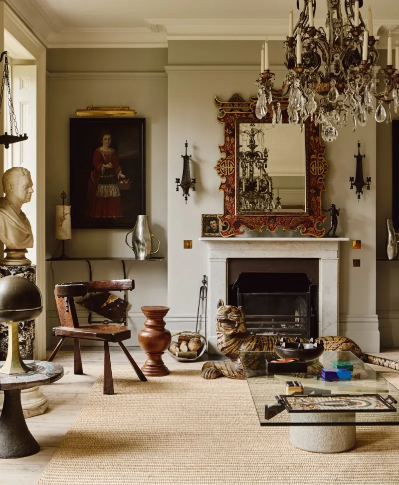
3. Above a deep colour, no white. A white ceiling above Huguenot No.49 or Observatory No.34 dazzles by contrast and cuts the room: you see nothing else. Limestone No.55 or Frieze No.84 keep the height without the shock — or, better still, the same colour everywhere: colour drenching enlarges a low room more surely than any white. See also our warm whites, our cool whites, our off-whites compared and which finish for a ceiling.