Choosing the woodwork white
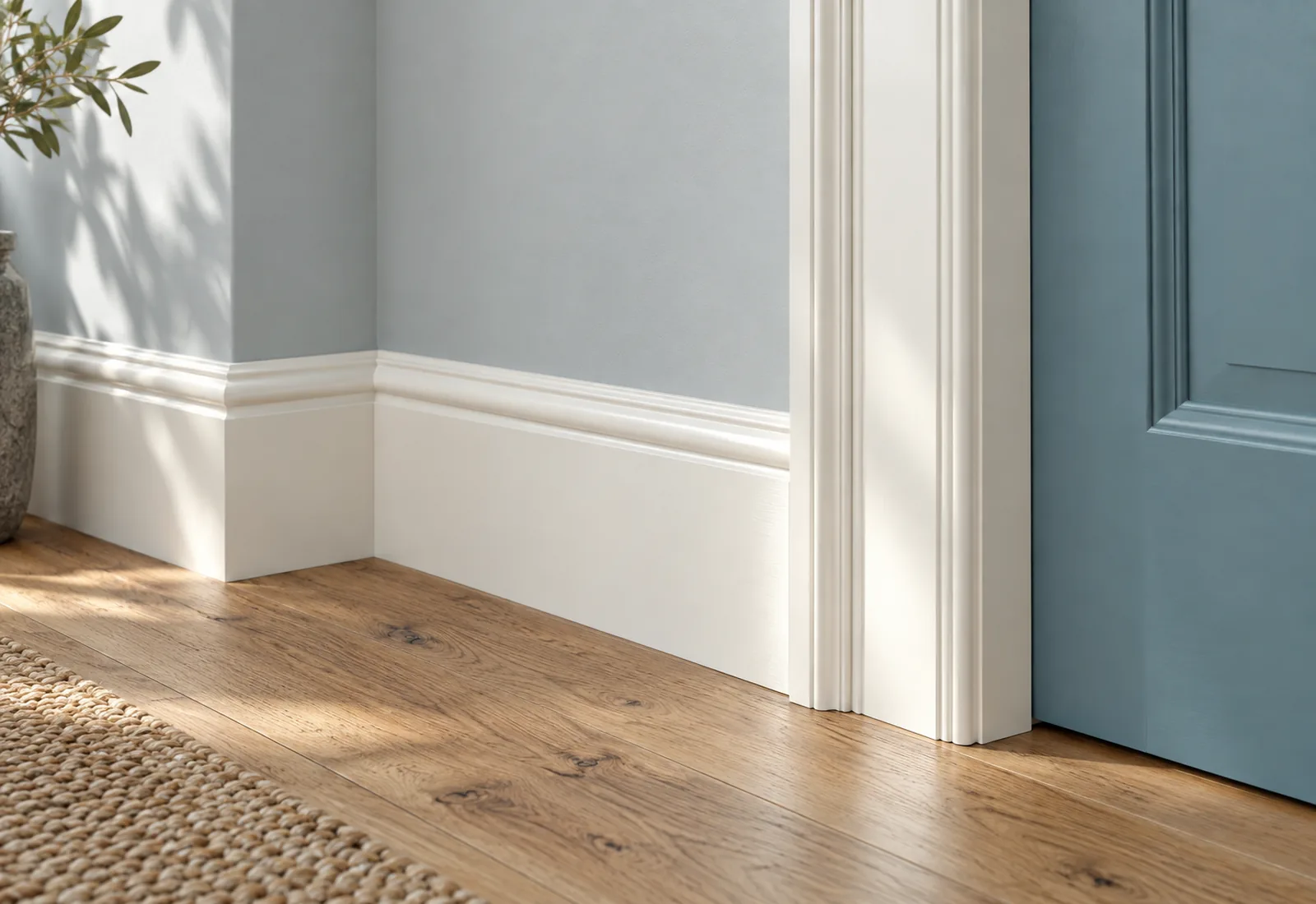
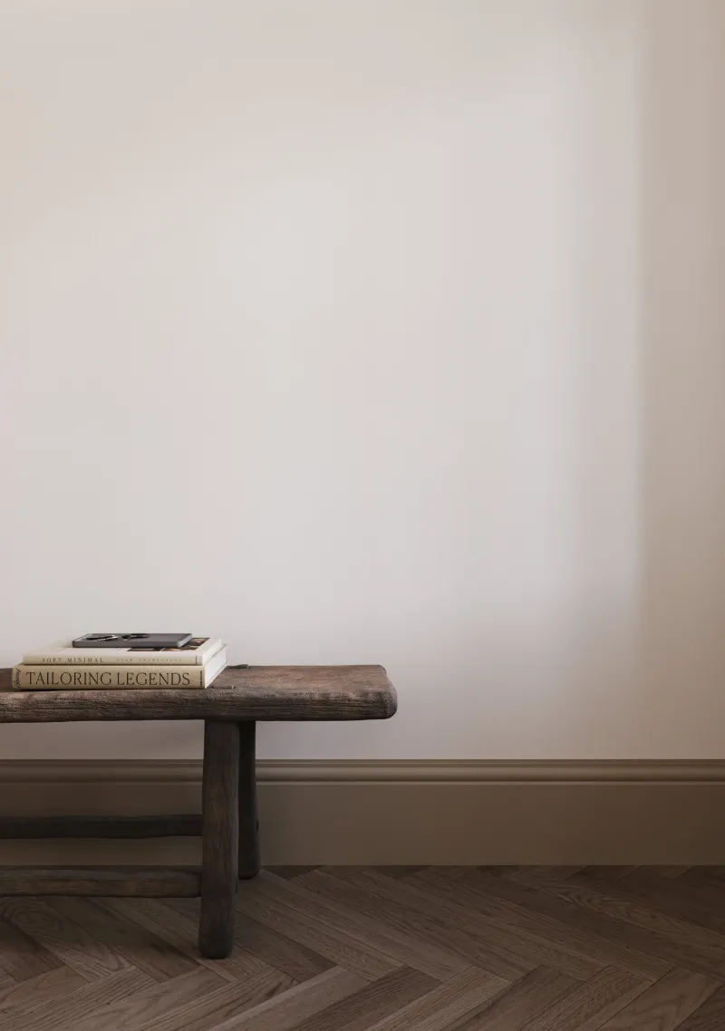
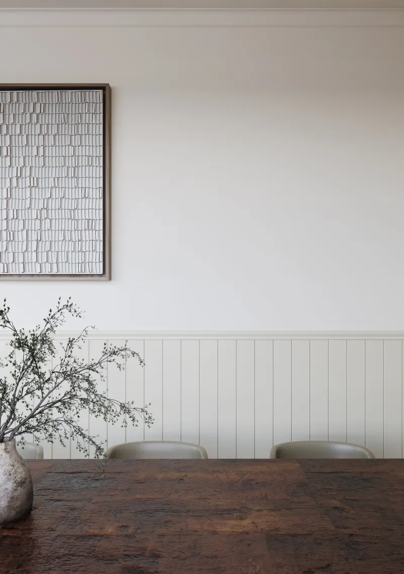
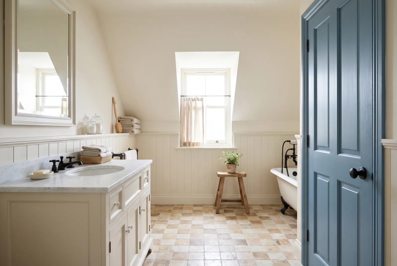
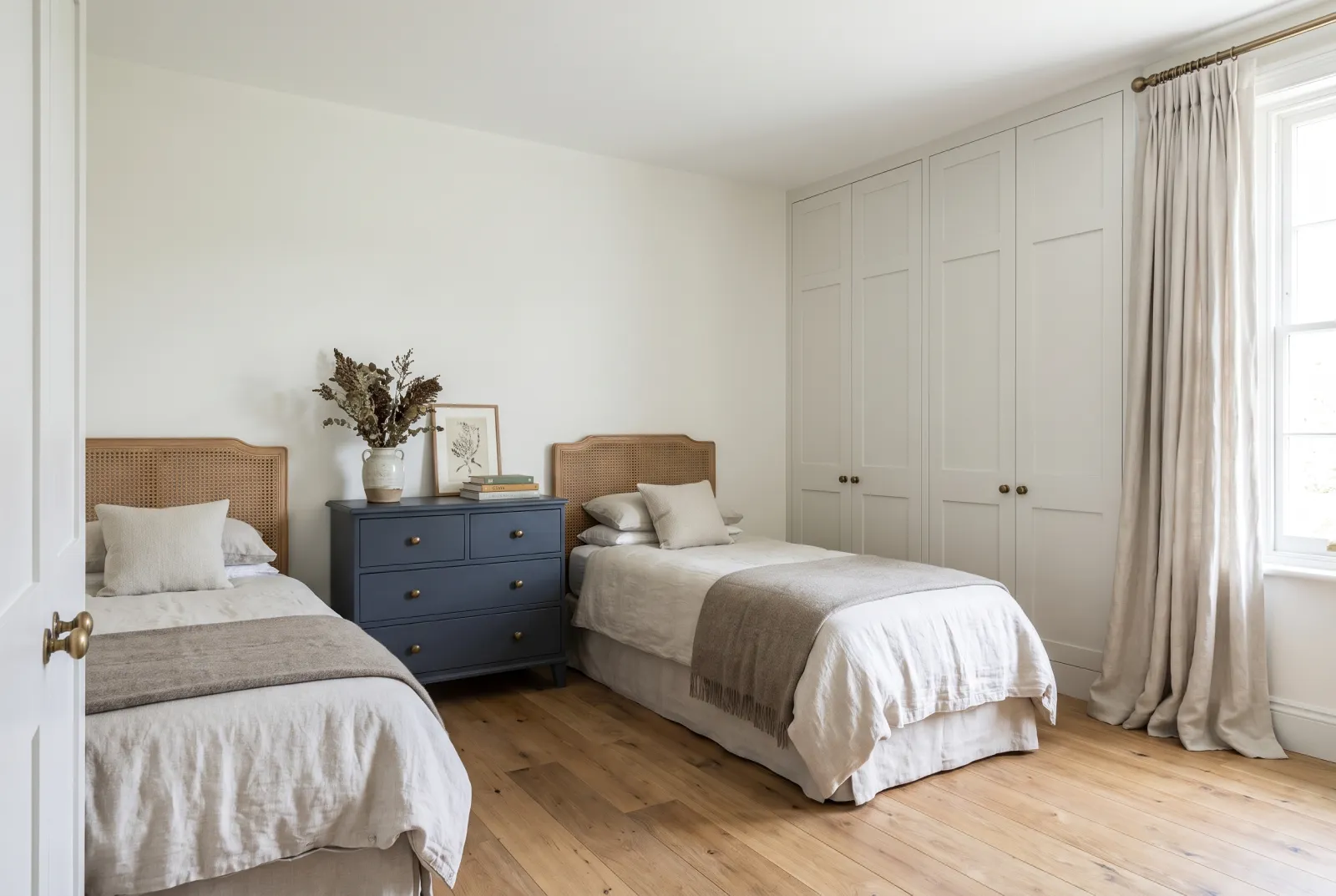
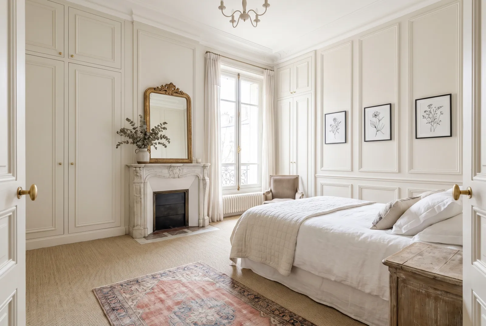
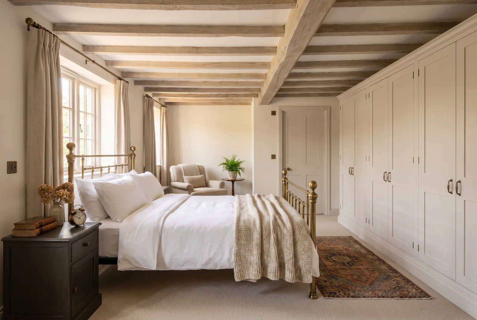
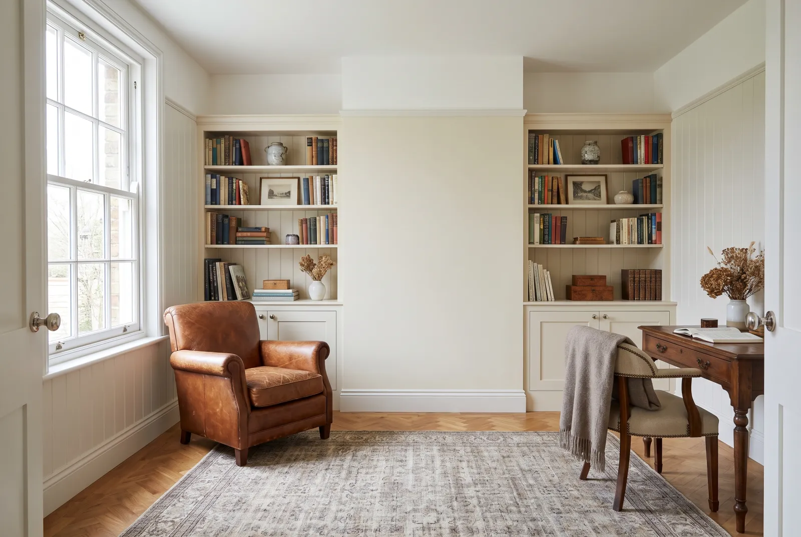
A woodwork white is never seen alone: it is seen against the wall it frames, and that contrast is what counts. Two rules are enough. Temperature: a crisp white (Pure White No.1, Charterhouse No.4, Cotton Street No.3) beneath cool walls, a warm white (Holland Park No.5, Whitehall No.9, Holbein Chamber No.7) beneath warm walls. A crisp white beneath a cream wall makes the wall look dirty; a warm white beneath a grey wall looks yellow. Contrast: the paler the walls, the closer the woodwork white must be to them — otherwise the room is chopped into rectangles. Beneath an off-white, choose a woodwork white just one notch crisper; or the same white, in satin, for a relief that comes only from the sheen.
Beneath a deep colour
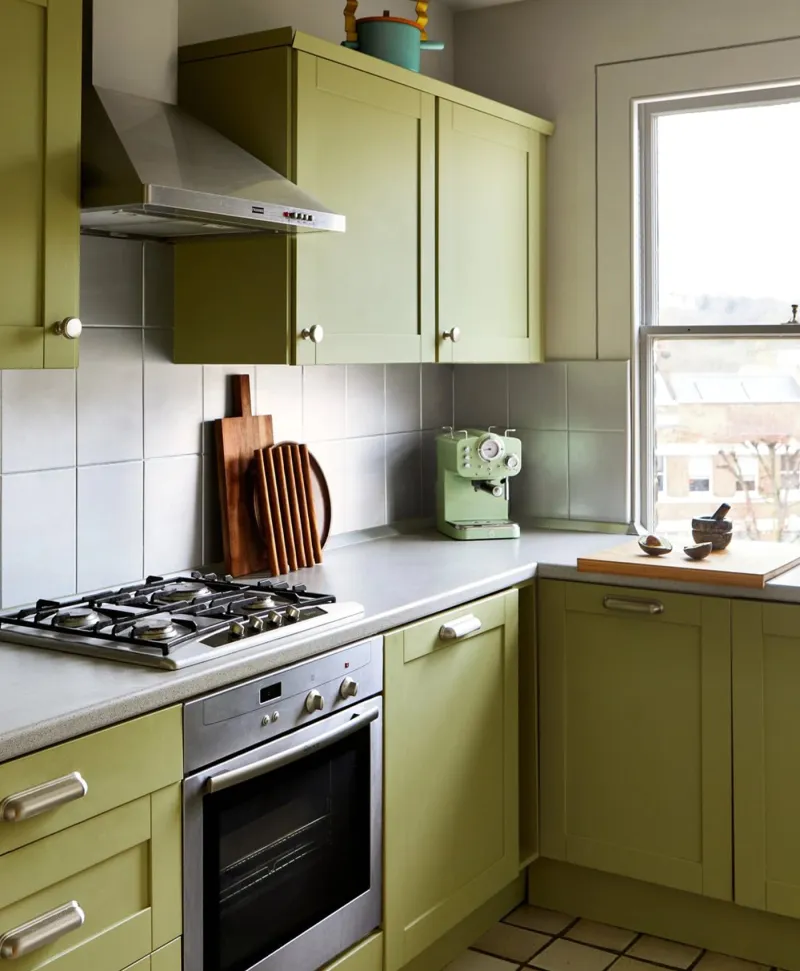
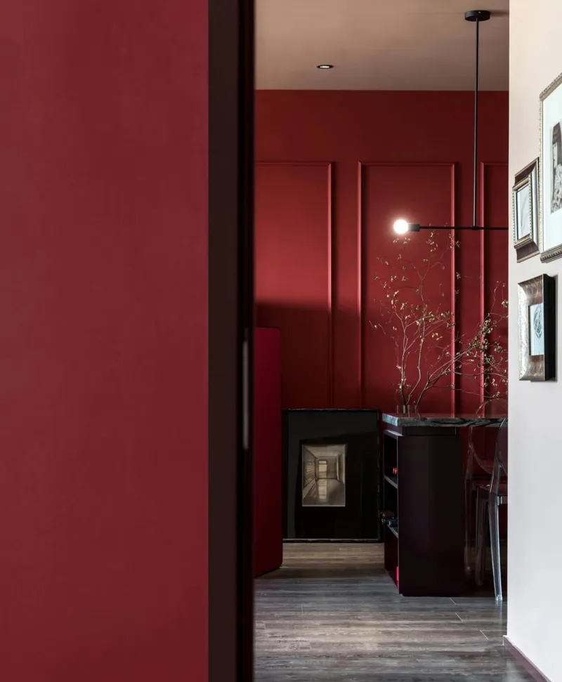
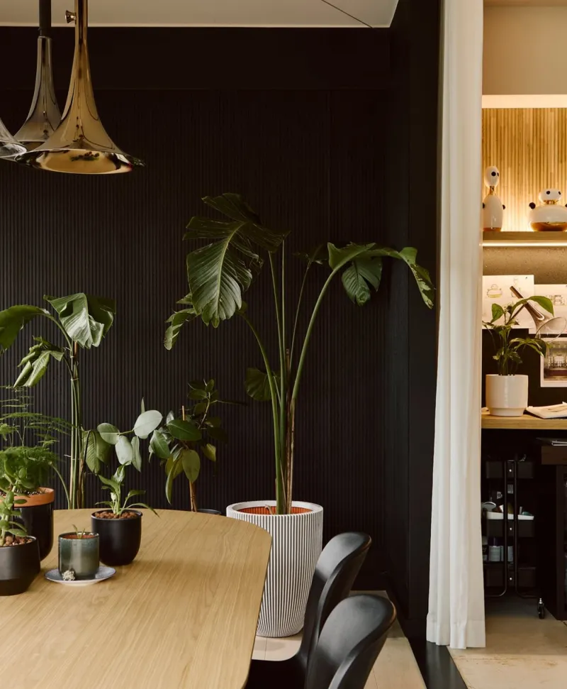
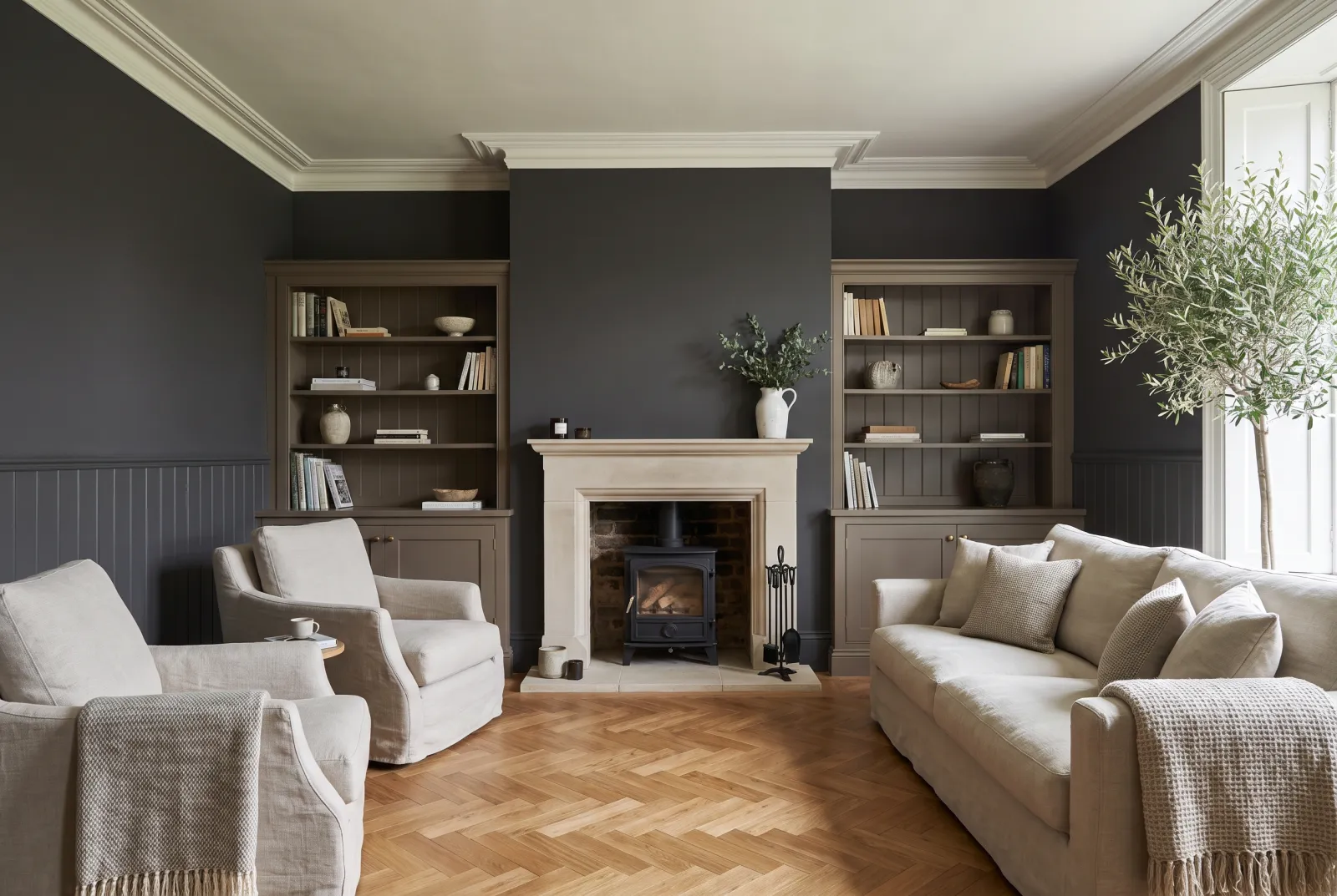
A deep colour can take any contrast. Pure white draws the room crisply — the classic choice beneath a night blue or a bottle green. A soft white such as Sleet No.91 frames without cutting. And the colour itself, in Multi-Surface Satin on the woodwork, makes the outlines disappear: that is colour drenching, and often the loveliest.
The finish
Woodwork whites go on in Multi-Surface Satin for almost the whole house, in eggshell for a softer look, in gloss for front doors and exterior windows. Always over a multi-surface primer, which blocks the wood tannins liable to yellow a white. The detail is in which finish for woodwork?.
To go further: our off-whites compared, which white for a ceiling? and our ideas in white.