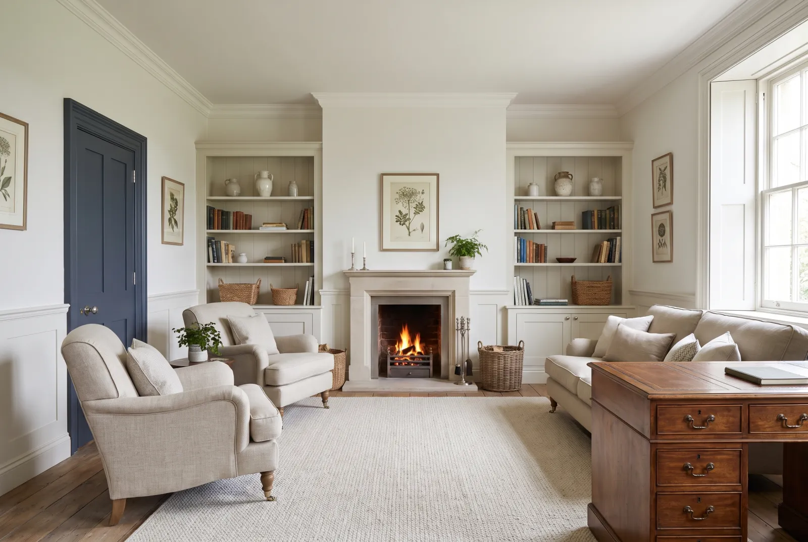
How to read an off-white
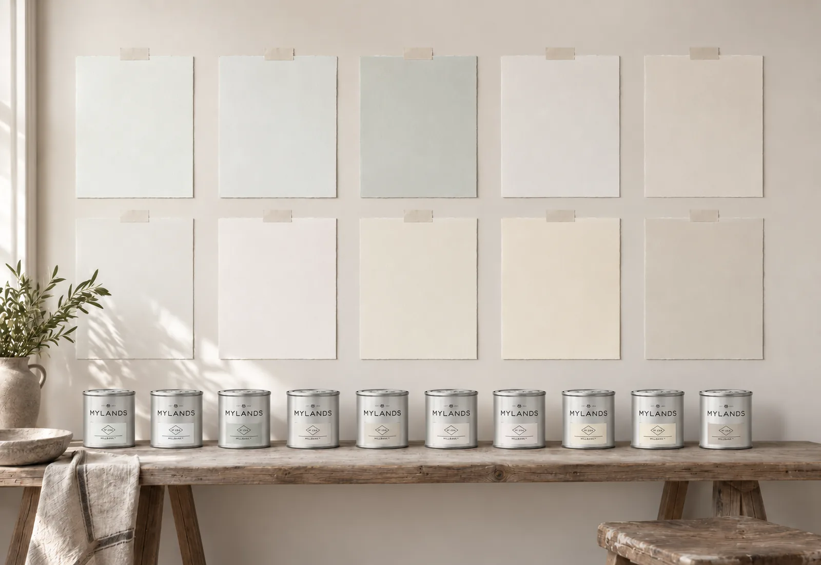
An off-white is a white to which a touch of another colour has been added — its undertone. That touch is invisible on the colour card and decisive on the wall, because light multiplies it: a yellow undertone turns cream in sunshine, a grey undertone turns blue facing north. So the rule is simple. South-facing room, warm light: a white with a cool undertone, to compensate — Charterhouse No.4, Cotton Street No.3, Belgravia No.6. North-facing room, cold light: a white with a warm undertone, to warm it — Whitehall No.9, Holbein Chamber No.7, Lots Road No.24. Mixed or uncertain aspect: a balanced white — Maugham White No.2, Holland Park No.5.
Brightness
The LRV column in the table above gives the share of light each white returns. Between Charterhouse No.4 (85) and St Martins No.37 (75) the gap is real: the first brightens, the second wraps. For a dark room you want lighter, stay above 80; for a room you want soft, go lower.
Test before choosing
An off-white is not chosen on a screen. Paint two sample pots onto paper, put them on the brightest and the darkest wall of the room, and look at them in the morning, at noon and at night under the lamps. The right white is the one that stays white at all three.
To go further: our warm whites for a dark room, our cool whites for a south-facing room, which white for a ceiling?, how light affects colour and our ideas in white.