


01
Soothe: light, greyed blues and greens
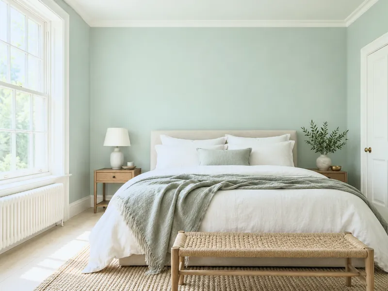
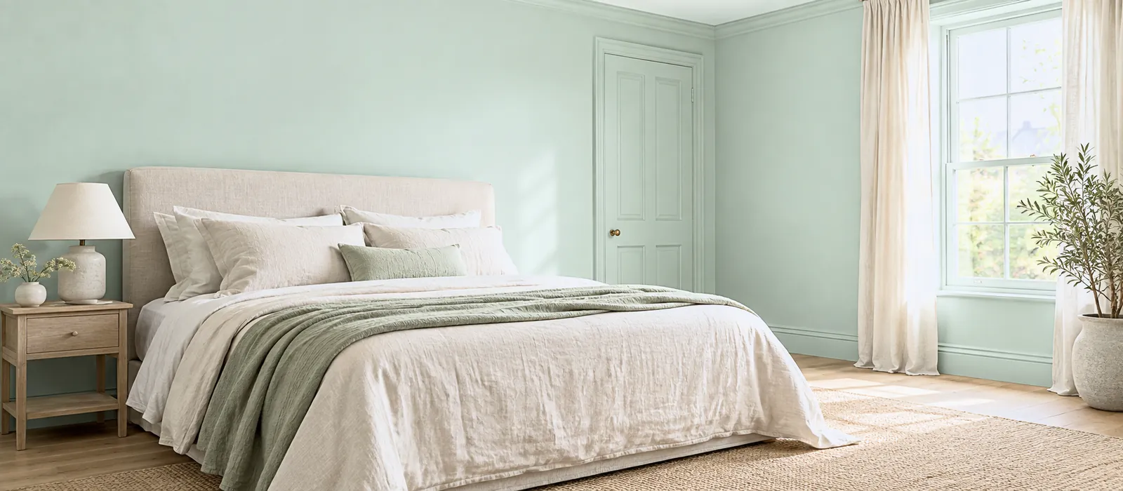
A greyed sky blue, a verdigris, on the walls of a bedroom or bathroom, woodwork in a white of the same family: the pulse slows. What soothes is the greying; a bright blue does not sleep.
Menu
How To
Design Advice
Customer Service
My account
Help with paint Choosing colour
A colour works on mood through three levers: its hue (blues and greens soothe, yellows and reds wake), its depth (light opens and lightens, dark gathers) and its saturation (greyed calms, vivid stimulates). The rest — a red "that excites", a green "that heals" — is partly cultural. The safe method: decide the mood you want in the room, choose the family, then set depth and saturation. Seven moods, seven palettes.
Page updated September 2026 · by the Mylands France colour team
Understanding
That colour affects mood, nobody doubts: you do not sleep the same way in a red bedroom and a verdigris one. What is solid: depth and saturation count more than hue. A greyed light shade soothes, whatever its colour; a vivid one stimulates, whatever its colour; a matt dark gathers. Hues themselves have tendencies — blues and greens, the colours of sky and foliage, are seen as restful in almost every culture; yellows and oranges, the colours of light, as waking; red draws attention — but they are set by depth and saturation.
What is less solid: the lists — "violet for creativity, yellow for optimism". Those are cultural associations, and they change. White is mourning in Asia and purity in Europe. Trust instead the mood you want, and your own eye on a painted board: the only experiment that counts is yours, in your light — see How light affects colour.
Seven moods
01
A greyed sky blue, a verdigris, on the walls of a bedroom or bathroom, woodwork in a white of the same family: the pulse slows. What soothes is the greying; a bright blue does not sleep.
02
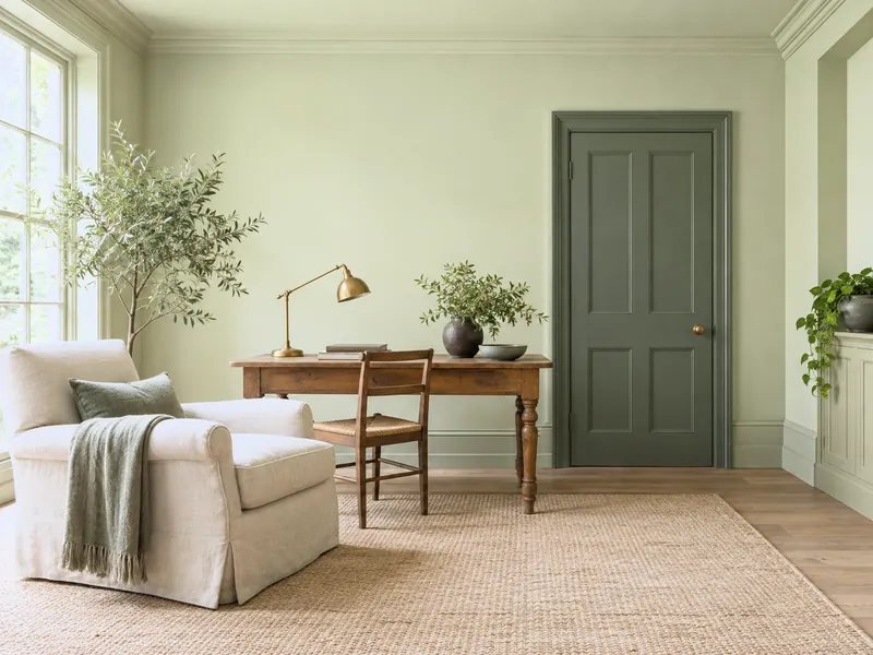
A sage or olive green on the walls of a sitting room or study: the colour of foliage, neither warm nor cool, on which the eye rests longest. For rooms where hours are spent.
03
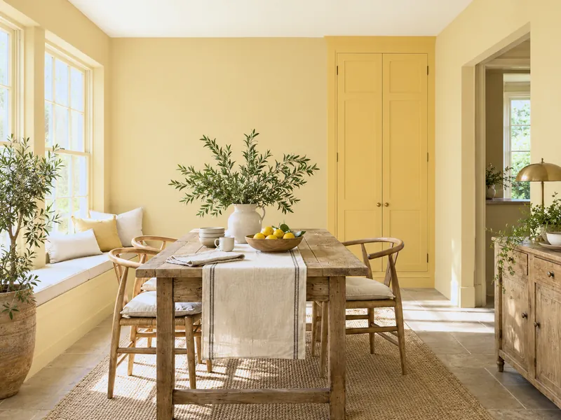
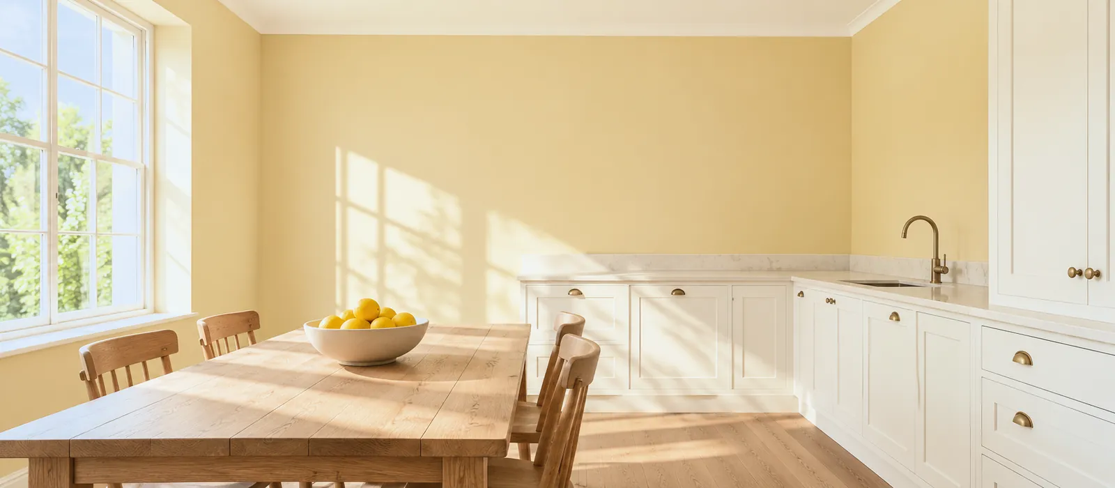
A golden yellow or a soft ochre in a kitchen, a hall, a morning room: the colour of light, which gives the impression of permanent sun. Muted, it wakes without agitating.
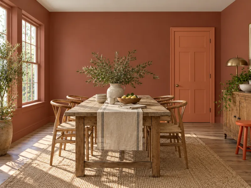
04
A brown-red in a dining room, a coral on a door, a vermilion on a stool: the colour that draws attention and gets people talking. Over large surfaces, muted; vivid, as an accent only.
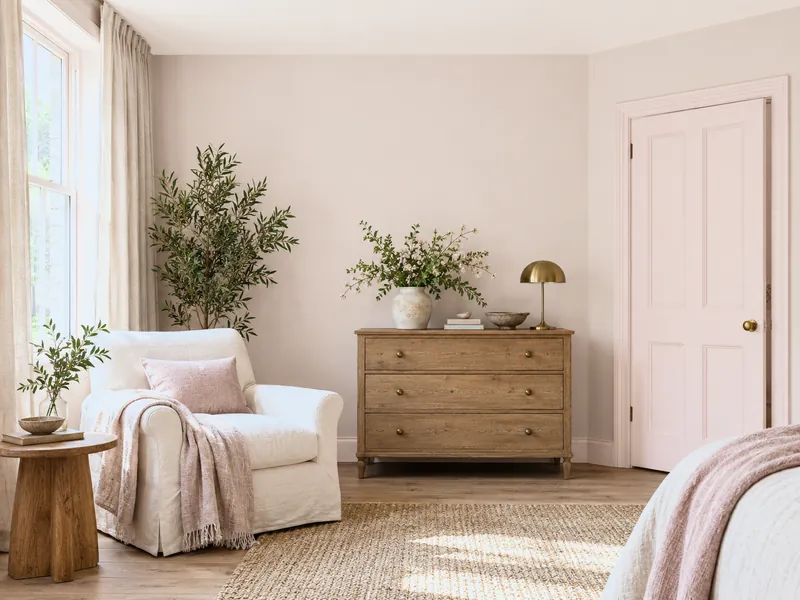
05
A powder pink or a brown-pink in a bedroom, a sitting room, a hall: the colour that warms without stimulating, the colour of complexions. Greyed pink behaves like a warm neutral.
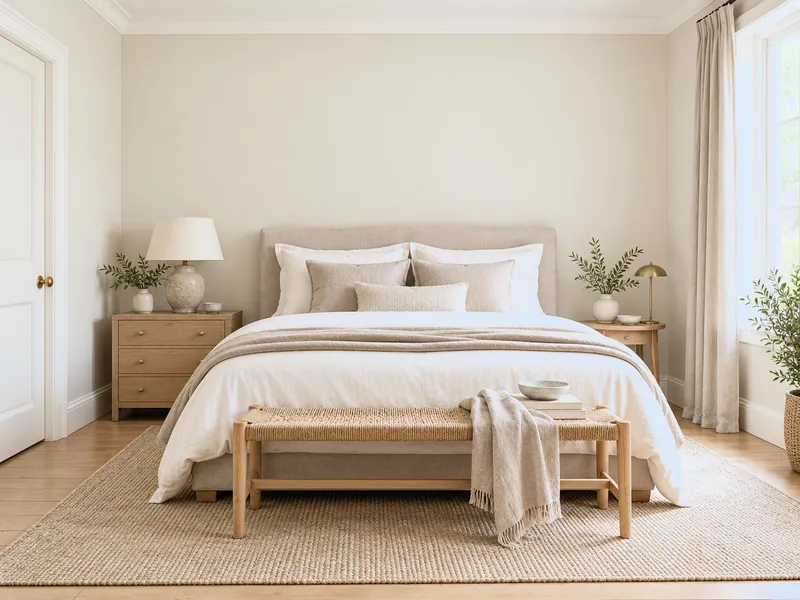
06
A stone, a greige, a warm off-white: the absence of a subject. For a room where nothing should catch the eye — a sitting room for guests, a corridor, a guest bedroom.
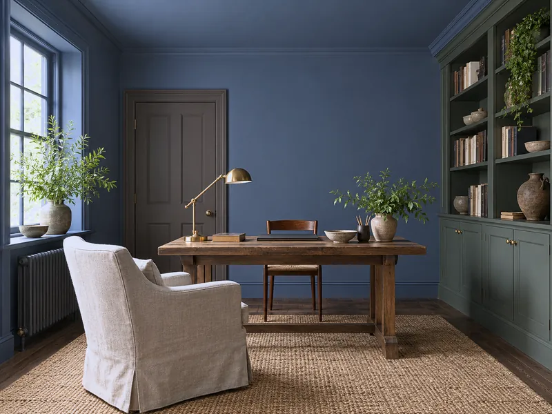
07
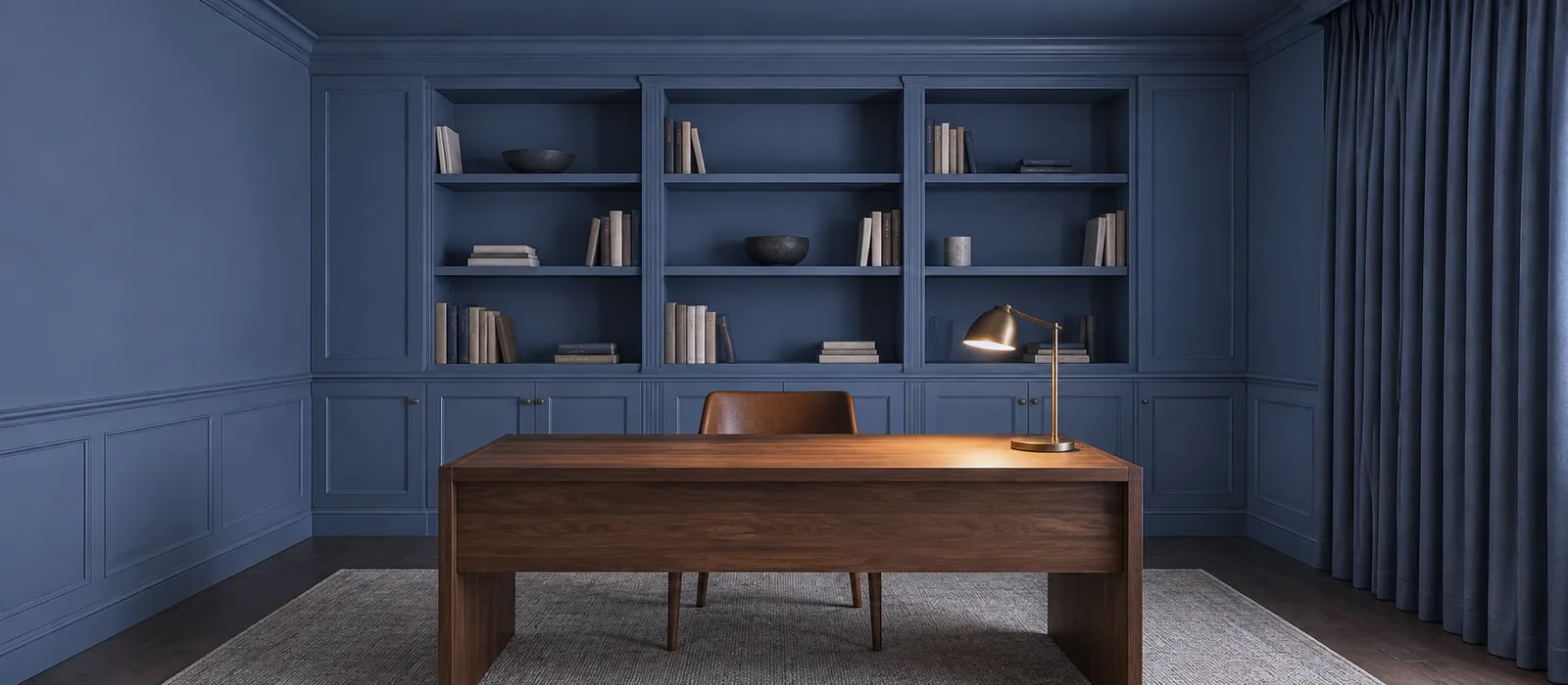
A midnight blue, a forest green, a deep brown, on every surface of a study, a library, a bedroom: the corners vanish, attention narrows. Matt dark is the colour of concentration and sleep.
Setting
The same hue gives opposite moods according to its depth and saturation. An example with blue and green.
| Setting | Towards calm | Towards energy | Example |
|---|---|---|---|
| Depth | Light (opens, lightens) or very dark (gathers) | Clear mid | Morning Blue soothes, Boathouse animates, Observatory gathers |
| Saturation | Greyed, earthy | Vivid, pure | Beauvais rests, New Lime wakes |
| Finish | Matt (absorbs, velvet) | Satin, gloss (reflects, vibrates) | The same green in Marble Matt Emulsion and in Gloss does not make the same room |
| Extent | On every surface (envelops) | On one surface (accent) | A red everywhere gathers; a red on a door stimulates |
Pure white is not calm: it is the highest possible contrast with everything set against it. A warm off-white calms; a pure white wakes, or tires.
To avoid
Frequently asked questions
A greyed light — blue, green, pink, warm neutral — or, the other way, a warm matt dark on every surface. What keeps you awake is vividness and contrast: a bold yellow, pure white woodwork on a coloured wall. See Blues for a bedroom.
Two schools: a mid green, on which the eye rests for a long time; or a matt dark drench, which removes everything that distracts. Both avoid vividness. See Colours for a home study.
A warm neutral or a brown-pink on the walls, so the people count more than the walls, with a stimulating accent — a red, an ochre — on a door or a sideboard. Or, for an evening dining room, a muted brown-red drench.
The big effects — light/dark, greyed/vivid — yes, more or less. The hue associations, no: they depend on culture, memories, taste. That is why the sample pot beats the theory.
See also
 From the midnight blue that envelops to the sky blue that soothes: seven ways to wear blue, and the Mylands bl...
 Neither light nor dark: mid-tones are the colours you stop noticing after a week — and that is their quality.
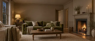 Comfort starts at the walls: six palettes for a sitting room you stay in at night, from deep neutral to autumn...
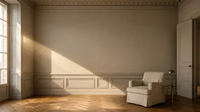 Understand how aspect and light change the way colours are perceived.
“A colour has no mood; it has yours, at the hour you look at it.”

Thanks for signing up to our newsletter!
Sign in to save items to your wishlist. Sign in to save your basket, so you can continue shopping later.
Don't have an account? Create one
Share this link and friends can buy items from your list. Anything bought disappears from it automatically. Anyone with this link can see your selection.
Moving in, redecorating, or dropping hints? A free account turns this selection into a gift list — add or remove colours whenever you like, and we'll email you when someone buys something from your shared list.
Free · Delivered to your door
Get a free colour card posted to you, showing our complete Colours of London range, with swatches made from the real paint for a true representation of our award-winning colours.

