


01
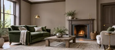
Khaki green and stone
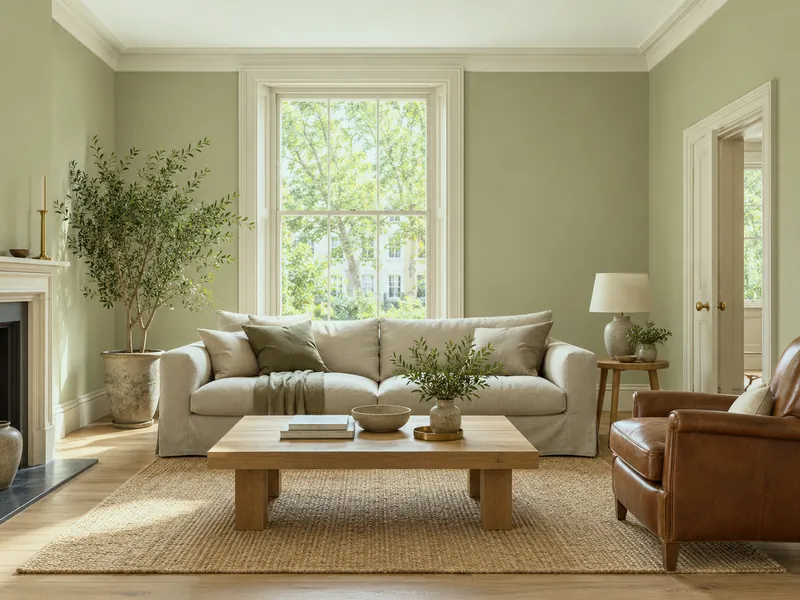
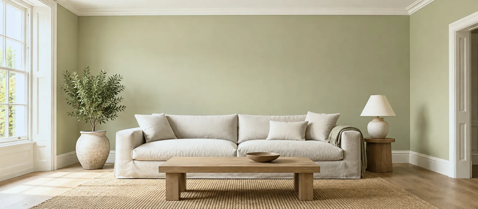
The sitting room that never dates: a soft khaki green on the walls, a warm stone on the woodwork. With oak, linen, leather.
Menu
How To
Design Advice
Customer Service
My account
Help with paint Choosing colour
A mid-tone is a colour that returns between 30 and 55 % of the light — neither an off-white that reflects it nor a deep shade that absorbs it: a grey-green, a greyed blue, a greige, a soft ochre, a brown-pink. They are the easiest colours to live with: they hide a wall's flaws, warm a north-facing room without darkening it, unify a house from room to room and accept almost any furniture. Twelve Mylands mid-tones, in six pairings.
Page updated September 2026 · by the Mylands France colour team
Understanding
Colour pages sometimes give a light reflectance value (LRV): 0 for an absolute black, 100 for a perfect white. Off-whites sit above 75, deep colours below 20; between 30 and 55 is mid-tone territory — the sage greens, the greyed blues, the greiges, the soft ochres, the brown-pinks, the warm greys. They have enough pigment to be a colour, not enough to become a statement.
Their ease comes from three things. They hide: an old wall, an uneven skim, a roller mark show on a white and vanish on a matt mid-tone. They warm without darkening: in a north-facing room a warm mid-tone gives presence where a white goes grey and a deep shade goes out. They unify: the same family of mid-tones from room to room makes a house, where alternating whites and darks make a catalogue. And they accept almost any furniture, because they are neither lighter nor darker than it.
Six pairings
Each pairing: one mid-tone on the walls, a second on the woodwork or a piece of furniture, and the white that goes with them. All between 30 and 60 LRV, whites excepted.
01
The sitting room that never dates: a soft khaki green on the walls, a warm stone on the woodwork. With oak, linen, leather.
02
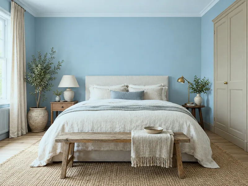
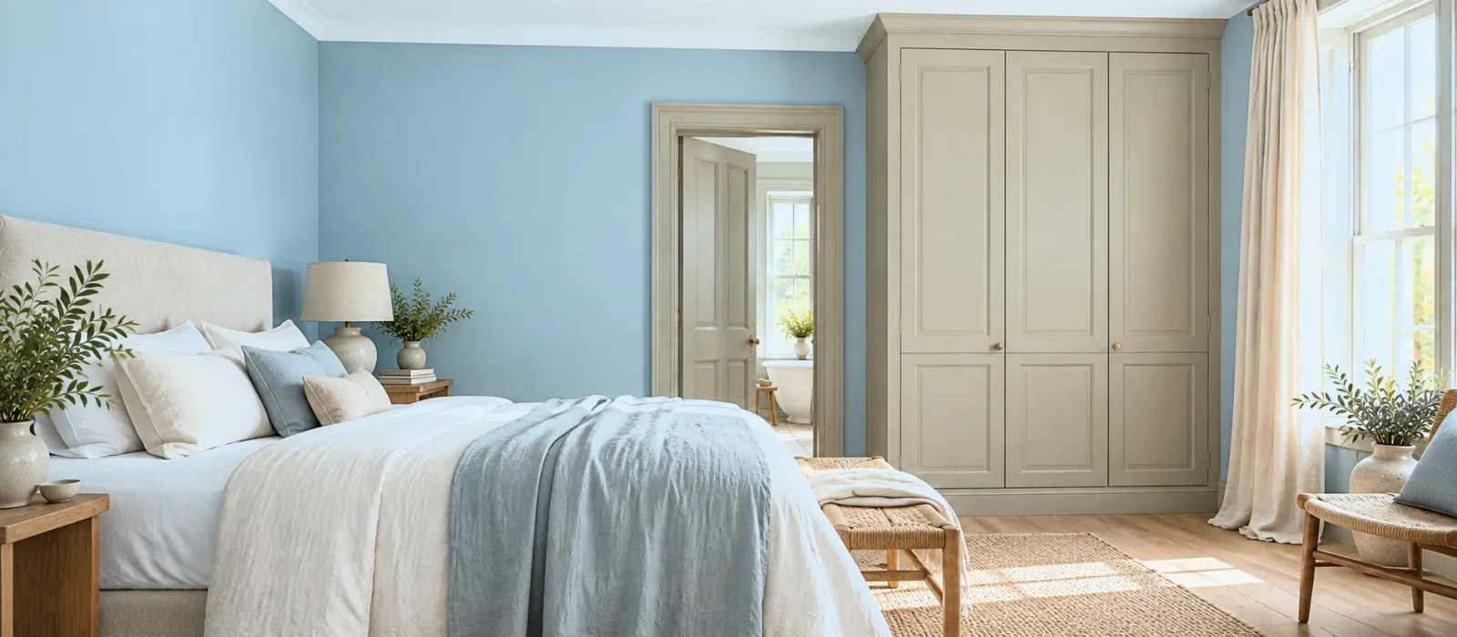
A calm bedroom: a greyed sky blue on the walls, a greige on a wardrobe or the door. The blue recedes, the greige comes forward.
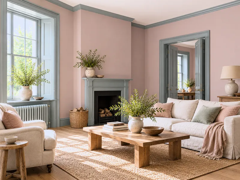
03
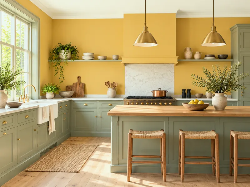
A north-facing kitchen: a soft ochre on the walls, a sage green on the cabinets. Southern light all year.
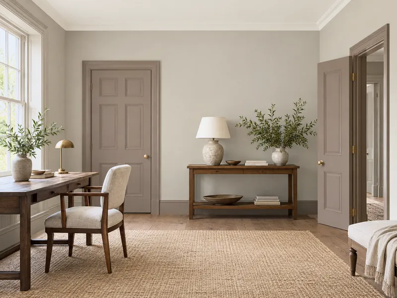
04
A sitting room or a guest bedroom: a brown-pink on the walls, a grey-green on the woodwork. Pink as the neutral, green as the drawing.
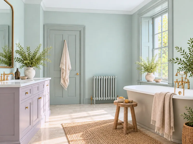
05
A hall or a study: a warm grey on the walls, a mid brown on the doors. Sober, grown-up, indifferent to coats.
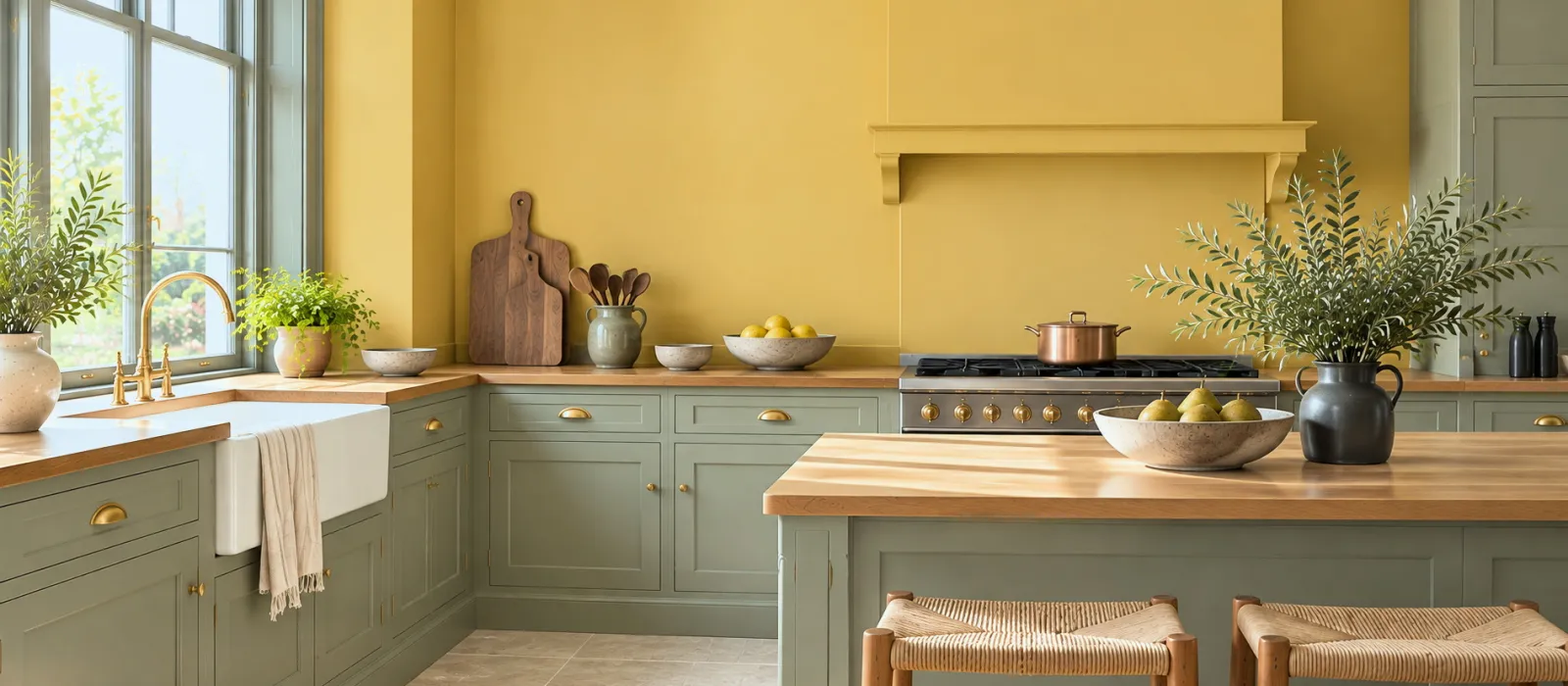
06
A bathroom or a dressing room: a verdigris on the walls, a greyed lilac on a piece of furniture. Two mid-tones that answer each other without contrast.
Reference
| Light tones (LRV > 60) | Mid-tones (30–55) | Deep tones (< 20) | |
|---|---|---|---|
| Effect on the room | Enlarges, brightens | Dresses, warms, unifies | Envelops, dissolves the corners |
| The wall's flaws | Shows them | Hides them | Hides them, except in sheen |
| North-facing room | Goes grey | Warms (if the tone is warm) | A cocoon, if you accept the dark |
| Furniture | Anything, except white, which yellows | Almost anything | Light stands out, dark blends |
| Number of coats | 2, sometimes 3 over a dark base | 2 | 2 over a tinted primer |
| Where | Ceilings, small rooms, south-facing rooms | Sitting rooms, bedrooms, kitchens, corridors | Dining rooms, studies, cloakrooms |
LRV is given as a guide; it depends on the finish measured. See the definition in our glossary.
Composing
On all four walls, light ceiling of the same family. The simplest use: the mid-tone makes the room, the ceiling in its page's companion white keeps the light. With woodwork in another mid-tone, as in the six pairings above: two mid-tones never fight, because neither is stronger than the other. As a bridge between two rooms: a corridor in a mid-tone links a light sitting room and a deep dining room. As a base: a mid-tone dado under a light wall, in a hall, a staircase.
What they ask: two coats, always, and matt — Marble Matt Emulsion on the walls, Eggshell on the woodwork. A satin mid-tone on a large wall returns reflections that wash it out and reveal the flaws it was meant to hide.
To avoid
Frequently asked questions
Less than you think: it still returns a third to a half of the light. What it does above all is reduce the contrast between the wall and the window, which makes the room more restful. A light ceiling from the same family makes up the rest.
One family: a grey-green, a greige or a greyed blue run from light to mid according to the rooms — the light in the bedrooms, the mid in the sitting room and corridor, the family's deep shade on a door or a sideboard. See A colour palette for every season.
The most natural pairing: a walnut, a dark oak or a charcoal sofa stand out from a mid-tone without the hard contrast they would have on a white. Choose a warm mid-tone with a warm wood.
On some colour pages and on our trends pages; failing that, the colour card held beside a pure white and a mid grey places the shade at a glance. What counts is not the number but the test: two boards, two days.
See also
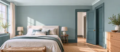 One colour, three depths: harmony guaranteed because the pigment is the same. Six Mylands families.
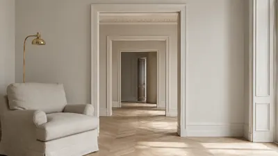 Our neutrals grouped by undertone to help you find the perfect match.
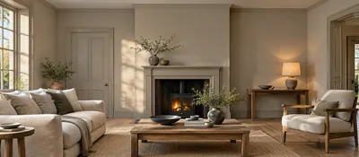 Aspect, the hour you live in it, what is already there: the method for choosing a living room colour, and six...
 From greige to chocolate: brown is the colour that gives weight to all the others. Six ways to use it.
“A mid-tone is the colour you stop seeing and keep feeling.”

Thanks for signing up to our newsletter!
Sign in to save items to your wishlist. Sign in to save your basket, so you can continue shopping later.
Don't have an account? Create one
Share this link and friends can buy items from your list. Anything bought disappears from it automatically. Anyone with this link can see your selection.
Moving in, redecorating, or dropping hints? A free account turns this selection into a gift list — add or remove colours whenever you like, and we'll email you when someone buys something from your shared list.
Free · Delivered to your door
Get a free colour card posted to you, showing our complete Colours of London range, with swatches made from the real paint for a true representation of our award-winning colours.

