Help with paint Choosing colour

How to use a monochromatic colour scheme

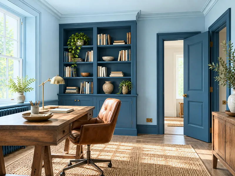
A monochromatic scheme uses one colour in several depths — the light on the ceiling, the mid on the walls, the deep on the woodwork or a door — and sometimes in several finishes. Harmony is guaranteed because the pigment is the same; depth comes from contrast of value, never of hue. It is the safest scheme and one of the most elegant, provided the depths are spaced far enough apart and no pure white ever slips in.

Page updated September 2026 · by the Mylands France colour team

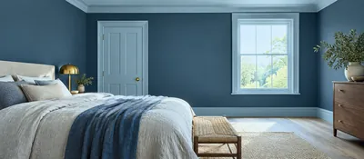
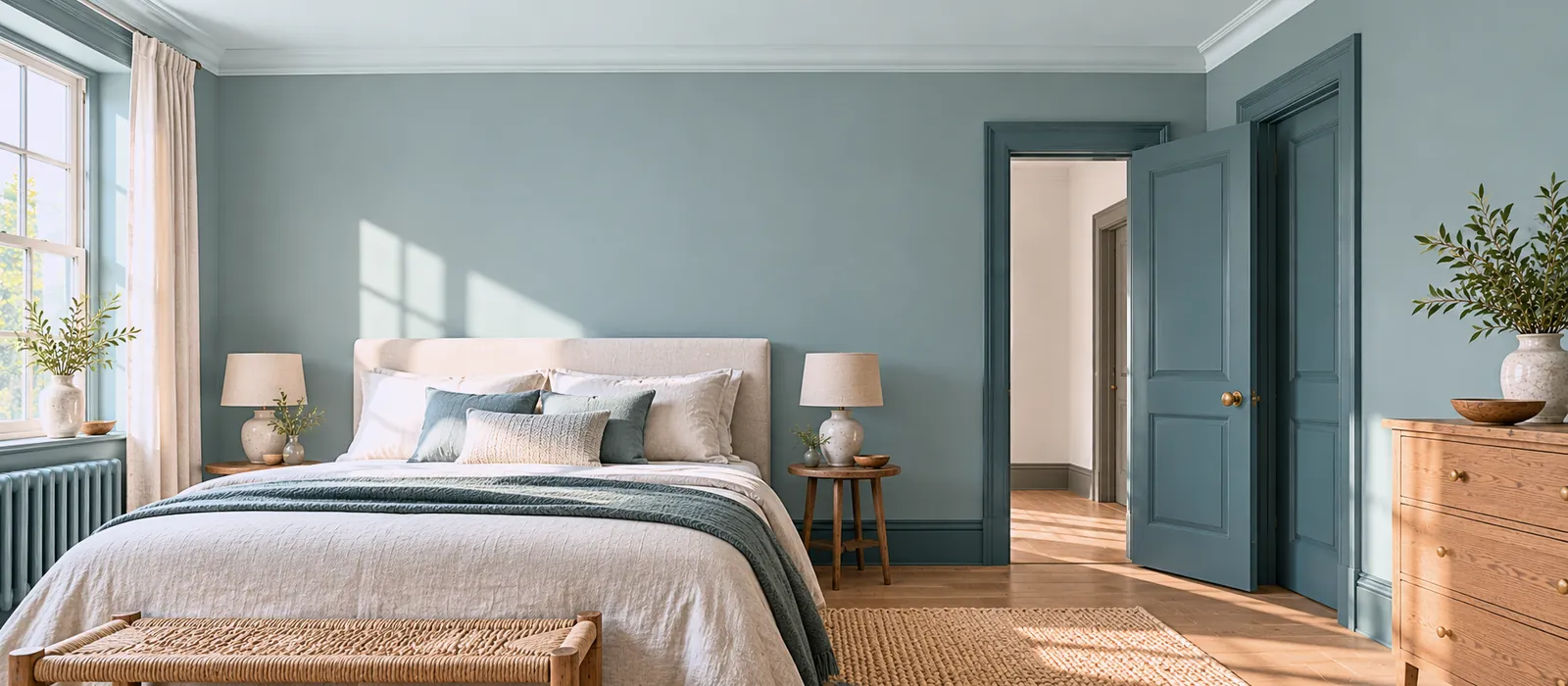
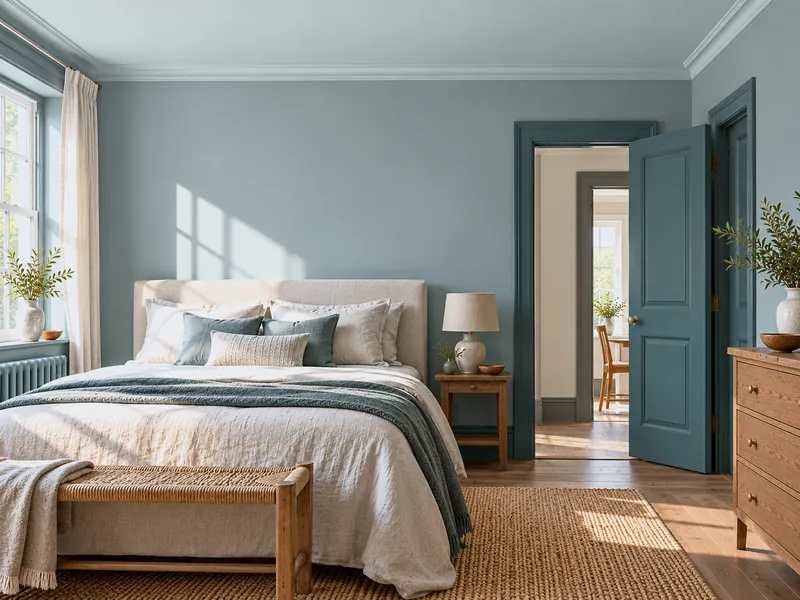
Bedroom in three depths of one blue-green: very pale ceiling, mid walls, deep door and skirting, linen bed, morning light
Beaufort Gardens No.212, Long Acre No.102, Burlington No.216: one colour, three depths

Understanding

One colour, several values

A monochromatic scheme does not mean a room in a single colour — that is drenching — but a room composed in the successive depths of one colour: a very pale blue-green, the same in mid, the same in deep. The eye reads a perfect harmony because nothing changes except the value; the room has depth without a second hue complicating it. It is the principle behind our colour capping and cloud capping pages.

At Mylands many colours exist as a family — a light, a mid, a deep related by pigment — and the colour pages list each shade's companion whites and related darks: that is where a family's members are found. The guide How to use your colour card shows how to read them.

Composing

The three rules of monochrome

01

1. Three depths, well spaced

A light, a mid, a deep, with at least two steps between each: two shades too close look like a mixing error, not a gradation. The folded colour card, three chips side by side, tells you at once whether the gap is enough.
02

2. Light at the top, deep at the bottom — or the reverse

Light ceiling, mid walls, deep skirting and doors: the room rises. Deep ceiling, mid walls, light woodwork: it draws in, a cocoon. Both work; decide by the height of the room.

03

3. No pure white

Pure white is one more hue, the hardest: it breaks the monochrome. The scheme's "white" is the family's lightest member, or the companion white given on the colour page.

Six families

Six Mylands monochromatic schemes

For each: the light (ceiling or woodwork), the mid (walls), the deep (doors, skirting, or ceiling) — and the room that suits it.

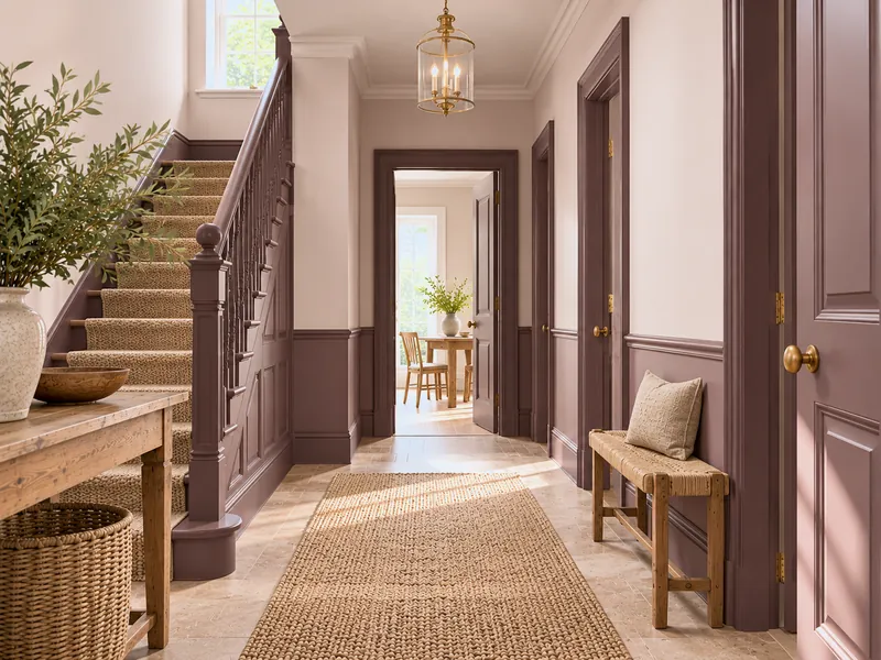
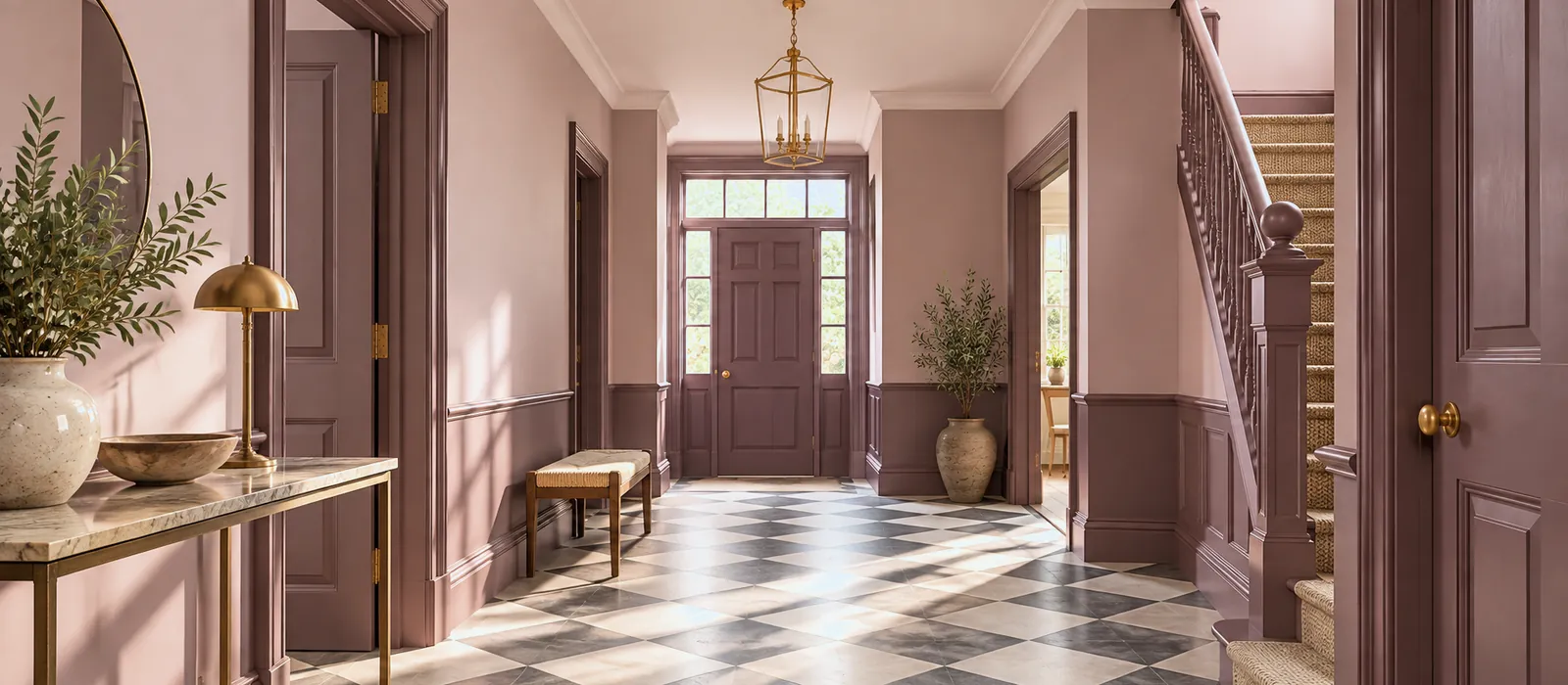
Hall in three depths of pink: pink-beige ceiling, greyed brown-pink walls, dark brown-pink doors and skirting, brass console, checkerboard floor
Threadneedle, Soho Pink, Rothschild Street: the pink monochrome, without a gram of sugar

Distributing

Which surface takes which depth

DistributionLightMidDeepEffect
Classic Ceiling Walls Skirting, doors The room rises; the floor is anchored
Inverted Woodwork Walls Ceiling The room draws in; a cocoon for a tall room
Vertical gradation Ceiling Upper walls Lower walls, skirting A dado line without a rail; see Colour capping
Two depths only — Walls and ceiling Woodwork The minimal monochrome, the easiest to get right
Through the finish Same shade, matt Same shade, eggshell Same shade, gloss One colour, three sheens: matt wall, lacquered door

The finish is part of the scheme: the same blue looks lighter in Gloss than in Marble Matt Emulsion. In a monochrome, stay matt on the walls and go up in sheen on the woodwork only.

To avoid

What breaks a monochrome

  • Pure white on the ceiling or skirting. One more hue, the hardest; the family's light instead.
  • Two depths too close. They look like a mistake; two steps apart at least.
  • Mixing two neighbouring families. A blue-green and a blue-grey are not the same family; the eye sees the drift.
  • Satin on the walls. It lightens the mid shade and falsifies the gradation.
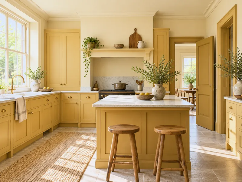
  • A vivid colour in monochrome. A bold yellow in three depths is a traffic light; monochrome likes greyed shades.
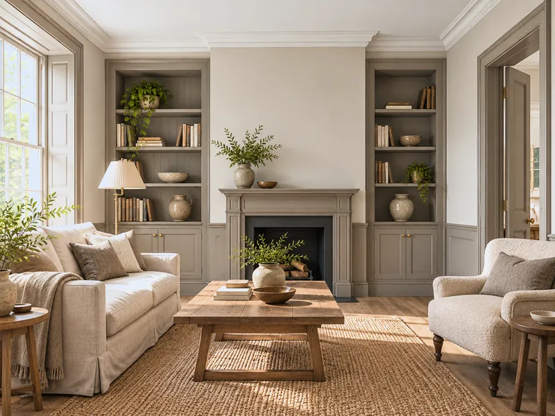
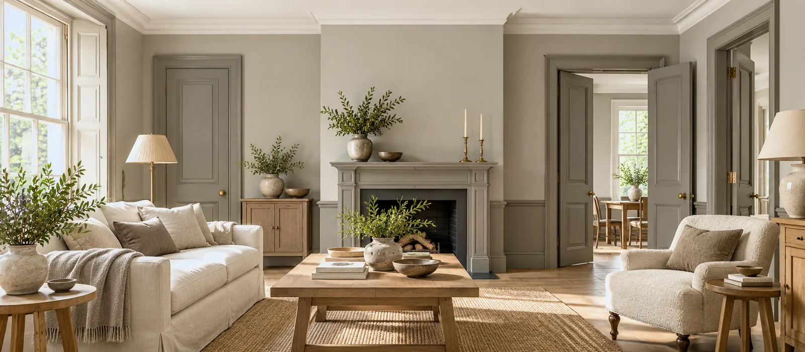
Sitting room in three depths of stone: light stone ceiling, greyed taupe walls, deep brown-grey doors and skirting, linen sofa, pale wood
Limestone, Egyptian Grey, Amber Grey: the monochrome of neutrals

Frequently asked questions

Your questions, our answers

What is the difference between monochrome and colour drenching?

Drenching paints every surface in a single shade; monochrome distributes them across several depths of the same colour. Drenching erases the borders; monochrome softens them and gives relief.

How do I find a family's members?

On a Mylands colour page: its companion whites (the light) and its related darks (the deep). On the colour card, the neighbouring chips in the same column. And on boards: three sample pots side by side, the spacing shows at once.

Can a monochrome include a piece of furniture?

Yes, the furniture often takes the deep: a wardrobe, a sideboard, a bookcase in the family's darkest shade, walls in the mid, ceiling in the light. See Refreshing wooden furniture.

Can a monochrome run through several rooms?

That is its best use: the same family from one room to the next, with different distributions — light in the bedroom, mid in the corridor, deep in the study. See A colour palette for every season.

“Monochrome is the pairing you cannot get wrong: the colour agrees with itself.”
Sign up to our newsletter

Sign up to our newsletter

Thanks for signing up to our newsletter!