


01
1. The family of warm neutrals
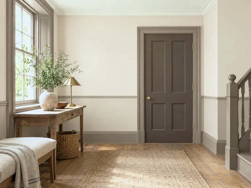
Five browns from the lightest to the deepest, spread from the ceiling to the woodwork: the colour blocks lead the eye to the darkest point. The safest palette there is, because all share the same undertone.
Menu
How To
Design Advice
Customer Service
My account
Help with paint Choosing colour
Brown is the colour that anchors: it gives weight to a palette that is too light, warmth to a room that is too cold, and it links colours that would otherwise have nothing to say to each other. It is composed by family — greiges, taupes, red-browns and chocolates share their undertones — or by contrast, with a green, a blue-green, a pink. What it fears: excess, which smothers, and the orange-brown of the 1970s, which dates. Six ways, with the Mylands browns.
Page updated September 2026 · by the Mylands France colour team
Understanding
Brown is what is left when the colours are mixed: an earth, a wood, a leather. That is why it goes with everything — it already contains a little of everything — and why it weighs: a brown room is a room with a ground, a weight, a gravity. For centuries it was the default colour of interiors, that of waxed panelling and leather; the twentieth century forgot it, then caricatured it in the 1970s as orange. It is back today greyed, muted, as greige and taupe, or deep, as chocolate.
The nuance is everything. A brown with a hint of red warms and goes towards pink and terracotta; a brown with a hint of yellow pulls towards honey and ochre; a brown with a hint of grey — greige, taupe — is a neutral that accepts cold. The Mylands colour pages list each brown's whites and accents; the guide Greige and beige: 8 shades compares the lightest, our neutral groups sort them by undertone.
Six ways
01
Five browns from the lightest to the deepest, spread from the ceiling to the woodwork: the colour blocks lead the eye to the darkest point. The safest palette there is, because all share the same undertone.
02
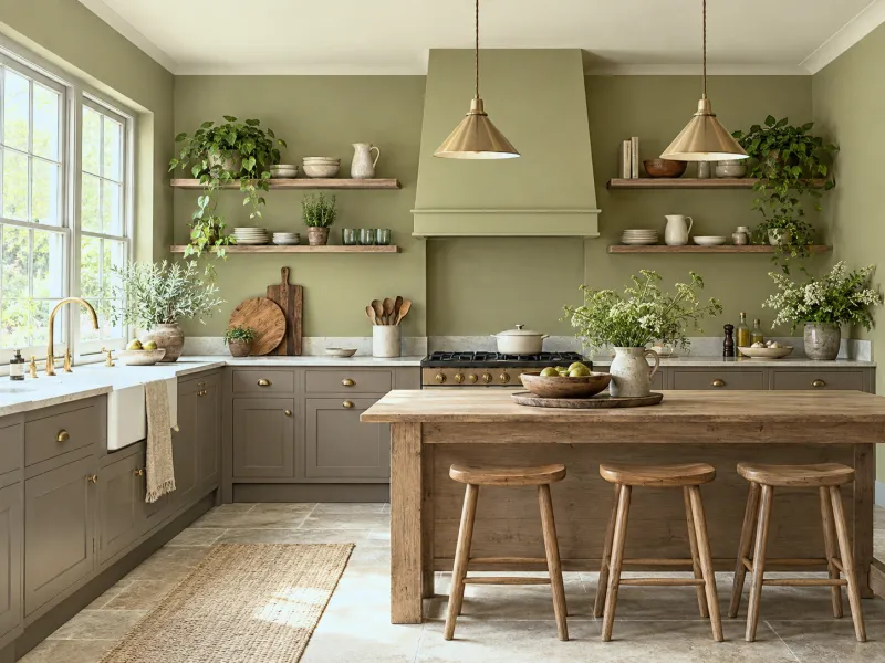
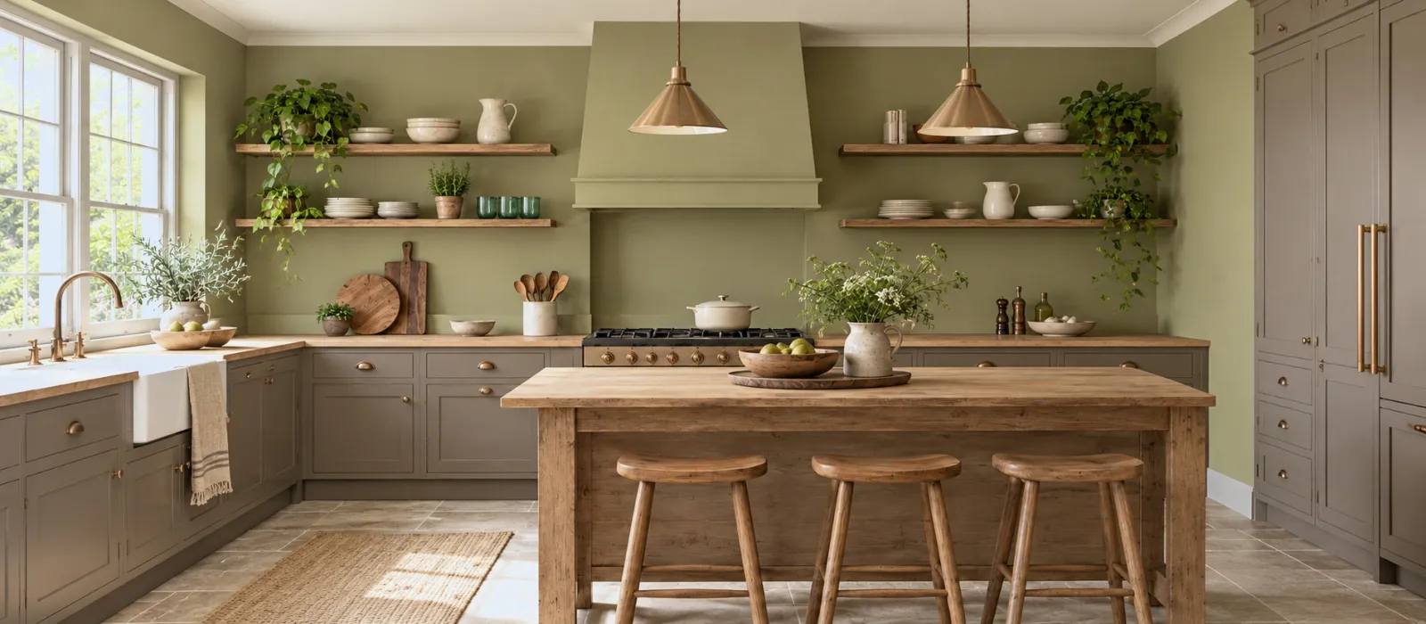
A kitchen does not have to be light: a golden green on the walls, a muted red-brown on the base units, a dark stone on the ceiling. Brown and green are neighbours through the earth; together they make a modern farmhouse kitchen.
03
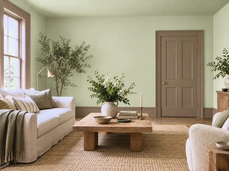
In a room drenched in green, an earth brown on the doors, architraves and skirting: brown is the ground of green, as the trunk is of the leaf. The room stops floating.
04
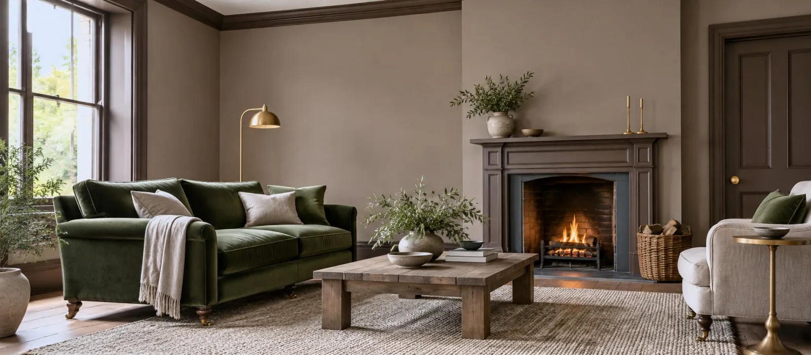
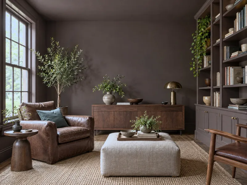
A chocolate brown on the walls, ceiling and woodwork of a small sitting room, a library or a dining room: the absolute cocoon. Objects in variations of brown — leather, walnut, undyed linen — and a single related contrast, a green or a blue-green.
05
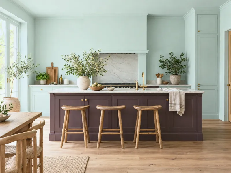
A pale blue-green kitchen with a deep purple-brown on the island or the splashback; a warm white sitting room with a chocolate sideboard. Brown gives the light its missing weight, on a single surface.
06
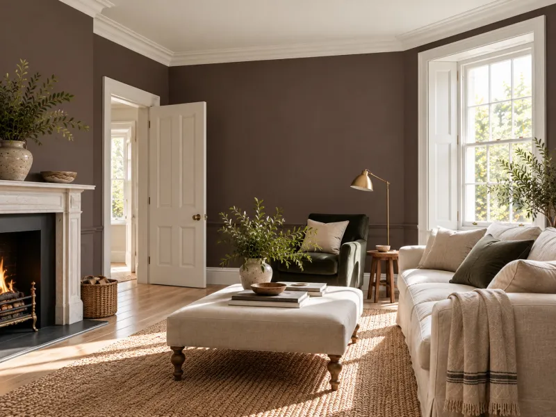
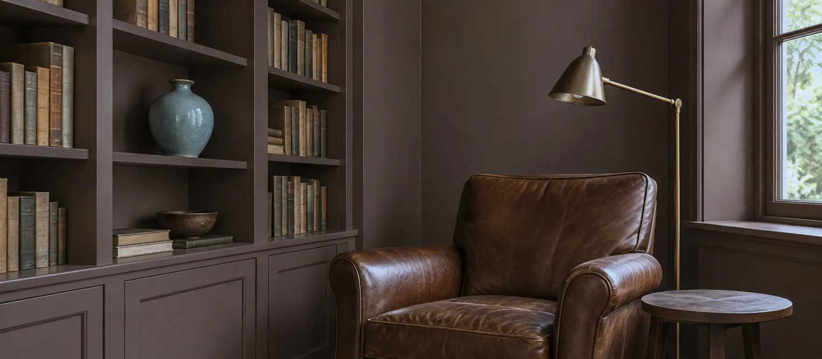
A chocolate on the walls and a clean white on the woodwork and ceiling: the brown monochrome, graphic, modern. The pairing of the chocolate bar and the milk.
The Mylands browns
| Brown | Undertone | For | The white that goes with it |
|---|---|---|---|
| Clerkenwell No.21 | Rosy beige | Sitting-room and bedroom walls | Holland Park No.5 |
| Hoxton Grey No.72 | Warm greige | Walls, corridors, north-facing rooms | Whitehall No.9 |
| Temple Bar No.70 | Beige-taupe | Walls, dados | St James No.40 |
| Egyptian Grey No.154 | Greyed taupe | Study and hall walls | St Clement No.11 |
| London Plane No.200 | Golden brown | Kitchens, dining rooms | Lots Road No.24 |
| Millbank No.254 | Mid brown-taupe | Deep sitting-room walls, woodwork | Holland Park No.5 |
| Westmoreland No.160 | Earth brown | Woodwork, furniture, bases | Whitehall No.9 |
| Birdcage Walk No.117 | Deep brown-grey | Study walls, doors | St Clement No.11 |
| London Brown No.287 | Almost-black chocolate | Drenches, doors, skirting, accents | Maugham White No.2 |
| Cigar BH.20 | Tobacco brown, red | Woodwork, furniture, dining rooms | Bone BH.04 |
The red-browns — Huguenot No.49, Henna BH.18 — are covered in Terracotta and ochre paint.
To avoid
Frequently asked questions
A greige or a taupe, no: they are mid-tones that still return a third of the light and warm. A chocolate, yes, and that is what it is asked to do: in a library, a dining room, a small evening sitting room.
Green first (the earth and the leaf), then blue-green, powder pink, ochre, cream white. Avoid cold grey and sky blue, which make it sad. The Mylands colour pages give each brown's accents.
If the wood and the brown share an undertone, it is one more material, not one more colour: golden oak with a yellow brown, walnut with a red brown. What clashes is a red brown with a yellow oak.
A greige or a rosy beige — Clerkenwell, Hoxton Grey, Temple Bar — on the walls, with woodwork in a deeper brown: warmth without heaviness. Chocolate rather on a headboard wall or a wardrobe.
See also
 Neither light nor dark: mid-tones are the colours you stop noticing after a week — and that is their quality.
 Comfort starts at the walls: six palettes for a sitting room you stay in at night, from deep neutral to autumn...
 Our neutrals grouped by undertone to help you find the perfect match.
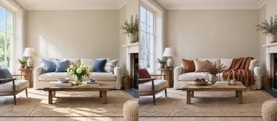 Loving your walls in July as in January: four timeless bases, and what each season adds.
“Brown is the ground on which the other colours can stand up.”

Thanks for signing up to our newsletter!
Sign in to save items to your wishlist. Sign in to save your basket, so you can continue shopping later.
Don't have an account? Create one
Share this link and friends can buy items from your list. Anything bought disappears from it automatically. Anyone with this link can see your selection.
Moving in, redecorating, or dropping hints? A free account turns this selection into a gift list — add or remove colours whenever you like, and we'll email you when someone buys something from your shared list.
Free · Delivered to your door
Get a free colour card posted to you, showing our complete Colours of London range, with swatches made from the real paint for a true representation of our award-winning colours.

