


The journal
A Chiswick Edwardian Home: Timeless Tones of Soft Neutrals
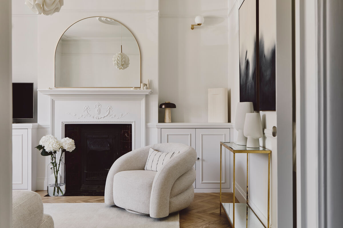
Nestled in the heart of Chiswick village, this spacious Edwardian family home is a sanctuary of soft minimalism, a contemporary ode to the enduring elegance of neutral tones. This light-filled residence is a modern tribute to the subtle power of colour.
Nestled in the heart of Chiswick village, this spacious Edwardian family home is a sanctuary of soft minimalism, a contemporary ode to the enduring elegance of neutral tones, a light-filled residence and a modern tribute to the subtle power of colour. At the heart of the aesthetic is a home wrapped in a soft palette of natural formulations, lined with daring edges, bringing a sense of calm and timeless elegance. This philosophy comes to life through a carefully curated selection of Mylands paint, gentle yet expressive tones that redefine the soft foundations of neutrals.
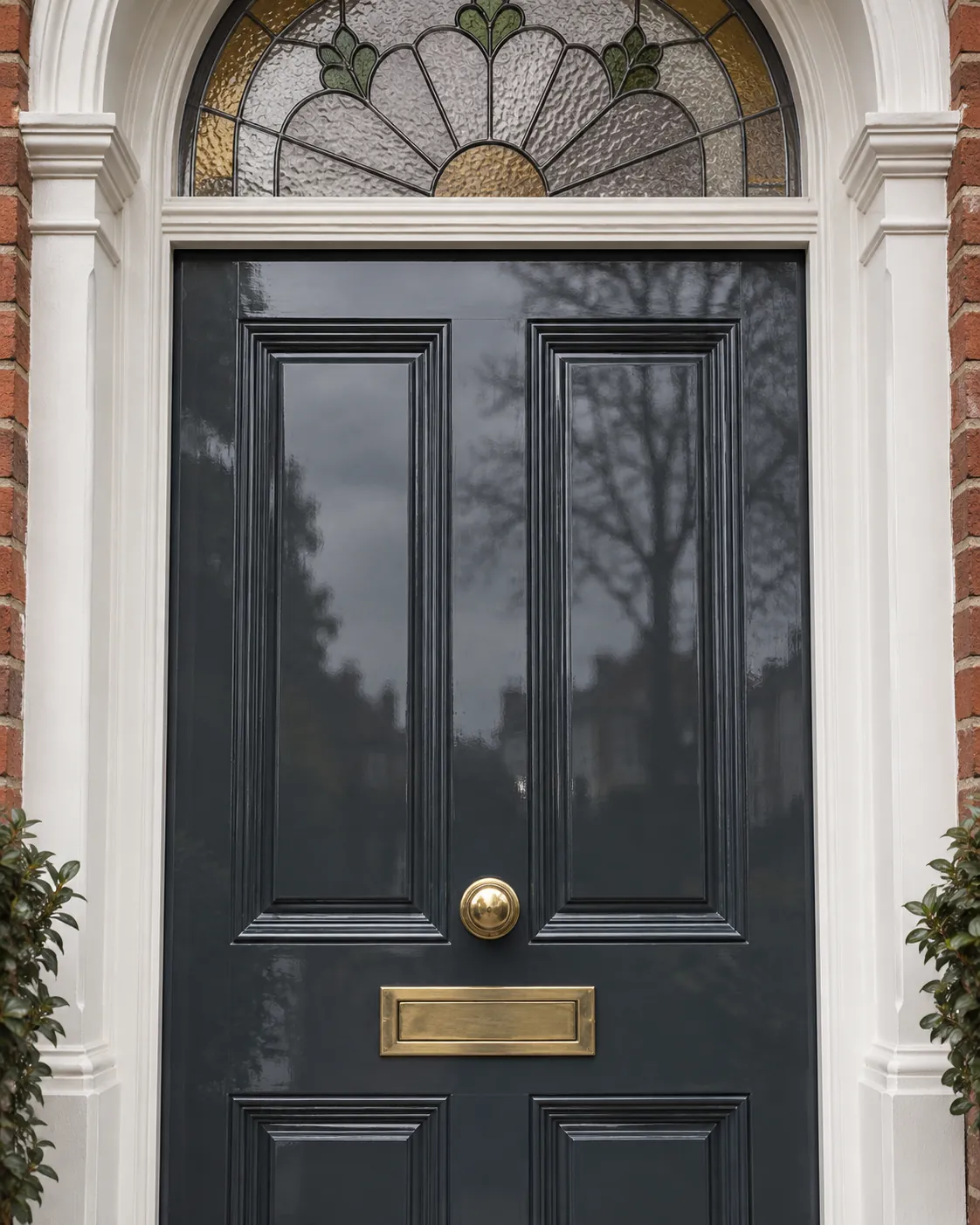
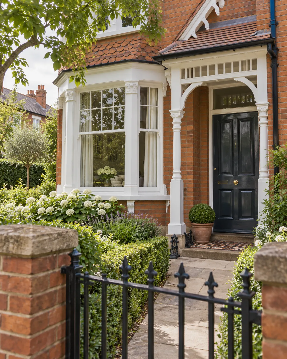
Framed by crisp white woodwork and a rich tapestry of traditional brick, the front door in Mylands' Bond Street™ No.219 anchors the façade with timeless depth and composure. This deep, inky blue-black is both classic and quietly daring, drawing the eye without overpowering the harmony of the home's Edwardian detailing. More than functional, Bond Street™ No.219 brings a weight and confidence that feels both rooted in heritage and distinctly modern, turning a simple doorway into a moment of quiet theatre; in a world of muted exteriors, this one speaks with calm authority, inviting, enduring and effortlessly elegant.
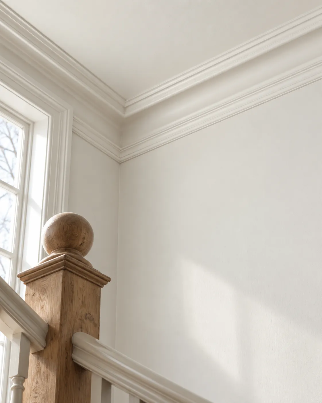
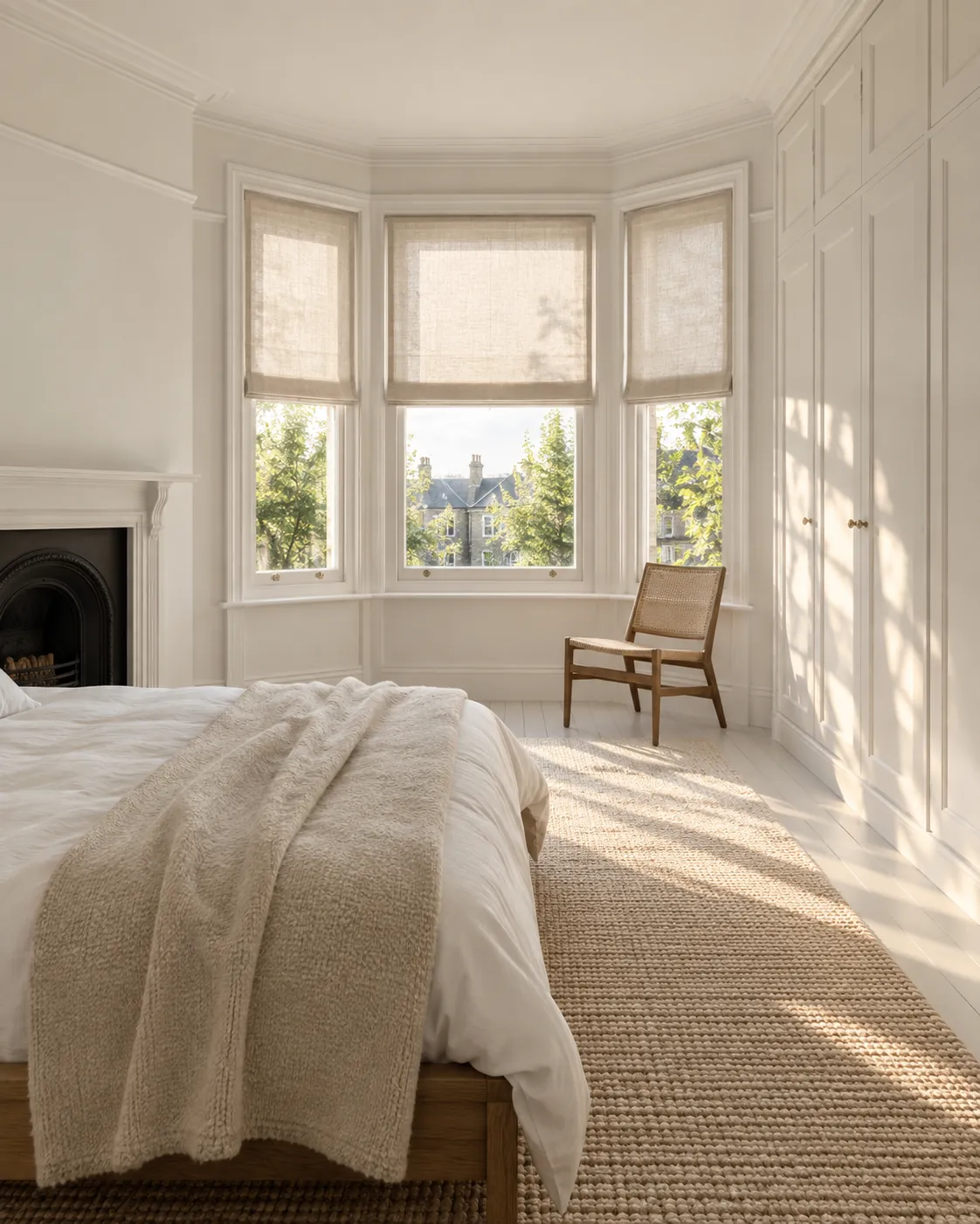
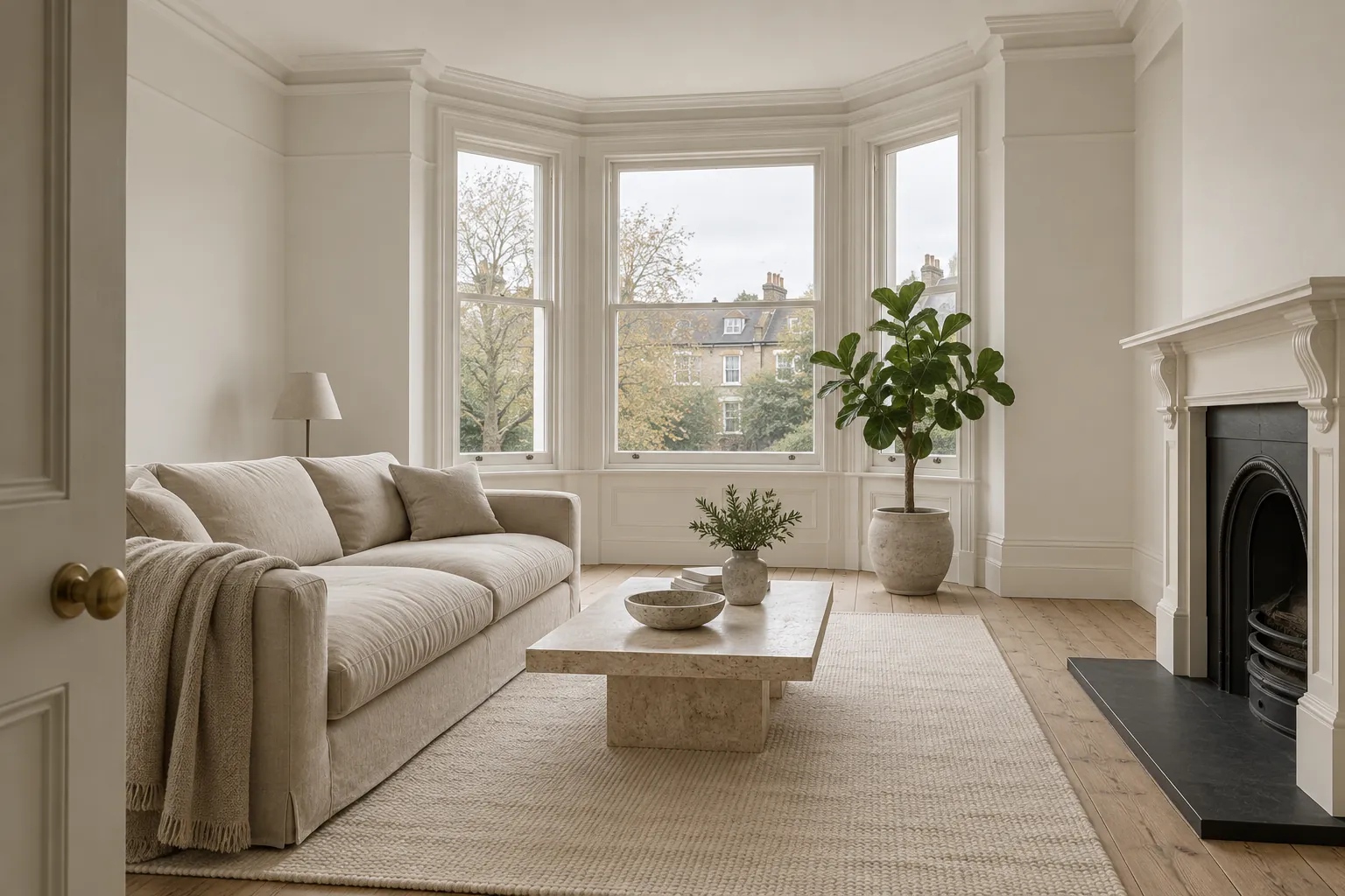
Neutrals, often thought of as safe colours, here exude a soft wave of modern warmth and elegance. With Cotton Street™ No.3, a chalky, warm-toned neutral, as the foundation, the rooms breathe; the shade stretches across walls and ceilings, creating a cocoon-like calm that feels both soft and architectural.
It's not just pale paint but a mood in still motion, designed to enhance the bones of the home rather than distract from them. Much like colour drenching, the ethos is commitment to tone, but in a more refined register; neutrals aren't a backdrop, they're the main narrative, and offset with bold, deliberate punctuation, they become dynamic.
Museum™ No.151, a warm, grounded stone colour with subtle complexity, brings an effortless refinement to any neutral palette, and here plays a quiet but powerful supporting role. Paired with richer tones like Beauvais™ No.195, it helps bridge classic elegance with a more contemporary sensibility; in spaces like this beautiful Edwardian house, where neutral foundations are lifted with structured design and moments of bold colour, Museum™ No.151 acts as the steady, sculptural presence, heritage-rich and quietly confident.
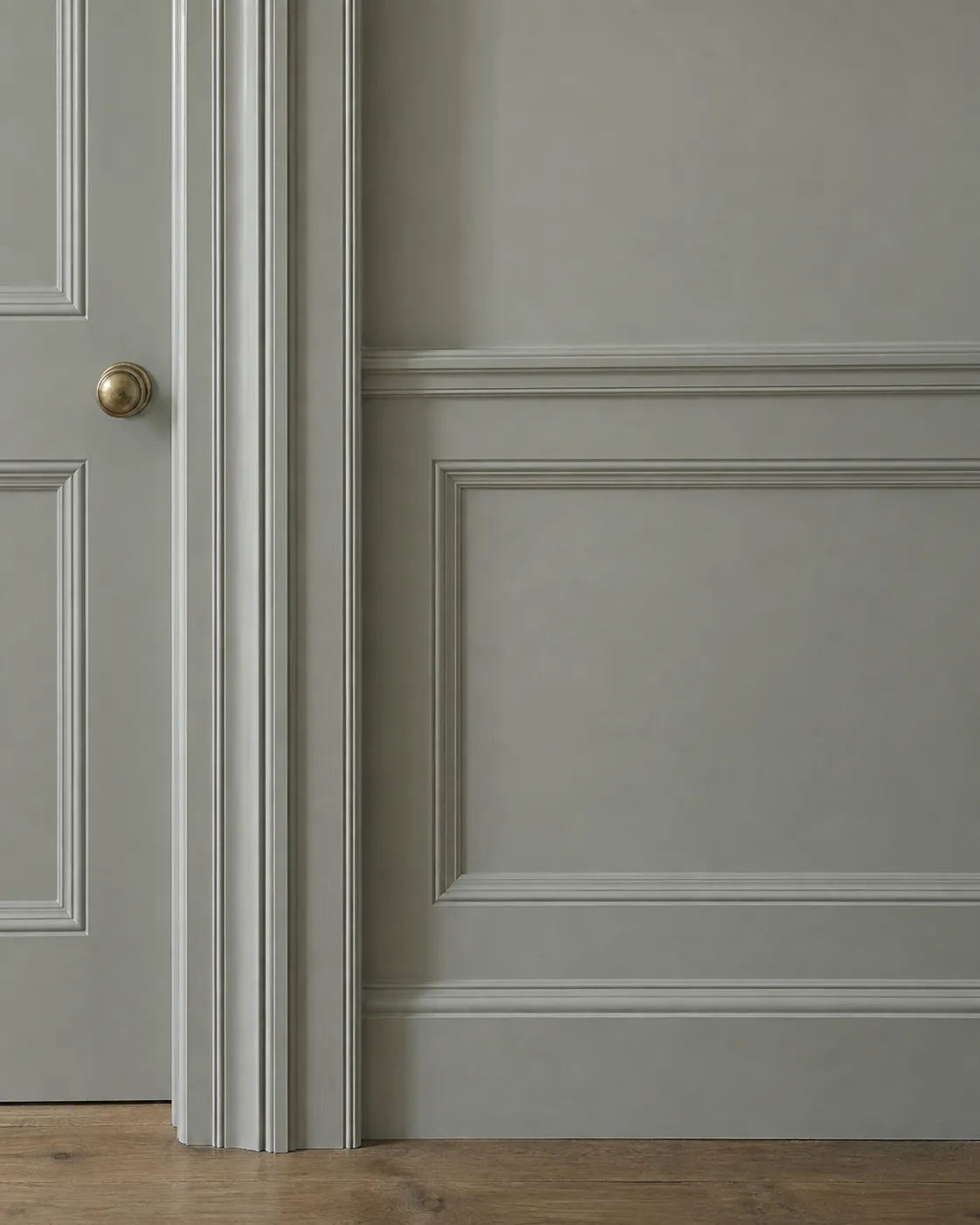
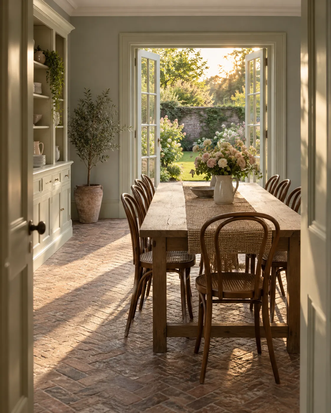
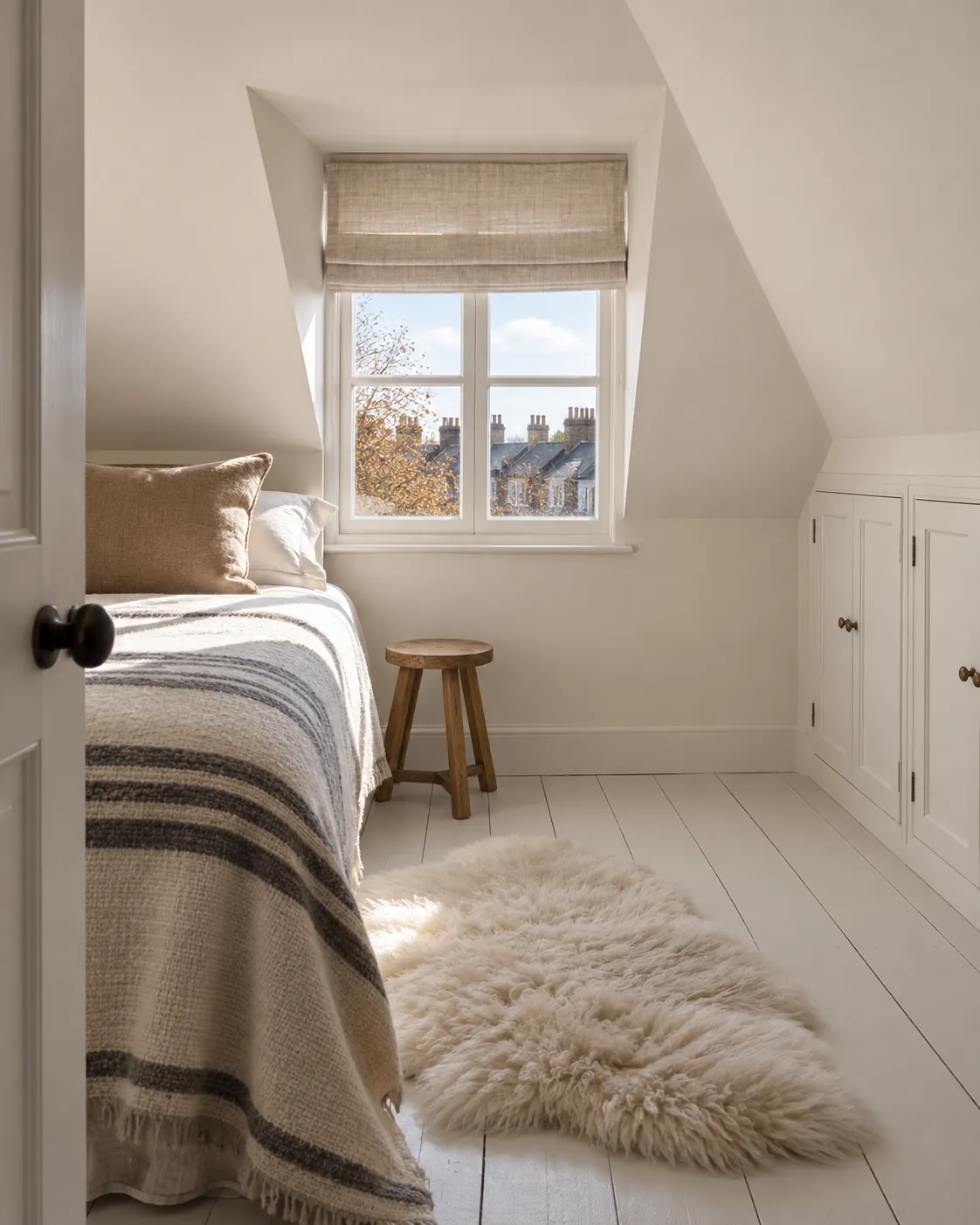
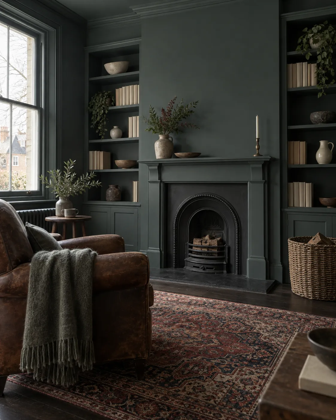
With large bay windows and generous ceilings, the property embraces and interacts with light differently. Mylands' Marble Matt finish, containing crushed Carrara marble, gives the paint a unique depth of colour, letting it catch the light gently, diffusing rather than reflecting, softening rather than flattening. From soft tones like Holland Park™ No.5 in one of the bedrooms to darker tones like Market Green, the Marble Matt finish adds depth to each curated space.
This beautiful project shows that colour doesn't need to shout to be powerful; sometimes the most impactful interiors are those that hold something back, letting tone, texture and subtlety speak louder than trends. Discover the full palette.





