


The journal
Colour Drenching: The Latest Colourful Interiors Trend
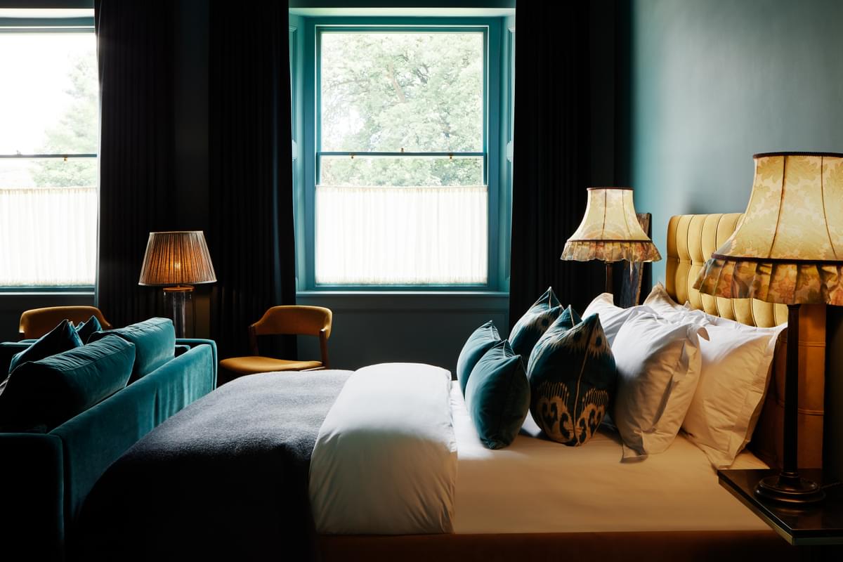
We've seen a huge uptick in bolder paint colours in recent years, and now the latest interior trend takes that a step further. Colour drenching is about fully committing to a paint colour and applying it all over a room, top to bottom, ceilings and skirting boards included. Deciding on the best colour for a room can take a long time, so once you've made that decision, embrace it and drench the room in your chosen hue; it shows confidence in your scheme and has been embraced by designers and homeowners alike. Here's how you can start colour drenching too.
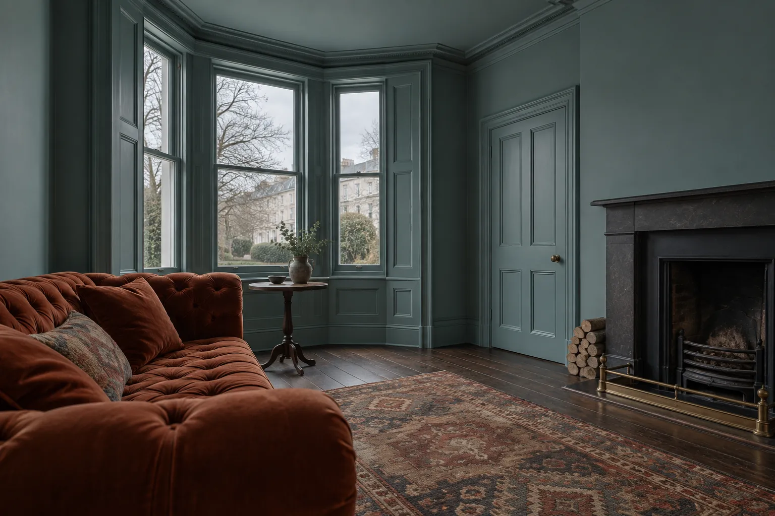
Colour drenching means applying one colour everywhere, yes, everywhere, ceilings, skirting, woodwork, window frames, doors, radiators, picture rails, panelling and coving. Conventionally, woodwork, ceilings and skirting would be white or natural wood, but this trend shuns convention for a bolder, all-encompassing approach, a brave design move that looks sensational.
What are the benefits of colour drenching?
When you use one colour on the walls and a contrasting one on the ceiling or woodwork, the eye is drawn to the join; using the same colour throughout blurs the boundaries and blends one into the other seamlessly.
How does it make a room feel?
A dark colour all over feels cocooning and enveloping, cosy in a living room and inviting you to snuggle up, or in a bedroom encouraging you to relax and unwind, more intimate throughout. It can also make a small space feel larger: two colours draw the eye to the join, but a single colour creates the illusion of height and expands the space visually, a real bonus in a small room. And there may be unattractive features, radiators for instance, that don't always look great; painting them the same colour as the walls helps them fade into the background.
How best to colour drench
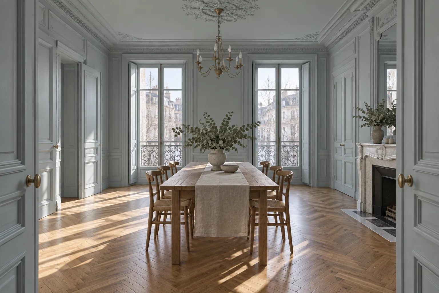
Think about how you want the room to feel; that will inform your colour choices and overall design. Be bold and bright: colour drenching works well with a bold scheme, so dress a dining room in a deep red or strong teal top to toe for an opulent yet inviting entertaining space, or opt for a fresh, rich yellow for a sunny, welcoming atmosphere.
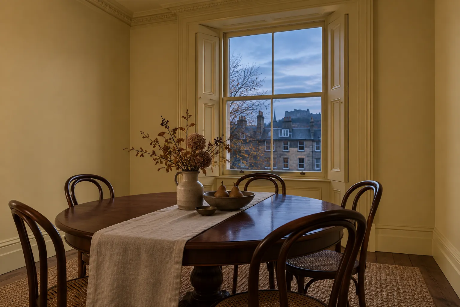
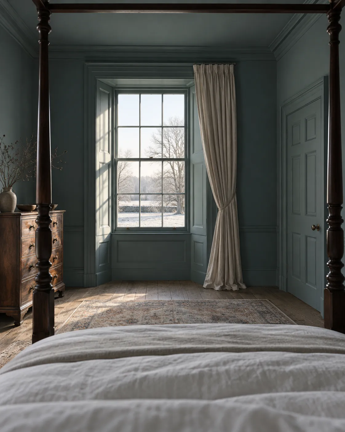
If you don't feel brave enough to go bold in a primary space like the living room, start with a downstairs bathroom or utility room, a place to try a fun, bright colour; enveloping it in a hot hue adds personality, interest and warmth. Go dark and deep: use a darker colour on walls, ceilings and woodwork for a cosy, inviting space, ideal in rooms used most in the evenings, and the deep blue-green of Mylands Burlington Arcade™ No.216 adds opulence to this grand Georgian-style bedroom while keeping it intimate and comforting. Dark blue, deep forest green and even black are popular choices, transforming a living room into an inviting, sophisticated snug.
Soften up a space: in stark contrast to dark décor, colour drench in softer pastels; warm pastels promote natural light and can make a room feel bigger, enhanced further by blending walls into ceilings and skirting in the same colour. Pink has been a hot trend, adding a friendly atmosphere, but there are many pastels, from blue to yellow, mauve to green, each adding soft freshness and lightening the room. Liven up a dark room: a narrow hallway or a windowless bathroom or utility space becomes more interesting when colour drenched, the colour creating real impact and distracting from limited space or light.
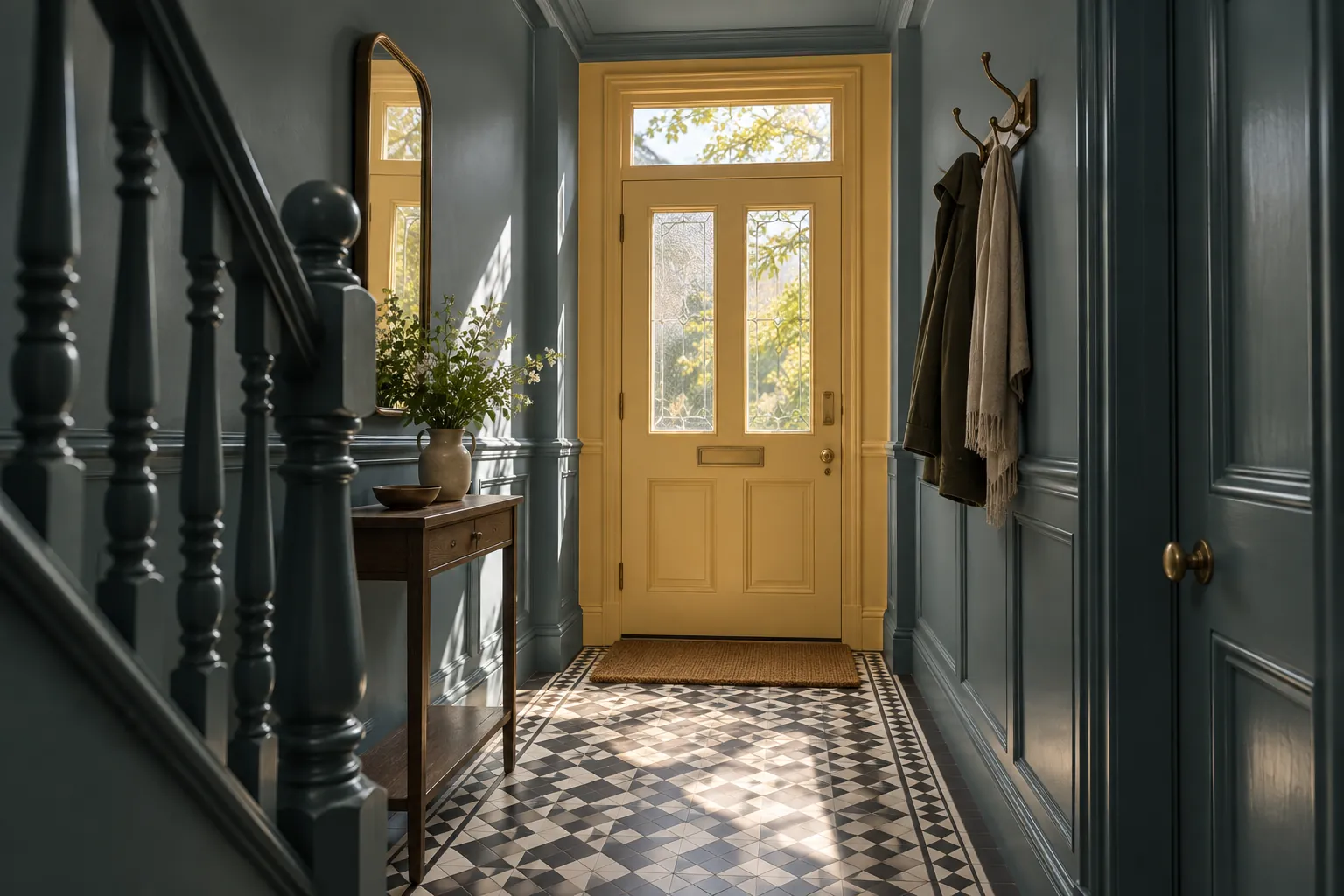
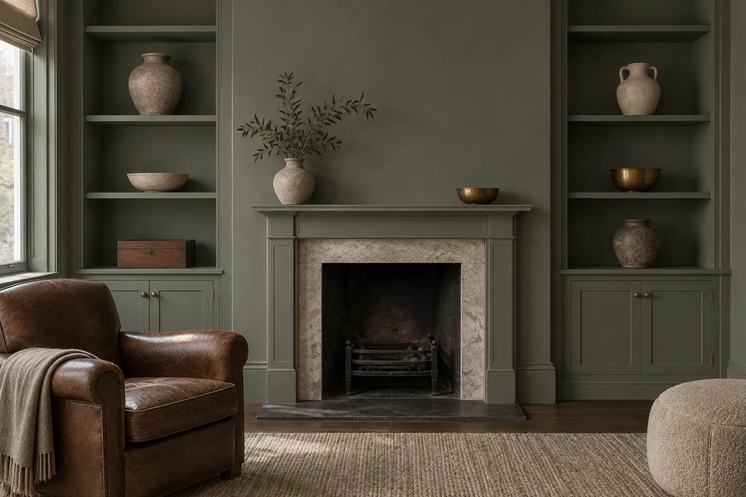
This narrow hallway is made dramatic and impactful by dark grey (Mylands Burlington Arcade™ No.216) on the walls, ceilings and woodwork, while bright yellow (Mylands Golden Square™ No.131) at the entrance draws the eye to the door and complements the graphic floor tiles. Create a backdrop: think about which elements you want to stand out, your art, striking furniture or a dramatic headboard, and if that's the thing you want to pop, keep the walls and ceilings a backdrop rather than the talking point, since a more neutral scheme lets your focal point shine. Blend in storage: we all need shelving and cabinetry, but it needn't be a focal point, and colour drenching helps it fade into the background and appear integrated with the wall, looking sleek and sophisticated while letting your ornaments, rather than the shelves, stand out.
Be inspired by the Country House Diaries
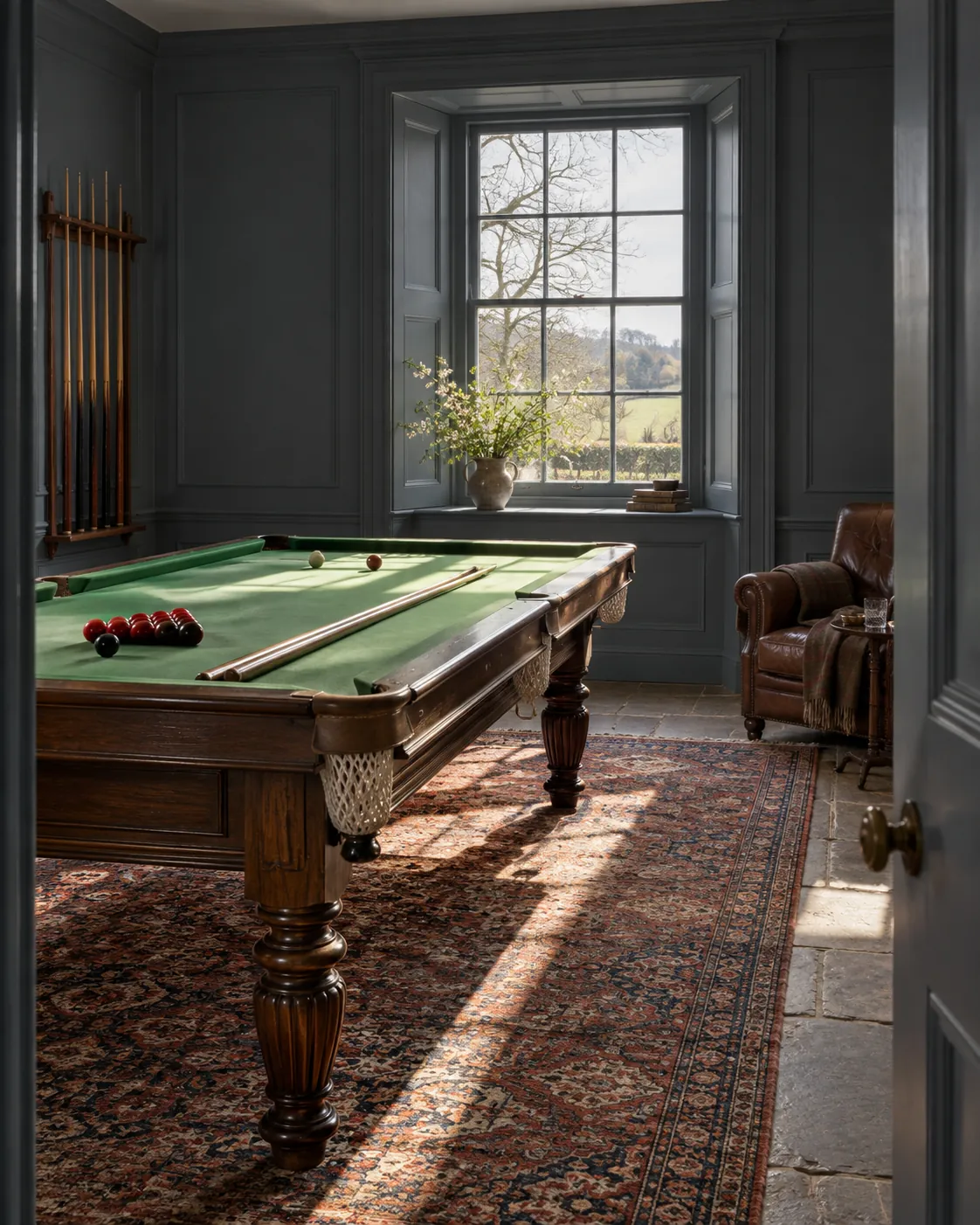
Ben and Paul of @thecountryhousediaries chose Mylands paint to transform their Georgian property in the Cumbrian countryside, their rich colours accentuating the incredible 19th-century architecture while giving the house a new lease of life. The bedroom is colour drenched in the rich blue-green Burlington Arcade™ No.216 for a dark, intimate feel; the games room is enveloped in Bond Street™ No.219 for drama and sophisticated impact; and in contrast the living area is drenched in a light, neutral Egyptian Grey™ No.154 for a calming, balanced atmosphere.
Read more about the incredible country house renovation and how colour drenching transformed the property. Colour drenching is a confident, stylish trend, choosing a colour you love and committing fully, no diluting with contrasting shades or confining it to an accent wall. Drench with that colour 100% and you'll create a stunning yet welcoming effect. Shop our range of colours and get drenching.





