


The journal
Home office paint: colours for focus and video calls
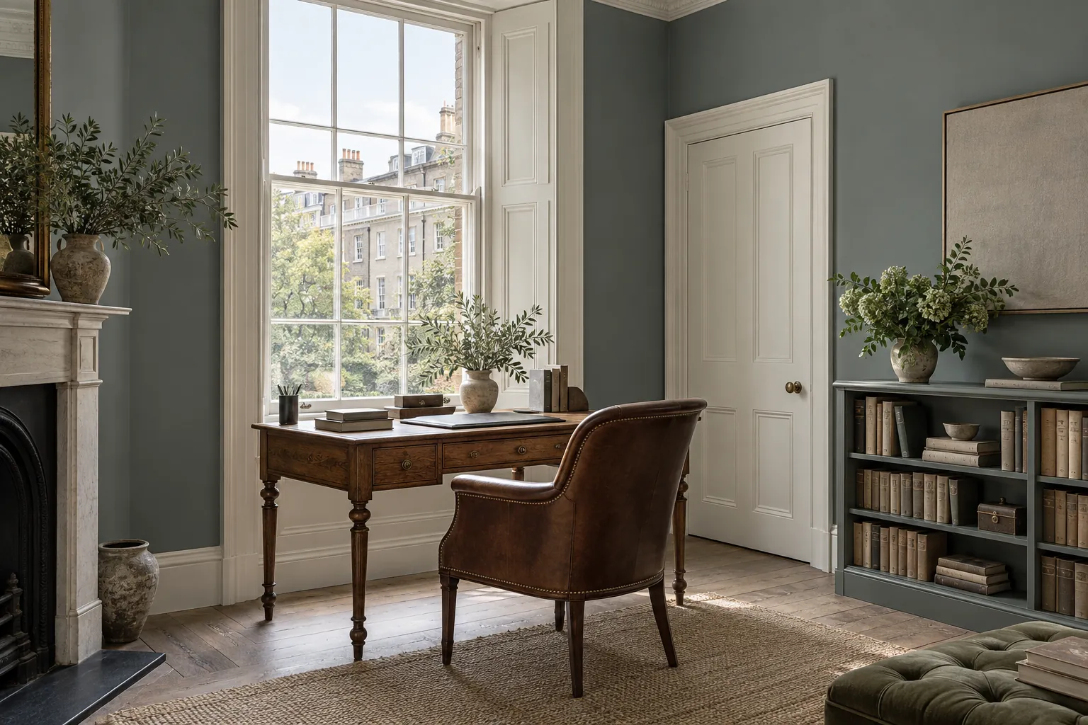
The right home office paint is a mid-tone, grey-green or grey-blue, applied in matt: it rests the eye when it leaves the screen, reflects neither window nor lamp, and gives a clean, flattering background on video calls. Overall BH.10, Long Acre No.102 and Riverine JB.07 are our first choices.
A home office is the one room you spend eight hours a day in without ever really looking at it, and yet it is the room that decides how good a working day feels. Home office paint has two jobs to do at once: help you concentrate when you are alone with the screen, and look composed behind you when the camera comes on. Those two demands overlap more often than people expect, and they point to the same family of colours, neither pale nor dark, applied in a finish that does not throw the light back at you.
What to ask of home office paint
The first instinct, when setting up a place to work, is to paint it white in order to "keep it neutral". It is often a mistake. A pure white, facing a window that lands squarely on the screen, becomes a dazzling surface that tires the eyes by mid-morning; on camera it bleaches the face and flattens its outlines. At the other extreme, a deep black or a night blue can be superb in a library, but it swallows so much light that you spend the whole day compensating with lamps.
Between the two lies the right zone: mid-tones, grey-greens, grey-blues, soft khakis, that hold the light without bouncing it, rest the eye when it leaves the screen and give the image depth. They are also colours that age well, that do not date an office after three years, and that cope with a crowded bookshelf as happily as with a bare wall. Every shade in this article comes from that range.
Concentration: colours that calm without sending you to sleep
An office asks for a colour that soothes without lulling. Greyed greens are the champions of that balance: they recall the outdoors, they rest the gaze, and they stay present enough to give the space structure. Overall BH.10, from the Beata Heuman collection, is a deep, calm blue-green, the colour of the mechanic's overalls it is named after; it carries a whole office without ever weighing on it, and it brings out the pale wood of a desk. Stockwell Green No.203, a soft khaki green named after the street where Mylands opened its first shop in 1884, is warmer and earthier, and suits rooms short on sun.
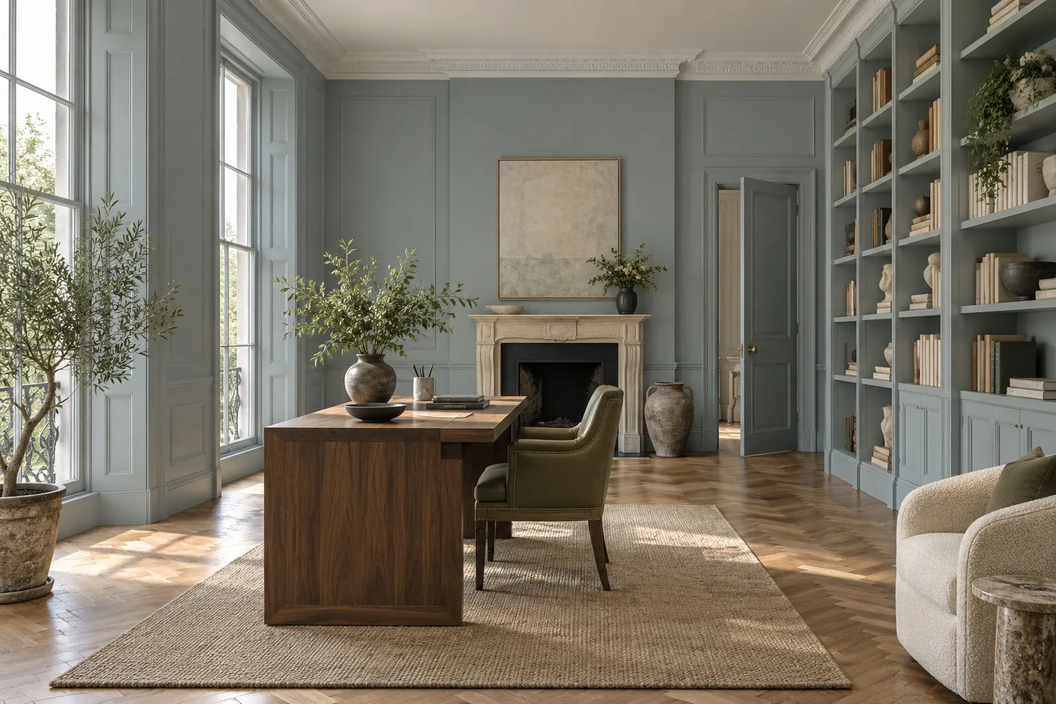
Greyed blues have the same virtue, with a cooler note. Long Acre No.102, a tempered grey-blue dedicated to one of the earliest sales of blue paint recorded in our books, may be the most universal office colour we know: light enough for a small room, strong enough not to fade to white at midday. Riverine JB.07, from the Jinny Blom collection, is darker and more mineral, a shaded-water blue that gives an office a quiet seriousness. Which you choose depends on whether your day needs warming up or cooling down.
The wall behind you on video calls
A laptop camera is an unflattering instrument: it crushes contrast, saturates or washes out colour, and turns a white wall into a halo. The wall that appears behind you therefore deserves to be chosen like the backdrop of a portrait. A mid-tone, matt, evenly lit by a window in front of you or to one side, gives a clear face and an image that looks considered without effort. All the shades above work; Uncle Maths BH.05, a composed, airy light grey-blue, is the most discreet option for anyone who wants a calm background without a declared colour.
Avoid patterns, sheen and vivid colours, on the other hand: a yellow or orange wall bounces onto the skin, a satin finish behind you catches the reflection of the window, and a busy wallpaper distracts whoever you are talking to. If your desk sits in a living room or a bedroom, painting only the stretch of wall that appears on screen, in a colour deeper than the rest, marks out the working area without partitioning the room, and gives the camera exactly what it needs.
A good video-call background is not a set; it is a wall that lets you do the talking.
Glare, screens and the choice of finish
In an office the finish matters almost as much as the colour, because the room is crossed all day by the light of a window and the light of a screen. A glossy or satin home office paint on the walls multiplies reflections and patches of glare, including in the screen itself. For the walls we therefore recommend Marble Matt Emulsion, whose film, loaded with crushed Carrara marble, absorbs light instead of returning it, and which remains washable, with class 1 wet-scrub resistance under EN 13300: chair-back scuffs and fingermarks around the light switch wipe away with a sponge. Allow around 15 m² per litre per coat, two coats, and a wall that is touch-dry in one to two hours.
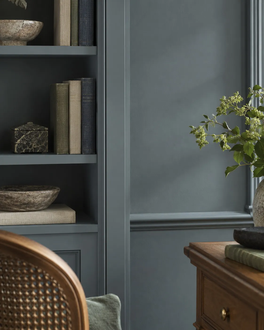
For shelves, the desktop, cupboard doors or a radiator, there are two routes. Multi-Surface Eggshell, at around 15 % sheen, protects a work surface that gets rubbed by elbows every day and cleans easily. Multi-Surface Dead Matt, at around 5 % sheen, does the opposite: it lets you paint wood, metal and walls in the same colour and the same appearance, so that no surface stands out, and it is what makes the cabin office described below possible. In both cases plan on two coats, and a primer on new or dark wood.
A word about the air, because you work in an office the day after painting it, or near enough. All our decorative paints are water-based, low in VOCs, low in odour and quick to dry; an office painted in the morning airs in the afternoon, and you can generally settle back in by evening.
The cabin office, or one colour everywhere
Some offices are proper rooms; many are a former larder, an attic room, the space under the stairs. For these small spaces the most effective strategy is also the boldest: a single colour on the walls, the ceiling, the shelves, the door and the skirting. This colour drenching erases corners and breaks, makes the room feel larger than it is, and creates a cabin-like, enveloping feeling that is very conducive to deep work. Thunder BH.12, the grey-blue of a storm sky, is the ideal candidate: deep enough to envelop, grey enough not to darken. Riverine JB.07 or Overall BH.10 work just as well.
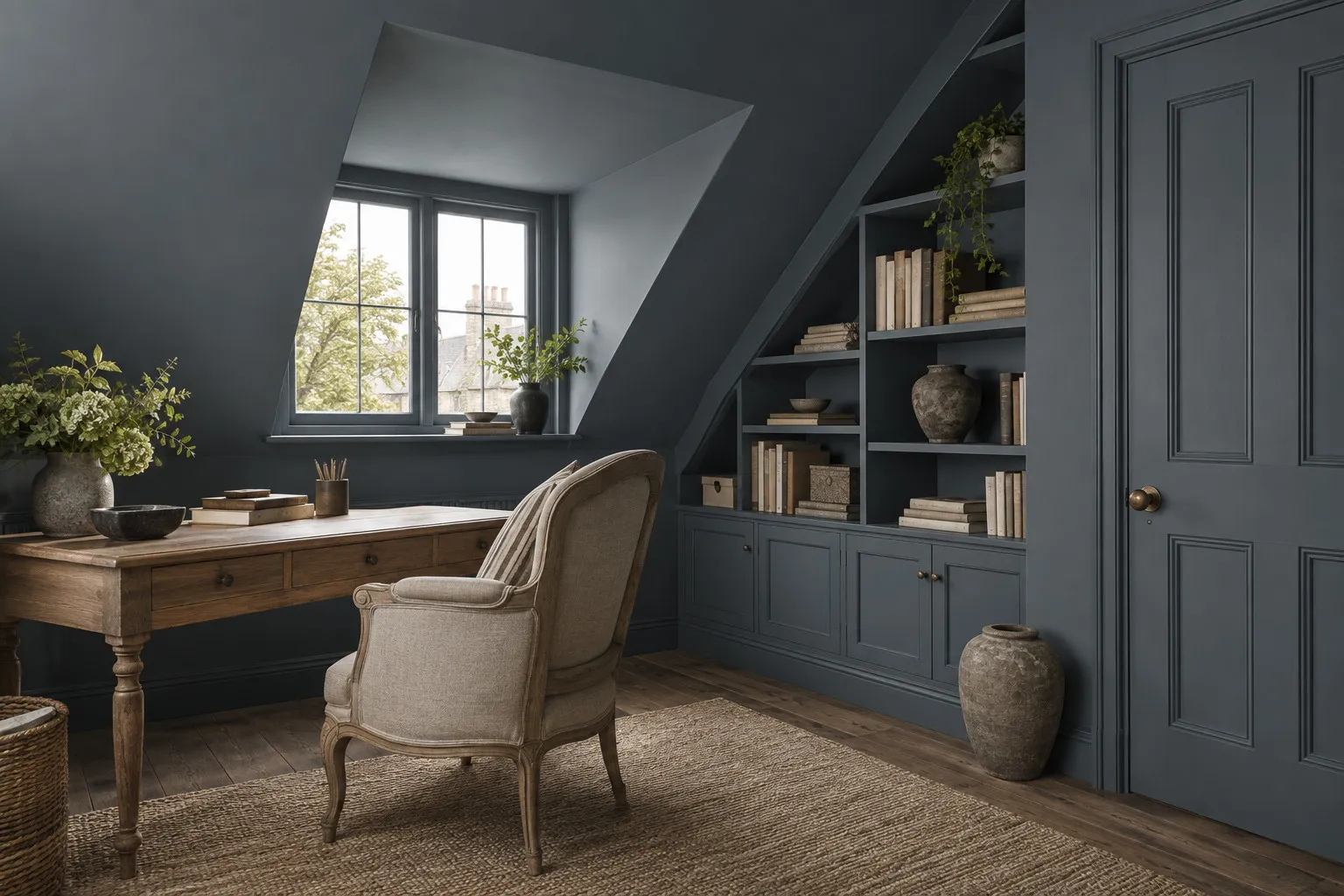
Technically, everything comes down to the finishes: Marble Matt Emulsion on walls and ceiling, Multi-Surface Dead Matt on woodwork and shelving, in the same shade. The result is a reflection-free monochrome in which only the wood of the desk, the leather of a chair and the brass of a handle bring in the light. An office treated this way becomes the place in the house where you want to close the door.
A desk corner in another room
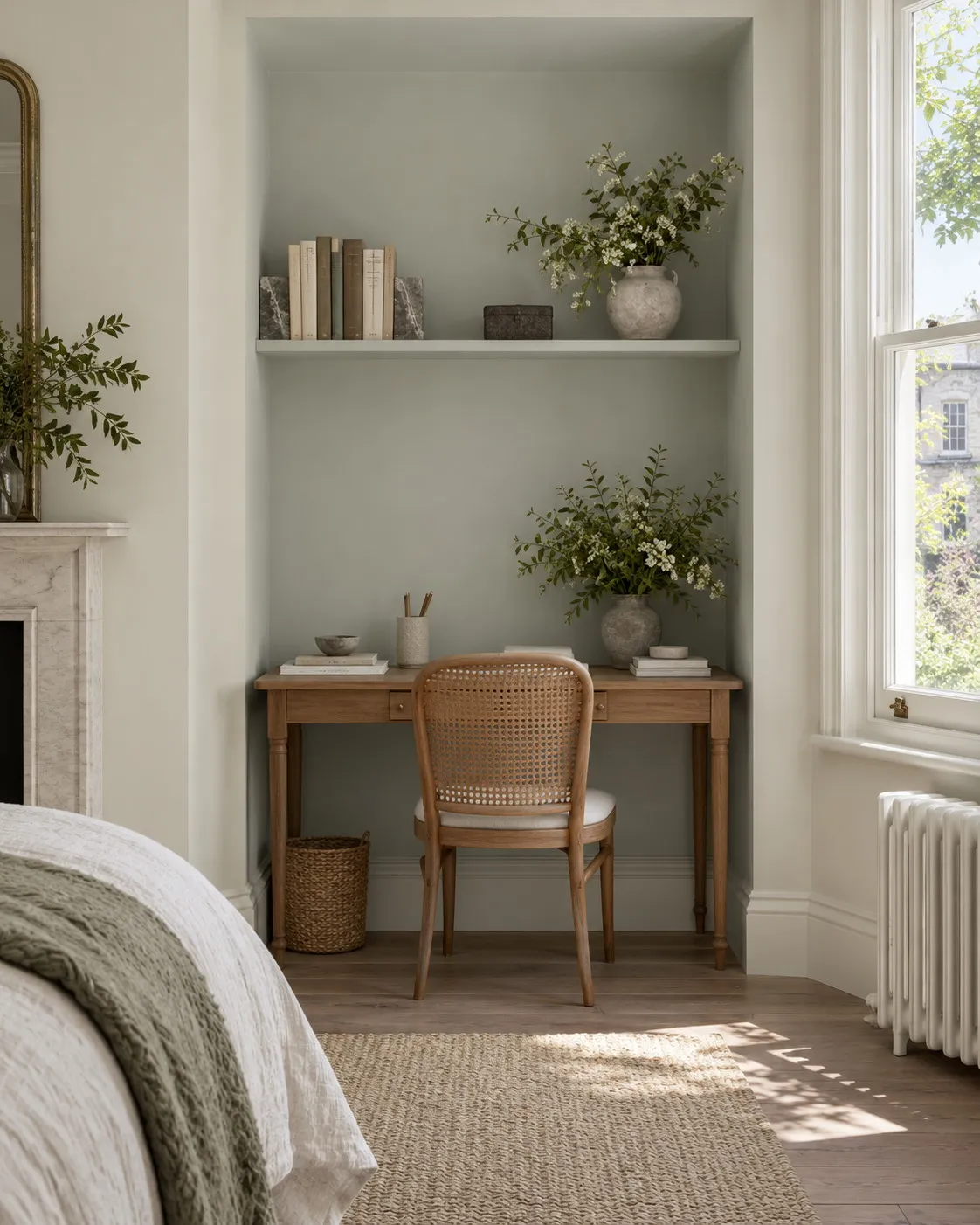
When the office has no room of its own, the challenge reverses: it has to exist without dominating. One wall of the sitting room or a bedroom alcove painted in a deeper shade than the rest, Long Acre No.102 against walls in Beata White BH.01, for instance, is enough to say "this is where the work happens". The bookcase or the recess can take the background colour, and in the evening you get a calm room back, without having watched the workspace annex everything else.
Where to start
Paint two or three squares of colour on the wall that will appear behind you on screen, using 100 ml sample pots, each covers around 1.5 m², then start a video call with yourself at ten in the morning and four in the afternoon: it is the only test that counts. The visualiser will help you compare shades on a photograph of the room before the pots even arrive. And to cost an office in two coats, walls and shelves included, the price per square metre page brings each finish back to the area it covers.
Frequently asked questions
Which colour should I choose for a home office?
A mid-tone, neither pale nor dark: a grey-green such as Overall BH.10 or Stockwell Green No.203, or a grey-blue such as Long Acre No.102 or Riverine JB.07. These colours rest the eye, hold the light without bouncing it and age well. Avoid pure white, which dazzles next to a screen, and vivid shades that tire over a long day.
Which wall colour works best behind you on video calls?
A matt mid-tone, evenly lit by a window in front of you or to one side. Grey-blues and grey-greens give a clear face and a considered image; Uncle Maths BH.05 is the most discreet option, Overall BH.10 the most assertive. Avoid white, which creates a halo, sheen that reflects the window, and patterns that distract the people you are talking to.
Matt or satin paint for an office?
Matt on the walls, without hesitation: an office is crossed all day by light from the window and from the screen, and a satin finish multiplies reflections. Marble Matt Emulsion absorbs light while remaining washable, with class 1 wet-scrub resistance under EN 13300. Keep eggshell for the desktop and shelves, or choose Multi-Surface Dead Matt to paint everything in the same appearance.
Can I work in a freshly painted office?
Yes, and soon. Our decorative paints are water-based, low in VOCs and low in odour; the matt is touch-dry in one to two hours and can be recoated after three to four. An office painted in the morning, two coats included, airs in the afternoon and can generally be used again the same evening. Wait a few weeks before the first vigorous wash, to let the film harden.





