


The journal
Dining room paint: colours and a finish made for evenings
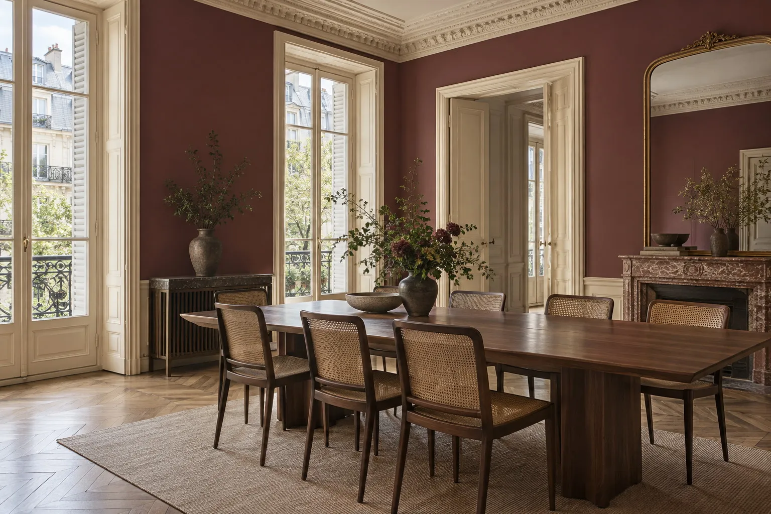
The best dining room paint is one that gains depth in the evening: a crimson red, a dark green or an aubergine, applied in a very matt finish that absorbs candlelight rather than reflecting it. Here are the Mylands shades to sample and the finish to order.
Once evening comes, a dining room no longer looks like the room you walk through in broad daylight. The curtains are drawn, the table is laid, the light comes from low down and close by. That is the moment to choose dining room paint for, not the quick passage at noon. A deep, richly pigmented shade that warms in candlelight will do more for the atmosphere of a dinner than any light fitting. Here is how to choose it, in which family of colours and in which finish.
An evening room that can carry depth
In most French homes, the dining room is the room used for the fewest hours a day and the most intensely. People sit in it, talk in it and look at its walls for longer than in a sitting room, where attention drifts to the screen or the fire. A pale, cautious colour often looks flat there as soon as the daylight fades, whereas a dark shade that might seem bold in a bedroom settles into place quite naturally.
There is a reason for this. Natural earth and mineral pigments, generously loaded into a paint, respond to raking light: they darken in the corners and wake up wherever the light strikes. On a dining room wall lit from the table, that play happens at eye level, exactly where guests are looking. A paint that is short on pigment gives a flat plane; a richly pigmented paint gives a depth that shifts as the evening goes on.
Three families of colour suit a dining room paint scheme particularly well: reds, deep greens and aubergines. None is neutral, all have a long tradition in rooms for entertaining, and each is handled a little differently.
Dining room reds, from crimson to theatre red
Red is the historic dining room colour, and for good reason: it flatters faces, warms wood and gives a meal a sense of occasion without any effort. The trick is choosing the right one. Huguenot No.49 is a sumptuous crimson from the Mylands archives, named after the rich silk weavings of the Huguenots. Its violet base keeps it well away from brick red; by candlelight it turns almost claret, dense and enveloping. It is the shade on the dining room walls at the top of this article.
Arts Club No.281 is more direct: a deep red used down the years by performing arts companies, less violet than Huguenot, with a touch of brown that makes it easy to live with oak or walnut. Theatre Land No.282, finally, leans slightly towards pink. It is a traditional Mylands red, long favoured by London theatres, which keeps a softness even across a large surface. Between the three, the question is one of temperature: Huguenot for a room you want hushed, Arts Club for a dining room that opens onto the kitchen, Theatre Land for a Haussmann apartment with white mouldings.
Deep greens and aubergine: the alternative to red
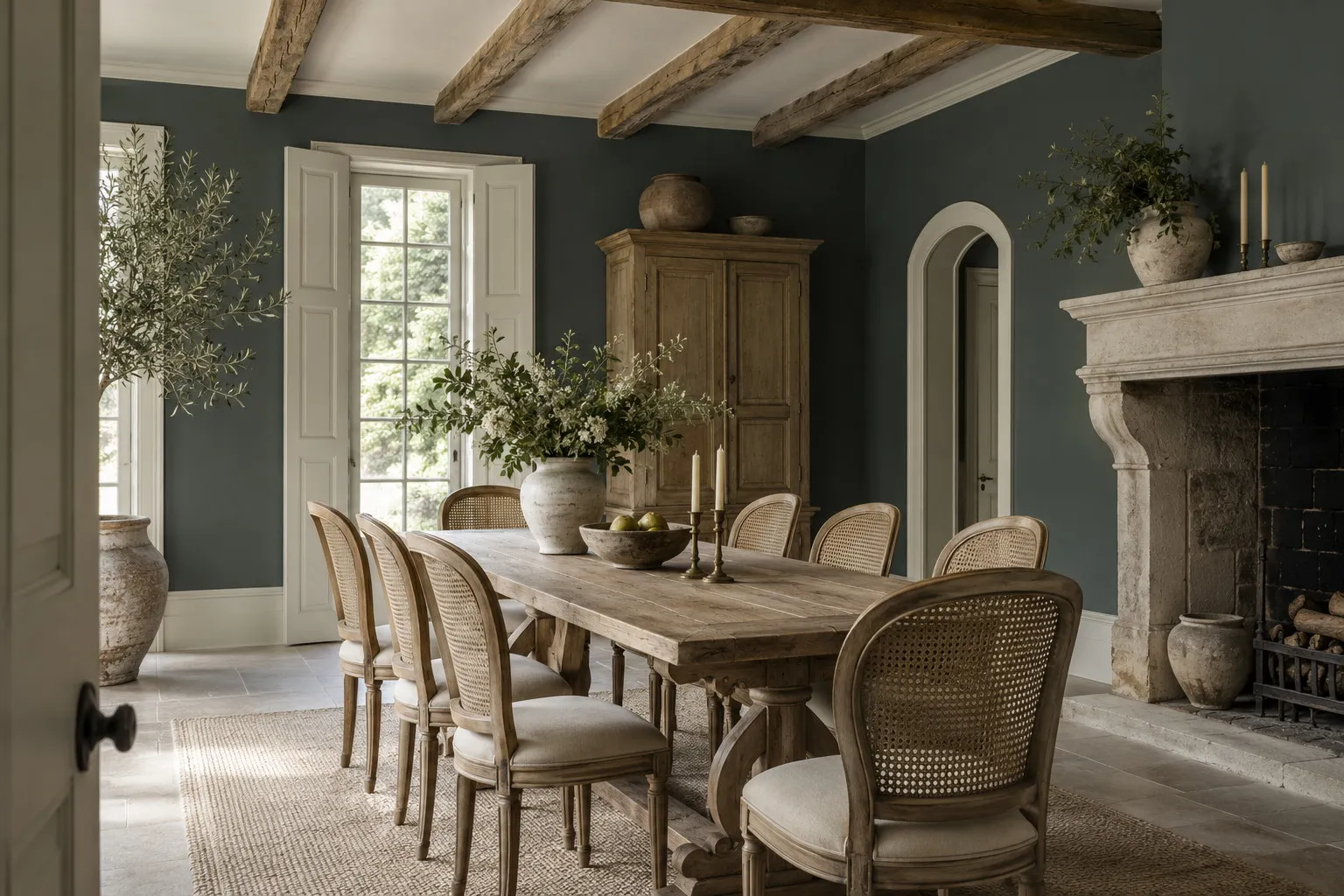
Those who find red too predictable turn to dark greens, and the dining room is the room where they are most convincing. Market Green No.38 is a dramatic green leaning towards blue, named after the iron building of a London market. It absorbs daylight and, in the evening, gives back reflections like deep water. With cane chairs, undyed linen and a little silver, it makes a room that seems to have always been there.
Pleasure Gardens Green No.214 is warmer: a dark green containing red and a drop of violet, which gives it an almost velvety depth and brings it close to garden foliage at dusk. It sits effortlessly with brass, tan leather and reddish woods. If red feels too demonstrative and green too expected, Duke's House No.44 offers a third way: a deep purple, almost black in shadow, which only reveals its colour where the light touches it. It is the aubergine for narrow dining rooms, the one that makes you forget the proportions of the room.
One piece of advice applies to all three: these shades change a great deal with orientation. A north-facing room will make them greyer and more serious; a west-facing room will warm them at the end of the day. Our guide on how light influences colour explains how to anticipate those shifts before you order.
Dining room paint: which finish to choose
The finish matters as much as the shade, and for an evening room the answer is almost always matt. A glossy surface throws back every candle flame, every pendant and every window as small bright points that cut up the wall; a matt surface absorbs light and lets the colour exist as one continuous plane. That is what gives a dark dining room its hushed rather than flashy character.
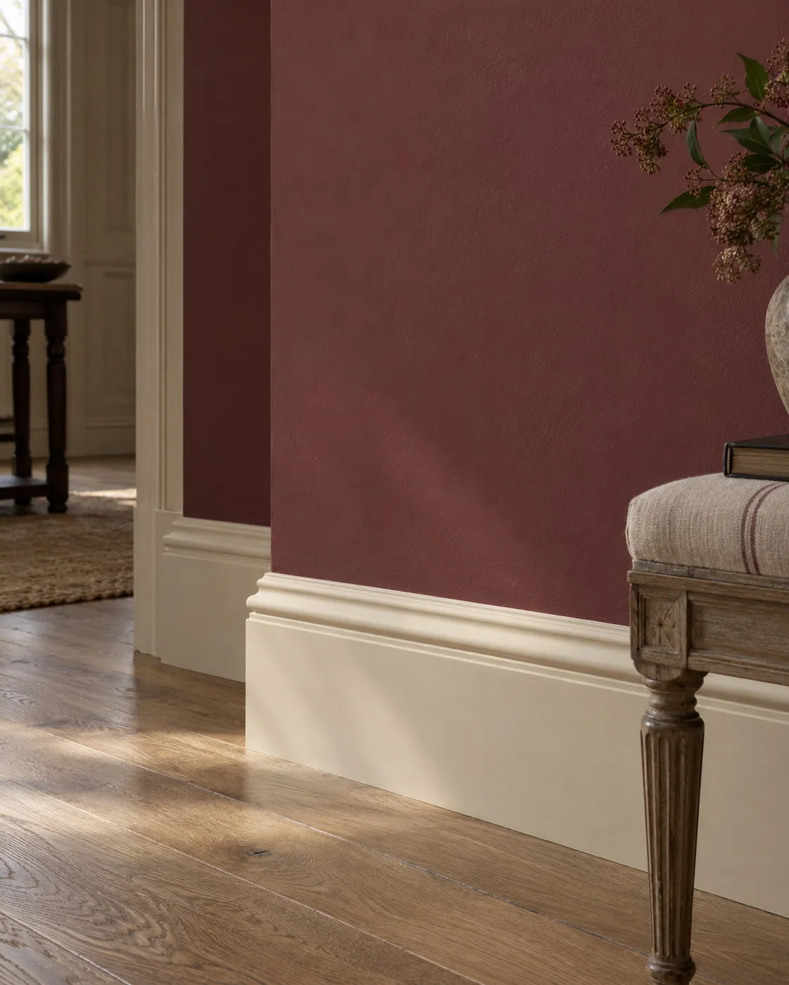
For walls, Marble Matt Emulsion is the finish to use. Very matt, loaded with crushed Carrara marble, it forms a dense film and offers class 1 wet-scrub resistance under EN 13300: you can sponge away a trace of wine or sauce without leaving a shiny patch, which in a dining room is no small thing. It covers around 15 m² per litre per coat, is touch-dry in one to two hours and can be recoated after three to four, so a medium-sized room is painted in a day.
For woodwork, doors, skirting and perhaps a sideboard, Multi-Surface Eggshell brings a soft silk glow of around 15 %, just enough to set the wood apart from the wall without breaking the mood. Two coats are recommended everywhere, and on a deep colour a primer shaded to sit under the wall colour saves you from piling on extra coats.
Ceiling, woodwork and daylight
A dark shade on the walls immediately raises the question of the ceiling. There are two schools. The first paints it in a warm white, Holland Park No.5 for instance, a slightly yellowed white that does not cut in too sharply and lets the volume breathe. The second, more enveloping, carries the wall colour up onto the ceiling, or picks a neighbouring shade just a touch lighter. In a modestly sized dining room this total immersion, known as colour drenching, paradoxically makes the room feel larger: no more corners, no more breaks, just one colour wrapped around the table.
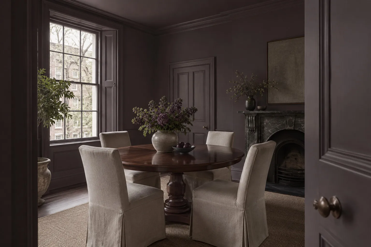
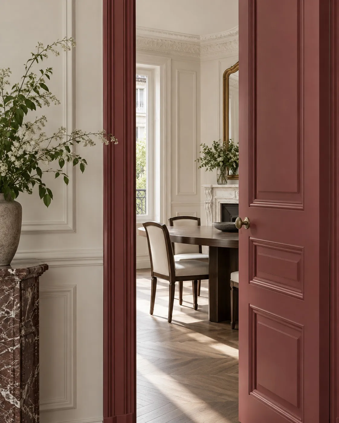
Woodwork follows the same logic. Huguenot walls with skirting and doors in Cavendish Cream No.120, a cream inspired by John Nash's stucco, make a classic, warm room; the same walls with woodwork in the same shade make a contemporary, theatrical one. Neither option is better than the other, but you need to decide before ordering the primer.
A good dining room is judged by candlelight, never under a ceiling light.
Then there is daylight, because the room is not only used in the evening. A deep colour in the middle of the day is more elegant than people fear, provided the room has at least one good window and the textiles bring some brightness: tablecloth, curtains, seat covers. Reds and dark greens pair especially well with undyed natural fabrics, which reflect light and soften the contrast. A dark dining room paint does not make the room gloomier; it moves the light towards the table.
Where to start
Start with two or three 100 ml sample pots, each covering around 1.5 m²: paint large squares on two different walls and look at them in the morning, then one evening at the table with the lights low. A deep red and a dark green side by side are often enough to settle the matter, and it is the surest way to paint a dining room without regret. The physical colour card is free and lets you hold the shades against the wood of the table and chairs. And to think in surface area rather than in tins, the page on the price per square metre gives the order of magnitude for the whole room, ceiling included.
Frequently asked questions
What colour should I paint a dining room?
Deep colours work best, because the room is mostly lived in during the evening. A crimson such as Huguenot No.49, a dark green such as Market Green No.38 or a purple such as Duke's House No.44 grows richer in low light. If the room opens onto a bright living space, a more direct red such as Arts Club No.281 makes the transition.
Should a dining room be painted matt or satin?
Matt, almost always. A satin finish reflects every candle and pendant as bright points that break up the wall, whereas a deep matt absorbs light and keeps the colour continuous. Marble Matt Emulsion is still washable, class 1 under EN 13300, so a splash of wine can be sponged off without leaving a mark. Keep eggshell for woodwork and the sideboard.
Can I paint the dining room ceiling the same colour as the walls?
Yes, and it is often the best option in a small dining room. Carrying a deep red or green onto the ceiling removes the corners and gives an enveloping feel that makes the room seem larger rather than smaller. If you prefer a pale ceiling, choose a warm white such as Holland Park No.5 rather than a pure white, which would look cold above a dark shade.
Will a dark dining room paint make the room gloomy during the day?
Not if the room has a proper window and the textiles bring some brightness. In daylight, a richly pigmented deep red or green reads as elegant rather than dark, especially with undyed linen, pale chairs and a ceiling or woodwork in a warm white. Always test a 100 ml sample on two walls and look at it in the morning as well as the evening before deciding.





