


The journal
Warm White Paint: Choosing a White That Stays White
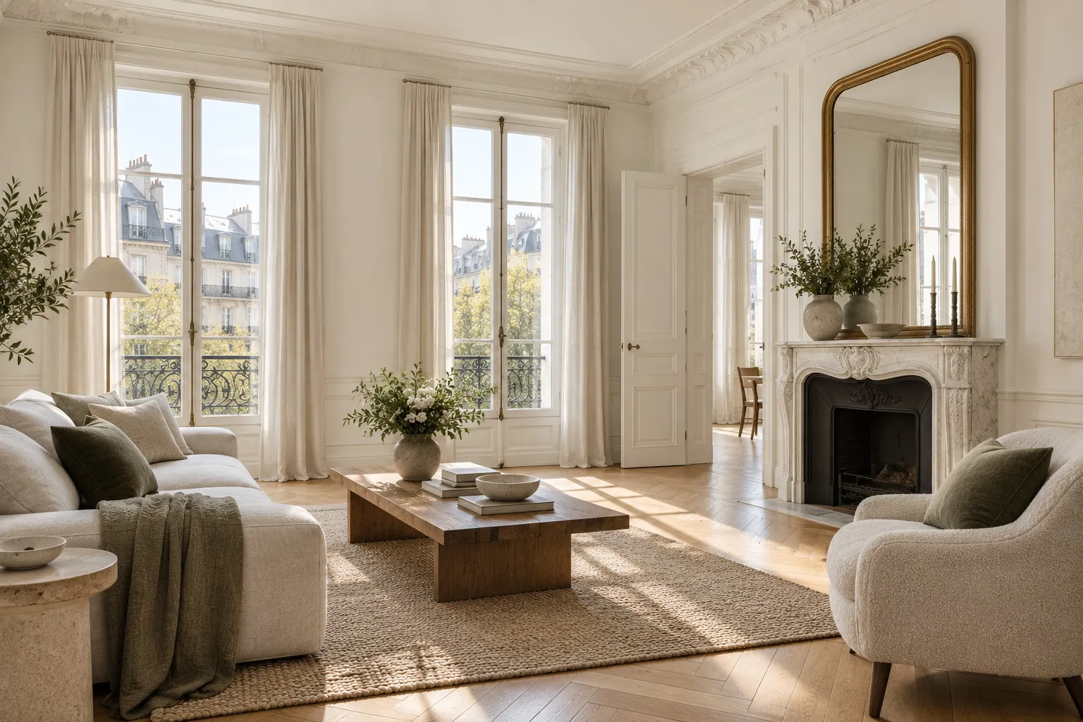
Warm white paint is a white shaded with a trace of yellow, pink or raw umber, which keeps its softness where a pure white turns grey. Under the often veiled light of France it is almost always the white to choose for walls, ceilings and woodwork.
White is the colour people think they can choose without thinking, which is exactly why it disappoints so often. A pure white, dazzling on the colour card, turns dull and faintly blue the moment it lands on a north-facing wall or in a room dimmed by a November sky. Warm white paint answers that problem: it carries a trace of natural pigment, yellow, pink or umber, which absorbs the coolness of the light and gives the wall back its softness. At Mylands these whites bear the names of London streets and districts, a city whose light has a great deal in common with Lille, Rouen or Paris. Here is how to read them, compare them and choose between them.
Why pure white looks grey under our windows
Daylight is never white. From the north, or under an overcast sky, it leans towards blue and grey; late in the afternoon, from the west, it warms and gilds every surface. A white with no nuance, made of white pigment alone, has nothing to set against that light: it simply reflects it as it comes. On a north-facing wall it takes on the tint of the sky, and the result looks more like a pale grey than the immaculate white that was hoped for. It is the most common complaint we hear from customers who have repainted a living room "in white" and find it cheerless.
A warm white works differently. The small quantity of yellow ochre, raw umber or red oxide it contains offsets the cool cast of the light. The wall then reads as white, simply because the eye perceives the balance between the two. It is a trick London colourmen have practised for a long time, and one that makes more sense once you have read how light influences colour. The earth and mineral pigments, richly loaded in Mylands paints, also give a white a depth that shifts gently through the day instead of sitting flat.
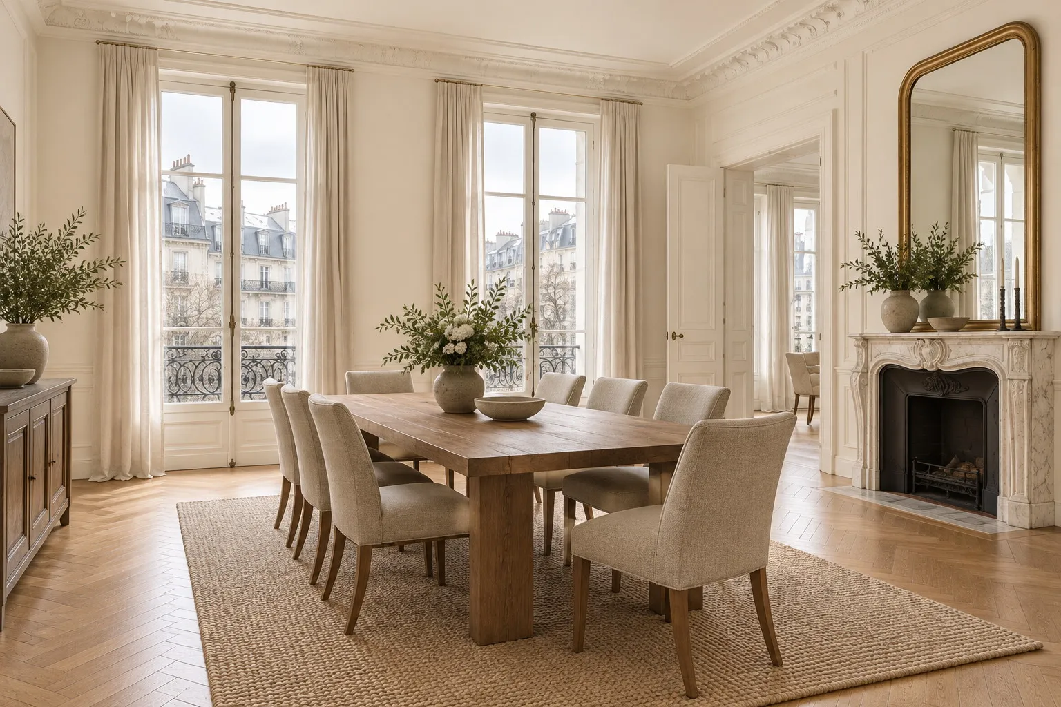
Warm white paint: reading the undertones
Not all warm whites are alike. What separates them is their undertone, the nuance that appears when they are set side by side or against a pure white. Three families cover most needs, and it helps to know which one you are looking at before ordering a sample from the white collection.
The yellow undertone, the sunniest
Holland Park No.5 is the reference warm white: a lightly yellowed off-white, originally made for a period house in west London, which warms a room without ever looking cream. Whitehall No.9 heads the same way with a more discreet touch of yellow ochre, which makes it an easy white for ceilings and woodwork. For more pronounced warmth, Lots Road No.24 adds more ochre and tips towards a very pale butter, precious in a room that is truly dark.
The pink undertone, the most flattering
A drop of red in a white produces a shade that flatters faces, pale timber and stone. Holbein Chamber No.7 is that white: versatile, barely blushed, it still reads as white but softens everything around it. It suits bedrooms and bathrooms particularly well, where a white that is too cold feels clinical.
The umber undertone, the most discreet
Raw umber, the brown-grey pigment, gives whites that are often described as "mineral". Clerkenwell No.21, with its natural tones of China clay, and St Martins No.37, which echoes the warm stone of the church on Trafalgar Square, are two slightly greyed whites that keep their warmth. Limehouse No.31 sits between them, with a nuance that is barely ivory. These whites are the allies of old houses, where they sit alongside plaster, stone and terracotta floors without arguing with them.
Which warm white for which room
In a north-facing living room, Holland Park No.5 or Lots Road No.24 give back the light the room lacks; facing south, where the sun already brings its own warmth, a more measured white such as Whitehall No.9 or St Martins No.37 stops the wall from yellowing at the end of the day. In a kitchen, an umber-based white like Clerkenwell No.21 speaks well to timber, brass and stone worktops, and stands up to regular cleaning when applied in Marble Matt Emulsion, a washable and scrubbable matt paint rated class 1 under EN 13300.
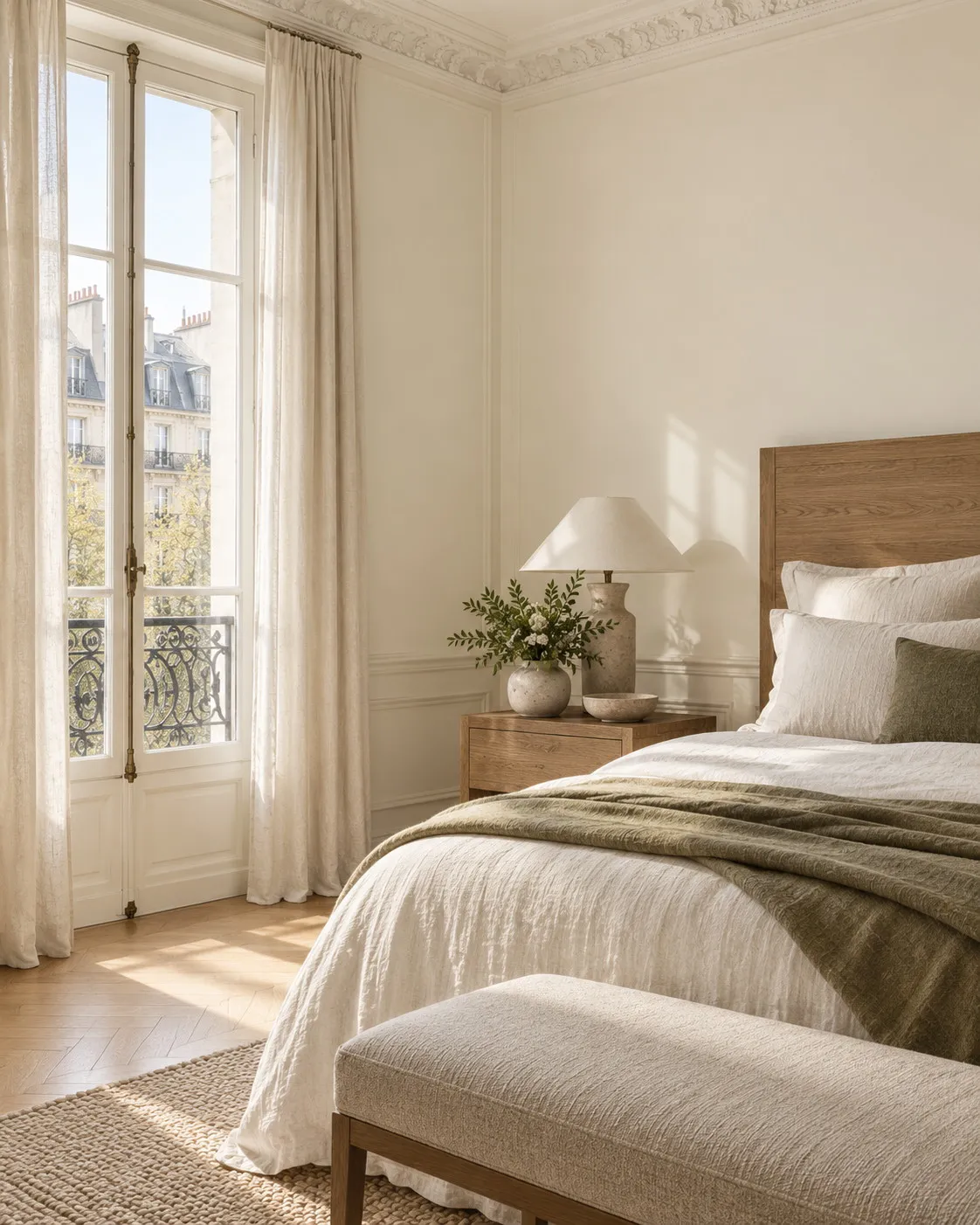
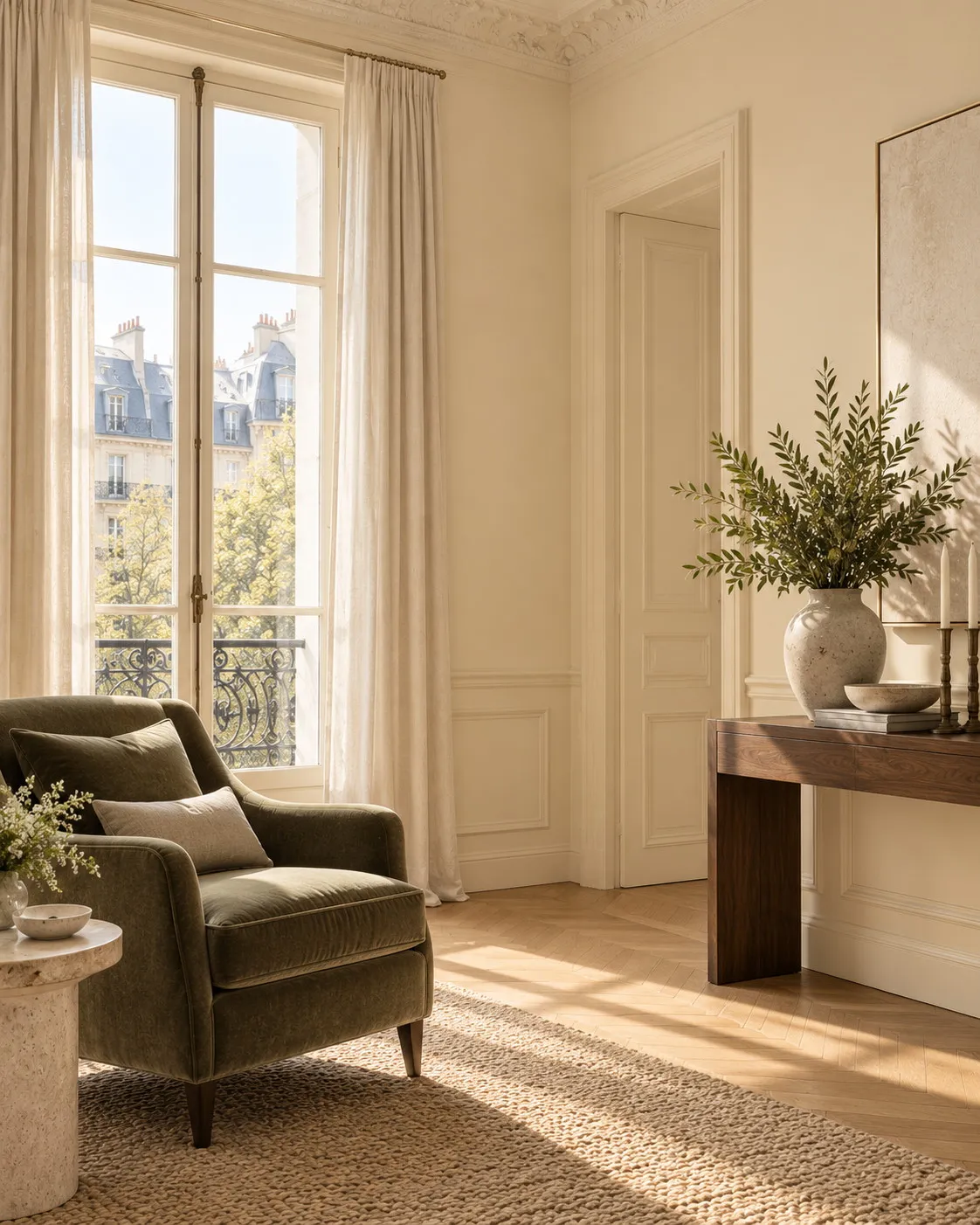
For a bedroom the aim is calm: Holbein Chamber No.7 or Bone BH.04, Beata Heuman's creamy white mixed to evoke the memory of a 1940s kitchen, wrap the room without darkening it. And when what you want is a true cream rather than a white, Walbrook No.142 brings the golden richness of the stone walls of St Stephen Walbrook, one of Wren's masterpieces. It is already a colour, best kept for rooms where a frankly warm atmosphere is the goal, a dining room or an entrance hall for instance.
Ceilings and woodwork: one white or two
The French habit is to paint the ceiling in pure white, whatever the colour of the walls. With a warm white on the walls, that habit produces a sharp break: the ceiling suddenly looks blue, and the contrast pulls the eye upwards. The most elegant answer is to use the same warm white on walls and ceiling, in Marble Matt Emulsion, or with Ceiling Paint, formulated for a flawless flat finish and tinted to the same shade. The room gains height and calm, and the corners melt away.
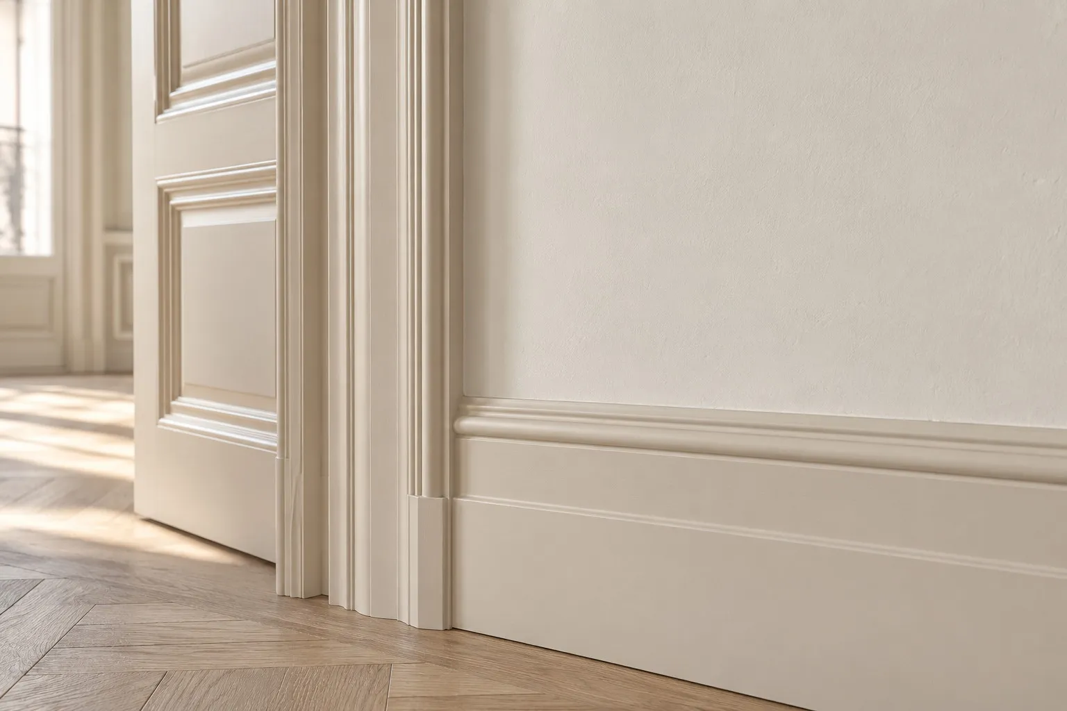
For woodwork, two options hold up. The same white, in Multi-Surface Eggshell, extends the wall and makes skirtings and architraves disappear; it is the gentlest approach, well suited to small spaces. A slightly deeper white, Clerkenwell No.21 against walls in Holland Park No.5 for example, draws the mouldings with subtlety instead, without the hard contrast of a brilliant white. In both cases, avoid pure white on the woodwork: against a warm wall it looks grey, and all the care taken over the walls is lost.
A good white goes unnoticed; it simply makes the room feel as though it has always had this light.
Testing a warm white before you paint
No colour deserves a sample more than white, because the differences are fine and the eye is easily fooled. A 100 ml pot covers around 1.5 m², enough to paint two or three large patches on different walls of the same room. Look at them in the morning, at midday and at dusk, and judge them by comparing them with each other rather than in isolation. Two coats are needed to see the true depth; a single coat over a wall that already has colour will always betray what is underneath.
One piece of advice that saves a good deal of regret: hold a sheet of ordinary white paper next to the samples. The warm white will look yellow or pink by comparison, and that is normal. What matters is the impression the wall gives on its own, with no reference, once the paper is taken away. If the sample then simply looks white and luminous, it is the right one.
Where to start
Order the free physical colour card to set the whites against one another, then two or three 100 ml sample pots: Holland Park No.5, Holbein Chamber No.7 and Clerkenwell No.21 make a trio that covers all three undertones. Prices by finish and tin size, along with the cost per square metre, are shown on the prices page. Orders leave our warehouse in Occitanie and arrive in two to three working days anywhere in mainland France.
Frequently asked questions
What is the difference between a warm white and an off-white?
An off-white is simply a white that is no longer pure; it can be warm or cool. A warm white is an off-white whose nuance comes from a warm pigment, yellow ochre, red oxide or raw umber. An off-white that leans towards blue or plain grey stays cool and makes a poorly lit room feel paler still.
Which warm white should I choose for a north-facing room?
In a north-facing room the light is bluish all day, so you need a white with a frank yellow undertone, such as Holland Park No.5 or Lots Road No.24, to offset that coolness. Umber-based whites, which are greyer, remain possible but will look darker. Always test two samples side by side, in the morning and again late in the day.
Should the ceiling be painted in the same warm white as the walls?
Yes, in most cases. A pure white ceiling above warm white walls looks bluish and creates a break that lowers the room. The same white on walls and ceiling, in Marble Matt Emulsion or tinted Ceiling Paint, gives a sense of height and continuity, especially in low rooms or older flats.
How can I tell whether a white is warm or cool on a colour card?
Lay the colour chip on a sheet of ordinary white paper in daylight. If the white looks faintly yellow, buttery or pink against the paper, it is warm; if it looks bluish or steel grey, it is cool. Comparing several chips with one another also helps you pick out the undertone of each.





