Colour guides · Kitchen

12 paint colours for kitchen cabinets

Painting your kitchen cabinets is the best value renovation there is: two tins, a weekend, and a new kitchen. But it takes a colour that holds — against the worktop, the appliances, the handles and the spotlights.

Here are twelve Mylands colours proven on cabinet fronts, from the gentlest to the deepest.

Updated September 2026 · by the Mylands France colour team

12 paint colours for kitchen cabinets

The short answer

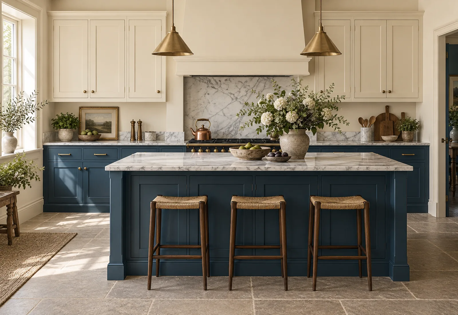
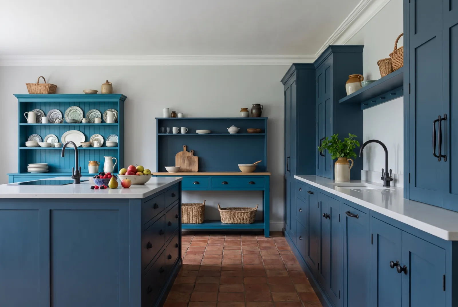
The best kitchen-cabinet colours have body: an ink blue such as Proper Blue No.67, a green such as Sorrel Green No.207 or Brompton Road No.205, a deep grey such as Artillery Ground No.164, a soft black such as Downing Street No.10. For a light kitchen, a greige such as Hoxton Grey No.72 or a cream such as Cavendish Cream No.120.

At a glance

Our selection

12 colours

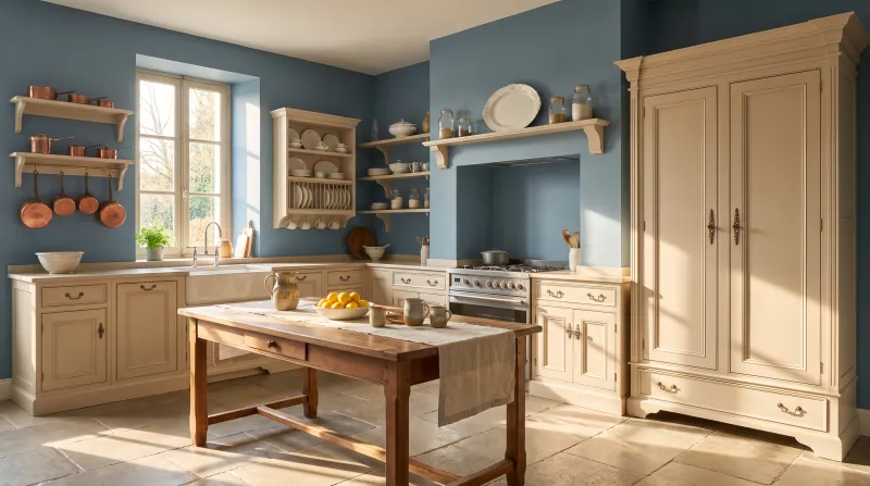
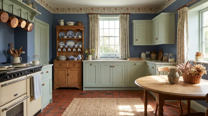
Cavendish Cream — Kitchen
01

The cream

Cavendish Cream™ No.120

  • Yellow
  • Pale tone
  • South light
  • LRV ≈ 72%

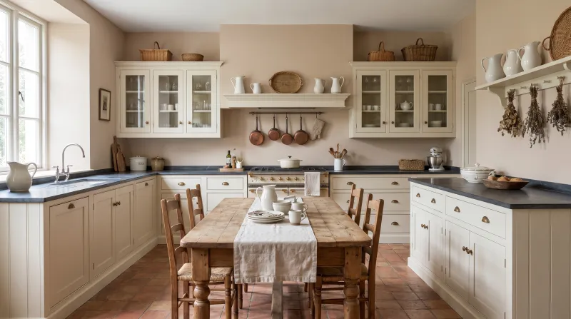
A warm, soft cream, the colour of fresh butter, that gives cabinet fronts the patina of an English country kitchen. It has a rare advantage among light colours: it doesn't show every mark, and it warms a north-facing kitchen. With a timber worktop and brass handles it is timeless.

Our tip — Base units in Sorrel Green or Proper Blue, wall units in Cavendish Cream: the classic two-tone kitchen.

View the colour → Already in your basket (limit 1 per order)
Hoxton Grey — Kitchen
02

The greige

Hoxton Grey™ No.72

  • Neutral
  • Pale tone
  • West light
  • LRV ≈ 58%

The reference grey-beige, warm and sober, for cabinets that want neither white nor colour. It is the easiest cabinet colour in the range to live with: it suits marble, timber, stainless steel and brass, and stays handsome in every light. A kitchen in Hoxton Grey has no age.

Our tip — Walls in Sleet or Holland Park, cabinets in Hoxton Grey: the discreet contrast that never tires.

View the colour → Already in your basket (limit 1 per order)
Cosy sky blue bedroom with a bed, tray with tea set, and decorative pillows.
03

The mid blue

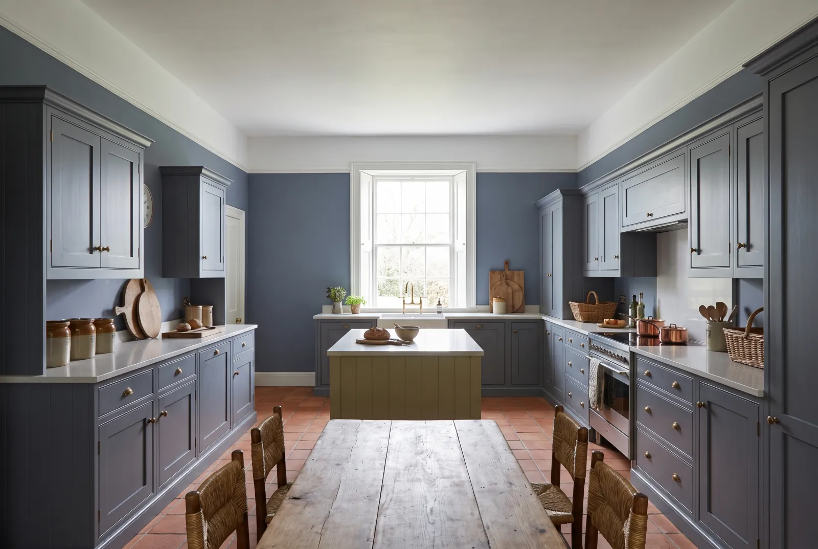
Bedford Square™ No.229

  • Blue
  • Mid tone
  • South light
  • LRV ≈ 46%

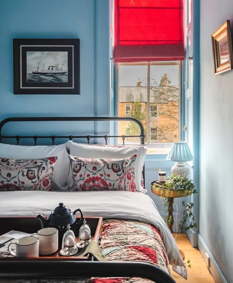
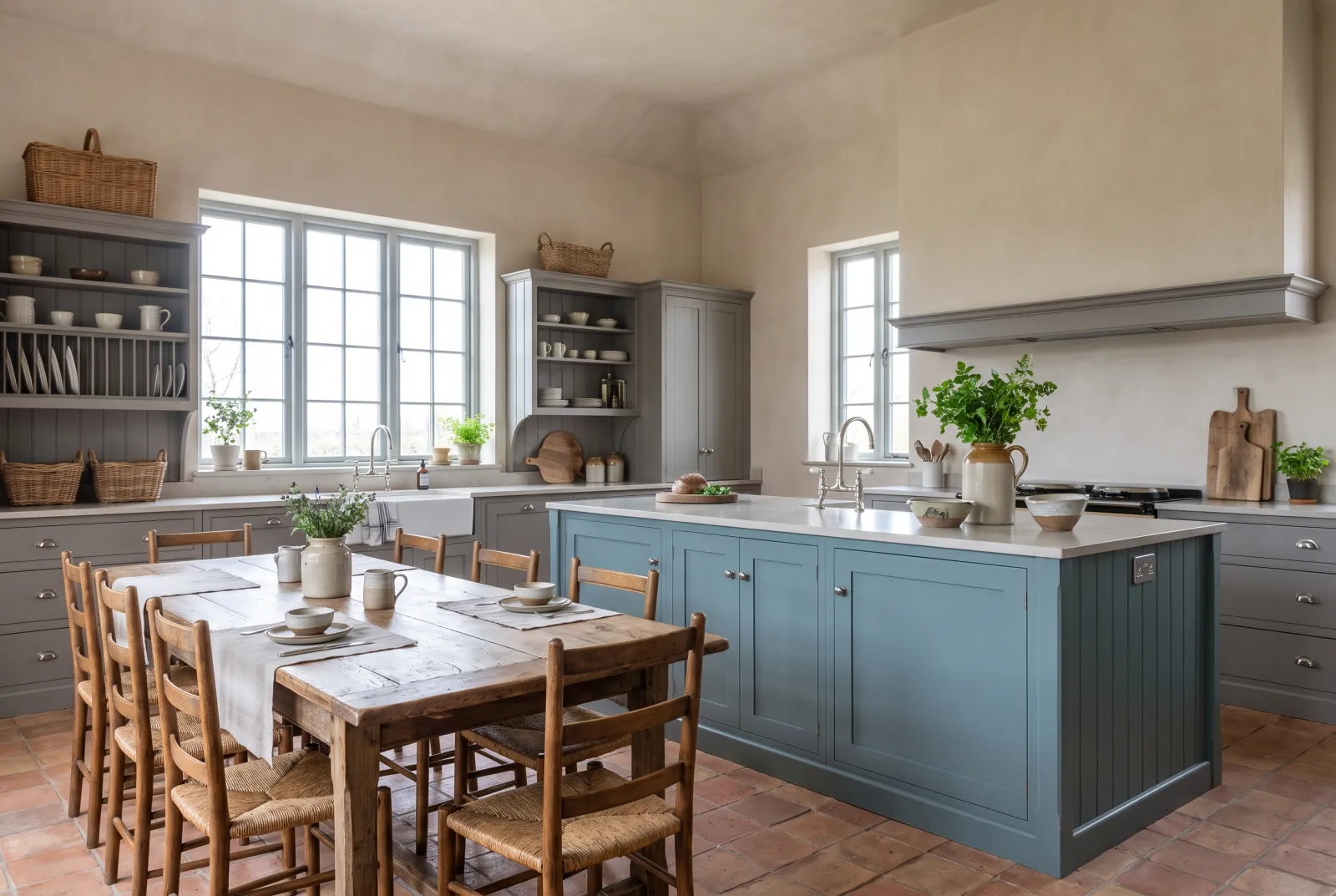
A luminous mid blue held back by a hint of grey, for a kitchen that wants colour without the depth of a navy. It is especially handsome on framed doors, where the sheen draws the mouldings, and it makes white sing — tiles, worktop, crockery.

Our tip — Walls in Charterhouse, a cool white that keeps it fresh; brushed-nickel handles.

View the colour → Already in your basket (limit 1 per order)
Eaton Square — Kitchen
04

The teal

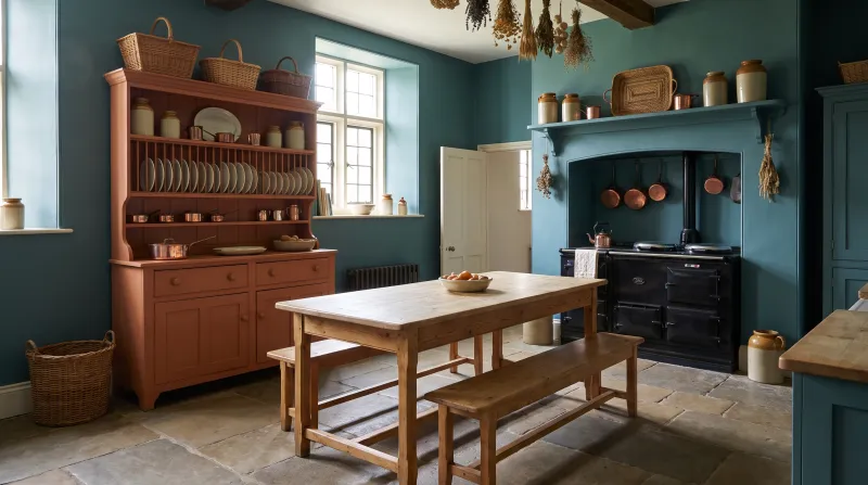
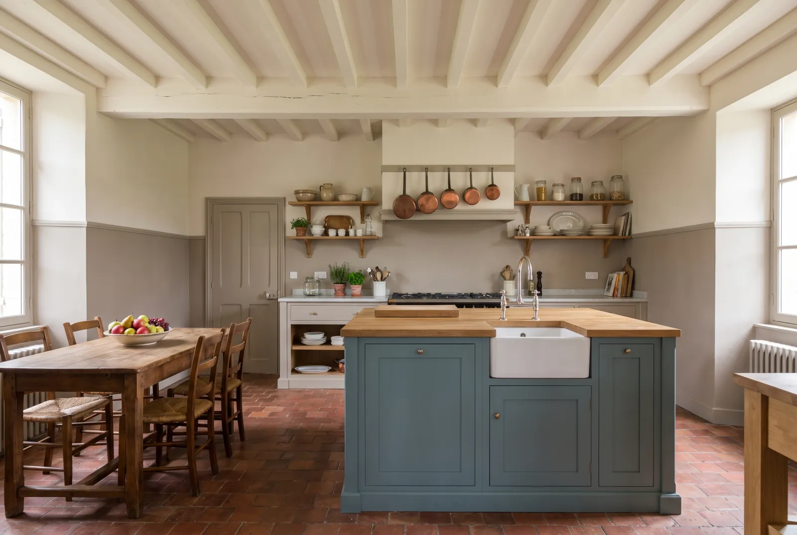
Eaton Square™ No.232

  • Blue
  • Mid tone
  • South light
  • LRV ≈ 24%

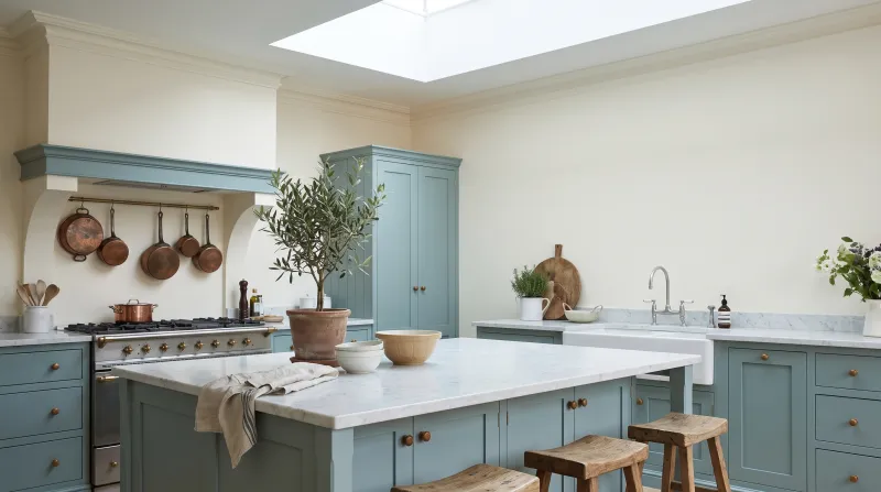
A mid-deep blue-green, the colour of a softened teal — deep enough to hold cabinets, green enough not to chill the room. It is the kitchen colour most people warm to: it has a blue's seriousness and a green's warmth. Superb with brass and mid-toned timber.

Our tip — Walls in Limestone and a white-tiled splashback: the teal kitchen without a misstep.

View the colour → Already in your basket (limit 1 per order)
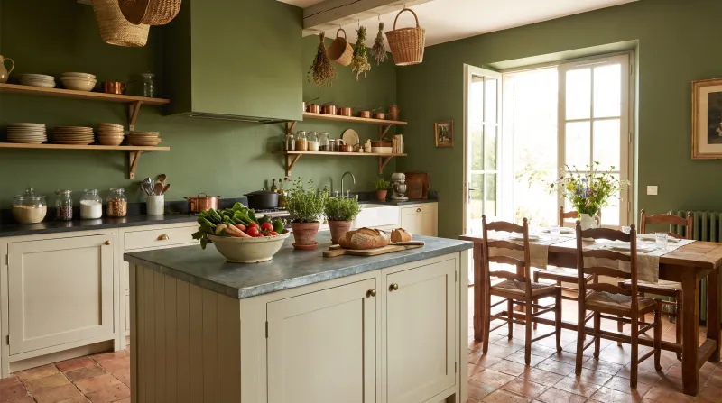
Sorrel Green — Kitchen
05

The cabinet green

Sorrel Green™ No.207

  • Green
  • Dark tone
  • East light
  • LRV ≈ 15%

Our most asked-for cabinet green: a vibrant botanical green of bright yellow, umber and white, which holds against marble and brass without darkening the room. With pale stone walls, it is the contemporary English kitchen par excellence.

Our tip — Over our green primer & undercoat, two coats of Multi-Surface Eggshell are enough.

View the colour → Already in your basket (limit 1 per order)
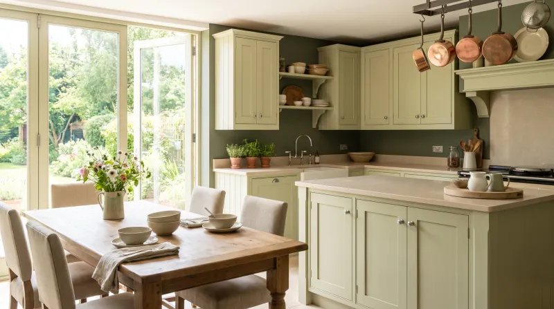
French Green — Kitchen
06

The deep grey-green

Brompton Road™ No.205

  • Grey
  • Dark tone
  • North light
  • LRV ≈ 13%

A deep green tempered with grey, with warm undertones, that has everything a cabinet colour needs: it turns neither blue in north light nor yellow under spotlights. On framed doors with brushed-brass handles it makes a serious, serene kitchen.

Our tip — The safest contrast: a white veined-marble worktop and Frieze walls.

View the colour → Already in your basket (limit 1 per order)
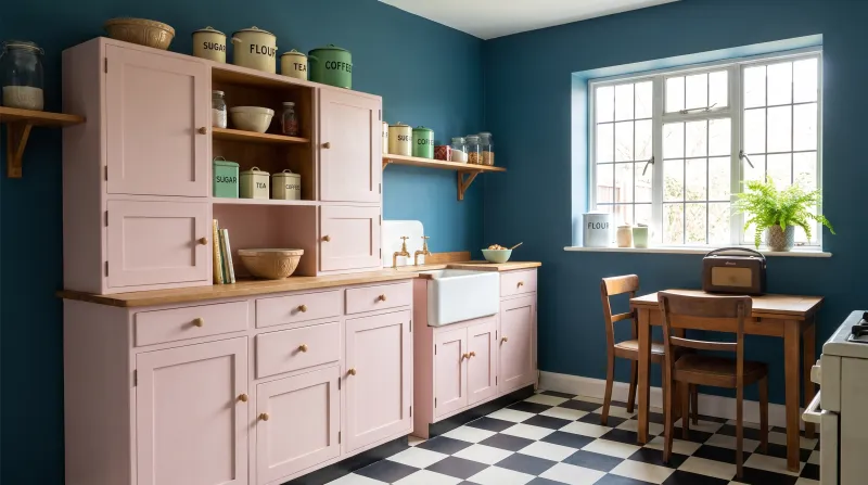
Proper Blue — 1930s kitchen
07

The ink blue

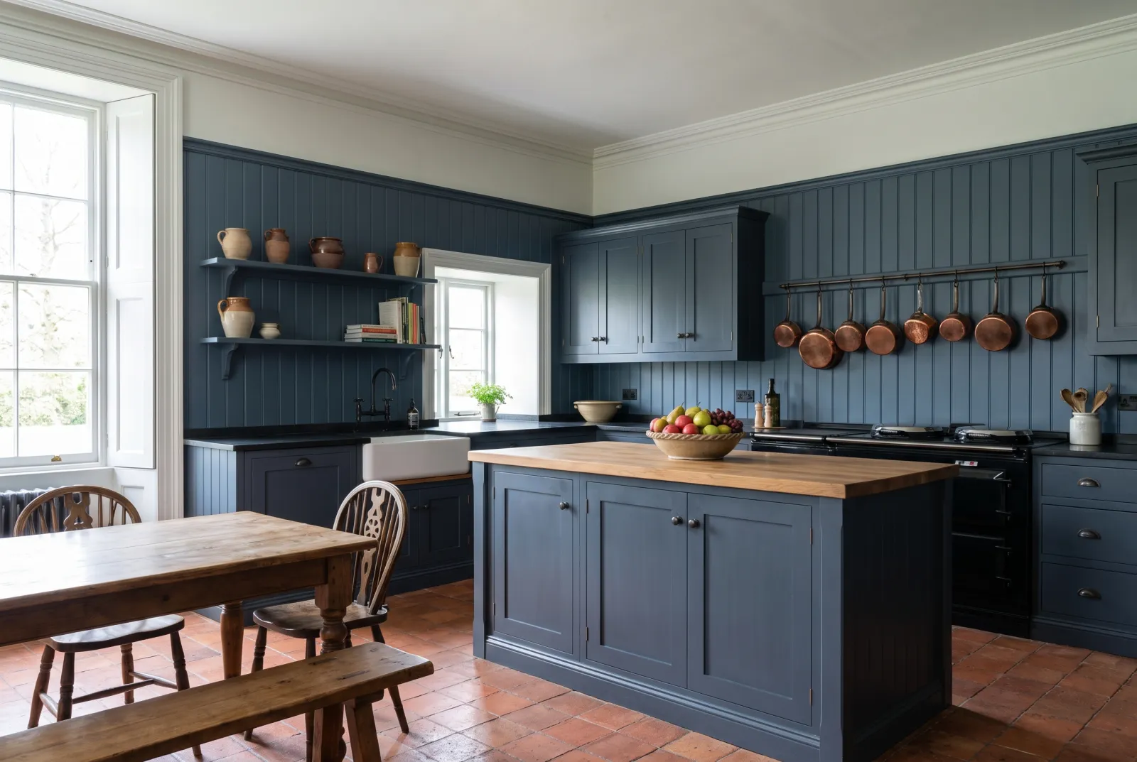
Proper Blue™ No.67

  • Blue
  • Dark tone
  • South light
  • LRV ≈ 7%

Our most-used blue on kitchen cabinets, and for good reason: a deep ink blue held back by a grey-green undertone, which stays blue — not black — once evening comes, and likes brass as much as oak. From the archive, it has the patina of an old blue on a brand-new kitchen.

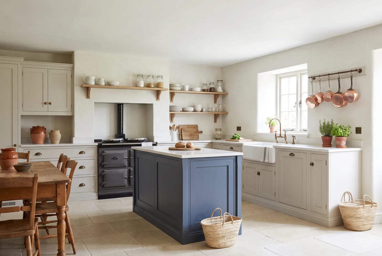
Our tip — Island in Proper Blue, cabinets in Cavendish Cream or Pure White: the most asked-for two-tone kitchen.

View the colour → Already in your basket (limit 1 per order)
Observatory — 1980s kitchen
08

The night blue

Observatory™ No.34

  • Blue
  • Dark tone
  • South light
  • LRV ≈ 11%

A deep blue-grey sliding towards violet — softer and warmer than Proper Blue. On kitchen cabinets it makes an evening kitchen, the kind you dine in by lamplight; by day it stays calm and a little grave. Superb with white marble and walnut.

Our tip — Walls in Maugham White, a warm white that stops it looking black.

View the colour → Already in your basket (limit 1 per order)
Market Green — Victorian kitchen
09

The deep blue-green

Market Green™ No.38

  • Neutral
  • Dark tone
  • North light
  • LRV ≈ 7%

A deep water green, almost a dark petrol blue, named after London's markets. It is cooler than Brompton Road and greener than Proper Blue — the cabinet shade for those torn between the two. With white tiles and black handles it makes a graphic, very current kitchen.

Our tip — Walls in Pure White for contrast, or in Beaufort Gardens for a grey-green tone-on-tone.

View the colour → Already in your basket (limit 1 per order)
Rothschild Street — Kitchen
10

The deep grey

Artillery Ground™ No.164

  • Grey
  • Dark tone
  • North light
  • LRV ≈ 9%

A deep, warm grey, almost a brown-grey, the colour of a weathered cannon. It is the cabinet grey that never looks cold or industrial: it has earth in its undertone, which makes it warm with timber and brass. An alternative to black for those who find black too hard.

Our tip — Walls in Frieze or Limestone, timber worktop: deep grey without the chill.

View the colour → Already in your basket (limit 1 per order)
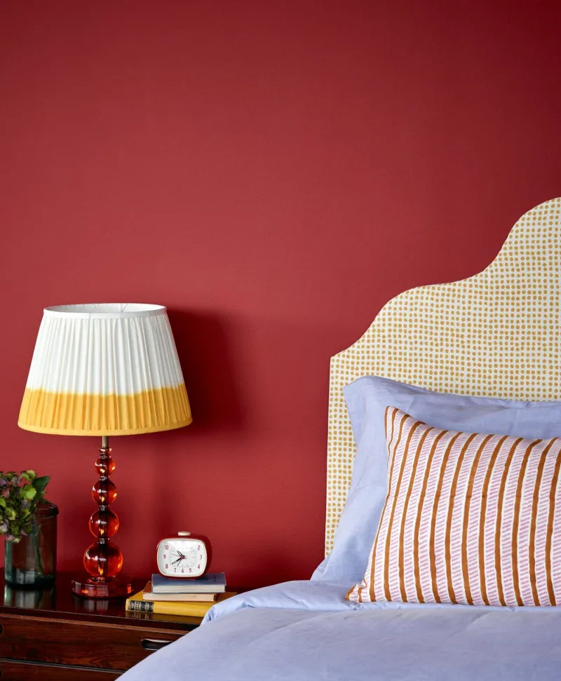
Bedroom in deep red paint, lamp, and bed with striped pillows.
11

The brick red

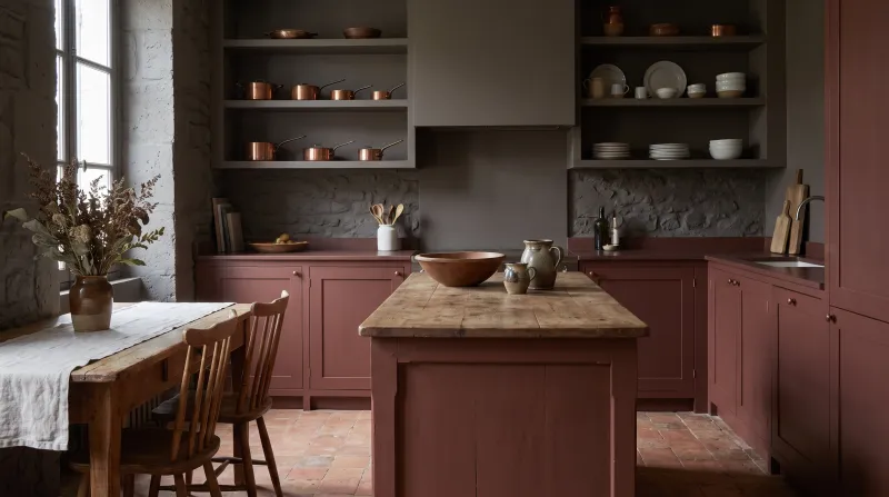
Red Post Hill™ No.68

  • Red
  • Dark tone
  • West light
  • LRV ≈ 11%

A deep, earthy red between brick and oxblood, from the archive. It is the boldest cabinet colour on this list, and one of the most successful: on base units or an island, with light walls, it gives a kitchen the warmth of an inn. It likes raw timber and aged brass.

Our tip — Keep it for base units or the island, with wall units and walls in Lots Road.

View the colour → Already in your basket (limit 1 per order)
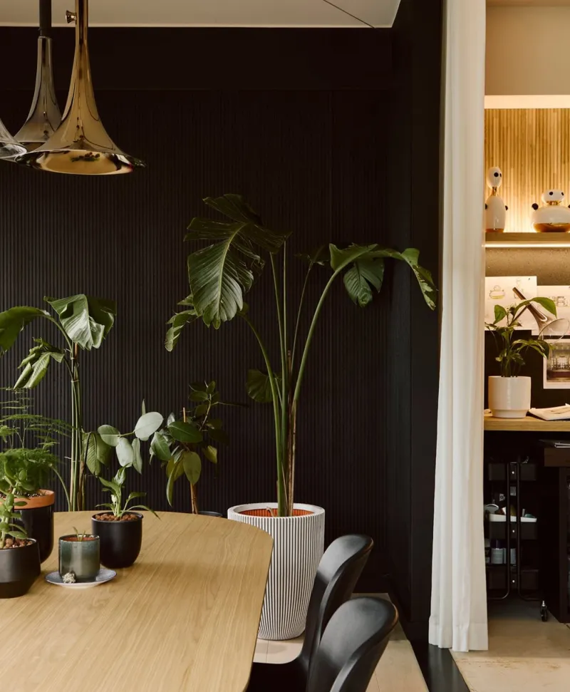
Modern interior with potted plants against a black panelled wall.
12

The soft black

Downing Street™ No.10

  • Black
  • Dark tone
  • North light
  • LRV ≈ 5%

The black of London's most famous door: a deep but soft black, faintly warm, that never looks hard on cabinets. It is the chicest kitchen-cabinet colour there is, and the easiest to match — everything goes with it. It asks for a bright kitchen or very light walls.

Our tip — Walls in Pure White, white marble worktop, brass handles: London black and white.

View the colour → Already in your basket (limit 1 per order)

These colours in real rooms

Our schemes in which one of this guide's shades plays the lead — or a supporting role.

All schemes · Kitchen →
Proper Blue™ No.67 Greenwich Time™ No.8 Murmuration JB.11
Observatory™ No.34 Greenwich Time™ No.8 Mayfair Dark™ No.218 Chester Square™ No.199
Empire Grey™ No.171 Limestone™ No.55 Eaton Square™ No.232
Midnight FTT-017 Saint Johns™ No.64 Proper Blue™ No.67
Beata White BH.01 Grosvenor Square™ No.109 Observatory™ No.34
Archway House™ No.106 Limestone™ No.55 Eaton Square™ No.232

Painting kitchen cabinets: the method

The finish. Kitchen fronts are painted in Multi-Surface Eggshell: 15% sheen, moisture- and hand-resistant, washable, with a soft sheen that flatters mouldings. For a more matt, more contemporary look, Multi-Surface Dead Matt (5%) — a little less easy to clean, very beautiful. Avoid wall emulsion, which is not made to be touched a hundred times a day.

The preparation. Degrease (kitchens are greasy), sand lightly for a key, dust off, then apply our multi-surface primer — or, for a deep colour, the tinted undercoat that matches it: green beneath Sorrel Green No.207 and Brompton Road No.205, dark grey beneath Downing Street No.10 and Artillery Ground No.164, dark red beneath Red Post Hill No.68. Two coats of finish, brush for the frames and a small roller for the panels.

One tone or two?

The two-tone kitchen — dark base units, light wall units — is the safest formula: Proper Blue No.67 or Sorrel Green No.207 below, Cavendish Cream No.120 or Pure White No.1 above. It anchors the room without darkening it. A dark monochrome kitchen — all in Observatory No.34 or Downing Street No.10 — needs plenty of light, and very light walls. Our guide Preparing woodwork covers each step, and Which finish for kitchen cabinets? compares the finishes. See also our greens for a kitchen and our kitchen ideas.


Frequently asked questions

Which finish for painting kitchen cabinets?
Multi-Surface Eggshell (15% sheen): moisture- and hand-resistant, washable, with a soft sheen. For a matt look, Multi-Surface Dead Matt (5%).
Which kitchen-cabinet colour is the most timeless?
Hoxton Grey No.72 (greige) and Cavendish Cream No.120 (cream) age without dating; among deep colours, Proper Blue No.67 and Sorrel Green No.207 have become classics.
Do kitchen cabinets need a primer?
Yes: a multi-surface primer after degreasing and light sanding. For a deep colour, use the matching tinted undercoat (green, dark grey, dark red): two topcoats are then enough.
Can kitchen cabinets be painted black?
Yes, with a soft black such as Downing Street No.10, in a bright kitchen with very light walls (Pure White No.1). For a warmer black, Artillery Ground No.164, an earthy deep grey.

Guides to read next

All colour guides →

Want to see these colours at home?

Order a sample to judge the shade in your own light, or browse every paint for the room.

Sign up to our newsletter

Sign up to our newsletter

Thanks for signing up to our newsletter!