Colour guides · Kitchen · Yellow

10 yellows for a bright kitchen

Yellow is the colour of breakfast: of butter, honey, the sun coming in through the kitchen window. It is also the hardest colour to dose — one tone too bright and the room shouts, one tone too dull and it looks dirty.

Here are ten Mylands yellows that have found the measure, from the most discreet cream to the most candid ochre.

Updated September 2026 · by the Mylands France colour team

10 yellows for a bright kitchen

The short answer

For a kitchen, the safest yellows are the creams and pale yellows — Cavendish Cream No.120, Lemon Salts No.43, Floral Street No.147 — which bring sunshine without shouting. For candid colour, Golden Square No.131 or Verdure Yellow No.148 on a wall or cabinets; for an old yellow, Cornhill No.128.

At a glance

Our selection

10 colours

Bone — Kitchen
01

The bone white

Bone BH.04

  • Yellow
  • White
  • South light
  • LRV ≈ 82%

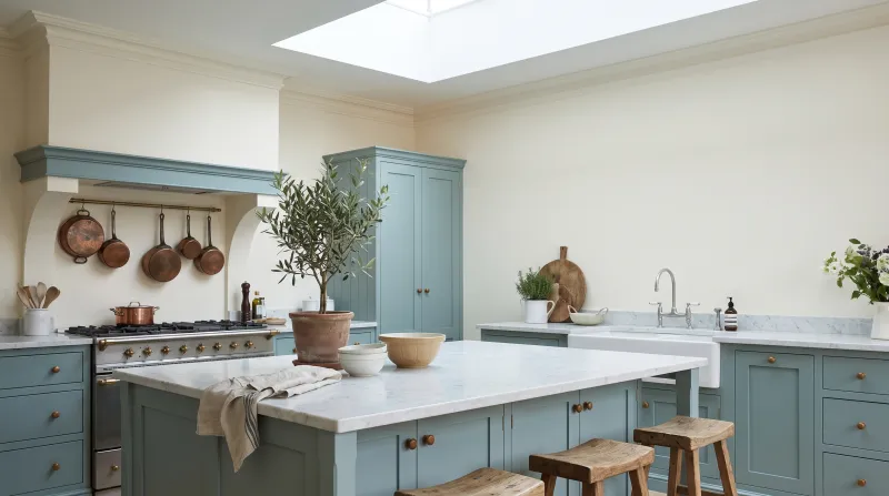
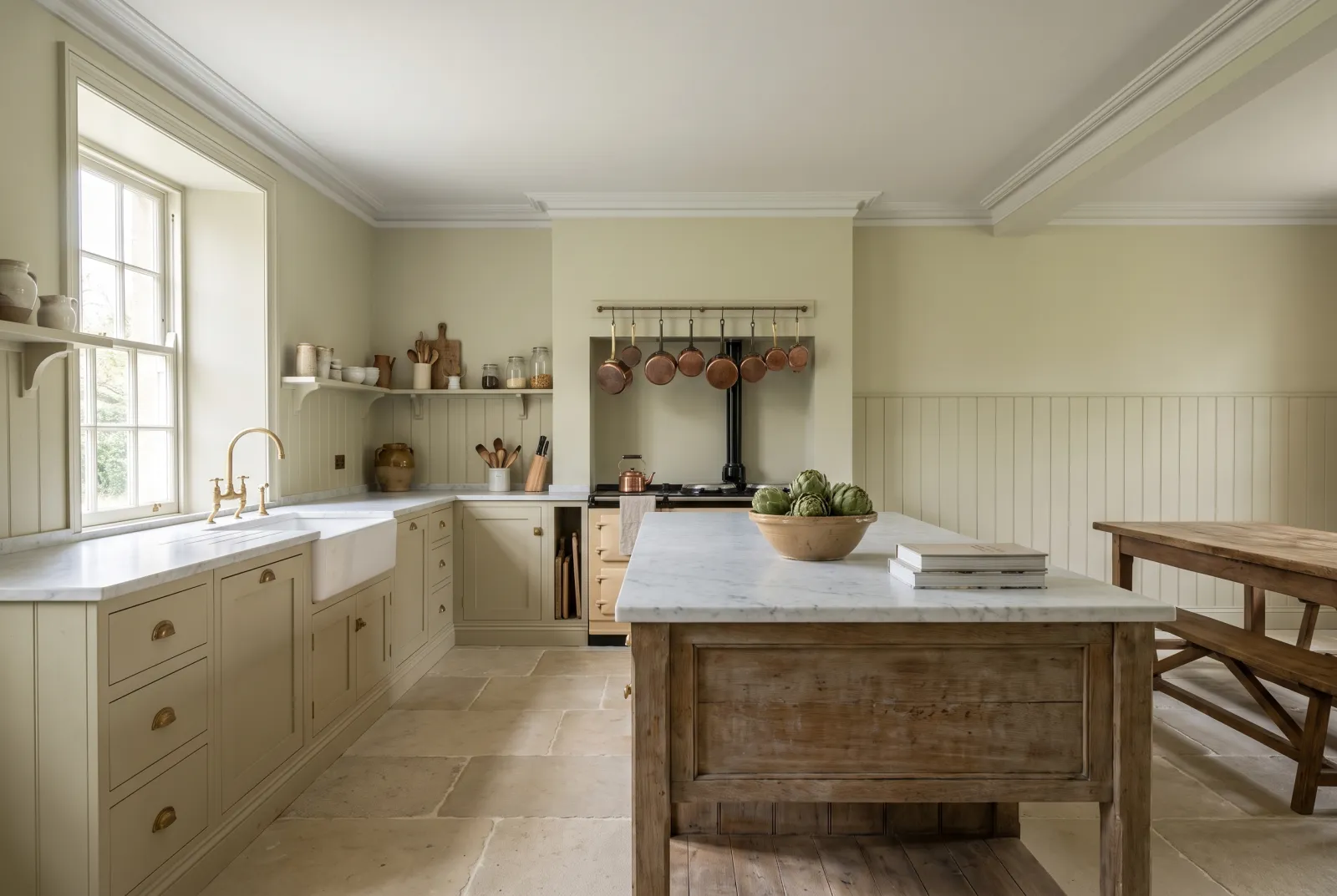
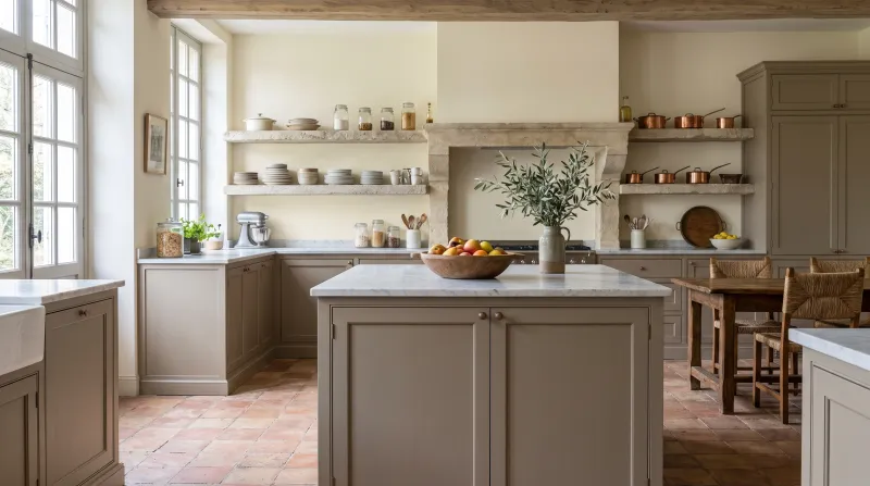
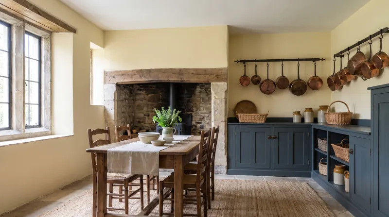
The most discreet yellow on the list — barely a yellow: a softened white, the colour of old ivory, designed by Beata Heuman. In a kitchen it does what a pure white cannot: it never looks cold or clinical. With timber cabinets and stone worktops it sets an old-house light.

Our tip — Walls and ceiling in Bone, cabinets in Forest or Pub: the Beata Heuman palette in a kitchen.
View the colour → Already in your basket (limit 1 per order)
Lemon Salts — Kitchen
02

The lemon white

Lemon Salts™ No.43

  • Yellow
  • Pale tone
  • South light
  • LRV ≈ 80%

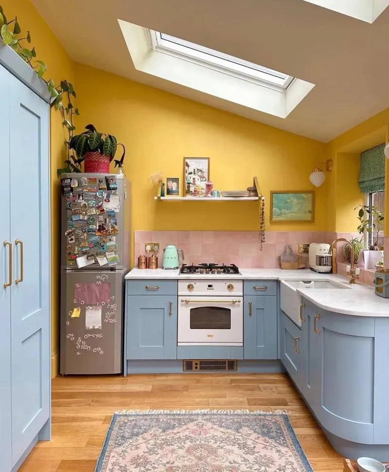
On the border between white and pale yellow: a lemon white, lively and fresh, that makes a kitchen cheerful rather than soft. Where Cavendish Cream is creamy, Lemon Salts is sharp — the yellow of a kitchen short of windows that wants waking up. It likes pale blues and grey-greens.

Our tip — Walls in Lemon Salts, cabinets in Morning Blue or Copper Green: the kitchen that smiles.

View the colour → Already in your basket (limit 1 per order)
Floral Street — Kitchen
03

The primrose yellow

Floral Street™ No.147

  • Yellow
  • Pale tone
  • South light
  • LRV ≈ 78%

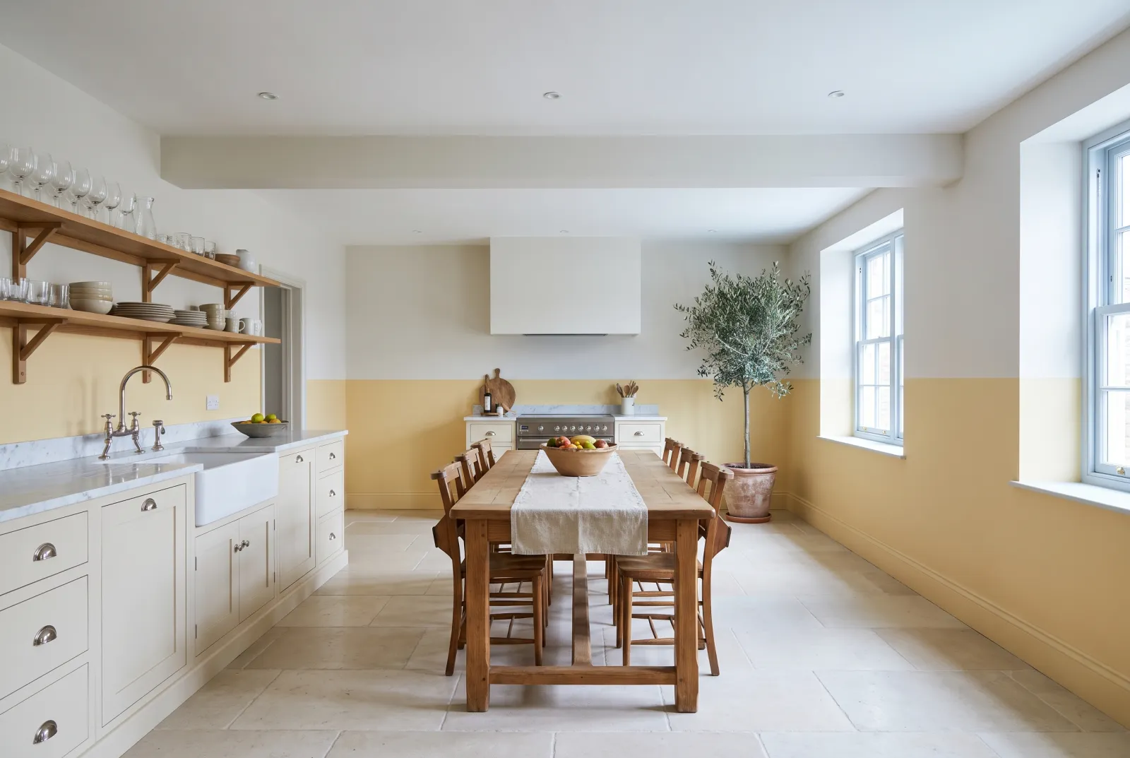
Named after the flower-market street: a pale, clear yellow, the colour of a primrose, yellower than Lemon Salts without being bright. It is the most luminous kitchen yellow on the list — it reflects nearly 80% of the light — and stays fresh all day. Superb with pure white and tiles.

Our tip — Ceiling in Pure White, cabinets in Pure White, walls in Floral Street: yellow without commitment.

View the colour → Already in your basket (limit 1 per order)
Cavendish Cream — Kitchen
04

The cream

Cavendish Cream™ No.120

  • Yellow
  • Pale tone
  • South light
  • LRV ≈ 72%

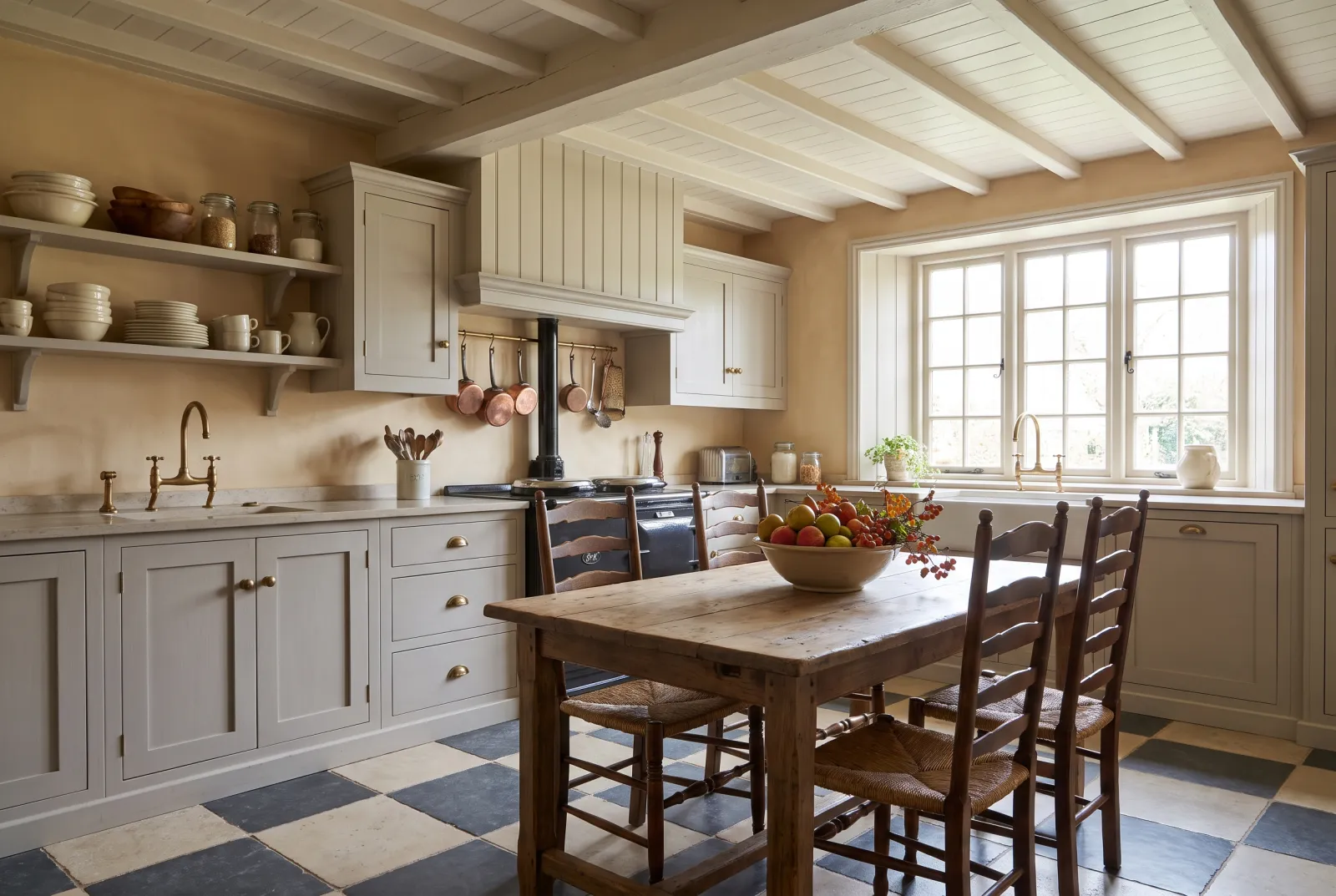
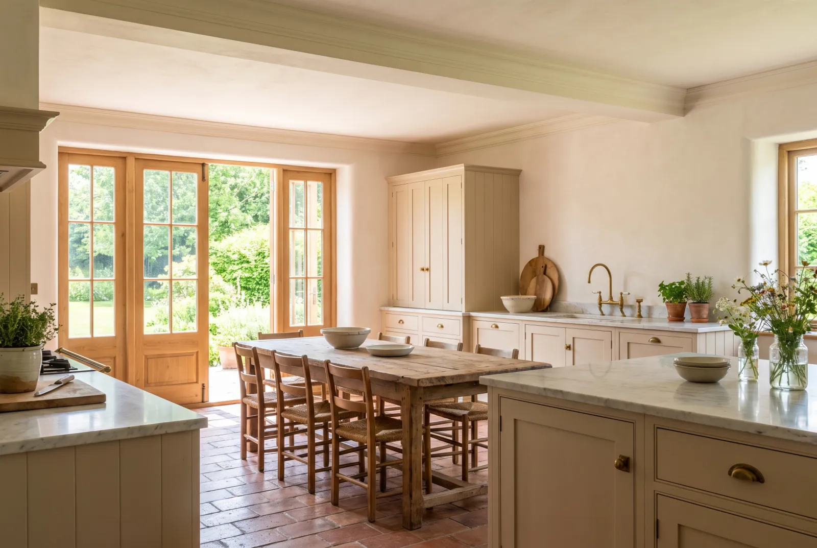
Our most-used kitchen yellow: a warm, soft cream, the colour of fresh butter, that gives walls and cabinets the patina of an English country kitchen. It warms a north-facing kitchen, doesn't show marks, and goes with everything — timber, brass, marble, tiles. Timeless.

Our tip — Walls in Cavendish Cream, cabinets in Sorrel Green or Proper Blue: the classic two-tone kitchen.

View the colour → Already in your basket (limit 1 per order)
Hurlingham — Hallway
05

The yellow-green

Hurlingham™ No.181

  • Yellow
  • Pale tone
  • South light
  • LRV ≈ 63%

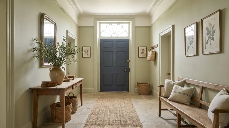
A yellow so green it reads as a very pale sage — the colour of verbena tea, named after the Fulham club. It is the yellow for those who don't like yellow: fresh, botanical, luminous, it brings sunshine to a north-facing kitchen without ever looking yellow. With pale timber and white it is perfect.

Our tip — Walls in Hurlingham, cabinets in Sorrel Green: two yellow-greens, from lightest to deepest.

View the colour → Already in your basket (limit 1 per order)
Cornhill — Kitchen
06

The old yellow

Cornhill™ No.128

  • Yellow
  • Pale tone
  • South light
  • LRV ≈ 61%

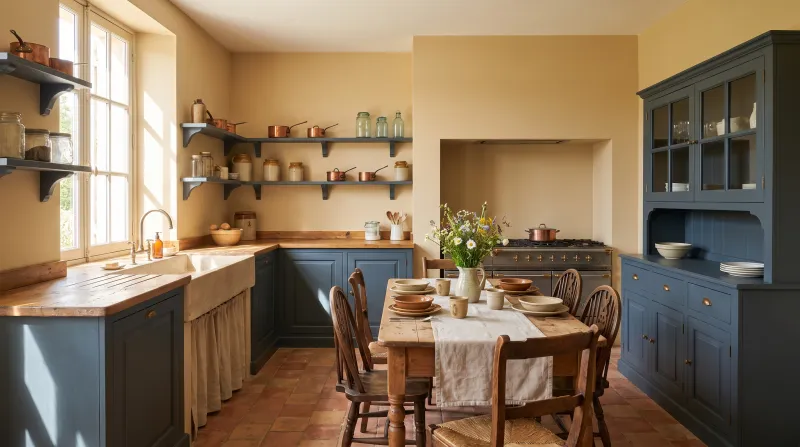
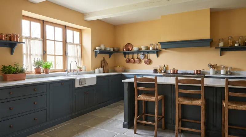
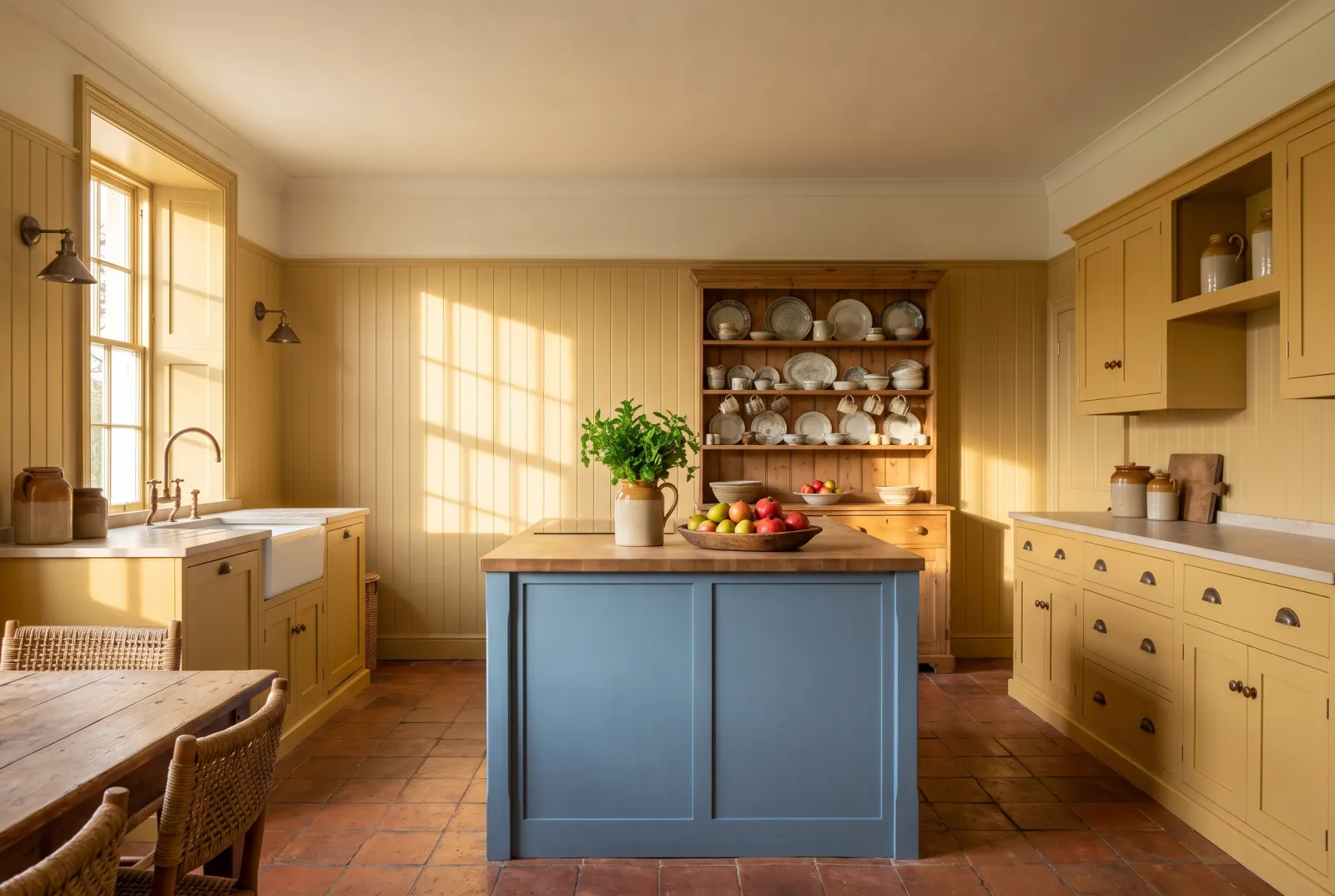
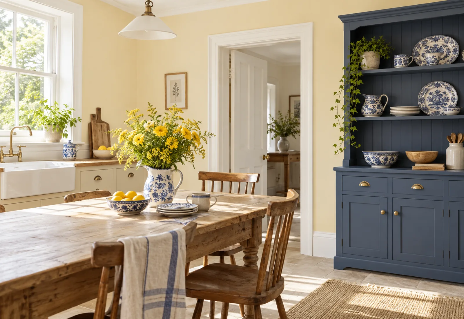
A mid yellow-beige, the colour of parchment or ripe wheat, named after the City street. It has the patina of old-house yellows — the ones found beneath layers of paint — and it makes a warm kitchen without being bright. With dark timber and blue earthenware, it is the farmhouse kitchen.

Our tip — Walls in Cornhill, cabinets in Bond Street or Proper Blue: old yellow and blue, the pairing of all time.

Verdure Yellow — Kitchen
07

The tapestry yellow

Verdure Yellow™ No.148

  • Yellow
  • Mid tone
  • South light
  • LRV ≈ 64%

The yellow of foliage in a verdure tapestry: a mid yellow, warm and a little green, candid without being loud. It is the first 'true' yellow on the list, and the easiest to live with on four walls — coloured enough to be a colour, soft enough for breakfast. It likes white and deep greens.

Our tip — Walls in Verdure Yellow, cabinets in Pleasure Gardens Green: the yellow and deep green of the same tapestry.

View the colour → Already in your basket (limit 1 per order)
Golden Square — Kitchen
08

The golden yellow

Golden Square™ No.131

  • Orange
  • Pale tone
  • West light
  • LRV ≈ 59%

A candid, warm yellow, the colour of a ripe apricot, named after the Soho square. It is the yellow of English hallways and kitchens for two centuries — the colour that looks most like sunshine. On kitchen walls it needs pure whites to breathe; on cabinets, it makes an island that glows.

Our tip — An island or base units in Golden Square, everything else in Pure White: sunshine, framed.

View the colour → Already in your basket (limit 1 per order)
Pimlico 2
09

The honey yellow

Pimlico™ No.136

  • Orange
  • Pale tone
  • West light
  • LRV ≈ 58%

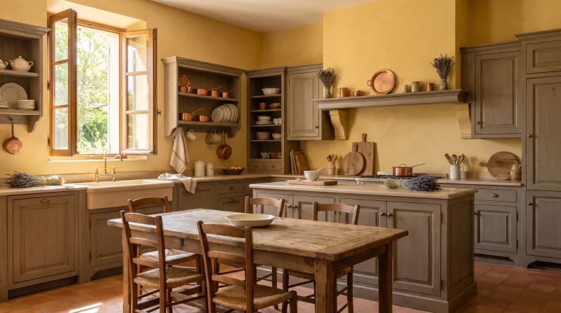
A soft orange-yellow, the colour of acacia honey, a touch warmer and less bright than Golden Square. It makes a golden kitchen rather than a yellow one — that of late afternoons — and it suits mid-toned timber, terracotta and copper especially well. The yellow of a kitchen-diner where you dine too.

Our tip — Walls in Pimlico, ceiling in Lots Road, timber cabinets: the golden kitchen.

View the colour → Already in your basket (limit 1 per order)
Circle Line — 1950s kitchen
10

The brightest

Circle Line™ No.45

  • Yellow
  • Mid tone
  • West light
  • LRV ≈ 57%

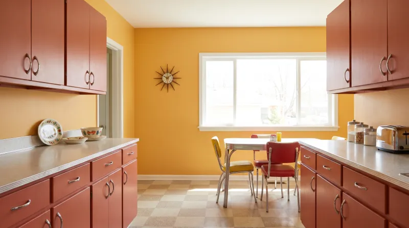
The yellow of the Underground line that gives it its name: a bright, candid yellow, the most saturated on the list. It doesn't go on four walls — it goes on a door, an island, the inside of a cupboard or a back wall, where it does the whole kitchen on its own. With Pure White walls and Downing Street cabinets, it is the London trio.

Our tip — One element in Circle Line; over our yellow primer & undercoat, two coats are enough.

View the colour → Already in your basket (limit 1 per order)

These colours in real rooms

Our schemes in which one of this guide's shades plays the lead — or a supporting role.

All schemes · Kitchen →
Cornhill™ No.128 Frieze™ No.84 Chambers Gate™ No.85
Hurlingham™ No.181 Elgin™ No.20
Floral Street™ No.147 Sleet™ No.91
Bone BH.04 Cotton Street™ No.3 St Martins™ No.37
Verdure Yellow™ No.148 Maugham White™ No.2 Pimlico™ No.136 Boathouse™ No.33
Verdure Yellow™ No.148 Sleet™ No.91 Pimlico™ No.136 Ultramarine Blue FTT-018

Dosing yellow in a kitchen

The light decides. A north-facing kitchen is where yellow is most useful: Cavendish Cream No.120, Hurlingham No.181 or Floral Street No.147 make the missing sun there, without ever looking loud since the cold light tempers them. A south-facing kitchen is where the most caution is needed: the sun adds its warmth to the yellow's, and Golden Square No.131 can turn orange there. Prefer Lemon Salts No.43 or Bone BH.04, the coolest.

On the walls or on the cabinets?

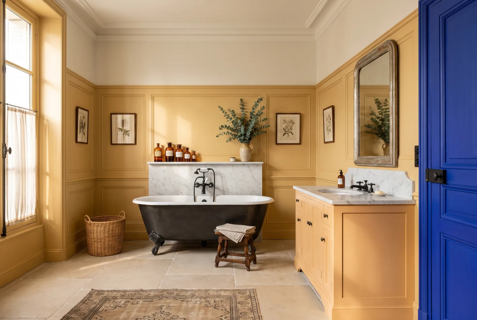
Pale yellows and creams go on the walls — they make a warm ground for coloured or timber cabinets. Candid yellows go on the cabinets or on a single element — an island in Golden Square No.131, a larder door in Circle Line No.45 — where they have just the surface they need to glow without taking over. The old yellow of Cornhill No.128 is the only mid yellow that holds on four kitchen walls without tiring.

What to pair it with

Yellow likes blue — Proper Blue No.67, Bond Street No.219, Morning Blue No.32 — as Delft earthenware has shown; it likes deep greens (Sorrel Green No.207, Pleasure Gardens Green No.214) and soft black (Downing Street No.10). It doesn't like cream white beside it, which makes it look dirty: prefer Pure White No.1 or Charterhouse No.4. See also our greens for a kitchen, our kitchen-cabinet colours, our yellow schemes and all our yellows.

Frequently asked questions

Which yellow for a north-facing kitchen?
A pale yellow or a cream that makes the missing sun: Cavendish Cream No.120, Hurlingham No.181 or Floral Street No.147. The cold light tempers them; they never look loud.
Which yellow for a south-facing kitchen?
A cool, pale yellow: Lemon Salts No.43 or Bone BH.04. Candid yellows such as Golden Square No.131 can turn orange in southern sun.
Can a bright yellow work in a kitchen?
Yes, on one element: an island or base units in Golden Square No.131, a door in Circle Line No.45, with everything else in Pure White No.1. On four walls a bright yellow tires quickly.
Which white with a yellow?
A pure or cool white — Pure White No.1, Charterhouse No.4 — that keeps the yellow crisp. A cream white beside a yellow makes it look dirty.

Guides to read next

All colour guides →

Want to see these colours at home?

Order a sample to judge the shade in your own light, or browse every paint for the room.

Sign up to our newsletter

Sign up to our newsletter

Thanks for signing up to our newsletter!