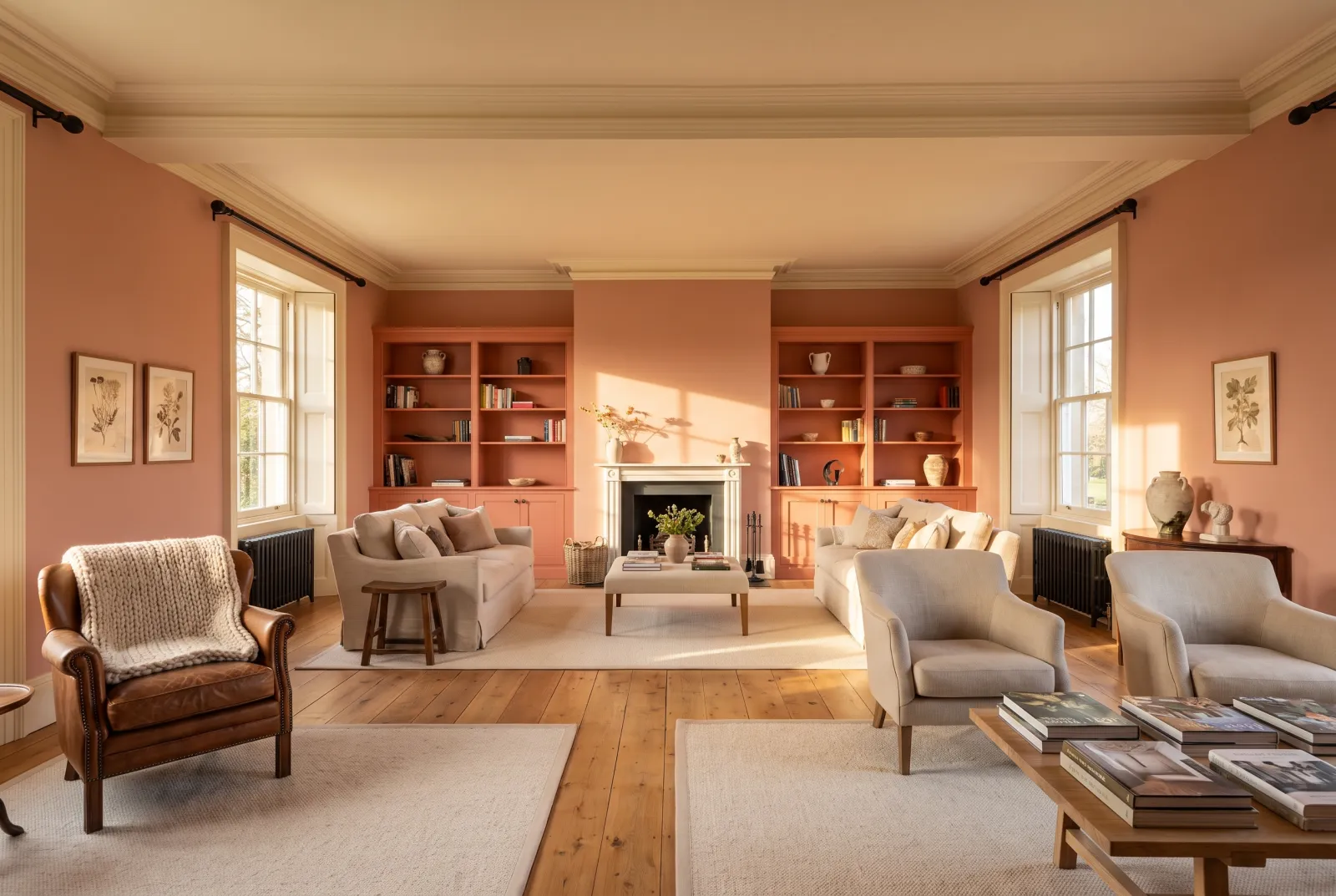
Red in a dining room: why it works
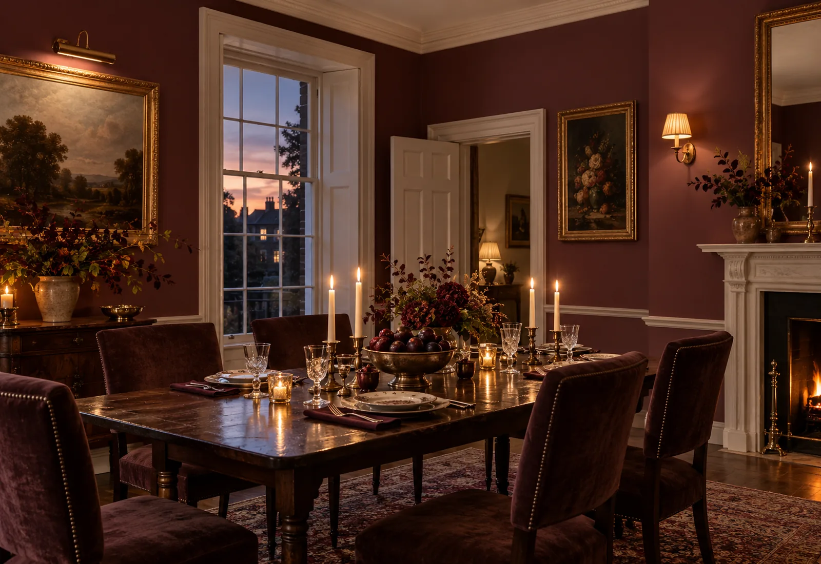
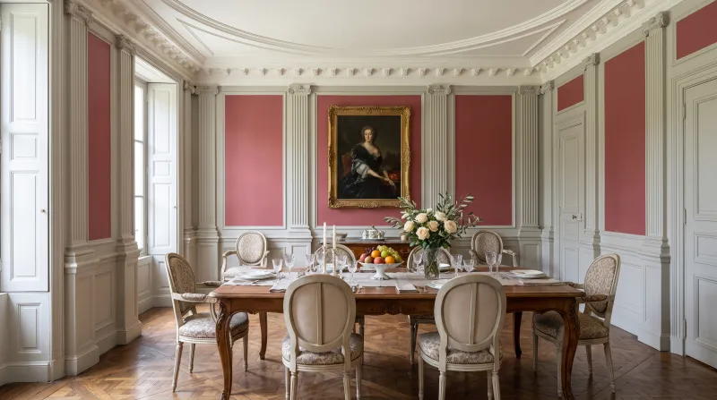
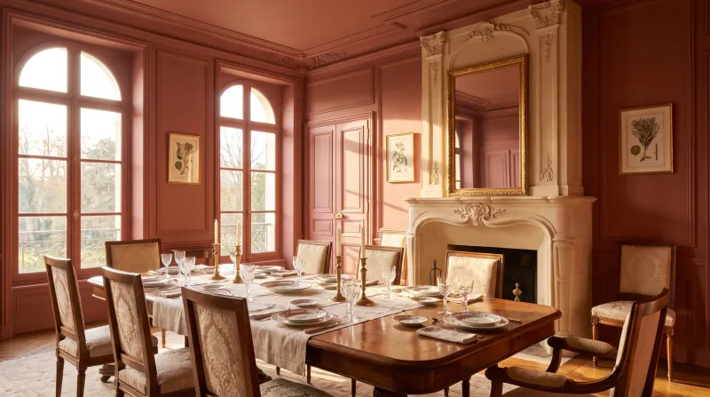
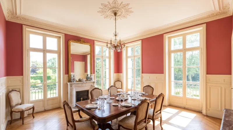
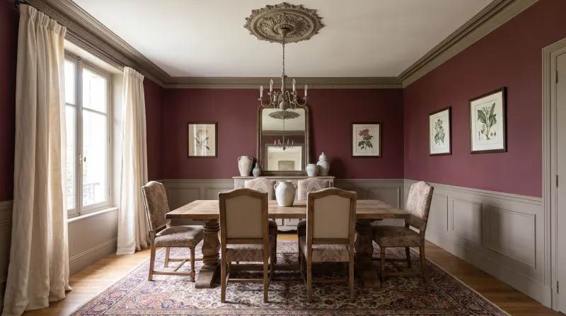
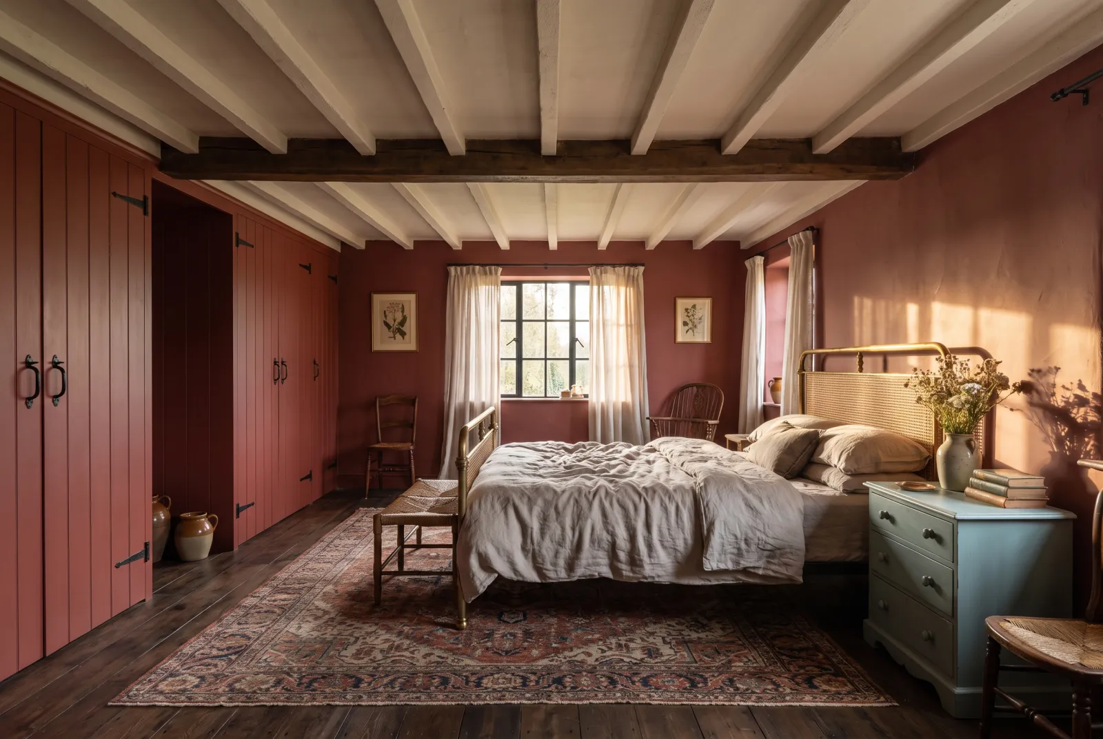
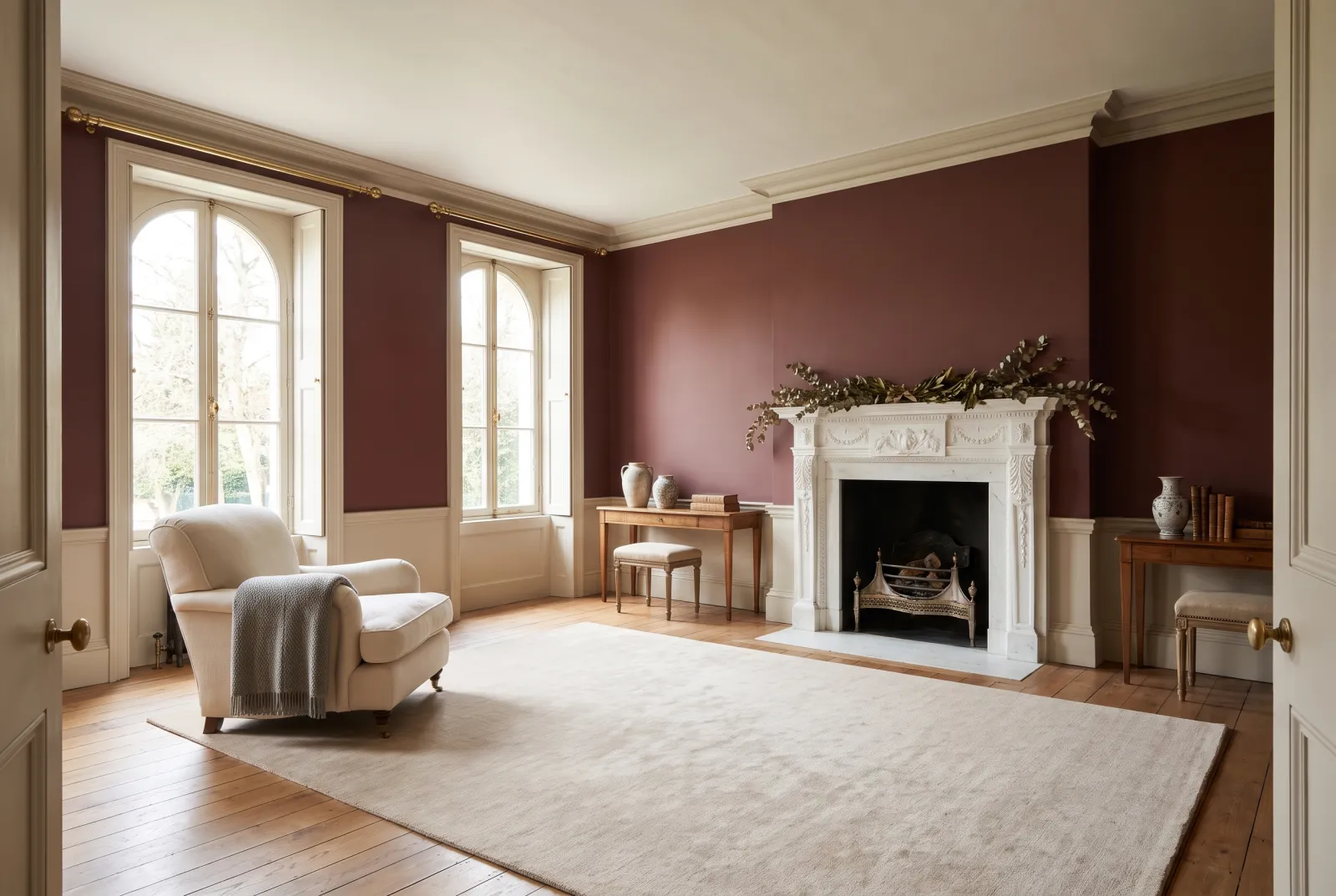
A dining room is lived in mostly at night, under warm light — lamps, candles — and that is precisely the light that flatters red. Deep reds (Huguenot No.49, Arts Club No.281, Theatre Land No.282) that look grave at noon turn sumptuous at eight in the evening; they flatter faces, draw guests together and make the table look richer. It has been the dining-room colour of the English tradition for two centuries, and there is no reason for it to stop.
Which red by room
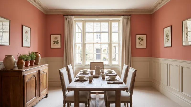
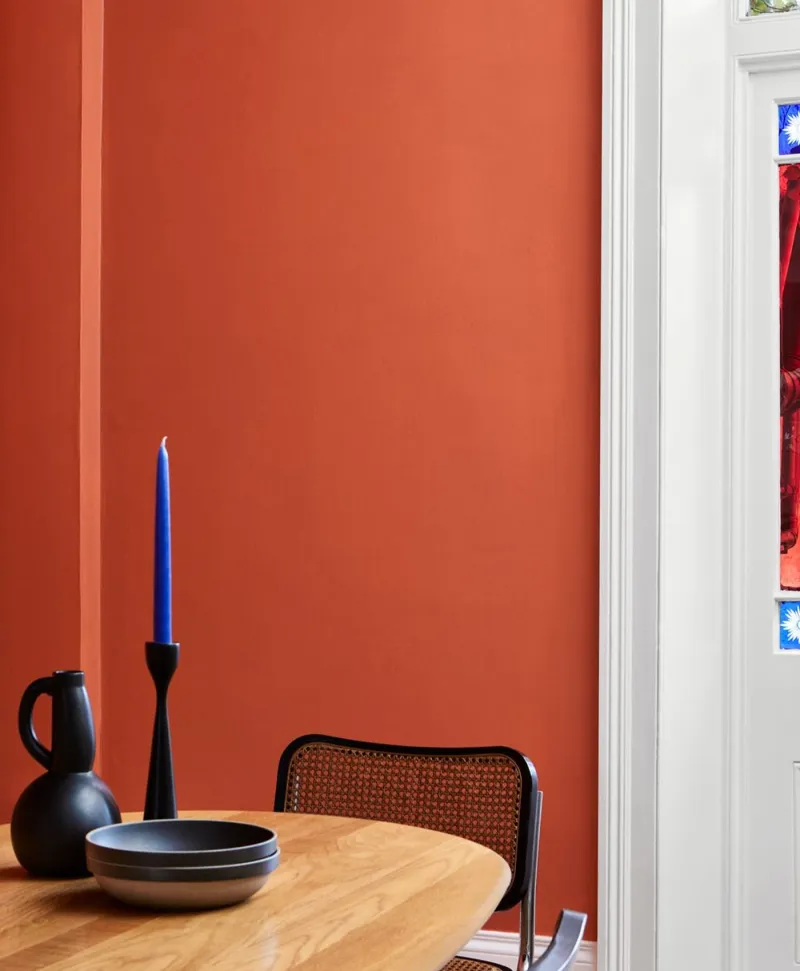
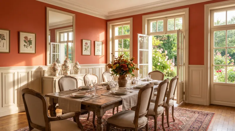
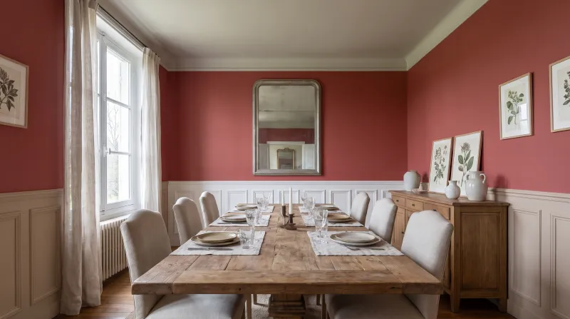
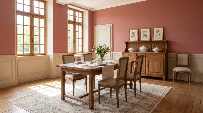
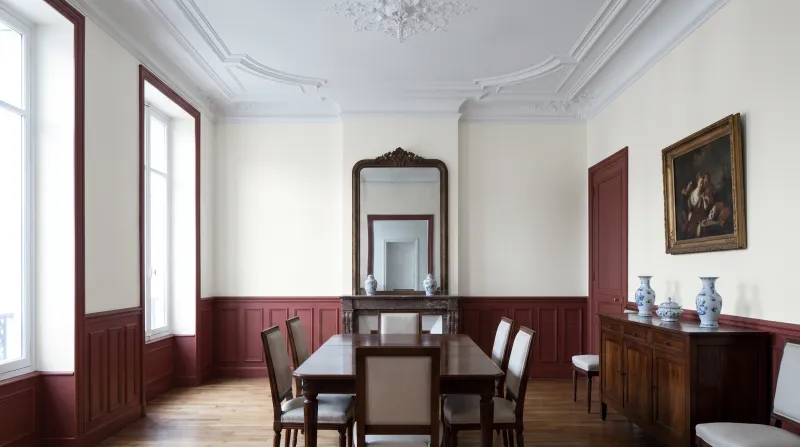
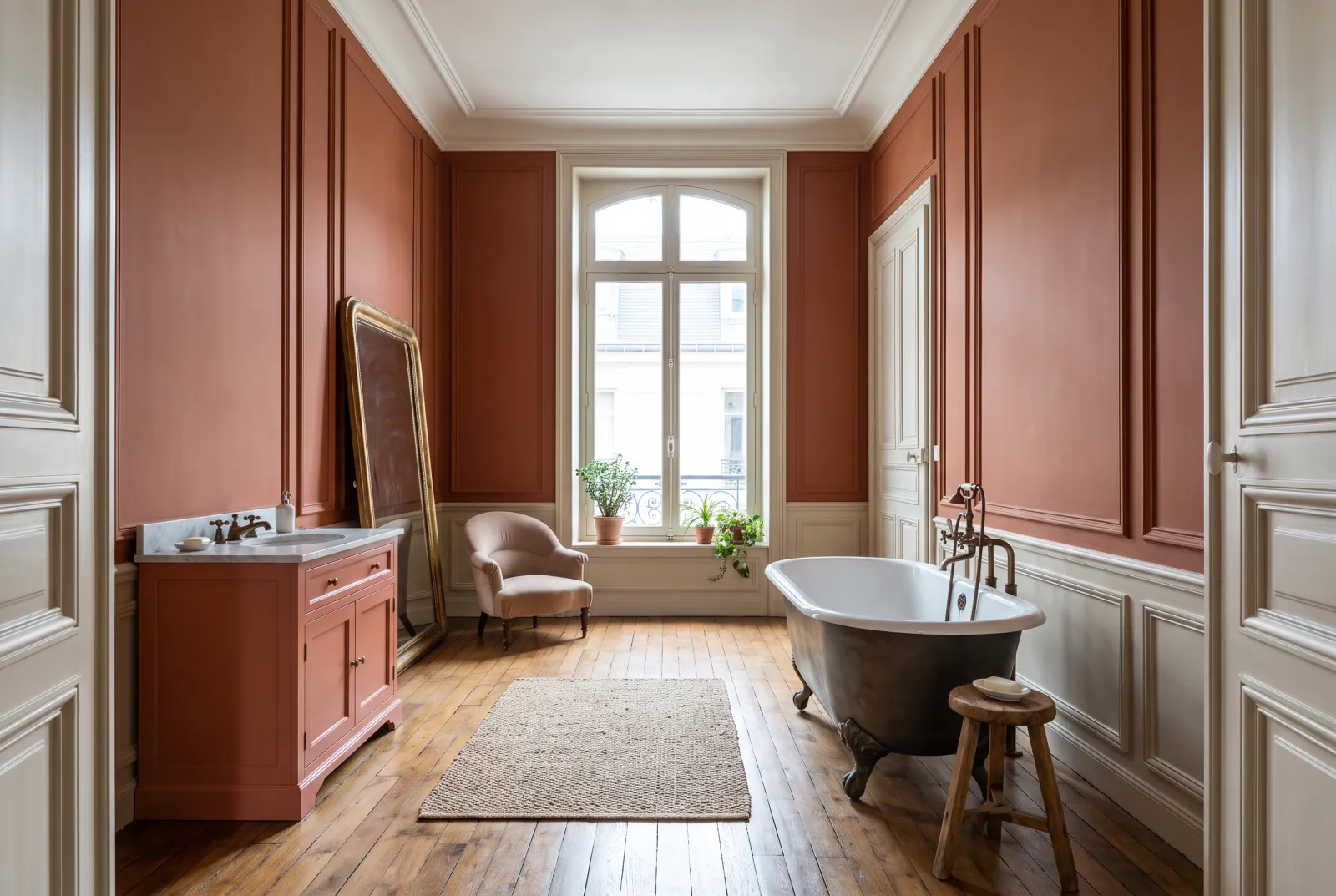
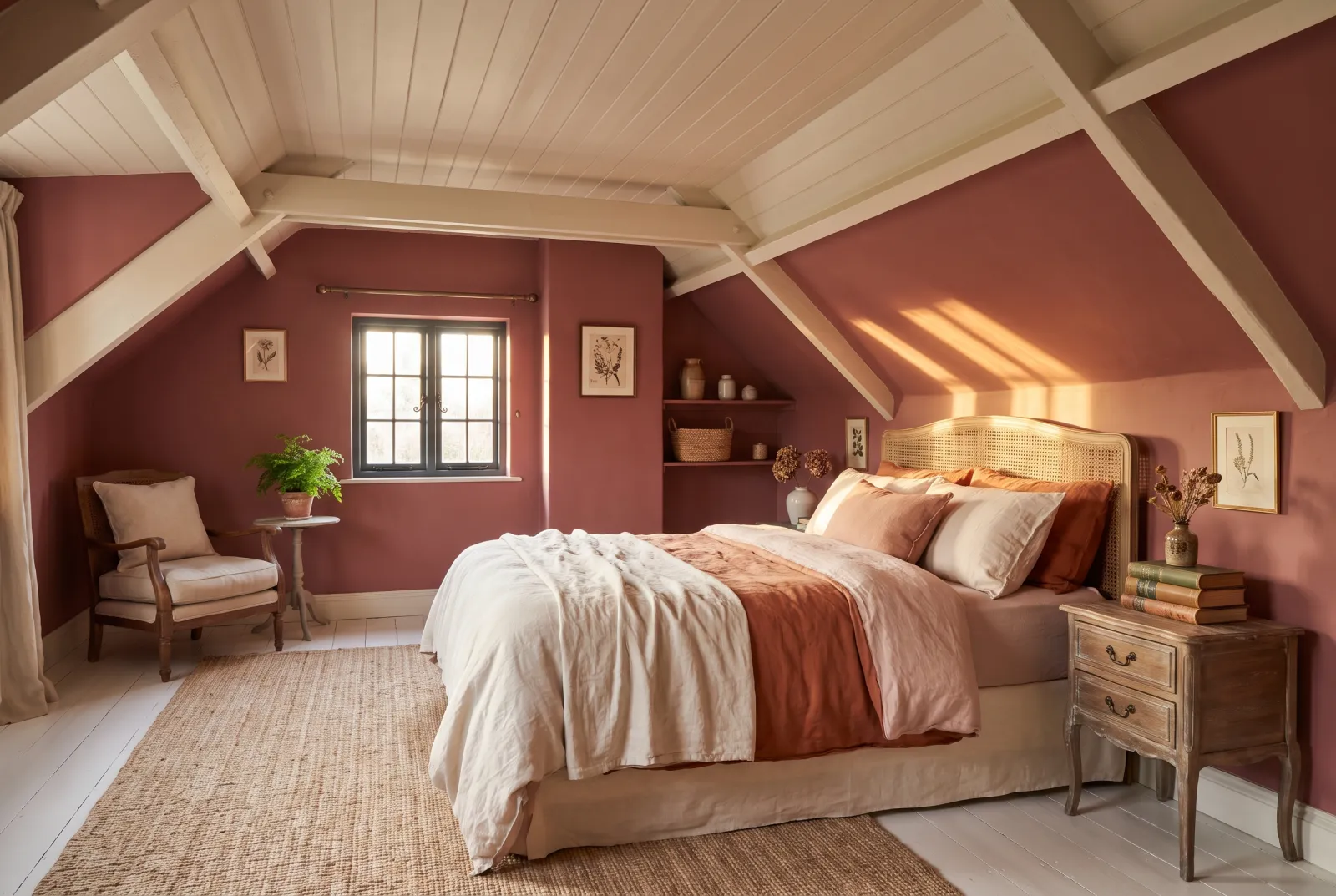
A bright dining room, or one also used at lunchtime, takes a terracotta (Coral Orange No.277) or a mid red (Indian Lake No.288, Mortlake Red No.290). An evening dining room, or a dark room, calls for a deep red colour-drenched: Huguenot No.49, Arts Club No.281. A north-facing dining room benefits from a warm, earthy red (Crayfish Party BH.19, Coral Orange No.277) rather than a violet red, which would look cold there.
What goes with it
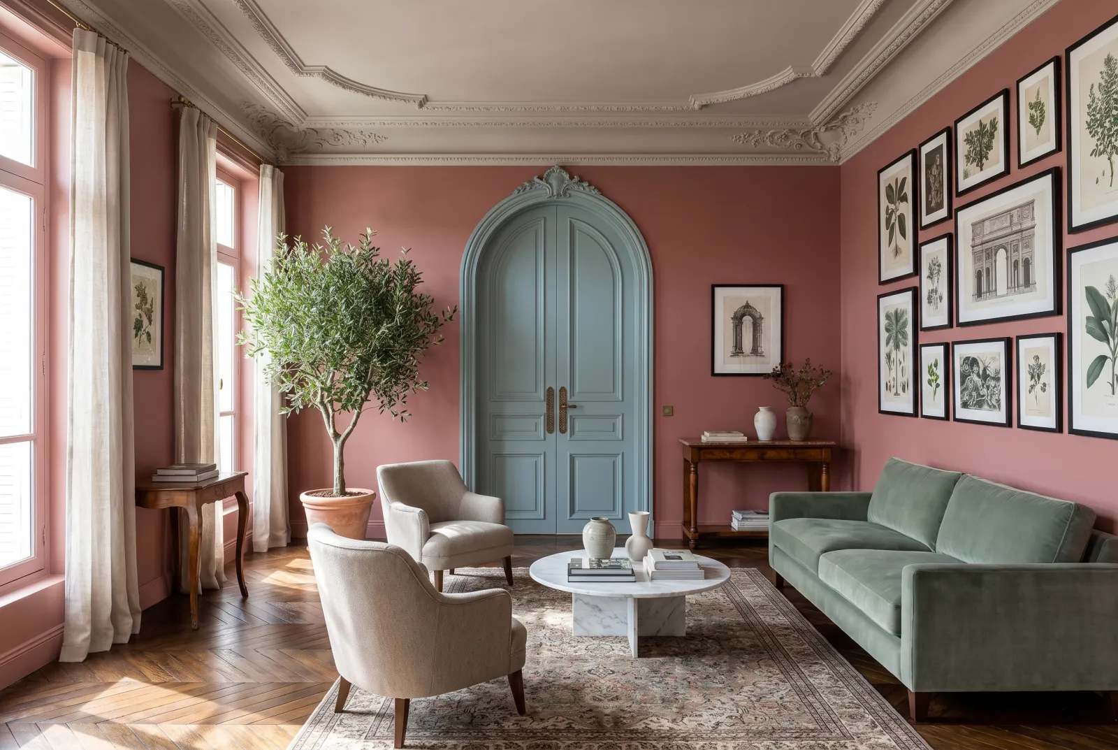
Red likes warm whites and stones — Lots Road No.24, Cavendish Cream No.120, Limestone No.55 — never pure white, which makes it loud. It also likes a deep green somewhere (Sorrel Green No.207 on a door) and a blue-green (Eaton Square No.232) on a sideboard: the complementaries calm it. Apply deep reds over our dark red primer & undercoat — two coats are enough. See also our dining-room colours, our red schemes and all our reds.