Colour guides · Dining room

10 paint colours for a dining room

The dining room is the evening room. It is lived in by candlelight and pendant light, around a table, and the rules that hold elsewhere — lighten, enlarge — reverse there: a dining room wants depth, warmth and a little theatre. It is the room where dark colours are easiest to dare.

Here are ten Mylands colours for a dining room, from the golden whites that flatter a table to the night colours that wrap around it.

Updated September 2026 · by the Mylands France colour team

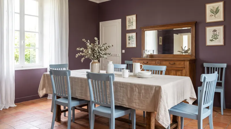
10 paint colours for a dining room

The short answer

For a dining room, choose colours that improve under artificial light: the night blues Observatory No.34 and Blueprint No.50, the deep greens Pleasure Gardens Green No.214 and Deep Green FTT-012, the reds and plums Huguenot No.49 and Plum Tree No.283. For a daytime dining room, a golden yellow such as Cavendish Cream No.120 or a warm neutral such as Hoxton Grey No.72.

At a glance

Our selection

10 colours

Observatory — Diningroom
01

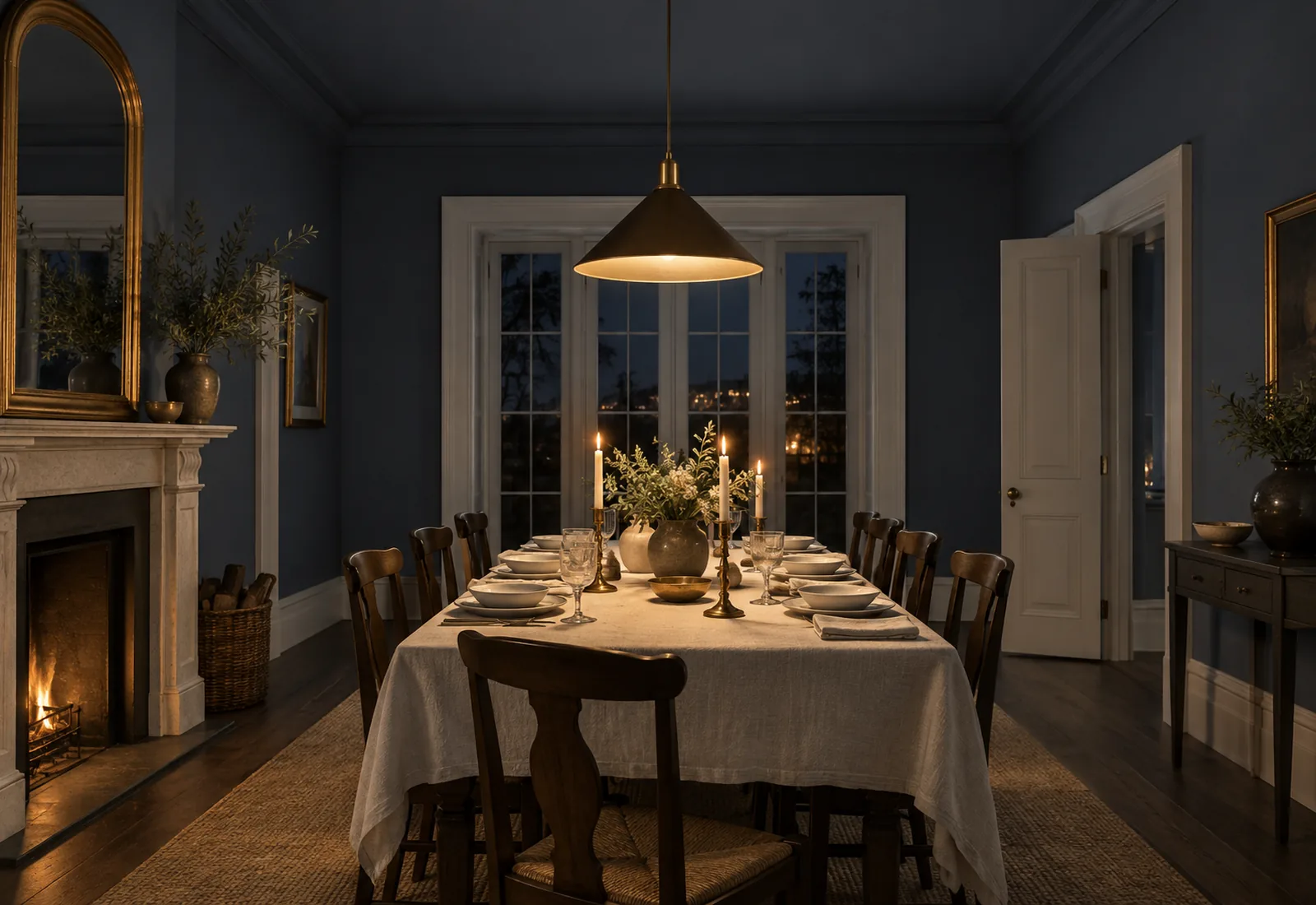
The night blue

Observatory™ No.34

  • Blue
  • Dark tone
  • South light
  • LRV ≈ 11%

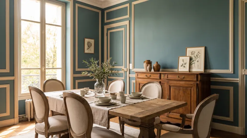
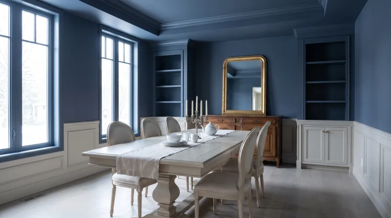
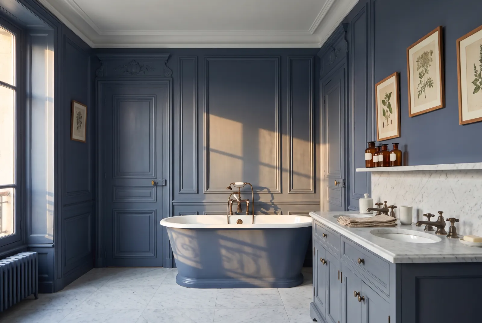
A deep, greyed blue named after the Greenwich observatory, which under candlelight takes on the colour of a midnight sky. It is our most requested dining-room colour: dark enough to envelop, blue enough to stay fresh, and flattering to everything gilded — frames, brass, waxed wood, and faces by the light of the flames.

Our tip — Ceiling in Walpole, a bluish white, and woodwork in Sleet: the dining room stays tall and crisp.

View the colour → Already in your basket (limit 1 per order)
Pleasure Gardens Green — Diningroom
02

The green of the English dining room

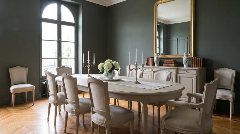
Pleasure Gardens Green™ No.214

  • Green
  • Dark tone
  • East light
  • LRV ≈ 8%

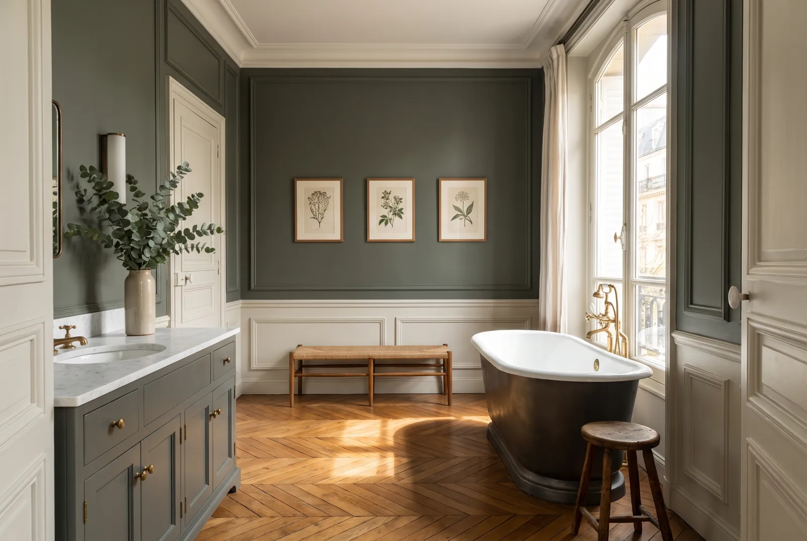
A very dark, leafy green that makes any dining room look like the one in a club or a country house. At night it recedes into shadow and lets the table become the only source of light; by day it makes the greenery of a garden through the window blaze. With portraits, prints and mahogany it is unbeatable.

Our tip — A dark green wall behind a pale sideboard in Lots Road: the sideboard becomes a picture.

View the colour → Already in your basket (limit 1 per order)
Huguenot — Diningroom
03

The dinner red

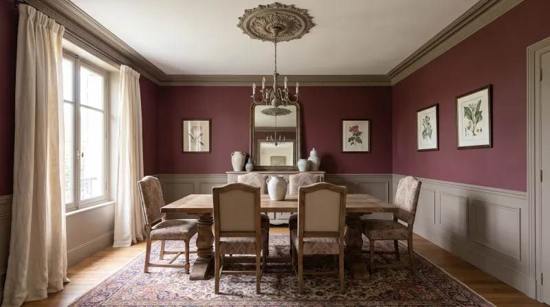
Huguenot™ No.49

  • Red
  • Dark tone
  • West light
  • LRV ≈ 7%

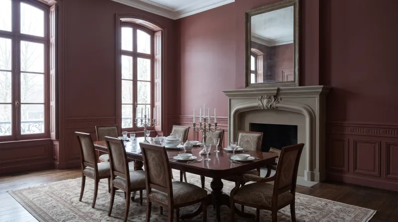
A deep, brown claret, the red of the Huguenot houses of Spitalfields. Dark red is the traditional dining-room colour for a simple reason: it stimulates the appetite and flatters faces. Huguenot does it with discretion — it is more wine than red, and it ages beautifully by candlelight.

Our tip — Woodwork in a warm white such as Holbein Chamber, never a cool white that would turn it purple.

View the colour → Already in your basket (limit 1 per order)
Cavendish Cream — Diningroom
04

The golden cream

Cavendish Cream™ No.120

  • Yellow
  • Pale tone
  • South light
  • LRV ≈ 72%

For a dining room used at noon as much as at night, a soft golden cream yellow that looks like sunshine even on a grey day. It makes a room welcoming rather than dramatic, and turns candlelight warmer still. It is the colour of country kitchen-diners, where cheer is wanted rather than theatre.

Our tip — With chairs in Sorrel Green or Observatory, the table becomes the centre of the room.

View the colour → Already in your basket (limit 1 per order)
Plum Tree — Diningroom
05

The plum

Plum Tree™ No.283

  • Neutral
  • Dark tone
  • West light
  • LRV ≈ 7%

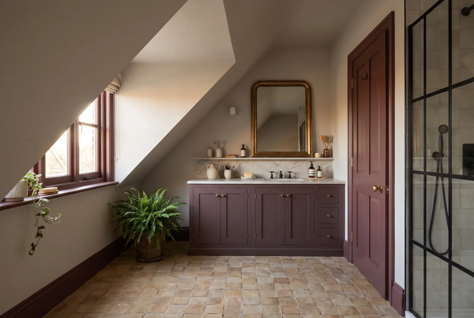
A deep, greyed brown-plum that is neither red nor purple but somewhere between, like the skin of a damson. It is softer than a claret and warmer than a dark grey, and under a pendant it turns to velvet. A colour for a flat's dining room, elegant and a little secret.

Our tip — Woodwork in Osterley, a faintly pink white, for a tone-on-tone match.

View the colour → Already in your basket (limit 1 per order)
Deep Green — Diningroom
06

The emerald green

Deep Green FTT-012

  • Green
  • Dark tone
  • South light
  • LRV ≈ 17%

A saturated blue-green, brighter and more joyful than bottle green — the green of a brasserie dining room. It is extraordinary with brass and mirrors, and holds its own against a big table without being forgotten. A colour for those who entertain often and want a room with wit.

Our tip — A big gilt mirror and brass wall lights: the Paris brasserie at home.

View the colour → Already in your basket (limit 1 per order)
Hoxton Grey — Diningroom
07

The warm neutral

Hoxton Grey™ No.72

  • Neutral
  • Pale tone
  • West light
  • LRV ≈ 58%

For a dining room open to the kitchen or sitting room, where a dark colour would isolate one corner of the space, a warm, velvety greige that welcomes everything — pale wood, mismatched chairs, coloured tableware. It is calm by day and warm by night, and lets the table and what is served on it provide the colour.

Our tip — The same Hoxton Grey on walls and ceiling, woodwork in Lots Road: the room looks bigger and softer.

View the colour → Already in your basket (limit 1 per order)
Blueprint — Diningroom
08

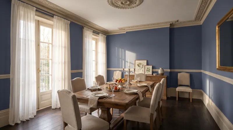
The violet ink blue

Blueprint™ No.50

  • Neutral
  • Dark tone
  • North light
  • LRV ≈ 6%

More mysterious than Observatory: a midnight blue leaning to violet, the colour of a sky half an hour after sunset. It is almost black at night and blue by day, and it makes candles look more golden than any other colour. A dining room in Blueprint is a room nobody forgets.

Our tip — Ceiling in the same colour, in dead matt: the smartest night-box there is.

View the colour → Already in your basket (limit 1 per order)
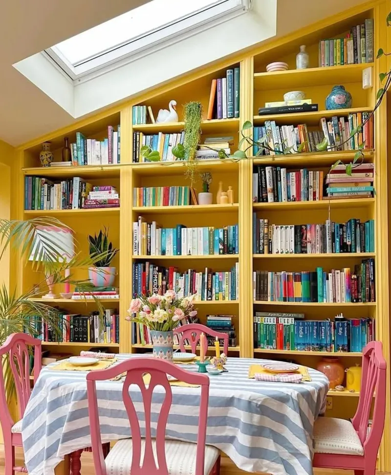
vibrant Yellow bookshelf filled with books above a dining table with pink chairs.
09

The Pimlico yellow

Pimlico™ No.136

  • Orange
  • Pale tone
  • West light
  • LRV ≈ 58%

A proper, golden, warm ochre yellow, more assertive than Cavendish Cream — the yellow of Georgian dining rooms, where it was the colour of luxury. It turns a north-facing room into a sunlit one, and it is superb with blue, whether chairs, a tablecloth or china. A colour for celebration.

Our tip — Woodwork in Pure White and a door in Observatory: the Georgian contrast.

View the colour → Already in your basket (limit 1 per order)
Rothschild Street — Diningroom
10

The claret brown

Rothschild Street™ No.296

  • Neutral
  • Dark tone
  • West light
  • LRV ≈ 8%

A deep brown veined with red, the colour of old leather or rosewood. Less red than Huguenot, warmer than Plum Tree, it is the most discreet of our warm darks — and perhaps the most flattering under a pendant light. A dining room in Rothschild Street has the softness of a library.

Our tip — With woodwork in Kensington Rose, a peach white, and plenty of wood.

View the colour → Already in your basket (limit 1 per order)

These colours in real rooms

Our schemes in which one of this guide's shades plays the lead — or a supporting role.

Deep Green FTT-012 Greenwich Time™ No.8 Iron Grey FTT-014 Proper Blue™ No.67
Observatory™ No.34 Greenwich Time™ No.8 Mayfair Dark™ No.218
Rothschild Street™ No.296 The Boltons™ No.28 Plum Tree™ No.283
Pleasure Gardens Green™ No.214 St Clement™ No.11 Mad About The Bathroom
Plum Tree™ No.283 The Boltons™ No.28 Westmoreland™ No.160
Pimlico™ No.136 Limestone™ No.55 Golden Square™ No.131

Choosing a dining-room colour

The first question to ask: when do you eat here? An evening dining room — the room of dinners, often separate — can be as dark as you like: artificial light will bring it to life, and a deep colour becomes magnificent there. A lunchtime dining room, or one open to the kitchen, benefits from a lighter, warmer colour that stays handsome in daylight and doesn't cut the space in two.

The colours that love candles

Night blues, deep greens, reds and plums have one thing in common: they hold enough warmth not to turn grey under yellow light. A cool grey, by contrast, turns dull at night. That is why Observatory No.34 and Huguenot No.49 are dining-room colours, and Drury Lane No.115 much less so.

Ceiling and woodwork

With a dark colour, two options: a warm white ceiling that keeps some height — Holbein Chamber No.7, Lots Road No.24 — or the ceiling in the wall colour, in Multi-Surface Dead Matt, for a jewel-box dining room. The woodwork follows the ceiling, or takes a deeper shade still.

For reds in detail, see our reds and terracottas for a dining room; for blues, our deep blues compared; for the finish, find your finish.


Frequently asked questions

Which colour for a dining room?
A colour that improves under artificial light: a night blue (Observatory, Blueprint), a deep green (Pleasure Gardens Green, Deep Green), a red or a plum (Huguenot, Plum Tree). For a daytime dining room or one open to the kitchen, a golden yellow (Cavendish Cream, Pimlico) or a warm neutral (Hoxton Grey).
Can a dining room be painted a dark colour?
It is the ideal room for it: it is lived in mostly at night, by candle and pendant light, which gives dark colours their depth. Keep a warm white ceiling if the room is low.
Which colour stimulates the appetite?
Traditionally reds and warm yellows: Huguenot, Rothschild Street, Pimlico, Cavendish Cream. They also flatter faces and food by candlelight.
Which finish for a dining room?
Marble Matt Emulsion on the walls, washable; Multi-Surface Satin on the woodwork. To paint the ceiling in the wall colour, Multi-Surface Dead Matt.

Guides to read next

All colour guides →

Want to see these colours at home?

Order a sample to judge the shade in your own light, or browse every paint for the room.

Sign up to our newsletter

Sign up to our newsletter

Thanks for signing up to our newsletter!