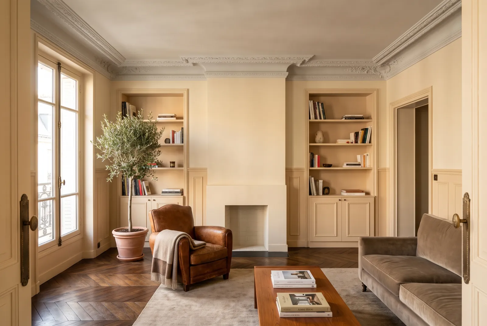
Colour guides · Living room · South-facing

Which colour for a south-facing living room?

A south-facing living room is the easiest to paint — the warm, generous light flatters almost everything — and the easiest to get wrong, because it flatters too much: warm shades blaze, cream whites turn yellow, and at noon everything looks a tone lighter than on the card.

It is the room where you can dare the colours you thought 'too cold'. Here are ten colours to make the most of it.

Updated September 2026 · by the Mylands France colour team

Which colour for a south-facing living room?

The short answer

In a south-facing living room, choose cool or frankly light shades that the warm light softens: a pure white such as Pure White No.1, a verdigris such as Copper Green No.36, a blue such as Morning Blue No.32 or Eaton Square No.232, a grey neutral such as Limestone No.55. Avoid creams and yellows, which blaze there.

At a glance

Our selection

10 colours

Pure White — living room
01

The pure white

Pure White™ No.1

  • White
  • White
  • South light
  • LRV ≈ 91%

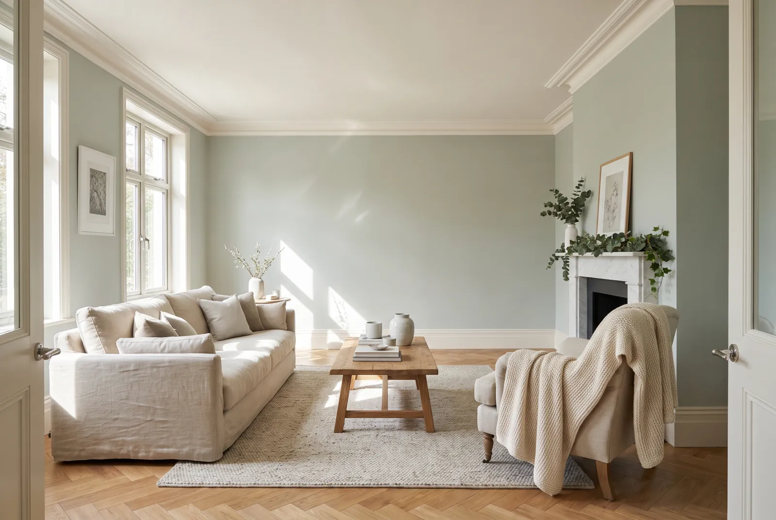
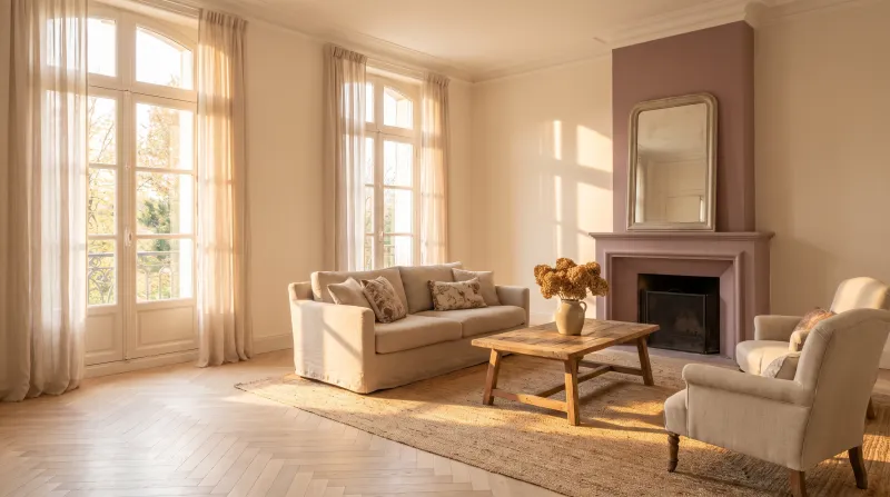
Our crispest white, without undertone — a white that only holds in a sunny room, and is magnificent there. The southern sun gives it the warmth it lacks; in return, it keeps the living room fresh and bright until evening. With walls, ceiling and woodwork in Pure White, the room becomes a gallery.

Our tip — A back wall in Copper Green or Eaton Square behind the sofa: pure white needs a partner.
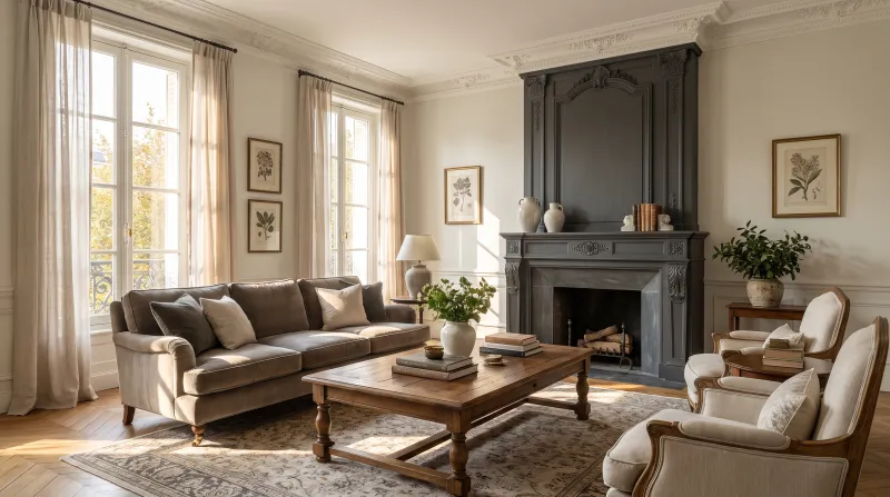
View the colour → Already in your basket (limit 1 per order)
Charterhouse — Livingroom
02

The cool off-white

Charterhouse™ No.4

  • White
  • White
  • South light
  • LRV ≈ 85%

An off-white faintly grey-green, barely softer than Pure White — the white for those who find pure white too hard but cream too yellow. Facing south, its hint of grey keeps it crisp all day, and it never turns beige in the late afternoon. A bright, sober living-room white.

Our tip — Ceiling in Pure White, one step lighter, to add height.

View the colour → Already in your basket (limit 1 per order)
Belgravia — Livingroom
03

The pale grey white

Belgravia™ No.6

  • White
  • Pale tone
  • South light
  • LRV ≈ 74%

A very pale grey white, filed for the south: it has just enough grey to absorb the excess warmth of the light and remain a calm white at noon. Named after the quarter of stuccoed façades, it has their restrained elegance. It is the ideal white for a south-facing living room with busy walls — pictures, bookcases, fabrics.

Our tip — Woodwork in Pure White: the most discreet contrast there is, but a contrast.

View the colour → Already in your basket (limit 1 per order)
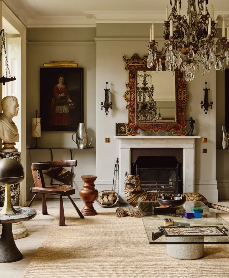
Warm grey living room with classical decor, including a chandelier, fireplace, and various sculptures.
04

The limestone

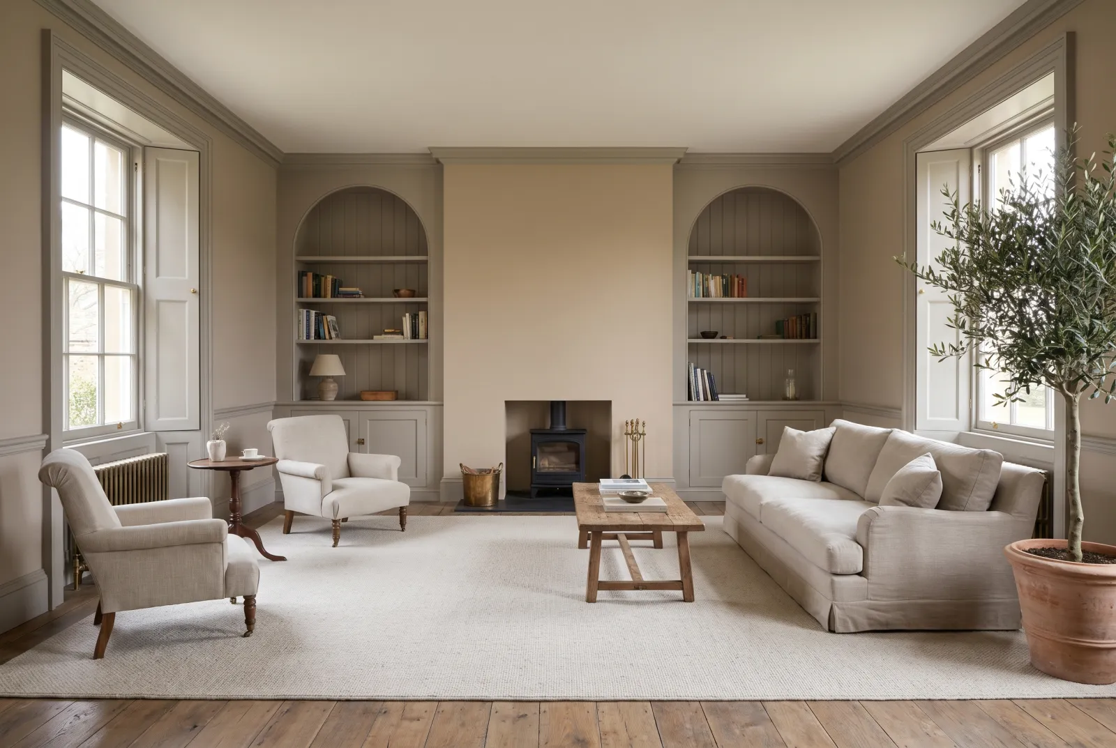
Limestone™ No.55

  • Neutral
  • Pale tone
  • South light
  • LRV ≈ 67%

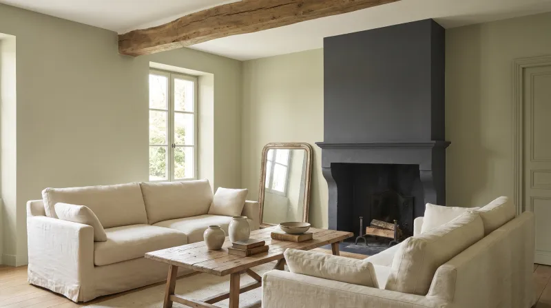
A pale grey-beige between stone and linen, almost without undertone. Facing south it is the neutral that doesn't turn beige: the sun warms it just enough to look stone rather than grey. It argues with nothing and leaves all the room to the furniture — the neutral of big, sunny living rooms.

Our tip — A bookcase or chimney breast in Brompton Road amid Limestone walls.

View the colour → Already in your basket (limit 1 per order)
Frieze — Livingroom
05

The stone grey

Frieze™ No.84

  • Grey
  • Pale tone
  • South light
  • LRV ≈ 65%

A pale grey with a beige undertone, filed for the south, the colour of limestone in the sun. It is the grey that stays grey in a warm room — where a yellower grey would turn beige — while keeping a softness cool greys lack. Across four walls it is calm; as woodwork beneath a deep colour it is perfect.

Our tip — Walls in Frieze, woodwork in Frieze, a door in Sorrel Green: the room draws itself without white.

View the colour → Already in your basket (limit 1 per order)
Copper Green — Livingroom
06

The verdigris

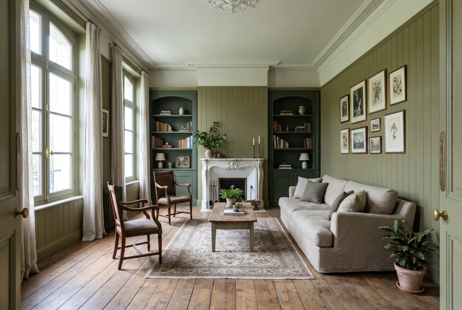
Copper Green™ No.36

  • Green
  • Pale tone
  • South light
  • LRV ≈ 63%

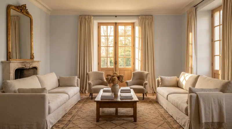
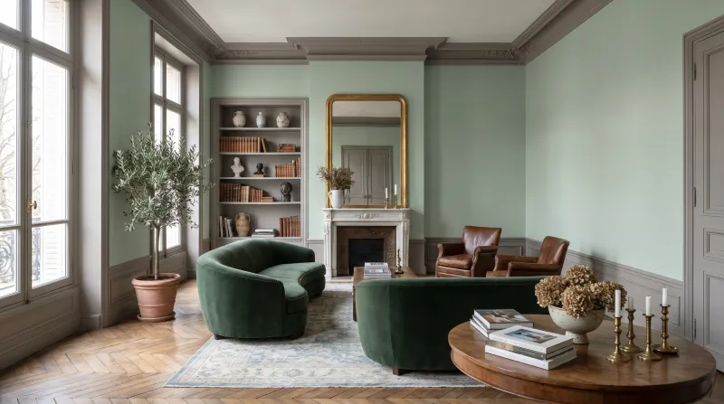
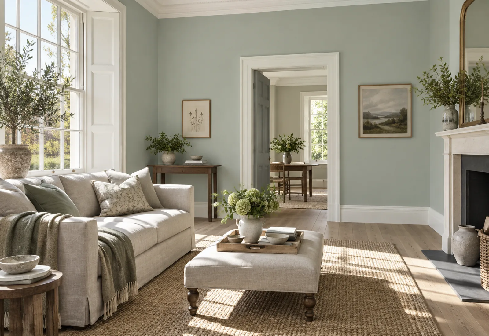
Inspired by the patina on copper roofs: a pale green lifted with a touch of blue, filed for the south. It is the colour that makes the most of a sunny living room — the warm light softens it without switching it off, and it stays fresh when the room warms. With pure whites and pale timber, it is summer all year.

Our tip — Ceiling in Pure White, woodwork in Charterhouse, and an ecru linen sofa.

View the colour → Already in your basket (limit 1 per order)
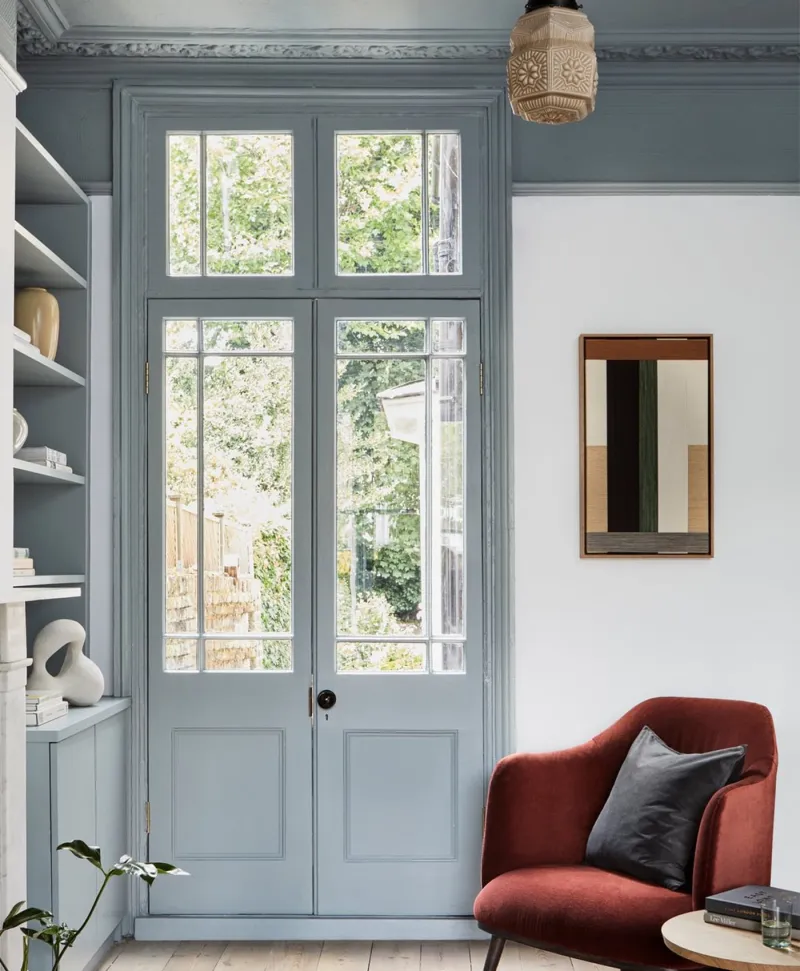
Victorian interior with a red armchair, dusty blue shelves, light blue walls and a large window.
07

The morning blue

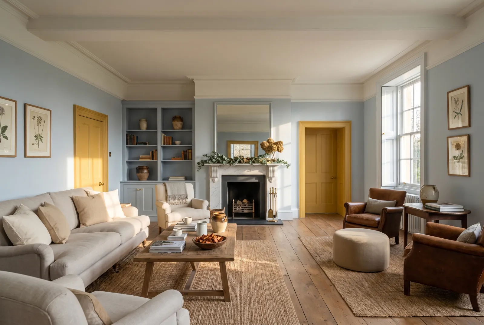
Morning Blue™ No.32

  • Blue
  • Pale tone
  • South light
  • LRV ≈ 65%

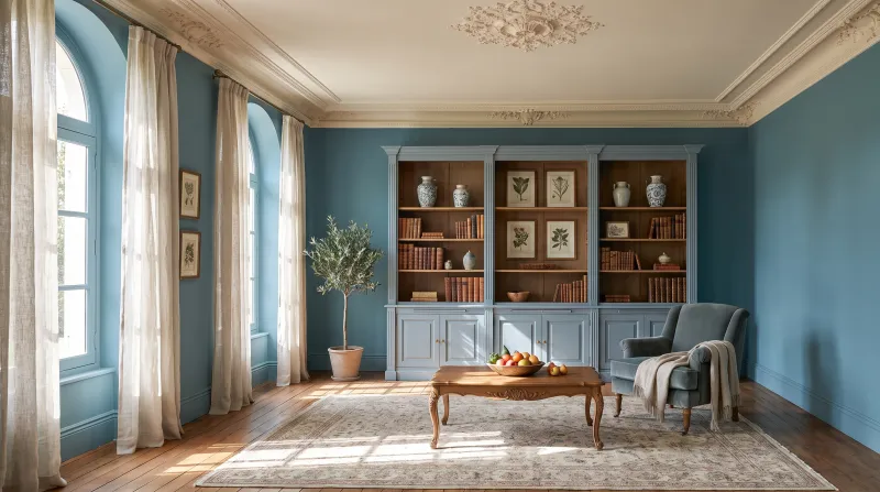
Our purest pale blue, a clear sky blue, filed for the south — that is where it stays blue all day rather than turning grey. In a sunny living room it does what no neutral does: it keeps the room cool to the eye when it is warm on the thermometer. Superb with white, rattan and linen.

Our tip — Woodwork in Pure White and an armchair in Proper Blue: blue in two values.

View the colour → Already in your basket (limit 1 per order)
Chester Square — Livingroom
08

The olive neutral

Chester Square™ No.199

  • Neutral
  • Mid tone
  • South light
  • LRV ≈ 44%

A mid neutral leaning towards olive, filed for the south, whose green undertone stops the sun turning it beige. It is the deep neutral of a sunny living room that wants substance without a candid colour — it makes a superb ground for dark timber, tan leather and gilt frames, and it holds well facing a garden.

Our tip — Ceiling in Limestone, natural linen curtains: the garden living room.

View the colour → Already in your basket (limit 1 per order)
Eaton Square — Livingroom
09

The deep blue-green

Eaton Square™ No.232

  • Blue
  • Mid tone
  • South light
  • LRV ≈ 24%

A mid-deep blue-green, the colour of an aged teal, filed for the south. In a sunny room a deep colour needs freshness so as not to smother — and Eaton Square has it: the sun warms it without making it heavy, and in the evening it turns sumptuous. The blue of a south-facing living room that entertains.

Our tip — Woodwork in Limestone and a Pure White ceiling to keep the air; brass everywhere.

View the colour → Already in your basket (limit 1 per order)
Sorrel Green — Livingroom
10

The botanical green

Sorrel Green™ No.207

  • Green
  • Dark tone
  • LRV ≈ 15%

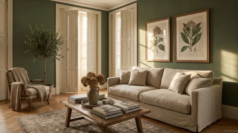
A vibrant botanical green of bright yellow, umber and white, filed for the east but splendid facing south: the warm light brings out its yellow and makes it almost luminous. In a sunny living room a wall or bookcase in Sorrel Green brings the garden in — and the whole room in green, with stone whites, makes a winter garden.

Our tip — Bookcase in Sorrel Green, walls in Limestone: green where the eye rests.

View the colour → Already in your basket (limit 1 per order)

These colours in real rooms

Our schemes in which one of this guide's shades plays the lead — or a supporting role.

All schemes · Living room →
Copper Green™ No.36 Holbein Chamber™ No.7
Sorrel Green™ No.207 Syon Park™ No.13 Forest BH.16
Morning Blue™ No.32 Greenwich Time™ No.8 Lambeth Walk™ No.210 Haymarket™ No.47
London Brick BH.07 Limestone™ No.55 Birdcage Walk™ No.117
Clerkenwell™ No.21 Frieze™ No.84 Hoxton Grey™ No.72
Cavendish Cream™ No.120 Frieze™ No.84 Walbrook™ No.142

South light: generous, and deceptive

A south-facing living room gets the sun all day. Its light is warm and golden, and it makes everything a tone lighter and warmer than it is. It is the most flattering orientation — and the one where the colour card deceives most: a shade chosen because it looked soft in the shop can blaze at noon.

What to avoid: creams and yellow whites (Lots Road No.24, Cavendish Cream No.120) that turn yellow; candid yellows and ochres, which turn orange; peach pinks, which turn apricot. All magnificent elsewhere — but here, the sun already does their job.

What works: pure and grey whites (Pure White No.1, Charterhouse No.4, Belgravia No.6) that the light warms just enough; grey or green neutrals (Limestone No.55, Frieze No.84, Chester Square No.199) that don't turn beige; and above all blues and greens (Morning Blue No.32, Copper Green No.36, Eaton Square No.232) that the sun calms — a blue-green that would look cool facing north turns serene facing south. See also our cool whites for a south-facing room, our colours for a north-facing living room, how light changes colour and our living-room ideas.

Frequently asked questions

Which white for a south-facing living room?
A pure or slightly grey white: Pure White No.1, Charterhouse No.4 or Belgravia No.6. The warm light gives them the warmth they lack; a cream white such as Lots Road No.24 would turn yellow there.
Which colours should be avoided in a south-facing room?
Creams, yellows and ochres, which blaze in already warm light, and peach pinks, which turn apricot. Prefer blues, greens and grey neutrals.
Does blue work in a sunny living room?
It is the ideal orientation for blue: Morning Blue No.32 stays blue all day, Eaton Square No.232 turns serene rather than cold. Facing north, the same blues would look icy.
How do I test a colour in a south-facing room?
Paint a large sample and look at it at noon — when the light is warmest and brightest — then in the evening. A colour that pleases at noon facing south will always please.

Guides to read next

All colour guides →

Want to see these colours at home?

Order a sample to judge the shade in your own light, or browse every paint for the room.

Sign up to our newsletter

Sign up to our newsletter

Thanks for signing up to our newsletter!