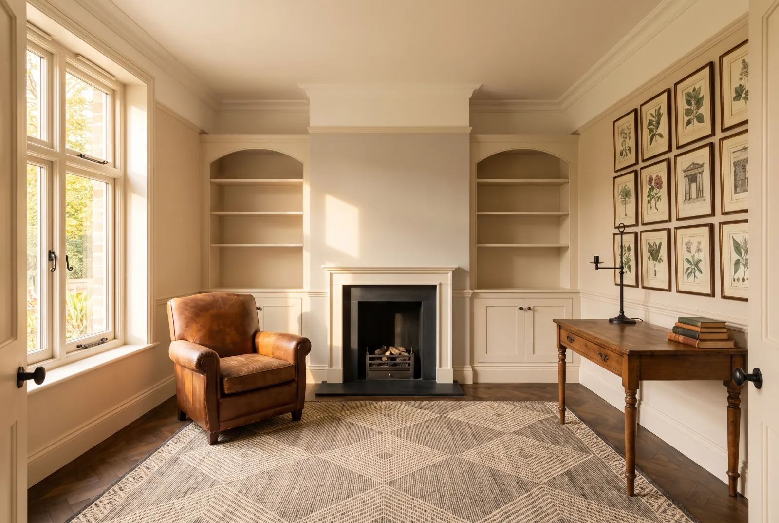
Colour guides · Living room · West-facing

10 paint colours for a west-facing living room

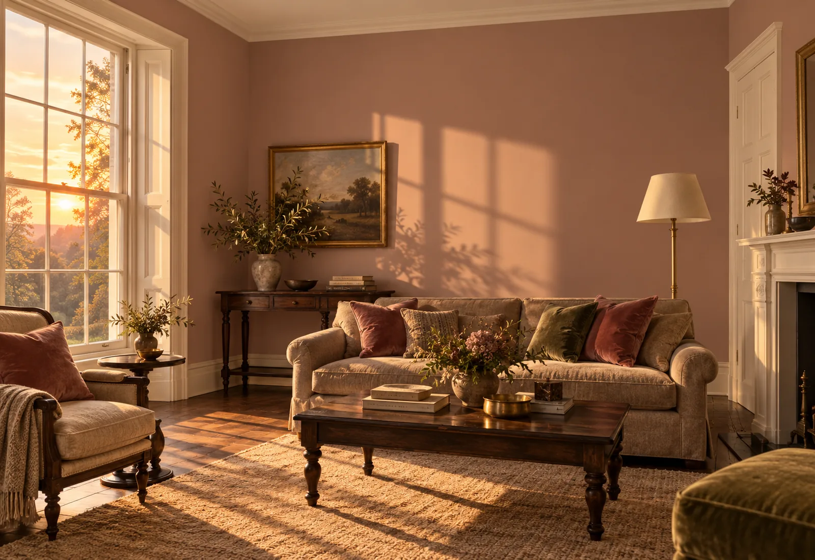
A west-facing living room lives in two acts. In the morning it is in shadow, its light soft and a little grey; in the afternoon the sun comes in lower and more golden, until it sets the walls ablaze at sunset. It is the most flattering aspect for a living room — the evening is spent there — provided you choose a colour that holds in both lights.

Here are ten Mylands colours for a west-facing living room, chosen to be handsome in the morning and magnificent at night.

Updated September 2026 · by the Mylands France colour team

10 paint colours for a west-facing living room

The short answer

For a west-facing living room, the warm neutrals and earths are the safest — Onslow No.48, Clerkenwell No.21, Hoxton Grey No.72, Egerton Place No.297: soft in the morning, ablaze at night. The greens and olive greys — Serpentine No.192, Amber Grey No.156 — temper the heat of the setting sun; the muted pinks and reds — Peach Flesh Pink No.268, Huguenot No.49 — amplify it. Avoid proper yellows, which turn orange at 6 pm.

At a glance

Our selection

10 colours

Onslow — Livingroom
01

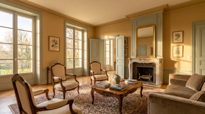
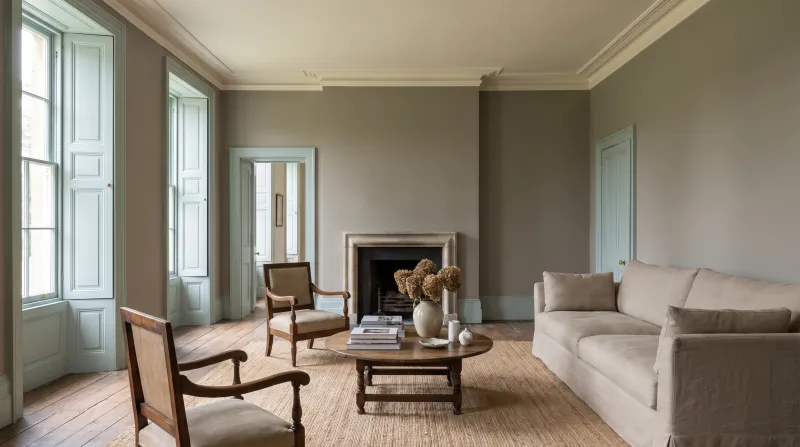
The peach off-white

Onslow™ No.48

  • Orange
  • Pale tone
  • West light
  • LRV ≈ 73%

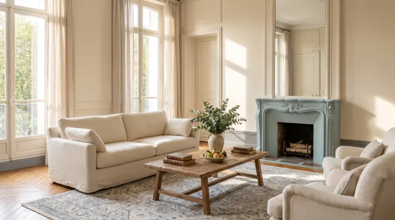
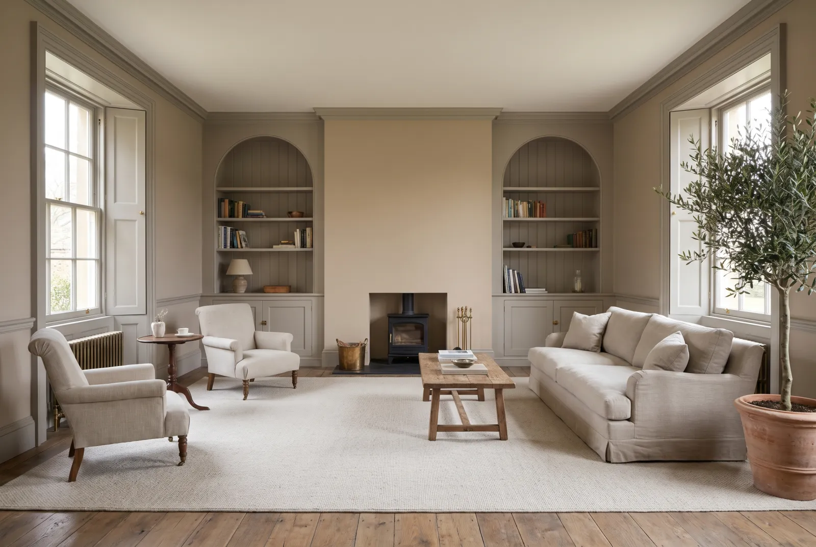
A warm off-white with a peach undertone, classed for west light precisely because it loves it: in the morning it is a soft, calm white; at night it takes on the colour of the inside of a shell. It is the white of a west-facing living room you want bright but never cold — and the ceiling for every colour that follows.

Our tip — Onslow on walls and ceiling, woodwork in Pure White: the brightest living room at 6 pm.

View the colour → Already in your basket (limit 1 per order)
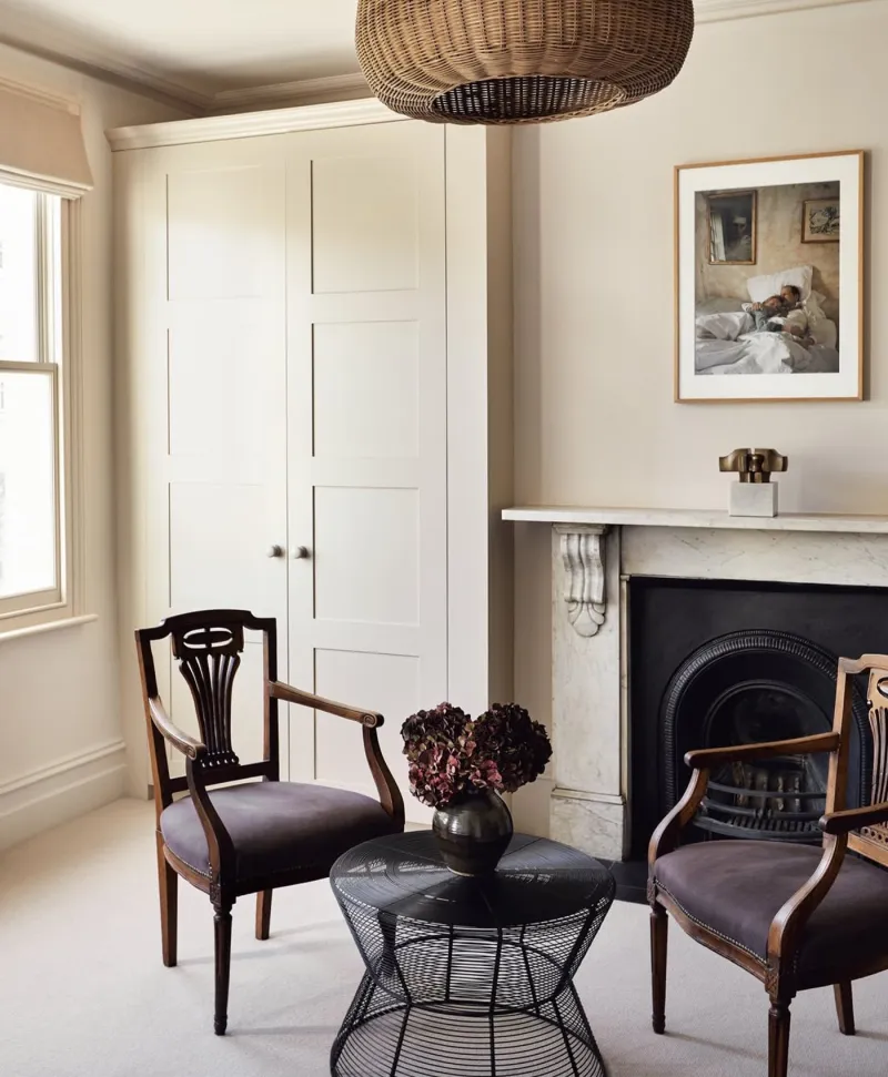
Warm off-white living room with two chairs, a small table, and a fireplace.
02

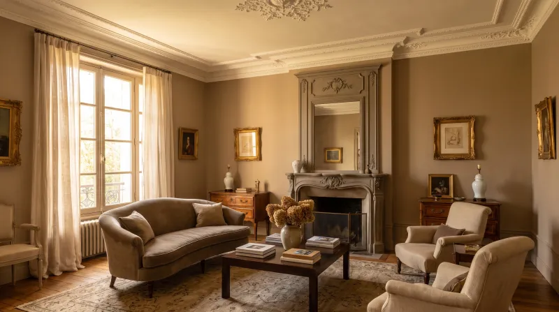
The light pinkish beige

Clerkenwell™ No.21

  • Orange
  • Pale tone
  • West light
  • LRV ≈ 68%

A light pinkish beige, the colour of old plaster, a notch deeper than Onslow. It was made for west light: its touch of pink, invisible in the morning, lights up in the afternoon and gives the walls the warmth of a candlelit room before a single candle is lit. A neutral that looks like a colour at night.

Our tip — With ecru linen curtains and dark wood: the living room of a Haussmann flat.

View the colour → Already in your basket (limit 1 per order)
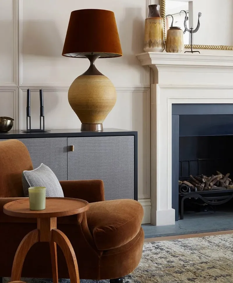
Cosy neutral living room with brown armchair, lamp, and fireplace.
03

The greige that shifts with the sun

Hoxton Grey™ No.72

  • Neutral
  • Pale tone
  • West light
  • LRV ≈ 58%

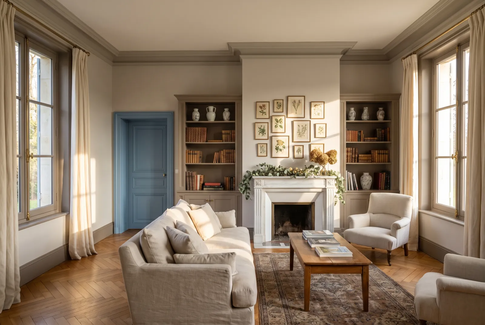
A light-mid greige with an earthy undertone, grey in the morning and beige at night — the ideal colour for a room that lives in two acts. In the morning its grey share keeps it calm and crisp; in the afternoon its beige share catches fire with the sun. It is the living-room neutral we recommend most often for west light, and it goes with everything that can be put in a living room.

Our tip — Hoxton Grey everywhere, ceiling included: the room becomes a golden cocoon at dusk.

View the colour → Already in your basket (limit 1 per order)
Wharf Sacking — Livingroom
04

The sackcloth

Wharf Sacking™ . No.127

  • Orange
  • Pale tone
  • West light
  • LRV ≈ 54%

A mid golden beige, the colour of a jute sack in sunshine — warmer and deeper than the previous neutrals, without being a yellow. It was classed for west light because the golden evening light is its light: it turns almost amber then, and the living room takes on the air of a holiday-house room. In the morning it stays a calm, slightly rustic beige.

Our tip — With rattan, white linen and greens: the summer living room all year round.

View the colour → Already in your basket (limit 1 per order)
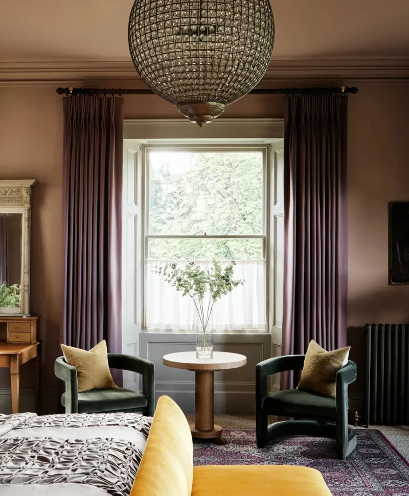
Plaster pink living room with purple curtains, a chandelier, and a round table.
05

The deep pinkish taupe

Egerton Place™ No.297

  • Neutral
  • Mid tone
  • West light
  • LRV ≈ 34%

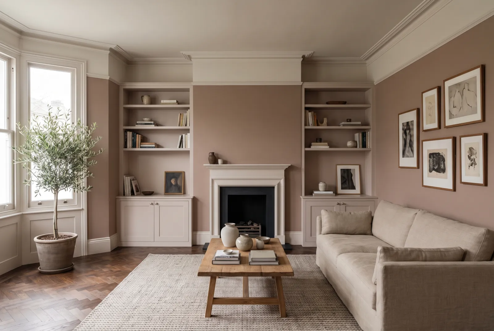
A warm, pinkish mid taupe, the colour of faded terracotta — our west-facing colour par excellence. The setting sun does to it what it does to an old brick façade: it lights it from within. In the morning it is a deep, quiet neutral; at 7 pm it is pink-brown and sumptuous. With velvet, brass and dark woods it is a winter living room.

Our tip — Woodwork in Onslow, a peach white, rather than pure white: the pairing stays warm.

View the colour → Already in your basket (limit 1 per order)
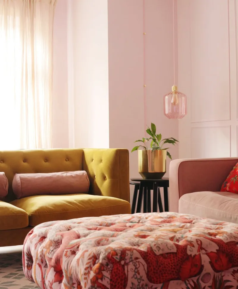
Living room with a yellow sofa, pink and orange patterned ottoman, and blush pink walls.
06

The peach pink

Peach Flesh Pink™ No.268

  • Orange
  • Pale tone
  • West light
  • LRV ≈ 47%

A soft, earthy mid peach pink with nothing sugary — the colour of a ripe apricot in shade. It is the colour that goes furthest with the setting sun: at 6 pm the walls seem lit from within, and everyone looks well. In the morning it is a muted, calm pink. A choice for a living room where guests come in the evening.

Our tip — With deep greens — a sofa, a door in Pleasure Gardens Green — the pink stays grown-up.

View the colour → Already in your basket (limit 1 per order)
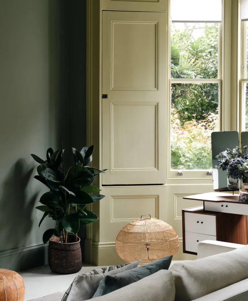
olive green Living room with a sofa, lamp, and large window
07

The olive grey-green

Serpentine™ No.192

  • Grey
  • Mid tone
  • West light
  • LRV ≈ 31%

A mid grey tinted with olive, the colour of the Serpentine in autumn — classed for west light, which is rare for a green. It is the counterpoint a west-facing living room sometimes needs: when the setting sun turns everything orange, a greyed green keeps the room fresh and serious. In the morning it is a warm grey; at night a golden olive. Superb with leather and oak.

Our tip — Serpentine on the walls, Sorrel Green on a bookcase: the library living room.

View the colour → Already in your basket (limit 1 per order)
Amber Grey — Livingroom
08

The amber grey

Amber Grey™ No.156

  • Grey
  • Mid tone
  • West light
  • LRV ≈ 26%

A warm, brown, golden mid grey, the colour of a piece of cloudy amber. It is greyer than Wharf Sacking, warmer than Serpentine, and it does exactly what its name promises in a west-facing living room: grey in the morning, amber at night. It is a deep neutral for a living room you want enveloping without closing it in, and it hides the marks of life admirably.

Our tip — Ceiling in Onslow, woodwork in satin Amber Grey: the end-of-day cocoon living room.

London Brick — Livingroom
09

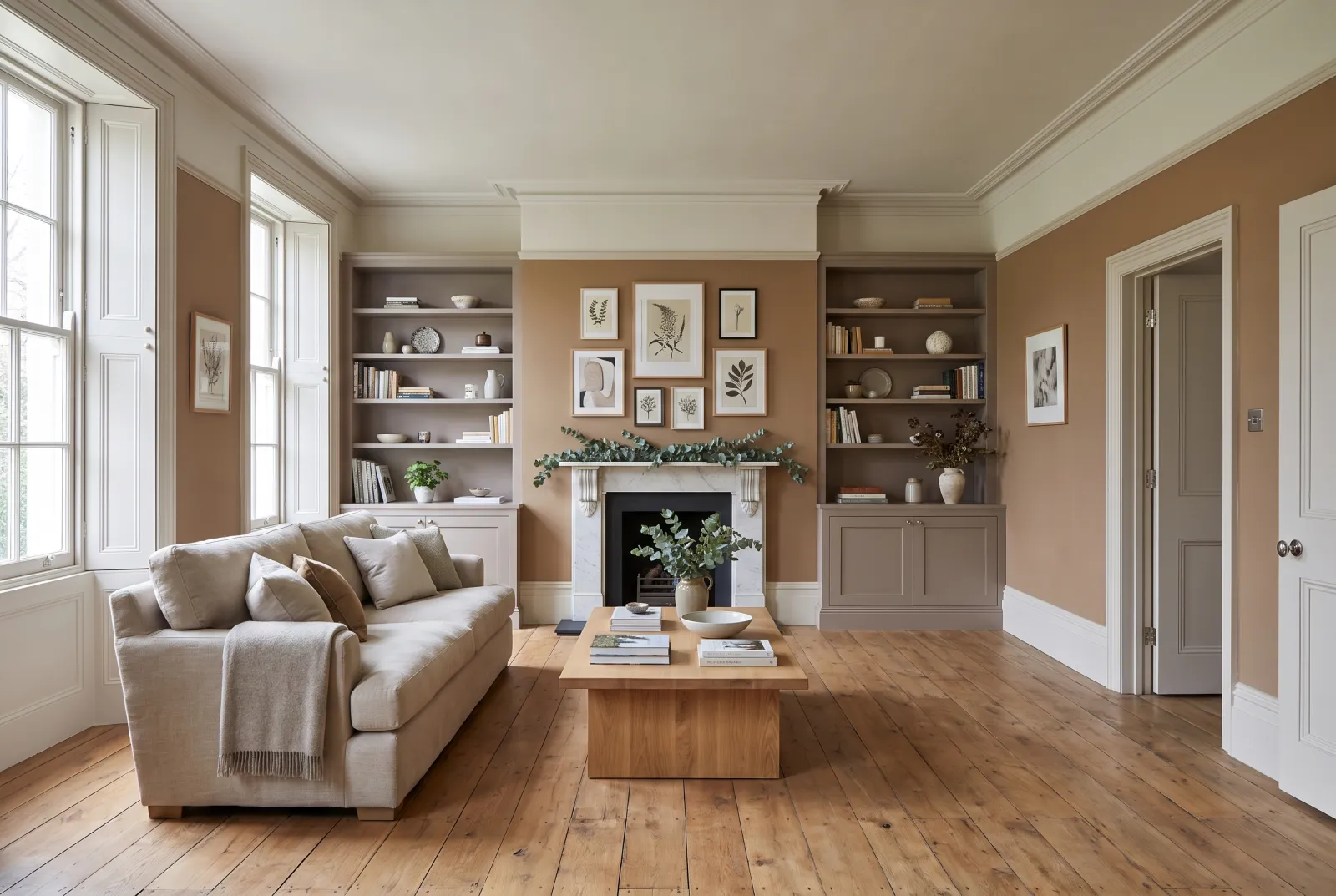
The London brick

London Brick BH.07

  • Neutral
  • Mid tone
  • West light
  • LRV ≈ 30%

A warm, golden mid brown-beige, the colour of a weathered London brick — designed by Beata Heuman. It is the most "earth" in this guide, and the setting sun does to it what it does to the city's façades: it gilds them. A living room in London Brick is warm at every hour, and it makes an extraordinary ground for pictures and coloured fabrics.

Our tip — With Chalk on the ceiling and Bone on the woodwork: the full Beata Heuman palette.

View the colour → Already in your basket (limit 1 per order)
Huguenot — living room
10

The evening claret

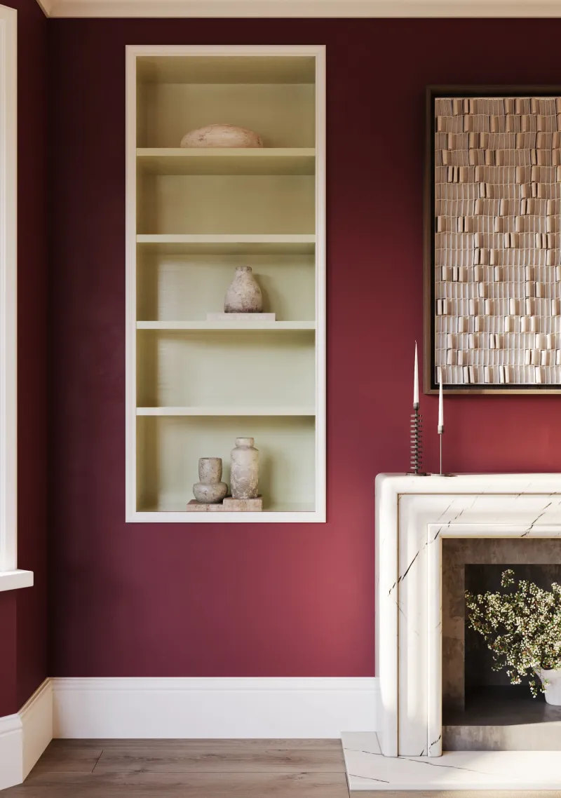
Huguenot™ No.49

  • Red
  • Dark tone
  • West light
  • LRV ≈ 7%

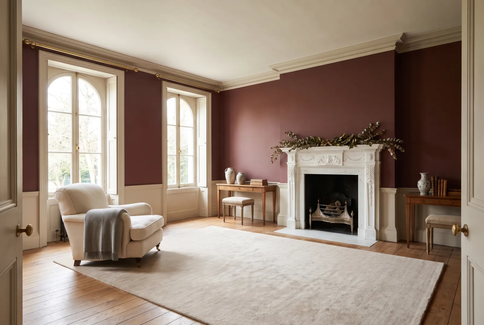
A deep brown claret, the red of the Huguenot houses of Spitalfields. In a west-facing living room it is the colour of the big evening: the setting sun lights it like a wine held before a candle, and the room becomes the warmest in the house. In the morning it is a calm, deep red-brown. For a living room lived in mostly after 5 pm.

Our tip — Ceiling and woodwork in Holbein Chamber, never a cool white that would turn it purple.

View the colour → Already in your basket (limit 1 per order)

These colours in real rooms

Our schemes in which one of this guide's shades plays the lead — or a supporting role.

All schemes · Living room →
London Brick BH.07 Limestone™ No.55 Birdcage Walk™ No.117
Clerkenwell™ No.21 Frieze™ No.84 Hoxton Grey™ No.72
Huguenot™ No.49 Limestone™ No.55
Egerton Place™ No.297 Limestone™ No.55 Pediment™ No.73
Amber Grey™ No.156 Frieze™ No.84 Westmoreland™ No.160 Wedgwood FTT-016
Onslow™ No.48 Holbein Chamber™ No.7 Silver Bit™ No.77

Understanding west light

A west-facing room gets no direct sun before early afternoon. In the morning its light is indirect, soft and slightly cool — close to that of a north-facing room. Then the sun swings round, comes through the window lower and lower, and its colour passes from white to golden, then to orange at sunset. A wall colour is therefore seen under two opposite lights in the same day, and that is what must be tested: a sample pot looked at at 10 am and at 6 pm.

The colours that love both

The warm neutrals — Onslow No.48, Clerkenwell No.21, Hoxton Grey No.72 — are the safest: calm in the morning, golden at night, never too much. The earths and taupes — Egerton Place No.297, Amber Grey No.156, London Brick BH.07 — go further into evening warmth without shouting, because they hold grey. The muted pinks and reds — Peach Flesh Pink No.268, Huguenot No.49 — amplify the sunset: a choice for those who live in their living room at night.

The colours to handle with care

Proper yellows turn orange under the setting sun: prefer a golden beige such as Wharf Sacking No.127. Pale blues and cool greys are handsome in the morning and dull at night, when the golden light muddies them; if you want fresh, take a greyed green such as Serpentine No.192, which holds both. We detail all this in how light affects colour.

For the other aspects, see our colours for a north-facing living room and our colours for a south-facing living room; for neutrals in detail, our neutrals for a living room; for all our ideas, the living room.


Frequently asked questions

Which colour for a west-facing living room?
A warm neutral or an earth — Onslow, Clerkenwell, Hoxton Grey, Egerton Place, Amber Grey — that stays calm in the morning and catches fire with the setting sun. To amplify the evening, a muted pink or red (Peach Flesh Pink, Huguenot); to temper it, a greyed green (Serpentine).
Which colours to avoid in a west-facing living room?
Proper yellows, which turn orange at sunset, and pale blues or cool greys, dulled by the golden evening light. Prefer a golden beige (Wharf Sacking) or a greyed green (Serpentine).
Is a west-facing living room dark in the morning?
It is in shadow in the morning, with indirect, slightly cool light, close to a north-facing room. That is why a warm colour is preferable there: it compensates in the morning and glows at night.
How do you test a colour in a west-facing living room?
Paint a sample pot onto paper, put it on the wall facing the window and look at it at 10 am and 6 pm. The right colour is handsome at both.

Guides to read next

All colour guides →

Want to see these colours at home?

Order a sample to judge the shade in your own light, or browse every paint for the room.

Sign up to our newsletter

Sign up to our newsletter

Thanks for signing up to our newsletter!