Colour guides

Colour drenching: 8 Mylands colours to paint everything

Colour drenching means painting a whole room in a single shade: walls, ceiling, skirtings, doors, windows, radiators, sometimes the furniture. No more white line at the ceiling, no more white rectangle around the doors: the colour becomes the space, and the room looks bigger, taller and calmer.

Not every colour lends itself to it. Here are the eight we recommend most often, and why.

Updated September 2026 · by the Mylands France colour team

Colour drenching: 8 Mylands colours to paint everything

The short answer

The best colours for colour drenching are those with enough grey or depth to stay calm on every surface: the warm neutrals Frieze No.84 and Hoxton Grey No.72 for a daytime room, the enveloping darks Oratory No.237, Rose Taupe No.292 and Observatory No.34 for a bedroom or an evening sitting room, the greens Sorrel Green No.207 and Pleasure Gardens Green No.214 for a kitchen or a study, the claret Huguenot No.49 for a dining room. All in Multi-Surface Dead Matt, the finish made for it.

At a glance

Our selection

8 colours

Frieze — Bathroom
01

The colour drench nobody notices

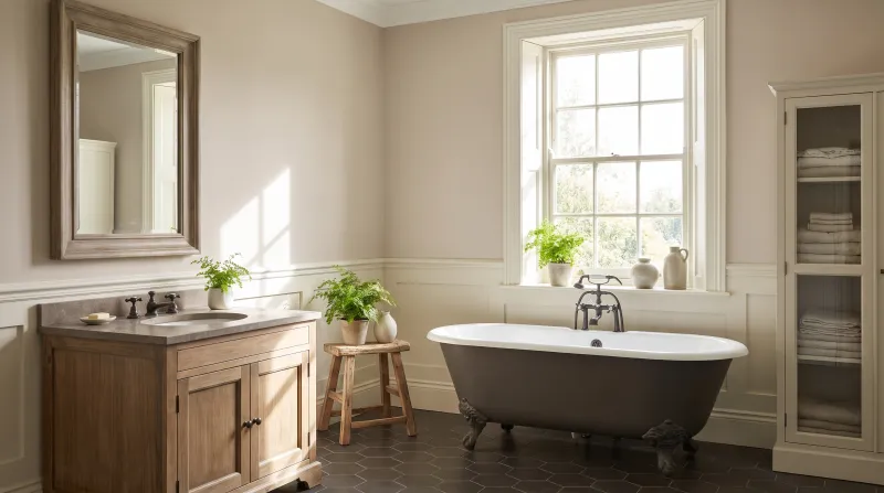
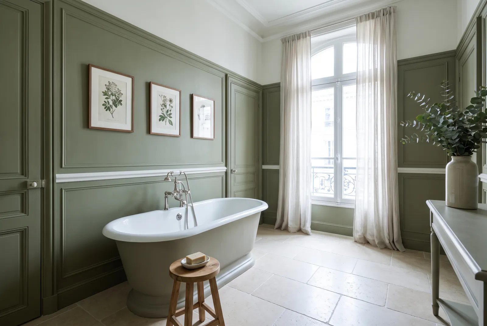
Frieze™ No.84

  • Grey
  • Pale tone
  • South light
  • LRV ≈ 65%

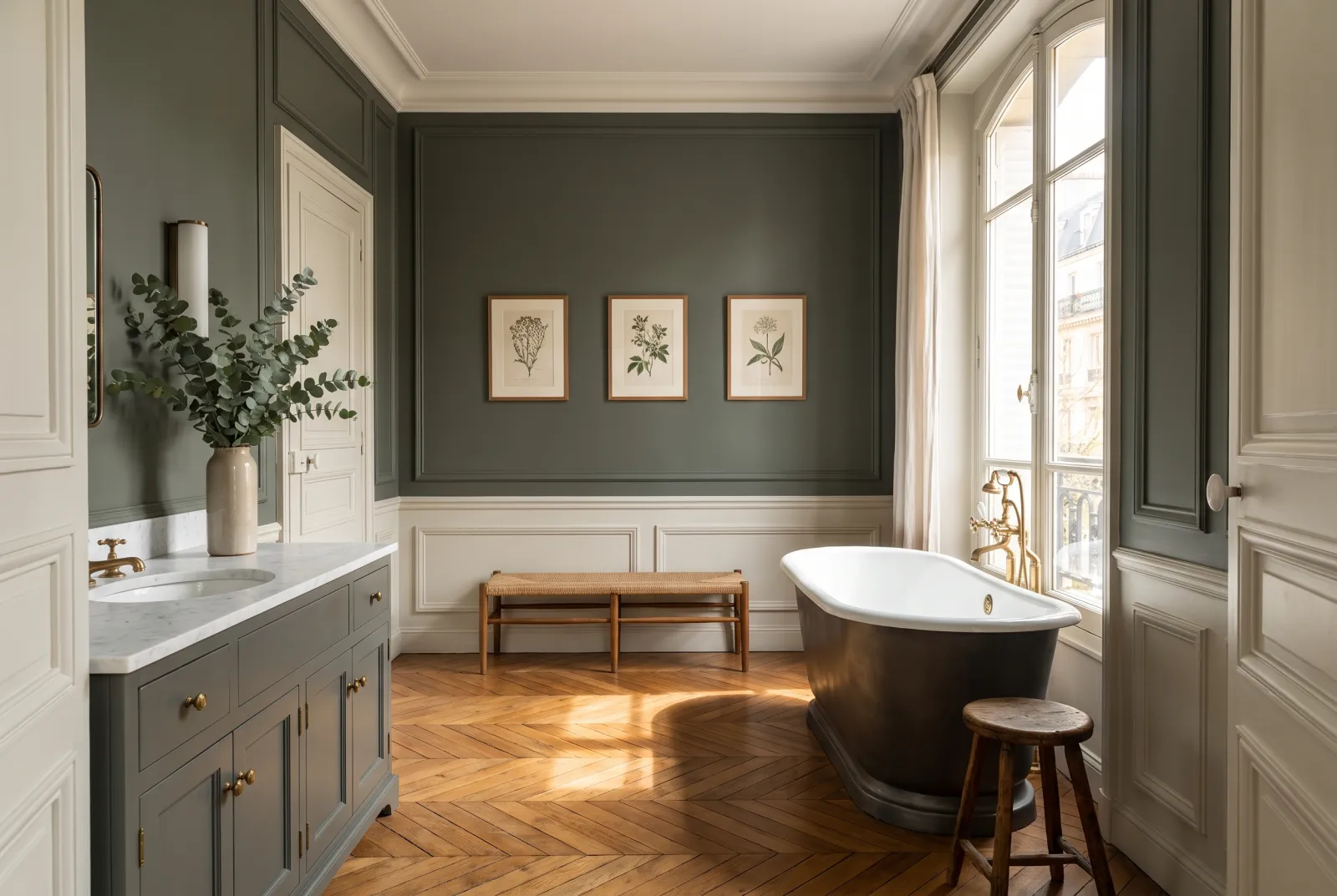
A warm stone grey so soft that a room painted entirely in Frieze doesn't look "coloured" — it simply looks finished, wrapped, like the inside of an old house with plaster walls. It is the colour drench for the hesitant: ceiling, walls and woodwork in the same shade, and the room gains height and calm without anyone knowing why.

Our tip — For a hallway, a staircase or a daytime sitting room. Add a door in Downing Street if you want a contrast.

View the colour → Already in your basket (limit 1 per order)
Huguenot — study
02

The velvety greige, for a sitting room

Hoxton Grey™ No.72

  • Neutral
  • Pale tone
  • West light
  • LRV ≈ 58%

A notch warmer and deeper than Frieze: a greige with an earthy undertone that, on every surface, gives a sitting room the softness of a linen interior. It shifts with the light — beige in sun, grey at night — which keeps a monochrome room alive. Radiators and skirtings disappear; pictures and fabrics come forward.

Our tip — For a sitting room, a bedroom or a dining room open to the kitchen.

View the colour → Already in your basket (limit 1 per order)
Modern bedroom with green walls, a bed with white pillows, and a black pendant light.
03

The slate, for a hallway or a study

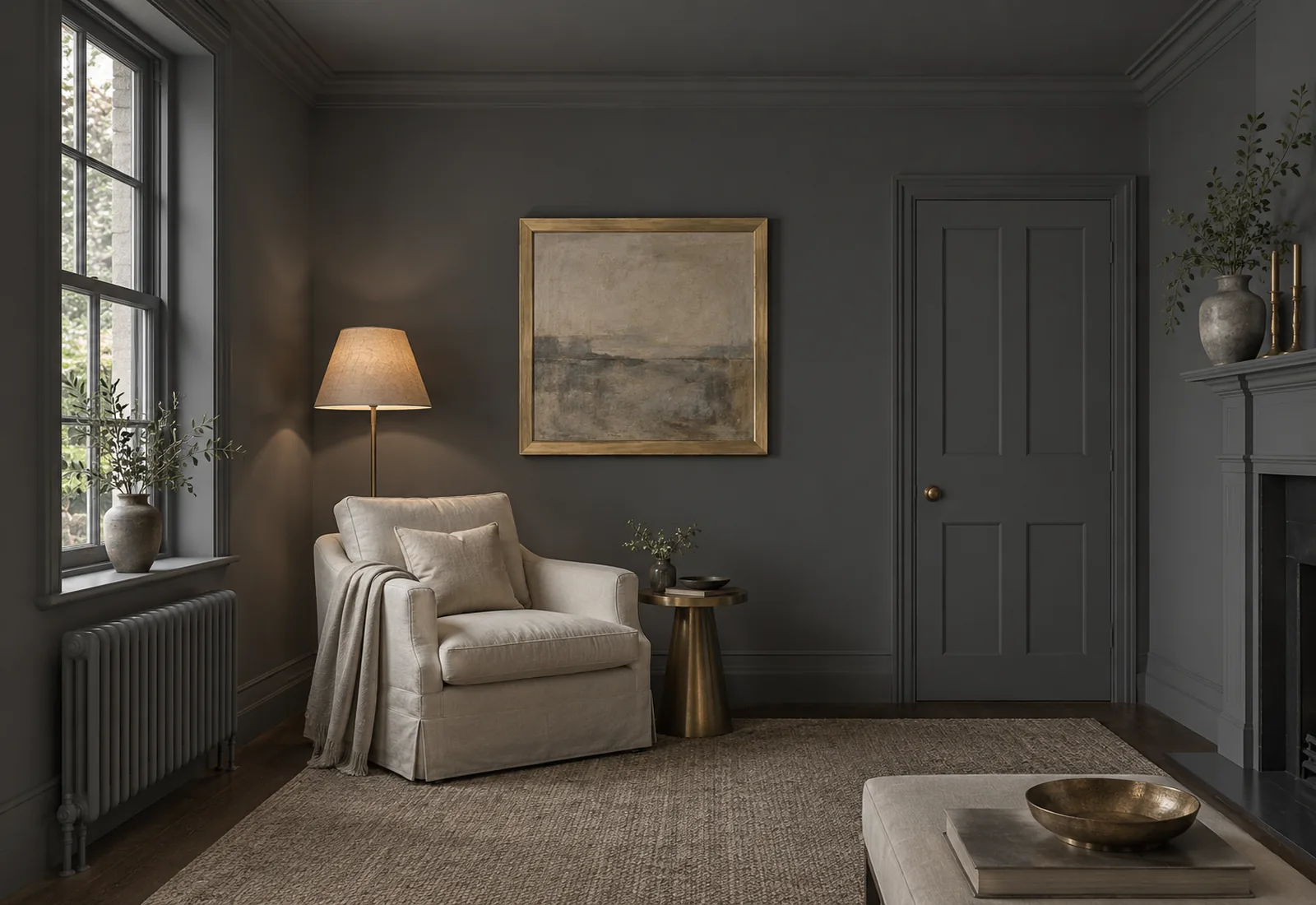
Oratory™ No.237

  • Grey
  • Dark tone
  • North light
  • LRV ≈ 14%

A deep bluish slate grey with the calm of a stormy sky. Colour-drenched, it turns a hallway, a study or a cloakroom into a dark, elegant box from which every open door looks bright. Dead matt suits it particularly: without reflection, the slate becomes a material rather than a paint.

Our tip — For hallways, staircases, studies and cloakrooms. Brass and pale wood to warm it.

View the colour → Already in your basket (limit 1 per order)
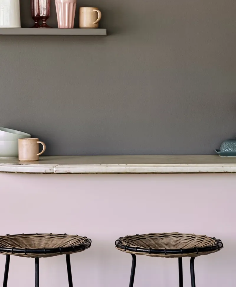
Two wicker stools in front of a kitchen counter with a grey wall and shelf in the background.
04

The deep warm grey, for a bedroom

Rose Taupe™ No.292

  • Grey
  • Dark tone
  • North light
  • LRV ≈ 11%

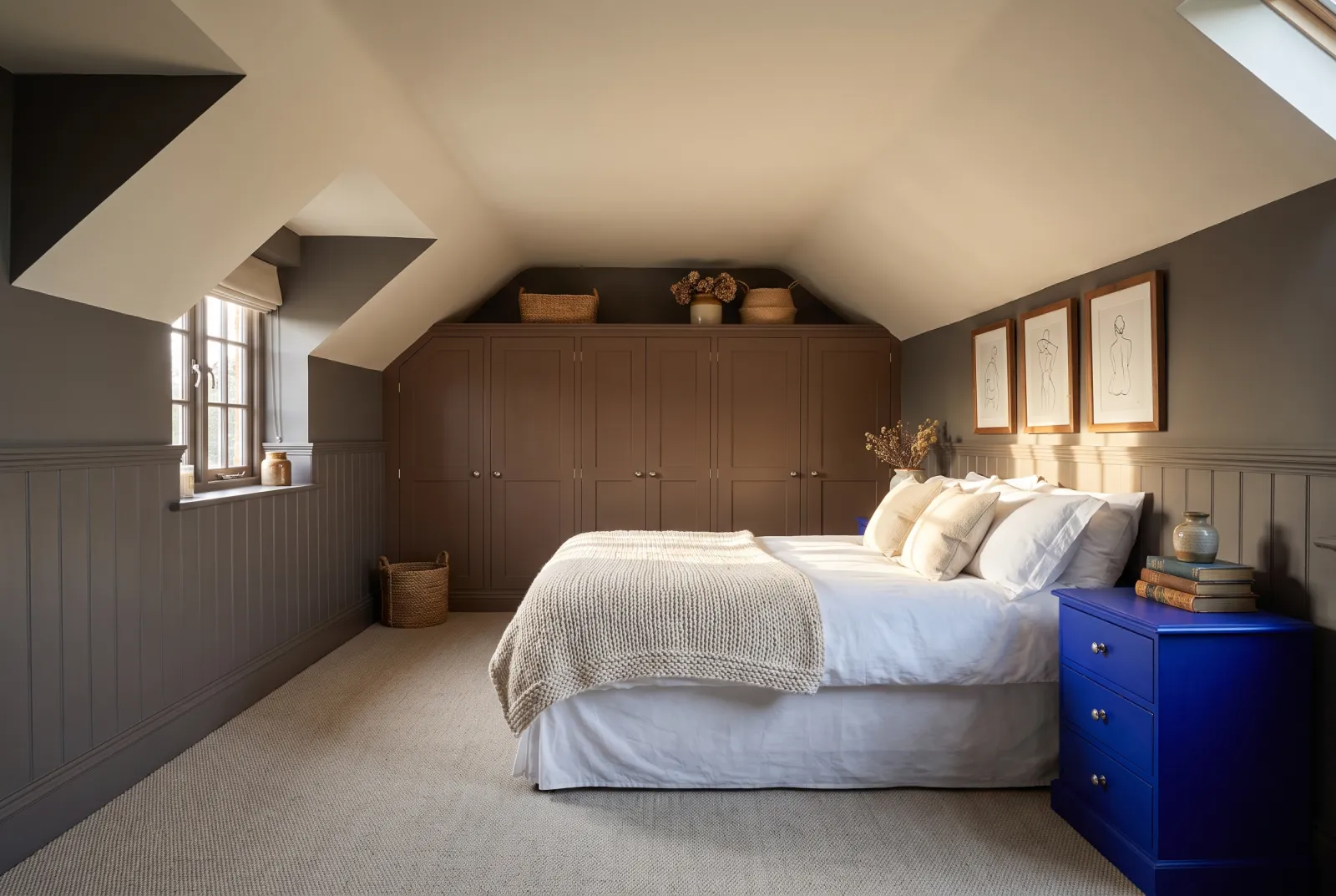
A dark grey veined with pink and brown, the colour of a wet pebble. It is the colour-drench bedroom colour we recommend most: on walls, ceiling and woodwork it makes a cocoon of a room where you sleep better, dark without being black, warm without being brown. With white sheets and pale wood it is sumptuous.

Our tip — For bedrooms, and sitting rooms used only at night.

View the colour → Already in your basket (limit 1 per order)
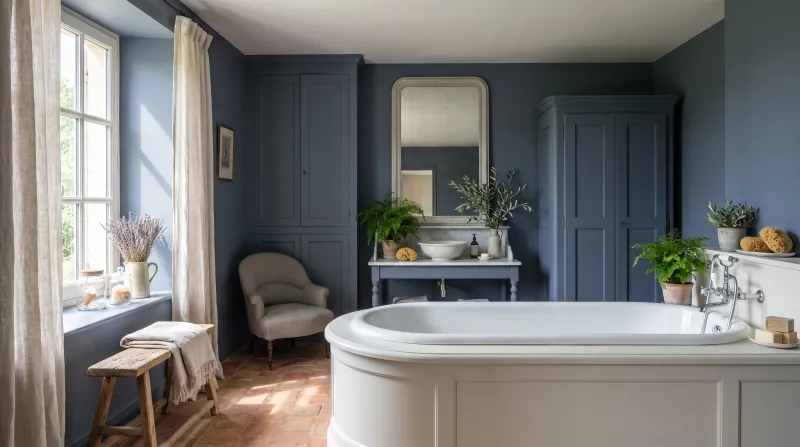
Observatory — Bathroom
05

The night blue, for a dining room

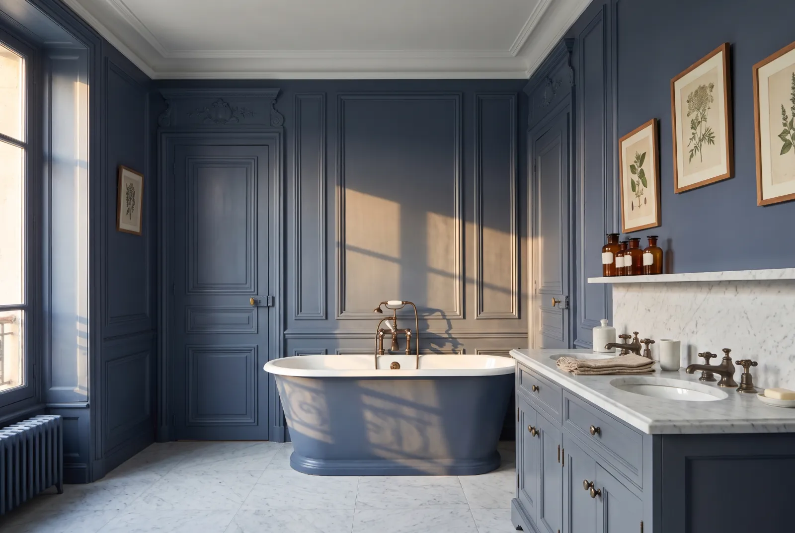
Observatory™ No.34

  • Blue
  • Dark tone
  • South light
  • LRV ≈ 11%

A deep, greyed blue that, on every surface of a dining room, does what a night sky does above a table outdoors: it recedes and lets the table become the only light. The Observatory ceiling is the decisive move — it is what turns a blue room into a night room. With brass, candles and gilt frames.

Our tip — For dining rooms, libraries and bedrooms you want deep.

View the colour → Already in your basket (limit 1 per order)
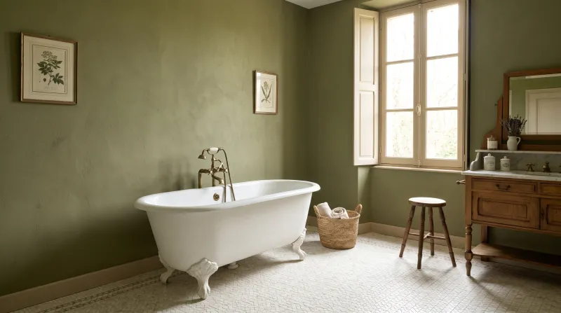
Sorrel Green — Bathroom
06

The olive green, for a kitchen

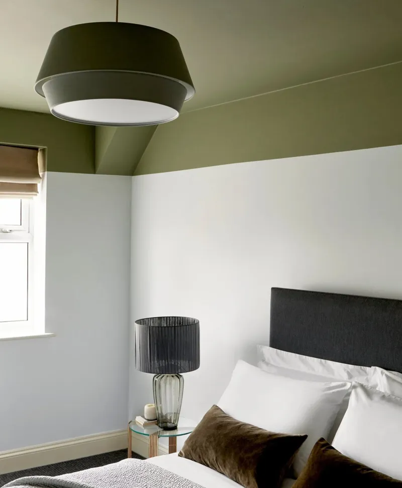
Sorrel Green™ No.207

  • Green
  • Dark tone
  • East light
  • LRV ≈ 15%

A muted, earthy mid olive green, the green of our most photographed kitchens. Colour-drenched — walls, ceiling, cabinet doors, skirtings, window — it turns a kitchen into a country-house room where wood, brass and white crockery take all the shine. It is light enough for a daytime room, deep enough to envelop.

Our tip — For kitchens, studies and guest bedrooms. Doors in eggshell, walls in dead matt.

View the colour → Already in your basket (limit 1 per order)
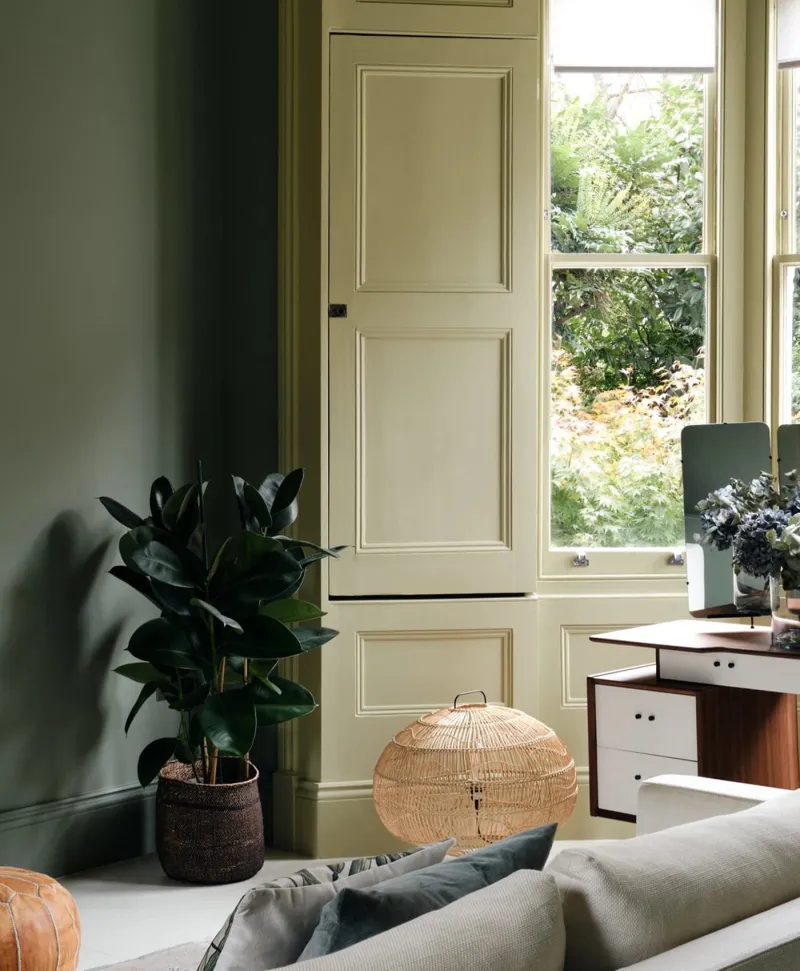
olive green Living room with a sofa, lamp, and large window
07

The bottle green, for a study

Pleasure Gardens Green™ No.214

  • Green
  • Dark tone
  • East light
  • LRV ≈ 8%

A very dark green, almost black in shadow, which colour-drenched turns a study or a small sitting room into a club room: walls, ceiling, bookcases and doors in the same green, and the books, frames and lamp become the only colours. It is the most spectacular colour drench, and curiously one of the easiest to live with — dark green is restful.

Our tip — For studies, libraries, cloakrooms and small sitting rooms. Painted bookcases included.

View the colour → Already in your basket (limit 1 per order)
Huguenot — kitchen
08

The claret, for an evening dining room

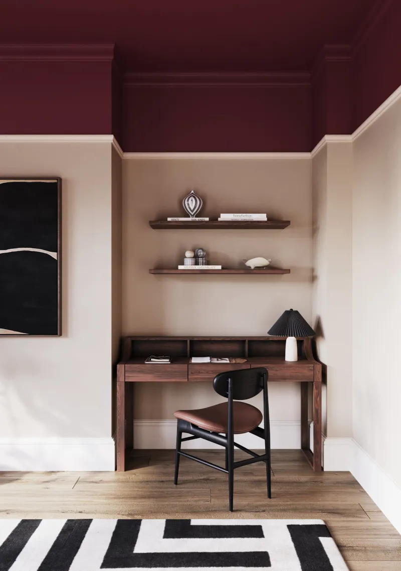
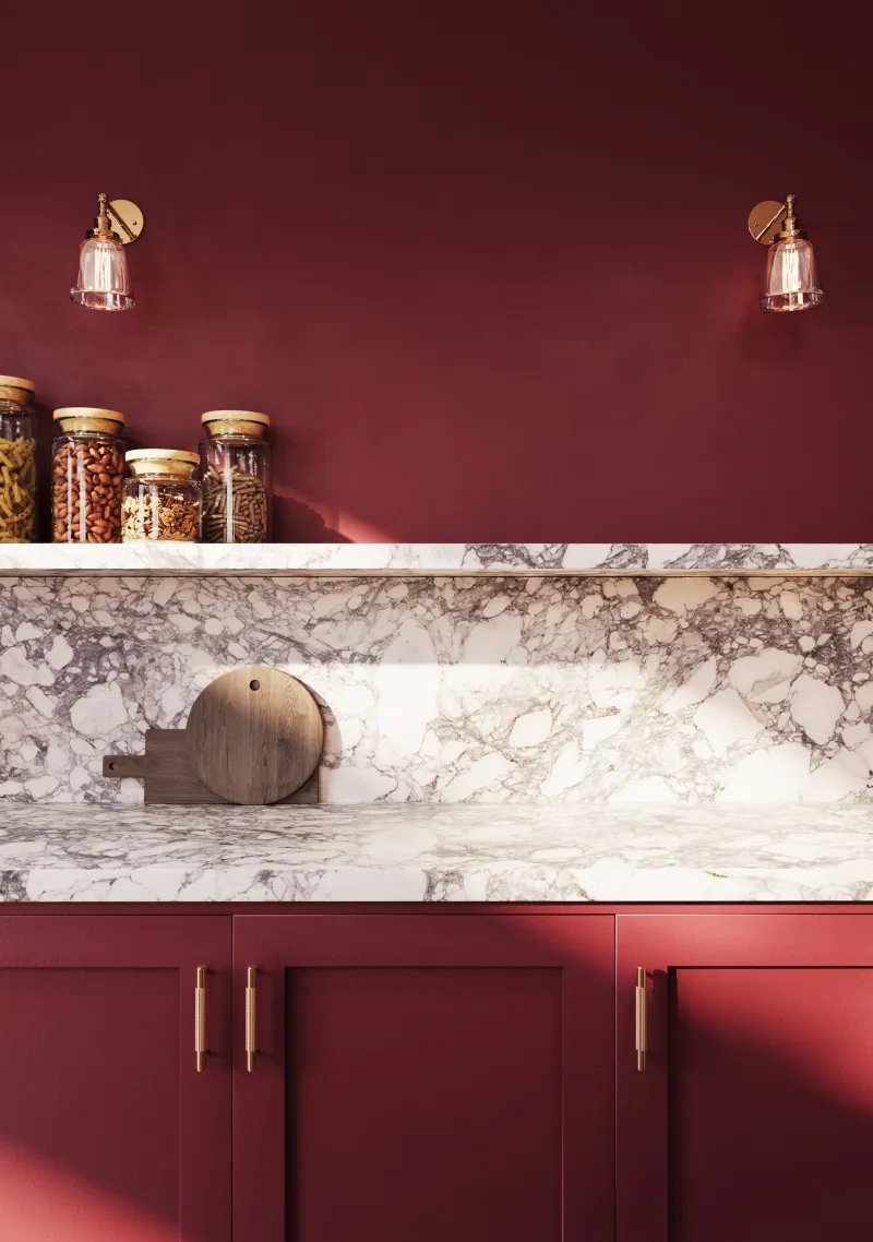
Huguenot™ No.49

  • Red
  • Dark tone
  • West light
  • LRV ≈ 7%

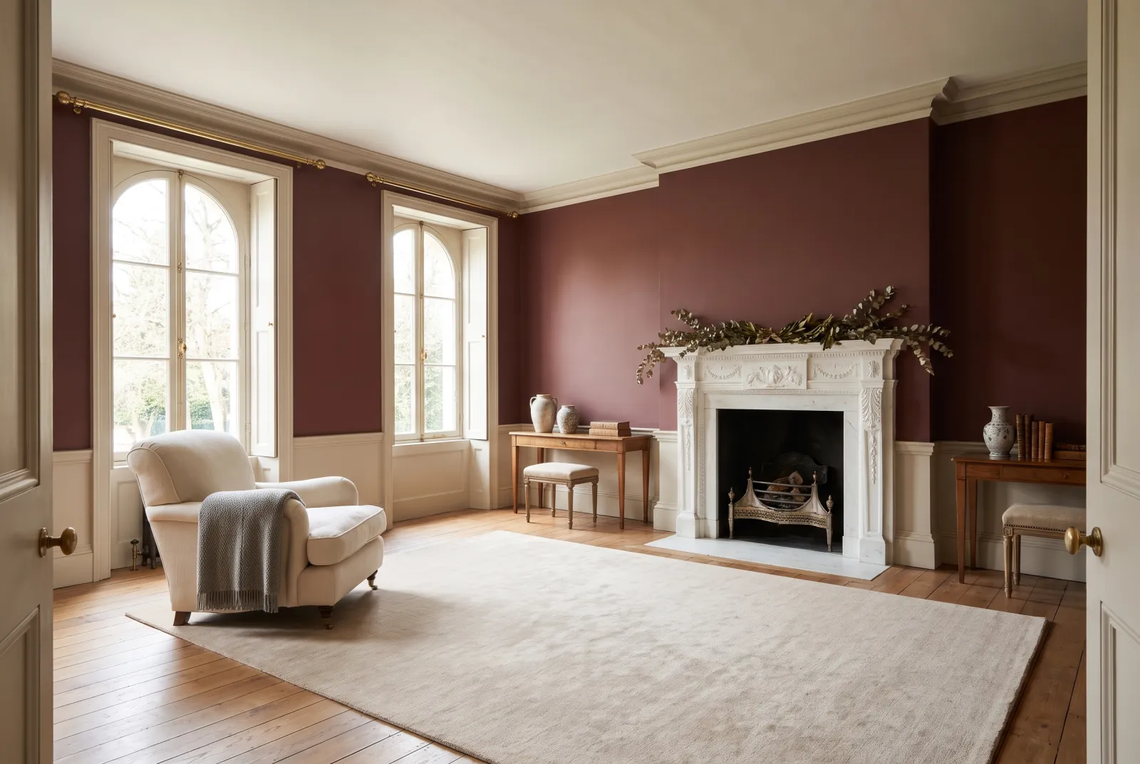
A deep brown claret that, on every surface, makes the warmest dining room there is — the colour of a glass of wine seen by candlelight. Red as a colour drench is intimidating; Huguenot, though, is dark and brown enough to envelop without assaulting, and it makes faces and food more beautiful. A Huguenot ceiling is a memory for every guest.

Our tip — For dining rooms, libraries and guest cloakrooms.

View the colour → Already in your basket (limit 1 per order)

These colours in real rooms

Our schemes in which one of this guide's shades plays the lead — or a supporting role.

Sorrel Green™ No.207 St Clement™ No.11
Observatory™ No.34 Greenwich Time™ No.8 Mayfair Dark™ No.218
Oratory™ No.237 Saint Johns™ No.64 Haymarket™ No.47
Pleasure Gardens Green™ No.214 St Clement™ No.11 Mad About The Bathroom
Rose Taupe™ No.292 Limestone™ No.55 Cigar BH.20 Ultramarine Blue FTT-018
Huguenot™ No.49 Limestone™ No.55

Getting a colour drench right

Colour drenching rests on three decisions. The colour: a shade with enough grey or depth to stay calm when multiplied over six surfaces — a bright yellow or a sky blue soon tire, a greige, an olive green or a night blue do not. The finish: the same on every surface, otherwise the doors shine more than the walls and the charm is gone; that is exactly what Multi-Surface Dead Matt was designed for — a 5% matt that goes on walls, ceiling, wood, metal and radiators. Discipline: everything, really everything — cornice, ceiling rose, radiator, inside of the door, curtain pole if it is painted. One forgotten white surface and the eye snags on it.

Light or dark?

A light colour drench — Frieze No.84, Hoxton Grey No.72 — enlarges and calms a daytime room. A dark one — Oratory No.237, Rose Taupe No.292, Observatory No.34, Pleasure Gardens Green No.214, Huguenot No.49 — envelops an evening room or a small room you commit to: hallway, study, cloakroom, bedroom. In between, Sorrel Green No.207 does both.

And the furniture?

Fitted furniture — bookcases, cupboards, kitchen doors — is painted in the shade, in dead matt or in eggshell if it is hard-worked. Loose furniture stays free: a pale armchair, a wooden table, a rug are what stop the room becoming a set.

To go further: our page on colour drenching, which finish for a hallway? and our colours for a staircase.


Frequently asked questions

What is colour drenching?
Painting a whole room — walls, ceiling, skirtings, doors, windows, radiators — in a single shade and a single finish. Without a white line or a white rectangle, the colour becomes the space, and the room looks bigger, taller and calmer.
Which finish for colour drenching?
Mylands Multi-Surface Dead Matt: a washable 5% matt that goes on walls, ceiling, wood, metal and radiators with the same look throughout. It is the finish designed for it.
Which colours suit colour drenching?
Those with enough grey or depth to stay calm on every surface: Frieze and Hoxton Grey for a light room; Oratory, Rose Taupe, Observatory, Pleasure Gardens Green and Huguenot for a dark one; Sorrel Green in between. Bright colours tire.
Does colour drenching make a room smaller?
No, the opposite: without the ceiling line and the door outlines, the eye no longer finds the room's limits, and it looks bigger. A dark colour envelops it; a light colour enlarges it.

Guides to read next

All colour guides →

Want to see these colours at home?

Order a sample to judge the shade in your own light, or browse every paint for the room.

Sign up to our newsletter

Sign up to our newsletter

Thanks for signing up to our newsletter!