


01
A dominant, a supporting role, an accent
About 60 % of the room in one shade (the walls), 30 % in a second (woodwork, a piece of furniture, a rug), 10 % in a third (an object, a door). Two colours in equal measure fight.
Menu
How To
Design Advice
Customer Service
My account
Help with paint Choosing colour
“Complementary” covers two different pairings: shades of one family, related by pigment, that agree without effort; or two colours opposite each other on the colour wheel — pink and green, blue and yellow, red and green — that bring each other to life. The first route gives calm rooms, the second lively ones. In both cases the rule is the same: a dominant, a supporting role, an accent — and never two colours in equal measure.
Page updated September 2026 · by the Mylands France colour team
Understanding
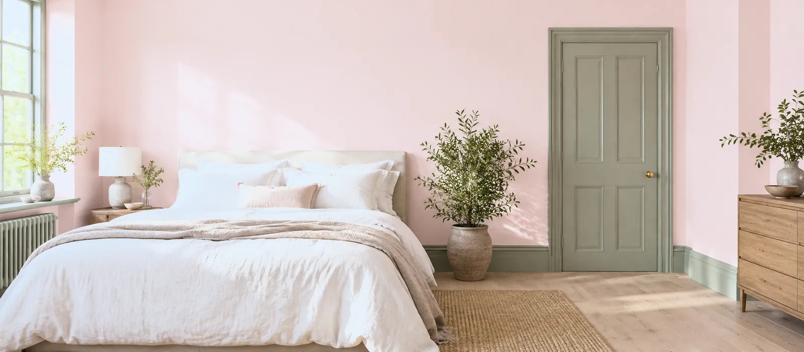
In decorating, colours that go together are called complementary — which covers two very different ideas. The first is kinship: shades that share a pigment, a warm white with an ochre, a grey-green with a deep green, a powder pink with a red-brown. They agree because they are made of the same thing; that is the route of monochromatic schemes and gradations. The second is opposition: on the colour wheel, red faces green, blue faces orange, yellow faces violet. Placed side by side, two opposites intensify each other — which is what makes a pink pinker beside a green.
Every Mylands colour page lists its companion whites, coordinating neutrals, related darks and accents: the pairing work is already done for both routes. This guide shows you how to read those pairings, and six palettes to begin with.
The rules
01
About 60 % of the room in one shade (the walls), 30 % in a second (woodwork, a piece of furniture, a rug), 10 % in a third (an object, a door). Two colours in equal measure fight.
02
A powder pink with a deep green, or a soft green with a brown-red: one of the two is always greyer or lighter than the other. Two vivid opposites on two walls is a flag.
03
A white ceiling and white woodwork are not neutral: their undertone (warm, grey, rosy, green) agrees or clashes with the rest. Choose the white last, in the dominant's family.
Six pairings
Three pairings by kinship, three by opposition. Each with its distribution: dominant, supporting role, accent.
01
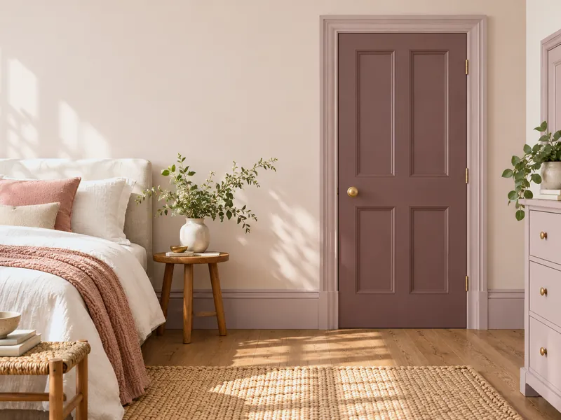
Three depths of one pink: the light on the walls, the mid on the woodwork, the deep on a door. The pairing cannot fail, and the room has depth without contrast.
02
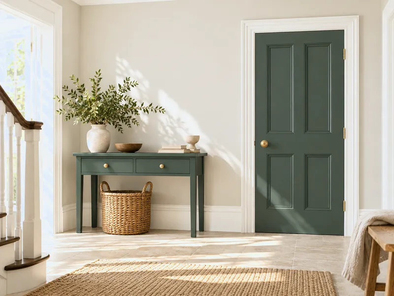
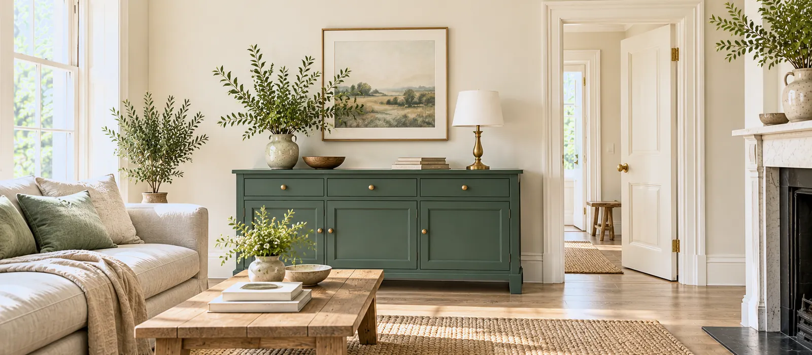
Stone walls, warm white woodwork — and a single piece of furniture, a single door in a deep green or a midnight blue. The neutral carries the accent; the accent wakes the neutral.
03
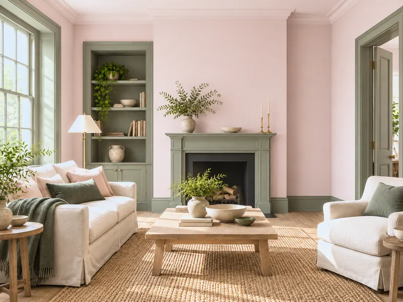
The contemporary pairing par excellence: a powder pink on the walls, a grey-green on the woodwork, a touch of deeper green. The green stops the pink being sugary; the pink stops the green being sad.
04
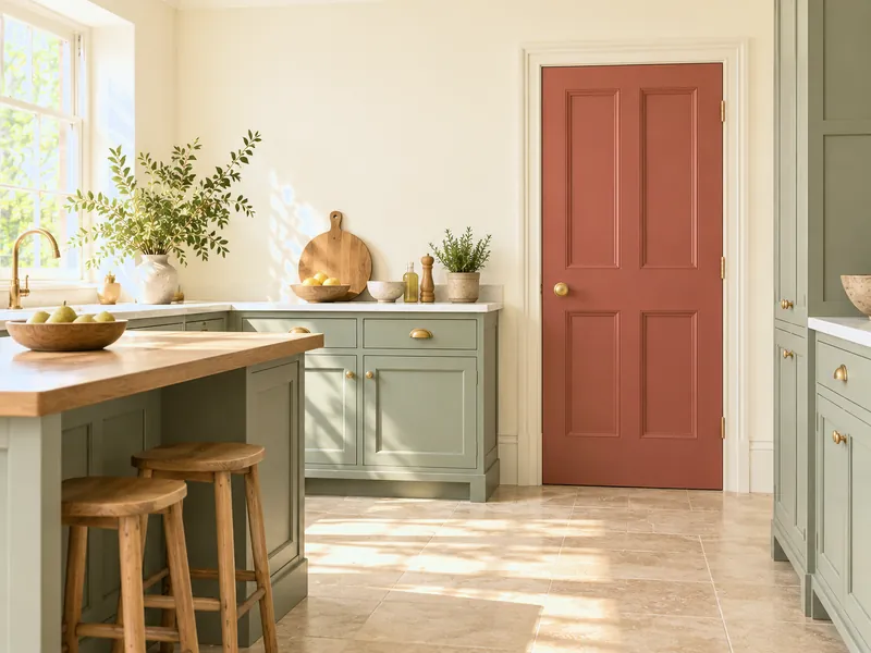
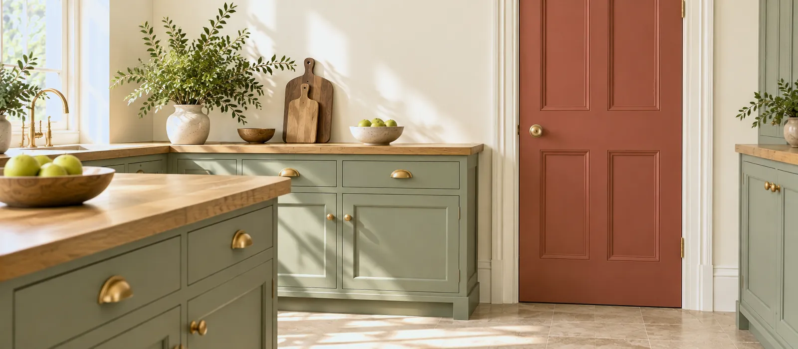
The classic contrast, muted for the home: an olive green on the kitchen cabinets, a brown-red on a larder door, warm white walls. Energetic, never Christmas, because both are desaturated.
05
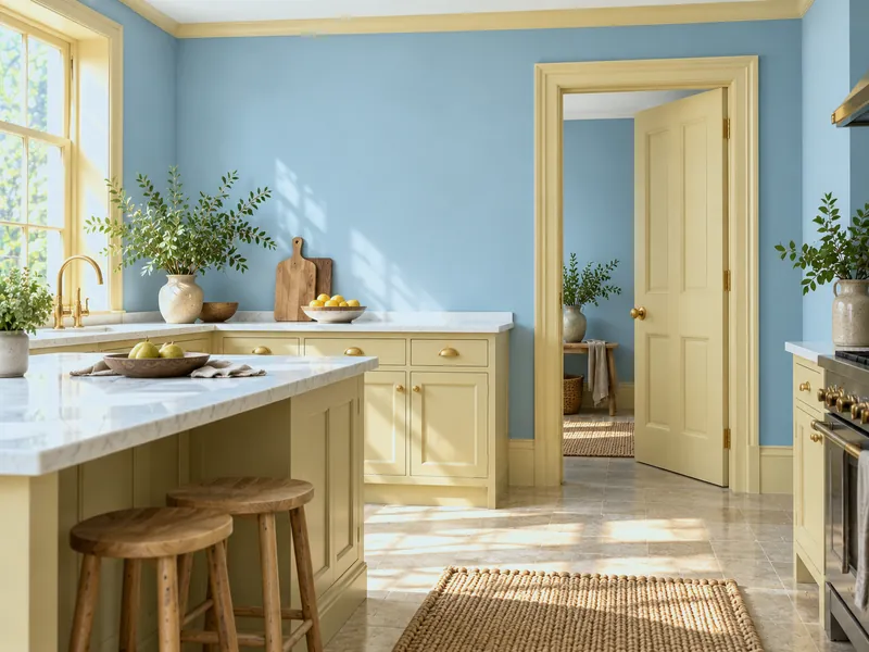
A mid blue on the walls, a honey yellow on the woodwork or a band below the ceiling: the vibration of opposites, held because the yellow is warm and the blue is greyed. A kitchen, a child's room, a dark corridor.
06
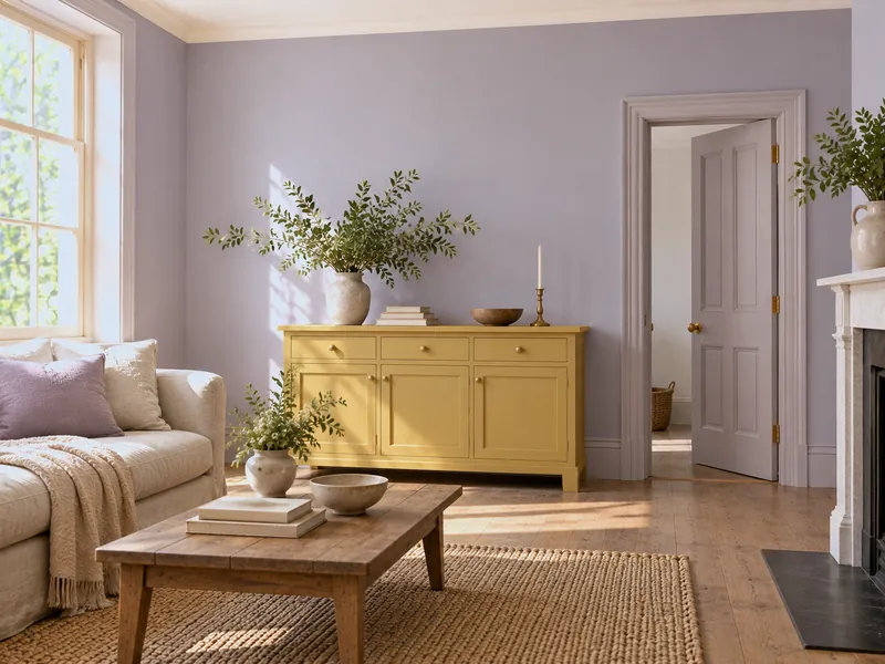
The pairing people forget: a greyed lilac on the walls, a soft ochre on a piece of furniture, a rosy white on the ceiling. Rare, grown-up, very gentle in north light.
Reading a colour page
| The line | What it is | Where to use it |
|---|---|---|
| Companion whites | The whites whose undertone agrees with the shade | Ceiling, woodwork, joinery |
| Coordinating neutrals | The stones, greiges and greys of the same family | The walls of neighbouring rooms, a corridor, a second room |
| Related darks | The same family, deeper | A door, a piece of furniture, a dado, the ceiling of a tall room |
| Accent | The opposite, muted or vivid | An object, a stool, the inside of a cupboard, a single door |
These pairings are composed by the manufactory's colour team; they take the pigment into account, not only the apparent shade. See also our neutral groups.
To avoid
Frequently asked questions
On the colour wheel, it is the colour opposite: red/green, blue/orange, yellow/violet. For the home, take it muted — a grey-green for a pink, an ochre for a lilac — and read the "accent" line on the Mylands colour page, where the work is done.
Three, plus white: a dominant, a supporting role, an accent. A whole house can carry five or six if they answer each other from room to room — see a colour palette for every season.
In a bedroom, a sitting room, a bathroom, yes. In a kitchen the green dominates more easily (cabinets) and the pink becomes the accent. The secret is never to give them equal measure.
Yes: the Colours of London, the Archive, the Beata Heuman and Jinny Blom collections and the FTT range are made with the same pigments. An FTT accent in a Colours of London palette is a house classic.
Two or three boards painted with sample pots, set side by side against the wall, in the intended proportions — a large one for the dominant, a small one for the accent — and looked at for two days. The method: How to test a paint colour at home.
See also
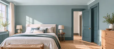 One colour, three depths: harmony guaranteed because the pigment is the same. Six Mylands families.
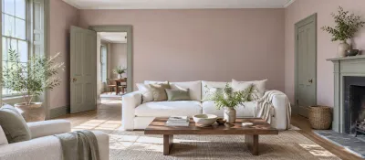 From powder to brown-pink, eight ways to wear pink without it being sugary — and the Mylands pinks for each.
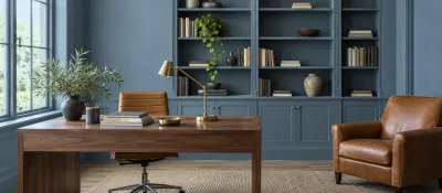 From the midnight blue that envelops to the sky blue that soothes: seven ways to wear blue, and the Mylands bl...
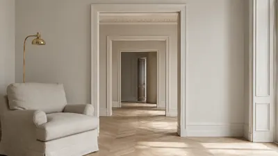 Our neutrals grouped by undertone to help you find the perfect match.
“One colour is a shade; two colours are already a conversation.”

Thanks for signing up to our newsletter!
Sign in to save items to your wishlist. Sign in to save your basket, so you can continue shopping later.
Don't have an account? Create one
Share this link and friends can buy items from your list. Anything bought disappears from it automatically. Anyone with this link can see your selection.
Moving in, redecorating, or dropping hints? A free account turns this selection into a gift list — add or remove colours whenever you like, and we'll email you when someone buys something from your shared list.
Free · Delivered to your door
Get a free colour card posted to you, showing our complete Colours of London range, with swatches made from the real paint for a true representation of our award-winning colours.

