


01
1. Deep pink, for impact
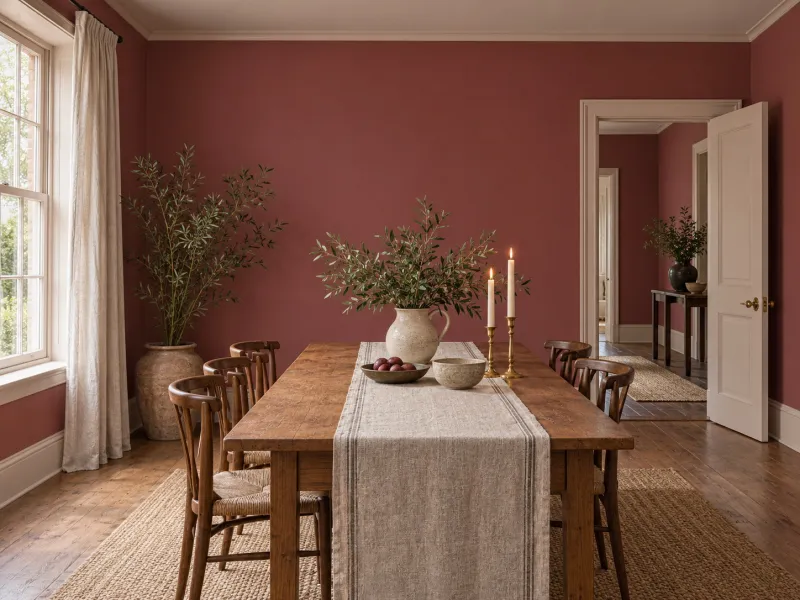
A pink pulled towards brown-red on all four walls of a dining room or a vestibule, woodwork in a lighter pink: the evening room, warm by candlelight, never sugary.
Menu
How To
Design Advice
Customer Service
My account
Help with paint Choosing colour
A pink is chosen by its undertone: muted with brown or grey, it is a warm neutral that replaces a beige in a sitting room; pushed towards red, it is a deep colour for a dining room; light and powdery, it is a light for a bedroom. What makes it sugary is not the pink but the pure white beside it: give it a grey-green, a brown, a soft black or a deeper pink, and it grows up. Eight ways, with the Mylands pinks.
Page updated September 2026 · by the Mylands France colour team
Understanding
A pink is a red — an earth, an oxide, a carmine — let down with white, and often a touch of yellow, grey or violet. That touch decides everything. A pink with a hint of violet is fresh and a little sweet; a pink with a hint of brown or ochre is a warm neutral that lives with oak and linen; a grey pink is almost a beige. The association of pink with the feminine is a twentieth-century invention; eighteenth-century drawing rooms were pink, and the houses of London and Paris have stayed so.
Mylands grinds its pinks from iron oxides and earths, which draws them naturally towards brown-pink rather than sweets. Each shade's page lists the whites, neutrals and accents that go with it; the guide Pinks for a bedroom compares the softest.
Eight ways
01
A pink pulled towards brown-red on all four walls of a dining room or a vestibule, woodwork in a lighter pink: the evening room, warm by candlelight, never sugary.
02
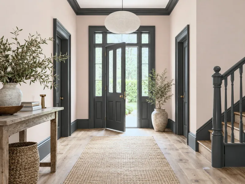
A powder pink on the walls, a softened black on the skirting, doors or cornice: the black sharpens the pink and takes away any sweetness. In a tall hall, a corridor, a bathroom.
03
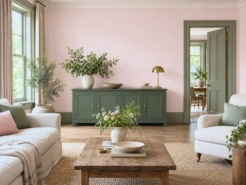
The pairing of opposites, muted: a pink on the walls, a grey-green or deep green on the woodwork and a piece of furniture. The green calms the pink, the pink warms the green. See Choosing complementary colours.
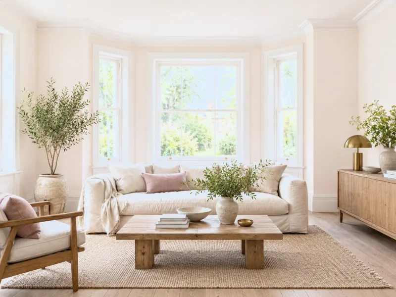
04
The lightest pink on walls and ceiling, rosy white on the woodwork: the room looks lit from within, like a complexion. For a bedroom, a north-facing sitting room, an open-plan kitchen.
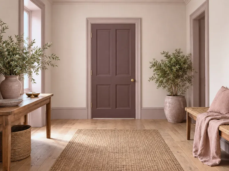
05
Three pinks of one family: the light on the walls, the mid on the woodwork, the deep on a door or the ceiling. Drenching in pink, with no white: the most enveloping hall or bedroom there is.
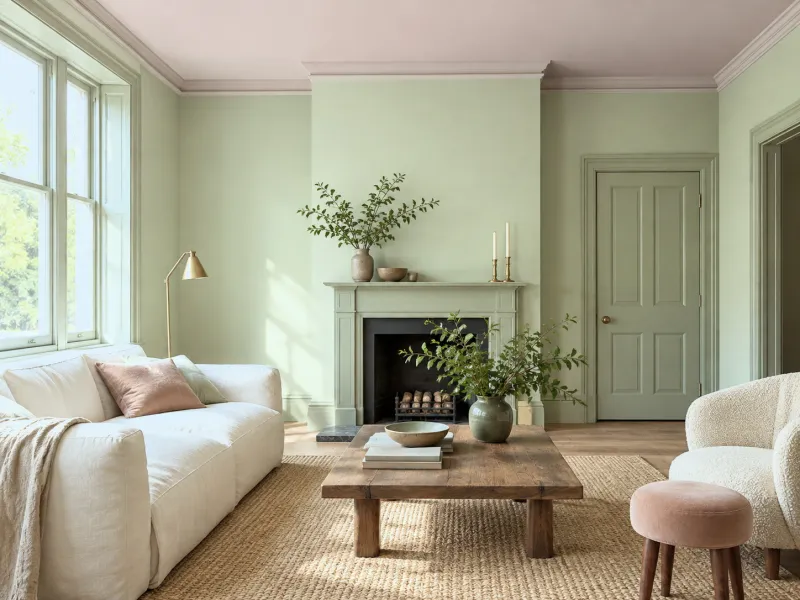
06
In a room already decided: a pink ceiling over green walls, a pink band below the cornice, the inside of a cupboard, a stool. Pink comes in without the walls being repainted.
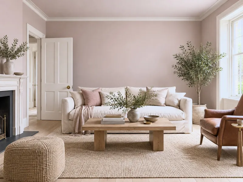
07
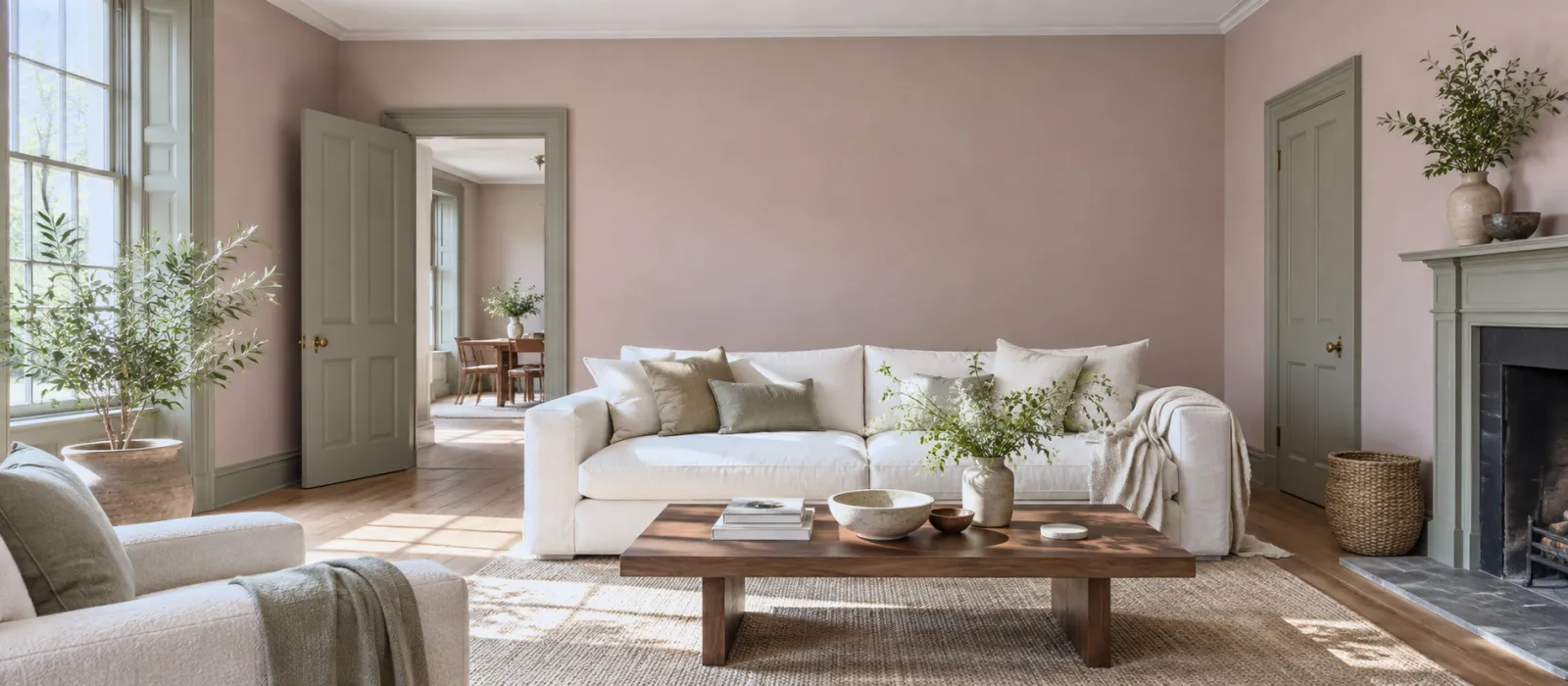
A brown-pink or grey-pink on every wall of a sitting room, in place of a beige: warmer than a greige, livelier than an off-white, and it holds with oak, leather and linen.
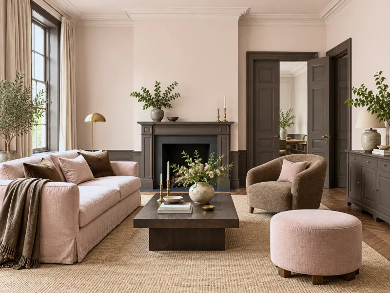
08
A powder pink and a deep brown — chocolate, brown-black — on the doors and a piece of furniture: pink's most grown-up pairing, the one of the 1930s and the hotels of Paris.
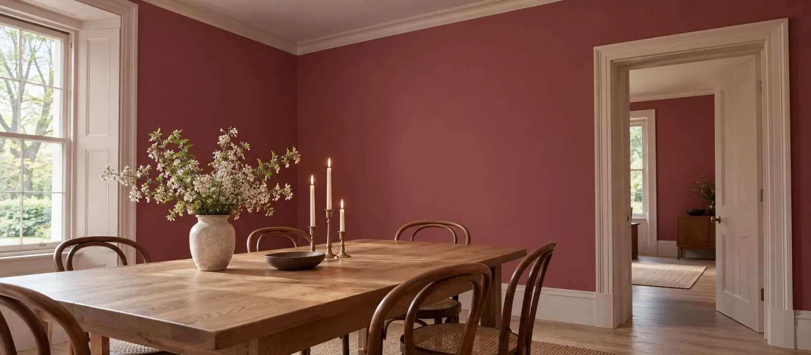
The Mylands pinks
| Pink | Undertone | For | The white that goes with it |
|---|---|---|---|
| Kensington Rose No.22 | Rosy white | Ceilings, walls of north-facing rooms, woodwork under a deeper pink | Holland Park No.5 |
| Palmerston Pink No.243 | Powdery, barely violet | Bedrooms, with a green | Osterley No.25 |
| Floris No.27 | Fresh rosy | Bathrooms, children's rooms | Holbein Chamber No.7 |
| Threadneedle No.262 | Warm pink-beige | The rosy neutral of sitting rooms and halls | Whitehall No.9 |
| Soho Pink No.266 | Greyed brown-pink | Sitting rooms, in place of a beige | Holland Park No.5 |
| Pale Lilac No.246 | Pink-mauve | Bedrooms, quiet studies | Osterley No.25 |
| Bloomsbury No.267 | Old pink, brown | Furniture, woodwork, one deep wall | Whitehall No.9 |
| Theatre Land No.282 | Deep pink-red | Dining rooms, vestibules | Threadneedle No.262 |
| Rothschild Street No.296 | Dark brown-pink | Doors, ceilings, the woodwork of pink drenches | Threadneedle No.262 |
The vivid pinks — French Rose, Shocking Pink, Magenta — are in the FTT collection: for an accent, a door, a child's piece of furniture.
To avoid
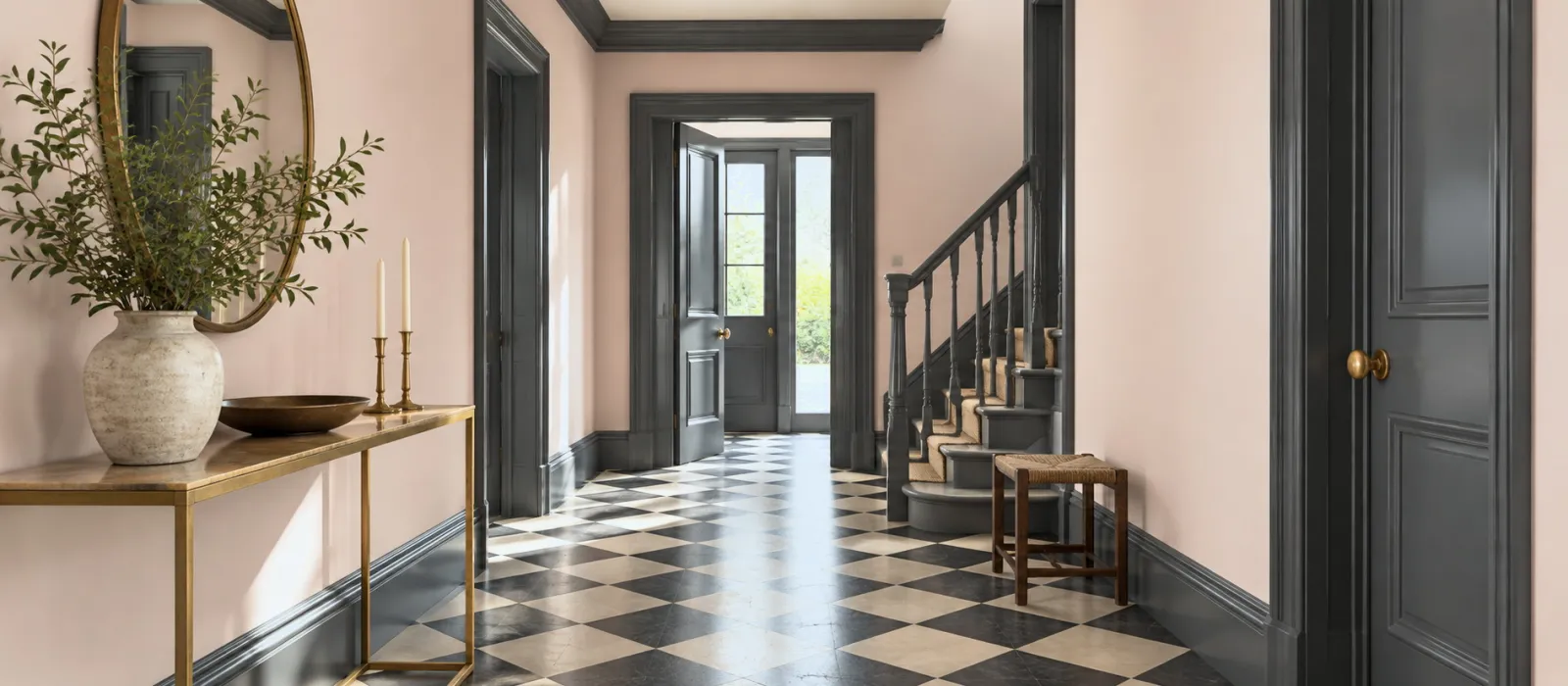
Frequently asked questions
Yes, in a brown-pink or grey-pink — Soho Pink, Threadneedle — which behave like warm neutrals. With grey-green or brown woodwork, a linen sofa and wood, nobody will say "pink sitting room"; they will say "warm sitting room".
A warm pink, with a hint of yellow or brown — Threadneedle, Kensington Rose — which makes up for the cool light. A violet-tinged pink will go grey. See How light affects colour.
A powder pink on the walls and a green or a yellow on a piece of furniture, rather than pink everywhere: the child grows, the furniture gets repainted. See Upcycling children's bedroom furniture.
The same pink (drenching), a lighter pink of the family, or a rosy white — never a pure white, which looks blue above pink. Kensington Rose No.22 is the ceiling for almost all our pinks.
Yes, within one family: a powder pink on the walls and a brown-red — Huguenot, Indian Lake — on a door or a fireplace. It is a gradation, not a contrast; it holds because the pigment is shared.
See also
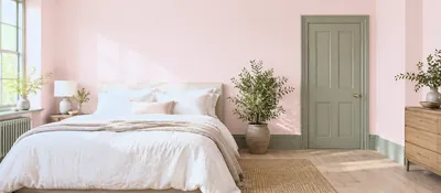 Pink and green, blue and yellow, red and green: why these pairings work, and six Mylands palettes ready to pai...
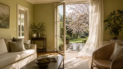 Dawn lavender, the verdigris of a shower, the soft green of new leaves, cherry-blossom pink: seven Mylands sha...
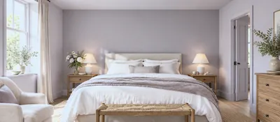 Pleasing everyone three nights running: calming mid tones, a deeper bedhead wall. Six palettes, and the guest...
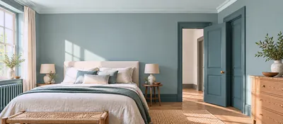 One colour, three depths: harmony guaranteed because the pigment is the same. Six Mylands families.
“Pink is not a girl's colour; it is a red that has learned gentleness.”

Thanks for signing up to our newsletter!
Sign in to save items to your wishlist. Sign in to save your basket, so you can continue shopping later.
Don't have an account? Create one
Share this link and friends can buy items from your list. Anything bought disappears from it automatically. Anyone with this link can see your selection.
Moving in, redecorating, or dropping hints? A free account turns this selection into a gift list — add or remove colours whenever you like, and we'll email you when someone buys something from your shared list.
Free · Delivered to your door
Get a free colour card posted to you, showing our complete Colours of London range, with swatches made from the real paint for a true representation of our award-winning colours.

