


01
1. Sea blue and lime white: the bathroom
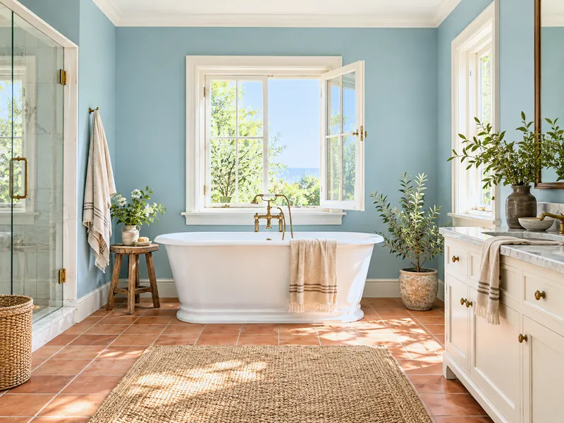
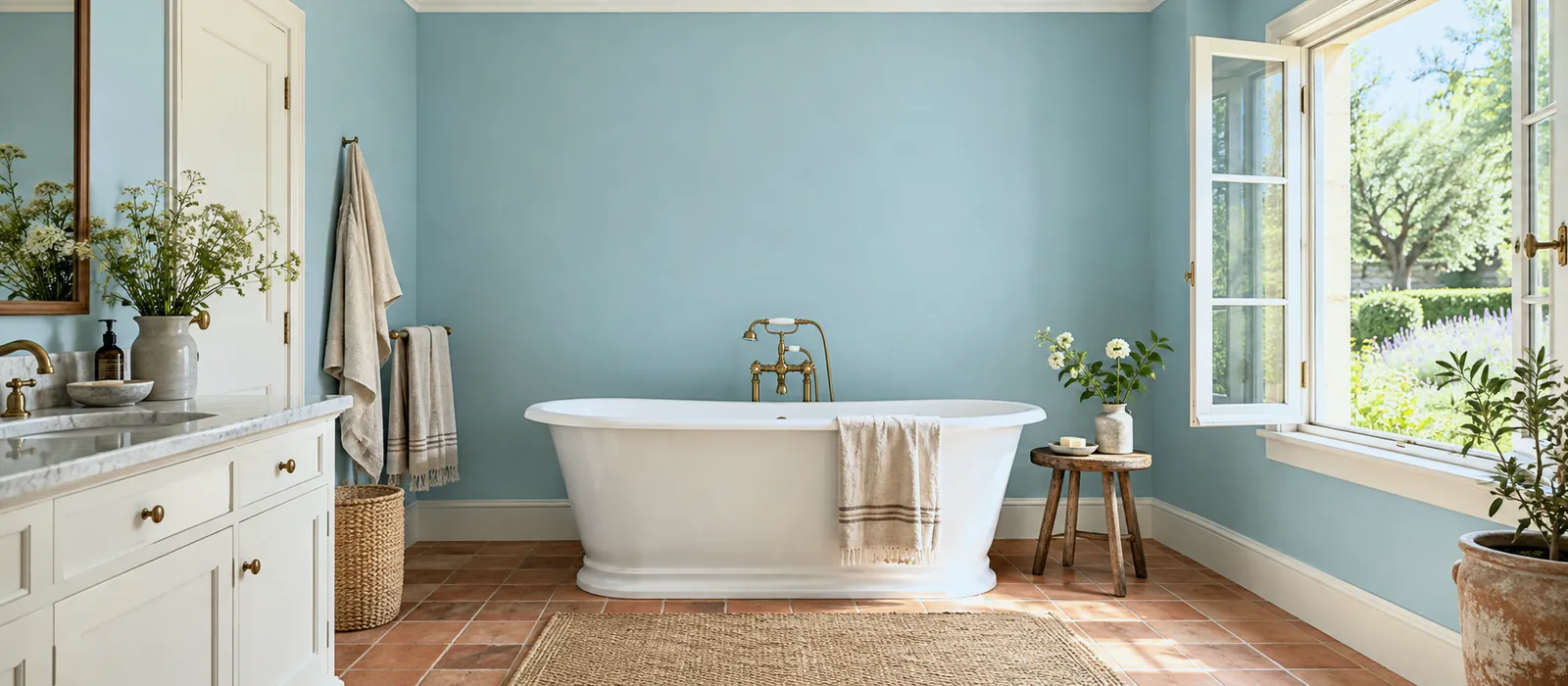
A mid blue-green on the walls, a warm white on the ceiling and woodwork, terracotta on the floor: the bathroom of a seaside house. The blue-green stands up to damp in Satin on the woodwork.
Menu
How To
Design Advice
Customer Service
My account
Help with paint Choosing colour
Summer in paint means colours franker than spring's — sea and ultramarine blues, ochres, grass greens, coral — on lime whites, in rooms the sun passes through. They are worn in contrast rather than as a family: a blue and an ochre, a green and a terracotta, a coral and a green. Eight palettes, from the kitchen to the conservatory, with the materials that go with them — linen, bleached wood, terracotta, rattan.
Page updated September 2026 · by the Mylands France colour team
Understanding
Summer light is high, white and long: it washes out pastels and can take confident colours. Summer colours are therefore more saturated than spring's — the blue of the sea rather than the April sky's, the ochre of the fields rather than the primrose's yellow, the green of grass rather than the bud's — and they pair by contrast: a blue and a yellow, a green and an earth red, two opposites that bring each other to life.
Summer's white is not a pure white but a lime white, tinted, matt, which absorbs the harsh light instead of returning it. And the materials do half the work: linen, washed cotton, bleached wood, rattan, terracotta, ceramics. Our page Shades of summer days makes seven shades into a season; this one makes eight palettes. For the complete style, the guide to Mediterranean style.
Eight palettes
01
A mid blue-green on the walls, a warm white on the ceiling and woodwork, terracotta on the floor: the bathroom of a seaside house. The blue-green stands up to damp in Satin on the woodwork.
02
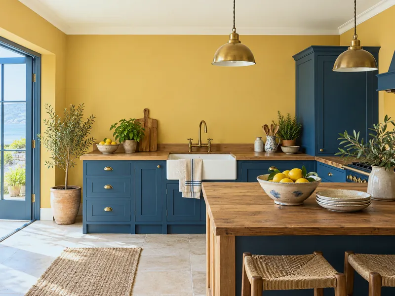
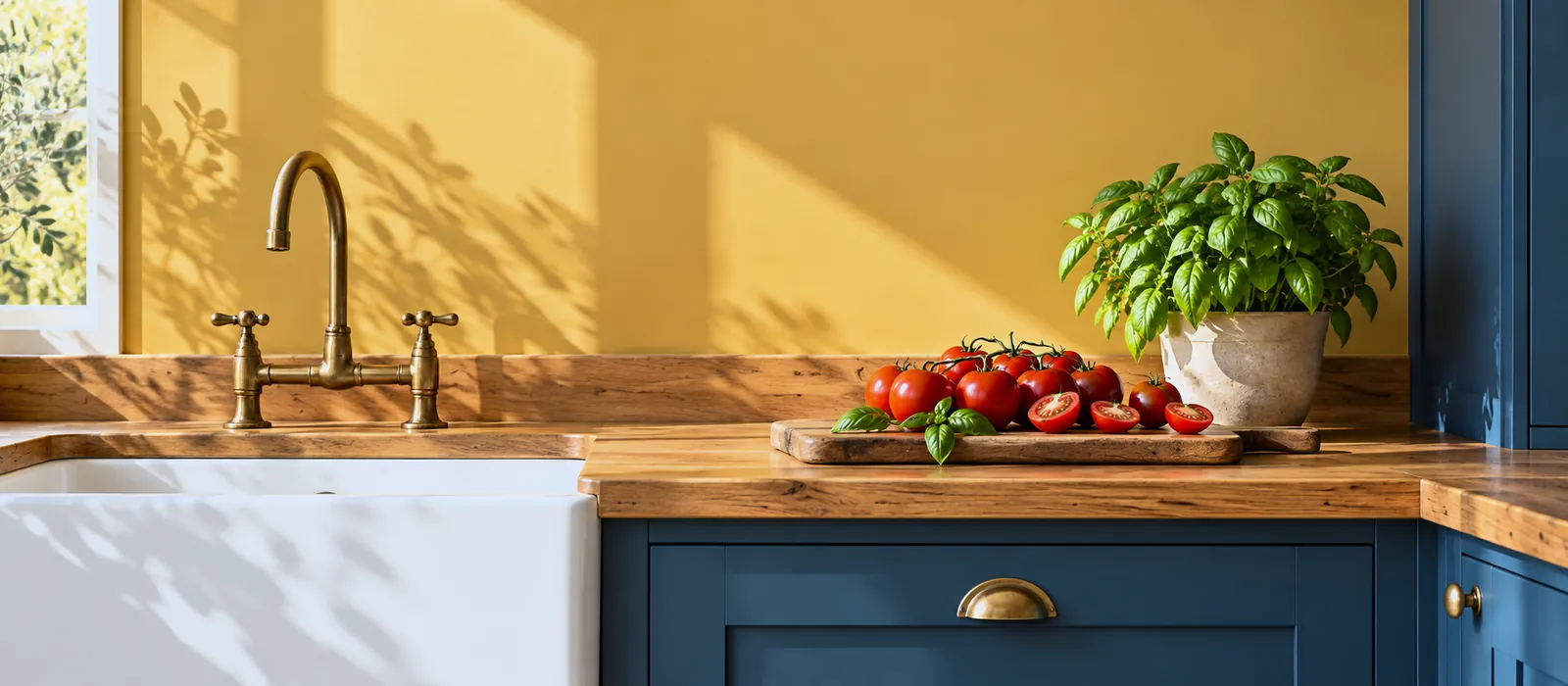
A golden ochre on the walls, a deep blue on the units in Satin, cream white on the ceiling: sun and shade. The frankest summer palette, calmed by a wooden worktop.
03
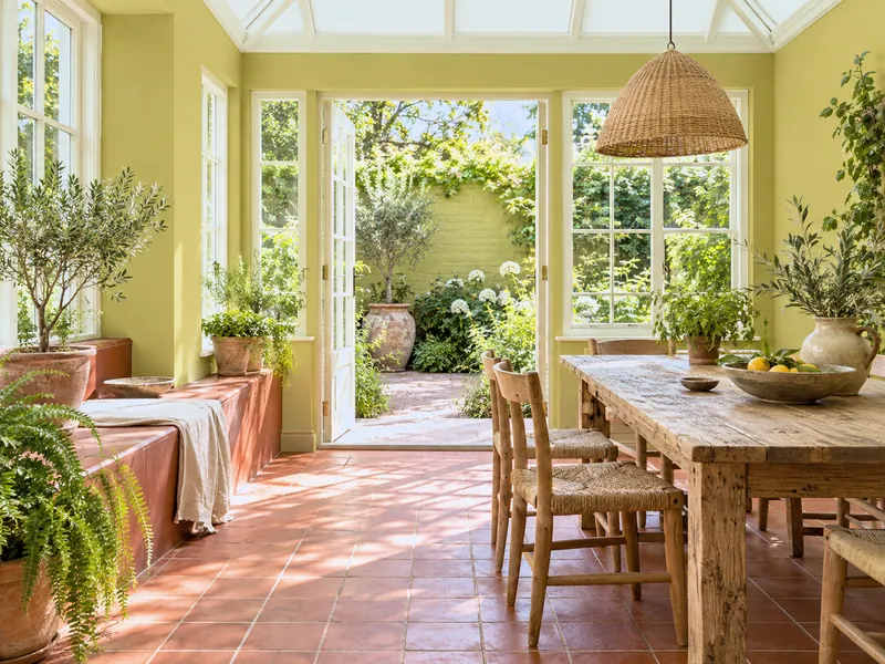
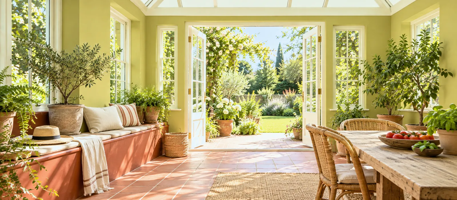
A grass green on the walls, a terracotta red on the floor or a bench, green-white on the ceiling: the garden coming in. Outside, the same green in Masonry Paint on a courtyard wall.
04
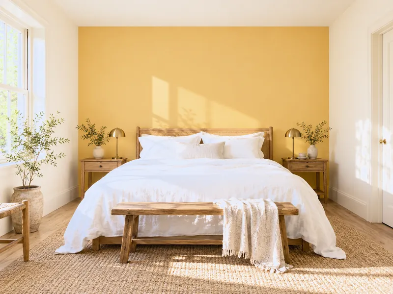
A golden yellow on the headboard wall only, the other three and the ceiling in a cream white, white linen: the sun coming in through the wall. A north-facing bedroom gains a sunrise.
05
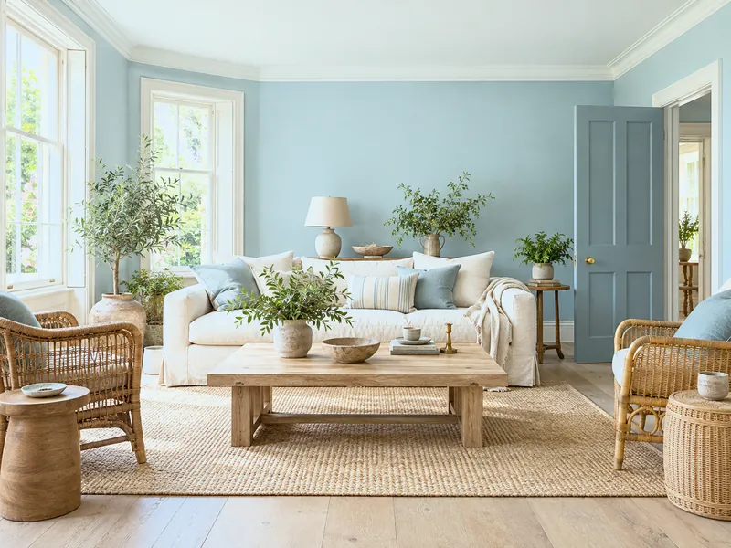
A greyed blue-green on the walls, woodwork in a warm white, lots of pale wood and rattan: the holiday house, calm. The wood warms the blue, the blue cools the wood.
06
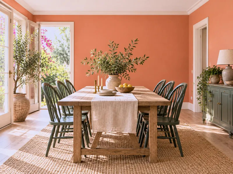
A soft coral on the walls, a deep green on the chairs or a sideboard, rosy white ceiling: the bougainvillea and its leaf. The most cheerful summer palette.
07
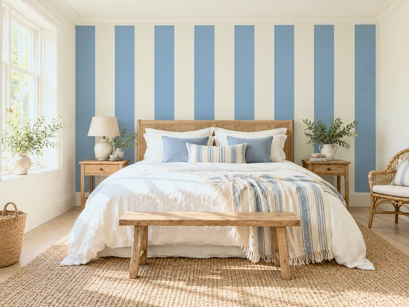
Lime-white walls and a single wall, or a headboard, in wide vertical blue and white stripes with tape: the beach hut. See Colour blocking.
08
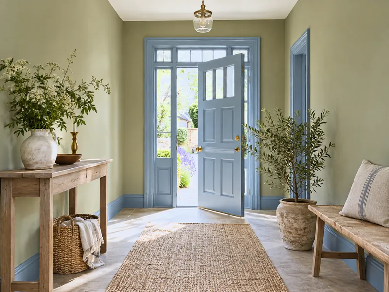
An olive green on the walls, a clear blue on the front door and skirting: neighbours on the wheel, confident. The hall of a holiday house that smells of the garden.
Reference
| Family | Light | Mid / clear | Deep |
|---|---|---|---|
| Sea blues | Morning Blue No.32 | Bridge Blue No.222, Boathouse No.33, Enamel Blue No.78 | Proper Blue No.67, Ultramarine Blue FTT-018 |
| Ochres and yellows | Cavendish Cream No.120 | Haymarket No.47, Golden Square No.131 | Freegrove Mustard |
| Clear greens | French Green No.187 | New Lime No.149, Stockwell Green No.203 | Pleasure Gardens Green No.214 |
| Coral and earths | Peach Flesh Pink No.268 | Coral Orange No.277, Lolly Pop No.275 | Crayfish Party BH.19 |
| Lime whites | Lots Road No.24, St James No.40, Holland Park No.5 | — | — |
All in Marble Matt Emulsion on the walls: matt absorbs the harsh light. For outside — shutters, façade, garden furniture — see Using exterior paint colours.
To avoid
Frequently asked questions
In a kitchen, a bathroom or a conservatory, yes: those rooms can take frankness. In a main sitting room or a bedroom, prefer the greyed version — Notting Hill rather than Bridge Blue, Haymarket rather than Golden Square — or go through accents. See A colour palette for every season.
A lime white: creamy, stone or warm — Lots Road, St James, Holland Park — in Marble Matt Emulsion. Brilliant pure white reflects the harsh light and dazzles.
Yes: the blues, greens and earths go onto shutters, a door, garden furniture in multi-surface finishes, and onto a façade or courtyard wall in Masonry Paint. See How to update outdoor spaces.
With a greyed blue-green or a clear green on the walls, a lime white on the ceiling, and matt materials: linen, wood, terracotta. A cool colour does not lower the temperature, but it gives the impression it does.
See also
 Sun on the walls all year: yellows, blues, greens and terracottas, in eight palettes.
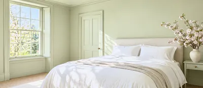 Tender greens, pinks, lilacs, pale yellows: eight palettes that bring spring in, room by room.
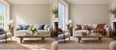 Loving your walls in July as in January: four timeless bases, and what each season adds.
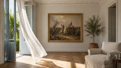 A palette inspired by the light and colours of summer.
“A summer palette is an open window someone managed to paint.”

Thanks for signing up to our newsletter!
Sign in to save items to your wishlist. Sign in to save your basket, so you can continue shopping later.
Don't have an account? Create one
Share this link and friends can buy items from your list. Anything bought disappears from it automatically. Anyone with this link can see your selection.
Moving in, redecorating, or dropping hints? A free account turns this selection into a gift list — add or remove colours whenever you like, and we'll email you when someone buys something from your shared list.
Free · Delivered to your door
Get a free colour card posted to you, showing our complete Colours of London range, with swatches made from the real paint for a true representation of our award-winning colours.

