Help with paint Painting outdoors

Choosing colours for the outside

Outdoors, daylight is ten to twenty times stronger than indoors: a colour looks lighter, brighter and cooler than it does on the colour card. So choose one or two shades deeper than what you are aiming for, and compose with what will not change — the stone, the brick, the render, the roof, the street. Three colours are enough for a house: one for the façade, one for the joinery (shutters, windows, eaves), one for the door. Test on large boards, against the façade, from the street — and before painting, a visit to the mairie: the prior declaration of works, and sometimes a communal colour chart.

Page updated September 2026 · by the Mylands France colour team

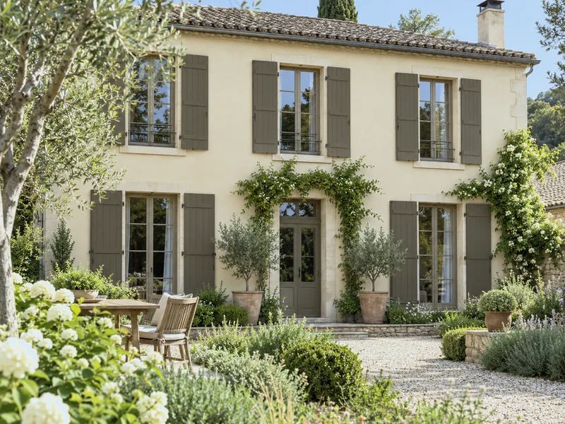
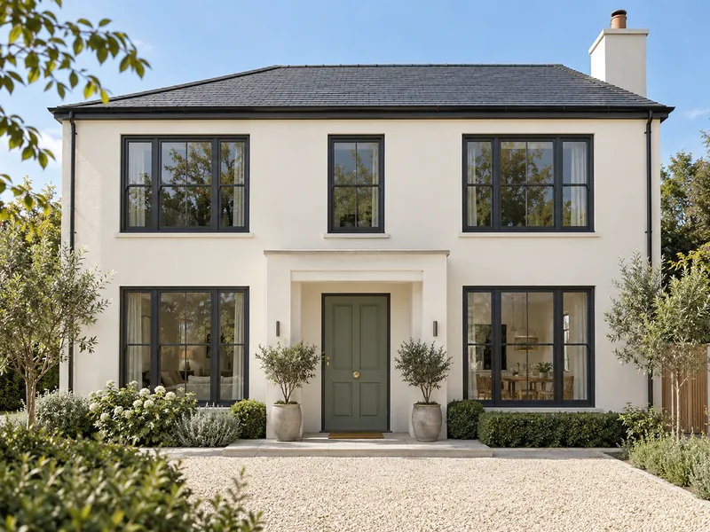
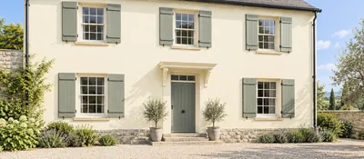
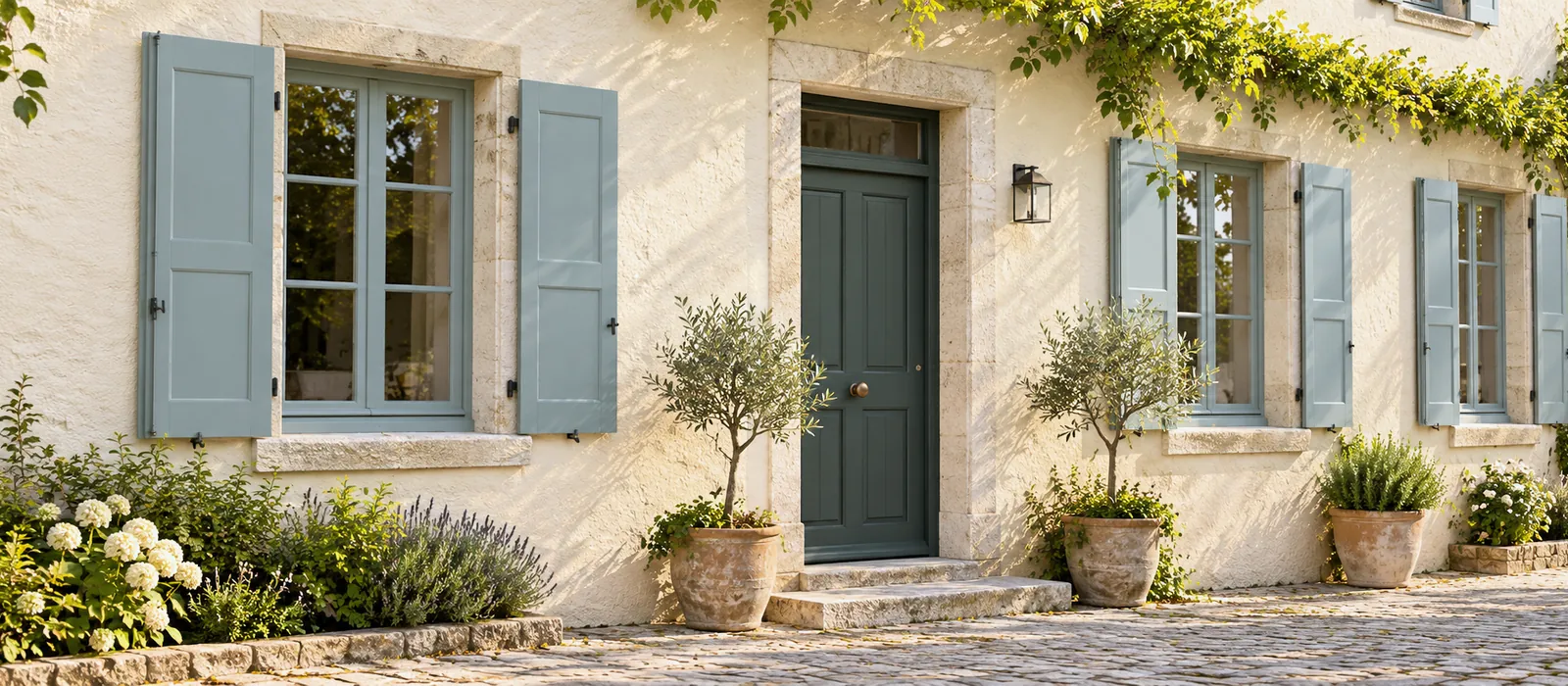
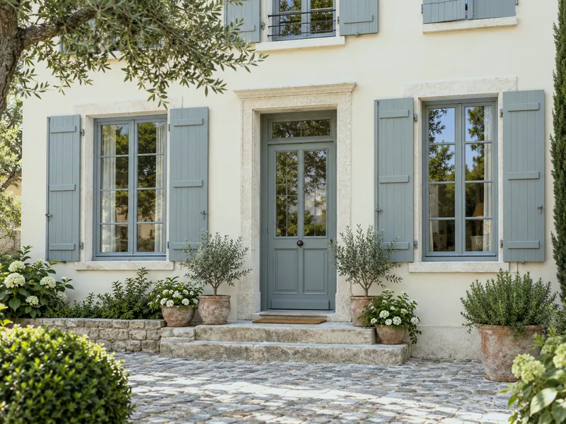
Village house façade rendered in a warm stone-white, shutters and windows in a mid grey-green, front door in a deeper green, plants in pots, late afternoon light
Long Acre No.102 shutters on a Lots Road No.24 render: the grey-green that holds up to the sun

Understanding

Why a colour changes between the card and the façade

Three things happen outdoors. Intensity: in full daylight, the light is ten to twenty times stronger than in a room; a mid colour looks light, a light colour looks white, a bright colour looks garish. Temperature: the light from the sky is blue; a grey turns cold, a white turns bluish, an olive green drifts towards khaki. Scale: ten metres of façade is not a swatch; a soft colour on a chip becomes bold on a wall, and a bold colour becomes an event in the street.

The rule that follows: one or two shades deeper than the effect you want, and a little warmer. The perfect façade white is a warm off-white; the successful shutter grey is a grey-green or a grey-brown, never a pure grey; the blue you love on the chip is taken a notch darker. The opposite of the indoor rule, where you lighten — which is why an interior colour card looked at outdoors misleads. Our colour card comes in a folded version, to take out onto the pavement.

Composing

Three colours and the fixed elements: the method

01

1. Start from what does not change

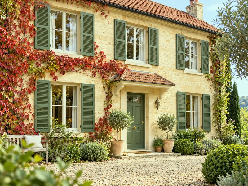
The roof (red tile, slate, zinc), the stone of the surrounds, the brick, the ground in front of the house: they do the choosing. A red tile calls for greens, grey-greens, creams; slate calls for cool whites, blues, warm greys; a golden stone calls for browns, ochres, blue-greys.
02

2. Three colours, three roles

The façade carries the lightest and largest colour. The joinery — shutters, windows, eaves, gate — carries the mid colour, the one that draws the house. The front door carries the deepest or brightest, alone. A fourth colour is one too many.

03

3. Look at the street

A house is seen with its neighbours. In a stone village, a render in the stone's colour and shutters in a local colour; on a housing estate, the house with the calmest palette is the one people notice. The mairie often has a colour chart or a regulation: ask for it first.

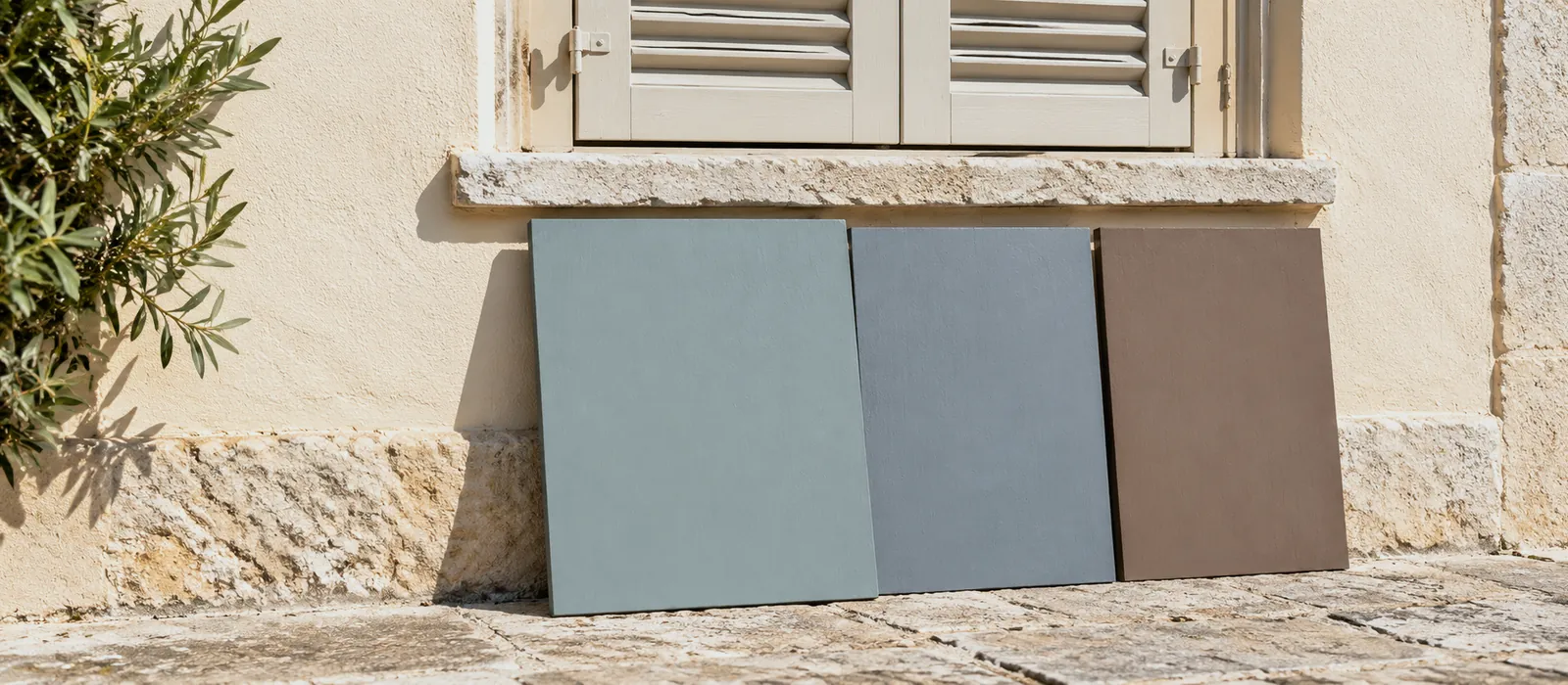
Three large painted boards — a grey-green, a blue-grey, a brown — propped against a pale render below a shuttered window, seen from the street, in full sun
Testing outdoors: three A3 boards against the façade, from the pavement, at noon and in the evening

By region

Six palettes for façade · joinery · door, by house

Six typical French houses and a Mylands palette for each. The shades are given one step deeper than the effect intended: that is already allowed for.

The houseFaçadeShutters & joineryDoor
Golden-stone village, red tile Lots Road No.24 Long Acre No.102 Brompton Road No.205
Rendered townhouse, slate St Clement No.11 Maritime No.236 Bond Street No.219
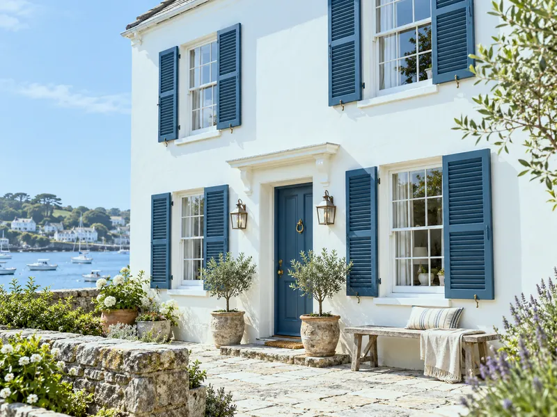
Longhouse, granite, seaside Charterhouse No.4 Proper Blue No.67 Proper Blue No.67
Mas, ochre render, the South Walbrook No.142 Hurlingham No.181 Sorrel Green No.207
Red brick, the North Bare brick Holland Park No.5 Downing Street No.10
1970s house, grey render Cadogan Stone No.59 Messel No.39 Huguenot No.49

The façade in Masonry Paint (render, brick, concrete — not lime); shutters, windows and door in Eggshell, Satin or Gloss Multi-Surface. The detail on shutters: Colours for shutters.

The colours

Six joinery colours that hold up to the sun

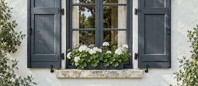
The shutters and windows are the colour you remember of a house. Six Mylands shades that stay handsome in full sun and under rain alike, each with the façade that suits it.

Testing

How to test a colour outdoors

A 100 ml sample pot covers 1.5 m²: paint two large boards per colour — A3 at least, two coats — rather than a chip. Prop them against the façade where they will go, and for shutters, against an existing shutter, beside the window. Step back to the pavement opposite: that is where a house is seen from. Look at noon in full sun, in the evening in shade, and on a grey day. A colour that pleases in all three lights is the right one; a colour that only pleases in sun will be dreary six months a year.

Photograph the boards from the street: the photo flattens the nuances, but it shows the contrast between façade, shutters and door, which is what counts. And if the commune imposes a colour chart, take your boards there: Mylands shades compare easily with the local references.

The mairie first. Changing the colour of a façade or its joinery requires a prior declaration of works (déclaration préalable) in most communes; in a protected area, the Architecte des Bâtiments de France gives an opinion, often against a communal colour chart. A month's processing, to allow for in the calendar.

To avoid

What goes wrong, outdoors

  • Choosing from the card, indoors. Outside, the colour will be lighter and cooler; one shade deeper.
  • Pure white on the façade. It dazzles and turns blue; a warm off-white.
  • Four colours. Façade, joinery, door: three, no more.
  • Pure grey on the shutters. It turns blue and cold; a grey-green or a grey-brown.
  • Ignoring the roof. A pink render under slate, a bright blue under red tile: the roof always wins.
  • Painting before the prior declaration. A month's patience beats a reinstatement order.
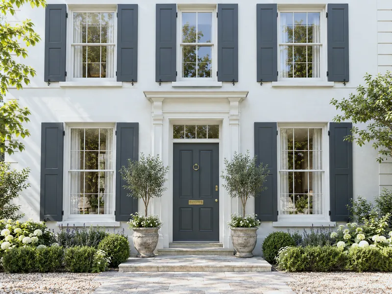
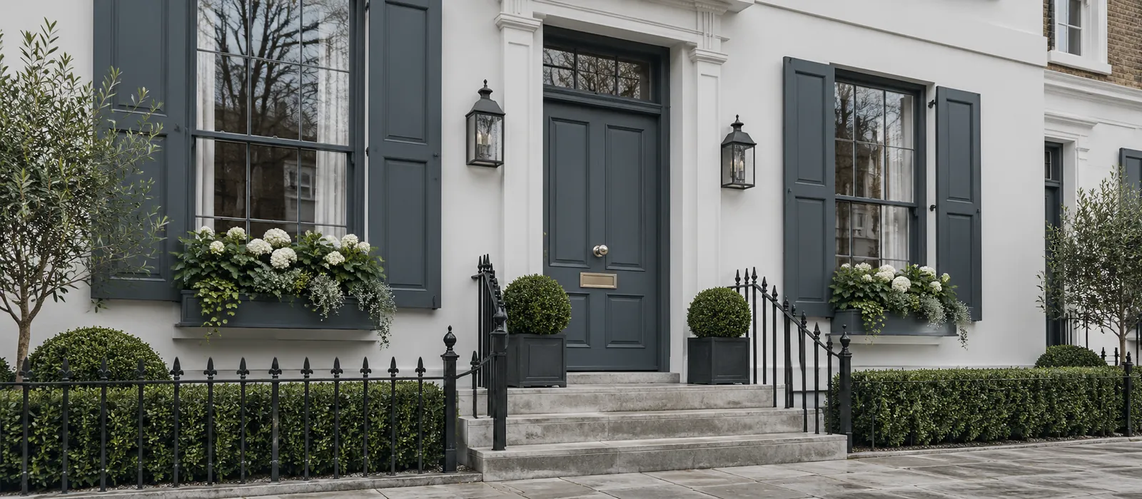
Townhouse with a cool white façade, windows and shutters in deep blue-grey, matching front door, grey stone steps, overcast sky
Bond Street No.219 on St Clement No.11: a townhouse palette under slate

Frequently asked questions

Your questions, our answers

Does a dark colour on shutters get hot?

Yes: a dark shutter facing south absorbs more heat, and the wood moves more. That is why south- and west-facing timber takes three coats instead of two, and maintenance roughly every three years. A mid tone lasts longer than a black; see Painting outdoor woodwork.

Should shutters and windows be the same colour?

Most often, yes: the house is calmer. The classic variation: windows in the façade white, shutters in colour. What doesn't work: shutters in one colour and windows in another colour.

Which finish for shutters and the door?

Multi-Surface Eggshell, Satin or Gloss, over primer and undercoat: all three hold outdoors. Eggshell for a soft look, Gloss for a classic door. See Find your finish.

And the façade?

Masonry Paint, matt, breathable, on render, brick or concrete — not on a lime render. The detail: Painting an exterior wall.

Can a door be painted a bright colour?

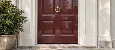
That is the bright colour's place: a single surface, framed by calm joinery. See Colours for a front door and Painting a front door.

“Outdoors, choose the colour one step on; the light will do the rest.”
Sign up to our newsletter

Sign up to our newsletter

Thanks for signing up to our newsletter!