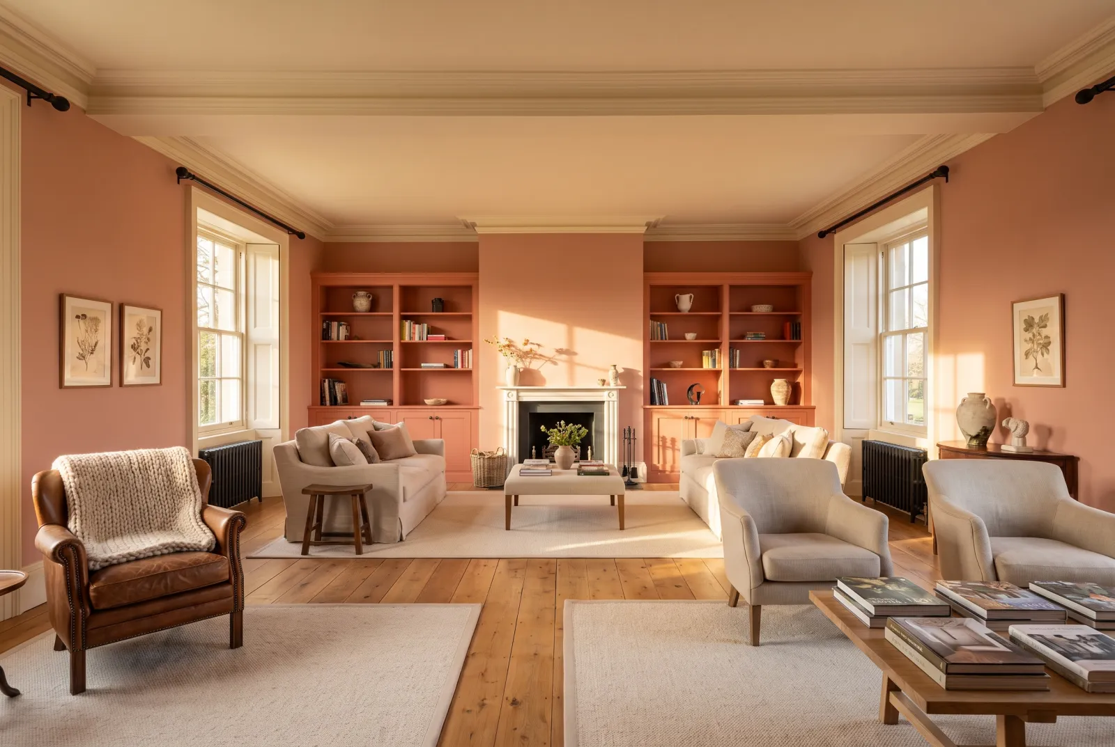
Colour guides · Orange

Terracotta and ochre: 10 Mylands shades compared

Terracottas and ochres are the colours of fired clay, natural pigments and southern walls — the oldest in paint, and among the warmest. They have a gift: they warm a room whatever its light, and they flatter everyone. One still has to choose the right shade between pale apricot and cigar brown.

Here are our ten terracottas and ochres side by side, from palest to deepest, with their lean — pink, yellow or brown — and the room that suits them.

Updated September 2026 · by the Mylands France colour team

Terracotta and ochre: 10 Mylands shades compared

The short answer

Our terracottas run from the pale — Mormor Zaza BH.17, Peach Flesh Pink No.268, pinker — through the ochres — Wharf Sacking No.127, Haymarket No.47, John's Pantry BH.24, Freegrove Mustard, yellower — to the deep fired clays — Coral Orange No.277, Crayfish Party BH.19, Henna BH.18, Cigar BH.20. The pale ones go everywhere; the ochres love kitchens and sitting rooms; the deep ones make enveloping dining rooms and hallways.

At a glance

The shades compared

Colour Family Tone Light LRV ≈ Best for
Mormor Zaza BH.17 Orange Pale tone West 52 % Lean: pink. For bedrooms and sitting rooms, especially north-facing; with Chalk or Bone.
Peach Flesh Pink™ No.268 Orange Pale tone West 47 % Lean: pink. For west-facing sitting rooms and bedrooms; with deep greens.
Wharf Sacking™ . No.127 Orange Pale tone West 54 % Lean: yellow, soft. For sitting rooms, kitchens and hallways; with Lots Road and Sorrel Green.
Haymarket™ No.47 Orange Mid tone South 49 % Lean: yellow, proper. For north-facing kitchens and sitting rooms; with Observatory.
John’s Pantry BH.24 Orange Mid tone West 34 % Lean: brown. For kitchens, studies and hallways; with Bone and Forest.
Freegrove Mustard Orange Mid tone West 30 % Lean: yellow-brown. For studies, libraries and kitchens; with Pleasure Gardens Green.
Coral Orange™ No.277 Red Mid tone West 26 % Lean: orange. For dining rooms and kitchens; with Kensington Rose and Sorrel Green.
Crayfish Party BH.19 Red Dark tone West 13 % Lean: red. For dining rooms, hallways and colour drenching; with Bone and Chalk.
Henna BH.18 Red Dark tone West 13 % Lean: red-brown, greyed. For bedrooms, studies and evening sitting rooms; with Mormor Zaza.
Cigar BH.20 Orange Dark tone West 11 % Lean: brown. For libraries, dining rooms and colour drenching; with Butter and Bone.

LRV: light reflectance estimated from the on-screen shade, from 0 (absolute black) to 100 (absolute white). Light: the orientation in which the shade looks its best.

Our selection

10 colours

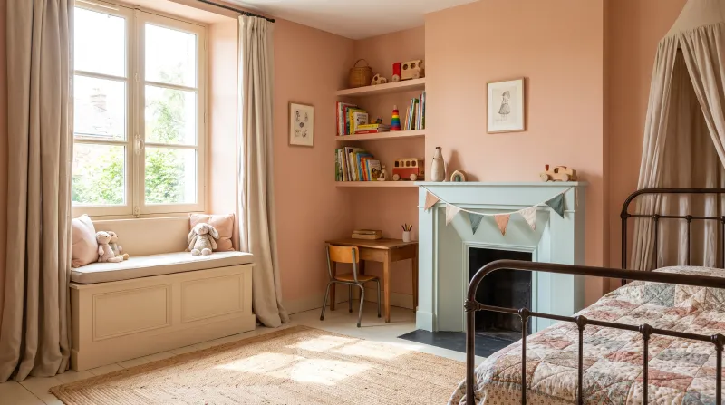
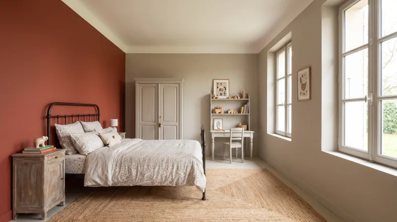
Mormor Zaza — Childbedroom
01

Pale · the powdery terracotta

Mormor Zaza BH.17

  • Orange
  • Pale tone
  • West light
  • LRV ≈ 52%

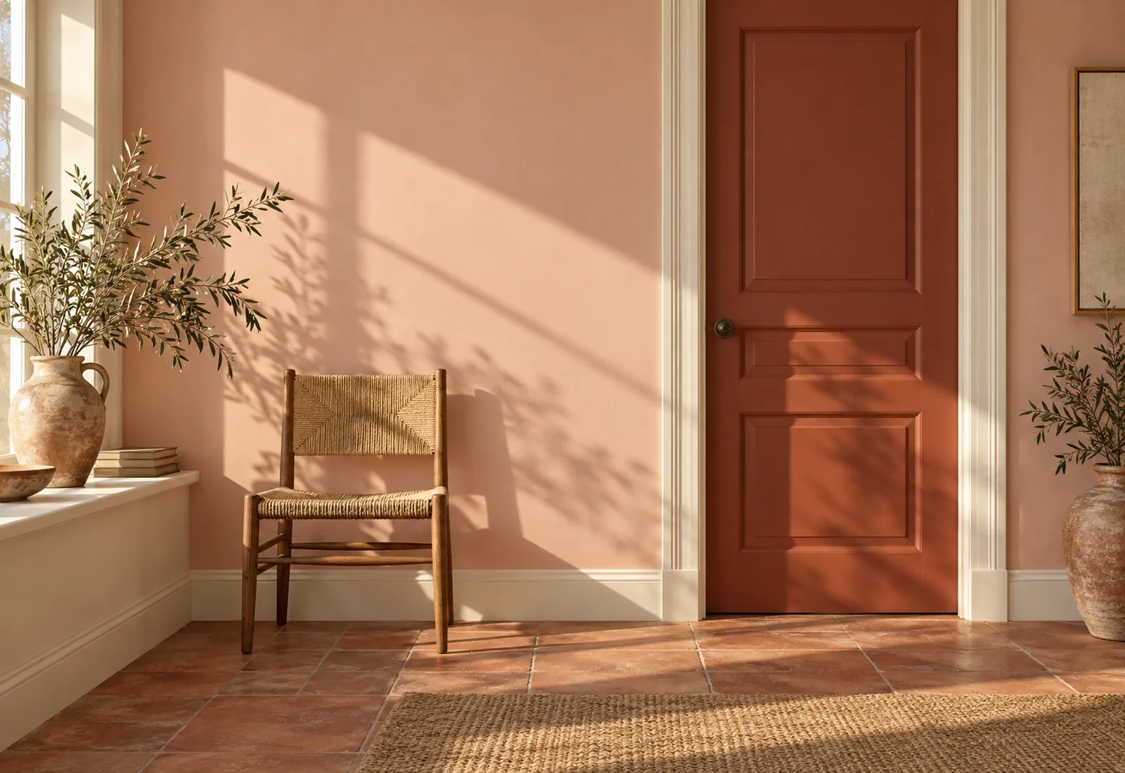
A pale, powdery terracotta between peach and clay, designed by Beata Heuman and named after her grandmother. It is the softest of the family: a greyed pink-orange that warms a room without ever frankly colouring it, and flatters faces like candlelight. Bedrooms, sitting rooms, hallways — anywhere warmth is wanted without saying so.

Our tip — Lean: pink. For bedrooms and sitting rooms, especially north-facing; with Chalk or Bone.

View the colour → Already in your basket (limit 1 per order)
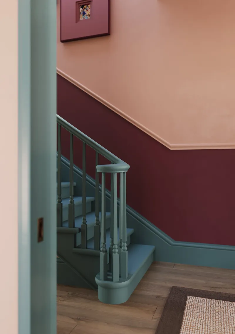
Huguenot — staircase
02

Pale · the earthy peach pink

Peach Flesh Pink™ No.268

  • Orange
  • Pale tone
  • West light
  • LRV ≈ 47%

A light-mid, soft, earthy peach pink with nothing sugary — the colour of a ripe apricot in shade. It is a notch deeper than Mormor Zaza and a little pinker, and it has the rare quality of improving at sunset, when the walls seem lit from within. A west-facing sitting room, a bedroom, a dining room.

Our tip — Lean: pink. For west-facing sitting rooms and bedrooms; with deep greens.

View the colour → Already in your basket (limit 1 per order)
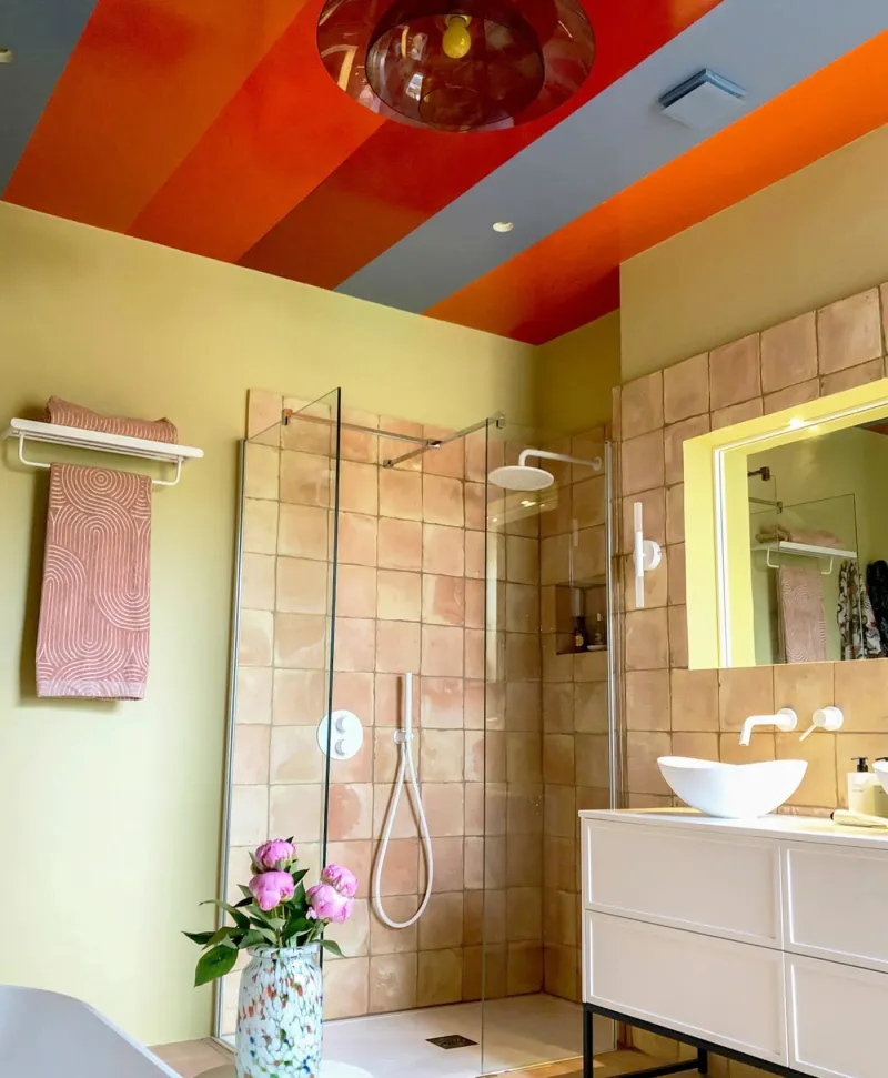
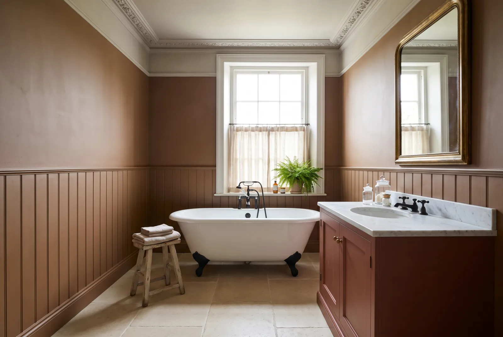
Modern bathroom with colourful ceiling painted in Mylands paints, shower, and vanity area.
03

Ochre · the golden beige

Wharf Sacking™ . No.127

  • Orange
  • Pale tone
  • West light
  • LRV ≈ 54%

A mid golden beige, the colour of a jute sack in sunshine — the most discreet ochre in this guide, almost a neutral. It warms a room as a yellow would, without its colour, and it is superb with linen, rattan and greens. In the morning a calm beige; at night an amber ochre. Sitting rooms, kitchens, hallways.

Our tip — Lean: yellow, soft. For sitting rooms, kitchens and hallways; with Lots Road and Sorrel Green.

View the colour → Already in your basket (limit 1 per order)
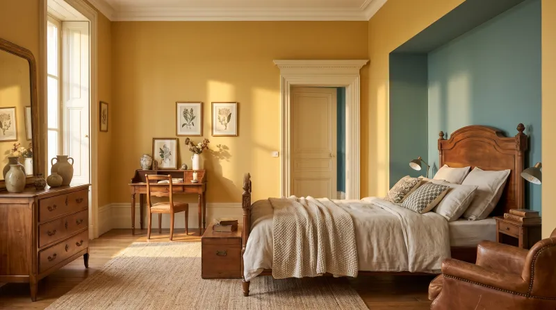
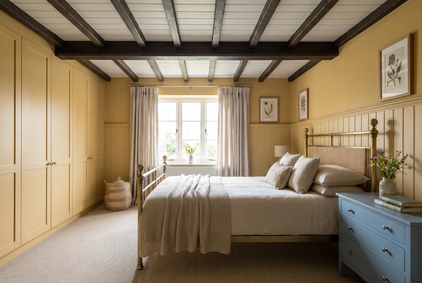
Haymarket — Bedroom
04

Ochre · the yellow ochre

Haymarket™ No.47

  • Orange
  • Mid tone
  • South light
  • LRV ≈ 49%

A proper, golden yellow ochre, the colour of a hay bale — the yellowest of our ochres, and one of the cheeriest. It has nothing of a lemon yellow: it is an earth yellow, warm and a little brown, that gives a kitchen or sitting room the light of an August afternoon. It is superb with deep blues and warm whites.

Our tip — Lean: yellow, proper. For north-facing kitchens and sitting rooms; with Observatory.

View the colour → Already in your basket (limit 1 per order)
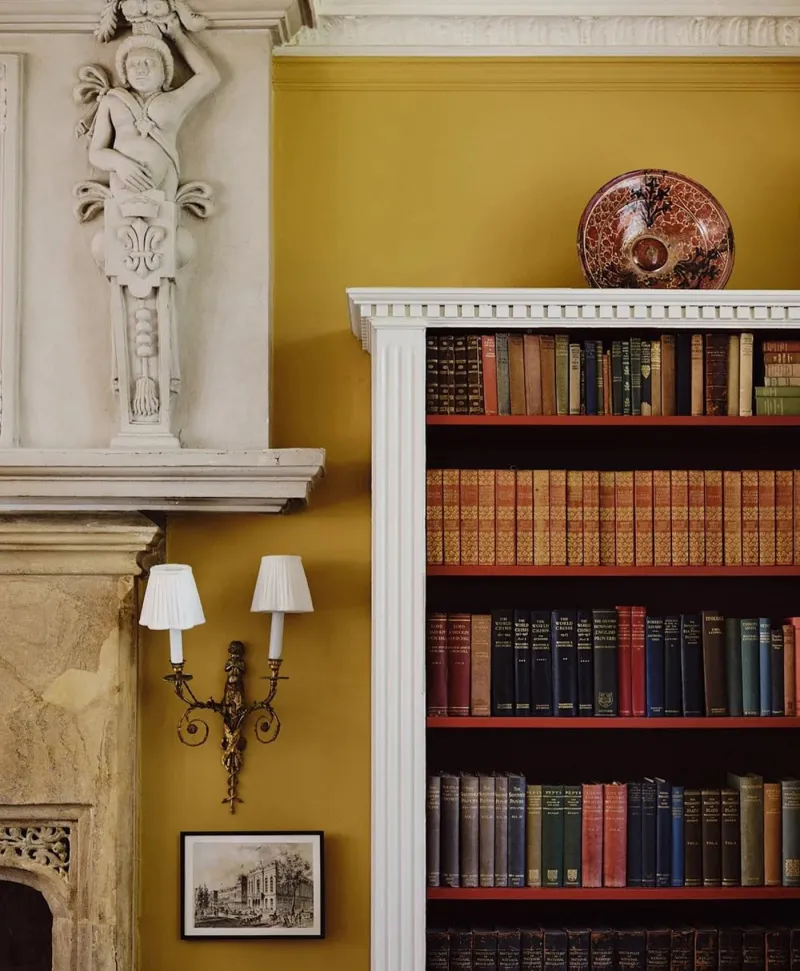
Bookshelf against a yellow neutral wall with decorative elements
05

Ochre · the caramel

John’s Pantry BH.24

  • Orange
  • Mid tone
  • West light
  • LRV ≈ 34%

A mid brown ochre, the colour of a caramel or a roasted hazelnut — designed by Beata Heuman for a pantry. It is deeper and browner than Haymarket, and it has the warmth of waxed wood: in a kitchen, a study or a hallway it makes an enveloping, appetising room. Superb with cream whites and dark greens.

Our tip — Lean: brown. For kitchens, studies and hallways; with Bone and Forest.

View the colour → Already in your basket (limit 1 per order)
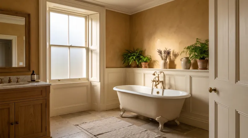
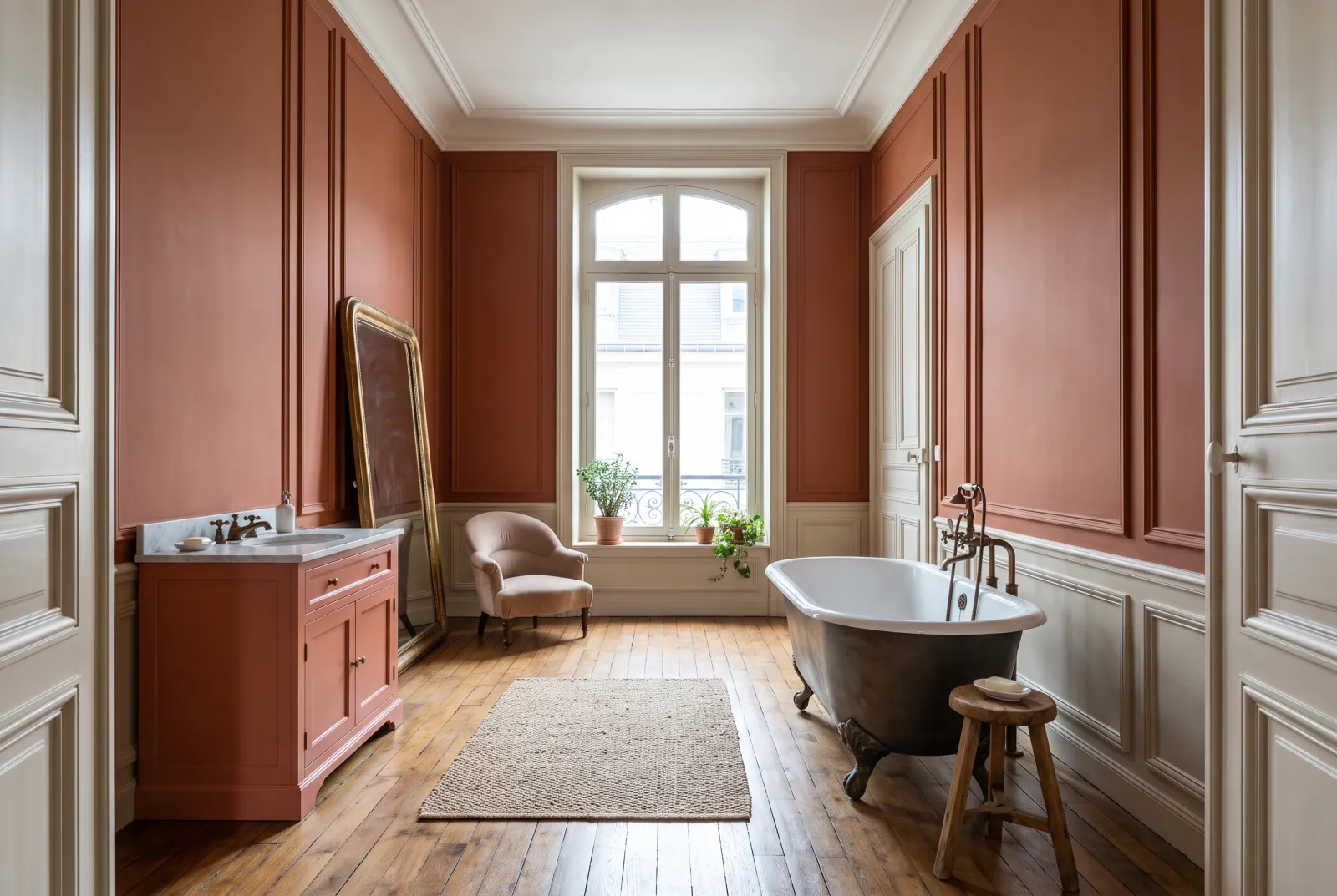
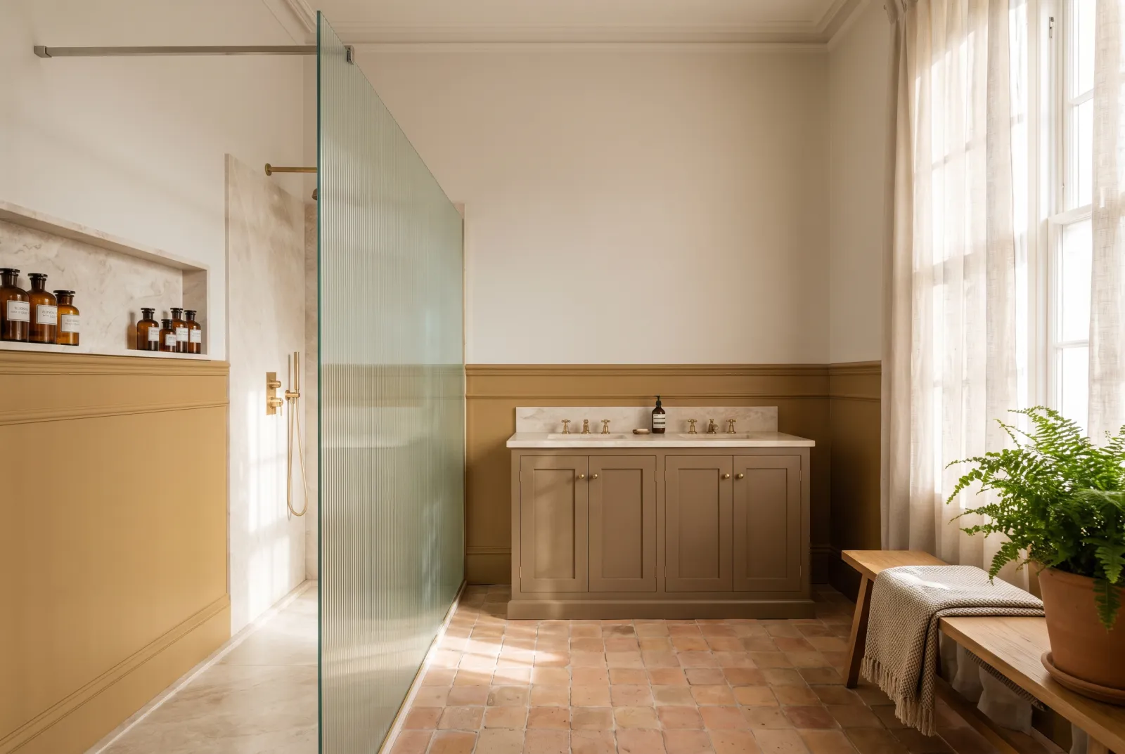
Freegrove Mustard — Bathroom
06

Ochre · the mustard

Freegrove Mustard

  • Orange
  • Mid tone
  • West light
  • LRV ≈ 30%

A mid mustard ochre, brown and golden, the colour of a wholegrain mustard. It is the most "colour" ochre in this guide: mistaken for no neutral, it gives a room a 1970s character in the best sense — warm, a little retro, very flattering with dark wood, leather and velvet. A wall, a bookcase, a kitchen.

Our tip — Lean: yellow-brown. For studies, libraries and kitchens; with Pleasure Gardens Green.

View the colour → Already in your basket (limit 1 per order)
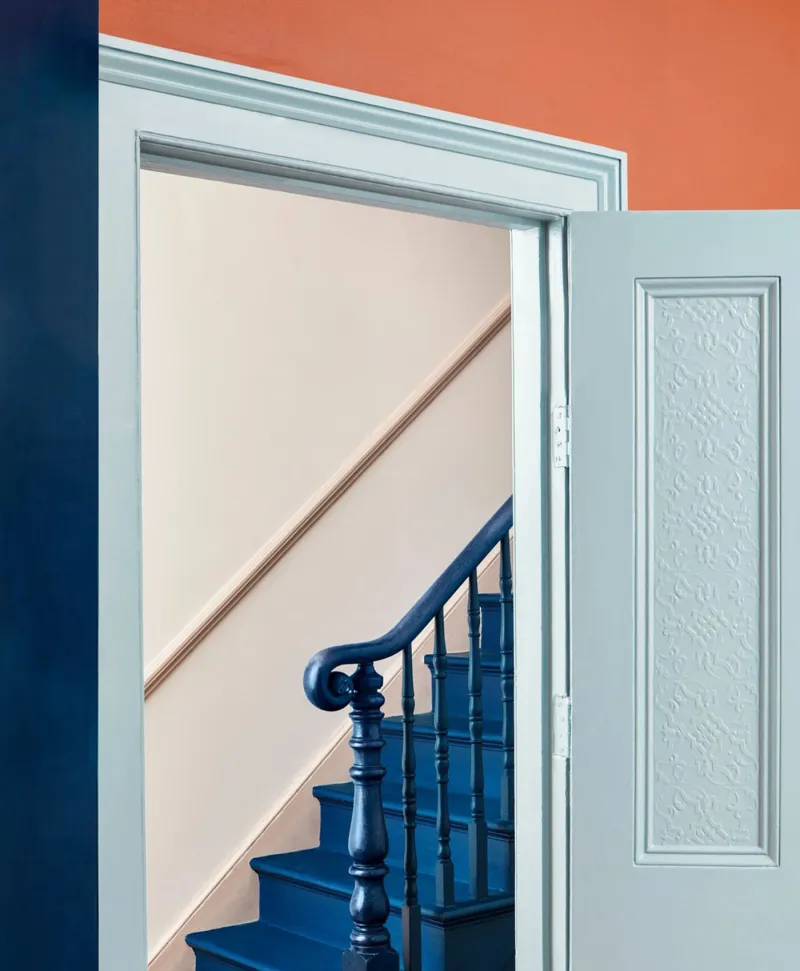
Staircase with blue railing and steps, open door leading to a room with orange wall.
07

Deep · the coral

Coral Orange™ No.277

  • Red
  • Mid tone
  • West light
  • LRV ≈ 26%

A proper mid terracotta between coral and brick, the colour of a new flowerpot. It is the most orange of our deep terracottas, and the most cheerful: it makes a festive dining room, a Mediterranean kitchen, a welcoming hallway. It asks for warm whites and wood — never pure white, which would make it shout.

Our tip — Lean: orange. For dining rooms and kitchens; with Kensington Rose and Sorrel Green.

View the colour → Already in your basket (limit 1 per order)
Crayfish Party — Childbedroom
08

Deep · the red fired clay

Crayfish Party BH.19

  • Red
  • Dark tone
  • West light
  • LRV ≈ 13%

A deep red terracotta, the colour of a cooked crayfish — designed by Beata Heuman after the Swedish August parties. It is redder and graver than Coral Orange, with a share of brown that makes it liveable on four walls: a dining room in Crayfish Party is warm by day and sumptuous by night. With cream white and pale wood it is southern Scandinavia.

Our tip — Lean: red. For dining rooms, hallways and colour drenching; with Bone and Chalk.

View the colour → Already in your basket (limit 1 per order)
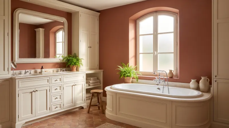
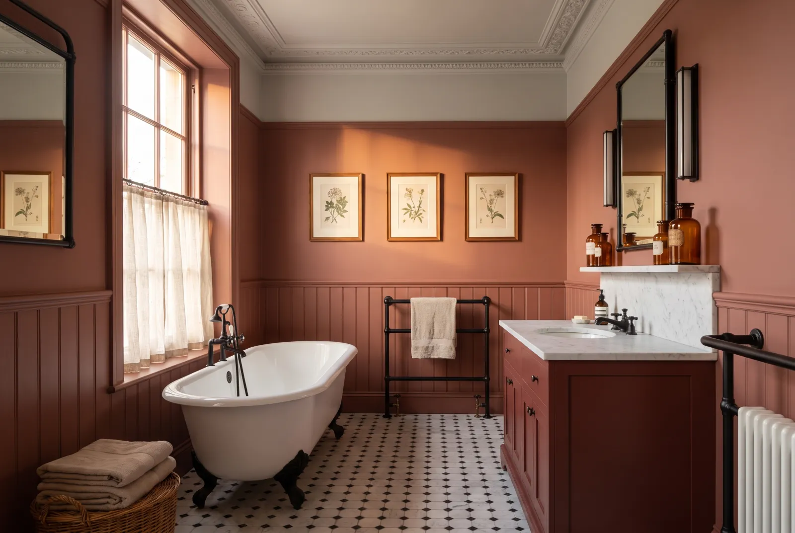
Henna — Bathroom
09

Deep · the henna

Henna BH.18

  • Red
  • Dark tone
  • West light
  • LRV ≈ 13%

A deep, greyed red-brown, the colour of dried henna — more muted and browner than Crayfish Party. It is the easiest deep terracotta to live with: its share of grey calms it, and it makes an enveloping bedroom, study or evening sitting room without ever looking orange. Superb with powder pinks, brass and linen.

Our tip — Lean: red-brown, greyed. For bedrooms, studies and evening sitting rooms; with Mormor Zaza.

View the colour → Already in your basket (limit 1 per order)
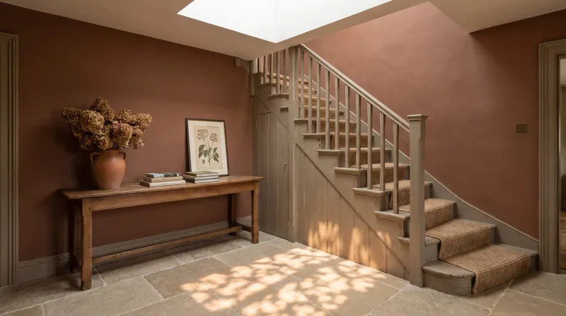
Cigar — Hallway
10

Deep · the cigar brown

Cigar BH.20

  • Orange
  • Dark tone
  • West light
  • LRV ≈ 11%

A deep, warm brown, the colour of a tobacco leaf — the edge of the family, where terracotta becomes brown. It is a brown that has kept its orange warmth, and it does what a black would in a library or dining room, more gently: it envelops, it flatters wood and leather, and it makes brass extraordinary. The most elegant brown we make.

Our tip — Lean: brown. For libraries, dining rooms and colour drenching; with Butter and Bone.

View the colour → Already in your basket (limit 1 per order)

These colours in real rooms

Our schemes in which one of this guide's shades plays the lead — or a supporting role.

All schemes · Orange →
Crayfish Party BH.19 Limestone™ No.55 Coral Orange™ No.277
Cigar BH.20 The Boltons™ No.28 Dulwich Red
Freegrove Mustard Limestone™ No.55 Westmoreland™ No.160
Henna BH.18 Limestone™ No.55 Arts Club™ No.281
Haymarket™ No.47 Sleet™ No.91 Pimlico™ No.136 Wedgwood FTT-016
Coral Orange™ No.277 Limestone™ No.55 Vermillion FTT-010

How to choose a terracotta or an ochre

Three leans, three uses. The terracottas leaning to pink — Mormor Zaza BH.17, Peach Flesh Pink No.268 — are the softest and most flattering: bedroom and sitting-room colours, which warm a north-facing room and blaze facing west. The ochres leaning to yellow — Wharf Sacking No.127, Haymarket No.47, Freegrove Mustard — are the sunniest: kitchen and daytime-room colours, which replace the missing sun. The earths leaning to brown — John's Pantry BH.24, Henna BH.18, Cigar BH.20 — are the most enveloping: evening colours, for dining rooms, studies and libraries. In between, Coral Orange No.277 and Crayfish Party BH.19 are the proper terracottas, for those who want the colour of a flowerpot on their walls.

By light

Terracottas are the easiest colours for a north-facing room: their warmth offsets the cold light, and they are brought back to their proper measure there. In a south-facing room they intensify: choose them greyed then — Mormor Zaza BH.17, Henna BH.18 — or accept that they sing. Facing west, the setting sun makes them blaze: that is their hour. We say more in how light affects colour.

What to pair them with

Never pure white, which makes them look garish: cream or ivory whites — Bone BH.04, Lots Road No.24, Chalk BH.02. Greens, their complement — Sorrel Green No.207, Forest BH.16, Pleasure Gardens Green No.214 — for balance. Deep blues for contrast. And wood, brass, linen, terracotta tiles on the floor. For reds, see our reds and terracottas for a dining room; for yellows, our yellows for a kitchen; for the whole family, our ideas in orange.


Frequently asked questions

What is the softest Mylands terracotta?
Mormor Zaza BH.17, a pale, powdery terracotta between peach and clay, followed by Peach Flesh Pink No.268, a little pinker and deeper. Both go in a bedroom as well as a sitting room.
Which ochre for a kitchen?
Wharf Sacking for a discreet, almost neutral ochre; Haymarket for a proper, sunny yellow ochre; John's Pantry or Freegrove Mustard for a more enveloping brown ochre.
Does terracotta suit a north-facing room?
It is even the easiest colour for north light: its warmth offsets the cold light, which brings it back to its proper measure. A terracotta facing north is never too orange.
Which colours go with a terracotta?
Cream or ivory whites (Bone, Lots Road, Chalk) rather than pure white, greens (Sorrel Green, Forest, Pleasure Gardens Green), deep blues for contrast, and wood, brass and linen.

Guides to read next

All colour guides →

Want to see these colours at home?

Order a sample to judge the shade in your own light, or browse every paint for the room.

Sign up to our newsletter

Sign up to our newsletter

Thanks for signing up to our newsletter!