Colour guides · Neutral

Greige and beige: 8 Mylands shades compared

Greige — half grey, half beige — has become the default neutral of contemporary interiors, because it does what neither grey nor beige does alone: it stays warm without yellowing, and calm without cooling. But under that name hide very different colours, more or less grey, more or less pink, more or less deep.

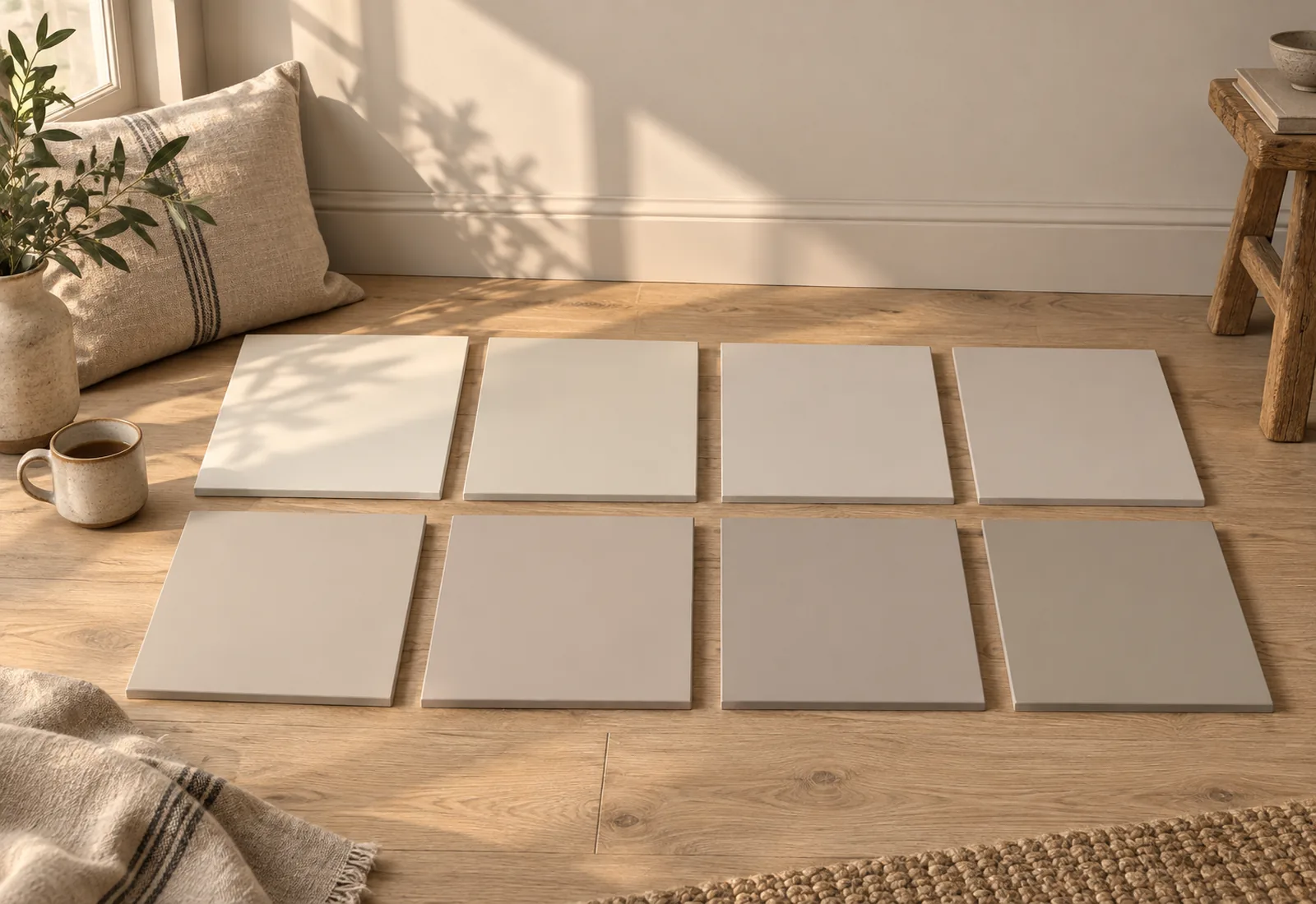
Here are our eight greiges and beiges side by side, from lightest to deepest, with their undertone and the room that suits them.

Updated September 2026 · by the Mylands France colour team

Greige and beige: 8 Mylands shades compared

The short answer

Our greiges are ranked by depth: the very light, almost off-whites — Chalk Farm No.53, Cadogan Stone No.59, Silver Bit No.77 — for a whole house; the light-mid — Colosseum No.66, Temple Bar No.70, Hoxton Grey No.72 — for a sitting room or bedroom; the mid — Grouse No.75, Grays Inn No.167 — to give character. The pinkest (Colosseum No.66, Grouse No.75) are the softest; the greyest (Silver Bit No.77, Grays Inn No.167) the most contemporary.

At a glance

The shades compared

Colour Family Tone Light LRV ≈ Best for
Chalk Farm™ No.53 Neutral Pale tone South, West 73 % Undertone: warm, neutral. For a whole house, hallways, north-facing rooms.
Cadogan Stone™ No.59 Neutral Pale tone West 67 % Undertone: balanced. For everything; the greige to choose when in doubt.
Silver Bit™ No.77 Neutral Pale tone West 65 % Undertone: pinkish grey. For contemporary sitting rooms and kitchens, south-facing rooms.
Colosseum™ No.66 Neutral Pale tone West 62 % Undertone: pinkish. For bedrooms, sitting rooms and dining rooms, especially north-facing.
Temple Bar™ No.70 Neutral Pale tone West 60 % Undertone: warm, proper. For country-house sitting rooms, kitchens and hallways.
Hoxton Grey™ No.72 Neutral Pale tone West 58 % Undertone: earthy. For sitting rooms, bedrooms, staircases and colour drenching.
Grouse™ No.75 Neutral Pale tone South 51 % Undertone: pinkish, deep. For dining rooms, bedrooms and evening sitting rooms.
Grays Inn™ No.167 Neutral Pale tone South 51 % Undertone: grey. For contemporary sitting rooms and studies, south-facing rooms.

LRV: light reflectance estimated from the on-screen shade, from 0 (absolute black) to 100 (absolute white). Light: the orientation in which the shade looks its best.

Our selection

8 colours

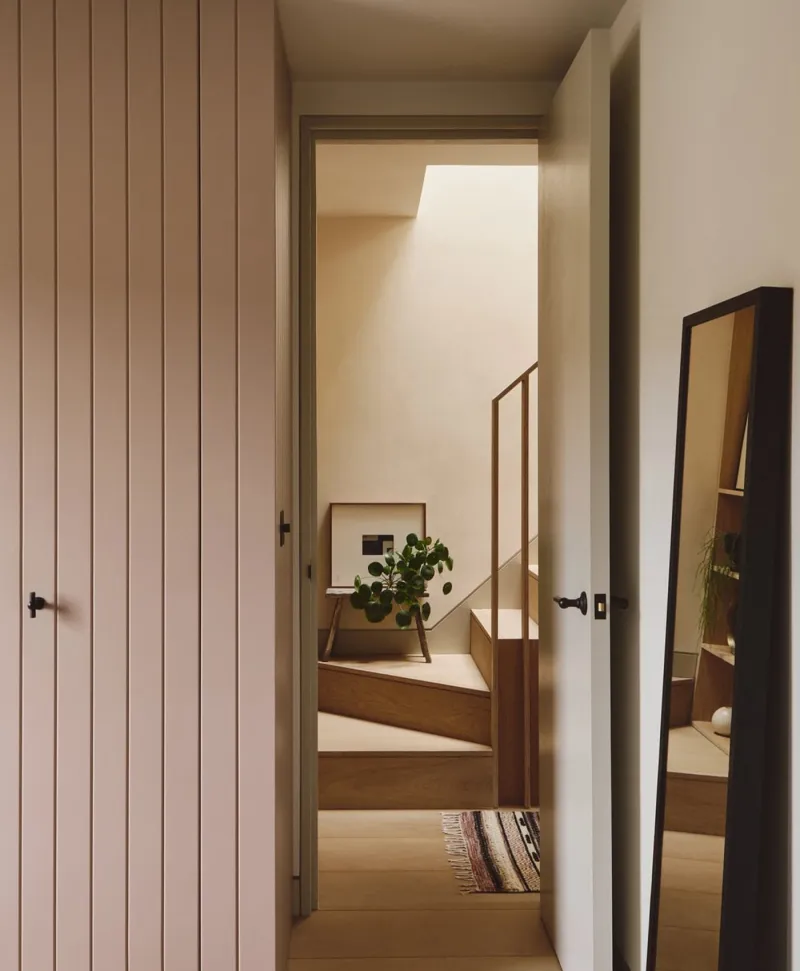
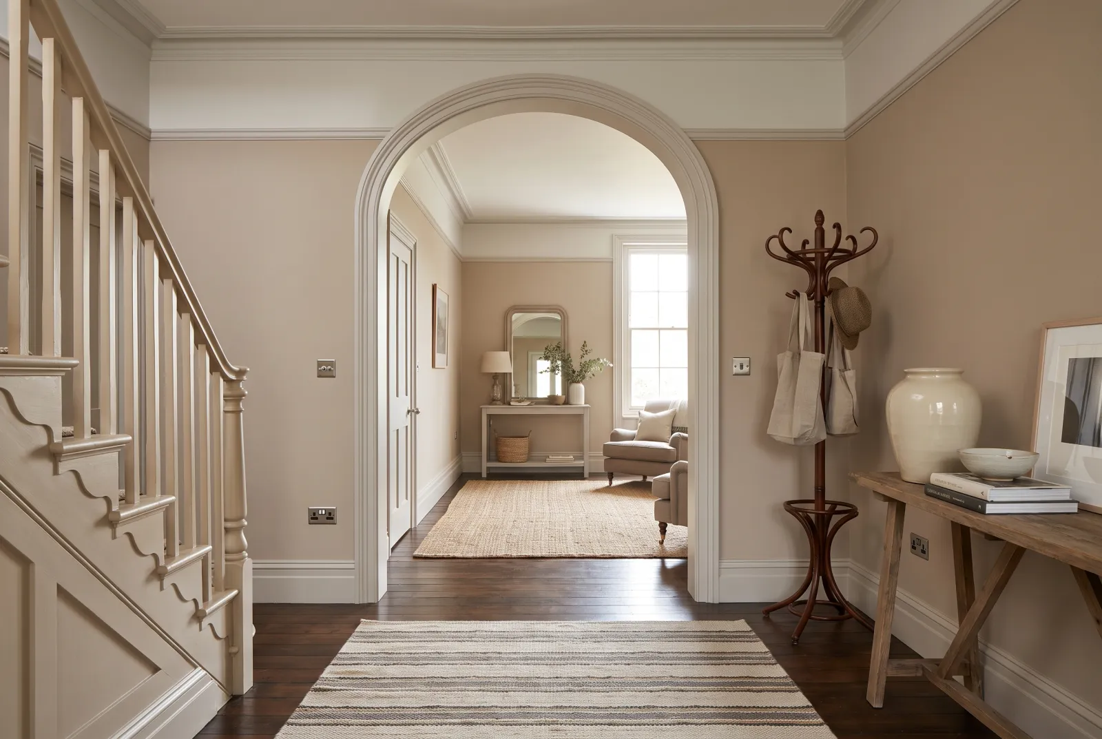
pale pink painted wardrobe door next to passageway leading to a room with a plant and a mirror.
01

Very light · the chalk beige

Chalk Farm™ No.53

  • Neutral
  • Pale tone
  • South light
  • West light
  • LRV ≈ 73%

A very pale, powdery beige, barely more than an off-white, the colour of soft chalk. It has a warm undertone with nothing yellow, and it does what a whole-house neutral is asked to do: brighten without being white, warm without showing. In a south-facing room it becomes almost white; facing north it keeps its softness.

Our tip — Undertone: warm, neutral. For a whole house, hallways, north-facing rooms.

View the colour → Already in your basket (limit 1 per order)
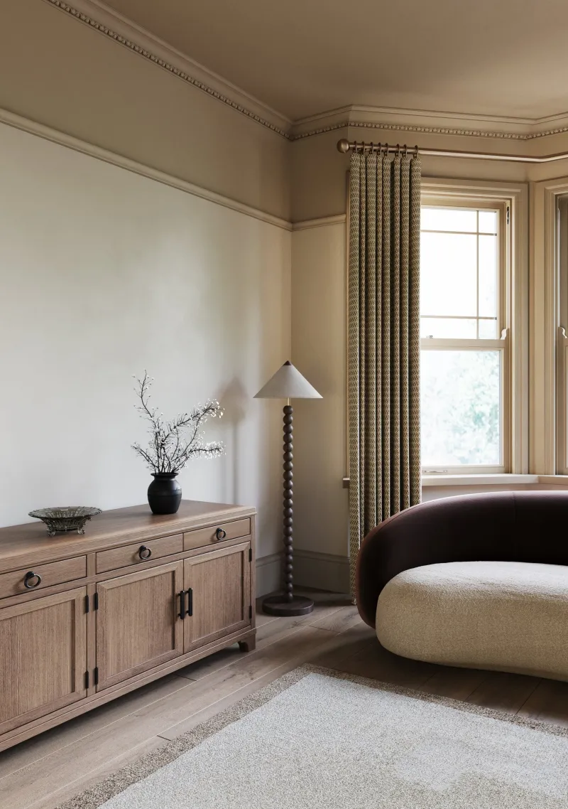
Cadogan Stone — living room
02

Very light · the Chelsea stone

Cadogan Stone™ No.59

  • Neutral
  • Pale tone
  • West light
  • LRV ≈ 67%

A light, warm greige, the colour of the weathered Portland stone of Cadogan Square's façades. It is our reference greige — the most balanced between grey and beige, the one meant when people say "greige". It goes on every wall of a house, it welcomes every colour, and it ages without ever looking dated.

Our tip — Undertone: balanced. For everything; the greige to choose when in doubt.

View the colour → Already in your basket (limit 1 per order)
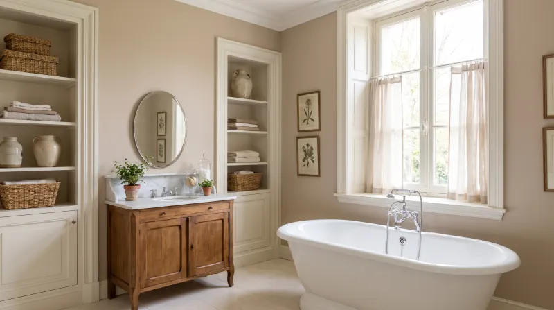
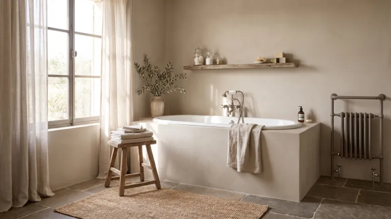
Silver Bit — Bathroom
03

Very light · the silvery greige

Silver Bit™ No.77

  • Neutral
  • Pale tone
  • West light
  • LRV ≈ 65%

A light greige leaning to grey, with a touch of pink that keeps it from being cold — the colour of a tarnished silver bit, hence its name. It is the most contemporary of our light greiges: crisper than Cadogan Stone, softer than a grey. It is very handsome with pale oak, linen and black.

Our tip — Undertone: pinkish grey. For contemporary sitting rooms and kitchens, south-facing rooms.

View the colour → Already in your basket (limit 1 per order)
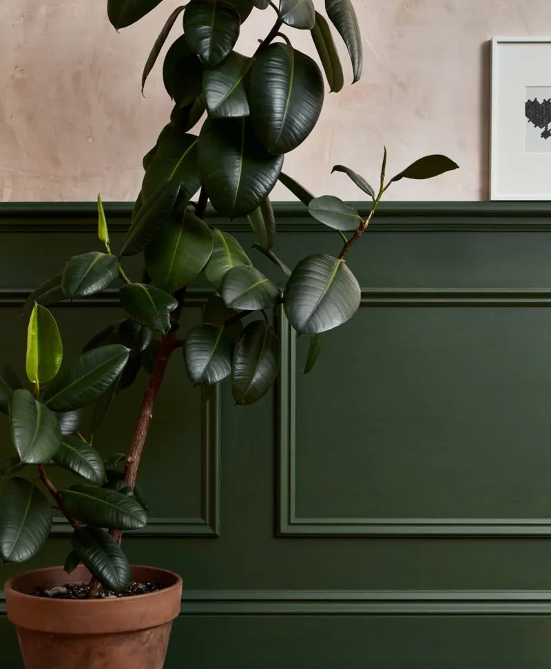
Potted plant against a green panelled wall with a framed picture on a plaster wall.
04

Light-mid · the pinkish greige

Colosseum™ No.66

  • Neutral
  • Pale tone
  • West light
  • LRV ≈ 62%

A light-mid greige with a pinkish undertone, the colour of Roman stone at sunset. The pink is invisible on the colour card and decisive on the wall: it makes the colour warm and flattering, especially at night. It is a bedroom and sitting-room greige, which makes handsome shadows and pairs with dark woods.

Our tip — Undertone: pinkish. For bedrooms, sitting rooms and dining rooms, especially north-facing.

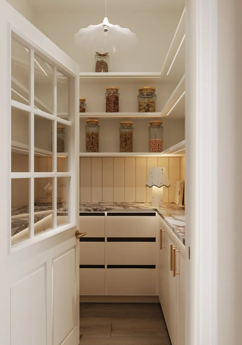
Cotton Street — pantry
05

Light-mid · the stone beige

Temple Bar™ No.70

  • Neutral
  • Pale tone
  • West light
  • LRV ≈ 60%

A proper, warm light-mid beige, the colour of dressed stone — more beige than greige. It is the most "beige" in this guide, with nothing yellow or pink, and it gives a room the warmth of a country-house interior. Superb with off-white, raw wood and greens.

Our tip — Undertone: warm, proper. For country-house sitting rooms, kitchens and hallways.

View the colour → Already in your basket (limit 1 per order)
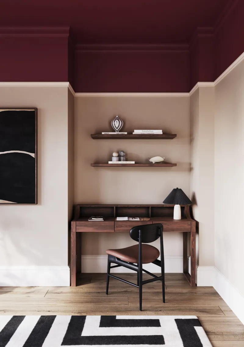
Huguenot — study
06

Light-mid · the velvety greige

Hoxton Grey™ No.72

  • Neutral
  • Pale tone
  • West light
  • LRV ≈ 58%

A light-mid greige with an earthy undertone that reads beige in sun and grey in shadow — our liveliest greige. It is a notch deeper than Cadogan Stone, and that notch is what gives it velvet: a room in Hoxton Grey looks wrapped rather than painted. The greige of our most successful sitting rooms and staircases.

Our tip — Undertone: earthy. For sitting rooms, bedrooms, staircases and colour drenching.

View the colour → Already in your basket (limit 1 per order)
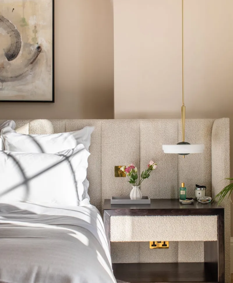
Neutral modern bedroom with a bed, nightstand, and decorative elements.
07

Mid · the pinkish taupe

Grouse™ No.75

  • Neutral
  • Pale tone
  • South light
  • LRV ≈ 51%

A mid greige leaning to taupe, with a pinkish undertone more marked than Colosseum — the colour of a grouse's plumage. It is deep enough to give a bright room character without closing it in, and its pink warmth makes it particularly flattering at night. A dining-room and grown-up-bedroom greige.

Our tip — Undertone: pinkish, deep. For dining rooms, bedrooms and evening sitting rooms.

View the colour → Already in your basket (limit 1 per order)
Grays Inn — Bathroom
08

Mid · the grey greige

Grays Inn™ No.167

  • Neutral
  • Pale tone
  • South light
  • LRV ≈ 51%

A mid greige leaning frankly to grey, the colour of the stones of Gray's Inn in the rain. It is the most sober and contemporary of our mid greiges — almost a warm grey — and it makes a perfect ground for modern furniture, black and oak. It holds very well in a south-facing room, where its share of grey calms the light.

Our tip — Undertone: grey. For contemporary sitting rooms and studies, south-facing rooms.

View the colour → Already in your basket (limit 1 per order)

These colours in real rooms

Our schemes in which one of this guide's shades plays the lead — or a supporting role.

All schemes · Neutrals →
Hoxton Grey™ No.72 Frieze™ No.84 Temple Bar™ No.70
Grouse™ No.75 Whitehall™ No.9 Gravel Lane™ No.169
Grays Inn™ No.167 Cotton Street™ No.3
Colosseum™ No.66 Maugham White™ No.2
St Martins™ No.37 Chalk Farm™ No.53 Ultramarine Blue FTT-018
Clerkenwell™ No.21 Frieze™ No.84 Hoxton Grey™ No.72

How to choose a greige

A greige is chosen on two axes. Depth: very light for a whole house or a dark room (Chalk Farm No.53, Cadogan Stone No.59, Silver Bit No.77), light-mid for a living room you want wrapped (Colosseum No.66, Temple Bar No.70, Hoxton Grey No.72), mid to give character (Grouse No.75, Grays Inn No.167). Undertone: pinkish for softness and north-facing rooms, grey for crispness and south-facing rooms, earth or stone for a natural look.

Why greige rather than grey or beige

A pure grey turns cold facing north; a pure beige turns yellow facing south. Greige holds enough of each to correct the other: in a north-facing room its beige share warms; in a south-facing one its grey share calms. That is why it is the safest neutral for a house of mixed aspects. We discuss it in our neutral groups and how light affects colour.

Ceiling and woodwork

With a greige, a ceiling in a warm white — Holland Park No.5, Maugham White No.2 — rather than pure white, which would make the greige look dirty. Or the greige itself on the ceiling, a notch lighter on the walls: the room looks taller and softer.

To go further: our neutrals for a sitting room, warm grey or cool grey? and our ideas in neutrals.


Frequently asked questions

What is greige?
A neutral halfway between grey and beige, which stays warm without yellowing and calm without cooling. At Mylands, Cadogan Stone No.59 is the reference greige; Hoxton Grey No.72 a notch deeper.
Which Mylands greige is the most versatile?
Cadogan Stone No.59, the most balanced between grey and beige, suits a whole house. For a living room you want more wrapped, Hoxton Grey No.72.
Greige or beige for a north-facing room?
A greige or beige with a pinkish or warm undertone — Chalk Farm, Colosseum, Grouse — that keeps its warmth under cold light. Avoid grey greiges such as Grays Inn, which are handsomer facing south.
Which ceiling white with a greige?
A warm white — Holland Park or Maugham White — rather than pure white, which would make the greige look dirty. Or the greige itself on the ceiling, a shade lighter on the walls.

Guides to read next

All colour guides →

Want to see these colours at home?

Order a sample to judge the shade in your own light, or browse every paint for the room.

Sign up to our newsletter

Sign up to our newsletter

Thanks for signing up to our newsletter!